| Section | |||||||||||
|---|---|---|---|---|---|---|---|---|---|---|---|
|
...
The Date/Time control relies on the timezone of the browser. The time portion will be calculated based on the date and whether or not Daylight Savings Time is observed in that time zone.
The Date control is used to denote a day and has no dependencies on time zone.
For example, A time of 5:00 PM is entered into a Time control and a date of 2/5/2014 plus 5:00 PM into a Date/Time control by a user located in the America/New_York (Eastern Standard Time). When the submission is viewed in the EST time zone, the Time Control displays 5:00 PM. This value will not change. The time portion of the Date/Time control also displays 5:00 PM, because it takes on the timezone of the browser (EST) and it is not further adjusted because Daylight Savings Time is not observed in EST on February 5th.
...
LDAP customers often use the ComboBox control if they have many users/roles configured on their LDAP server. What if the designer wants to pull a list of users or roles from their LDAP server into a form or flow for user selection? Using a traditional dropdown control is not ideal especially when you have thousands of users to pick from. The ComboBox control allows users to type characters in the ComboBox control that filter the choices to the entered characters and display those that match. You can also type a value that is not in the list. 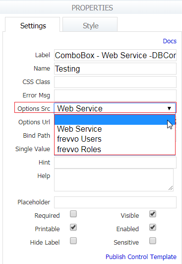
Drag/drop the ComboBox from the Palette or import it from schema. When you dnd the ComboBox from the Palette, it does not have a Control Type property. You cannot change the ComboBox to a different control by changing the value in the Control Type dropdown. You must delete the ComboBox and then add the control that you want.
...
The control options default to "true=Yes" and "false=No". When you drag the control from the palette, only the "Yes" option will be visible. You can change the option labels from Yes and No to whatever you want. It is important to note changes to the label for false are irrelevant as it will never be visible on the form. The option values cannot be changed and will always stay as true and false. Blank labels for options are not allowed. Checking the “Yes” checkbox of the Boolean control results in a true value in the XML document.
...
Max size is the upper limit for each attachment uploaded to Upload controls in your forms/flow. The internal upper limit is controlled by a configuration parameter - frevvo.attachment.maxsize. In the cloud. It is set to 1 10 Mb. If you enter a value into the control's max attachment size property greater than internal upper limit, you will see an error message displayed on the upload control.
In-house, customers can control the internal upper limit via the /wiki/spaces/frevvo80/pages/975572178 frevvo.attachment.maxsize parameter in the web.xml or frevvo.xml files. Initially, this value is set to 10485760 bytes. You can also set the max attachment size per user by editing the user's profile as the admin user and editing the Configuration field shown below:
...
The Rich Text editor will be vertically expanded when you show the menus in Message Controls or any group control that you drop a Message control into that is less than 4 columns wide.
Message Control in a Repeat
You can drag and drop a Message control from the palette into a repeat or into a section that then gets dropped into a repeat. You can write Rules affecting the Message controls in repeats. Message controls in Repeats can contain templates. Repeat controls containing Message controls can be converted to Tables. Refer to the Control Type property for the details.
Horizontal Layout using the Message Control
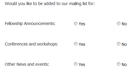
Let's say you wanted to modify a section of your form to reflect a horizontal layout as shown in the image. c
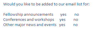
One approach would be to use the Table and Radio Controls. Another alternative is to use three Message controls and three Radio controls. Follow these steps:
- Drag and drop a Panel onto the designer canvas.
- Drop Message controls into the panel for the user instruction and the labels Fellowship announcements, Conferences and workshops and Other major news and events. Select None in the Message Control Type field.
- Click on the Style tab. Set the width of the Message Controls to half the size of the panel.
- Place 3 Radio controls with Yes/No options to the right of the Message Controls for the 3 choices. Check the Hide Label property for each.
- Click the Style tab and enter 50% in the Item Width property
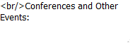
- You may have to insert a single line break HTML tag in the Message property to align the Message Control text with the Yes/No options of the Radio Control.
Here is what the form looks like in Use mode:
.
Link Control (for URLs)
...
The message informs the designer what the configured limits are so they can take corrective action.
Centering Images using the Message Control
You can add a Message control on the left side of an image uploaded to your form to center the image. Message controls can be set to an empty string. Delete the default text in the message control. Change its Message Type to None. This will add a blank area on the left of that image and move it into the center. Click the Style tab if you need to modify the width of the message control.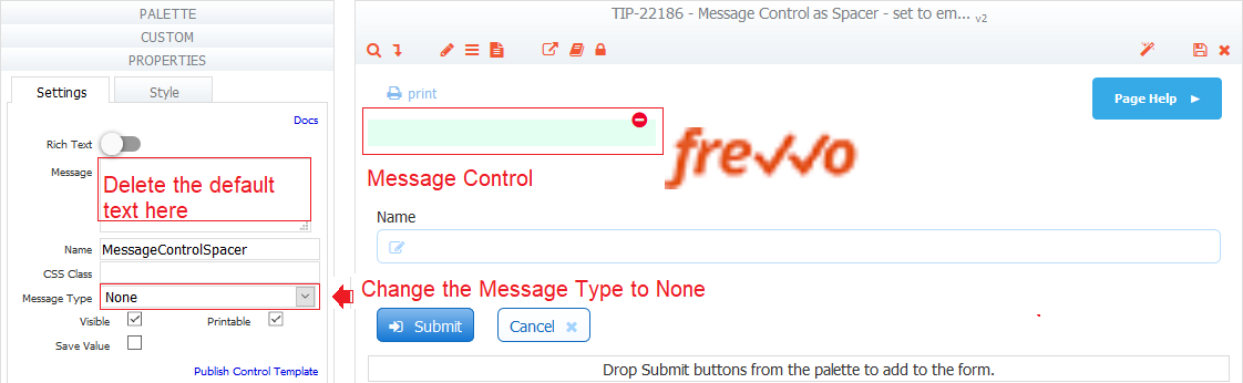
Trigger Control
The trigger control adds a button to your form and is used in conjunction with rules. If your form does not have rules you will not need the trigger control. If your form does have rules, see Triggers & DynamicOptions for details on how to use trigger controls and examples of when you might want to use them.
...