| Section | ||||||||||||||||
|---|---|---|---|---|---|---|---|---|---|---|---|---|---|---|---|---|
|
...
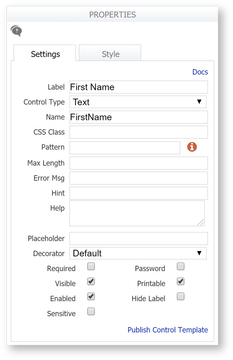
If your control was generated from a schema element, it will have a Display As property instead of a Control Type property.
...
| Note |
|---|
The error message only displays when an invalid value has been entered. Required empty fields are always displayed with a yellow or orange background. If the Accessible property is checked, the error message "You can't leave this empty" - not the error message text configured by the designer - will display. The 'You can't leave this empty:' string can is included in the downloaded file used for form/workflow internationalization. |
Refer to the Table control for information on error messages and columns in a table.
...
This property applies only to controls generated from XSD schema elements. (If the control was dragged in from the palette, it has a Control Type property).
Use the Display As property to change the way your control looks on your form (for example, to change a text control to a dropdown, select dropdown from the list of allowable controls). This will change the control's appearance but will not affect how the control validates data. If you need to modify the control's validation behavior, you must update the schema. See Data Sources for further information. The Display As property is not available for the following schema controls: Message, Date, Time, Date/Time and T/F. Repeat controls can only be changed to tables and vice versa.
...
The Date Format property applies to Date controls and the Date portion of the Date/Time control. The default, recommended format is "Automatic", which is a locale-specific date format. The designer has the option to set a particular date format independent of the locale by using the format field, but this is not recommended. Read this documentation for more information about date controls and internationalization.
Available Date Formats consist of three different separators (dash '-', slash '/', or period '.') and four date display formats (DD/MM/YYYY, MM/DD/YYYY, YYYY/MM/DD, or Mmm/DD/YYYY). European date formatting is supported.
...
- A date typed into a form field will be reformatted to match the selected Date Format
- A date entered into a form field will be translated according to the selected format. For example, if you choose a European format of DD-MM-YYYY and the user enters 10-05-2009, the date value will be translated as May 10, 2009. If you choose a US format of MM-DD-YYY the date value will be translated as October 5, 2009.
- Any of the three separators will be valid for date entry but will be translated to the selected separator. For example, if you choose a format of MM/DD/YYY and the user enters 10-05-2009, the date will display 10/05/2009.
- Dates entered like Feb 3, 2001 will be translated into the specified format.
frevvo adjusts dates expressed with a two-digit year to be within 80 years before or 20 years after. For example, using a pattern of "MM/DD/YY" and the current date/time of Jan 1, 1997, the string "01/11/12" would be interpreted as Jan 11, 2012 while the string "05/04/64" would be interpreted as May 4, 1964. During parsing, only year strings consisting of exactly two digits will be parsed into the default century. Any other numeric string, such as a one-digit string, a three- or more digit string, or a two-digit string that isn't all digits, is interpreted literally. So "01/02/3" or "01/02/003" are parsed, using the same pattern, as Jan 2, 3 AD. Likewise, "01/02/-3" is parsed as Jan 2, 4 BC. frevvo will always format as 4-digit years.
| Note |
|---|
The date will be converted to the standard xsd:date format of yyyy-mm-dd in the submissions XML document. Here is an example: <Order Date>2012-03-06</Order Date>. Refer to Viewing XML Documents for more details. |
Rules can be applied to the Date control in all variations.
Time Format
The Time Format property applies to the Time control type. The default recommended format is "Automatic", which is a locale-specific time format. The designer has the option to set a particular time format independent of the locale by using the format field, but this is not recommended. Read this documentation for more information about time controls and internationalization.
If you keep the default "Automatic" format, you can enter data into a Time control using any of the formats shown in the table. The Time control will accept and display the values as shown:
The Time Format dropdown provides variations of military and standard time conventions, with either colon or period separators.
...
| Note |
|---|
The time will be converted to the standard xsd:time format of hh:mm:ss in the submissions XML document. Here is an example: <Order Time>14:00:00</Order Time>. Refer to Viewing XML Documents for more details. |
...
| Note |
|---|
The local time will be converted to and saved in UTC format and the date will be converted to the standard xsd:datetime format of yyyy-mm-ddThh:mm:ssZ in the submission XML document. Here is an example: <OrderDate>2013-08-12T19:13:00Z</OrderDate>. Refer to Viewing XML Documents for more details. |
...
This property applies only to text area controls and selection controls using the Comment Property. This property lets you define the initial size of the text area. Scroll bars will appear automatically when the user reaches the # of rows you specify. The default value is 3 for the textarea controls and 1 for selection controls.
...
The choices cannot be changed if they have been generated from an uploaded schema, since the schema specifies the choices. On controls generated from schema, you won’t see the Options property in the Properties area. However, you can change the option labels. See Labels 1069257488.
Checkbox Values
Checkbox option values cannot contain spaces. For example, if you set your checkbox option to "Black Cat=Black Cat", it will automatically be converted to "Black_Cat=Black Cat" as soon as you tab out of the options property. This is because checkboxes are multi-select. When the form is submitted, space is used as the separator character for the checkbox control's value. Thus a space character cannot be in the value itself as it would be interpreted as a separator.
...
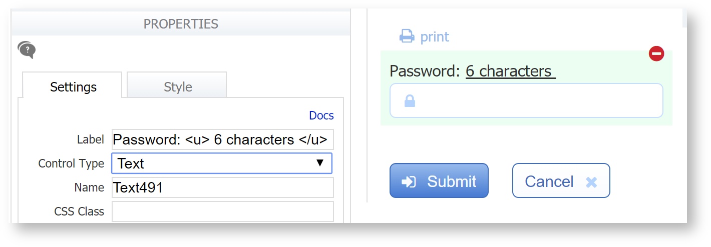
When Other is selected in Use mode for the Product category dropdown shown above, a 3-line text box displays where comments can be entered. If the Required 1069257488 property is checked for the dropdown control, then the comment box that opens on selecting the last option is also required.
...
| Excerpt | |||||||||||||||||||||||||||||||||||||||||||||||||||||||||||||||||||||||||
|---|---|---|---|---|---|---|---|---|---|---|---|---|---|---|---|---|---|---|---|---|---|---|---|---|---|---|---|---|---|---|---|---|---|---|---|---|---|---|---|---|---|---|---|---|---|---|---|---|---|---|---|---|---|---|---|---|---|---|---|---|---|---|---|---|---|---|---|---|---|---|---|---|---|
Setting Up Dynamic Options No Coding NeededCheckbox, Dropdown, and Radio controls support the ability to dynamically retrieve options at runtime from a RESTful web service. The Dynamic Options feature will NOT work with SOAP web services. Using this feature with the ComboBox control is described below. frevvo supports data returned from RESTful web services formatted in either XML or JSON. The frevvo Database Connector is an example of a RESTful web service. The Dynamic Options feature requires:
Watch this 5-minute video example of setting Dynamic Options using the frevvo Database Connector.
Follow these steps:
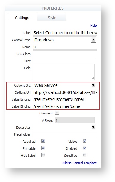
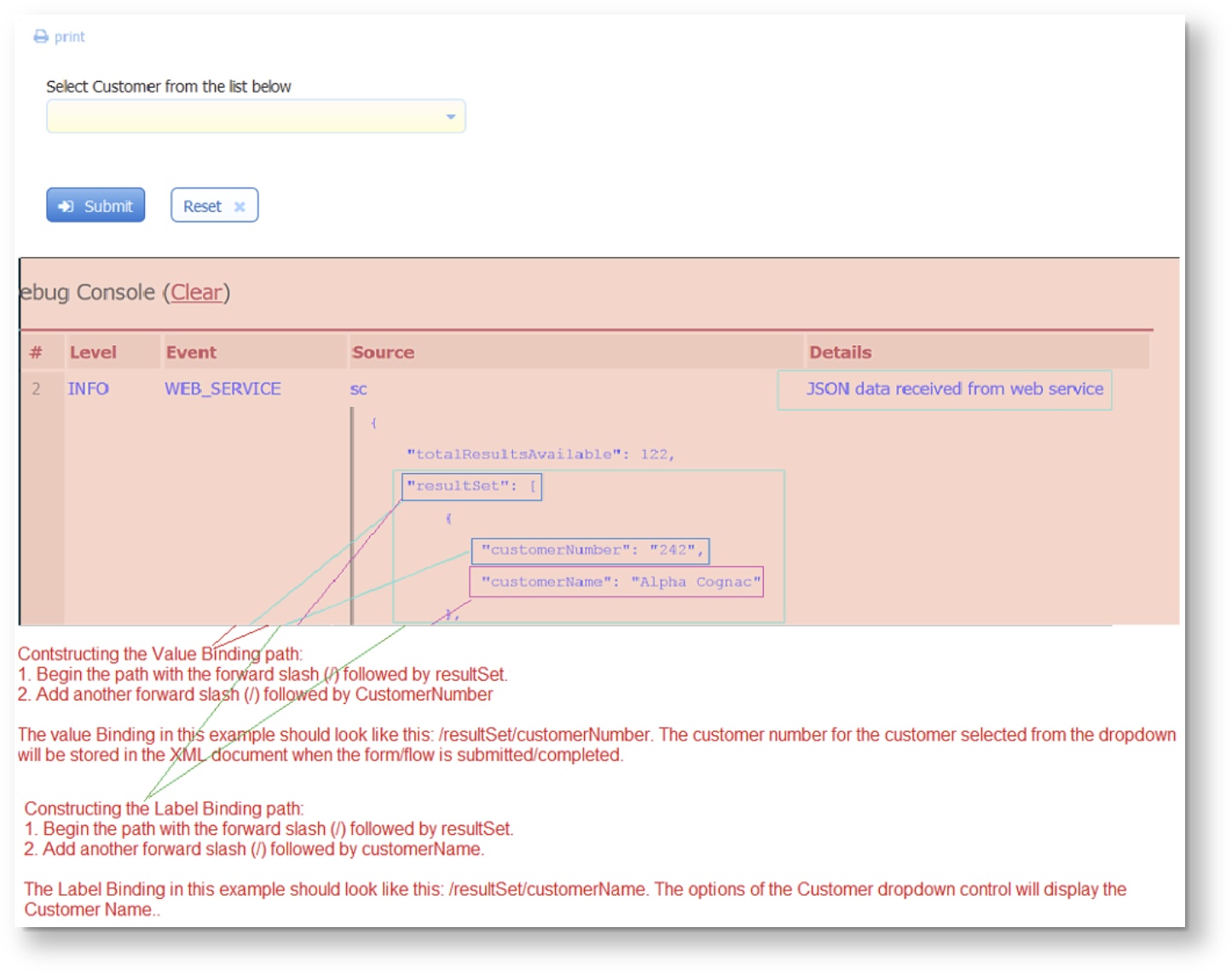
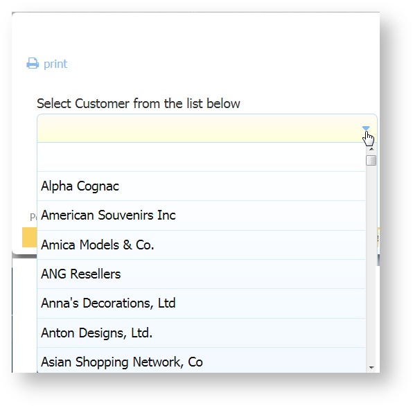
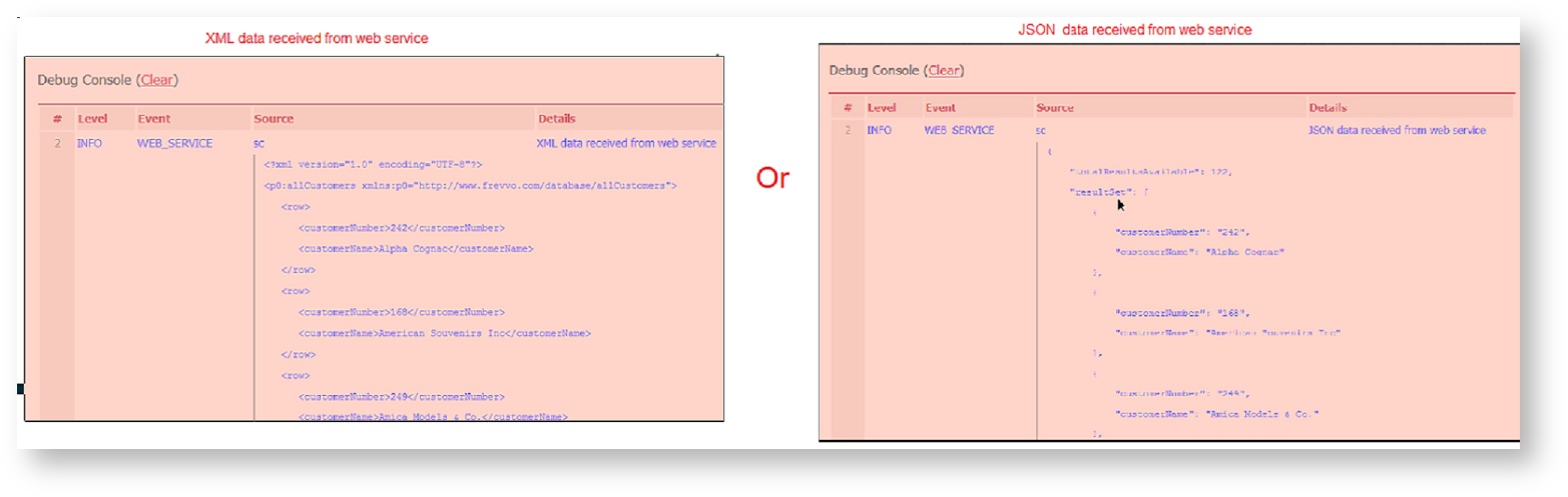
Dynamic Options ExampleLet's say you have a form/workflow with a Dropdown control named Customer. You want to populate the options of this control with a list of Customers Names. You also would like to store the Customer Number associated with the Selected customer in the form/workflow submission. We will use the Database Connector as our Web Service. For this example, the Database Connector is configured in Standalone mode to work with a MySQL database named classicmodels. The Customer dropdown options can be populated with a business rule but you can also use the Dynamic Options feature. The frevvo Database Connector executes a query against a database named classicmodels that will return a list of Customers in JSON format. We will determine the Value and Label bindings by examining the results returned in the debug console. Follow these steps:
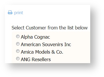
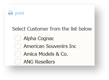
The images show the same form with a Radio/Checkbox control replacing the Customer dropdown.
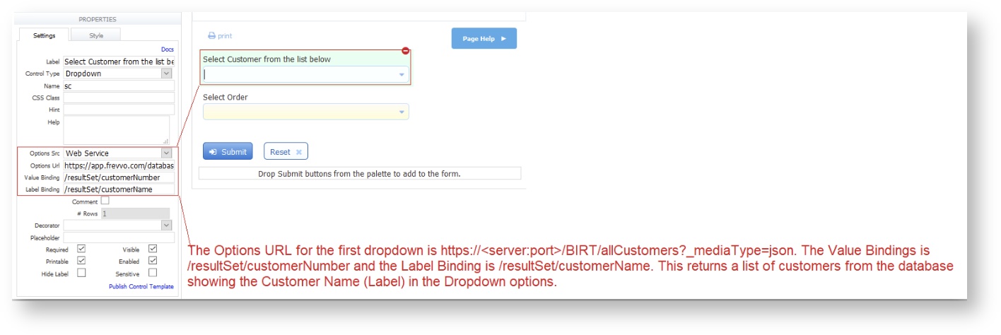
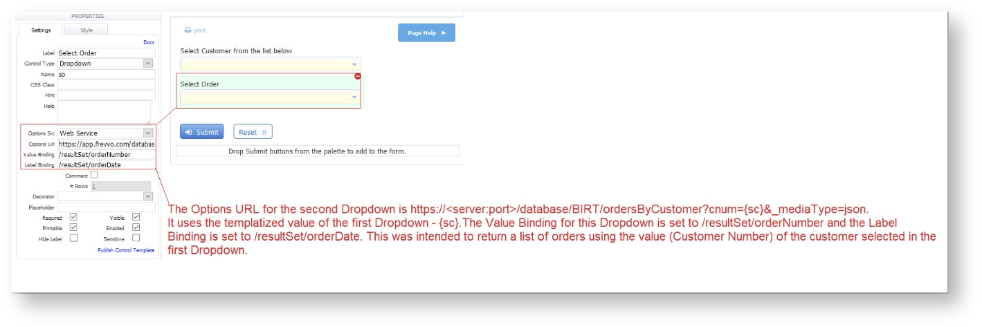
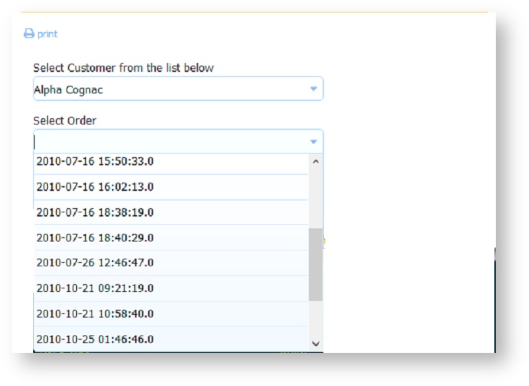
Populating a Selection Control based on the Value of Another Dynamically Populated Selection ControlOptions for Selection Controls (Dropdowns, Checkbox, Radio) are set up using the syntax: value=label. When these controls are used in a template, frevvo uses the option label when resolving the template at runtime. This is desirable when you want your users to see the labels as options. If you use a template in the Options URL, the template resolves to the label at runtime. This may cause the query to fail. Template syntax has been expanded to force the use of the true value as opposed to the option label if the template control is a Selection Control. Use {controlName.value} in place of {controlName} in the options URL to substitute the value instead of the label at runtime. Consider this example: Let's say you want to display customer orders for a particular customer in a form/workflow. You have created a form with two Dropdown controls configured to retrieve dynamic options from a database using the frevvo Database Connector. The first Dropdown, named sc for Select Customer, returns a list of customers. The second Dropdown, named so for Select Order, returns orders based on the customer selected in the first Dropdown. The Options URL for the first dropdown is https://<server:port>/BIRT/allCustomers?_mediaType=json. The Value Bindings is set to /resultSet/customerNumber and the Label Binding is set to /resultSet/customerName. This returns a list of customers from the database showing the Customer Name (Label) in the Dropdown options. The Options URL for the second Dropdown uses the templatized value of the first Dropdown - {sc} - https://<server:port>/database/BIRT/ordersByCustomer?cnum={sc}&_mediaType=json. The Value Binding for this Dropdown is set to /resultSet/orderNumber and the Label Binding is set to /resultSet/orderDate. This was intended to return a list of orders using the value (Customer Number) of the customer selected in the first Dropdown. Note the use of the Select Customer template - {sc} in the Options URL.
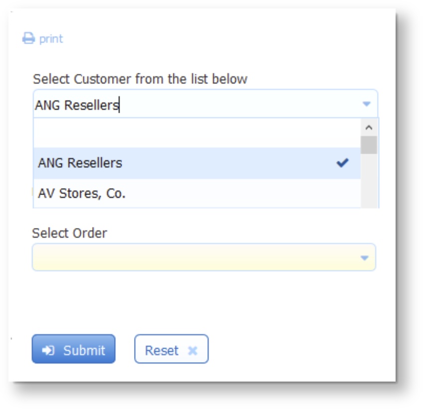
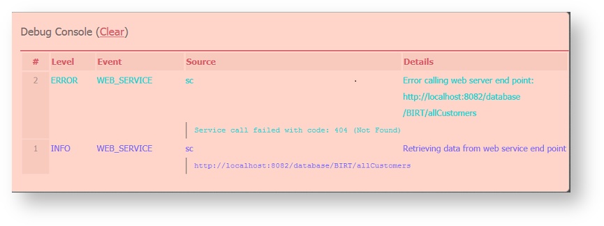
When you test the form, the Customer dropdown is successfully populated but when a customer is selected, the Select Order Dropdown does not populate. The Debug console shows this error:
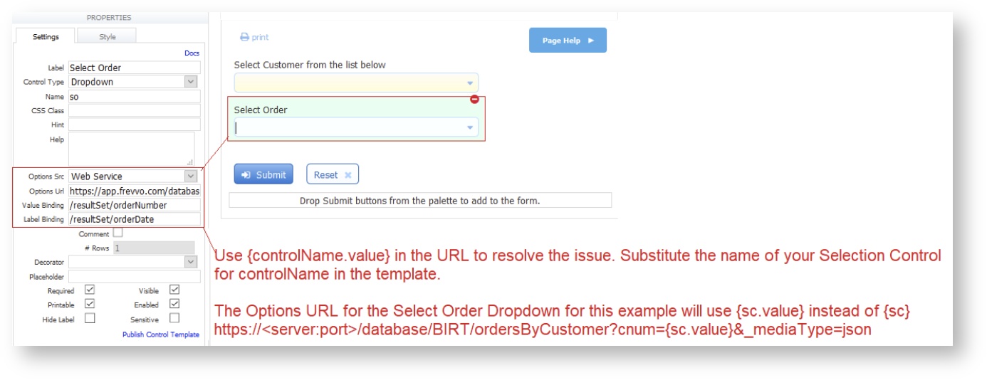
This happens because the second dropdown is using the label of the first dropdown (instead of the value) while executing the web service call. Changing the Select Order template - {sc} to {sc.value} in the Options URL for the Select Order Dropdown forces to evaluate the template to the option value instead of the label and the query will return the expected results. Note the Select Customer template is {sc.value}.
Dynamic Option Runtime Support in the Debug ConsoleWhen developing a form/workflow with selection controls with dynamic options, the designer needs to see returned results from an entry point in order to determine bind paths, troubleshoot end point urls, etc. Logging available in the "Debug Console" in test mode includes Web Service events such as:
If there is a runtime problem invoking a configured web service entry point, frevvo will log a warning statement with a reason to the <frevvo-home>\tomcat\logs\frevvo_YYYY-MM-DD logfile. For example:
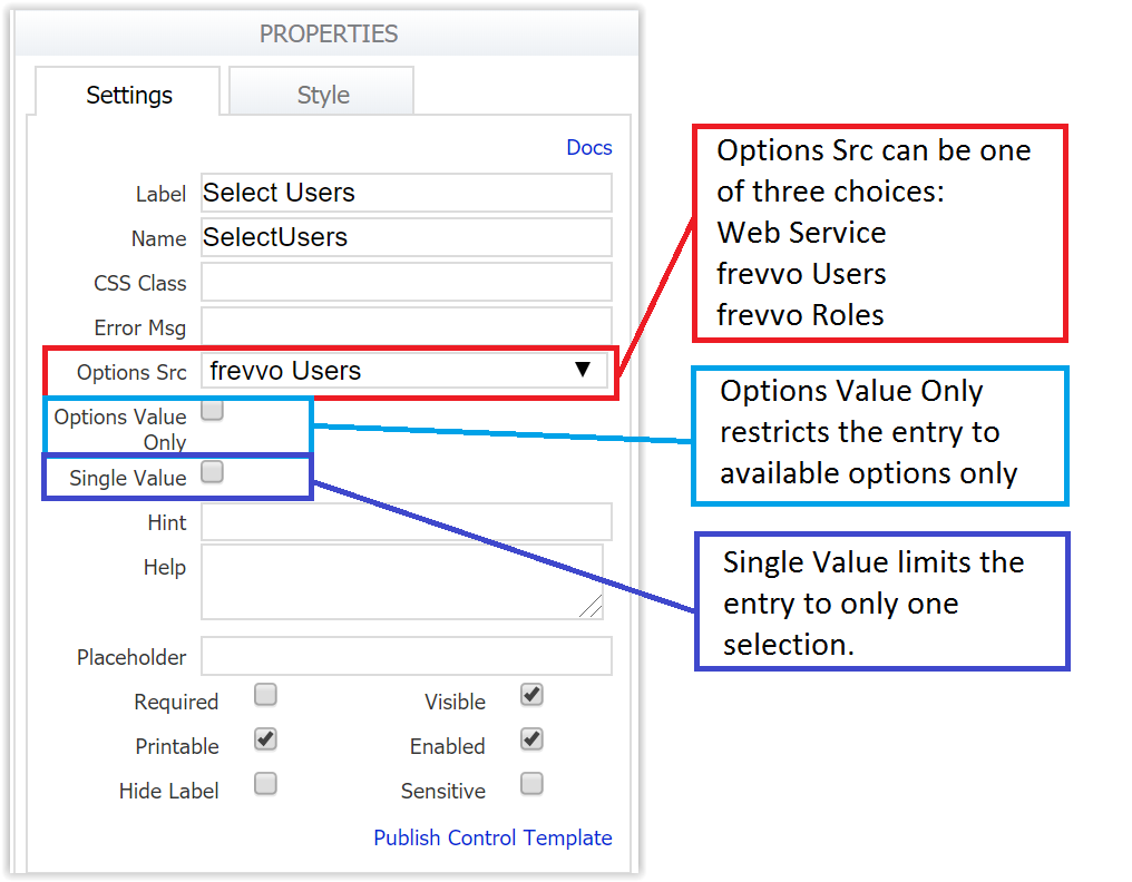
Timeouts for Non-responsive Web ServicesA non-responsive web service call for dynamic options can hold-up a form/workflow indefinitely. Two timeouts have been added to frevvo for socket read timeout and connection timeout. Both timeouts default to 30 seconds. They can be overridden by adding these parameters to the URL: http.connection.timeout and http.socket.timeout. Both are specified in milliseconds. These timeouts apply to web service calls from rules as well as doc actions, etc. Secure Web Servicesfrevvo supports Secure Web Service entry points that use HTTP basic authentication. The authentication credentials are entered in the HTTP Authorization Credentials section of the Edit Tenant screen by the tenant administrator. These HTTP credentials are used by the web service integration. Other authentication schemes in use by 3rd-party services are not supported. Dynamic Options for the ComboBox ControlThe ComboBox control supports three types of data retrieval: frevvo Users, frevvo Roles and Web Service. Select the data source using the dropdown in the Options Src property. Selecting Web Service makes it possible to use the ComboBox to retrieve values from a database and enable a list of possible partial matches. There is also a blank option. Pick this one if you are going to populate your ComboBox options using a business rule.
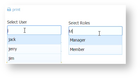
Here's how it works: Use the ComboBox to return a list of users/roles in the tenant where your form/workflow is located (current tenant). You cannot pull users/roles from a tenant other than the current one due to security restrictions.
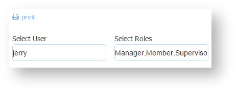
3. The ComboBox supports the ability to specify single or multiple values. Check the Single Value checkbox if you want to limit the choice to one value. Users can typeahead to narrow the choices based on the letters entered. User ids and roles are case sensitive so remember to use the correct case when typing.
4. Check the Options Value Only checkbox to restrict the ComboBox value to available options. Options Value Only is only available when Options Src is set to frevvo Users or frevvo Roles.
Populate Dynamic Pick Lists from a Database with the ComboBoxThe ComboBox control can be used to retrieve values from a web service and enable a list of possible partial matches. This is helpful when you have database queries that return a large number of options. You can filter the number of options returned from a query based on the text typed into the ComboBox. Users typeahead and are only presented with the matching options as choices.
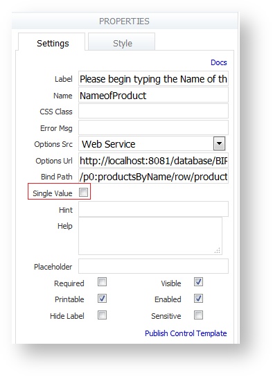
Set the Options Source property of the ComboBox to Web Service then provide the Options URL and Bind Path properties:
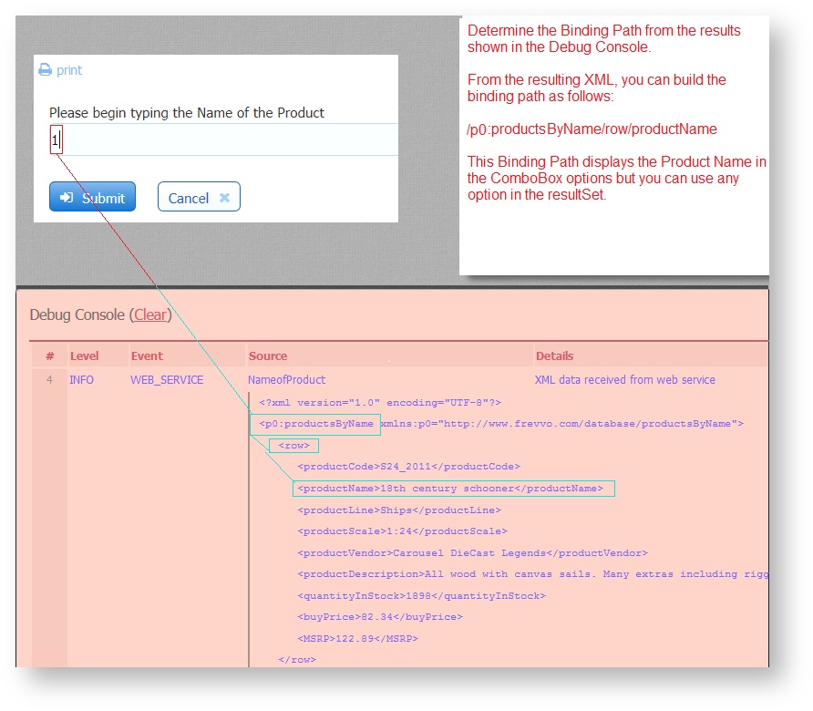
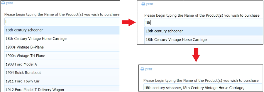
ExampleIt is very common to pull options for a typeahead control such as the ComboBox from a database. If you are using the frevvo Database Connector to integrate with your SQL database you already have a Restful service that returns data as resultSets. Let's say you have a classicmodels MySQL database with a Products table that contains 121 records. You have a form with a ComboBox control named NameofProduct and you want to populate the options from the query results. However, you do not expect your users to scroll through 121 choices until they find the one that they are looking for. Ideally, you would like to filter the results coming back from the query based on the characters inserted into ComboBox. Users can then typeahead and select a value from the filtered choices. For this example, the frevvo Database Connector is installed on the same machine as frevvo and configured in Standalone mode running on port 8081.
ComboBox Control Properties for Business RulesThe following ComboBox properties can be used in rules.
|

...
The Labels property is also very useful when used in conjunction with the Display As property. For example, imagine your XSD schema contains an element named "product" which is of the type xsd:string. But you know for a fact that there are a limited set of product types that are allowed by the back-end system (a database, for example). An xsd:string element will create a text control on your form by default. But you can easily change the form to restrict the types by using the Display As property to change the control from text to dropdown. Then use the labels property to enter the list of product choices. The submission values will now be restricted to that set of options rather then any text string.
...
You are not permitted to disable grouping controls such as panels or repeats. However, there is an Enabled property for Sections, each of the columns in a Table and each tab in a Tab control. If "enabled" is set on Tab or Section, controls inside of these group controls would be enabled. Conversely, if the property is unchecked, controls inside of a section or tab would be disabled. This property will make it easier to write Business Rules.
You can enable/disable the selection controls via rules thereby enabling/disabling all the selection control options. It is not possible to enable/disable individual options.
Disabled tabs are still selectable and disabled sections can still be expanded and collapsed. This is as designed. If you are trying to show/hide the contents of a tab/section, use the Visible 1069257488 property.
Visible
This property determines whether the control is visible or hidden when users first access your form. It is almost identical in concept to the Enabled property, but instead of disabling the control you hide it and write a Rule that makes it visible based on what users enter in another control.
...
| CSS Class Name | Description |
|---|---|
| f-page-break | Adds a page break to the forms PDF |
| f-break-children-avoid | When applied to a group control, avoids page break inside child controls |
| f-break-inside-avoid | Avoid a page break inside a specific control |
| f-page-break-inside-avoid* | *Deprecated, but will continue to work. Prevents a PDF page break from occurring in the middle of a group control. v10.1+ use f-break-inside avoid or f-break-children avoid. |
| showhelp | Enables Help icon at the top of each column when using the Tight layout |
| f-font css classes | Sets the font size for Message and Table controls |
| f-submit-error | Used to display a message to the user if the form is invalid when they click submit |
(workflows) | Used to display a message to the user if an Activity Document Action in a workflow fails |
...
Another is the showhelp CSS Class that is built into the Tight layout. For example, you can reduce white space even further with the Tight layout so that you have virtually no space between controls by selecting the hide label property on each control. This can be a way to implement a grid type layout as shown in this sample form below.
When controls are this tight together there is no room to display the help icon for controls with help text. Notice that the first row of controls does display the help icon. This is done by putting the string showhelp into the css class property for each control in the first row. This is a useful way to have help at the top of each column.
CSS Class to Set Font Size for the Table and Message Controls
There are seven CSS classes that set font size that can be used with a Message Control or Tables 1069257488 controls. Add these into the CSS Class property for these controls only. Other use cases are not supported.
...
| Tip |
|---|
If you are using frevvo On Premise, Cascading Style Sheet code that was used in themes applied to forms/workflows in previous frevvo releases, can be added to a newly created style.css file in the frevvo.war file. The context parameter, frevvo.css.url, in the web.xml file must be changed to point to it. |
...
This property applies only to Submit controls. By default, frevvo disables the form's submit button until all required fields are filled and contain valid data. See Valid Forms for details of this feature. However, sometimes you may wish to override frevvo's default behavior and allow the user to submit a form even if it is invalid. To do this, uncheck this property.
When "Enable if Valid" is checked and you click on the Submit button in a form that contains invalid data or required fields that are empty, the form will not submit and the invalid fields will be highlighted with an orange background color. The designer can also display a message instructing the user what to do.
This approach is very helpful to users when trying to determine why a form does not submit. Refer to this Invalid Form Notification for the details.
If "Enable if Valid" property is unchecked, you can control the Submit button behavior in a business rule using the Submit.enabled = [true,false] property.
Prefix Property
Custom groups with rules included when dropped back onto the same or another form, will contain a special "Prefix" property. The property will automatically be given a unique value if you drop the group onto the same form 2 or more times. This ensures that the group controls have unique element name. You can view the impact the prefix has on the element names by viewing the form's schema or the control's property panel. Using the prefix property, you can write a separate rule to manipulate the 2nd or greater instance of the custom control. Refer to this documentation for the details.
...