This documentation is for frevvo v10.1. Not for you? Earlier documentation is available too.
Valid Forms
One of frevvo's most powerful and useful features is its ability to automatically ensure that any submitted form generates a set of XML documents that are valid with respect to their corresponding XML schemas. frevvo does this by:
- always generating valid XML instance documents and
- preventing form submission if data is invalid or missing.
Required Controls and Validation
frevvo controls may be marked as required or optional by setting the control's required property in edit mode. Controls that are generated from an uploaded schema will automatically be designated as required or optional depending on the schema (for example, whether the control is required based on the minOccurs value). Validation for controls you generate from schema elements depends on the element’s XSD type and other schema-specific information.
On form load, required controls that do not contain valid values have a visual indicator. For example, an invalid control has a yellowish background when a required field is missing a value, and additionally, a warning icon when a control (either required or not) contains an invalid value.
You can change the background color for required fields by creating a style and applying it to your form. Refer to the Styles topic for the details.
Here is a form that is missing values in required fields.
Here is the form when the user has entered valid values into the required fields.
And another that has a value in the field but the value is invalid for the given field type. Notice the error message, yellow background and the warning icon. When the user enters a valid value in the phone control and clicks the Submit button the form will be submitted.
Note that the Email Address and Phone controls are optional. The form may be submitted even though there are no values in these controls. However, if the user enters an invalid value in one of the fields (required or not), frevvo will prevent form submission.
When a form has sections or tabs, the submission may not be allowed due to invalid controls that are not currently visible. For example, a section that is collapsed or a tab that is not currently selected may have an invalid control. This is indicated in the header section and tab label color changing to red.
Invalid Form Notification for Users
Consider the scenario where there are several required fields in a form and the user clicks the submit button having missed a few of them. frevvo will not allow the form to be submitted due to the empty required fields. The user must provide the information for these fields but it is not immediately obvious what data is missing. The user is forced to scroll up the form to find the errors.
frevvo provides a method to show validation errors at the time of submission. Here's how it works:
- The Submit button is never dimmed.
- If you click Submit and the form is invalid (cannot be submitted) all invalid control fields are highlighted with a background color. The color shown in the image is the default. The designer can specify this color by changing the value for (Submit Error Highlight) in a Style and then applying that style to the form.
- Once the required fields have been filled and/or invalid data has been corrected, the highlight color will disappear and the form can be submitted by clicking the Submit button.
- The designer can add a message control(s) to the form with a customized message to alert the user that the form cannot be submitted and what they need to do to correct it.
- The message control must contain your text in the message area and the CSS class f-submit-error specified in the CSS class property.
- A message control with this CSS class is invisible by default. When the error condition is met, these message controls become visible.
- You can use select a Message Type and use all the properties on the Style tab to style your message.
- The message control must contain your text in the message area and the CSS class f-submit-error specified in the CSS class property.
- Once the required fields have been filled and/or invalid data has been corrected, the highlight color will disappear and the form can be submitted by clicking the Submit button.
The error message will automatically clear when the form becomes valid.
Sometimes, you click the Submit button and see that the form will not submit even when all required fields appear to be filled with valid data. The cause is always a hidden required field with no data or a hidden field with invalid data. You can find troubleshooting tips to resolve the issue here.
Signed Sections
Control validation will also run on a signed section when the user clicks "Sign this Section." If invalid control exist, the user will receive an error message and the require fields will be highlighted as described above.
Optional Sections
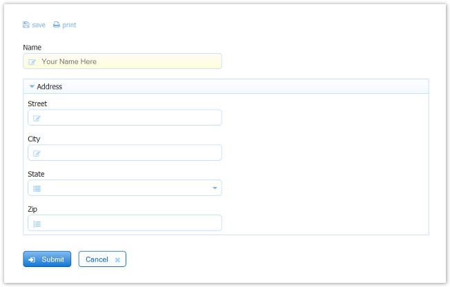
Optional sections can cause the validity of a form to change dynamically. For example, consider the following form:
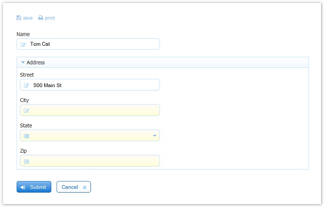
The Required property is selected for the Name field and all the controls inside of the Address section. The Required property is NOT selected on the Address section control making the section and the controls inside of it optional. If the user enters a valid value in the Name field then clicks Submit the form may be submitted. However, if the user chooses to enter an address, then the controls in the Address section become required as indicated by the yellow background in the City, State and Zip fields.
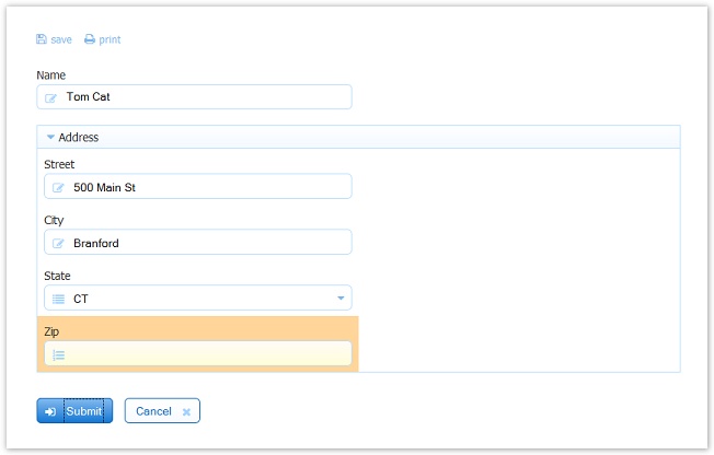
If the user enters a value in the Street and City fields, then clicks Submit, the Zip field is highlighted with a background color and the form will not be submitted until valid values are entered in the three newly required fields.
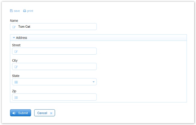
If the user changes his/her mind and removes the value from the Street field, frevvo will recalculate the validity of the form and infer that the Address section is no longer invalid since it is optional. The generated XML instance document will also not contain an address element. Once again, frevvo is automatically ensuring that it is not possible to submit a form that is in an invalid state and that would generate an invalid document.
You can find information about the section Required property here.
Message controls can be included inside an optional section provided the Save Value property is unchecked.
Input Validation
Form fields added from frevvo's control palette have built-in validation rules. The table below details the default validation for each control type in frevvo's palette. Patterns added to a control change the defaults.
| Control Type | Default Validation Rule |
|---|---|
| Text | xsd:string |
| Text Area | xsd:string |
| Date | xsd:date |
| xsd:string with pattern [a-zA-Z0-9\-_][a-zA-Z0-9\-\+_]*(\.[a-zA-Z0-9\-\+_]+)*@([a-zA-Z0-9\-_]+\.)+[a-zA-Z]{2,6} | |
| Money | xsd:double |
| Phone | xxxxxxxxxx, xxx-yyy, xxx.yyyy, xxx-yyyyzzzz, xxx.yyy.zzzz, |
| Time | xsd:time |
| Quantity | xsd:decimal with pattern [\-+]?[0-9]+ |
| Number | xsd:double |
| T/F | xsd:boolean |
If a user clicks submit and any of the controls listed above fails validation, the controls will be highlighted with an orange color indicating that the form cannot be submitted. See InvalidFormNotificationforUsers for other methods to notify users when forms are invalid.
Patterns
Patterns imposes additional validation on what users enter in a particular control. See Designing Forms with Patterns for information on setting a pattern on any control in your form. Patterns are XML schema regular expressions.
- DO NOT use the typical leading ^ and trailing $ characters in your patterns. These two characters represent the beginning and end of line markers and do not apply to frevvo form field values.
- It is important to use a text control for most patterns. For example a zip code requires a '-' character. If a '-' is used in a number control the pattern will fail, as a number control does not allow non-numeric characters.
If a user enters a value in a field that does not match the required pattern, a validation error displays when the user tabs out of the field. If the user clicks Submit without correcting the invalid data, then the field will be highlighted with a background color and submission will not be allowed. See InvalidFormNotificationforUsers for other methods to notify users when forms are invalid.
Here are examples of typical scenarios where designers may want to apply patterns:
US Zip Code Pattern
A pattern that restricts a text control to only allow strings formatted as a US zip code: ##### or #####-####:
\d{5}|\d{5}-\d{4}
The form will flag an error unless the value entered is either five digits or five digits followed by the '-' character followed by 4 digits.
US/Canada Zip/Postal Code Pattern
This pattern validates US zip codes (##### or #####-####) and Canadian postal codes (L#L #L#).
>(\d{5}(-\d{4}))|(\d{5})|([ABCEGHJKLMNPRSTVXY]{1}\d{1}[A-Z]{1} *\d{1}[A-Z]{1}\d{1})
SSN
This pattern ensures that the user enters a valid Social Security Number:
\d{3}-\d{2}-\d{4}
Money
You should not try to apply a pattern to a money control. If you need to apply special behavior to a money control (for example, using three decimal places), we recommend using a text field, which affords a wider range of patterns you can apply. You could also use a number field and apply rules to it — such as rounding up to three decimal places.
Number Range
Patterns for number ranges are not as straight forward as you might imagine. If you want a quantity control allow to only numbers in the range 1-42 it is not sufficient to use the pattern [1-42]. Here is the pattern that will work:
([1-9]|[1-3][0-9]|4[0-2])
Numbers with commas
frevvo's default number control supports digits followed by an optional decimal point and multiple decimal places. Suppose instead you want to allow numbers containing commas and optionally starting with a '$' and only up to 2 decimal places. For example: $1,000.50 2,500. But also to allow numbers without the comma such as $1000. To do this:
- Add a text control to your form
- Set the pattern to: \$?([0-9]{1,3},([0-9]{3},)*[0-9]{3}|[0-9]+)(\.[0-9][0-9])?
If you do not want to allow the optional '$' then:
- Set the pattern to: ([0-9]{1,3},([0-9]{3},)*[0-9]{3}|[0-9]+)(\.[0-9][0-9])?
Numbers with Decimal Places
This pattern allows you to specify the number of decimal places for Number Controls. Change the number 6 in the pattern to the desired number of decimal places. Note there is a period before the second slash.
\d+(\.\d{1,6})?
An customized error message displays if the user enters more than the allowed number of decimal places and the control becomes invalid.
EMail pattern
If you use frevvo In-house (downloaded and installed on your computer), you can change frevvo's built-in patterns for the Email control by editing the ''types.xsd'' file included in the <frevvo installdir>/tomcat/webapps/frevvo.war file. This file includes the email type definition shown below, and you can edit its pattern value. See the example in Phonepattern for instructions to modify the types.xsd file.
<xsd:simpleType name="emailType">
          <xsd:restriction base="xsd:string">
                  <xsd:pattern value="[a-zA-Z0-9\-_][a-zA-Z0-9\-\+_]*(\.[a-zA-Z0-9\-\+_]+)*@([a-zA-Z0-9\-_]+\.)+[a-zA-Z]{2,6}"/>
          </xsd:restriction>
</xsd:simpleType>
You can also create a custom email pattern on Text control. This would be useful to ensure users only enter their work or school email, for example. Drag a text control from the palette and set the pattern as follows, replacing "@domain.com" with your domain.
[a-zA-Z0-9\-_][a-zA-Z0-9\-\+_]*(\.[a-zA-Z0-9\-\+_]+)*@domain.com
Phone pattern
Lets say you would like to change the phone control validation from the frevvo current built-in pattern. Cloud customers must apply Patterns to a text control while in-house customers have two options
- Apply patterns to a control - Like other control properties, the pattern property will not need to be redone when you upgrade frevvo.
- Modify the built-in values in the types.xsd file. Be aware that if you modify the types.xsd file, you will have to make this change each time you perform a frevvo upgrade or apply a frevvo patch.
Apply a Pattern to a Control for a Phone Number
If you are using frevvo Online, you will not have access to types.xsd. Both cloud and in-house customers, can override the pattern in the phone control by setting its pattern property. You can only restrict a built-in pattern (such as the phone control) but not change the pattern via the pattern property. For example you can add the pattern 203-\d{3}-\d{4}. Now all phone numbers must start with area code 203.
The Pattern property will not need to be redone when you upgrade frevvo.
A pattern such as ##-####-#### or ####-###-### is not a simple restriction. To impose validation against this pattern you must start with a Text control rather than a Phone control
- Drag a Text control to your form
- Add your pattern to the Text control's pattern property: \d{2}-\d{4}-\d{4} or \d{4}-\d{3}-\d{3}
- Change the error message and help properties to assist the user in understanding the required pattern
Modify the types.xsd file
frevvo OEM partners may choose this method when customizing frevvo. The built-in values are shown in the image below:
Follow these steps to change the current buit-in pattern to ##-####-#### or ####-###-###.
If you are using frevvo In-house (downloaded and installed on your computer), you can change frevvo's built-in patterns for the Phone control by:
- Stop frevvo if it is running.
- Open <frevvo home>/tomcat/webapps/frevvo file and copy the WEB-INF\data\users\types.xsd file to a temporary location of your choice.
- Edit c:\tmp\frevvo-war\WEB-INF\data\users\types.xsd,
- Change the element phoneType as shown in the code block below: Save the changes to the types.xsd file.
Replace the original file with the updated version.
- Restart your frevvo form server. Now all your phone controls will validate against this pattern.
<xsd:simpleType name="phoneType">
    <xsd:restriction base="xsd:string">
        <xsd:pattern value="\d{2}-\d{4}-\d{4}"/>
        <xsd:pattern value="\d{4}-\d{3}-\d{3}"/>
    </xsd:restriction>
</xsd:simpleType>


