The Guided Designer Settings mode displays the Properties Wizard, where you can configure form/workflow settings, the user experience, and what happens to submissions and data. Form and Workflow Settings are very similar, but some tab names will reflect either "form" or "workflow" respectively. Additional property differences are outlined in the sections below.
- If you are working on several tabs at one time, you can navigate to other tabs and make changes there. Your changes are temporarily saved while you switch between forms, or even between the Settings tab and other Guided Designer modes (Workflow, Form(s), Rules, PDF Mapping). Click Saveto permanent save your changes.
will validate the Property Settings when you select a different Guided Designer mode or use any of the Save options (Save, Save and close, Save and test). If a property value is invalid, the tab(s) will not close and a message will display telling the designer that there are corrections to be made before saving. CLOSE returns you to the current tab if there is a validation error. Otherwise, another invalid tab will be auto selected (starting from left to right) if another tab needs attention. Tab labels with invalid entries display in red. DISCARD & CLOSE dismisses your changes and returns you to the current tab. You can now navigate elsewhere.
- Hover over any field on the Properties tabs to see a helpful hint providing information about the property. Some fields contain instructions to guide you.
- Clicking on the down arrow for a property shows an unfiltered list of choices applicable to that property. For some properties, you may see templatized controls from your workflow and workflow/special templates provided in
. In some cases, you can type ahead to narrow down the list. Use the up/down arrows, the Enter key or click an option with your mouse to select an option. Use the Backspace, Delete or click the x on a selected property to delete it.
- Typing a opening curly brace into some fields, followed by the name of a control, show a list of the fields in your workflow that match the entered text and will be added to the field as a control template.
- On some tabs, you may have to slide the toggle to the right to turn on a feature.
Settings
Specify General Settings for your form/workflow on the Settings tab.
Form/Workflow Name
This is the name you see on the Forms & Workflows Homepage where your forms are listed. We recommend giving your form/workflow a meaningful name, but keep in mind it is a working name only, so users will not see it. Form names longer than 255 characters will be truncated. It is recommended that you name your form/workflows using characters that are suitable for filenames. Following the POSIX filename standard (A–Z a–z 0–9 . _ - ) will ensure it works. You can change the name on the Settings tab or in Form/Workflow editing mode.
If the Form/Workflow Name is changed after the form has been deployed and has submissions, the original form name will still appear on the Task List and Recent Submissions tabs on the user dashboard.
Description
By default all form descriptions say, “Edit the form/workflow to change this description,” but you can change this if you wish. You also see this description when you view individual submission documents. The Description is limited to 255 characters.
The Search feature looks for both name and description, so use keywords that will help you find your form later.
Navigation
(Workflow Settings only)
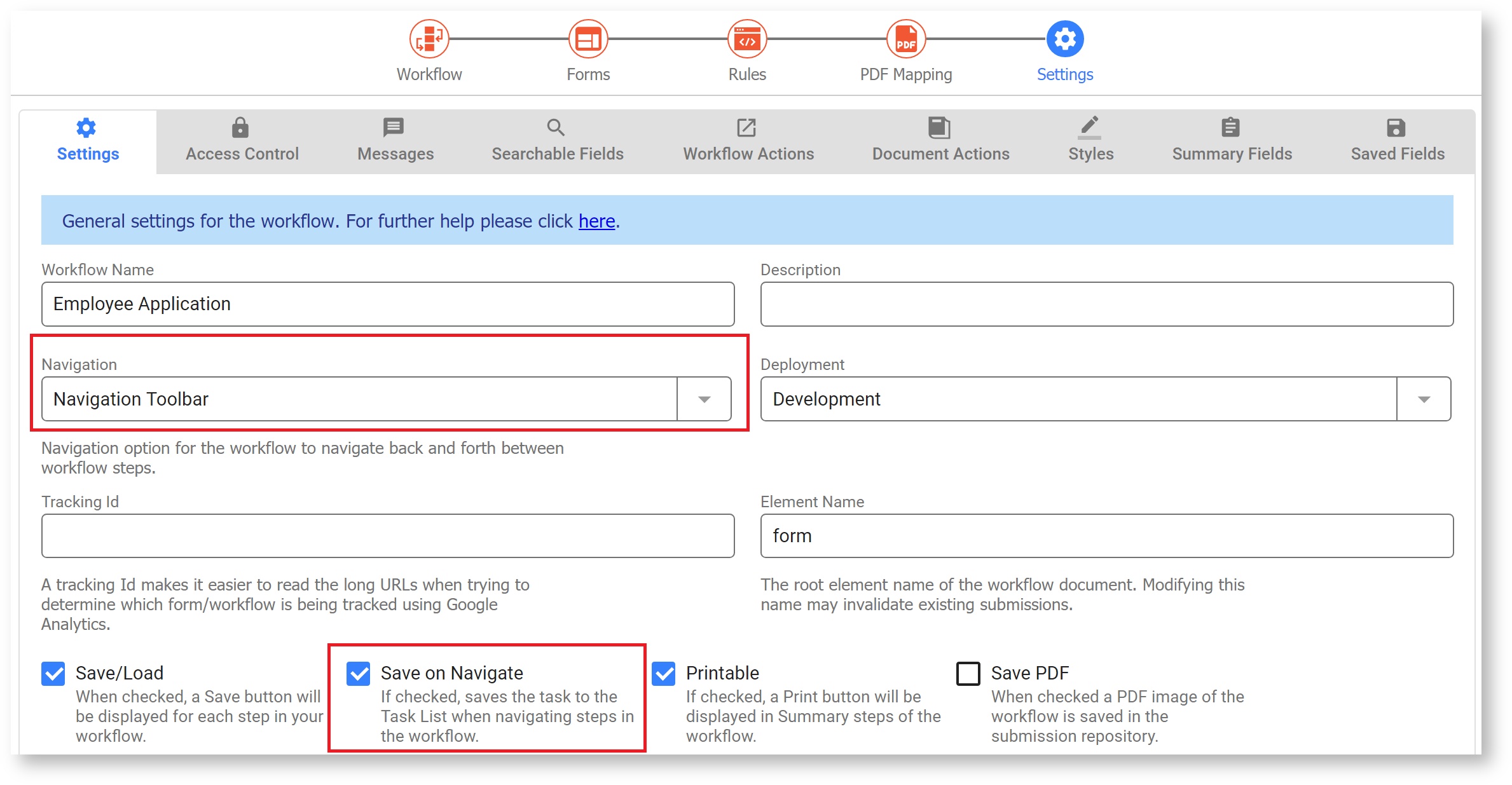
can automatically generate and display a navigation toolbar for your workflow which users can use to navigate back and forth between workflow steps. There are four available options:
- None: This option displays no navigation toolbar. This is useful for situations where the same form is being passed between users for signatures e.g. Vacation Request workflow filled in by an Employee and signed by a Manager.
- Navigation Toolbar: this displays a standard navigation toolbar with links for each step.
- Percent: This displays progress through the workflow as a percentage.
- Step 1 of 4: This option displays progress through the workflow as a counter.
The default value for Navigation is Navigation toolbar. When you configure the Navigation toolbar for your workflow, users will see the following:
- The name of the current step displays with a bright blue color. Note that the active step number is also circled in bright blue. Steps that have yet to be performed display with a light blue color.
- HTTP Wait-Notify and Anonymous Task steps, once performed, display with a faded blue color indicating that the workflow cannot be reset to this step.
- Skipped steps display with a light blue color and steps that have already been performed display with a black color. For example the Expense Report workflow shown in the image, has four steps: Expenses, Reviewer, Supervisor and Accounting. The employee fills out the Expense report for an amount less than $5000.00. The workflow is routed to a company reviewer and if approved, to Accounting for final processing. If the amount of the expense had been greater than $5000.00 then the workflow is routed to a Supervisor for an additional review before navigating to the Accounting department. The Supervisor step is skipped for Expense reports less than $5000.00. When the Accounting employee performs the task, here is what they will see:
- The Expenses and Reviewer steps display in black since they have already been performed.
- The Supervisor step is displayed in faded blue because it was skipped as the total amount of the expenses was less than $5000.00.
- The name and number of the Accounting step, which is the step that is currently being performed by the Accounting employee, display in a bright blue color.
Refer to the precondition topic to see how to use them to skip a step in a workflow.
Mobile vs Desktop Behavior
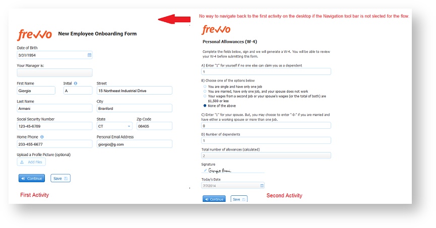
You may notice a difference in behavior when using a workflow on the desktop vs on a phone/tablet. For example, imagine a two step workflow where Step 1 has two Pagebreak controls and neither step has an assigned role/user. On the phone/tablet this translates into a screenflow with three pages for Step 1 and one page for Step 2. You can use the Previous button to get back to the Step 1.
However, on the desktop there is no "Previous" button so once the workflow gets to Step 2, they must use the Navigation Toolbar to get back to Step 1. If the designer does not configure the Navigation Toolbar in this situation once the user gets to the second step in the workflow, there is no way to return to the first step.
Anonymous Screenflow Navigation
A screenflow is a type of workflow consisting of a collection of sequential steps performed by the same user. What if you wanted that user to be anonymous? Configuring the Navigation Toolbar in an anonymous screenflow allows anonymous users to navigate back to a previous step in a screenflow. The set of available links is restricted to the steps that are executed in sequence by the anonymous user. Links to steps outside of the screenflow are not visible. The steps in the screenflow cannot have a role, dynamic role or user property assigned to them.
Configuring the Save on Navigate feature enables the screenflow to be completed in multiple sessions.Let's consider a Job Application workflow with the following requirements:
- The workflow is going to be performed by anonymous users. Anonymous users do not sign in to
.
- The anonymous user receives an email that includes a link to the workflow.
- The workflow must collect a lot of information from the applicant: Contact Information, Education and Employment history, References and more. You can create one long form or design a screenflow with an Anonymous Task step and subsequent steps as separate screens to collect the information.
- The user must have the option to compete the screenflow in multiple sessions. Clicking on the email link takes the user back to the last step in the screenflow where the Continue button was clicked.
- The user must be able to navigate back to previous steps to review or update information that was previously entered.
Workflow Designer
- Step 1 of the screenflow has a field named EmailAddress that collects the applicant's email address.
- Step 2 is assigned to an email address. This is the first step that is performed by the anonymous user.
- All remaining steps in the screenflow are designed to collect the applicant's information: Contact Info, Education and Employment history, references etc. Remember, the anonymous user does not login to perform these steps so they cannot have a role, dynamic role or user property assigned to them.
- The Save on Navigate checkbox is checked and the Navigation Toolbar is configured.
The image shows an example of a possible screenflow design:
Use Mode
Anonymous screenflow users return to a previous step by clicking on the Navigation Toolbar..
Element Name
The default value for the Element Name property is form for newly created forms as well as workflows. The root element name in the submission xml of a form created from the designer palette is determined by the value in this field. It needs to be a valid XML element name. The designer can now change the name of the form without impacting the element name. Form schema and the generated xml file show the element name. When the form name is updated, and 'Element Name' is kept the same, previous submissions can be initialized successfully. When 'Element Name' is updated, previous submissions cannot be initialized.
If you change the element name, all existing submissions will become invalid and you will see the error message. "Submission is not valid. An incompatible change was made to the form/workflow."
Deployment
This field lets you toggle a form/workflow between two states: PRODUCTION and DEVELOPMENT. When a form/workflow is in the development state it contains a watermark. Deploying the form into the production state removes the watermark.
You can change the state of your form from the deployment dropdown or you can click on the deployed/undeployed button on the Forms & Workflows home page.
See the deployment state topic in the Administrator's Guide.
Tracking Id
When your form loads it will send a page view event to your Google Analytics account if you enter your Google account tracking ID into this form property. Please refer to Google's documentation for information about finding your Google Analytics tracking ID.
Tracking Url
(Form Settings only)
This property works in conjunction with the Tracking ID and was intended to make it easier to read the long URL's when trying to determine which form/workflow is being tracked using Gloogle Analytics. Full functionality will be available in a future release. Please contact Customer Support for the latest information on this feature. Tracking Url is not available for workflows at this time.
Save/Load (Forms) and Save to Task List (Workflows)
If you check this checkbox, a Save button will be displayed at the bottom of your form, or for each step in your workflow. This feature is useful for lengthy forms where your users may not have all the information required to complete the form in a single session. By clicking on the Save button a copy of the form with all the current values is saved on the form server. Later the user can re-open the form/step from their task list. See Perform a task for more information. The form will populate the fields with the saved values. You can save your partially filled in forms as many times as you want. If you don’t want users to be able to save partially completed workflows and continue them later, uncheck the checkbox so users will not see this button.
If you are not authenticated, clicking the Save button will display an authentication dialog that requires you to login. See documentation on using forms for more details.
Saved workflows can be monitored in the Submissions Repository. Saved workflows can contain invalid data and can also contain required fields with no values yet entered. When such a workflow is re-loaded the missing and invalid values are again flagged as such by , and the workflow cannot be continued/finished until corrections are made to those fields.
Refer to the Save and Load feature for full details.
Customizing the Save Button Label for Workflows
The Save button label can be customized for each step in your workflow on the Settings tab of the Edit Step Properties wizard. For example, you can change the button text to 'Save for Later' to help clarify the function of the Save/Load feature to your users. Currently the Save button label for forms cannot be customized like it can for workflows. The ability to change this may be available in a future release.
Save
(Form Settings only)
This property is checked by default. When checked all submissions for this form will be stored in ' submission repository. If you uncheck the checkbox, the submission will still be logged in the submission repository and you will be able to view the metadata about the submission (time/date submitted, success/failure conditions, etc...) but NO form field data is saved.
The submissions repository can store your form data in three ways: 1) as data values, 2) as an xml document, and 3) as a PDF snapshot. By default for efficiency, data is only stored as xml. If you plan to export your form data to an Excel spreadsheet or plan to view your form data in the submission repository detail view, you must configure your form to save the data field values. See the documentation for 1063038196. Also see the documentation for viewing your data in submission repository.
Save on Navigate
(Workflow Settings only)
Imagine you are entering data into a large screenflow and something happens that causes you to navigate away from the workflow... you just lost all your work! Checking the Save on Navigate property saves the task to your Task List. automatically "bookmarks" your place in the workflow. You can go to your Task List to retrieve the task and be returned to the screen where you were when the browser was closed.
Let's say you have a screenflow with steps A > B> C and the user closes the browser at screen B. When the user performs the task from the Task List, the workflow will open up at step B.
Here is a short synopsis of when the current location is saved. Consider a workflow with the following steps/roles: Role1(A → B → C) → Role2(D) → Role3(E):
- A user in Role1 starts the workflow on Step A:
does not save because it is the FIRST step (if the user abandons the workflow in the browser it is as if it never existed).
- The user clicks next:
saves BEFORE step B renders.
- The user performs Step B and C, then clicks next:
does not save because the workflow will already be saved in the PENDING state due to the new role assignment on Step D.
- Role2 performs Step D and clicks continue: no need to save here since the workflow is already saved in the PENDING state due to the new role assignment on Step E.
will not save if the step is READONLY - this might be the case if the user navigates back to a previous step that was performed by a different user.
will not save when the workflow navigates from an HTTP/Anonymous Task step to the next one.
will not save when the workflow is completed, because it will already be saved in the SUBMITTED state.
When Save on Navigate is used on a screenflow with sequential steps performed by an anonymous user, it brings the user back to the workflow at the current/latest anonymous step.
Configuring Save on Navigation
In-house customers can turn this feature on globally with a configuration parameter. If configured on a server level, it will apply to all workflows. If you want to save workflow steps that are partially filled in to the Task List, enable the Save/Load feature in your workflow.
Printable
If you check a form's printable checkbox a print icon will be displayed at the top of your form. On workflows, the print icon will only be displayed on Summary steps. If you don’t want users to print your form, uncheck the checkbox to hide the print icon. You can control which form fields are visible in the PDF print view via the printable property on each field in your form. Refer to Printing Forms for more information about Print View/submission PDFs, including how to support international characters.
Save PDF
This property can only be checked if you also have the Save property checked. When checked, a PDF image of the file is also saved in Live Forms' submission repository or to Google drive. See submissions repository documentation for details on viewing the PDFs. Notice all controls, including those disabled or in a signed section, are no longer grayed out in the PDF.
PDF Name
When you check Save PDF an optional PDF name field displays. You can use static text and/or templates to name the PDFs. For example, let's say you have an Employee Onboarding form for new hires and you wanted the PDF in the submissions to be named using their last name. Simply add the name of the control in your form that collects the last name as a template ex:{LastName} in the PDF Name property. The PDF for each Employee Onboarding submission will then be named {LastName}.pdf.
If the PDF Name property is empty, then the form/workflow name is used as the PDF name. It is recommended that PDF Names use characters that are suitable for filenames. Following the POSIX filename standard (A–Z a–z 0–9 . _ - ) will ensure it works.
PDF names can contain special characters with the exception of curly braces {}.
In the submissions, the PDF for the Onboarding of new hire Eric Armani is named as shown.
The designer can specify the content of the headers, footers and the size of margins for the PDF for a form/workflow on the Styles tab. Refer to this documentation for the details.
Fast Finish
(Workflow Settings only)
The Fast Finish feature is very useful when you're filling out a lengthy screenflow. screenflows consist of multiple steps performed by the same person. The designer can select the Navigation Toolbar or add a Summary step as one of the steps to provide an easy way to move forward and backwards through the steps of a
workflow.
Let's say a user needed to return to a previous workflow step to change entered data. The user clicks the step on the Navigation toolbar or the edit link in a Summary step and the workflow returns to the previous step so the user can make the change.
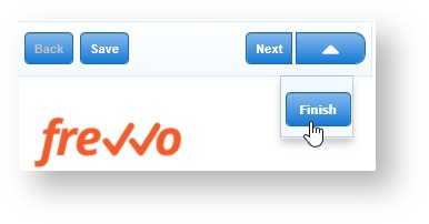
The Fast Finish feature provides a finish button, visible in use mode, in addition to the Submit and Save button (if 1063038362 is selected) for the forms in your workflow. The Finish button works the same way as the Continue button. The workflow will not advance to the next step or be submitted If any of the fields are invalid.
Selecting Finish automatically advances through the workflow steps until one of the terminating conditions listed below is true:
- A step is encountered that is not valid - this could be as simple as a required field that was not filled in.
- The next task is assigned to any email or a user/role that is different from the user that selected finish - an example would be the step in the workflow that gets routed to a manager for approval.
- The next task is an HTTP step type.
- The last step is valid and submitted.
You can select the Fast Finish property at the workflow level or for the individual steps in the workflow. Selecting Fast Finish at the workflow level enables it for all steps. Selecting it on the individual steps makes the Finish button available on the designated steps only.
If both the Fast Finish and Save/Load features are enabled for a workflow, the user can save a partially completed form to their task list. If the saved form still has required fields that have to be filled in, when the user retrieves the saved task from their task list to complete and submit it, clicking the Fast Finish button takes the user to the point in the screenflow where they left off.
Fast Finish on Mobile Devices
The Fast Finish button on an iPhone or iPad is accessed via a dynamic action menu that is activated by the right-most button in the top button bar. The action menu drops down below the button and floats above the form. If Fast Finish is not selected for the workflow or on the current step, then the action button and menu are not present at all.
Captcha
(Form Settings only)
This feature helps to protect your forms against spamming by automatic submitters. It is only supported for Forms. Check the Captcha checkbox to select it.
uses Google-provided Invisible reCAPTCHA. When using and submitting a form configured with Captcha, the reCAPTCHA logo is displayed in the lower right corner. In most cases, no further action is required by the user
Some less trusted users may see one or more challenge screens when attempting to submit a reCAPTCHA protected form. The challenge screens are grids of images and users are asked to choose the images matching a certain criteria. These are standard reCAPTCHA challenge screens and frevvo has no control over what is presented and when.
does not control the reCAPTCHA logo nor its placement.
- In some share link embedding scenarios, the logo may not show even though reCAPTCHA is active.
The frevvo Cloud uses a custom reCAPTCHA key that is configured for Domain Name Validation providing maximum security. To implement the maximum possible protection from form spamming in your in-house environment, follow the steps listed in Administration of reCAPTCHA Keys.
Allow Sign Pad
(Form Settings only - for workflows, configure on Workflow Step Properties)
Check this checkbox if the form will be using an external signature pad, and leave it unchecked (default) if the form will not be using a signature pad. See Topaz Electronic Signature Pads topic for the models supported and configuration information.
Decorated
Decorated is checked by default when you create a new form/workflow. If you uncheck Decorated at the form/workflow level, newly added controls will have their control level decorator property unset, meaning no decorator. It will not remove the decorator from controls already in the form.
Force Auth
If this is checked and the tenant supports SSO (single sign on) such as the LDAP Security Manager enabled tenants, then the
authentication mechanism will be in effect even when a user is already authenticated via SSO.
For example, if you leave force auth unchecked and your form is public in tenant, and you are already authenticated via SSO you will not have to login directly to to use the form. If instead you check force auth
will force you to login directly even though you are already authenticated via SSO.
See Working with LDAP and Single Sign On for more details.
This property is currently ineffective for tenants with the default delegating security manager. However the delegating security manager may support SSO in the future.
Show in History
If this checkbox is unchecked, tasks for the form will not appear in Tasks history searches. If you want them to appear, make sure this box is checked. Changing this property affects all tasks for this form, including ones that were created prior to the action.
Accessible
Live Forms can be used to build accessible forms/workflows that meet Section 508 and WCAG 2.0 accessibility standards. Check the Accessible property to turn on this feature. Refer to this documentation for the details.
Show Logo
This property is checked by default and causes the “Powered by frevvo” logo to appear on your form. Uncheck the checkbox to remove the logo from your form.
Access Control
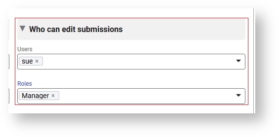
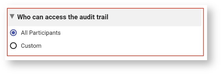
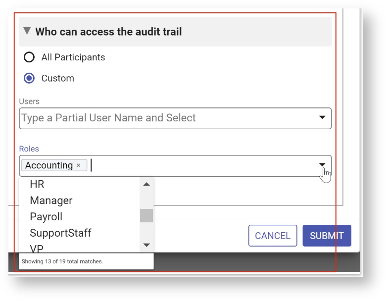
Use the Access Control tab to assign form permissions to users and roles in your tenant. The Access Control feature offers the designer increased flexibility when assigning access to forms/workflows and form/workflow submissions. Runtime access can be assigned to specific users and roles as long as they exist in your tenant. Also, the Access Control feature enables the designer to use templates to define user and role lists to dynamically control access.
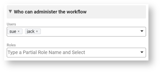
Designer users can give permission to edit forms/workflows and monitor submissions to other user(s) by adding them to the Who can edit the form/workflow dropdown. Users with this permission also have the ability to run the Refresh Searchable Fields process for the forms/workflows they are editing. This process updates existing submissions if changes are made to1063038196.
Tenant admins will continue to have full access to all capabilities and will not be subject to Access Control List (ACL) checks.
- Clicking on the down arrow(s) show a list of users, roles and templatized fields from your form. Select the users/roles from the dropdown.
- Type the opening curly brace - {- followed by the control name to enter a field from your form as a template. Selecting an option enters the control name into the field with the closing curly brace.
Messages
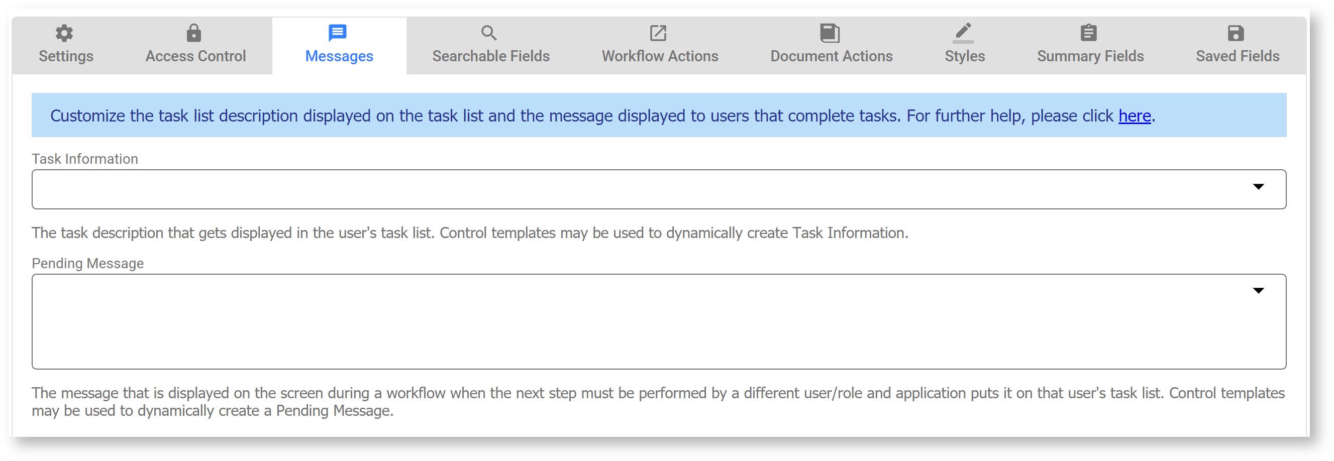
Message provide more information for users as they use a form or workflow. On forms, the single configurable message is Task Info, the description that gets displayed in the user's task list. Workflows also have a Pending Message field. Enter your customized text for each message in the appropriate field.
- Clicking on the down arrow shows a list of templatized fields from your form that you can use in the Task Information message.
- Type the opening curly brace - {- followed by the control name to enter a field from your workflow as a template. Selecting an option enters the control name into the field with the closing curly brace.
Form:
Workflow:
Task Information
When you save a partially filled form/workflow to continue it later, the saved form is accessed via your task list. This field controls the name that gets displayed in the task list. For more details, see the Tasks documentation. This field can use templatized strings for dynamic content, e.g. the Task Info can contain "Vacation Request for {FirstName} {LastName}" where FirstName and LastName are the names of fields in a form. Before putting the task on your task list, will resolve the Task Info string using the actual values of the FirstName and LastName fields e.g. "Vacation Request for Tom Smith".
will truncate the Task Info data to 250 characters.
You access your Task list from your projects home page. You use the Task list to perform tasks, complete a saved form or work workflow, to view a task's history, or search for tasks you've participated in — a tenant admin can also search for other users' tasks.
Set the Task Information on the workflow level if you want it to be the same for all the steps in your workflow. If you want different text, then customize the Task Information on the workflow step.
Pending Message
(Workflow Settings only)
This is the message that is displayed on the screen during a workflow when the next step must be performed by a different user/role and puts it on that user's task list. For example, in an Vacation Request workflow, the first step may be filled in by an Employee but the second step (approval) must be signed by a Manager. When the Employee clicks Continue,
will put the task on the Manager's task list and display this message on the Employee's screen. This message can use templatized strings for dynamic content, e.g. the message can be set to "Thank You {FirstName} {LastName}. Your request has been submitted to your manager for approval." where FirstName and LastName are the names of fields in a form from a prior step in the workflow. Before putting the task on a user's task list,
will resolve the pending message using the actual values of the FirstName and LastName fields e.g. "Thank You Tom Smith. Your request has been submitted to your manager for approval.".
This property can be set at the workflow or workflow step level. If you set up a message at the workflow level, it will display after the Continue button is clicked on each step of the workflow except for the last one. On the last step, you will see the default message, "Thank You! Your submission has been received" unless you customized the message using the Form Action wizard.
This property will display the same message for all of the steps of your workflow. Often designers want to display different customized messages after each step. Set the Pending Message at the workflow step level to override the workflow-level pending message for individual steps.
Searchable Fields
Use the Searchable Fields tab to set up fields from your form to use as task and submission search criteria. They also set which form data you will see in your submissions table, the order of the columns in the submissions table, and which data gets exported in the submissions CSV download. Follow the instructions below to setup the Searchable Fields for your form. Click the Submit button to save the changes.
Form/Workflow Actions
The Form/Workflow Action wizards help set up what the user sees when the form is submitted. Please refer to the Form Action documentation for additional details.
Document Actions
The Document Action wizards help set up what happens to the data when the form/workflow is submitted. Please refer to the Document Action documentation for additional details.
Styles
Set up style settings for your form on the Styles tab.
Summary Fields
(Workflow Settings only)
Check the individual fields to select the fields you want to appear in the Summary view if you have a Summary step in your workflow. Only checked fields will appear in the Summary. There are also two buttons labeled "Select All" and "Select None" which will check all the fields or none of the fields, respectively.
These controls are excluded from the Summary Fields list:
- Form Viewer
- Image
- Link
- Message
- PageBreak
- Panel
- Repeat
- Section
- Signature
- Tab
- Trigger
Saved Fields
Set up Saved Fields for your form on the Saved Fields tab. Saved Fields tab
This Saved Fields tab displays only when the Legacy Submissions view is configured as it is in the cloud. The only reason to configure Saved Fields for a form/workflow is if you want to use the Export to Excel which is only available in the Legacy Submissions view. Remember, Saved Fields are stored in the database when the form/workflow is completed. This can significantly reduce performance, especially for large forms and require additional storage in the repository.
In-house customers can choose to hide the Legacy Submissions view with a configuration parameter. If the Legacy submission view is not visible, the Saved Fields tab is not displayed in the Form/Workflow Designers and the Export to Excel feature is not available.
Select the Available Fields and use the arrow buttons to move them to the Saved Fields list. Drag and drop is available for some browsers.Geo Location
(Form Settings only- for workflows, configure on Workflow Step Properties)
Use the Geo Location tab to set up your form to pull in a Google map and/or collect location information.
New in-house installations must obtain an API key in order to use this feature. Follow the steps listed here to obtain the key.
You can capture the location where your form was filled in by turning on ' Geo location feature. A forms knows it's current location and will submit that information when the form is completed.
uses the HTML5 GeoLocation api. The geo api is well supported on tablet, phone and recent laptop/desktop browser versions. This feature works on a desktop or any GPS capable mobile device.
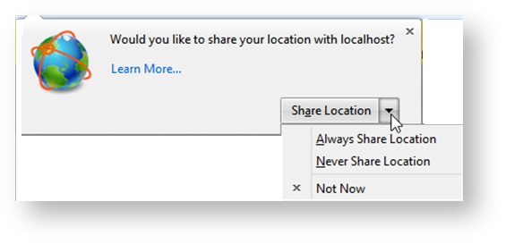
When the form loads in the browser, it will ask for the location. All browsers will show a pop up asking the user's permission to use their location, unless permission was Always granted or refused in a previous session. The user must give permission for Geo location to proceed. Here is an example of the request in the Firefox browser:
The Geo Location feature works in conjunction with rules that use the form.positionUpdated identifier. You can set up the rule to execute every time the position is updated. See Business Rules for examples of rules that will do this. Also see Rules Position Data for the complete list of available build-in data.
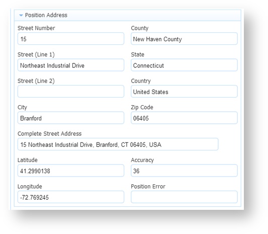
You can also collect additional information associated with your location. For example, a section of a Police Incident Report, shown in the image, captures the location where the form was filled in plus the address information associated with it. The last position update will be in the submission metadata of your form or workflow but it is NOT automatically added to the XML document . You must create controls (perhaps hidden) and rules to add the location information to the form XML document. The Position Address section of the Police Incident Report has controls and rules to show longitude, latitude, accuracy and/or errors plus the address information.
Latitude and Longitude display the coordinates of the user location. The accuracy of the location in meters is represented by the value in the Accuracy field - a low Accuracy value means the position is more precise. You can display a position error code and the text description of error message in your form if desired. Error message codes can be 1, 2 or 3:
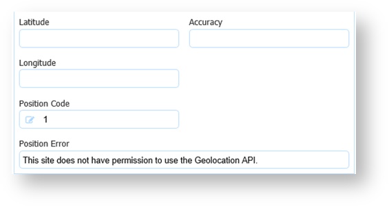
1 - Permission Denied - You will get this error code if the user says no to the access question.
2 - Position Unavailable - This error code means the device running the browser cannot get the GPS satellite signal (tunnel, underground).
3 - Timeout - The device running the browser times out trying to get the location information.
You will never see coordinates and error codes in the same form. You get one or the other.
The options for the Geo Location field are:
- None - (no location) - this is the default
- On Load - at start time
- Custom - allows the designer to specify a periodic refresh. The default value is 30 seconds. Choosing this method will fire a rule in the specified time. For example, if the field to the right of the Geo Location Dropdown was set to 10, the rule would fire every 10 seconds.
The Loc Timeout is the amount of time in seconds the location finder in the browser will search to find the location before it times out. The default value is 5 seconds. To capture additional information based on the location via a Business Rule or to embed a Google map in your form. you need a connection to google.com and you must check the Detailed Loc checkbox on the Properties panel. You will need to put a message control in your form where you want the map to display. Type f-map-div in the css class field on the message control Properties panel. This is a built in java script to display the map that cannot be edited.
The map will only display in use mode.
