frevvo v10.2 is no longer supported. Please visit frevvoLatest for our current Cloud Release. Earlier documentation is available too.
Working with Rules
- Former user (Deleted)
- Megan Ellis
Business rules are added by editing your form or workflow. Click the Rules editing mode in the Form/Workflow Designer header to add new business rules or edit existing ones.


provides two ways to create business rules:
- Visual Rule Builder - visual wizards to help create your rule. The Visual Rule Builder provides access to the generated JavaScript in the Rule Validator for editing.
- Rule Validator - canvas to type in JavaScript with tools to help form/workflow designers write and debug rules.
Create a new rule by clicking on the  icon.
icon.
- Your new rule is given a randomly generated name. Change the name and description to describe the rule function.
- Click the Run Builder button to open the Visual Rule Builder (Click the link to find out more information about the wizard) or the 10634054791063405479 button (Click the Rule Code link for details about the Rule Validator) to enter the JavaScript directly.
- Click any
 icon to edit an existing rule in the Visual Rule Builder.
 - Use the
 Action Menu to
- Collapse or expand the rule (you can also collapse/expand by clicking on the rule name or the carrot.)
- Delete
 a rule. Confirm your choice in the dialog that pops up and the rule will be immediately removed. This is an irreversible process so make sure you do not need the rule before you delete it.
 - Enable
 /Disable
  the rule. Rules are enabled by default.
 - Move
 a rule to reorder the list. Depending on the rules current location your choices may be "Move up," "Move down," "Move top," and/or "Move bottom." You may also reorder rules by dragging and dropping them to another spot in the list.
- Click
 1063405479 to see a readonly view of the javascript for all the rules in your form/workflow.
 - Click Save and Test
 to test your rule without leaving the Rule Editor.

Refer to Rule Examples for many real world samples.
Writing Rules / Syntax
A business rule is created as JavaScript code. The Visual Rule Builder provides a wizard that generates the JavaScript for you or you can enter the code directly into the Rules Validator canvas. Either way, rules are saved and will run after you save your form using Save  or Save/Test
  .
.
A rule is of the form:
if (condition)
{
    true actions;
}
else
{
    false actions;
}
You can create more advanced rules primarily for the purpose of looping over repeating items. We will describe these later in the many rules examples below and here.
Some basic concepts of JavaScript:
- Everything is case-sensitive. Ex: var color1 and var Color1 are two different variables.
- Variables are loosely typed. Ex: var color = 'red'; and var num = 33 case the variable color to be a string type and num to be a numeric type.
- End-of-line semicolons are optional. However we recommend you use semicolons to terminate lines as part of proper coding practice as this often prevents mistakes. The rules validator will flag missing semicolons as an issue, so you should use them to terminate lines in your rules.
- Comments. Code can be commented out using either // or /* */ syntax
Rules do not currently support the syntax:
- switch statement
Rules support the following syntax with some limitations:
- try-catch
Example: The value of the control named FN will get set to 'got exception' because the JavaScript variable named x is undefined in this rule.
if (form.load) {
    try {
        x.randomproperty = 'blah';
    } catch (e) {
        FN.value = 'got exception';
    }
}
However, catching an exception when a control does not exist (is undefined), will not work as you might expect. This is because
catches the problem while parsing the rule before the JavaScript interpreter catches the error. In the example below the control named Color does NOT exist in the form.
if (form.load) {
    try {
        Color.value = "red";
    }   catch(e) {
        msg1.value = "error caught: " + e;
    }
}
Max Size for Rule Code
Write concise JavaScript rules for readability and improved performance. The Visual Rule Builder naturally enforces this by limiting your options. While frevvo allows up to 64Kb of code per rule, this is more than what you should use in practice. Significantly large rules may impact performance.
Strings vs Numbers
Because JavaScript is a loosely typed language you may run into occasions where you are trying to add field values and the rule performs string concatenation instead. There are several ways to designate math vs string. One simple way is by adding a *1 to the variable. id = id*1 + 1; will ensure that id equals the current value plus one rather than the current value with a 1 appended. Ex: If the current value was 4 and you didn't write id*1 the result may be "41" rather than 5. In the Visual Rule Builder, "+" is used for addition and the concat() function is used for concatenation. The Visual Rule Builder supports text to number conversion with the function number(). For example, you may want to calculate a total from two Text controls that contains numbers. Set Total to number(Text1) + number(Text2) to convert the Text control strings to numbers.
You may also encounter a situation in a rule in which money controls perform a string concatenation rather than addition. To correct this:
- Open the form with the rule in the Designer, change the money controls to text controls, and then save the form.
- Open the form, change the text controls back to a money controls, and then save the form again.
See this topic about string and numeric conversion.
Writing Conditions
One of the most common conditions is a rule that executes as soon as the user enters a value in control. The test for this condition depends on if the field is a string type or a numeric type.
String Types: text, textarea, date, phone
if (name.value.length > 0)
Numeric Types: money, quantity, number
if (name.value != null) or if (name.value > 0)
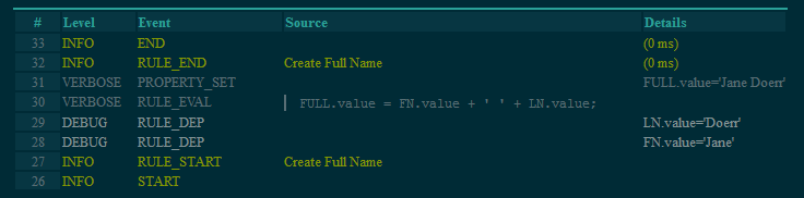
Many times the condition name.value.length > 0 can be dropped altogether and the rule can be simplified. This rule executes whenever a user enters a value into either the control named firstname or lastname because the firstname and lastname controls are on the right side of the assignment operator.
fullname.value = firstname.value + ' ' + lastname.value;
Conditions testing for equality should use the === operator and not the ==. The latter will not pass the validator's strict syntax verification even though it may perform correctly at runtime.
if (Age.value === 13)
Use caution when switching == to === as the latter removes the type coercion. For example, dropdown, radio and checkbox control values are text types. So you must quote values when performing comparison operations:
Ex: if (Building.value === 1) will evaluate to true. You must quote the 1 as in if (Building.value === '1') to make the one a text type.
Control Name
Rules usually need to reference form controls. You assign a control a name using the control's name property.
Names are case sensitive. If your control is named FirstName then you must write the rule as FirstName.value. firstname.value will not work.
Use English alphabet characters only when naming controls. For example, controls named with ó as in Póliza may cause issues when the control is used in a business rule and with submission data.
It is highly recommended that you avoid using JavaScript Reserved Keywords as control names. For Example, a section named New in your form will cause rule validation errors if explicitly referenced in a rule. Your rule may still work but the only way to fix the error in the rule validator is to change the name of the control. Click here for a list of the JavaScript Reserved Keywords to avoid.
Duplicate Control Names
It is very important when using a control in a rule that the control has a unique name. If multiple controls have the same name can not determine which control the rule refers to. Controls added to your form from palette are for the most part forced to have a unique name. If you try to change it to a name of a control that already exists in your form
will not allow it. However there are several ways you can have multiple controls with the same name:
- Controls added from XSD data sources
- Controls added from the custom palette
- Controls nested in Sections
For example, when a control is dropped inside a section control, it is at a different nesting level then a control dropped outside a section. Also two controls, one inside a section called Car and another in a section called Boat are also at different nesting levels. The form designer will allow you to name the controls the same. For example both Car and Boat can contain a control named VIN.
You will have unexpected results if non-uniquely named controls are used in rules. Simply edit their names to make them unique. Note that editing the name of a from xsd schema control has no effect on the xml instance document created when the form is submitted nor on the xml validation.
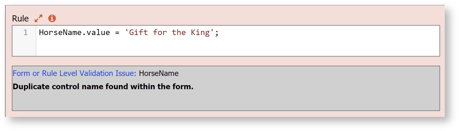
The rule validator described in detail below will help you detect this potential rule bug by displaying a validation error such as the one shown below. This form has two controls named HorseName.
Accessing Control Properties
Rules refer to form controls using the control's Name. Refer to properties of the control using the syntax <Control Name>.<Property>. supports the following properties:
- visible : Set to false to hide a control and true to make the control visible.
- value : Read or write the value of a control. This is not applicable to sections, tabs and other controls where it does not make sense to set a value.
- enabled : Set to false to disable (grey out) a control so that a user can not change its value and true to enable it. This is not applicable to sections, tabs and other controls that do not make sense to disable/enable.
- expanded : Set to false to collapse a group control (sections controls only) and true to expand a group control.
- selected : Set to true to make a tab the selected tab (tab controls only).
- valid : The value of this property is true if the control contains a valid value otherwise false. Validity is based on the control’s type. For instance a numeric control will be invalid if the user enters a string value that cannot be converted to a number. This property can be read as well as written.
- required : Set to true to make a control required and display a yellow background color. Available for palette and schema controls (controls generated from XSD schema data source). This is also a property of section controls. Setting a section required to false automatically sets all inner controls to not required. Click here for an example.
- options : This property enables dynamic setting select control options (radio, dropdown & checkbox controls only).
- label : This property sets the label seen on any control including sections.
- help : This property sets the help text.
- hint : This property sets the hint seen on hover.
- status : This property sets the error message display whenever the control's value is invalid. The one exception is the Required Property for Controls in an Accessible form/workflow.
- clicked : This property works with trigger controls. Its initial state is false. When a user clicks a trigger its state turns true.
- printable: Set to false to remove the control from both the printable view and PDF submission document.
- itemAdded : This property works with repeat controls. Its initial state is false. When a user clicks "+" to add a repeat item AND when a repeat item is added via a Document URI as the form loads its state turns true.
- itemRemoved : This property works with repeat controls. Its initial state is false. When a user clicks "-" to delete a repeat item its state turns true.
- itemIndex : This property works with repeat controls. When an itemAdded or itemRemoved event fires the value of itemIndex is set. For itemRemoved events itemIndex will return -1. For itemAdded events itemIndex will give you the index of the added item
- minFiles - This property only applies to an Upload control. Use this property to dynamically change the minimum number of attachments that can be uploaded by the user.
- maxFiles - This property only applies to an Upload control. Use this property to dynamically change the maximum number of attachments that can be uploaded by the user.
- comment.value - This property only applies to dropdowns, checkboxes and radio controls. Use this property in a rule to retrieve or set the value of the comment field that displays when users select the last option. The comment value can also be accessed for dropdowns, check boxes and radios directly in templates using special syntax.
Examples of identifiers used in rules are:
- FirstName.value
- BillingAddress.visible
- Email[1].value
- Email[i].visible
The latter two are examples of repeating controls. We discuss repeating controls in more detail below. Note that the case of the properties is important. FirstName.value is a valid rule identifier but FirstName.Value and FirstName.vAlUe are not.
Events
There are three special events that do not reference a specific control name. They use the static name "form." Rules can be written based on when these events occur. See Rule Examples for many use cases referencing these events.
- form.load : This event is occurs when a form or workflow step loads for the first time. It is useful for setting default values via rules that you need to be set before the user starts interacting with the form.
- form.unload : This event is true when users click the form's Submit or a workflow's Continue button. It is useful for setting control values just prior to the execution of the form's Doc Actions and Form Actions. If you have a rule in your form that changes any control(s) after clicking Submit, thereby making the form invalid, the form will no longer be submitted and the invalid form will redisplay. Form and Document actions will not execute, PDFs are not generated, invalid controls become highlighted as expected and form.unload output displays in the 1063405479.
- form.positionUpdated : This event is used for the Geo location feature. You can fire a rule using this special identifier every time the position is updated.
- form.activate: This event indicates that a workflow has navigated to a step. If form.activate is true, the workflow just moved to a step. Use the 1063405479 to determine what step that is.
- form.deactivate: This event indicates that a workflow has left a step. If form.deactivate is true, the workflow just left a step. Use the 1063405479 to determine what step that is.
form.load vs form.activate
The form.activate and form.deactivate events can be used in rules in forms and multiuser workflows but they are most useful for screenflows with regards to forward/backward navigation. Workflow designers often need to orient rules around workflow navigation. For example, you want to do something when your workflow moves from step 2 to step 3 or you want to do something when you are leaving a step.
A form.load event fires only when the form initially loads and cannot be used reliably for setting the form state to ensure proper workflow navigation when a user navigates back and forth via the Navigation toolbar. Designers must take care to avoid a situation where a step in a workflow becomes invalid thereby prohibiting forward navigation.
For example, imagine a two step screenflow created using linked steps:
Step 1 has 2 text controls, both are not required and text 2 is hidden. The workflow has a rule that makes text 2 required and visible when the workflow navigates to step 2.
- The user accesses the workflow, the form.load rule runs, text 2 is not visible and not required. The user completes step 1 and clicks continue. The workflow advances to step 2.
- On step 2, text 2 becomes required and visible.
- Without filling in text 2, the user navigates back to step1.
- On step 1, text 2 is not visible but the control is required and the workflow will not advance when the continue button is clicked.
form.activate and form.deactivate give designers a more reliable way to set properties appropriately for each step in a single user screen workflow. This is helpful when considering back and forth workflow navigation in order to prevent invalid workflow states as described above. Writing the rule with the form.activate identifier instead of the form.load resolves the issue.
Users must be aware that in general, form.load is a one-time event that fires only when the form is loaded the first time while form.activate fires every time a Read/Write form is shown.
The difference between form.load and form.activate is:
· For READ/WRITE FORMS IN WORKFLOW (the steps in a single user screenflow):
- form.load fires once when the form is instantiated.
- form.activate fires every time a R/W form is displayed (including the first time when it is also instantiated).
· For READ_ONLY FORMS IN WORKFLOW (the steps in a multi-user workflow):
- form.load fires once when the form is instantiated.
- form.activate does not fire at all when moving backwards to a step performed originally by another user.
- The step assigned to the current user will load only once but will activate every time they are loaded in a particular session.
It is important for the designer to understand when these events fire in order to make an informed decision about when to use form.load vs form.activate. Certainly, there are situations when you might want to run a rule when the form loads. For example, you may want to prefill fields with user details or populate the options of a dropdown from your database or Google sheet.
form.load is triggered in the following situations:
- When the first step in a workflow is displayed.
- Navigate to the next step in a screenflow for the first time
- Perform the next workflow step from the task list
- Save a form/workflow and perform from the task list
- Edit submission
- Navigate back to prior workflow steps while editing a submission for the first time
form.activate is triggered when you
- Navigate forward/backwards whether it’s the first or nth time in a screenflow
- Will not trigger when navigating back to a read only step.
When you edit a submission:
- The last activity loads and activates when initialized
- Navigating each activity would both load and activate it.
When a form is saved and then loaded from the task list both load and activate are triggered.
Here is an example of a single user screenflow where a rule was written based on a form.load event when the form.activate event was a better choice.
form.unload and form.deactivate
- These two identifiers are identical - whenever a step gets deactivated, it is unloaded as well. form.deactivate was added for completeness.
Using the Form Outline
When writing rules, it is critical that you refer to your form's controls using correctly spelled control names and correct case, and that you refer to the control properties applicable to the control's type. For example only section controls support the expanded property and only radios, checkboxes and dropdowns support the options property. The Form Outline assists form designers by making all the form's control names visible where you can copy/paste them into your rules. Also the Form Outline displays a properties list so you do not have to memorize the documentation above describing which properties are applicable to which control types.
The Form Outline is only visible when you toggle to the business rules designer view. When you toggle back to the form designer canvas view the Form Outline is hidden.

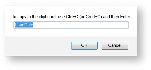
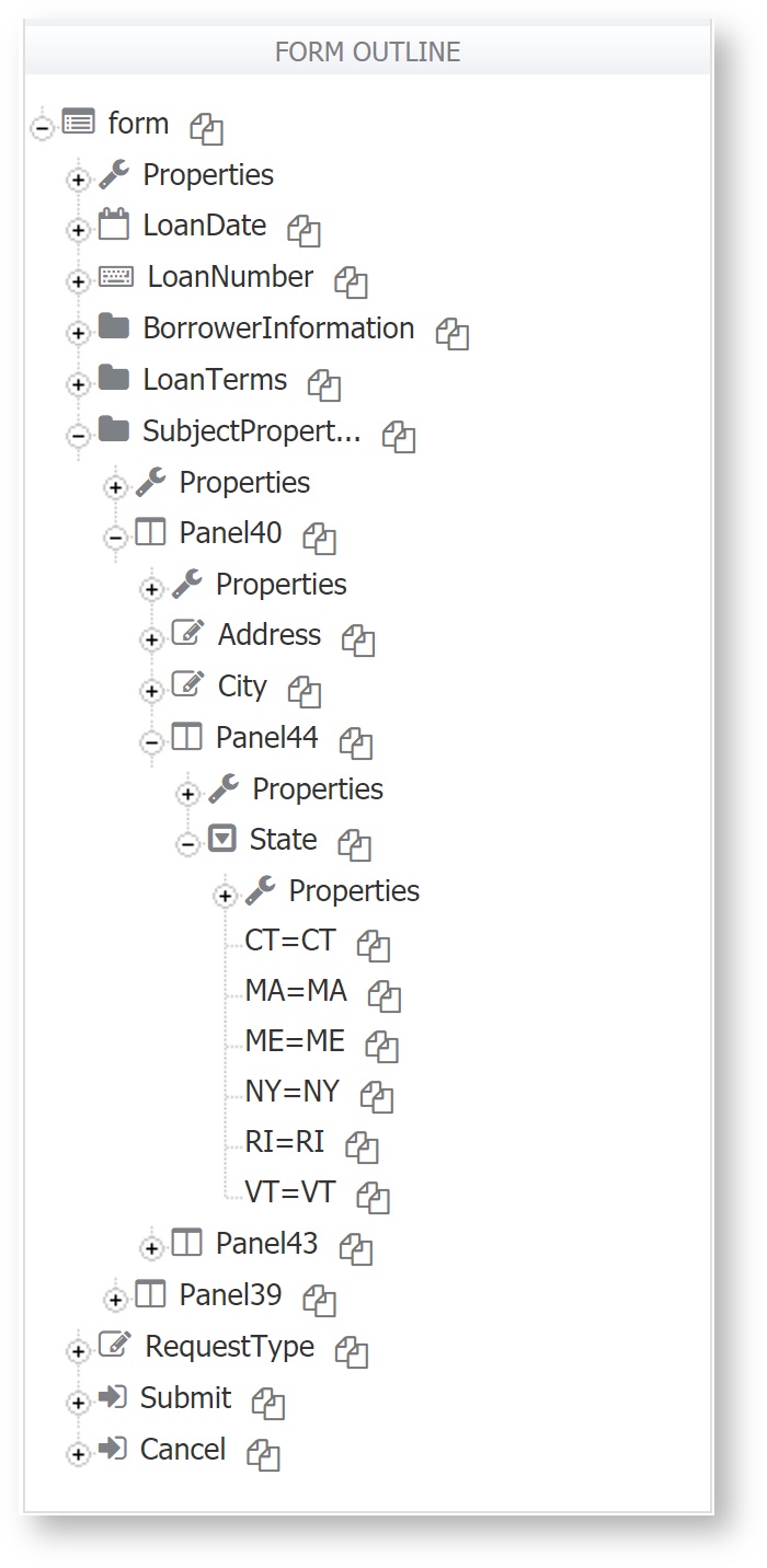
At first the form outline will be collapsed. Click the "+" on the top level form icon to begin expanding the outline. The icons are indicative of the control's type. See the LoanDate control displays a calendar icon and the LoanNumber is a quantity control. The BorrowerInformation, LoanTerms and SubjectPropertyInformation controls are section types. You can click the  icon to copy a control name from the outline. The image below shows the light box that displays and prompts you to copy the control name to the clipboard via Ctrl C or Command C. From the clipboard, you can paste it into your rule. This is a great way to avoid typo mistakes.
Continue expanding the outline by clicking deeper "+" icons to reveal controls nested inside of panels and sections. In this example the Subject Property Information section contains a Panel40 and an inner Panel44 with a dropdown control named State. Notice that the outline shows all the dropdown control's options in value=label syntax. This is very useful when you need to perform a comparison to determine which option a user selected. You can copy/paste the option values into your rules to avoid typo mistakes by clicking on the icon to the right of the options.
When a control has focus (is selected) in the Form and you move to the Rules page, that control will be expanded in the Form Outline. This give you access to view the control's properties that are available to you in the Rule Builder/Editor.

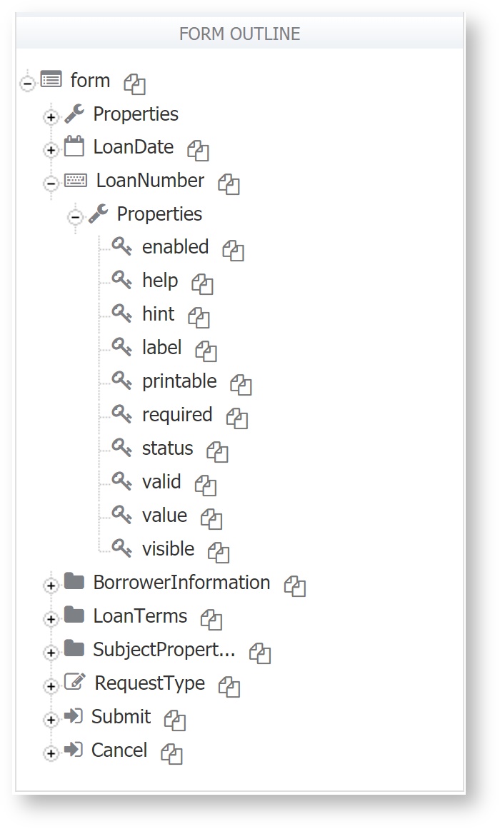
Every control has a Properties icon. Click the "+" to expand the Properties. You will see a list of all the properties that are applicable to this control. Note that even the "form" itself has a Properties icon which show that the form has form.load and form.unload properties. LoanNumber is a quantity control and thus has all the properties you expect for this control type such as LoanNumber.required, value, visible, etc.
Refer to 1063405479 for an alternative method of composing rules within the rules editor.
When are Rules Executed ?
When you create or edit a rule, figures out the list of controls and properties of those controls that the rule depends upon. The rule will be automatically executed whenever there is a state change that is relevant to the rule. This is called a dependency. If there are multiple rules triggered by the same dependency, the rules are executed sequentially in a top to bottom order as they are seen in the form designer's rules panel.
Rules can trigger the execution of other rules. So, if a rule, R1, sets the value of a control with Name A, and there is a rule R2, that depends on A.value, then rule R2 will be triggered and executed.
A rule will typically refer to one or more form controls and their properties and it will be executed if any of those properties change value. Note that Rules are not fired when the page is loaded. See form.load for more details. For example, the rule below will only be executed when N1.value changes its value.
if (N1.value > 0 || N2.value > 0) {
    T.value = N1.value + N2.value;
}
Now let's assume a use case where you want to show a message if a user enters an invalid email. The form has a required email input control (Name=E) and an action should be executed if the email control 'valid' property is 'false'. One could write the rule:
if (!E.valid) {
// code to show message here.
}
The code above would not work as expected. E is a required field and therefore E.valid initial value is 'false' since the field is in initially empty. When the user enters an invalid email address, E.valid would still have the value 'false' and the rule would not execute since there is no state change. The code below would work properly.
if ((E.value.length > 0) && (!E.valid)) {
// code to show message here.
}
Now, the rule depends on both the value of E.valid and E.value.length and therefore, when a string longer than zero characters is entered the rule will be executed and the message will be shown.
There are certain rules that are dependent on other rules and should be executed in order. "Valid" and "Status" are one example. A rules valid property must be set to false prior to the status (error message) property being set.
//Incorrect Rule Order. Status will not set as expected.
MyText.status = 'abc';
MyText.valid = false;

//Correct Rule Order
MyText.valid = false;
MyText.status = 'abc';
Infinite Loops
It's easy to create rules that run forever. An example is a rule that updates A.value based on B.value and another rule that updates B.value based on A.value. They could continually trigger each other.
The server will prevent this from happening by setting an execution time limit for each rule. Any rule that takes longer than 5 seconds to execute will be forcibly stopped. Note that this is a very lengthy period of time for most computational tasks and the vast majority of rules will not be impacted by this constraint. However, since
is a hosted site that may be simultaneously used by numerous users, there is a time limit imposed on these computations.
Circular Dependencies
The restriction to disable rules with circular dependencies has been lifted. For example, the rule below tries to set the value of the same control used to trigger the rules execution.
if (Users.value < 2) {
  Users.value = 2;
}
Where are Rules Executed?
Business rules are executed on the server-side and not as client-side javascript. There are several reasons why rules execute server-side:
- Browser independence. We found it impossible to get these to run reliably in so many versions of so many browsers, especially IE. A bug in your rule (e.g. an infinite loop) will crash the browser and in some cases will require a Windows reboot. On the server, these run in separate threads with lower priority and timeouts so it will not impact the form server.
- The ability for the rule to do server-side things like http.get() to a database connector, invoke a REST service etc. These often reside behind the firewall and are not accessible to the browser.
- The rules are not exposed to the browser at all so any sensitive information in the rule (e.g. a password) won’t leave the server. However, we do not recommend putting any sensitive information in a rule.
- Rules can use information like the currently authenticated subject user id, name, email etc. though technically it would be possible to make this available on the browser if required. However, providing this information in the browser is a potential security hole.
- Rules can also modify a control – in theory, this can cause large-scale changes to the form’s valid state. Think of an optional XML complex type that has a deeply nested data structure inside it with some required and some optional elements. If any element has a value, all the other required elements become required. It’s much easier and efficient to analyze the form on the server although, technically, this is also possible in the browser. It can be extremely slow for large forms, especially in IE or if someone is running on a slower machine.
There is a potential for performance bottlenecks. However, this is rare since rules are not compute intensive typically. We think the benefits outweigh the drawbacks here.
Rule Debugging
There are several tools to help form designers write and debug rules. Each is described in detail below.
- Save and Test
- Rule Validator
- Form Outline
- Debug Console
See the FAQ - Business Rules topic for additional important information and known limitations with rules in the current release.
Save and Test
When you are designing a form/workflow with many objects and a lot of business rules, reduce the number of page reloads when switching between the designer view, rules view, and the test view by clicking the save and test icon. Save and Test checks for Rule errors before the test popup displays. If rule validation errors are detected, the designer is notified and given the option to correct before the Test popup is displayed.
If you clicked the save and test icon from the Rules page, clicking Cancel on a Rule Validation Failure message returns to the Rules page where you can make changes. Clicking Ok proceeds to the Test popup. Refer to Test Forms and Workflows for more information.
Rule Validator
The first step in debugging your rule is to correct all errors caught by the rule validator. The validator executes automatically as soon as you tab or click outside of the rule editor. All rules with errors are highlighted in red. If you click finish to save your changes while there are invalid rules, you will be prompted to save with errors.
Not all errors can be detected by the rule validator. It is still very important to test your use mode forms. Use the debug console described in the next topic to test for and solve runtime errors.
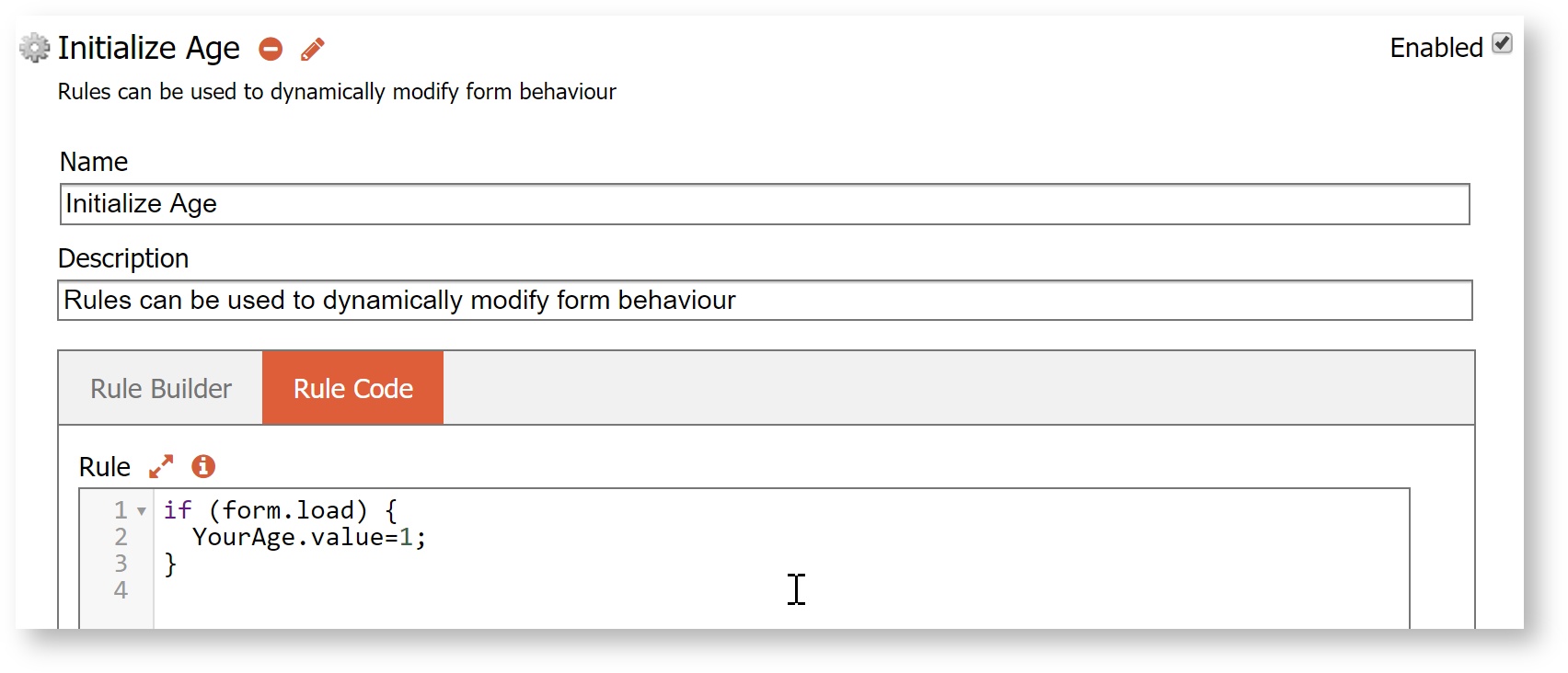
Here is an example of a validation error. Note the red background and the validator information displayed below the rule. In this case the control name was mis-typed as Yourage when the name is actually YourAge. Remember that control names are case sensitive. So Yourage is not the same as YourAge with a capital A.

Once you correct the control name in this rule and click anywhere out of the rule code input area, the validator automatically runs again and removes the red background warning and also the validation output area disappears as there are no errors to display.
The validator enforces high code standards. Some may find this onerous at first but this is a win in the long run as your rules will have far fewer issues found at runtime.
Disabled rules will not be validated. This can be useful if you are in the middle of writing a rule and want to save the form without validation errors. Disable the rule temporarily. Disabled rules do not execute at runtime either.
If you click finish to save the form and one or more rules have validation errors, you will be prompted: "One or more of the rules on this form validated with error(s). It is recommended that you correct these issues before saving. Do you wish to save now?" If you choose not to save, then the editor remains open.
Both dot and square bracket notation are allowed when getting/setting object properties in rules.
Validation Directives
Directives are available to control how the JavaScript is validated. Directives are placed at the top of the rule code. The directives do NOT effect runtime rule execution. They are solely for communicating object information to the validator so that your rules pass validation.
This common rule paradigm shown in the example below is used to retrieve data from another system such as a database. This rule will cause validation errors since the validator does not have any information about the variable 'x'. The validator therefore cannot say whether or not the members 'resultSet', 'productId' and 'description' are valid.
if (form.load) {
  var x;
  eval('x=' + http.get('http://localhost:8082/database/products'));
  var opts = [];
  for (var i=0; i < x.resultSet.length; i++) {
    if (x.resultSet[i]) {
      opts[i] = x.resultSet[i].productId + '=' + x.resultSet[i].description;
    }
  }

  Products.options = opts;

}
The validator will display the following errors and a suggestion that you can solve this error by confirming that resultSet, productId and description are in fact valid members of object x. To confirm the suggestion copy the suggested member directive into the first line of your rule. Of course if the validation errors are truly errors, then fix them.
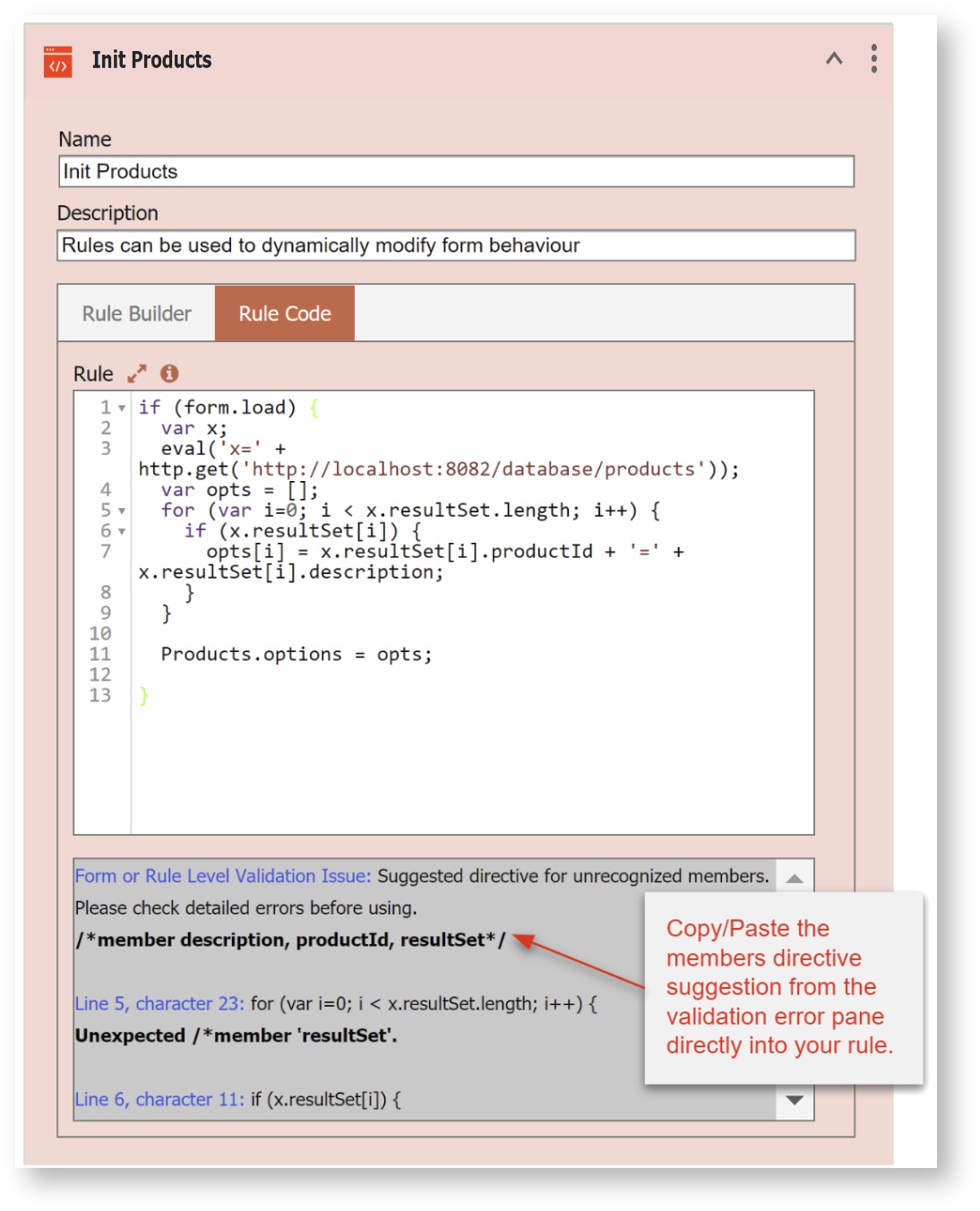
You can copy/paste the members directive suggestion from the validation error pane directly into your rule. This corrected rule will pass validation: Note the use of commas to separate the items in the list (description, options, productId). Both global and member directives require comma separators to pass validation.
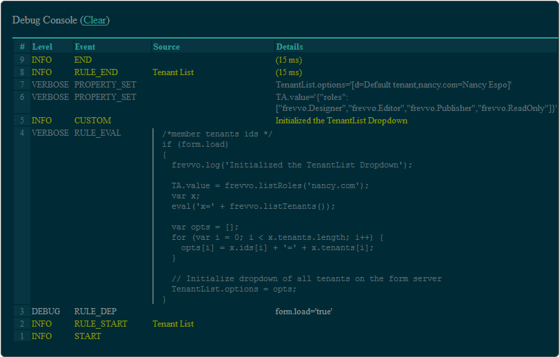
/*member description, options, productId, resultSet*/

if (form.load) {
  var x;
  eval('x=' + http.get('http://localhost:8082/database/products'));
  var opts = [];
  for (var i=0; i < x.resultSet.length; i++) {
    if (x.resultSet[i]) {
      opts[i] = x.resultSet[i].productId + '=' + x.resultSet[i].description;
    }
  }
  Products.options = opts;
}
The validator also supports global directives. Use the global directive to identify additional global objects and functions defined in the execution environment and made available to the rule for which it is not appropriate to include a var statement in the rule code itself. One directive can be used to list all additional globals on a single line. Currently there are no known cases requiring the use of the global directive.
Rule Editor Functions
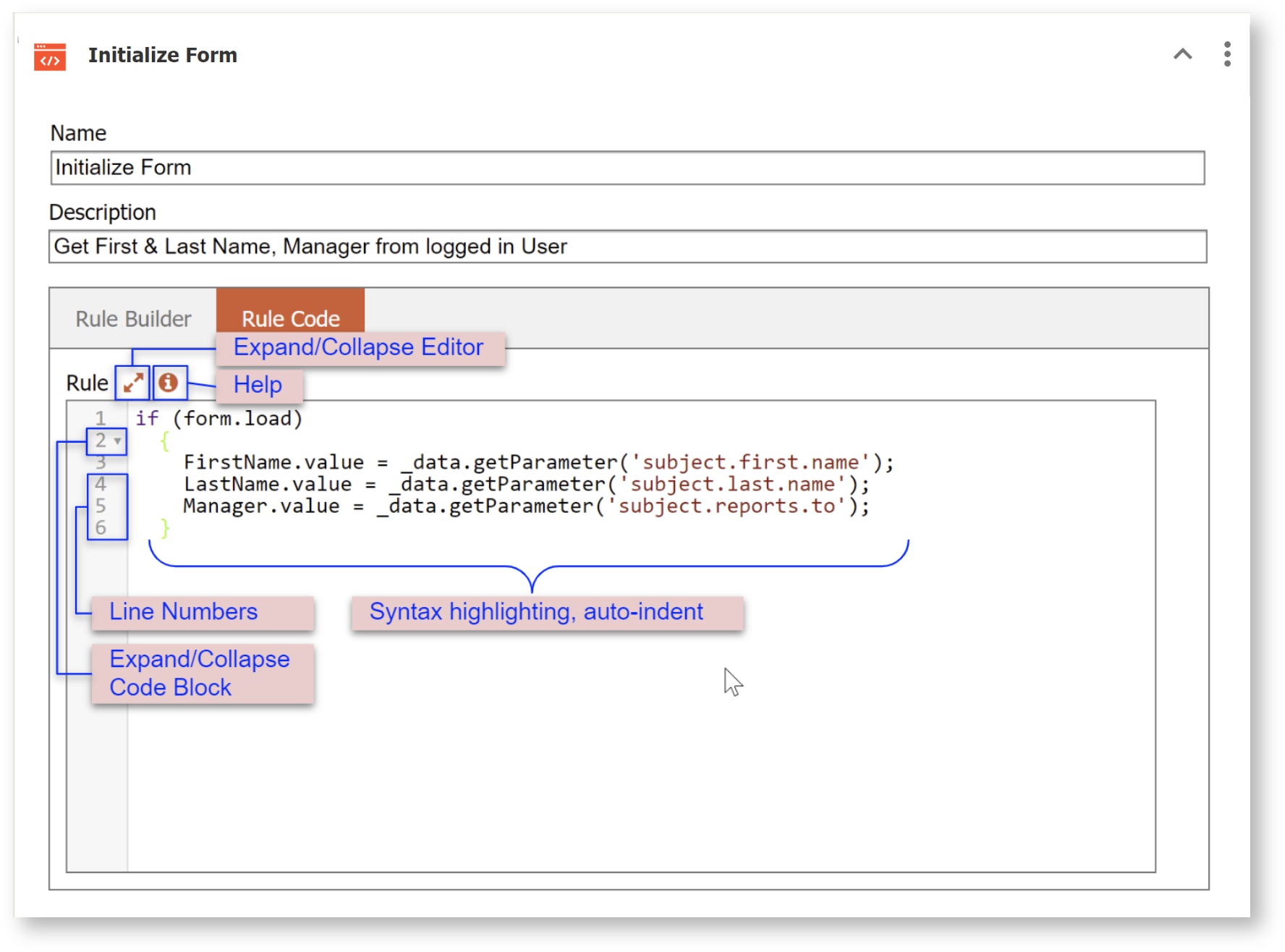
The Rule Validator includes an enhanced editor designed to provide an easy experience when developing rules. The rule editor box includes the following features:
| Features | Description |
|---|---|
| Line Numbers | Line numbers in the rule code editor make it easier to correlate reported validation errors with the line of code. |
| Bracket auto close | Type a {, ( or [ and the closing bracket is automatically inserted. |
| Match Bracket | Place the cursor on a bracket and both it and the matching bracket are shown in a matching distinctive color (green). |
| Syntax Hi-lighting | JavaScript syntax hi-lighting with keywords, variables, comments, etc. shown in distinctive colors. |
| Auto Indent | New lines are auto-indented according to generally accepted code formatting rules. |
| Code Folding | Bracketed code blocks (functions, if-then-else blocks, etc.) are collapsible. Click the  arrow immediately to the right of the line numbers to collapse/expand code blocks. arrow immediately to the right of the line numbers to collapse/expand code blocks. |
| Full screen edit mode | Expand the editor to full screen mode if you need more space to work. Click the |
| Auto Complete/Hinting | When composing a rule, the designer can pick from a list of available |
| Help | The help icon displays a small help window listing the hot keys described above - (F2, ESC and Ctrl-Space) |

Auto Complete/Hinting Example
The easiest way to minimize mistakes in control names when writing rules is to use the Auto Complete/Hinting feature in the rule editor. Let's say you want to compose a rule that will populate the FirstName field in your form with the first name of the logged in user when the form loads. This rule using the 1063405479 in conjunction with the 1063405479 rule identifier will accomplish this.
if (form.load)
{
  FirstName.value = _data.getParameter("subject.first.name");
}
To begin, type "if (" on the first line of the rules editor. The closing parenthesis will be added automatically.
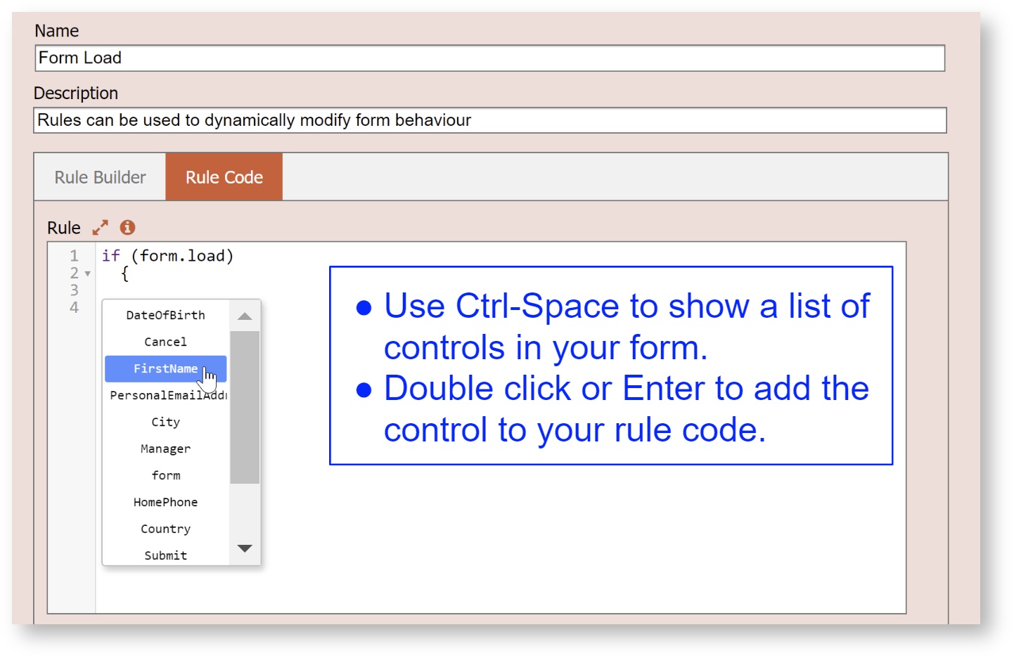
Type "form." - the word form followed by a dot - after the open parenthesis and a list of available identifiers displays. You can type the first letter of the item you are looking for and the property starting with that character will be highlighted in the list. Double click or use Enter key to select your choice. For this example, select load.
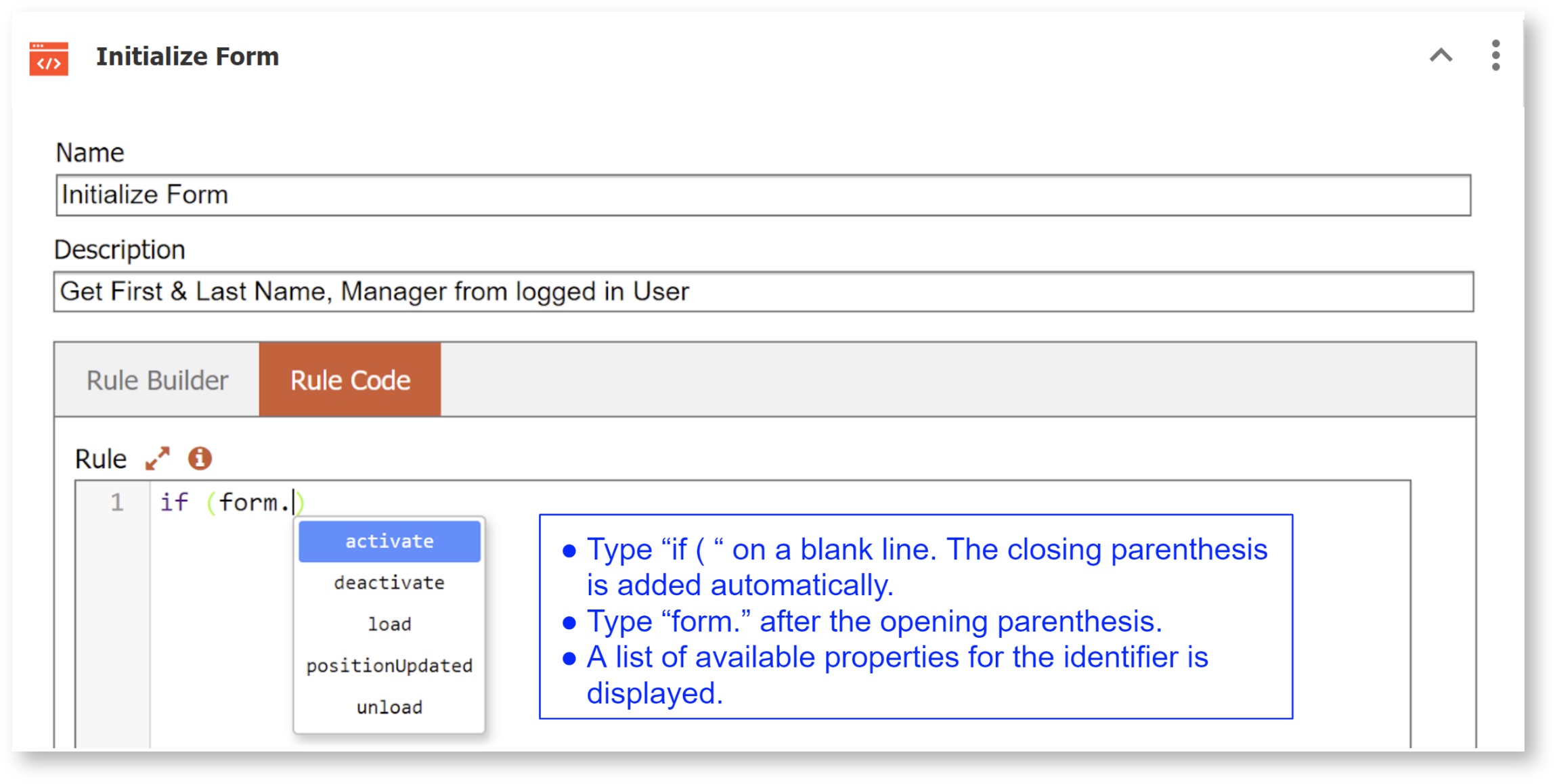
Press the Enter key to advance to line 2. Add the left curly bracket. Press the Enter key to advance to line 3. Press Control Space. A list of available controls from your form will display. You can type the first letter of the item you are looking for and the first field name starting with that character will be highlighted in the list. Be sure to use the correct case. Double click or use the the Enter key to select the FirstName control. The control named FirstName will be inserted in your rule.
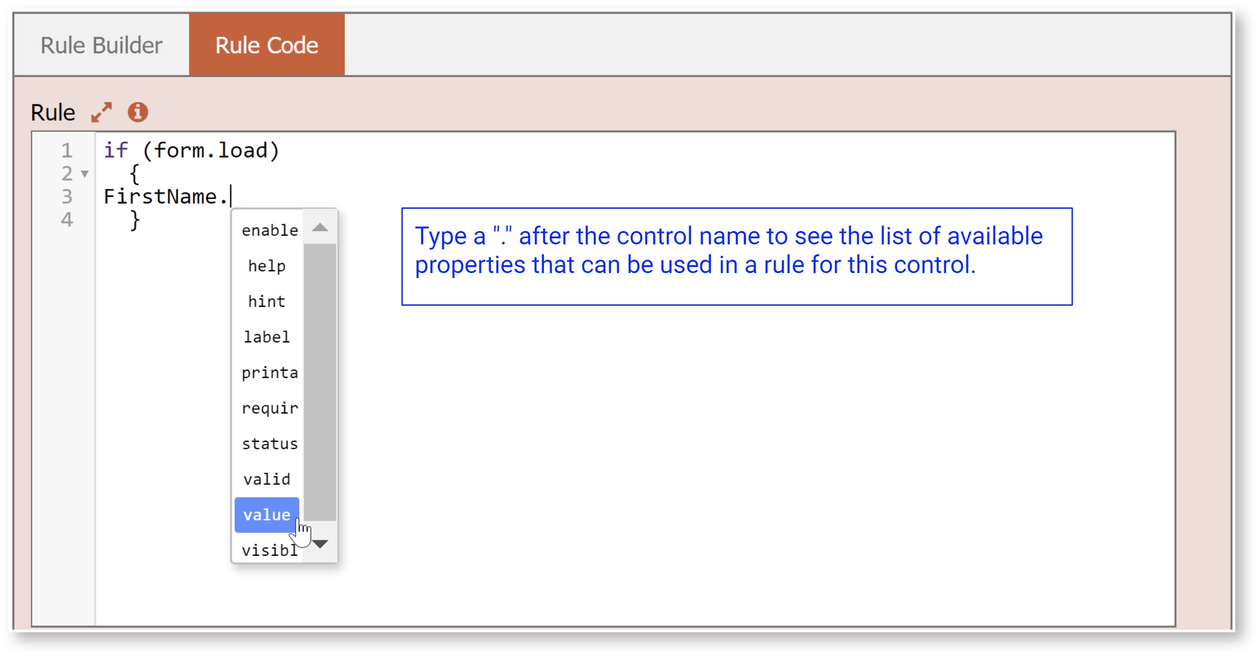
Type a "." after the control name to see the list of available properties that can be used in a rule for this control. You can type the first letter of the item you are looking for and the property starting with that character will be highlighted in the list. Be sure to use the correct case. Continue typing until the value property appears in the list. Double click or press the Enter key to add it to the rule.
Add the remainder of the rule. The closing bracket will already be there. Of course, you can still use the 1063405479 to help you when composing rules.
Correct any other errors reported by the validator. Click anywhere outside the editor to verify there are no further errors.
Click the save and exit icon to save your rule.
JavaScript manually entered into the Rules Editor is not autoformatted. JavaScript "beatification" is only applied to rules created with the Visual Rule Builder.
Debug Console
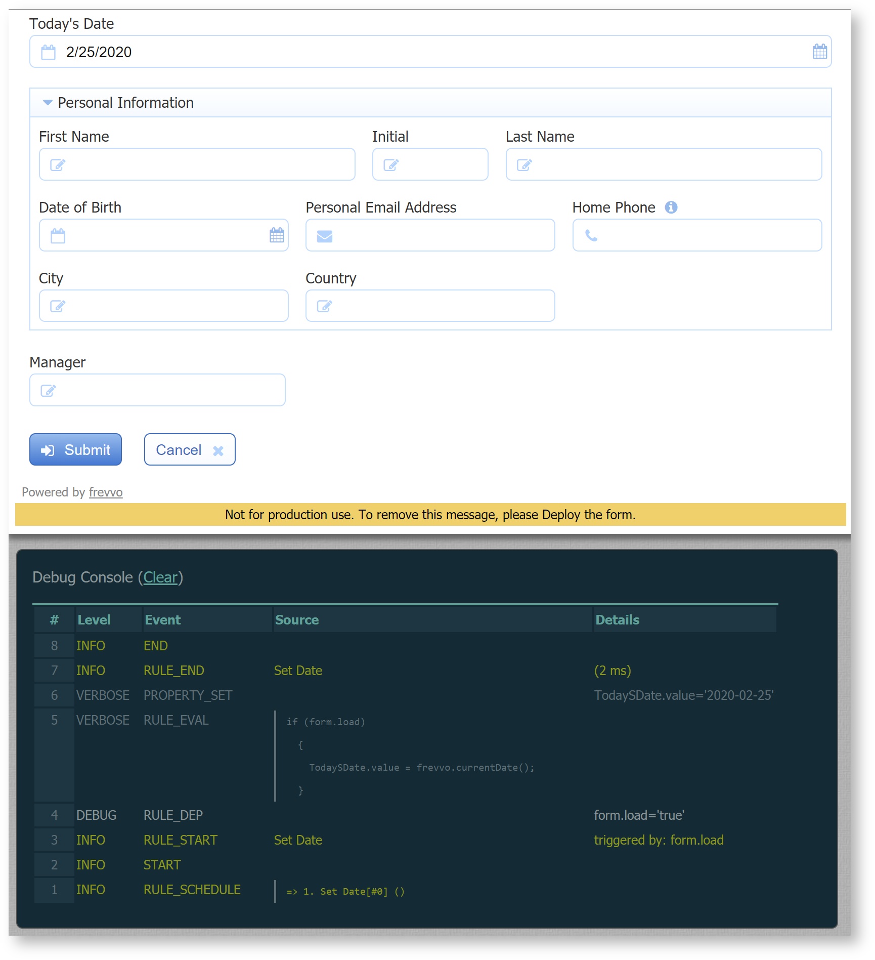
The debug console can help you quickly solve runtime problems in your business rules. The debug console is enabled by appending the URL parameters _test=true and embed=true to a form's share URL. A form's or workflow's test button automatically adds the &_test=true parameter so you do not have to append the parameter manually. The debug console appears below the form. If your form is long, scroll down to view the debug console.
Here is an example of the Share URL (Link/Email/Web) that will display the debug console for the form in the image when browsed. Note the _test=true is preceded by a '?' to separate the form/workflow URL from the parameters. Subsequent parameters, such as the embed=true parameter, are preceded by the '&' to separate the parameters from each other. Refer to Parameter Separators in URLS for more information about this syntax.
https://app.frevvo.com/frevvo/web/tn/mycompany/u/8aa27da6-4bef-427c-92e3-6ad8d58e506a/app/_QDidgGGwEeeZjNWktbplXA/formtype/_tZmTYFf-EeeDC8g6jZAQlw/popupform?_test=true&embed=true
The debug console will only appear for users that have the special frevvo.Designer role. If a user without frevvo.Designer role appends the &_test=true URL nothing will happen, no debug console will become visible. This protects the designer's rule code from accidentally becoming visible to normal form/workflow users.
The rule validator will catch many of the common errors you can make writing rules but it will not catch all errors. Some issues are only caught by testing your form at runtime. For example if a rule references a control that repeats but the rule does not use the necessary repeating array syntax, this will pass validation but can be caught by runtime testing with the aid of the debug console.
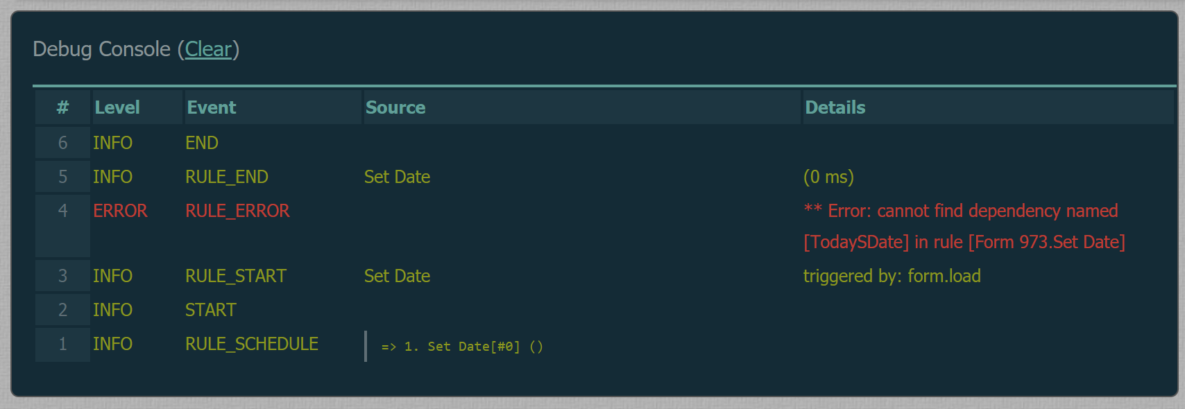
Here is an example of debug console indicating that there is an error in the rule due to the fact that there is not control name 'TodaySDate' in this form.
The most recently executed rule is displayed at the top of the console. Scroll down to see prior rules. To follow a rule's execution, scroll down to find the RULE_START Event and then read the console output from bottom to top. This ensures that the latest rule output is always in the most handy position at the top of the debug console area.
The debug console is organized into 5 columns:
- # - A sequential line number. The # starts at 0 when a form is instantiated and increments until the form is finally submitted. Even if you clear the console by clicking the Clear link, the numbers continue incrementing from where they left off for this particular form instance. This gives you a clear way to follow the order in which the rule code was executed during the lifetime of a particular form instance.
- Level - One of 5 log levels. See below for details. The level also dictates a color coding. For example all ERROR log level messages are displayed in red.
- Event - One of many possible Events. This column enables you to quickly distinguish between various events such as rule start/stop. See the detailed event list below.
- Source - This column contains the name the designer gave to each rule for RULE_START and RULE_END events so that you can clearly see which rule the output lines are a part of. Source is also set for DOC_READ_START and DOC_READ_END events and indicates the name of the data source. If the data source is the default document Source displays the form/workflow's name.
Refer to the log files for a complete history of all rule debugging output.
Log Levels
The debug console log level output defaults to the most verbose level which is TRACE. Currently there is no way to change this. The output is color coded with ERROR messages appearing in red so they can be quickly identified. The recognized log level are:
- ERROR
- INFO
- DEBUG
- VERBOSE
- TRACE
The log levels are inclusive. For example: INFO level includes ERROR, DEBUG includes INFO, etc.
This rule executed successfully as no ERROR level log messages appear in the console. The TRACE level output includes RULE_EVAL events which dump the exact lines of Javascript in your rule.
Event Types
The Event types enables you to quickly understand the meaning of each line in the debug console output. The event types are:
- START - signals the start of an execution that may span one or more rules and Doc URIs
- END - signals the end of the execution of a batch of one or more rules plus the total execution time in milliseconds
- ERROR - any errors that were thrown NOT in the context of executing rules
- START_RULE - signals the start of a rule execution
- END_RULE - signals the end of a rule execution plus the execution time of this one rule in milliseconds
- RULE_ERROR - any errors that happened while executing the specific rule
- RULE_EVAL - A message displaying the rule script
- RULE_DEP - one for each rule dependency. Examples of dependencies are: form.load, trigger clicked, if conditions that trigger rules, control values changes on the right hand side of assignments, etc.
- RULE_SCHEDULE - shows the next rule to execute and the remaining rules in the agenda/batch. This event makes it a bit easier to track what the rules engine is doing when debugging.
- PROPERTY_SET - one for each control property set by the current rule
- HTTP_START - signals the start of an http call (get, put, etc.)
- HTTP_END - signals the end of the http call + status code and timing
- HTTP_RESPONSE - a message that dumps the first few lines of the http response
- HTTP_ERROR - any errors that may have been thrown while performing the http call
- DOC_READ_START - signals the start of a manually set Doc URI read
- DOC_READ_END - signals the end of a manually set Doc URI read
- DOC_READ - signals the success or failure of the Doc URI read
- LOG - a user defined message that can be generated from a rule using frevvo.log('my INFO message') or frevvo.log('DEBUG', 'my debug message')
- INFO - this statement informs the designer when the set of property values in a workflow during form state initialization are ignored.
- WEB_SERVICE - events to report the URL and XML/JSON results when dynamically populating selection control (Dropdown, Checkbox, Radio and ComboBox) options from a RESTful web service
Dynamic Options Logging
Populating a selection control (Dropdown, Checkbox, Radio, ComboBox) using the Dynamic Options feature requires the designer to examine the returned results from an entry point to determine bind paths, troubleshoot end point URLs, etc. To assist the designer when developing forms/workflows with controls that use this feature debug console logging includes Web Service events such as:
- The web service call being made with fully the resolved end point URL shown
- The web service data retrieved (JSON/XML)
- Any errors received upon calling the web service
Refer to the Dynamic Options topic for an explanation of this feature and examples of how these web service events in the debug console assist the designer.
Custom Output
This example shows a CUSTOM event. These events are created by adding frevvo.log() calls to your rules. Custom log messages are useful when you need even more debugging output. See Custom Logging for more details.
Doc URI write methods information, which occur when the form is submitted, do not appear in the debug console output.
Rule Debug Logfile Output
Rules debug output can also be written to the log file <frevvo-home>/frevvo/tomcat/logs/frevvo.log file and is also visible in the tomcat console if tomcat stdout logging is enabled.
To change the rule debug logging verbosity level, append one of the URL parameters below to the base URL. For example: http://<server:port>/frevvo/web?rule-debug=TRACE turns on the highest rule debug log level. The verbosity options are:
- ?rule-debug=ERROR - Only log errors
- ?rule-debug=INFO - A moderate level of logging is output
- ?rule-debug=DEBUG - A higher level of logging is output
- ?rule-debug=VERBOSE - Rule dependencies and the rule code itself is also logged
- ?rule-debug=TRACE - This is the most verbose rule log level
Log levels are inclusive: INFO level includes ERROR, DEBUG includes INFO, etc.
Changing the rule logging verbosity affects all tenants, users, and forms running on the server. A high log level can effect the form server's performance. Turn rule logging back to the lowest level of ERROR when your are done debugging.
Rule Profiling
Rule execution can be profiled to determine how much time each rule takes to execute. This can help you tune and improve performance in forms that use a lot of business rules. To turn on profiling in the log files set the rule-debug=INFO or higher. See 1063405479 for setting log levels. Profiling output is also displayed in the Debug Console.
The execution time for each rule is displayed on the RULE_END and END events. This sample debug console output indicates that the rule named "Init Products" executed in 125 milliseconds. The 141 milliseconds shown on the END event is the total time for all rules triggered by a single form change event. It's likely that the END event total time will be great then the addition of all RULE_END times. This is normal and due to the fact that some small time elapses between each rule.

Rule profiling is very helpful in narrowing down performance issues in rules that execute database queries. Profiling can help you identify if the db queries are taking too long. You will see HTTP calls taking a long time to execute.
As rules are executed on the server and not on the browser client side. Thus timing is effected by the performance of your server machine and the server's current load.
Rule Timeout
By default a rule that takes longer to execute then 5 seconds will be timed out by the Form Server. Customers using the in-house download version can customize this timeout. This is often necessary when rules have to perform longer running operations such as sending email messages, database stored procedures, etc. To configure the timeout add the following line to your web application containers property file. For the -tomcat bundle this file is <frevvo-home>\tomcat\conf\Catalina\localhost\frevvo.xml and is specified as follows:
<Parameter name="frevvo.rule.timeout" value="5000" override="false"/>
To set the timeout to 15 seconds set value="15000".
What is not permitted in a rule?
Setting the value of a control to an array or to a random JavaScript object is not allowed.
Initial Control State
Every control in your form has an initial default property states for the visible, expanded, value, valid & enabled properties. However you can change a controls initial state in ' form designer Edit tab. A control’s initial state can be modified several ways. One way is by simply typing a value into an input control. This sets the default value for the control when the form is first opened in use mode. Another way is by expanding or collapsing group controls. This sets the initial expanded state. The default state for the visible and enabled properties is set via the controls edit property panel. The edit property contains checkboxes for visible and enabled for controls on which those properties make sense like input controls.
Dates and Times
There are several special considerations when writing rules using date, time and date/time controls. You can also find many working samples in the Rules Examples chapter.
To initialize a date control, the data must be in the correct format. Here are examples of correct date formats:
d1.value = "2012-01-13"; //yyyy-mm-dd
d2.value = "01-13-2012"; //mm-dd-yyyy
d3.value = "jan 13 2012"; //using string for month
The following formats will not correctly initialize a date control. They will either cause unexpected results or be flagged as an invalid value when the form is used.
//adjusted or invalid date formats
d4.value = "2012-13-01"; //yyyy-dd-mm
d5.value = "13-01-2012"; //dd-mm-yyyy
d6.value = "13-2012-01"; //dd-yyyy-mm
d7.value = "01-2012-13"; //mm-yyyy-dd
In general, it is not recommended to rely on either the browser's locale or the server's locale when writing date, time (time of day) and date/time literals in rules. The recommended method is to use locale independent formats that are listed below. These are standard ISO formats.
Date - yyyy-MM-dd
Date/Time - yyyy-MM-ddTHH:mm:ssZ - The trailing Z indicates UTC.).
Time - HH:mm:ss (or HH:mm). Time is really time of day and is not affected by time zones at all.
yyyy-MM-ddTHH:mm:ss is also supported but will convert to the server's timezone. The rule author has no control of this, so it is not recommended.
Here is an example rule:
if (form.load) {
  date.value = "2020-02-20";
  timeofday.value = "13:10:02";
  datetime.value = "2020-02-20T18:10:02Z";
}
This rule will initialize a date control in a form with 02-20-2020, a time control with 1:10 PM and a date and time control with 02-20-2020 in the date portion and 1:10 PM in the time portion.

Notice the special character "Z" at the end of the date/time value. This is equivalent to an offset of UTC-00:00 and indicates that the time of 18:10:02 is given in UTC. 18:10:02 UTC is equal to 1:10 PM Eastern Standard time.
Rules and Repeating Controls
Nested Repeating Items
If you have a repeating control in a form that itself contains a repeating control, you cannot apply a rule to the "inner" repeating control, since there's no way to tell which of the inner repeating items goes with which outer repeating item.
Dynamic Add or Remove for Repeating Items
The minOccurs and maxOccurs (Max#) properties of a Table or Repeat control, can be used to write a rule to dynamically change Min# and Max# values of repeating items. This feature is helpful if you want to allow only a certain number of items based on user input. Here's how it works:
In the designer, set the min/max properties so that they cover the whole range of min and max numbers that you wish to use via rules. When you increase the Min# value with a rule, will check if that number of items are there in form, if not then it will add them. When you reduce the maxOccurs property via the rule,
will check if the form has more than that many items. If there are more items than the Max# that you are setting via the rule, it will remove those extra items.
Follow these important points when writing your rule:
- Your rule can set minOccurs to 0 even if the design time setting > 0, but you cannot set minOccurs to a value that is greater than the current maxOccurs.
- Your rule can set maxOccurs to a value that exceeds the design time setting, but you cannot set maxOccurs to a value below the current minOccurs value.
- Repeat items and table rows are added if your rule increases the Min# property and are removed when the rule decreases the Max#.
- Added rows due to increasing the MinOccurs property will trigger the itemAdded property.
- This feature can be used for schema controls, but min/maxOccurs values have to be set within the limit given in the schema. For example, if the schema has text control defined with minOccurs=2 and maxOccurs=100. We cannot set minOccurs less than 2 nor maxOccurs greater than 100.
This is one case where the order of your rules matters. When adding rows, set the maxOccurs first, then minOccurs. When deleting rows, set minOccurs first, then maxOccurs. If you attempt to set minOccurs higher than the current maxOccurs, you will see an error in the debug console, "Illegal value for minOccurs. The type specifies a range of [0,3]. Attempted to set to: 4". Notice the rule order in these code snippets from this example rule to dynamically set min/max on a table.
//Add new rows if existing number of rows is less than resultset length
  RepeatRow.maxOccurs = x.resultSet.length;
  RepeatRow.minOccurs = x.resultSet.length;

//Delete extra rows if existing number of rows is more than resultset length
  RepeatRow.minOccurs = x.resultSet.length;
  RepeatRow.maxOccurs = x.resultSet.length;
A common example is a form that retrieves data from a database - let's say the details of a Purchase Order. There could be one or more rows in the result. Depending on how many rows are returned, you may want to show only that many repeat/table rows in the form. Your rule can automatically set the min and max properties of the repeat/table to the same value (Min# = Max#) so that only the number of items specified in your rule are displayed.
Refer to this rule example for repeats and this rule example for tables.
When you dynamically populate repeats/tables using the Doc URI Approach, will automatically set the minOccurs/maxOccurs accordingly, so you do not need a business rule.
Note: Setting the min and max to the same value via a business rule will not always remove the left +/- column. You may see a blank left column.
Selection Controls
Radio controls, dropdowns and checkboxes are all examples of select controls. Radio & dropdown controls are single select. That is, if one item in the dropdown is selected then all other items in the dropdown are deselected. The same is true for a radio. Only one radio button can be depressed at any time. Thus the <ControlName>.value of radios and dropdowns are similar to the other input and output controls. The value is a single item.
Checkbox controls are multi-select meaning multiple items can be selected at any given time. Therefore the value of a checkbox is an array. To determine the number of items selected, use the value's length. For example to determine the number of items selected for a checkbox control named "Fruits", use Fruits.value.length. Once you know that the length is greater than zero, you can determine which items are selected by using the array syntax. For example, let's say Fruits has 3 options: Apple, Banana and Pear. If a user checks off just Banana, Fruits.value.length will be 1. Fruits.value[0] will return the value of the first item selected which in this case would be "Banana". If the user then checked off Apple and Banana, Fruits.value.length would be 2, Fruits.value[0] would be "Apple" and Fruits.value[1] would be "Banana".
HTTP methods
Business rules can interact with web services to retrieve data from back end systems and to update/insert data into back end systems using the http.get(), http.put(), http.post() and http.delete() methods. Rules that call a database query and rules that call stored procedures are two examples of how these methods are used.
These are the parameters to these http methods:
- the URL to the web service
- payload (data) constructed as a JavaScript object.
- headers constructed as a JavaScript object
- Whether the payload is in multipart form
dataOnly, which defaults to true and returns just the content. It should be set to false in order to get additional information (headers, status) in a JSON format (see this sample JSON data set).
In previous versions of , the post, put, get and delete methods accepted only a JSON string for payload and header parameters. Using string concatenation to generate a JSON string is fragile due to potential encoding issues and possibly XSS security concerns. This requires the designer to use JSON.stringify('{name:'+Name.value+'}')) to avoid encoding issues.
/**
	Performs an HTTP GET
	@param {String} url - the target resource url (e.g. "http://myservice/myresource")
	@return {String} - the target resource (e.g. {"CustomerName":"John Doe"})
*/
function get (url){...}

/**
	Performs an HTTP GET with headers
	@param {String} url - the target resource url (e.g. "http://myservice/myresource")
	@param {Object} headers - request headers" (e.g. {"X-MyHeader":"MyHeaderValue"})
	@return {String} - the response (e.g. {"CustomerName":"John Doe"})
*/
function get (url, headers){...}

/**
	Performs an HTTP GET with headers and encoding
	@param {String} url - the target resource url (e.g. "http://myservice/myresource")
	@param {Object} headers - request headers" (e.g. {"X-MyHeader":"MyHeaderValue"})
    @param {Boolean} - Do you want frevvo to encode the URL? A false value tells frevvo not to encode it.
    @return {String} - the response (e.g. {"CustomerName":"John Doe"})
*/
function get (url, headers, encode){...}

/**
	Performs an HTTP GET with headers and encoding and dataOnly
	@param {String} url - the target resource url (e.g. "http://myservice/myresource")
	@param {Object} headers - request headers" (e.g. {"X-MyHeader":"MyHeaderValue"})
    @param {Boolean} - Do you want frevvo to encode the URL? A false value tells frevvo not to encode it.
	@param {Boolean} dataOnly - defaults to true and returns just the content. It should be set to false in order to get additional
                     information (headers, status) in a JSON format.
    @return {String} - the response - if dataOnly=false, with additional info in JSON (e.g. {"CustomerName":"John Doe"}),
					   or if dataOnly=true, returns just the content.
*/
function get (url, headers, encode, dataOnly){...}

/**
	Performs an HTTP POST
	@param {String} url - the target resource url (e.g. "http://myservice/myresource")
	@return {String} - the response (e.g. {"CustomerName":"John Doe"})
*/
function post (url){...}

/**
	Performs an HTTP POST with a payload
	@param {String} url - the target resource url (e.g. "http://myservice/myresource")
	@param {Object} payload - the POST request payload
	@return {String} - the response (e.g. {"CustomerName":"John Doe"})
*/
function post (url, payload){...}

/**
	Performs an HTTP POST with a payload and headers
	@param {String} url - the target resource url (e.g. "http://myservice/myresource")
	@param {Object} payload - the POST request payload
	@param {Object} headers - request headers" (e.g. {"X-MyHeader":"MyHeaderValue"})
	@return {String} - the response (e.g. {"CustomerName":"John Doe"})
*/
function post (url, payload, headers){...}

/**
	Performs an HTTP POST with a payload,headers and multi-part
	@param {String} url - the target resource url (e.g. "http://myservice/myresource")
	@param {Object} payload - the POST request payload
	@param {Object} headers - request headers" (e.g. {"X-MyHeader":"MyHeaderValue"})
	@param {Boolean} multipart - is the request payload multipart?
	@return {String} - the response (e.g. {"CustomerName":"John Doe"})
*/
function post (url, payload, headers, multipart){...}

/**
	Performs an HTTP POST with a payload,headers,encoding and multi-part

	@param {String} url - the target resource url (e.g. "http://myservice/myresource")
	@param {Object} payload - the POST request payload
	@param {Object} headers - request headers" (e.g. {"X-MyHeader":"MyHeaderValue"})
    @param {Boolean} - Do you want frevvo to encode the URL? A false value tells frevvo not to encode it.
    @param {Boolean} multipart - is the request payload multipart?
	@return {String} - the response (e.g. {"CustomerName":"John Doe"})
*/
function post (url, payload, headers, multipart, encode){...}

/**
	Performs an HTTP POST with a payload,headers,encoding, multi-part and dataOnly

	@param {String} url - the target resource url (e.g. "http://myservice/myresource")
	@param {Object} payload - the POST request payload
	@param {Object} headers - request headers" (e.g. {"X-MyHeader":"MyHeaderValue"})
    @param {Boolean} - Do you want frevvo to encode the URL? A false value tells frevvo not to encode it.
    @param {Boolean} multipart - is the request payload multipart?
	@param {Boolean} dataOnly - defaults to true and returns just the content. It should be set to false in order to get additional
                     information (headers, status) in a JSON format.
	@return {String} - the response - if dataOnly=false, with additional info in JSON (e.g. {"CustomerName":"John Doe"}),
					   or if dataOnly=true, returns just the content.
*/
function post (url, payload, headers, multipart, encode, dataOnly){...}

/**
	Performs an HTTP POST with a payload and headers
	@param {String} url - the target resource url (e.g. "http://myservice/myresource")
	@return {String} - the response (e.g. {"CustomerName":"John Doe"})
*/
function put (url){...}

/**
	Performs an HTTP POST with a payload and headers
	@param {String} url - the target resource url (e.g. "http://myservice/myresource")
	@param {Object} payload - the POST request payload
	@return {String} - the response (e.g. {"CustomerName":"John Doe"})
*/
function put (url, payload){...}

/**
	Performs an HTTP POST with a payload and headers
	@param {String} url - the target resource url (e.g. "http://myservice/myresource")
	@param {Object} payload - the POST request payload
	@param {Object} headers - request headers" (e.g. {"X-MyHeader":"MyHeaderValue"})
	@return {String} - the target resource (e.g. {"CustomerName":"John Doe"})
*/
function put (url, payload, headers){...}

/**
	Performs an HTTP POST with a payload, headers and multi-part
	@param {String} url - the target resource url (e.g. "http://myservice/myresource")
	@param {Object} payload - the POST request payload
	@param {Object} headers - request headers" (e.g. {"X-MyHeader":"MyHeaderValue"})
	@param {Boolean} multipart - is the request payload multipart?
	@return {String} - the target resource (e.g. {"CustomerName":"John Doe"})
*/
function put (url, payload, headers, multipart){...}

/**
	Performs an HTTP POST with a payload, headers, encoding and multi-part
	@param {String} url - the target resource url (e.g. "http://myservice/myresource")
	@param {Object} payload - the POST request payload
	@param {Object} headers - request headers" (e.g. {"X-MyHeader":"MyHeaderValue"})
    @param {Boolean} - Do you want frevvo to encode the URL? A false value tells frevvo not to encode it.
    @param {Boolean} multipart - is the request payload multipart?
	@return {String} - the target resource (e.g. {"CustomerName":"John Doe"})
*/
function put (url, payload, headers, multipart, encode){...}

/**
	Performs an HTTP POST with a payload, headers, encoding, multi-part and dataOnly
	@param {String} url - the target resource url (e.g. "http://myservice/myresource")
	@param {Object} payload - the POST request payload
	@param {Object} headers - request headers" (e.g. {"X-MyHeader":"MyHeaderValue"})
    @param {Boolean} - Do you want frevvo to encode the URL? A false value tells frevvo not to encode it.
    @param {Boolean} multipart - is the request payload multipart?
	@param {Boolean} dataOnly - defaults to true and returns just the content. It should be set to false in order to get additional
                     information (headers, status) in a JSON format.
	@return {String} - the target resource - if dataOnly=false, with additional info in JSON (e.g. {"CustomerName":"John Doe"}),
					   or if dataOnly=true, returns just the content.
*/
function put (url, payload, headers, multipart, encode, dataOnly){...}

/**
	Performs an HTTP POST with a payload and headers
	@param {String} url - the target resource url (e.g. "http://myservice/myresource")
	@return {String} - the target resource (e.g. {"CustomerName":"John Doe"})
*/
function delete (url){...}

/**
	Performs an HTTP POST with a payload and headers
	@param {String} url - the target resource url (e.g. "http://myservice/myresource")
	@param {Object} headers - request headers" (e.g. {"X-MyHeader":"MyHeaderValue"})
	@return {String} - the target resource (e.g. {"CustomerName":"John Doe"})
*/
function delete (url, headers){...}

/**
	Performs an HTTP POST with a payload, headers and encoding
	@param {String} url - the target resource url (e.g. "http://myservice/myresource")
	@param {Object} headers - request headers" (e.g. {"X-MyHeader":"MyHeaderValue"})
    @param {Boolean} - Do you want frevvo to encode the URL? A false value tells frevvo not to encode it.
    @return {String} - the target resource (e.g. {"CustomerName":"John Doe"})
*/
function delete (url, headers, encode){...}

/**
	Performs an HTTP POST with a payload, headers, encoding and dataOnly
	@param {String} url - the target resource url (e.g. "http://myservice/myresource")
	@param {Object} headers - request headers" (e.g. {"X-MyHeader":"MyHeaderValue"})
    @param {Boolean} - Do you want frevvo to encode the URL? A false value tells frevvo not to encode it.
	@param {Boolean} dataOnly - defaults to true and returns just the content. It should be set to false in order to get additional
                     information (headers, status) in a JSON format.
	@return {String} - the target resource - if dataOnly=false, with additional info in JSON (e.g. {"CustomerName":"John Doe"}),
					   or if dataOnly=true, returns just the content.
*/
function delete (url, headers, encode, dataOnly){...}
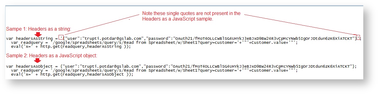
The http.get(), http.post(), http.delete() and http.put() methods now accept native JavaScript object directly eliminating the need for the JSON.stringify() function. This is the preferred way of sending payload and headers from rules.
Instead of using this in your rule:
http.get('http://localhost/my/service', JSON.stringify('{name:'+Name.value+'}'));
Use a native JavaScript object:
http.get('http://localhost/my/service', {name: Name.value});
Here is another example. The image shows a section of a business rule used to read from a Google sheet. Notice Sample 2 (Headers as a JavaScript object) does not include the single quotes present in the first sample (Headers as a string). Although both methods will work, Sample 2 shows the preferred method:
The advantages to this approach are:
- The rule will fail when executed if the object syntax is incorrect.
takes care of encoding to JSON automatically.
Encoding Parameter for URLs in Rules
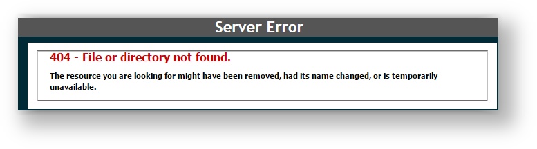
When making http calls from rules, special characters (e.g #) cannot be used in URLs because the URL which is passed in the http method gets encoded by default. For example, if the URL contains a #, encoding assumes this is a query fragment. If the designer encodes it as shown in the example below by replacing the # with the encoded value %23,
will encode it again turning the % into %25 for a final value that looks like %2523. This returns an invalid URL.
A boolean parameter can be specified in a rule for http.get, http.put, http.delete and http.post methods that can be used to tell not to encode the URL. In this case, the designer encodes the URL and sets this parameter to false to turn off additional encoding by
.
For example: Let's say you write a rule to perform an http get to a web server when the form loads. Here is the URL you want to use in plain text:
'http://<someserver>/Client/AMR/Vendors/aramark|8435 Georgetown Road#100IndianapolisIN46268'
In this rule, the local variable URL is set to the encoded version but the http.get() does not include the third argument to prevent double encoding:
if (form.load) {
  var url = "http://<your webserver:port>/Client/AMR/Vendors/aramark%7C8435%20Georgetown%20Road%23100IndianapolisIN46268";
  var response = http.get(url);
  frevvo.log(response);
}
encodes the URL again. The result is a server 404 error because the URL is invalid which prompts an error message in the
logfile similar to:
In this rule, the local variable URL is set to the encoded version and the http.get() includes the third argument, set to false, to prevent double encoding:
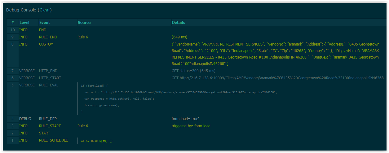
if (form.load) {
  var url = "http://<your webserver:port>/Client/AMR/Vendors/aramark%7C8435%20Georgetown%20Road%23100IndianapolisIN46268";
  var response = http.get(url, null, false);
  frevvo.log(response);
}
This resolves the issue and the data is retrieved as shown in the debug console:
This example shows the syntax to use if you to turn off encoding for an http.post that already has up to 4 arguments: http.post(url,null,null,null,false). The encoding argument always goes in the last position no matter how many parameters the method has.
Error Handling in Rules
When using an http.get() method in rules, it's a good idea to also handle error states within the rule. If there is an error with the http.get() or there is no match for your query, it can cause the form to stop working without much explanation. To prevent that situation, include an if/else statement that returns an error message in the case of null results, and otherwise runs the rule normally.
Example 1
Here is an example of a rule that reads from a google sheet to get a Full Address. The rule first checks for errors, and uses the variable fi to pass either an error message or the correct results to the Full Address control. If the results are null (meaning there was an error), the Full Address control will show "Error." If there are results but no match for the query (state either MA or CT), the Full Address control will show "No Match." If neither of those states are true, the Full Address from the results will populate in the control as desired.
/*member fulladdress, results, password, user*/

if (form.load) {
  var x;
  var opts= [];

var headers =
{"user":"<your Google id>","password":"<your access token>"};
var readquery = '/google/spreadsheets/query/key/<your spreadsheet key>?wsname=<your worksheet name>&query=state=MA or state=CT';
  eval('x=' + http.get(readquery,headers));

//Error Handling in the Rule
var fi = '';
if (x.results == null) {
    fi = 'Error';
} else if (x.results.length === 0) {
    fi = 'No Match';
} else {
    for (var i=0; i < x.results.length; i++) {
        fi = fi + '\n' + x.results[i].fulladdress;
    }
}
FullAddress.value = fi;
}
Example 2
Here is another example of error handling in a business rule that looks at a database connector resultset, but can be adapted to handle integration to any web service, not just the database connector.
/member resultSet/

if (ConnectToDBC.clicked) {
var x;
eval ('x=' + http.get('http://localhost:8082/database/BIRT/allCustomers')); //replace with your query url

if (x === null) {
DatabaseError.value = "Error calling database. http.get() return x is null.";
DbConnectionErrorMessage.visible = true;

} else if (x.resultSet.length === 0) {
DatabaseError.value = "Error calling database.  No results returned.";
DbConnectionErrorMessage.visible = true;
}
else {
// if (x.resultSet[0].<property> === <bad value>) --> handle another error here
// else
DatabaseError.value = "Database query success!";
}
}
Dynamic Content
Real business forms often require dynamic content in dropdown list. Often based on the value entered into one form field, the values in other fields or options available in select controls need to be dynamic.
Rules allow invocation of http gets that return X-JSON headers with JSON objects. This allows complete flexibility in assignment of default values populated into form fields such as text controls and select (radios, dropdown, checkbox) controls. You can also use http.post(), http.delete(), and http.put() in rules, although you must use URL parameters with them, as they do not all support payloads.
Here is an example that shows the syntax of the http.get. This rule invokes the http get which must return a JSON object. The method on the servlet can do whatever necessary such as querying a database given the itemName to retrieve the itemPrice. In this example the JSON object returned contains a field called price. The eval converts and assigns the JSON object to the javascript variable x. Then x can be used in the rule as necessary. In this case it is used to set a value to the form field called Price.
eval('x=' + http.get('http://<webhost>/test/json/getPrice?itemName=' + itemName.value));
Price.value = x.price;
Imagine another example where the JSON object returned in the http.get response contains an array called clients. This array can then be used to set the options in a dropdown list.
eval('x=' + http.get('http://<webhost>/test/json/getClients'));
Clients.options = x.clients;
Here is another example of a servlet that returns a JSON object after authenticating a user/password.
@Override
public void doGet (HttpServletRequest request, HttpServletResponse response)
        throws ServletException, IOException
{
    try {
        String u = request.getParameter("username");
        String p = request.getParameter("password");
        if (authenticate(u, p) === null)
                response.addHeader("X-JSON", "{auth:false}");
        else
                response.addHeader("X-JSON", "{auth:true}");
    } catch (Exception e) {
        throw new ServletException(e);
    }
}
This servlet could be used in a rule as follows:
if (signForm.clicked)
{
    eval('x=' + http.get('http://<webhost>/MYservices/signForm?username=' + u.value + '&password=' + p.value));
    if (x.auth)
    {
        m.value = "<center>Authenticationn Succeeded</center>";
    } else
    {
      m.value = "<center>Invalid username or password</center>";
      }
}
It is important to note that the http.get is accessing your http service via a URL. Certain characters must be encoded in order to correctly pass through via an HTTP URL. W3 Schools provides one good reference on this topic. You may not always be able to control the values your users enter into your form fields. If the value may contain one of these characters that value must be encoded.
For example, this http.get contains a password parameter. Since user passwords may contain characters such as '#' you should encode the value. The built-in javascript method encodeURIComponent() makes this easy.
eval('x=' + http.get('http://<webhost>/MYservices/signForm?username=' +
                         u.value + '&password=' + encodeURIComponent(p.value)));
You may also need to decode the URL parameter in your HTTP service. For example:
import java.net.URLDecoder;
String p = request.getParameter("password");
p = URLDecoder.decode(password, "UTF-8");
For complete details of integration with your backend systems to provide dynamic data into your forms, see the section on integration.
Reusing Dynamic Content
Fetching dynamic content from your backend system can be the source of degrading form performance. If your form needs to use the dynamic content multiple times you can improve performance by fetching the content once from the http.get() and saving the returned JSON string in a hidden text form control. Then you can later read the text control value and convert it back to a JSON object without having to call your backend system multiple times.
For example add a hidden text control to your form named jsonUserData. Add a single line to the rule that retrieves the user Data from your backend system via the http.get():
jsonUserData.value = http.get(requestUrl);
In other rules that also need the user data, rather than calling http.get() to your backend system again, add the following line to your rule:
var x = JSON.parse(jsonUserData.value);
This will have the affect of setting x to the same data as if you had again fetched content from your backend system.
Here is a simple working example that fetches a customer list from our database and saves it to a hidden textarea control named jsonUserData where it can now be reused in multiple rules.
// Fetch the customer list resultset from the database on form load
if (form.load) {
  var readquery = 'http://app.frevvo.com/database/BIRT/allCustomers';
  jsonUserData.value = http.get(readquery); // This stores the JSON string value
}
This second rule uses the saved JSON string, converts it back to a JSON object, and then populates the CustomerList dropdown upon trigger button click.
/*member customerName, resultSet*/
if (GetCustomers.clicked) {
  var x = JSON.parse(jsonUserData.value);
  var opts= [];
  for (var i=0; i < x.resultSet.length; i++) {
    opts[i] = x.resultSet[i].customerName;
  }
  CustomerList.options = opts; // Assign values to the CustomerList dropdown control
}
Reusing Data from a Web Service
The example above uses the database connector, which returns a clean json that doesn't cause any problems when it is copied into a text field. The json returned from other services might included extra spaces or other characters and might require trimming. This can cause an error such as 'SyntaxError: Unexpected token in object literal'.
You may need to add this code, which removes spaces from the json string, to your first rule:
var json = http.get(requestUrl); jsonUserData.value = json.replace(/[\n\t\r]/g,"");
Relative URIs
The dynamic content described above requires an http get to a specific URI service returning a JSON object. The examples above specified absolute URI paths. You can also use a relative path.
Assuming the Form Server is running on http://www.myhost.com, http.get(‘http://www.myhost.com/path/to/resource’) may instead be written as http.get(‘/path/to/resource’).
For example:
eval('x=' + http.get('http://<webhost>/database/mydb/getPrices'));
In this example the path to the URI service is an absolute hard coded path. When the service is running on the same host as the form server you may use a relative URI. One common scenario where this is applicable is for
In-house customers who have also installed the
database connector. In this case the rule is best written as follows because it becomes portable if you move your form server from one <webhost> to another <webhost> as is common when running under development servers and moving to production servers.
eval('x=' + http.get('/database/mydb/getPrices'));
Templatized URIs
The URIs used in a http get very often contain variables. For example, the service getPrice takes as an argument an item name:
eval('x=' + http.get('http://<webhost>/test/json/getPrice?itemName=' + itemName.value));
Price.value = x.price;
This URI can also be shortened using a simplified template syntax:
eval('x=' + http.get('http://<webhost>/test/json/getPrice?itemName={itemName}'));
Price.value = x.price;
For example assuming that when the form is used the field named itemName contains the value 'laptop', then using examples of both absolute and relative URIs and assuming that the service is running on http://www.frevvo.com:
http.get('/path/to/service/{itemName}')
    => 'http://www.frevvo.com/path/to/service/laptop' http.get('http://www.frevvo.com/path/to/service/{itemName}') => 'http://www.frevvo.com/path/to/service/laptop'
Note that since templates need not be bound to form controls the value for 'itemName' may be passed into the form using _data rather than as a value entered into the field by the user. If instead you use the syntax itemName.value in your URI then a control named itemName must exist as a field in your form.
This can be a very good way to dynamically configure your service's location rather than hard-coding the location into the rule. This form was loaded with the URL parameter &_data(myBaseUrl:'http://www.myhost.com')
http.get('{myBaseUrl}/path/to/service') => 'http://www.myhost.com/path/to/service
In this case since we do not want a form field to display myBaseUrl we use a template rather then adding a special field just for the purposes of passing the base URL into the rule.
URL Parameters Accessed in Rules
URL parameters passed into your form via the _data parameter can be accessed in rules several ways. If &_data(FirstName:'Joe') was added to your form URL, then:
- FirstName.value - only for parameters bound to a control in your form.
- {FirstName} - only for parameter used in http get 1063405479.
- _data.getParameter('FirstName') - if used anywhere else in a rule other than a URI.
Option 2 & 3 are available for both bound and unbound controls. So choose whichever approach is the simplest for you.
Built-in Data
makes certain data available to your rules. This includes information about the person currently using your form, the tenant and form information. You retrieve this data in your rule using the _data.getParameter('<data name>') syntax. Here is the list of available data:
- subject.id - logged in user's username.
- subject.first.name - Logged in users's First Name
- subject.last.name - Logged in users's Last Name
- subject.email - Logged in users's email address
- subject.roles - A list of all the roles for the logged in user
- subject.reports.to - Logged in users's Reports To
- user.id - Owner of form/workflow and user folder name in the filesystem
- user.name - TBD
- subject.name of the active directory attribute - use this to pull Active Directory custom attributes information from an LDAP server
The following additional data is also available:
- form.type.id - The unique id associated with a given form (See Sharing Forms.)
- flow.type.id - The unique id associated with a given workflow. (See Sharing Forms.)
- form.id - The unique form instance id; This id is unique for each for submission.
- form.name - The name of the form
- flow.id - The unique workflow instance id; This id is unique for each workflow submission.
- flow.activity.id - The ID of the current workflow activity
- flow.activity.name - The name of the current workflow activity
- form.extid - Client defined extId passed in the formtype Url parameter
- flow.extid - Client defined extId passed in the flowtype Url parameter
form.description - The description of the form
form.project.id - The unique id associated with the project of the given form
form.tenant.id - the Tenant ID where a form/workflow is located
form.user.uuid - The unique user id of the user that submitted the form
project.id - The unique id associated with a given project (See Sharing Forms.)
project.name -The name of the project
tn.id - the Tenant ID where a form/workflow is located
- tn.name - the Tenant Name where a form/workflow is located
Starting in v9.1.0, "Applications" are known as "Projects." The built-in data names app.id, app.name, and form.application.id will be supported for a limited time but may not be available in a future release. Please update forms and workflows to use the updated data names project.id, project.name, and form.project.id.
Position Data
The following data is available when you enable your form's GEO Location feature:
- position.latitude - Latitude
position.longitude - Longitude
- position.accuracy
- position.error.message - Error if any, retrieving the GEO Location
- position.street_number - Street Number
- position.route - Street Name
- position.locality - City
- position.administrative_area_level_1 - State
- position.administrative_area_level_2 - County
- position.country - Country
- position.postal_code - Postal Code
- position.street_address - Complete street address
Security Subject Information
You can use a form.load rule to pre-populate fields in your form with information about the currently logged in user. For example, if you have controls in your form named Id, FirstName, LastName, Email, Roles and Manager, the following rule will prefill those fields as indicated below.
if (form.load) {
    // User Information
    Id.value = _data.getParameter('subject.id'); // Username
    FirstName.value = _data.getParameter('subject.first.name');
    LastName.value = _data.getParameter('subject.last.name');
    Email.value = _data.getParameter('subject.email');
    Manager.value = _data.getParameter("subject.reports.to");
    var roles = _data.getParameter ("subject.roles");
    if (roles) {
         eval ('x=' + roles);
         Roles.options = x;
    }
}
Security Subject Information from LDAP
LDAP supports both the standard subject attributes and custom attributes. When a user is successfully authenticated by the LDAP security manager, frevvo automatically retrieves Last Name, First Name and Email Address for this user from the LDAP server. You can retrieve custom attributes in addition to the standard ones from Active Directory and pull the data into your form/workflow using business rules.
Rules can use 1063405479 methods to populate controls on a form/workflow with the information for the logged in user. The rules use the _data.getParameter syntax, For example, the business rule shown fills the respective form fields with the First/Last Names and Email Address of the logged in user.
if(form.load)
{
EmployeeEmail.value=_data.getParameter('subject.email');
FirstName.value=_data.getParameter('subject.first.name');
LastName.value=_data.getParameter('subject.last.name');
}
You can retrieve additional custom attribute information from the LDAP server by listing the custom attributes in a separated list in the custom field on the LDAP Configuration screen. Then write a rule to use that information in your form. For example, this rule populates the Middle Initial and Home Phone fields which are retrieved from the LDAP server by configuring custom attributes.
if (form.load)
{
FirstName.value=_data.getParameter('subject.first.name');
MiddleInitials.value=_data.getParameter('subject.initials');
LastName.value=_data.getParameter('subject.last.name');
HomePhone.value=_data.getParameter('subject.telephoneNumber');
EmployeeEmail.value=_data.getParameter('subject.email');
}
The image shows a simple form using the rule above to populate the Employee's First Name, Middle Initial, Last Name, Home Phone and Email Address from Active Directory on the LDAP server.

Attributes with more than one value are also supported. For example, The carLicense attribute can return multiple licenses. You can write a rule to populate dropdown options with those values. Make sure the carLicense attribute is added to the custom field on the LDAP Configuration screen and of course, there are multiple carLicense attributes, each one containing a different value for the dropdown options, set up for appropriate users on the LDAP server.
A JSON array string listing multiple car licenses is returned and it can be used in a rule to populate the options of a dropdown control named carLicense.
if (form.load) {
carLicense.options=JSON.parse(_data.getParameter('subject.carLicense'));
}
The manager attribute maps to the built-in data 'subject.reports.to.' This means you can retrieve this value in a rule or use 'subject.reports.to' for workflow navigation if you configure the manager attribute in your LDAP tenant.
Execute a Rule on a Specified Workflow Step
Using the flow.activity.name built-in parameter in a rule ensures that the actions in the rule only occur when the workflow is on a specified step. Here is an example of a rule that makes a tab named Review visible only for the workflow step named Manager Review. See this topic for more information.
if (form.load) {
  if (_data.getParameter('flow.activity.name') === 'Manager Review') {
    Review.visible = true;
  }
}
Built-in Methods
provides built-in helper methods for common functionality required by business rules.
Date and Time Methods
Here is the list of available methods for working with dates and times:
- Time - frevvo.currentTime() - returns the current time in the user's local timezone. This method should only be used to set the value of a Time control.
- Date - frevvo.currentDate() - returns the current date in the user's local timezone. This method should only be used to set the value of a Date control.
- DateTime - frevvo.currentDateTime() - returns the current date and time in the user's local timezone. This method should only be used to set the value of a Date/Time control.
- DateUtil.todayISO() - returns today's date in 'yyyy-mm-dd' format. The date is returned in the server's timezone.
- frevvo.beforeDate(Date1.Date2): true if Date2 is earlier than Date1.
- frevvo.afterDate(Date1, Date2.value): true if Date2 is after Date1. Date1 and Date2 are controls in your form.
- frevvo.addToDate(date, "m, d, or y", "number of days, months or years you want to add") - Add a number of years,days or months to a date. See an example here.
Here is an example of setting a Time control named Tm, a Date control named Dt and a Date/Time control named DtTm. See the dates and times rule examples for more samples.
  Tm.value = frevvo.currentTime();
  Dt.value = frevvo.currentDate();
  DtTm.value = frevvo.currentDateTime();
The methods listed below have been deprecated and will be removed in a future release.
- frevvo.currentTime(form)
- frevvo.currentDate(form)
- frevvo.currentDateTime(form)
- String DateUtil.today()
If these methods are used in rules a the designer will see a message in the 1063405479 urging that the methods listed 1063405479 be used instead.

When you Save & Test a form, the form time zone is determined automatically. However, when you copy the share URL, you should consider whether to add the _formTz parameter to specify the time zone where the rules should run.
- When using frevvo.currentDateTime() or now() to set a Date/Time Control value without the _formTz parameter, these functions will return the current date/time in UTC and display it in the user's browser timezone. Often, this is the desired behavior, so _formTz is not necessary.
- When using frevvo.currentDate() or today() to set a Date control value, or frevvo.currentTime() or timeofday() to set a Time control value without the _formTz parameter, these functions will both return and display the current date/time in UTC. This may or may not be the desired behavior, as the UTC time may appear "wrong" to the end user since it does not match their own time zone.
- To return and display Date, Time, and Date/Time values set by these functions in a particular time zone, specify a timezone using the _formTz=<timezone> URL parameter.
See the Time Zones and Business Rules documentation for more details.
Locale Method
There is one method that will access the current locale in a rule. For example, if you wanted to generate PDFs for different languages, you can use this method will take the value of the locale from the URL. You can then write a rule or, in the case of PDFs, a precondition to set up selection criteria.
- frevvo.getLocale() - returns the current locale
Users, Roles and Tenants Methods
Here is the list of methods that can be used in business rules to verify if a specified user or role exist in your tenant or if a tenant exists in your server. These methods return a boolean true/false value:
- boolean frevvo.isUniqueUserId (String userId, String tenantId) - returns true if this user does not exist in the tenant and false if it does
- boolean frevvo.isUniqueRoleId (String roleId, String tenantId) - returns true if this role does not exist in the tenant and false if it does
- boolean frevvo.isUniqueTenantId (String tenantId) - returns true if this tenant does not exist in the form server and false if it does
See Rules Examples for Tenants, Roles, Users for examples of rules that use these methods.
Here is the list of methods that can be used to access details about a user in your tenant such as (user id, first name, last name, email, reports to, roles). You can use the functions discussed below to display the details of a user even if that user is not logged into the tenant.
These functions return a JavaScript object directly so there is no need to include an eval()) method for conversion that is required when the return is a JSON string.
You can extract information about a single selected user id using the frevvo.userDetails function discussed below.
- frevvo.userDetails(String userId) - returns a Javascript object with the following properties:
{
	   id: "john",
	   firstName: "John",
	   lastName: "Doe",
	   name: "John Doe",
	   email: "john@doe.com",
	   reportsTo: "jerry",
	   roles: "Employee", "frevvo.Designer",
 }
- frevvo.userIds() - returns an array of user ids in your tenant.
These functions can be used to write a rule that populates a dropdown with a list of users in your tenant or a list of users with a specified role or roles.
- frevvo.userIds(String role) - returns an array of user ids that have the specified role.
- frevvo.userIds(String[ ] anyOfTheseRoles) - returns an array of user ids that have any of the roles.
This function returns all of the roles assigned to a specified user:
- frevvo.userDetails("roles") - returns an array of roles assigned to the user.
These functions return the name of the current tenant and user Id of the logged in user.
- frevvo.currentTenant() - returns the tenant id of the logged in user. It Returns null for anonymous users.
- frevvo.currentUser() - returns the user id of the logged in (current) user
See Rules Examples for Tenants, Roles, Users for examples of rules that use these functions.
Both dot and square bracket notation are allowed when getting/setting object properties in rules.
Limitations:
At this time, you cannot use the user detail functions to:
- obtain an efficient, paginated list of users/roles
- obtain user details for all users in a role(s) - you can only get the details for a single userId
Deprecated Methods
These methods have been deprecated. A warning message, suggesting the use of the currently supported functions, displays in the debug console when any of these methods are used.
- String frevvo.listUsers(String tenantId) - returns a list of users in the tenant
- String frevvo.listRoles(String tenantId) - returns a list of all roles in a tenant
- String frevvo.listRoles(String tenantId, boolean filterAdmin) - returns a list of all roles in the tenant if filterAdmin is false. Returns a list of all roles in the tenant except for frevvo.Administrator and frevvo.TenantAdmin if filterAdmin is true (true is the default)
- String makeCategories(String tenantId, String type) - returns a list of tenant form or control categories. Set type to 'CT' for control categries and 'FT' for form categories.
- String frevvo.listTenants() - returns the list of all tenants on the form server
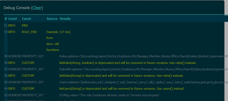
Custom Logging Methods
You can output user defined logging messages to debug console using these helper methods:
- void frevvo.log(String msg) - adds an INFO level USER event message to the debug console
- void frevvo.log(String level, String msg) - adds a message to the debug console at a log level you define via the 'level' parameter.
If you do not set a log level the log message defaults to INFO. The recognized log level are:
- INFO
- ERROR
- DEBUG
- VERBOSE
- TRACE
Here is a snippet of debug console output. The frevvo.log() message Event type displays as "CUSTOM". In this example the rule called the method frevvo.log('ERROR', 'Loading tenant roles...'); The message appears in red because all ERROR level log messages automatically are colored red.
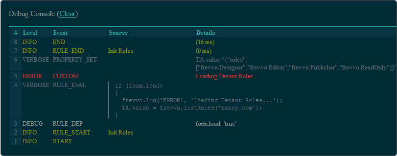
See the 1063405479 topic for full details of all the console output information.
Additional Helper Methods
Here is a list of additional useful helper methods:
- String frevvo.uuid() - returns a universally uniqe identifier
- Boolean IsInt(Var s) - returns true if the string is actually a number and returns false if it is not a number
- Integer makeInt(Var s) - converts the string to an integer. Returns 0 if the string cannot be converted
- String makeString(Var s) - converts the input to a string
- Boolean makeBoolean(Var s) - converts the string "true" to a boolean true else returns false
- String SubjectUtil.getFullName(Var fn, Var ln) - concatenates fn + ' ' + ln. This a handy helper so you do not have to code the javascript string concat yourself.
Here is an example:
if (form.load) {
myGuid.value = frevvo.uuid();
myFullName.value = SubjectUtil.getFullName(_data.getParameter('subject.first.name'),
                                           _data.getParameter('subject.last.name'));
IsItInt.value = isInt(Input.value);
}
See Rule Examples for usage details.
Numbers with Decimal Places
JavaScript behavior when calculating decimal point addition, might show a result with a large number of decimal places. provides a built-in method, toFixed(n) that can be used in this situation.
- toFixed(n) method converts a number into a string, keeping a specified number of decimals (specified by n).
See an example on our Rule Examples page.
Common Methods (includes.js)
This feature is mainly intended for OEM partners. Often there are common rule code that is reused over and over in many forms. Traditionally this code must be duplicated in each form.
is packaged with a file in tomcat/webapps/frevvo/WEB-INF/rules/includes.js which is initially empty. OEM
partners can put commons functions into includes.js. There is a second file com.frevvo.forms.model/src/main/resources/com/gauss/forms/rule/executor/includes.js also in the WEB-INF directory whose contents are defined by
.
When you write any form rule you can now call functions defined in these two includes.js files above. The first one is for OEM partners to create and repackage with frevvo.zip. The second one is frevvo's and is automatically updated when there is a new release and should not be modified by OEM partners.
Extracting common functions into includes.js can simplify rules by calling a common method in includes.js rather than coding the common code into each rule.
Note that includes.js is parsed and compiled once when starts. If you update this file with new functions and fixes to existing functions you must restart
for the changes to take affect.
Changing the Value Property of Controls in Signed Sections
Rules that change the .value property for a control inside a Signed Section after the user has signed are not allowed. The designer will be notified of this with a message in the debug console. This applies ONLY to the value property. All other properties can be modified inside a signed section using rules.
Let's take a look at a simple form.

This form has a control called t1 that is populated with the word "text" using a rule when the form loads. Notice this control is not inside the section. A second rule changes the text from "Unchanged" to "changed it' for a control named t2 located inside the section when the trigger control is clicked. If the section is not signed, clicking on the trigger control ("Try and change the value") executes the rule and the text in t2 changes.
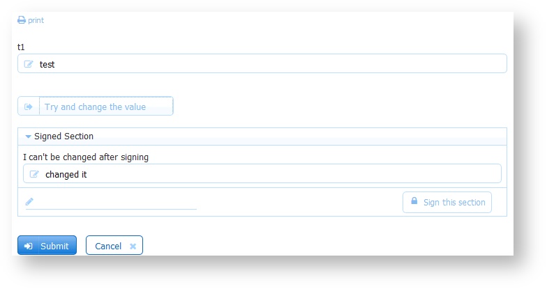
However, once the user signs the section, the rule is prevented from updating the t2 field when the trigger is clicked and the debug control displays the following message: "Set of t2.value ignored. Reason: Changes in signed sections not allowed."
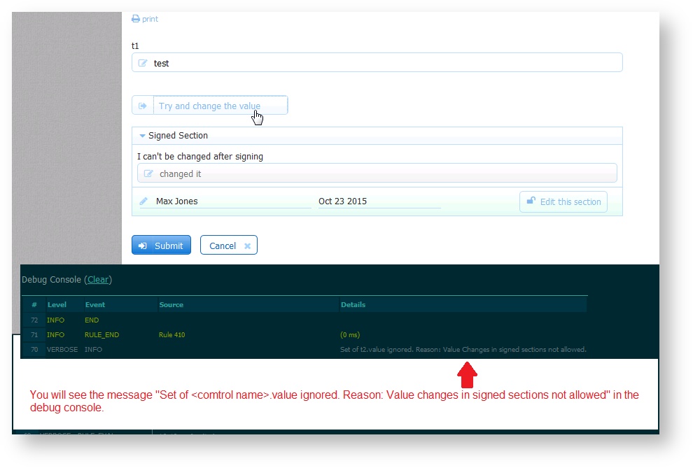
Copy Rule Code
Designers may want to copy rules created with the Visual Rule Builder so they can be reused in the same, or another, form/workflow. To copy a rule's javascript code, click the Copy icon  on the “Rule Code” tab that appears in either Rule Builder mode (when javascript code is read-only) or Edit Code mode. This icon will copy all of the javascript to the clipboard. You can then create a new rule (in the same or another form/workflow), click Edit Code on the new rule, and paste the copied code there to replicate the rule. Then, edit as desired.
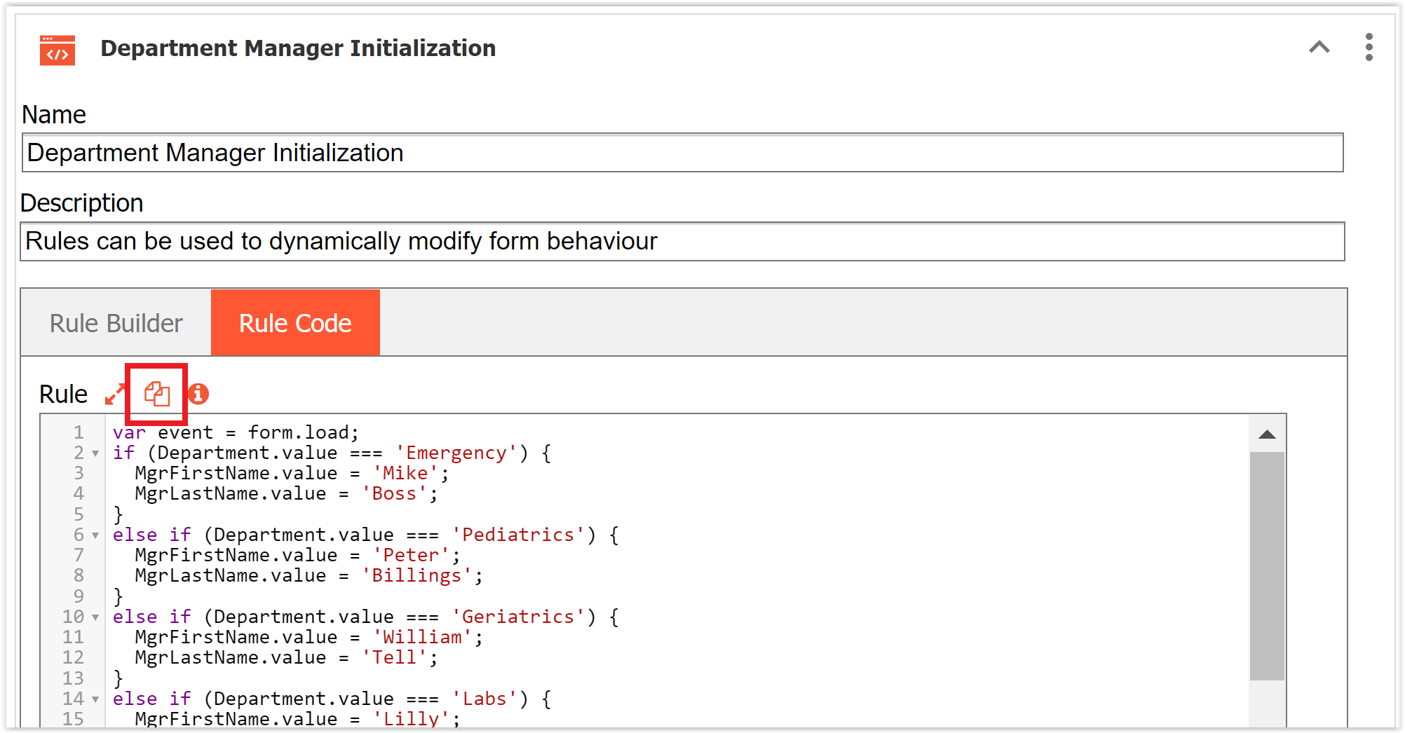
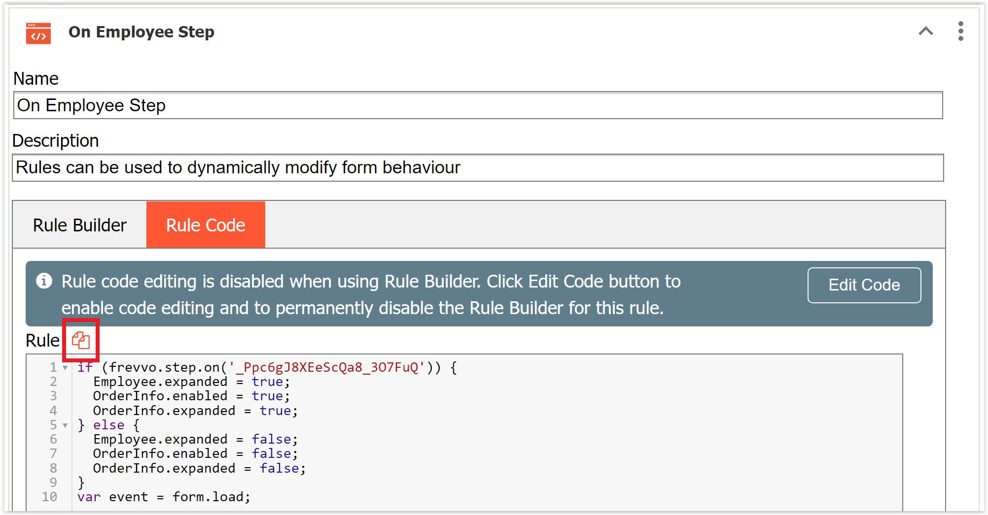
View All
Click the View All button to display a read-only view of all the rules in your form/workflow. Then use a browser search (Ctrl+F) to highlight all the places in your rules where a particular search item is mentioned. For example, if you were looking for all the rules that set the required property for a section, search for 'SectionName.required' (replace SectionName with the name of your section). This view might be helpful when correcting errors reported by the Rules Editor.
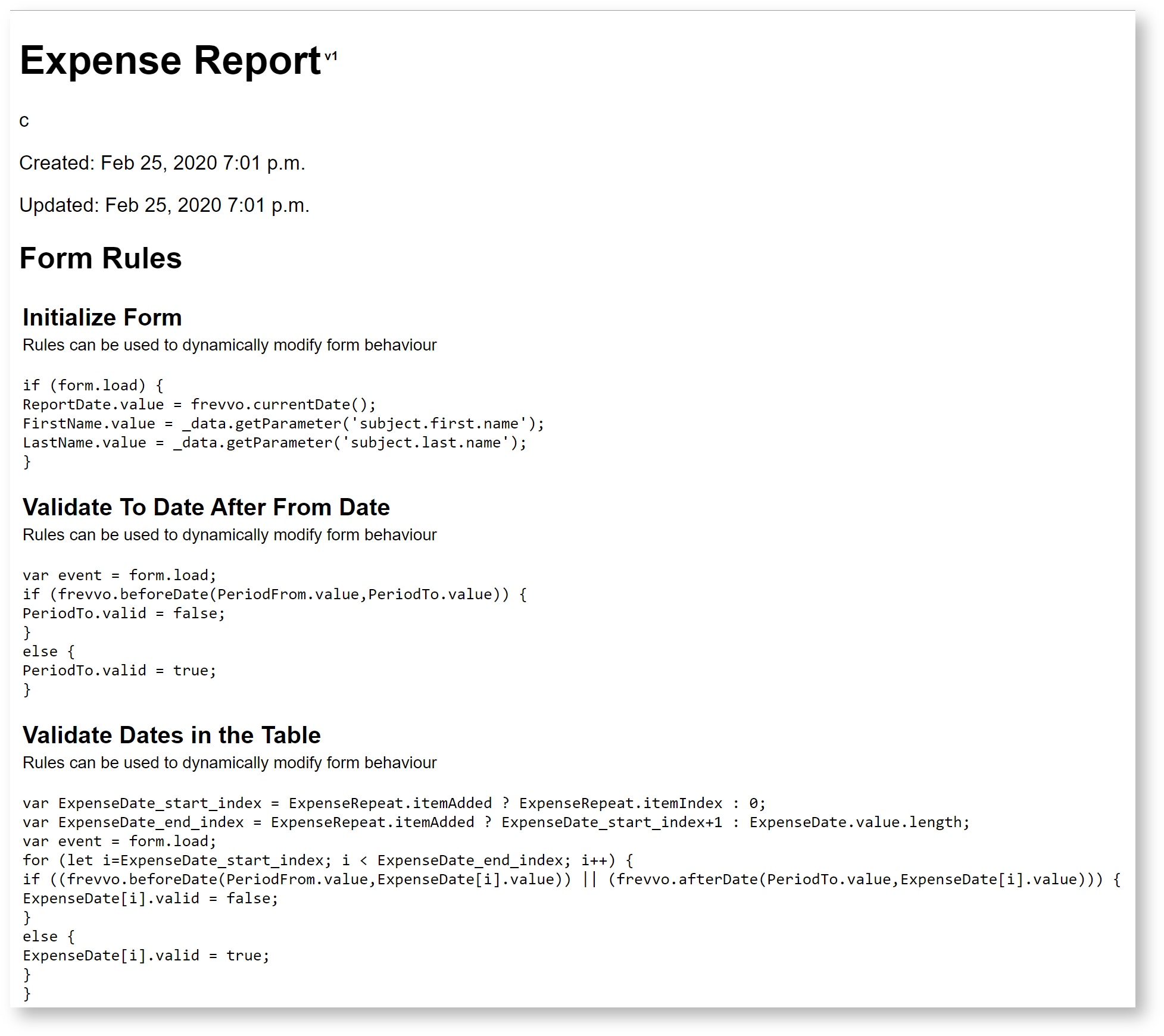
Prefix Property
Section controls of custom read-only controls are named with a prefix value. The prefix of the Section control is editable and will be automatically assigned whenever the custom control is dragged more than once onto the form. In this way, you can write a separate rule to manipulate these controls within the 2nd and greater instances of the custom control. Refer to this documentation for the details.