| Warning |
|---|
The initial release of Version 10.0 was deployed to the frevvo Cloud in October 2020. The v10.0 download is available for On Premise customers from our Software Downloads Directory. |
...
Expand title Features introduced in v9.1 v9.1 New Features
v9.1 contains a modern, intuitive new user interface that make it easier than ever to organize and navigate your content. To see all of the new features for v9.1 visit our Detailed Release Notes page. Here are some highlights to get you started:
Tip Watch our 30-minute What's New in v9.1 Webinar for a tour of our favorite new features!
Redesigned User Interface
You will see several improvements to the User Interface (UI) throughout which make navigating projects, forms and workflows simpler and more intuitive while retaining all of the your favorite functionality. This documentation space is updated to reflect the new UI. If you have internal documentation, consider updating it to reflect these changes.
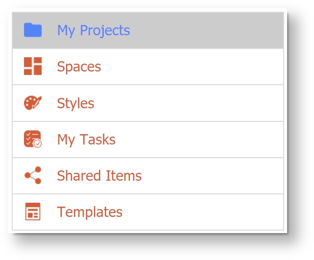
My Projects Homepage
The My Projects Homepage replaces the My Applications Homepage from prior versions.
- On the Designer Homepage, the top left menu has been update with new icons. You will notice that "My Projects" now replaces "My Applications."
- The Projects Homepage now displays a list of your projects by the date they were created with the newest on top, making them easy to find. You can
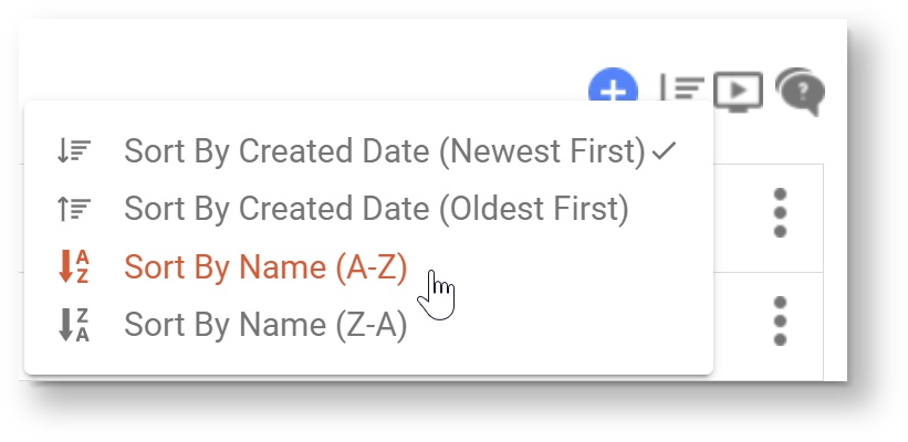
 Sort projects by created cate or alphabetically by name. Applications created in prior versions will seamlessly transition to Projects. You may still upload files with the suffix _app.zip and they will be added to the Projects list. If you download a Project, you will see it has the new suffix _project.zip.
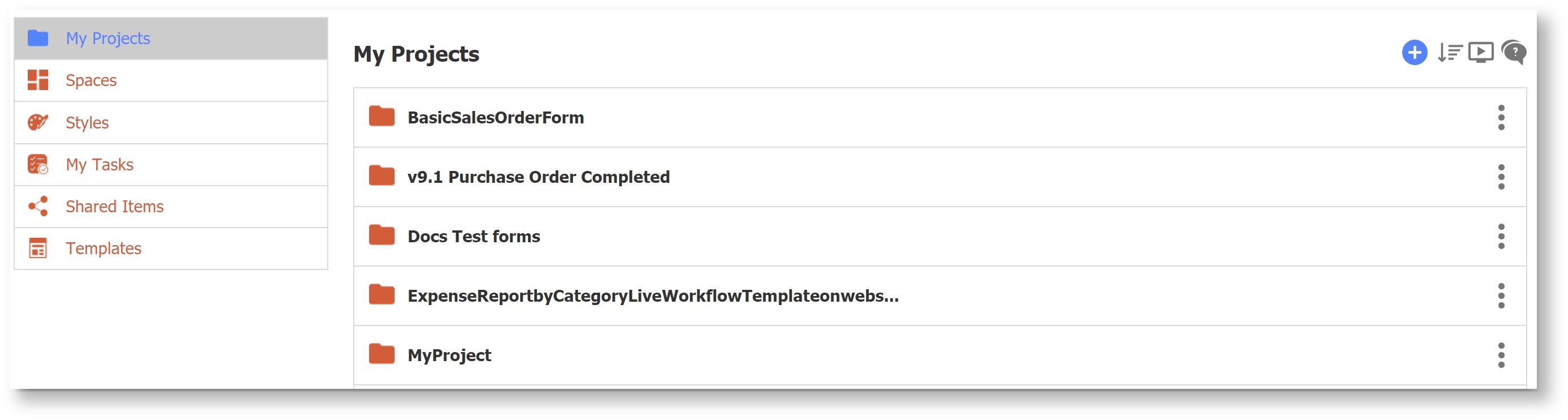
All of the operations that can be performed on a project are available by clicking on the Action Menu icon (three vertical dots) on the right side of each project, as shown below.
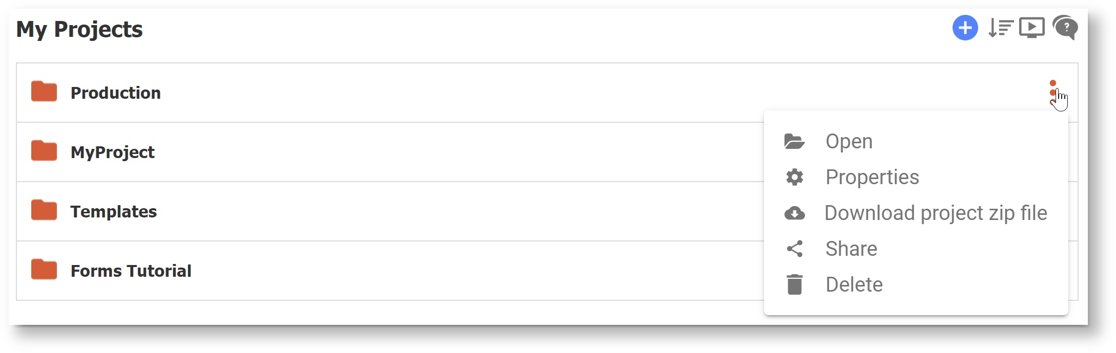
Menu Item
Description
 Open (Formerly Edit)
Opens the project.
 Properties
Allows user to customize the Name, Description, Layout, Style, Form Action Base URL and Doc Action Base URL.
Note that this is the only place where a project's properties are available.
 Download
Downloads a zip file. The zip file name will have a suffix of "_project.zip".
 Share
ShareProduces a share URL for the project. The URL will still contain '/app'.
 Delete
Delete the project (you will be prompted to confirm.)
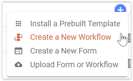
Add Content/Install Prebuilt Templates
- Use the
 Add icon to add content.
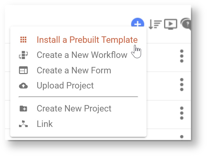
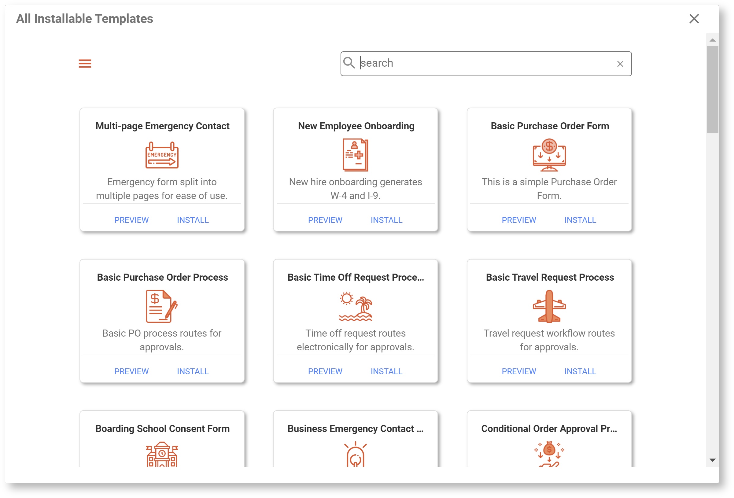
- Select Install a Prebuilt Template to access Global and Tenant Form and Workflow templates. This is an easy way to design a form starting with a commonly used process and customizing for your needs. On the Install Templates menu, you can filter by category, search by keyword, view the name and description of each template, and preview the template before installing.
- Selecting
 Create a New Workflow or
  Create a New Form will prompt you to either add the new content to an existing project or create a new project.
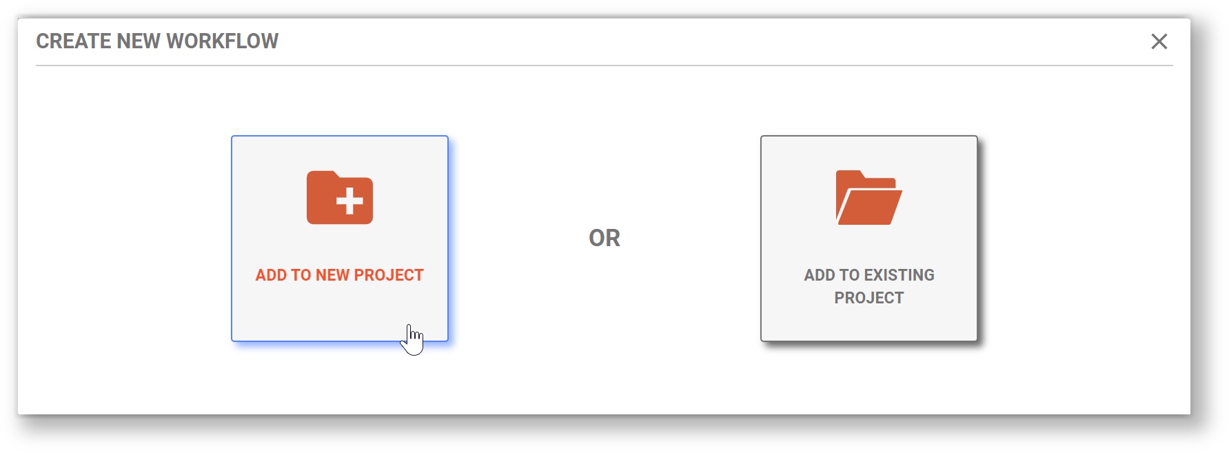
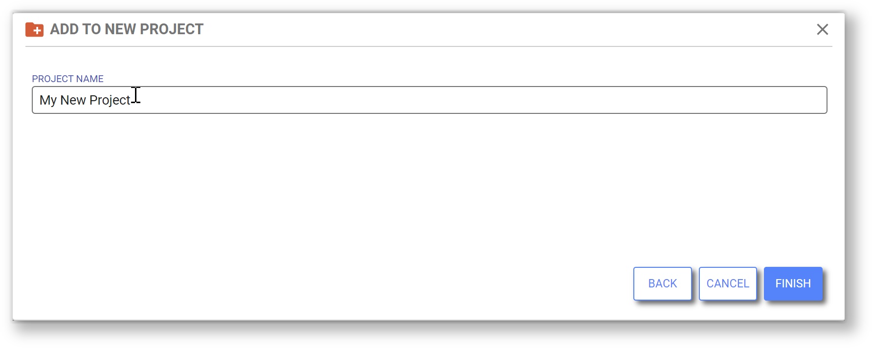
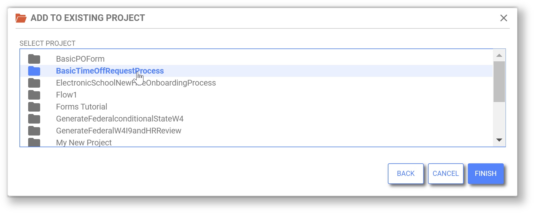
- Select Add to New Project to create a project. will prompt you to name the new project. Click Finish to create the project and the new form/workflow. You will be automatically sent to the Form/Workflow Designer where you can rename the Form/Workflow and begin customizing it.
- Select Add to Existing Project to select from a list of your projects. After you select one, click Finish to go to directly to the Form/Workflow Designer where you can rename the Form/Workflow and begin customizing it.
 Upload Project functions as "Upload Application" did in prior versions. You can upload files with the suffix _app.zip to Projects.
 Create New Project will prompt the designer to name the new project. Click Finish to create the project and go directly to that Project's Forms & Workflows homepage.
 Link functions as "Link Application" did in prior versions.
Forms and Workflows Homepage
Within each project, forms and workflows are now listed together in the Forms and Workflows homepage. By default they are listed in order of last modified date. The user can sort the list based on last modified date or alphabetically using the sort icon above the list.
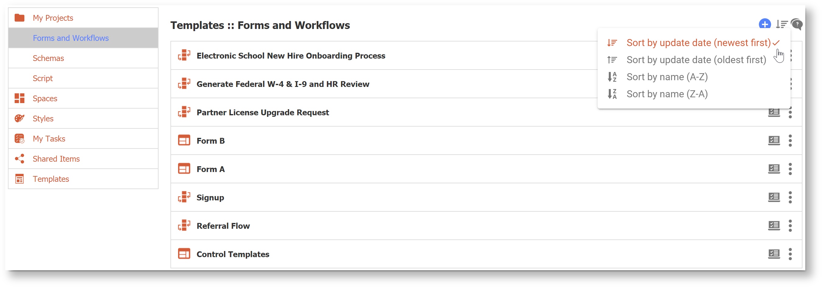
- The blue Add icon opens a menu of content that can be created within the current project.
- Select Install a Prebuilt Template to access Global and Tenant Form and Workflow templates. This is an easy way to design a form starting with a commonly used process and customizing for your needs. On the Install Templates menu, you can filter by category, search by keyword, view the name and description of each template, and preview the template before installing.
- Create a New Workflow and Create a New Form will create the content and open it in the appropriate designer where you can change the name and begin to customize.
- Upload Form or Workflow functions as prior version Upload operations did, though now will accept either a _form.zip or a _flow.zip file.
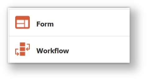
- Forms and Workflows are combined into one list, and can be identified as either a Form or Workflow by their icons.
- Click on the
 Test icon beside the action menu to quickly access the form/workflow test mode.
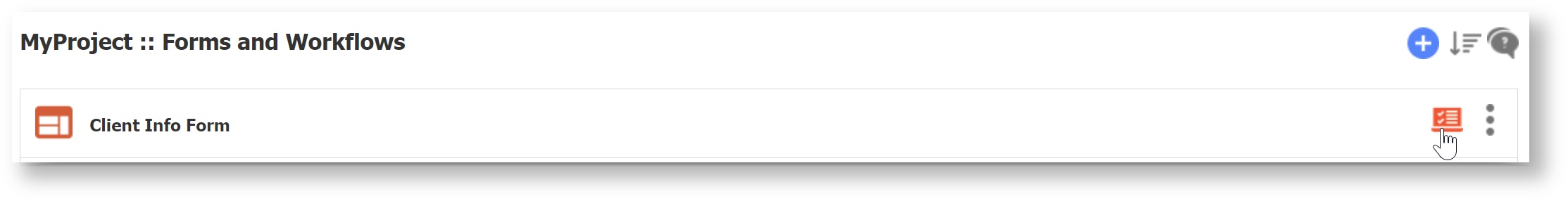
- Form and Workflow operations are now accessible via the
 Action Menu (three dots icon) to the right of the Form/Workflow name. Click on the Form/Workflow name to quickly open the Form/Workflow in its respective designer.
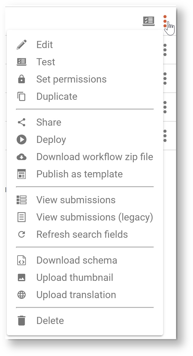
Menu Item Description  Edit
EditOpens the form or workflow in the appropriate designer.  Test
TestOpens the form or workflow in another browser tab/window in test mode.  Set Permissions
Shows the access control dialog.
 Duplicate
Creates a copy of the form or workflow. This function is extended to workflows in this release. ShareShows the share form or share workflow dialog.  Deploy/UndeployThis menu item and icon is dynamic. If the item is deployed, the menu item will be
 Undeploy . Download
Downloads a zip file.  Publish as Template
Same behavior and UI as in the previous release.  Submissions
Opens the Submissions view.  Submissions (Legacy)
Opens the Submissions (Legacy) view.  Refresh Search Fields
Same behavior and UI as in the previous release.  Schema
Same behavior and UI as in the previous release.  Thumbnail
Same behavior and UI as in the previous release.  Internationalize
Same behavior and UI as in the previous release. DeleteDelete the form or workflow. Deployed Forms & Workflows
In previous versions of , it was easy to see which forms or workflows were deployed based on the status of "deploy/undeploy" icon. In v9.1 the convenience of at-a-glance view for deployed forms and workflows has been preserved. Deployed forms and workflows will now appear in the list with a
 flag icon beside them. Here is an example of a list of forms and workflows in which one workflow is deployed:
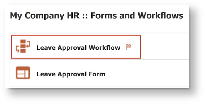
Schemas
The Schemas screen received a UI refresh in a similar fashion to the Projects and Forms/Workflows screens. Schemas are now sorted alphabetically by name and item numbers have been removed. Each item has a 3-dot item menu that contains all of the existing operations. Use the
 Add icon to upload a new schema.
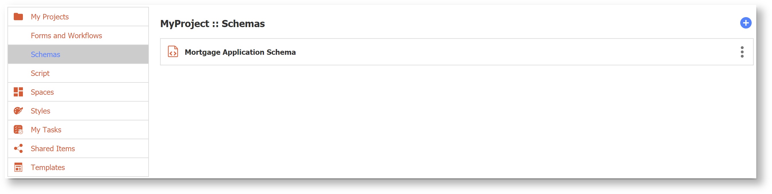
Script
The Script screen received a UI refresh in a similar fashion to the Projects and Forms/Workflows screens. The current script has an
Action menu that contains all of the existing operations. 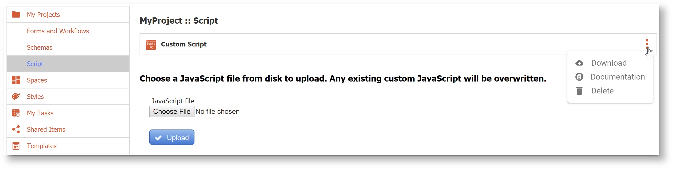
Spaces
The Spaces home page received a UI refresh in a similar fashion to the Projects and Forms/Workflows screens. Spaces are now sorted alphabetically by name and item numbers have been removed. Each item has an
 Action menu that contains all of the existing operations. Use the Add icon to create a new space. An added convenience for designers is that when creating a new space you will be directed immediately to the Space Designer to begin editing, rather than back to the Spaces home page.
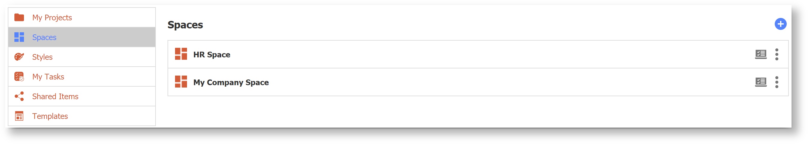
Styles
The Styles screen received a UI refresh in a similar fashion to the Projects and Forms/Workflows screens. Styles are now sorted alphabetically by name and item numbers have been removed. Each Style has an
Action menu that contains all of the existing operations. Use the  Add icon to create or upload a new style.
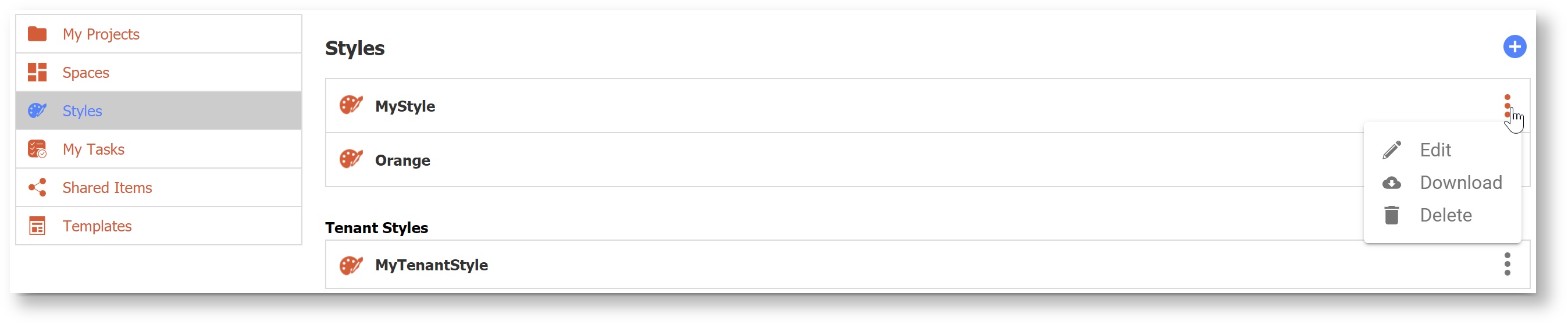
Enable Strong Passwords
Note This feature applies only to tenants using the default security manager.
Good security is a desirable feature and is becoming mandatory with compliance initiatives like GDPR. Tenant admins can now set password strength requirements on the Create Tenant or Manage Tenant screens. There are four password strength options (Fair, Good, Strong, Very Strong) or the field can be left blank if you do not want to enforce password strength. In v9.1, leaving this blank will still require a minimum password length of 8 characters. When you change the password strength requirement, users whose passwords do not comply will automatically be prompted to change their password on their next login.
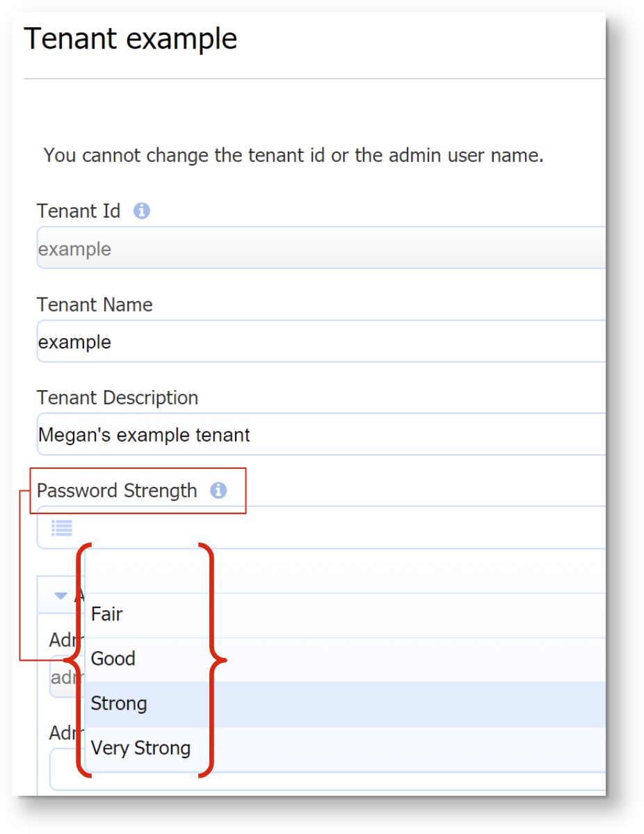
Definitions of Password Strength:
- none - uses system default, enforces a minimum password of 8 characters
- Fair - very guessable: protection from throttled online attacks. (guesses < 10^6) Strength Meter will indicate "Very weak."
- Good - somewhat guessable: protection from unthrottled online attacks. (guesses < 10^8) Strength Meter will indicate "weak."
- Strong - safely unguessable: moderate protection from offline slow-hash scenario. (guesses < 10^10)
- Very Strong - very unguessable: strong protection from offline slow-hash scenario. (guesses >= 10^10)
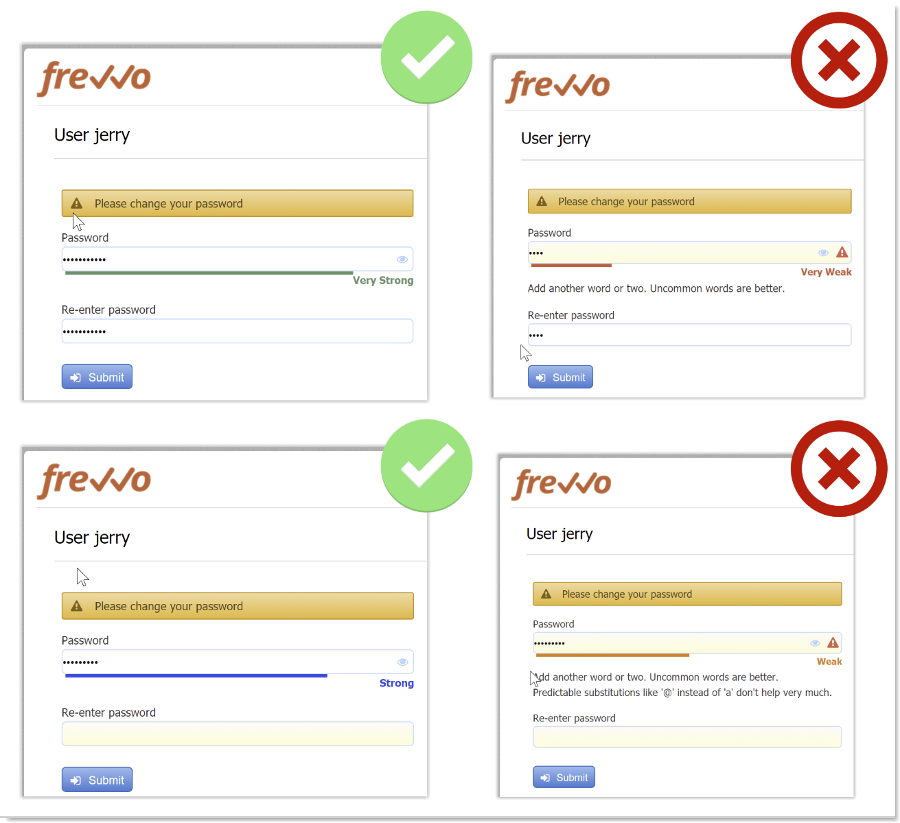
A user creating or resetting their password will be required to meet the password strength specified by the tenant admin. Password strength is indicated as the user types by a Password Strength Meter visible below the entry. There are no specific length or character requirements, but the meter will detect the strength of the password based on use of uncommon words or phrases and unpredictable use of capitalization, numbers and special characters. Helpful suggestions appear to prompt the user towards a stronger password. Password length is limited to 100 characters and an error message will appear if user attempts to enter more than 100 characters. Users cannot use their old password or a temporary password as the new password. Here are screenshots of what a user might see if the Tenant Password Strength is set to "Strong." Strong and Very Strong passwords use uncommon words or phrases and unpredictable use of capitalization, numbers and special characters.
Additional Enhancements
The Google Connector was automatically upgraded to v3.0.0 for Cloud customers. See the Google Connector v3.0.0 Release Notes for more detail.
- Generated PDF page break improvement: Controls can be prevented from having a page break in the middle of the control. For example, you may not want a checkbox control split with some options printed on one page and the rest of the options on the next page. In this case, place the checkbox control inside a group control (such as a section or a panel) and apply the CSS Class property f-page-break-inside-avoid to the group control. If the control would have had a page break inside the control, this property will cause the entire control to print on the next page. If you have nested group controls, the outer group control f-page-break-inside-avoid CSS Class property takes precedence.
- Enhanced Submission filter allows both upper- and lower-case search.
Info icon false frevvo is committed to making more intuitive and easier to use. More features/improvements are coming in future releases.
v9.1 Migration Considerations
Updated Built-In Data Names
With the transition from "Applications" to "Projects," some of the built-in data used in rules and templates is updated in v9.1. The following built-in data has been added:
- form.project.id - The unique id associated with the project of the given form
- project.id - The unique id associated with a given project. See Sharing Forms.
- project.name -The name of the project.
The corresponding application equivalents (form.application.id, app.id, and app.name) will be available for a limited time and may not be supported in a future release. Designers should update their forms/workflows to use the new built-in data at their earliest convenience.
Table Column Printable Property
Designers can now set the table column printable property using rule code. Here is an example. Line 1 will set the entire column's printable property to false; lines 2-4 show an example of how to make individual cells not printable. Keep in mind that the column setting will override the setting of individual cells.
Code Block Col2.printable = false; for (var i=0; i<Col2.value.length; i++) { Col2[i].printable = false; }Note Setting a column to printable is a feature introduce in the v7.4.19 patch for in-house customers and v9.1 for Cloud customers. If you were using a rule to set a column to printable in a prior version, edit the rule and re-save it to ensure that the column setting takes effect.
Control Validation Errors
In prior versions, controls whose type was changed (i.e. from date/time to date) after initial design could give an unexpected error when the user entered valid values. This has been fixed, but for workflows that had this error in prior versions, customers should take these steps to trigger the updated type definition:
- See Administrator Best Practices for information on updating a workflow in production.
- Choose one of these methods to fix the control:
- Delete the control with errors and re-add it.
- Change the control type (i.e. from date/time to date).
- Save the workflow step and then save the workflow.
- Return to the designer and change the control back to it's original type,
- Save the workflow step.
- Save the workflow.
Visual Rule Builder
Functions for Date/Time Controls
The Date/Time control type is meant to represent a point in time, so certain functions in the Visual Rule Builder (year, month, day, hour, minute) are not available on this control type.
Change to Function for Concatenate
In prior versions, the '+' operator could be used in the right-side of expressions for either addition of numeric values or concatenation of strings. However, using the '+' operator for both functions could cause browsers to hang on longer expressions. Starting in v9.1, the '+' operator will be used only for addition. Use the function concat(text1, text2, text3) to concatenate text strings.
- Rules that previously used the '+' operator to concatenate will automatically be converted to the concat() function.
- To concatenate items in v9.1 or later, use the concat() function as shown in this rule example.
- Rules created in v9.1 or later will show an error message if '+' is used with string values and users will be prompted to use the concat() function instead.
Documentation Links
Some of our terminology was updated in v9.1, such as "Applications" to "Projects" and "flow" to "workflow." As a result, some page titles in our documentation and their URLs have changed. If you have our documentation bookmarked, please use the left-hand page tree to navigate the documentation and update your bookmarks so that you can always find what you are looking for.
- On the Designer Homepage, the top left menu has been update with new icons. You will notice that "My Projects" now replaces "My Applications."
Expand title Features introduced in v9.2 v9.2 New Features
v9.2 includes exciting features for both new and experienced designers that help you create workflows easily and better utilize your current content. To see all of the new features for v9.2 visit our Detailed Release Notes page. Here are some highlights to get you started:
Tip Watch our 30-minute What's New in v9.2 Webinar for a tour of our favorite new features!
Workflow Design Wizard
Creating workflows is faster than ever with ' built in Workflow Design Wizard! Simply click "Create a New Workflow" from your Projects or Forms and Workflows home page to launch the wizard. Here's a quick video of how it works:
Multimedia name Workflow Design Wizard Low2.mp4 width 600 Search
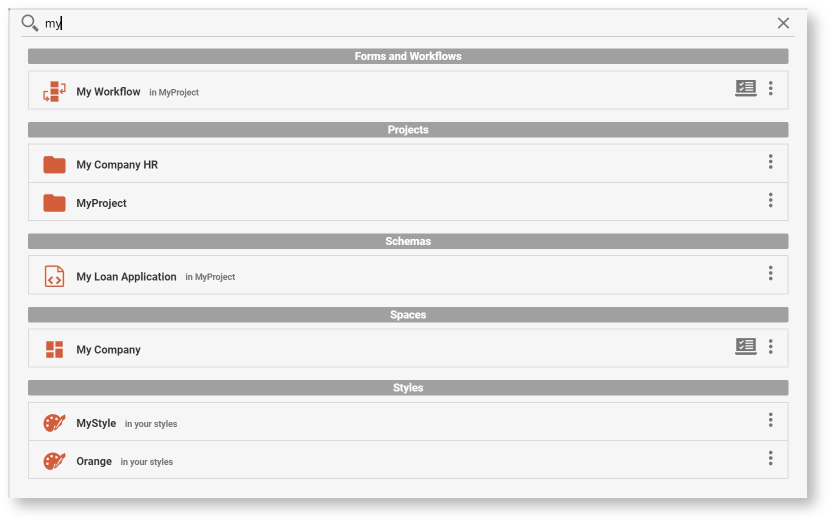
We are excited to roll out a search feature that many customers have asked for. Search can be used to search for the following content items owned by, or shared with, the user:
Forms and Workflows (including shared items)
Projects
Schemas
Spaces
Styles
Scripts
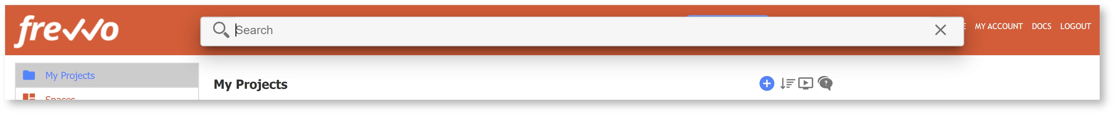
On each user's homepage, they will see a magnifying glass icon in the orange header bar. Search is available on any of the left-hand menu items (Projects, Spaces, etc.) It will not appear inside the Form or Workflow Designer screens.

Click on the search icon to open a Search Box. The cursor will automatically appear inside the search box and you can begin typing your search criteria.
Begin typing a few characters to start the search. Search looks for the criteria in the name and description of the user's content. Results will appear when the user pauses or finishes typing. Continue typing to narrow the search. The results will disappear when the user clicks away from the search/results window.
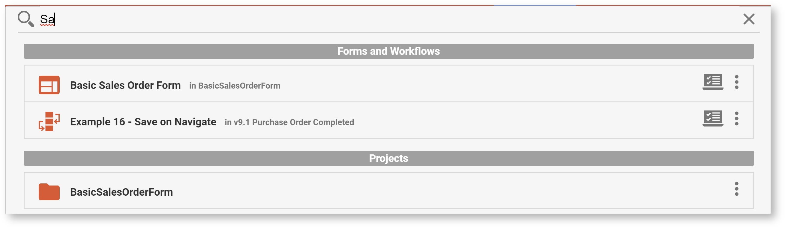
Results will show up to 20 items in each of the categories below, in this order. If there are fewer than 20 items in a category, more results can be offered for the next category. There will always be a maximum of 120 results. The results include icons indicating the type of resource (i.e. form or workflow), and also indicates the location of the resource, such as the project name.
Forms and Workflows (including shared items)
Projects
Schemas
Spaces
Styles
Scripts
Info To search your task list, continue to use the Search Tasks feature.
This Search feature currently does not search for controls within forms or workflows. You can search for controls by opening your form or workflow designer, and using your browser search function (i.e. Ctrl-f) to search for a control name.
v9.2 Migration Considerations
Resource Names & Descriptions
In v9.2, Names and Descriptions of resources (forms, workflows, projects, styles) will be truncated to 255 characters, and Space names truncated to 50 characters, to improve resource index for search. Existing resources with longer names will also be truncated, so you may see your current projects, forms, workflows, etc. with their names shortened if they were very long.
Refresh Searchable Items
The Refresh Searchable Fields option on the Tenant Admin and Server Admin page has been re-titled "Refresh Searchable Items." It now includes the ability to refresh the searchable fields in forms/workflows or the resources used by the Search Feature (projects, forms, schemas, etc.) Cloud customers still need to contact frevvo to request a tenant-wide refresh of searchable items.
Upgrade Threshold
A minimum prior version of v7.0 is required for upgrade to v9.2+. The frevvo infrastructure team has verified that active Cloud customers have met this requirement.
API Applications must support TLS 1.2
The frevvo server was recently upgraded to support TLS 1.2. frevvo will drop support for TLS 1.0 and TLS 1.1 on May 25, 2020. Cloud Customers using the frevvo client API library must revise their applications to support TLS 1.2 as soon as possible and no later than May 25, 2020. You may implement these changes immediately. If you do not update your application to support TLS 1.2, your API application may stop working on May 25, 2020.
...
The frevvo.forms.server.external.url property has been deprecated and is no longer supported. If this property was configured in your previous version, you must remove it when upgrading to v10+. Instead, configure a Tomcat proxy in the HTTP connector (port 8082) of the <frevvo-home>\tomcat\conf\server.xml file. See the External URLs Documentation for instructions.
...