This documentation is for frevvo v10.0. Not for you? Earlier documentation is available too.
Planning for v10.0
- Former user (Deleted)
- Megan Ellis
The initial release of frevvo Version 10.0 was deployed to the frevvo Cloud in October 2020. The v10.0 download is available for On Premise customers from our Software Downloads Directory.
Automatic Upgrade for frevvo Online (Cloud Hosted) Customers
frevvo Online cloud hosted customers receive a seamless automatic cloud upgrade. If you have any questions, please email support@frevvo.com.
New Features
frevvo v10.0 features a fresh new user interface and tools that will help designers swiftly and easily create new forms and workflows, build custom logic, and customize the user experience. The brand new Guided Form & Workflow Designers are simple and intuitive, making the design process faster and even more fun. We hope you will love these enhancements as much as we do! To see all of the new features for this release visit our Detailed Release Notes page. Here are some highlights to get you started:
Watch our What's New in v10.0 Webinar for a tour of our favorite new features!
Features Introduced in Prior Releases
There are several important features that were introduced to the frevvo Cloud in prior releases and are now included for On Premise customers in v10.0. Please review the information below and see the detailed release notes for each version in between your current version and v10.0.
v9.1 New Features
frevvo v9.1 contains a modern, intuitive new user interface that make it easier than ever to organize and navigate your content. To see all of the new features for v9.1 visit our Detailed Release Notes page. Here are some highlights to get you started:
Watch our 30-minute What's New in v9.1 Webinar for a tour of our favorite new features!
Redesigned User Interface
You will see several improvements to the User Interface (UI) throughout frevvo which make navigating projects, forms and workflows simpler and more intuitive while retaining all of the your favorite functionality. This documentation space is updated to reflect the new UI. If you have internal documentation, consider updating it to reflect these changes.
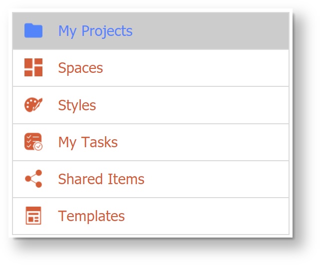
My Projects Homepage
The My Projects Homepage replaces the My Applications Homepage from prior versions.
- On the Designer Homepage, the top left menu has been update with new icons. You will notice that "My Projects" now replaces "My Applications."
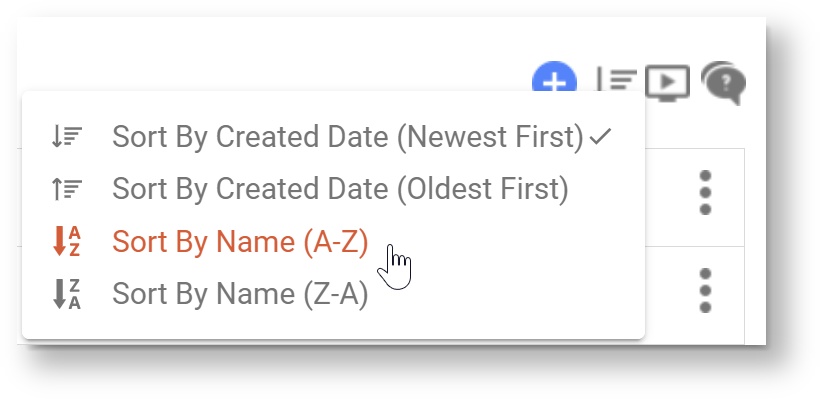
- The Projects Homepage now displays a list of your projects by the date they were created with the newest on top, making them easy to find. You can
 Sort projects by created cate or alphabetically by name. Applications created in prior versions will seamlessly transition to Projects. You may still upload files with the suffix _app.zip and they will be added to the Projects list. If you download a Project, you will see it has the new suffix _project.zip.
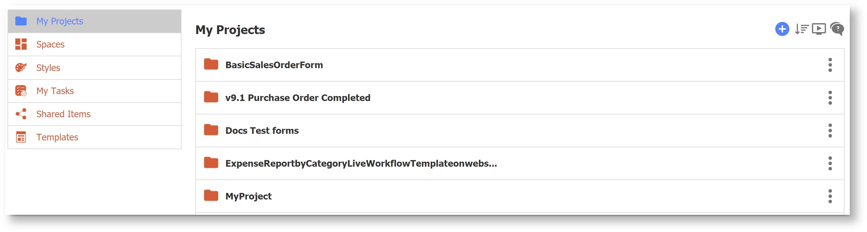
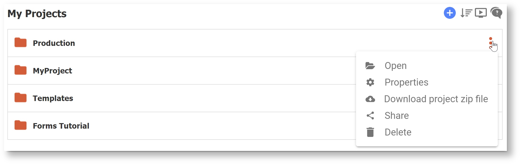
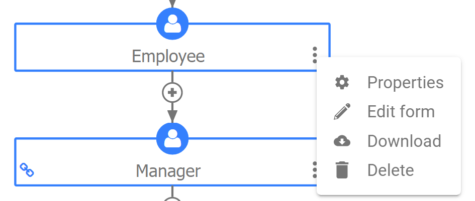
All of the operations that can be performed on a project are available by clicking on the Action Menu icon (three vertical dots) on the right side of each project, as shown below.
Menu Item
Description
 Open (Formerly Edit)
Opens the project.
 Properties
Allows user to customize the Name, Description, Layout, Style, Form Action Base URL and Doc Action Base URL.
Note that this is the only place where a project's properties are available.
 Download
Downloads a zip file. The zip file name will have a suffix of "_project.zip".
 Share
ShareProduces a share URL for the project. The URL will still contain '/app'.
 Delete
Delete the project (you will be prompted to confirm.)
Add Content/Install Prebuilt Templates
- Use the
 Add icon to add content.
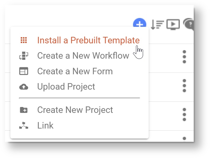
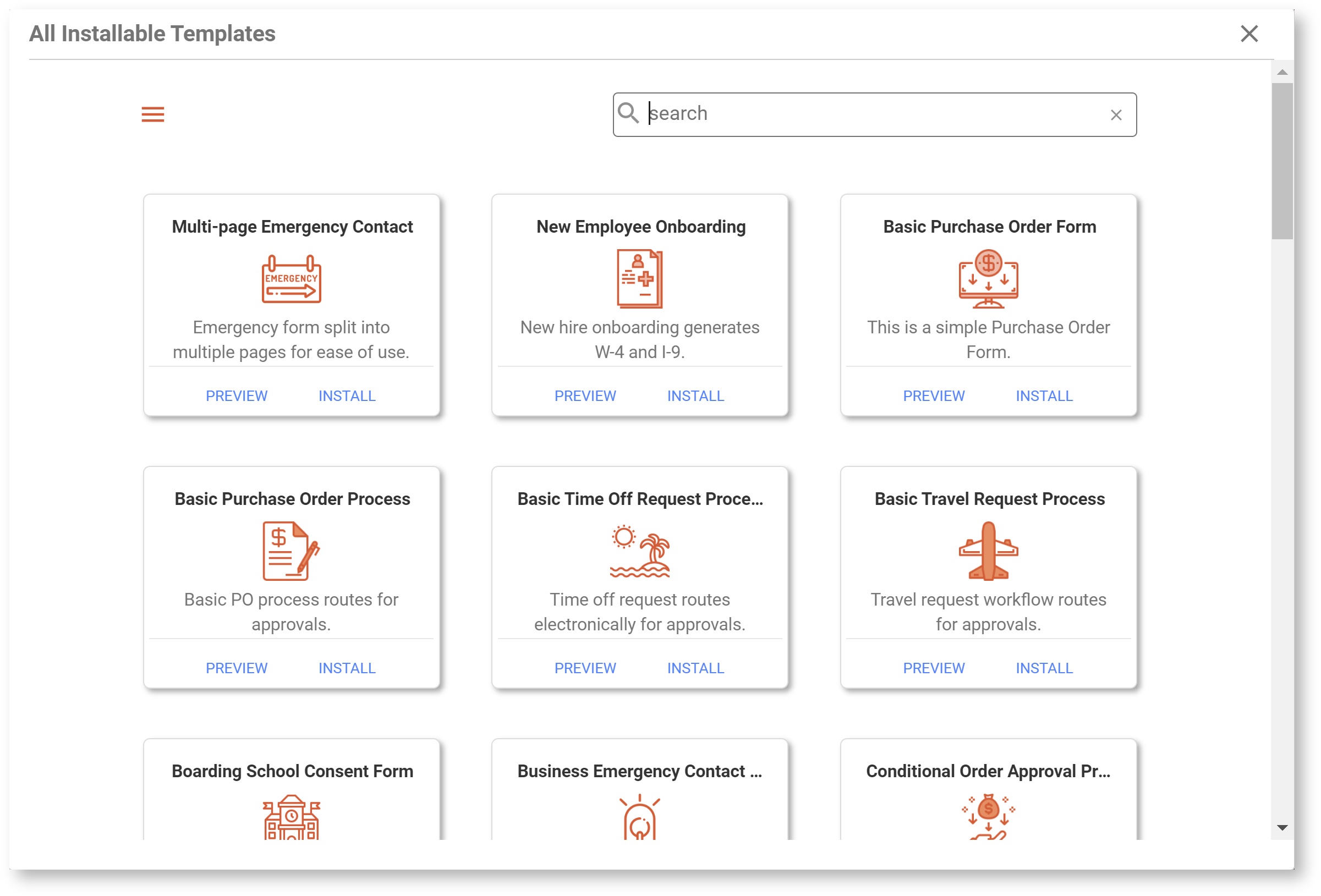
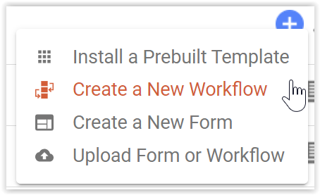
- Select Install a Prebuilt Template to access Global and Tenant Form and Workflow templates. This is an easy way to design a form starting with a commonly used process and customizing for your needs. On the Install Templates menu, you can filter by category, search by keyword, view the name and description of each template, and preview the template before installing.
- Selecting
 Create a New Workflow or
  Create a New Form will prompt you to either add the new content to an existing project or create a new project.
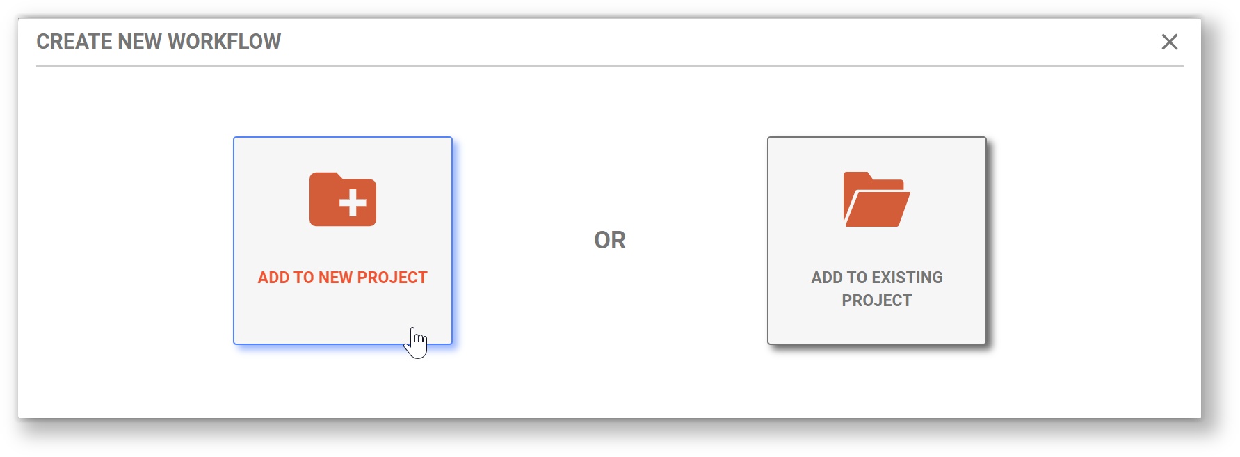
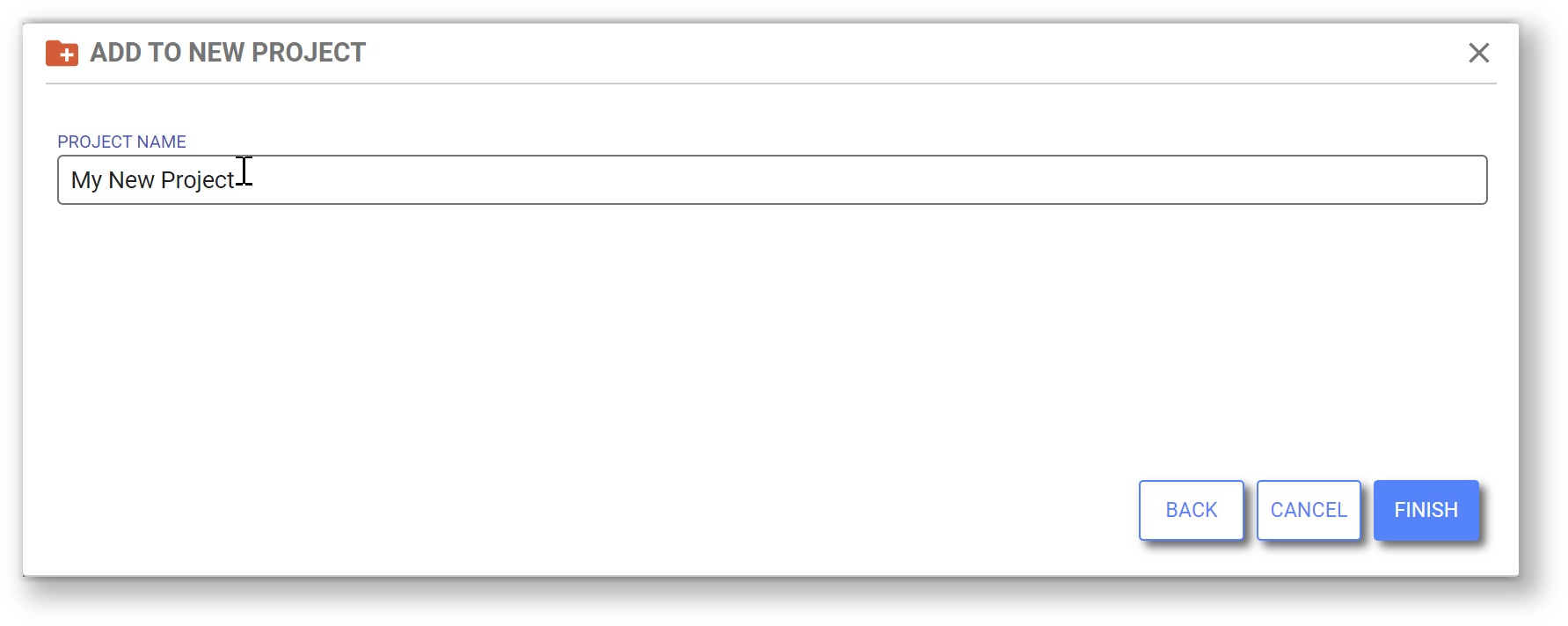
- Select Add to New Project to create a project. frevvo will prompt you to name the new project. Click Finish to create the project and the new form/workflow. You will be automatically sent to the Form/Workflow Designer where you can rename the Form/Workflow and begin customizing it.
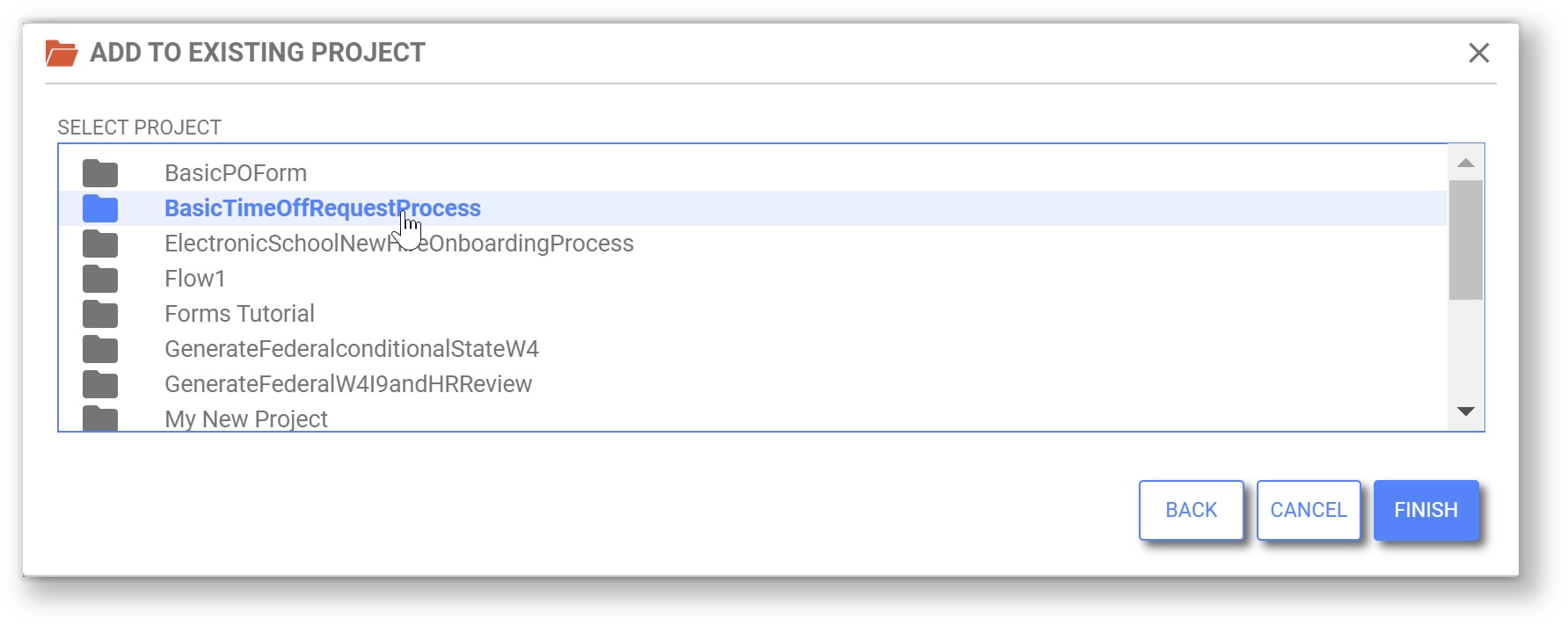
- Select Add to Existing Project to select from a list of your projects. After you select one, click Finish to go to directly to the Form/Workflow Designer where you can rename the Form/Workflow and begin customizing it.
 Upload Project functions as "Upload Application" did in prior versions. You can upload files with the suffix _app.zip to Projects.
 Create New Project will prompt the designer to name the new project. Click Finish to create the project and go directly to that Project's Forms & Workflows homepage.
 Link functions as "Link Application" did in prior versions.
Forms and Workflows Homepage
Within each project, forms and workflows are now listed together in the Forms and Workflows homepage. By default they are listed in order of last modified date. The user can sort the list based on last modified date or alphabetically using the sort icon above the list.
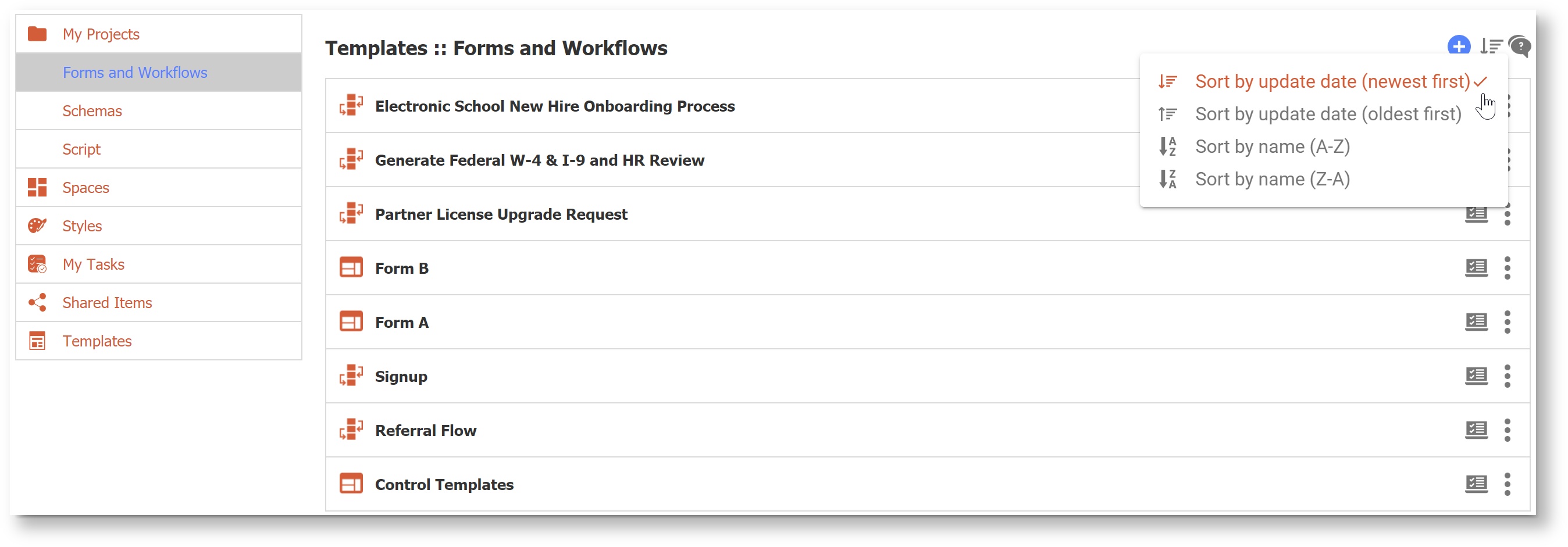
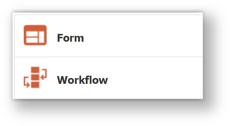
- The blue Add icon opens a menu of content that can be created within the current project.
- Select Install a Prebuilt Template to access Global and Tenant Form and Workflow templates. This is an easy way to design a form starting with a commonly used process and customizing for your needs. On the Install Templates menu, you can filter by category, search by keyword, view the name and description of each template, and preview the template before installing.
- Create a New Workflow and Create a New Form will create the content and open it in the appropriate designer where you can change the name and begin to customize.
- Upload Form or Workflow functions as prior version Upload operations did, though now will accept either a _form.zip or a _flow.zip file.
- Forms and Workflows are combined into one list, and can be identified as either a Form or Workflow by their icons.
- Click on the
 Test icon beside the action menu to quickly access the form/workflow test mode.
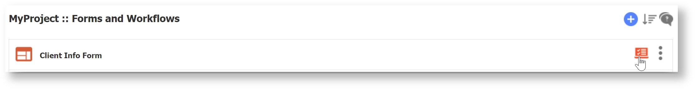
- Form and Workflow operations are now accessible via the
 Action Menu (three dots icon) to the right of the Form/Workflow name. Click on the Form/Workflow name to quickly open the Form/Workflow in its respective designer.
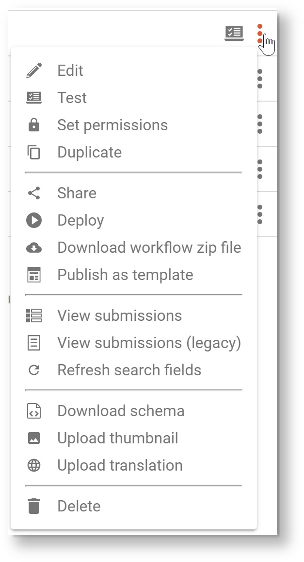
Menu Item Description  Edit
EditOpens the form or workflow in the appropriate designer.  Test
TestOpens the form or workflow in another browser tab/window in test mode.  Set Permissions
Shows the access control dialog.
 Duplicate
Creates a copy of the form or workflow. This function is extended to workflows in this release. ShareShows the share form or share workflow dialog.  Deploy/UndeployThis menu item and icon is dynamic. If the item is deployed, the menu item will be
 Undeploy . Download
Downloads a zip file.  Publish as Template
Same behavior and UI as in the previous release.  Submissions
Opens the Submissions view.  Submissions (Legacy)
Opens the Submissions (Legacy) view.  Refresh Search Fields
Same behavior and UI as in the previous release.  Schema
Same behavior and UI as in the previous release.  Thumbnail
Same behavior and UI as in the previous release.  Internationalize
Same behavior and UI as in the previous release. DeleteDelete the form or workflow. Deployed Forms & Workflows
In previous versions of frevvo, it was easy to see which forms or workflows were deployed based on the status of "deploy/undeploy" icon. In v9.1 the convenience of at-a-glance view for deployed forms and workflows has been preserved. Deployed forms and workflows will now appear in the list with a
 flag icon beside them. Here is an example of a list of forms and workflows in which one workflow is deployed:
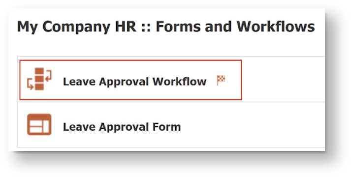
Schemas
The Schemas screen received a UI refresh in a similar fashion to the Projects and Forms/Workflows screens. Schemas are now sorted alphabetically by name and item numbers have been removed. Each item has a 3-dot item menu that contains all of the existing operations. Use the
 Add icon to upload a new schema.
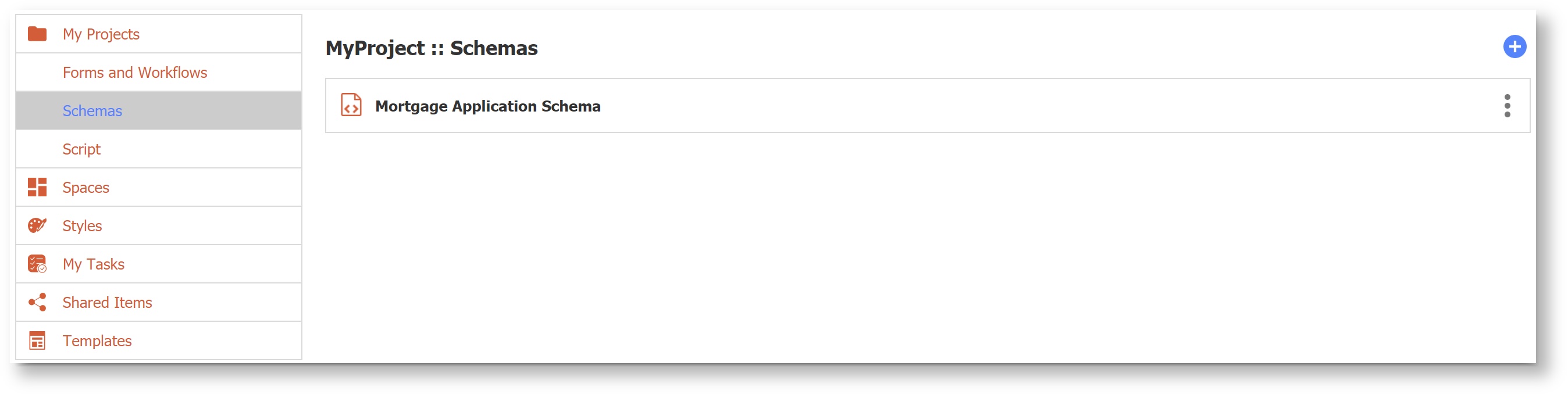
Script
The Script screen received a UI refresh in a similar fashion to the Projects and Forms/Workflows screens. The current script has an
Action menu that contains all of the existing operations. 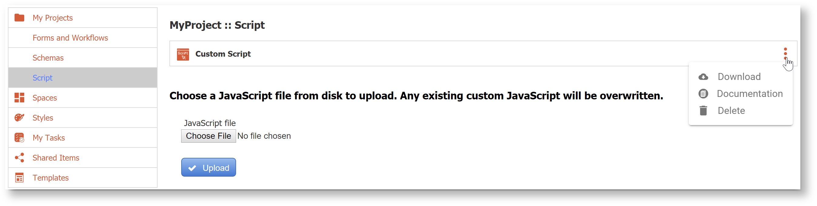
Spaces
The Spaces home page received a UI refresh in a similar fashion to the Projects and Forms/Workflows screens. Spaces are now sorted alphabetically by name and item numbers have been removed. Each item has an
 Action menu that contains all of the existing operations. Use the Add icon to create a new space. An added convenience for designers is that when creating a new space you will be directed immediately to the Space Designer to begin editing, rather than back to the Spaces home page.
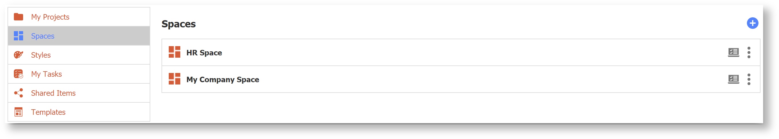
Styles
The Styles screen received a UI refresh in a similar fashion to the Projects and Forms/Workflows screens. Styles are now sorted alphabetically by name and item numbers have been removed. Each Style has an
Action menu that contains all of the existing operations. Use the  Add icon to create or upload a new style.
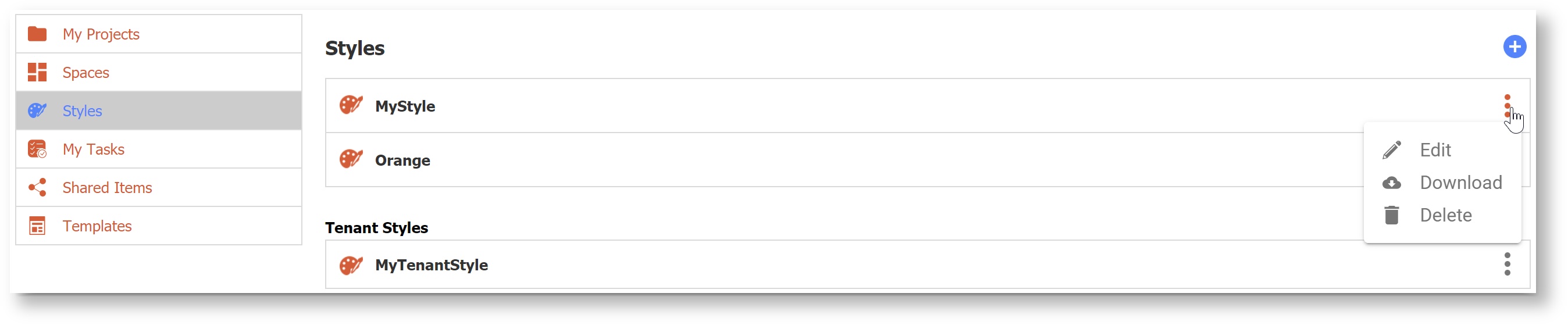
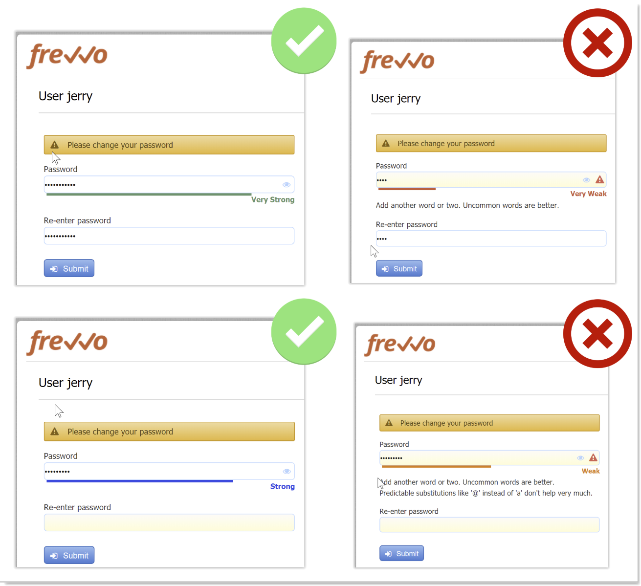
Enable Strong Passwords
This feature applies only to tenants using the default security manager.
Good security is a desirable feature and is becoming mandatory with compliance initiatives like GDPR. Tenant admins can now set password strength requirements on the Create Tenant or Manage Tenant screens. There are four password strength options (Fair, Good, Strong, Very Strong) or the field can be left blank if you do not want to enforce password strength. In v9.1, leaving this blank will still require a minimum password length of 8 characters. When you change the password strength requirement, users whose passwords do not comply will automatically be prompted to change their password on their next login.
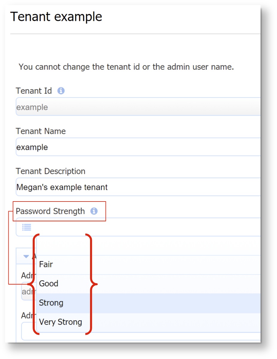
Definitions of Password Strength:
- none - uses system default, enforces a minimum password of 8 characters
- Fair - very guessable: protection from throttled online attacks. (guesses < 10^6) Strength Meter will indicate "Very weak."
- Good - somewhat guessable: protection from unthrottled online attacks. (guesses < 10^8) Strength Meter will indicate "weak."
- Strong - safely unguessable: moderate protection from offline slow-hash scenario. (guesses < 10^10)
- Very Strong - very unguessable: strong protection from offline slow-hash scenario. (guesses >= 10^10)
A user creating or resetting their password will be required to meet the password strength specified by the tenant admin. Password strength is indicated as the user types by a Password Strength Meter visible below the entry. There are no specific length or character requirements, but the meter will detect the strength of the password based on use of uncommon words or phrases and unpredictable use of capitalization, numbers and special characters. Helpful suggestions appear to prompt the user towards a stronger password. Password length is limited to 100 characters and an error message will appear if user attempts to enter more than 100 characters. Users cannot use their old password or a temporary password as the new password. Here are screenshots of what a user might see if the Tenant Password Strength is set to "Strong." Strong and Very Strong passwords use uncommon words or phrases and unpredictable use of capitalization, numbers and special characters.
Additional Enhancements
The Google Connector was automatically upgraded to v3.0.0 for Cloud customers. See the Google Connector v3.0.0 Release Notes for more detail.
- Generated PDF page break improvement: Controls can be prevented from having a page break in the middle of the control. For example, you may not want a checkbox control split with some options printed on one page and the rest of the options on the next page. In this case, place the checkbox control inside a group control (such as a section or a panel) and apply the CSS Class property f-page-break-inside-avoid to the group control. If the control would have had a page break inside the control, this property will cause the entire control to print on the next page. If you have nested group controls, the outer group control f-page-break-inside-avoid CSS Class property takes precedence.
- Enhanced Submission filter allows both upper- and lower-case search.
v9.1 Migration Considerations
Updated Built-In Data Names
With the transition from "Applications" to "Projects," some of the built-in data used in rules and templates is updated in v9.1. The following built-in data has been added:
- form.project.id - The unique id associated with the project of the given form
- project.id - The unique id associated with a given project. See Sharing Forms.
- project.name -The name of the project.
The corresponding application equivalents (form.application.id, app.id, and app.name) will be available for a limited time and may not be supported in a future release. Designers should update their forms/workflows to use the new built-in data at their earliest convenience.
Table Column Printable Property
Designers can now set the table column printable property using rule code. Here is an example. Line 1 will set the entire column's printable property to false; lines 2-4 show an example of how to make individual cells not printable. Keep in mind that the column setting will override the setting of individual cells.
Col2.printable = false;
for (var i=0; i<Col2.value.length; i++) {
  Col2[i].printable = false;
}
Setting a column to printable is a feature introduce in the v7.4.19 patch for in-house customers and v9.1 for Cloud customers. If you were using a rule to set a column to printable in a prior version, edit the rule and re-save it to ensure that the column setting takes effect.
Control Validation Errors
In prior versions, controls whose type was changed (i.e. from date/time to date) after initial design could give an unexpected error when the user entered valid values. This has been fixed, but for workflows that had this error in prior versions, customers should take these steps to trigger the updated type definition:
- See Administrator Best Practices for information on updating a workflow in production.
- Choose one of these methods to fix the control:
- Delete the control with errors and re-add it.
- Change the control type (i.e. from date/time to date).
- Save the workflow step and then save the workflow.
- Return to the designer and change the control back to it's original type,
- Save the workflow step.
- Save the workflow.
Visual Rule Builder
Functions for Date/Time Controls
The Date/Time control type is meant to represent a point in time, so certain functions in the Visual Rule Builder (year, month, day, hour, minute) are not available on this control type.
Change to Function for Concatenate
In prior versions, the '+' operator could be used in the right-side of expressions for either addition of numeric values or concatenation of strings. However, using the '+' operator for both functions could cause browsers to hang on longer expressions. Starting in v9.1, the '+' operator will be used only for addition. Use the function concat(text1, text2, text3) to concatenate text strings.
- Rules that previously used the '+' operator to concatenate will automatically be converted to the concat() function.
- To concatenate items in v9.1 or later, use the concat() function as shown in this rule example.
- Rules created in v9.1 or later will show an error message if '+' is used with string values and users will be prompted to use the concat() function instead.
Documentation Links
Some of our terminology was updated in v9.1, such as "Applications" to "Projects" and "flow" to "workflow." As a result, some page titles in our documentation and their URLs have changed. If you have our documentation bookmarked, please use the left-hand page tree to navigate the documentation and update your bookmarks so that you can always find what you are looking for.
- On the Designer Homepage, the top left menu has been update with new icons. You will notice that "My Projects" now replaces "My Applications."
v9.2 New Features
frevvo v9.2 includes exciting features for both new and experienced designers that help you create workflows easily and better utilize your current content. To see all of the new features for v9.2 visit our Detailed Release Notes page. Here are some highlights to get you started:
Watch our 30-minute What's New in v9.2 Webinar for a tour of our favorite new features!
Workflow Design Wizard
Creating workflows is faster than ever with frevvo's built in Workflow Design Wizard! Simply click "Create a New Workflow" from your Projects or Forms and Workflows home page to launch the wizard. Here's a quick video of how it works:
Error rendering macro 'multimedia' : com.atlassian.renderer.v2.macro.MacroException: Cannot find attachment 'Workflow Design Wizard Low2.mp4'Search
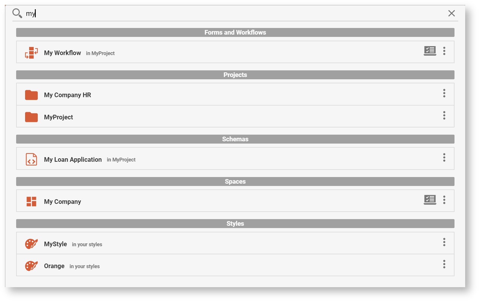
We are excited to roll out a search feature that many customers have asked for. Search can be used to search for the following content items owned by, or shared with, the user:
Forms and Workflows (including shared items)
Projects
Schemas
Spaces
Styles
Scripts
On each user's homepage, they will see a magnifying glass icon in the orange header bar. Search is available on any of the left-hand menu items (Projects, Spaces, etc.) It will not appear inside the Form or Workflow Designer screens.

Click on the search icon to open a Search Box. The cursor will automatically appear inside the search box and you can begin typing your search criteria.
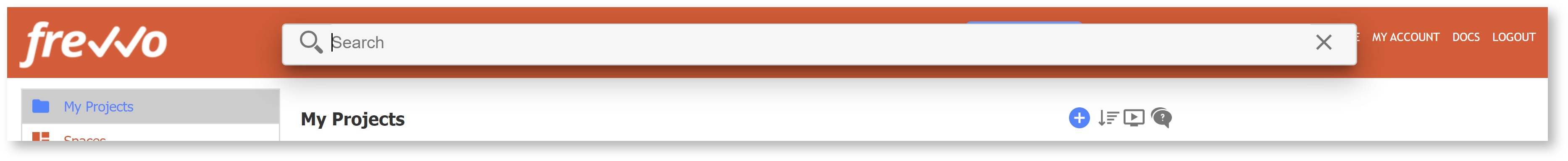
Begin typing a few characters to start the search. Search looks for the criteria in the name and description of the user's content. Results will appear when the user pauses or finishes typing. Continue typing to narrow the search. The results will disappear when the user clicks away from the search/results window.
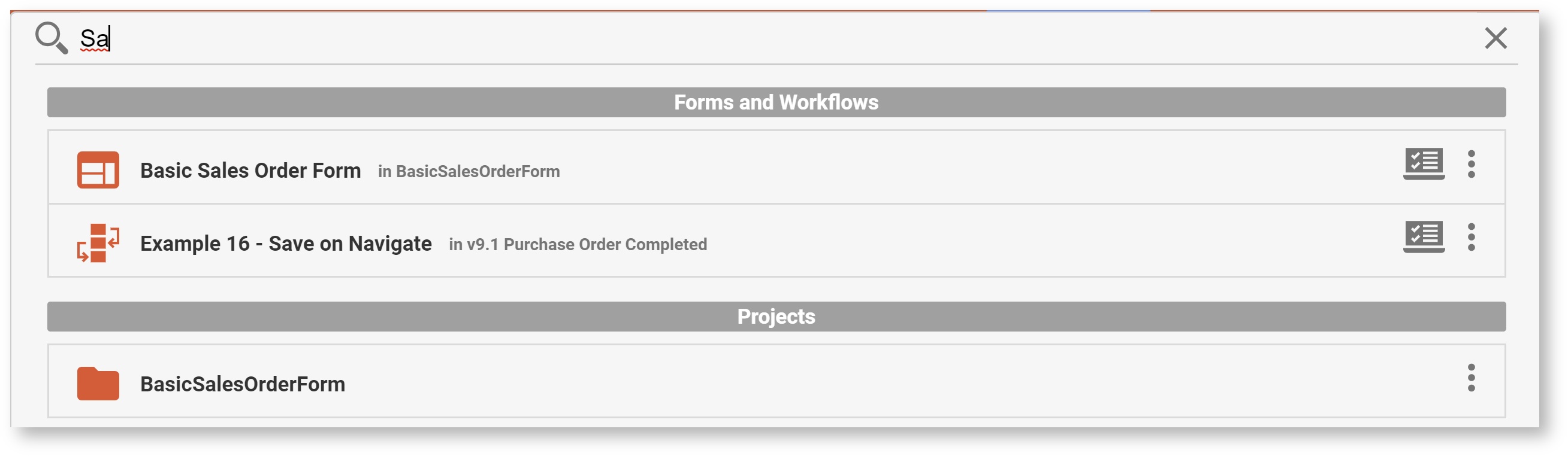
Results will show up to 20 items in each of the categories below, in this order. If there are fewer than 20 items in a category, more results can be offered for the next category. There will always be a maximum of 120 results. The results include icons indicating the type of resource (i.e. form or workflow), and also indicates the location of the resource, such as the project name.
Forms and Workflows (including shared items)
Projects
Schemas
Spaces
Styles
Scripts
To search your task list, continue to use the Search Tasks feature.
This Search feature currently does not search for controls within forms or workflows. You can search for controls by opening your form or workflow designer, and using your browser search function (i.e. Ctrl-f) to search for a control name.
v9.2 Migration Considerations
Resource Names & Descriptions
In v9.2, Names and Descriptions of resources (forms, workflows, projects, styles) will be truncated to 255 characters, and Space names truncated to 50 characters, to improve resource index for search. Existing resources with longer names will also be truncated, so you may see your current projects, forms, workflows, etc. with their names shortened if they were very long.
Refresh Searchable Items
The Refresh Searchable Fields option on the Tenant Admin and Server Admin page has been re-titled "Refresh Searchable Items." It now includes the ability to refresh the searchable fields in forms/workflows or the resources used by the Search Feature (projects, forms, schemas, etc.) Cloud customers still need to contact frevvo to request a tenant-wide refresh of searchable items.
Upgrade Threshold
A minimum prior version of v7.0 is required for upgrade to v9.2+. The frevvo infrastructure team has verified that active Cloud customers have met this requirement.
API Applications must support TLS 1.2
The frevvo server was recently upgraded to support TLS 1.2. frevvo will drop support for TLS 1.0 and TLS 1.1 on May 25, 2020. Cloud Customers using the frevvo client API library must revise their applications to support TLS 1.2 as soon as possible and no later than May 25, 2020. You may implement these changes immediately. If you do not update your application to support TLS 1.2, your API application may stop working on May 25, 2020.
Guided Designers
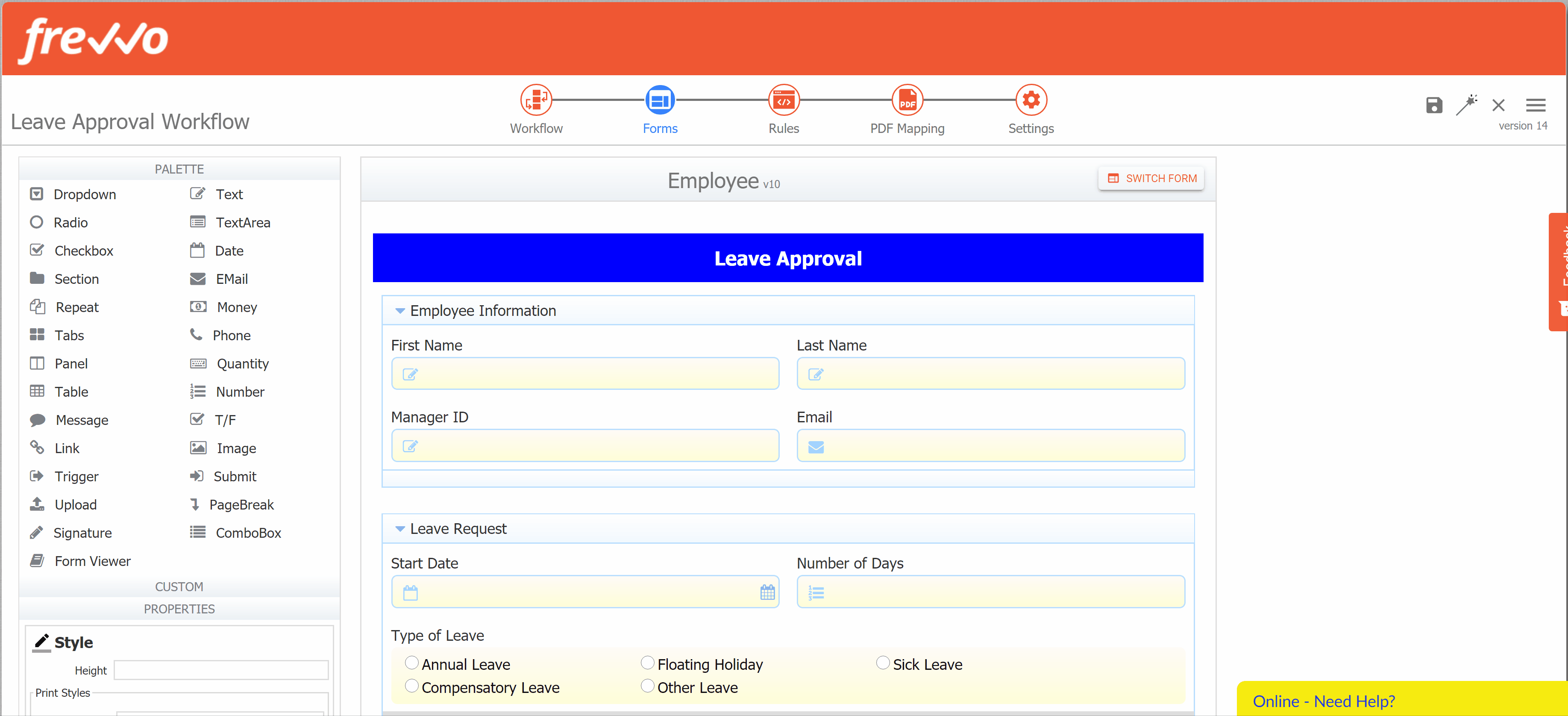
The Form Designer and Workflow Designers have a new look with improvements to speed up your design process. The new navigation icons at the top of the page help you step through an efficient form/workflow design process, but you can also switch between them as needed with just a click.
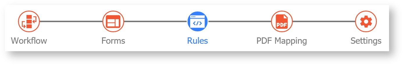
Guided Form Designer
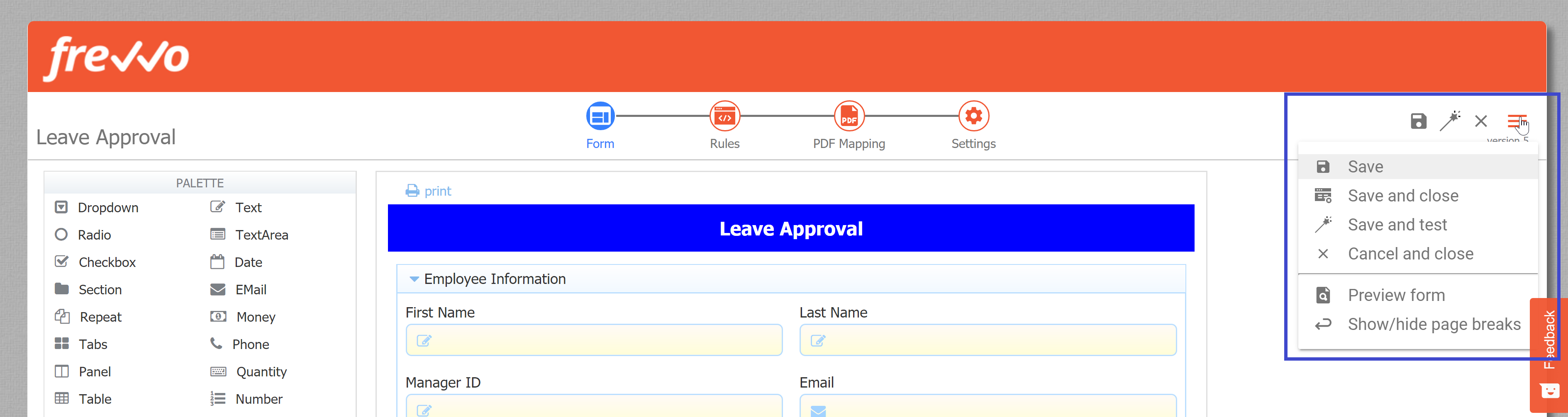
You will notice that the header on the Form Designer has been replaced by the Guided Designer navigation header. This allows you to quickly switch between adding and editing controls on your form to building custom logic with business rules to mapping a PDF and modifying the overall form settings. You also have a menu of actions such as Save, Test, and Preview in the upper right corner.
Form Name
Your form name will always show in the top left corner, and you can edit it here as well by clicking the pencil.
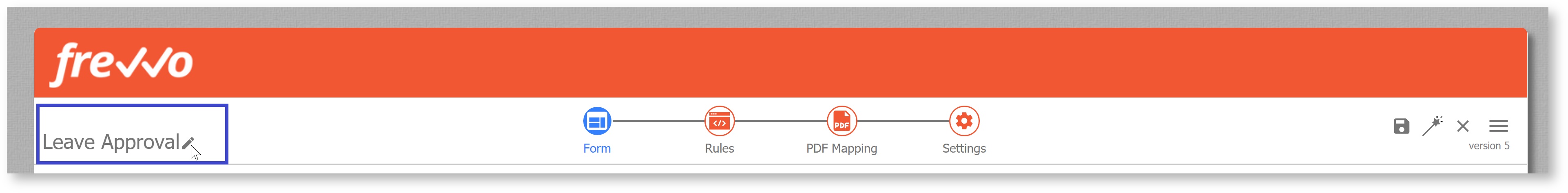
Action Menu
Use the action menu to save, test, and more. Visit the Forms page for a description of each action. Additionally, you will see your version number just below the dropdown icon.
Form
This mode allows you to add controls to your form and edit their properties via the left side Properties panel. Notice that you no longer see overall form properties here (view those in Settings.)

Notice that when you first open the Form Designer editing mode, or anytime you click the Form icon in the navigation bar, the Properties panel on the left side will say "Select a control on the form in order to view and edit its properties here." In past versions you saw an overview of the Form Properties here; starting in v10.0 this panel is exclusively used for Control Properties. You can view all of your Form Properties by selecting the Settings editing mode from the navigation bar.
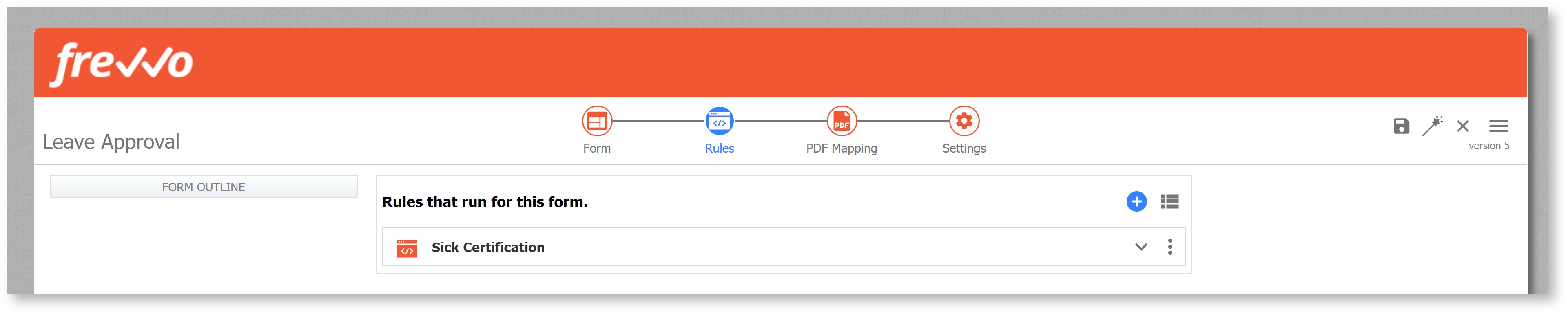
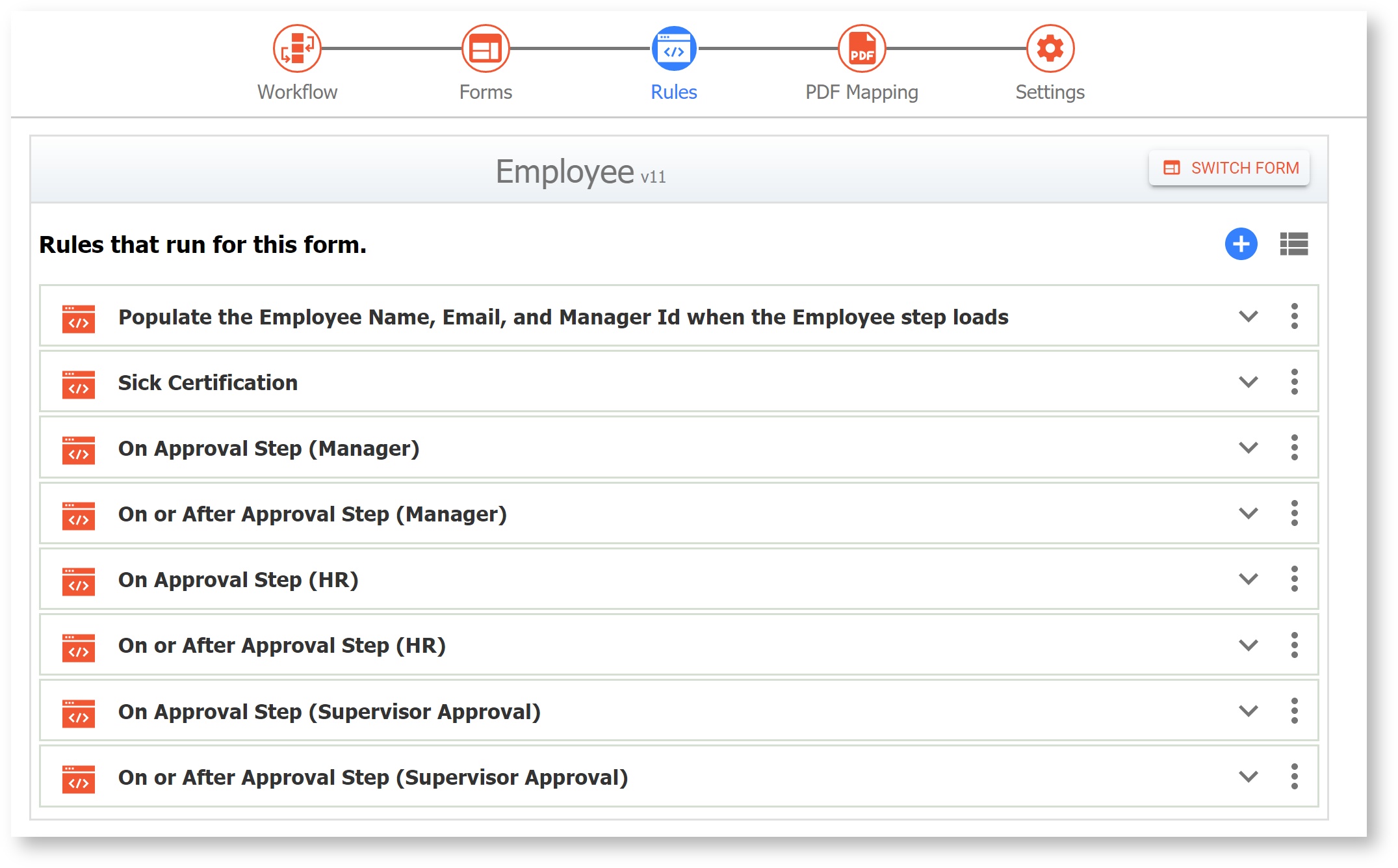
Rules
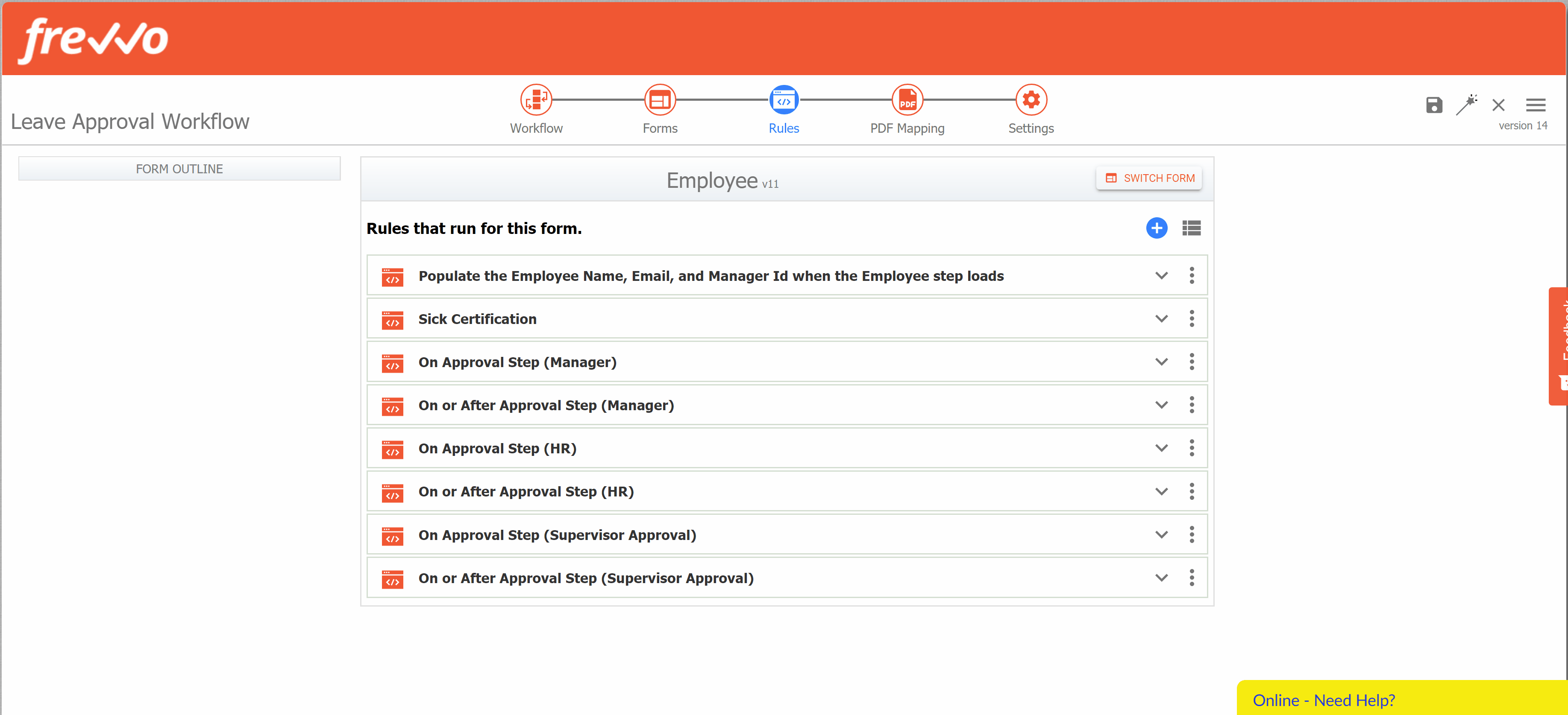
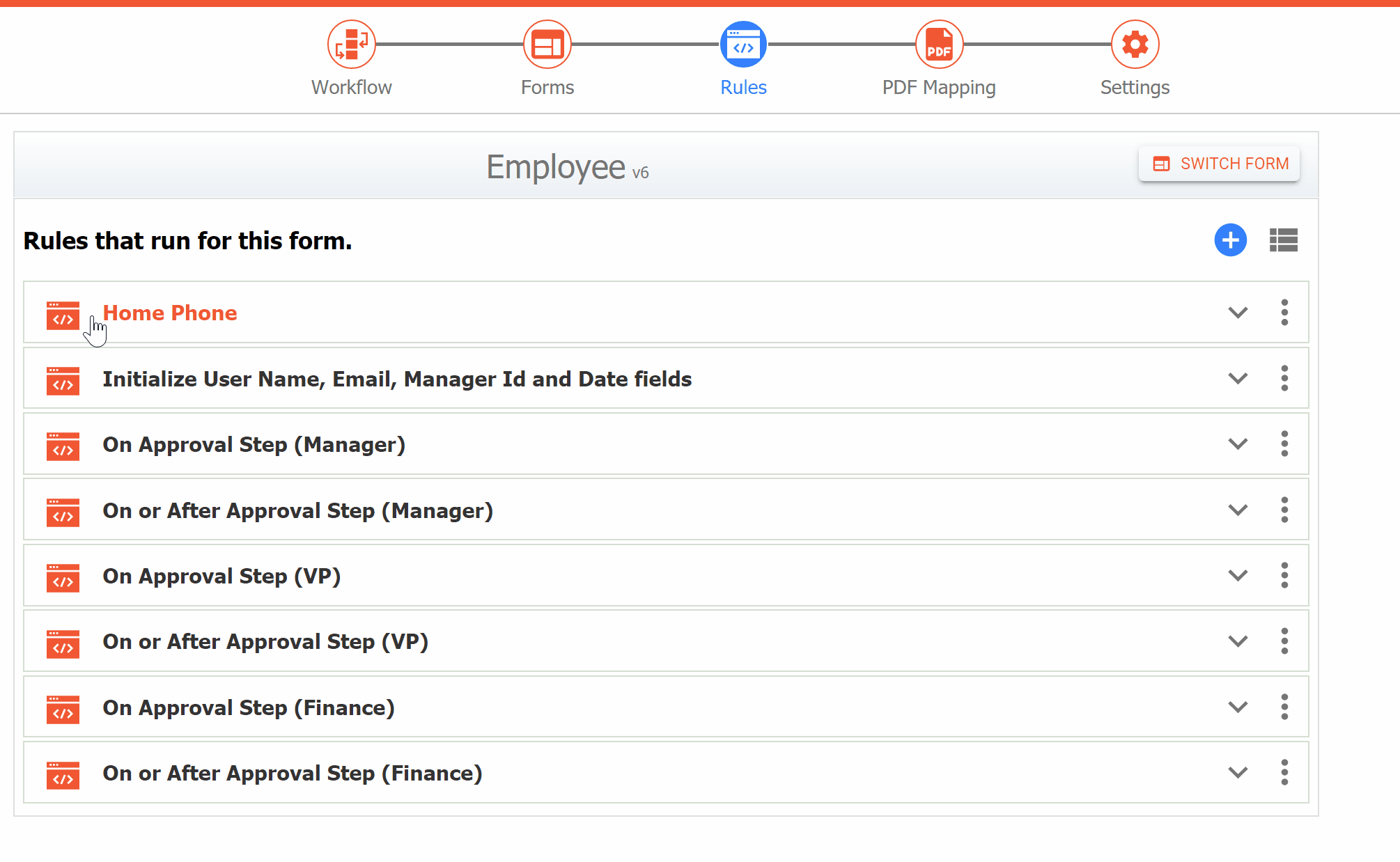
The rules mode is where you will add and edit business rules to customize form behavior. While you're there, check out these additional enhancements to the Rules list.
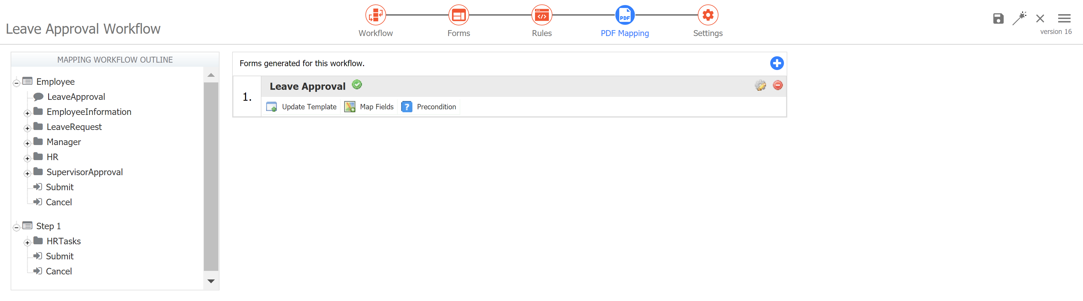
PDF Mapping
Access, add and edit custom PDFs you are generating for this form.

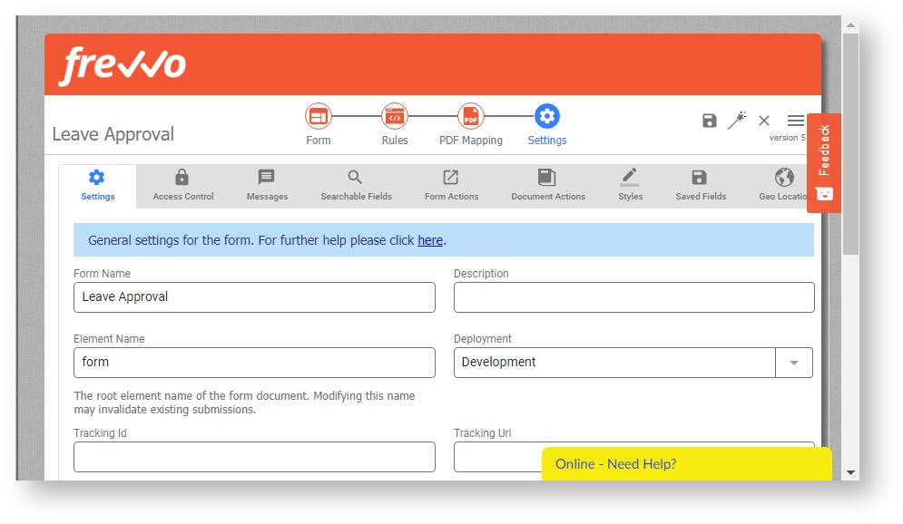
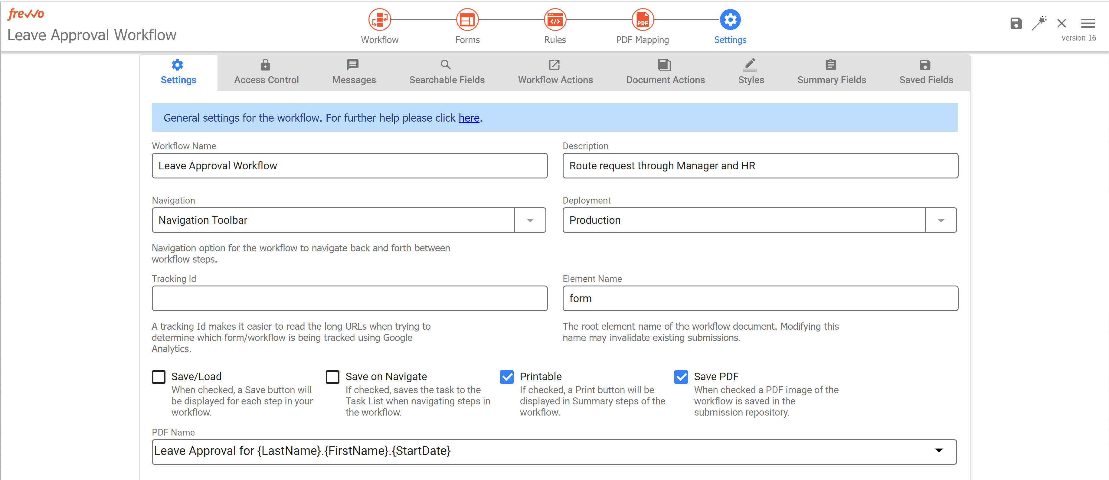
Settings
Settings mode displays your familiar Form Properties Wizard previously accessed as a popup window when you clicked the cog icon. Now it has much more space so it's easier to view and edit your form properties, and it's responsive when you change your window size.

Guided Workflow Designer
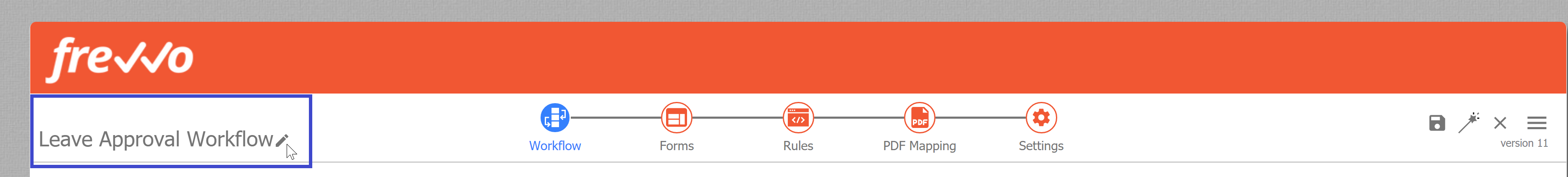
Workflow Name
Your workflow name will always show in the top left corner, and you can edit it here as well by clicking the pencil.
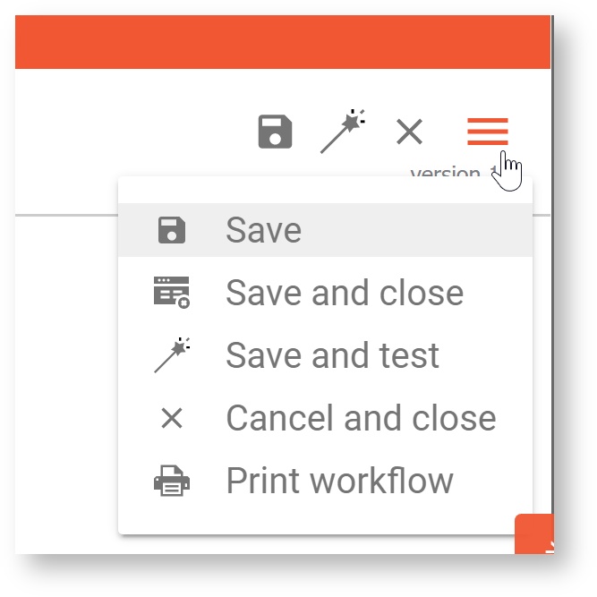
Action Menu
Use the action menu to save, test, and more. Visit the Action Menu documentation for a description of each action. Additionally, you will see your version number just below the dropdown icon.
Workflow
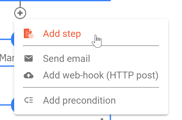
One of the biggest changes you'll see is the great new workflow outline look! The workflow outline now has narrower boxes with an action menu, and they also have icons that you can customize. Consider printing a screenshot of your workflow outline to use as a proof of concept or wireframe when planning a workflow with your team.
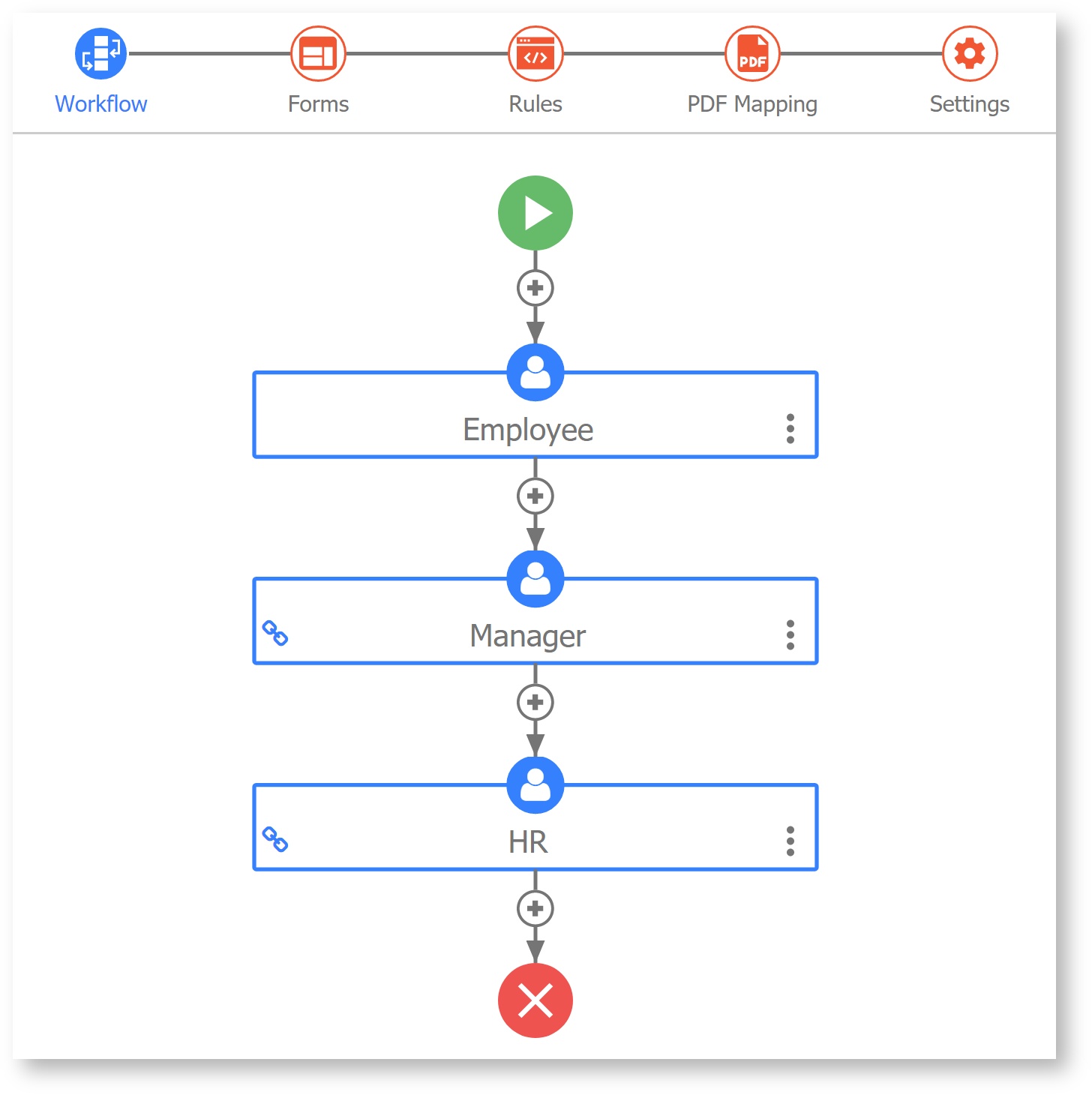
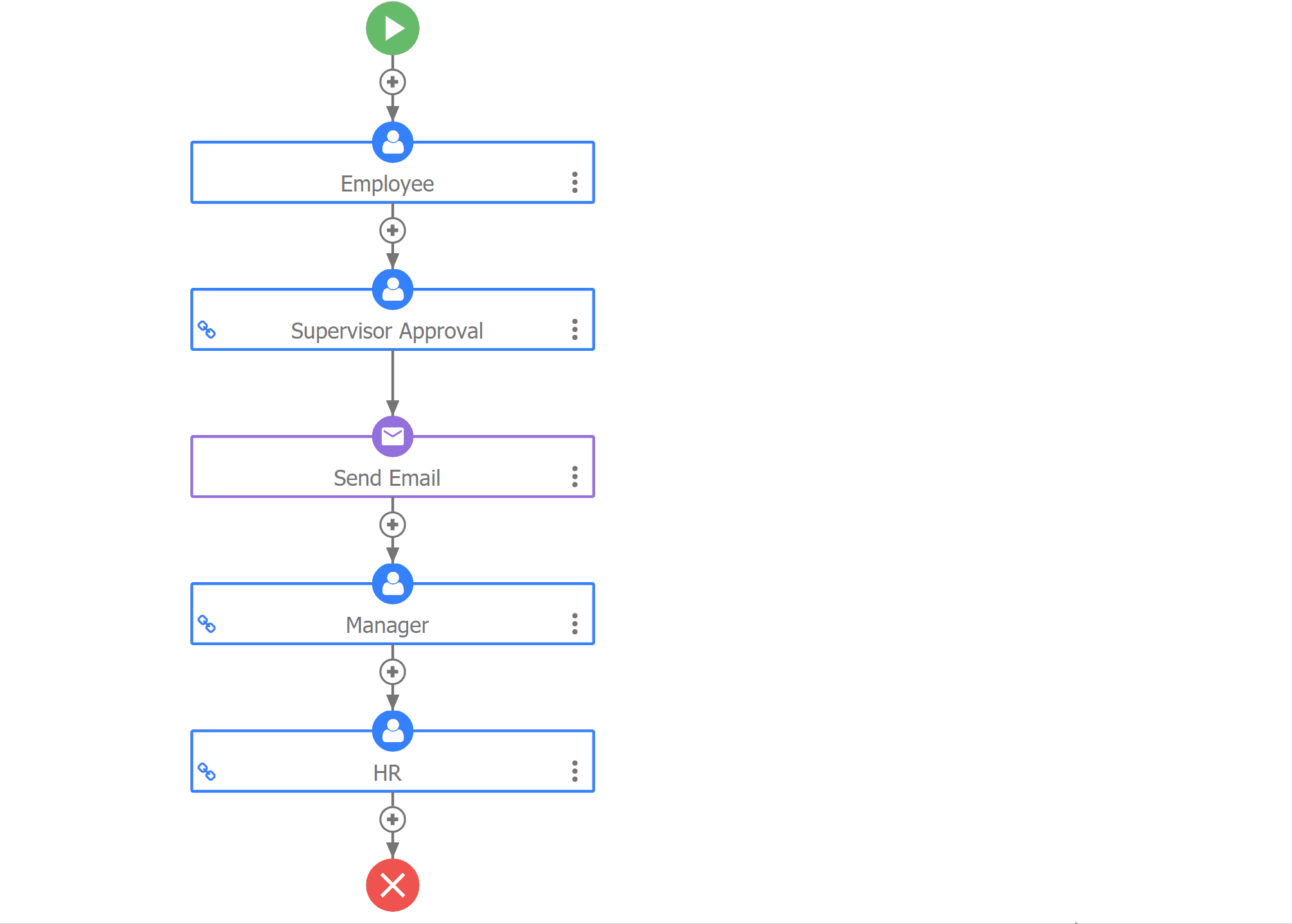
Activity Document Actions (Email and Web Hook) will appear on your workflow outline, making it very clear what actions happen on each step.
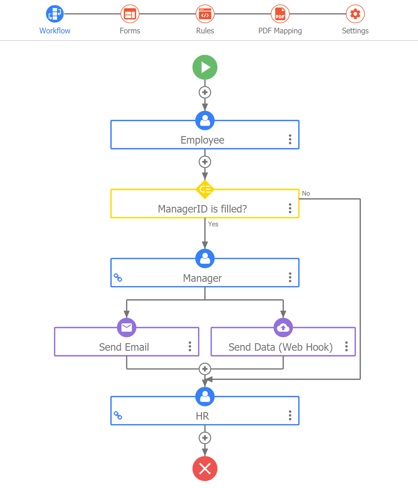
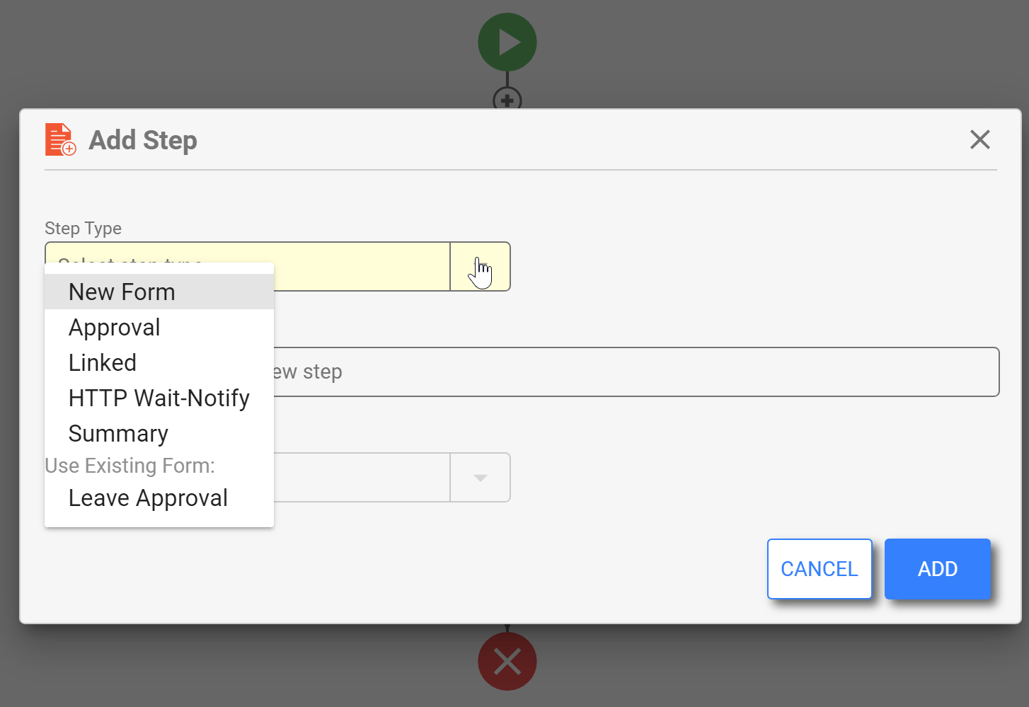
Quickly add steps, preconditions, or Activity doc actions using the + icon between steps with a handy wizard tool.
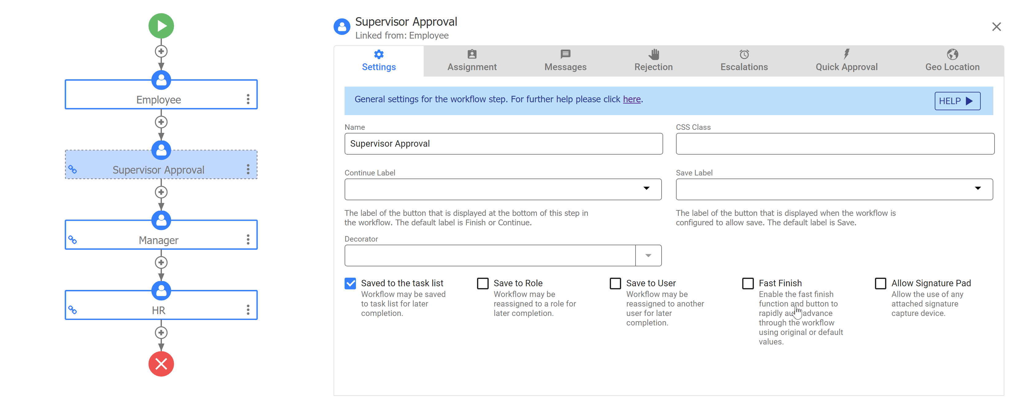
Drag and drop steps to change their order.
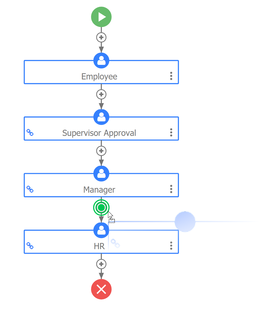
Copy (alt-drag) Email or Web Hook steps to copy them to other workflow steps.
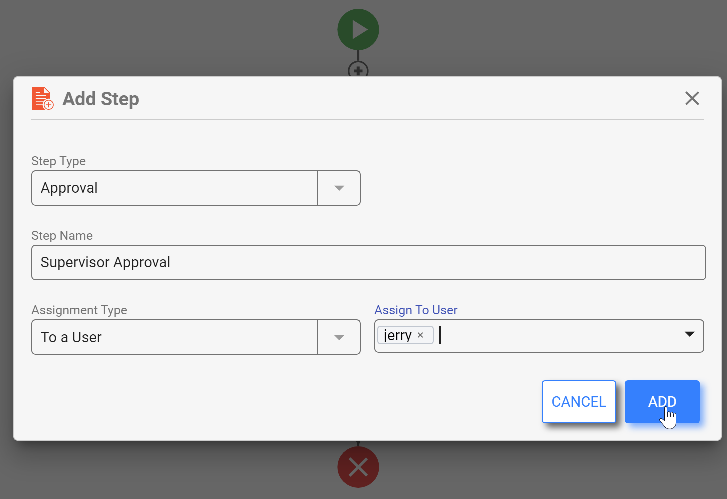
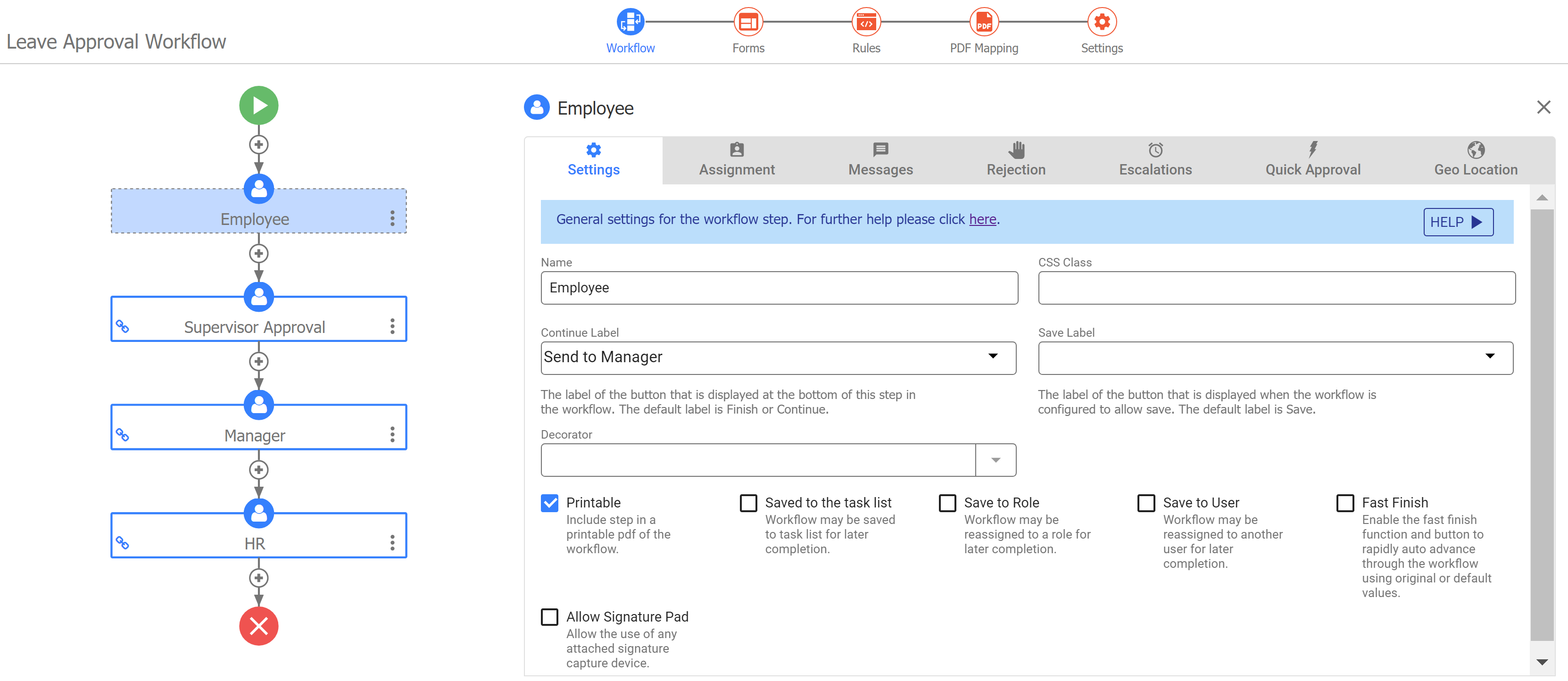
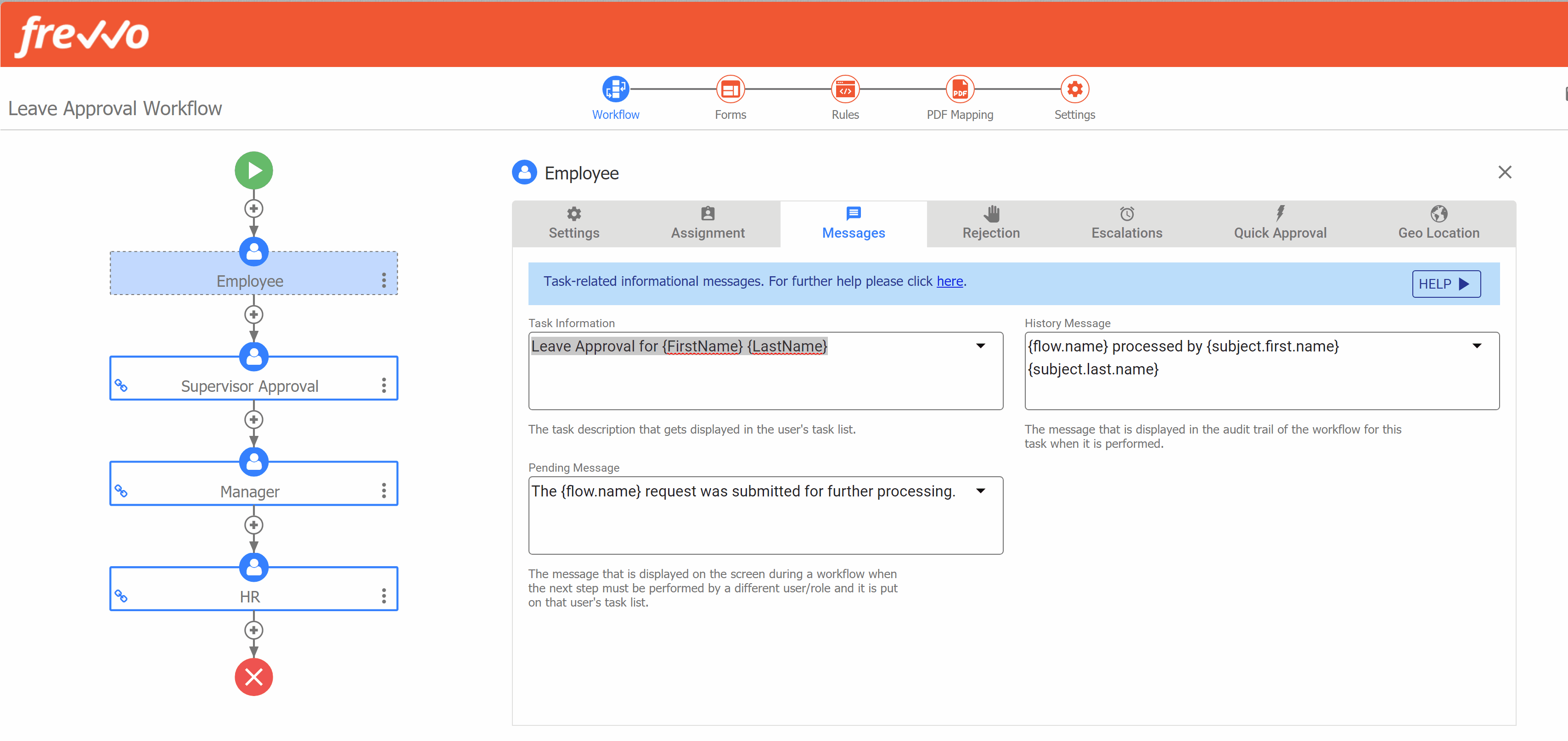
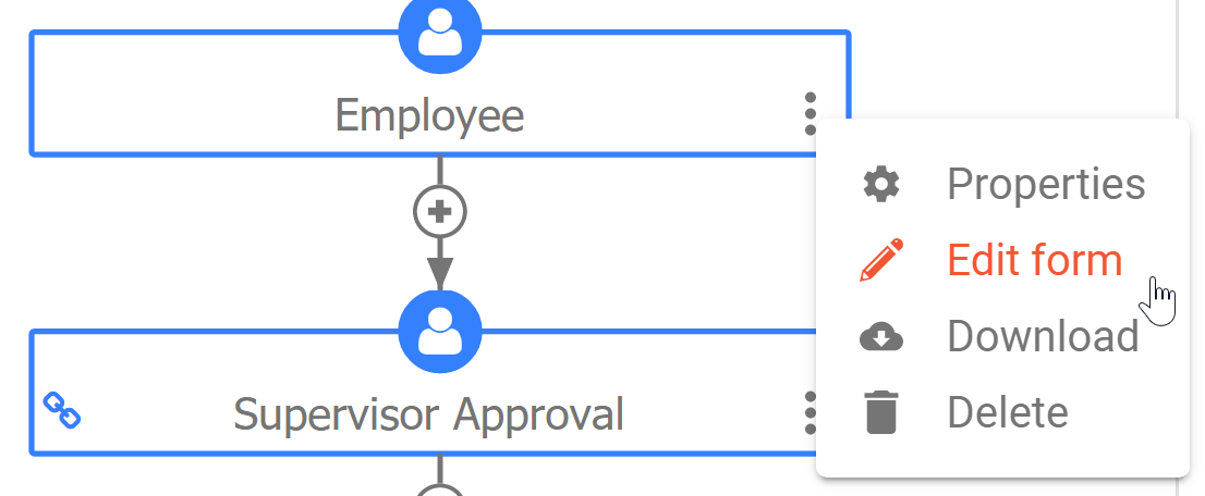
Workflow: Step Properties
Simply click on any step to view it's properties wizard right there on the canvas. Keeping the workflow outline in view gives you context for the properties you're working on. You now also have the ability to switch between steps while remaining on the same properties tab. We find this super time saving when making lots of similar changes to workflow steps, such as changing the Task Info message for every step of a workflow.
Forms
This is where you can edit the forms included in your workflow.
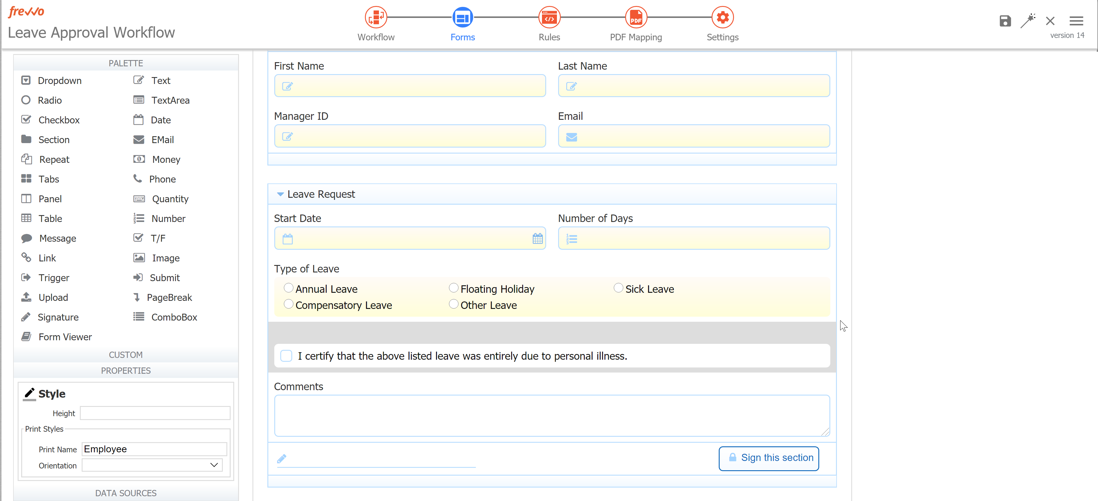
Click Switch Form  to change to a different form in your workflow.
The form that appears will be the step or linked step you last selected in the workflow outline. You can also get to the Forms mode by clicking the Action Menu on any step and selecting Edit.
Print Name Property in Workflow Steps
In past versions, a form used as a workflow step had a Form Name property independent of the Workflow Step Name property. The Form Name was primarily used as the filename when printing a workflow step. In v10.0, the printable PDF filename can be edited using the Print Name property, located in the Forms editing mode in the left-side properties panel.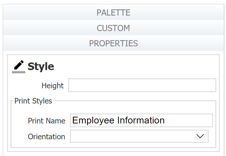
Rules
The rules mode is where you will add and edit business rules to customize form behavior. While you're there, check out these additional enhancements to the Rules list.
Just like the Forms mode, you can Switch Form to view and edit rules for another form in your workflow.
PDF Mapping
Access, add and edit custom PDFs you are generating for this workflow.
Settings
This is your familiar Workflow Properties Wizard previously accessed as a popup window when you clicked the cog icon. Now it has much more space so it's easier to view and edit your workflow properties, and it's responsive when you change your window size.
Saving Changes
We've added two new ways to save your work.
Your changes are temporarily saved in memory when you move from one screen to another within the Guided Designer, switch between forms in a workflow, or switch between steps on Workflow Step Properties. You can quickly, and safely, navigate the the Guided Designer without losing your work.
You must still Save, Save and Test, or Save and Exit before leaving the Guided Designer (i.e. closing the window, clicking the 'back' button in your browser, or clicking
 Cancel and Close.)
 Save without closing: You can now Save your work and remain on the current page instead of being navigated back to the Forms & Workflows homepage. This is super handy for saving time while designing forms!
Notice our Save icons have been updated and look great!
- Save without closing saves your work but keeps you on the current page.
 Save and Test
 Save and Close returns you to the Forms & Workflows list.
 Cancel and Close cancels all changes and returns you to the Forms & Workflows list.
Business Rules Enhancements
The Business Rules list been enhanced with a similar user interface to the other list views in frevvo, along with the much-requested ability to drag-and-drop to reorder rules.
Reorder Rules
It's easy to change the order of your rules. Simply click and hold any rule, and drag it to the place in the list you want to move it. You may also use the "Move down," "Move Up," "Move Top," and "Move bottom" options in the rule's Action Menu. These feature is helpful when you want to group your rules by workflow step, action or control type.
New User Interface
The Rules list now features
 Add icon to create a new rule. New rules will now be added to the top of the list so you can start editing them without scrolling.
- New icon for View all Rules

- Action menu
 with options to expand/collapse, delete, enable/disable, or move the rule
Switch Form button to view rules for a different form in your workflow
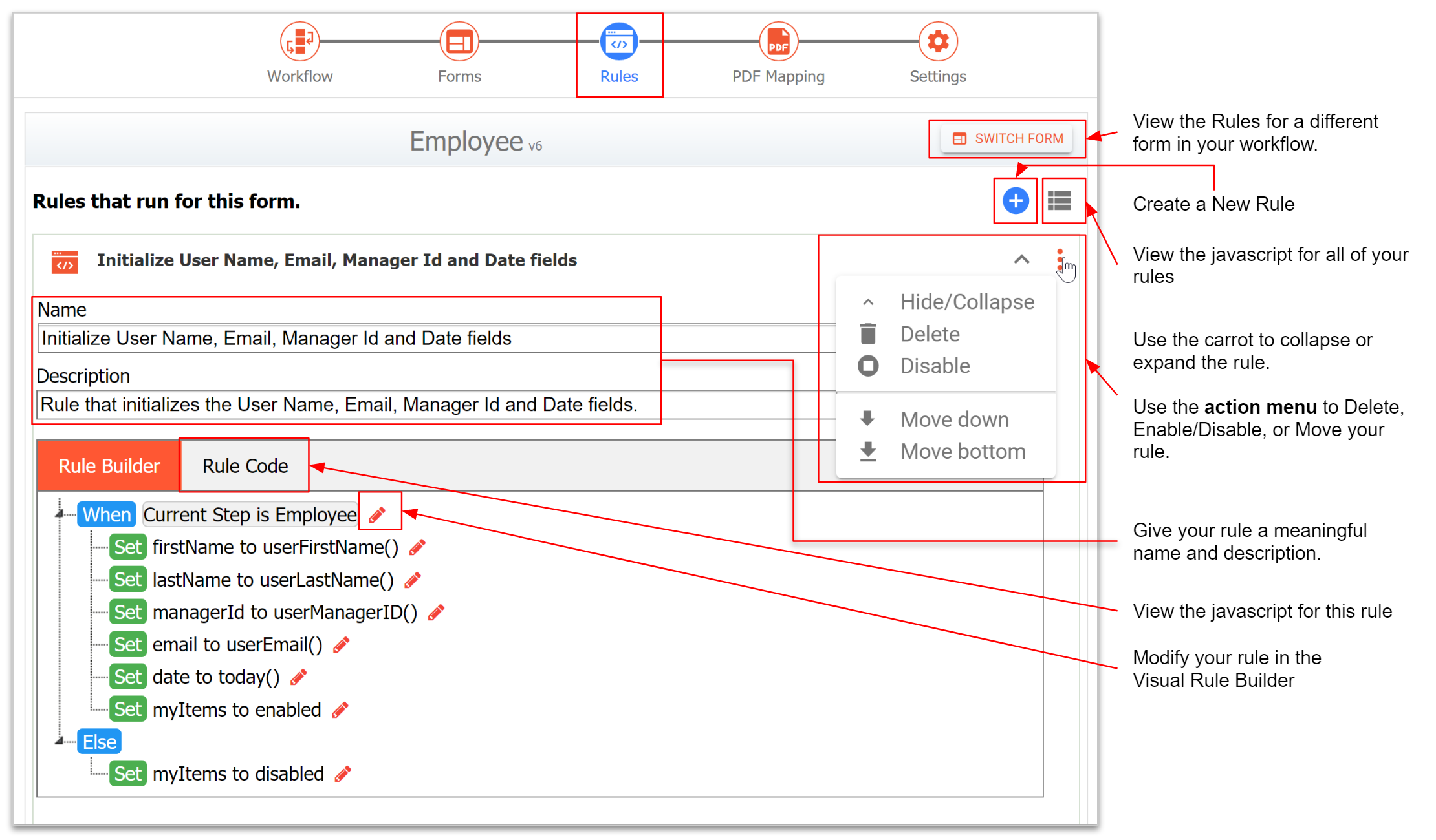
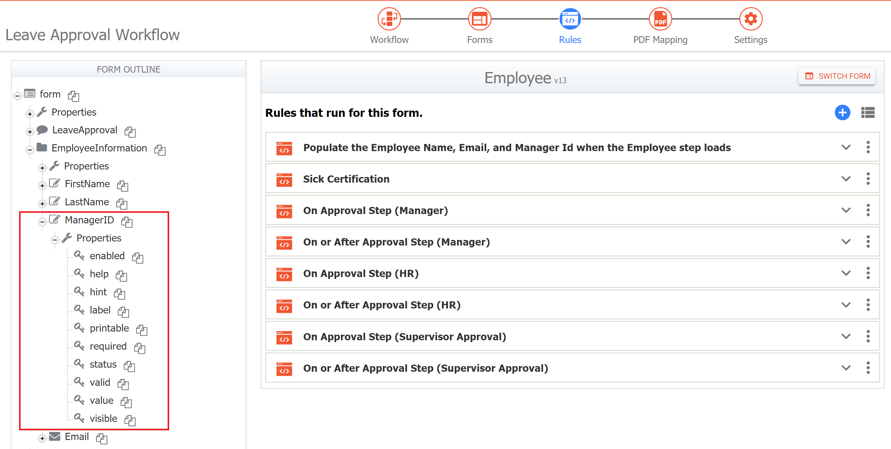
In prior versions, a Control Properties panel appeared on the Rules page above the Form Outline. With v10 the Properties Panel is gone. Instead you will notice that when a control has focus (is selected) in the Form and you move to the Rules page, that control will be expanded in the Form Outline. This give you access to view the control's properties that are available to you in the Rule Builder/Editor.
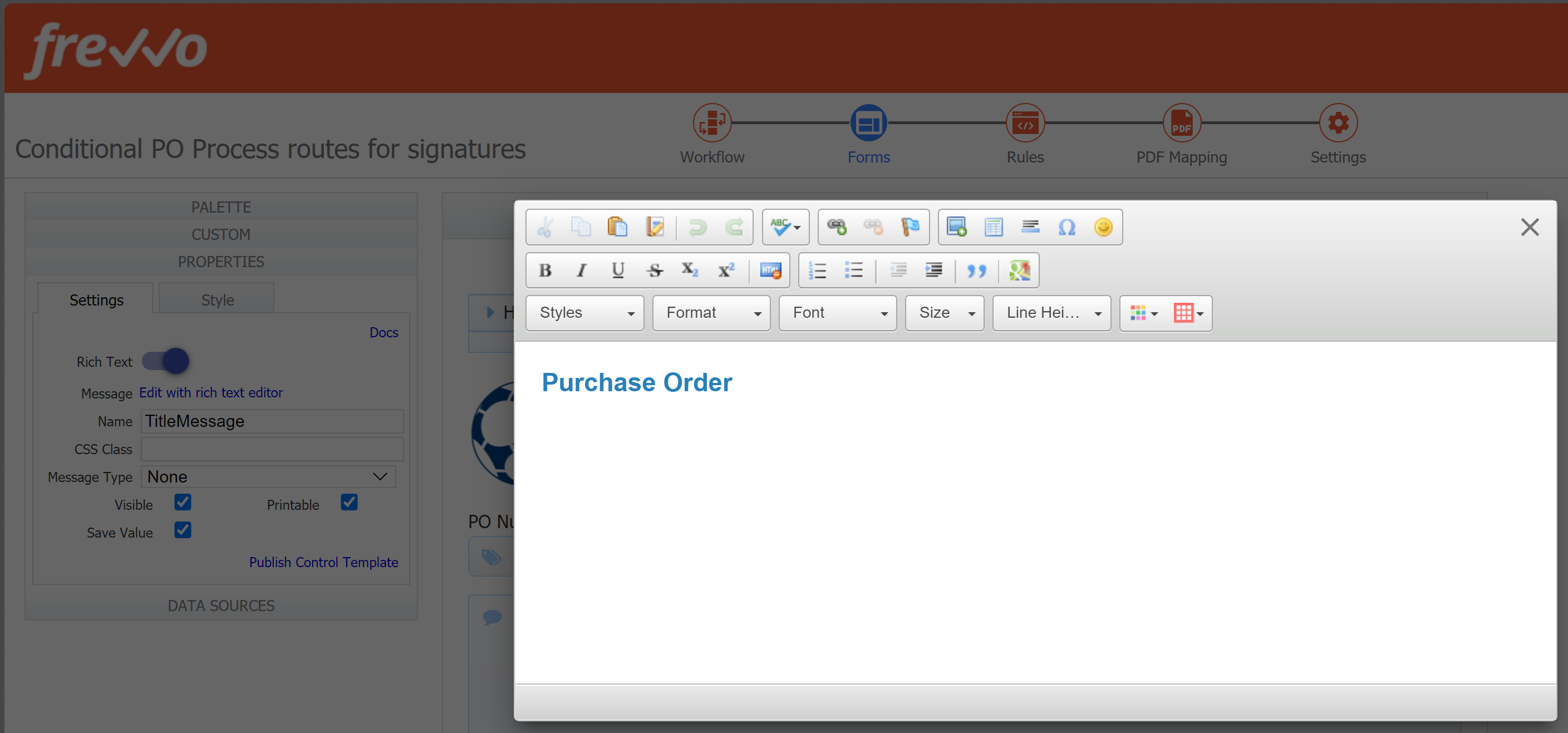
Rich Text Editor Enhancements
The Rich Text Editor (RTE) for Message controls now displays as a pop-up window. This provides more space for easily adding, editing and formatting your content. It also resolves bugs that could cause the RTE to close or disallow edits.
When you toggle Rich Text "on" the message property will be replaced with a link to "Edit with rich text." Click the link, or the red pencil icon  on the control, to open the RTE window.
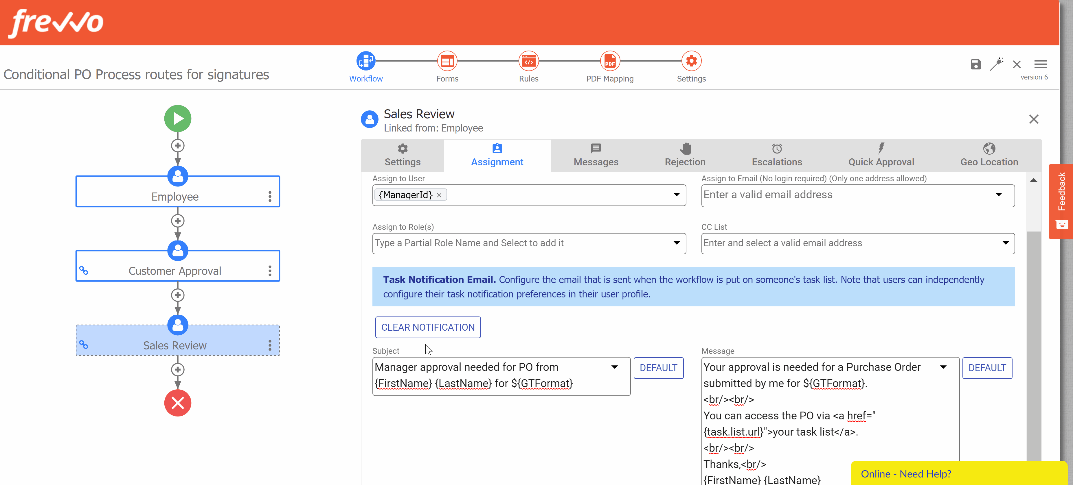
Disable Task Notification Emails
You can disable the Task Notification emails for any workflow step assigned to a User or Role. This feature is useful for steps that should not notify users or for testing purposes. This feature is not available for steps assigned to an Email.
Navigate to the Assignment Tab.
Click CLEAR NOTIFICATION 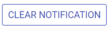 .
.
A confirmation message will appear. Click OK.
This will permanently remove both the Subject and Message text, effectively disabling the Task Notification email for that step.
If you have customized your task notification Subject and Message fields, and only want to temporarily disable notifications (such as for testing) we recommend copying the Subject and Message fields to a text editor so that you do not have to configure them from scratch later.
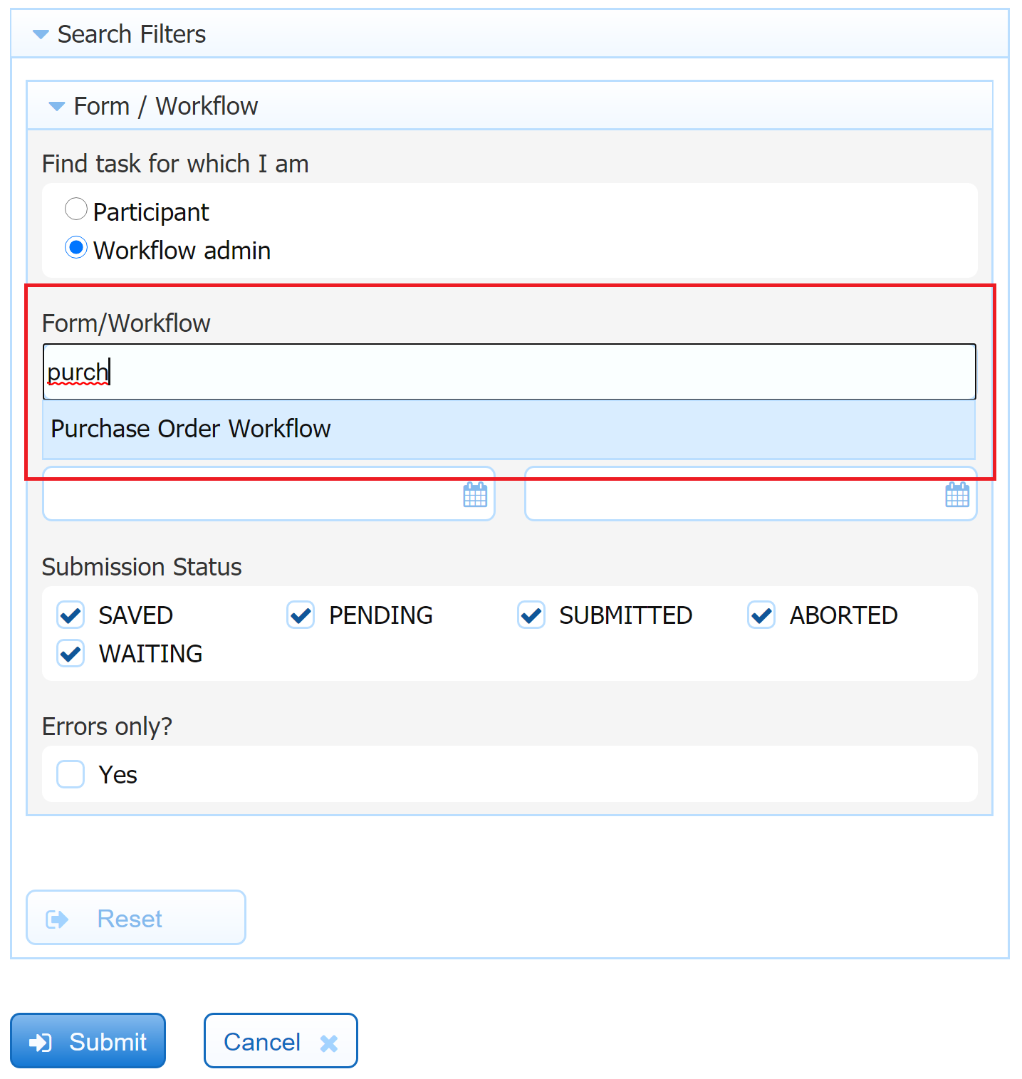
Task List Search
Searching the task list could sometimes be a resource-intensive process, especially for workflow admins with permission on multiple forms/workflows. To speed up the process and prevent timeout issues, the form/workflow dropdown has been replaced with a search bar. Type a few letters of the name of your form/workflow, and a list of relevant results will show. Select the one you want.
Sort Spaces, Styles and Schemas
The Spaces, Styles and Schemas lists now have a Sort  feature that allows you to sort alphabetically A-Z or Z-A.
Retired Features
ImageSilo/Papervision Connector
The ImageSilo/Papervision Connector has been removed. Forms and workflows will no longer be able to be saved to ImageSilo. Alternatively, customers may use the frevvo Filesystem Connector, or a Document Action email with PDF attachment that can be manually or programmatically uploaded to ImageSilo/Papervision. If you are currently using ImageSilo/Papervision connector, frevvo recommends that you contact your Account Manager to discuss other integration options.
Migration Considerations
Upgrade Startup Times
The initial frevvo restart following v10.0.0 upgrade could take upwards of 10 minutes to complete (10+ in our Cloud) due to changes related to MySQL 8.
Windows Service Log On Settings
This applies only to On Premise Customers. If you plan to install frevvo as a Windows Service, there is a new Tomcat default security setting that you need to be aware of and configure so the service will run successfully. See Installing frevvo as a Windows Service for complete instructions.
Double click on the Service and go to the Log On tab. Notice that Log on as is set to This Account: Local Service. This is a Tomcat default security setting. 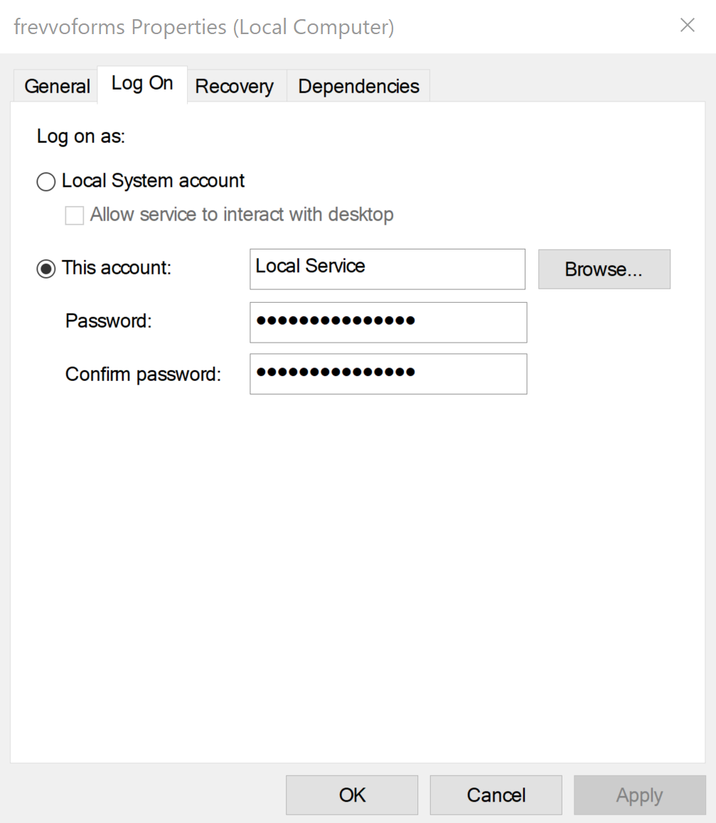
You must make one of the following changes:
- To continue running as "Local Service", you have two choices.
- Give "full control" to the "Local Service" account for the frevvo installation folder (e.g. using File Explorer on Windows 10: properties->Security -> Advanced -> Add -> Select a Principal -> Enter "Local Service"), or
Use this command to give specific access to only the Administrators, SYSTEM and LocalService (replace the frevvo-install-directory placeholder with the actual folder path):
"%SystemRoot%\system32\icacls.exe" "<frevvo-Install-Directory>" /inheritance:r /grant *S-1-5-19:(OI)(CI)(F) /grant *S-1-5-32-544:(OI)(CI)(F) /grant *S-1-5-18(OI)(CI)(F)
Or, switch the Log on as setting to "Local System account"
The windows documentation describes the security implications as "The LocalSystem account has broad permissions, including the ability to write to the event log. Use this account with caution, because it might increase your risk of attacks from malicious software. For other tasks, consider using the LocalService account, which acts as a non-privileged user on the local computer and presents anonymous credentials to any remote server".
Uploading Forms, Workflows and Projects from Different Versions
Uploading from a Prior Version
Uploading forms, workflows and projects from prior versions is supported for resources up to two major release versions apart. frevvo v10.0 will support uploads from v7.4 and later. For example, you may download forms, workflows and/or applications/projects from v7.4 and upload them directly to v10.0. However, if you attempt to upload a form, flow, or application created in v7.0 or earlier to v10.0, you will see the error message "Invalid project/form/workflow file version: Version 7.0. Make sure you are uploading a zip file that was downloaded from a version of frevvo frevvo that is between version 7.4 and 10.0." In this case, you will need to first upload your forms to a v7.4 or v9.0 installation to upgrade them, then download from that installation and upload to your v10.0 installation. See our End of Life Policy chart for a list of major release versions.
If you need assistance upgrading forms and workflows in order to use v10.0, please contact our Support Team at support@frevvo.com.
Uploading to a Prior Version
Beginning in v10.0, you will no longer be able to download a form, workflow or project from one major frevvo version and upload it to a prior major version. For example, in the future if you upgrade your test server to v10.1.x, download a form from the test server, and attempt to upload it to your v10.0.x production server, you will see the error message "Invalid form file version: Version 10.1. Make sure you are uploading a zip file that was downloaded from a version of frevvo frevvo that is between version 9.0 and 10.1." You may still upload/replace versions safely between patches in the same major version (i.e. 10.0.14 → 10.0.13).
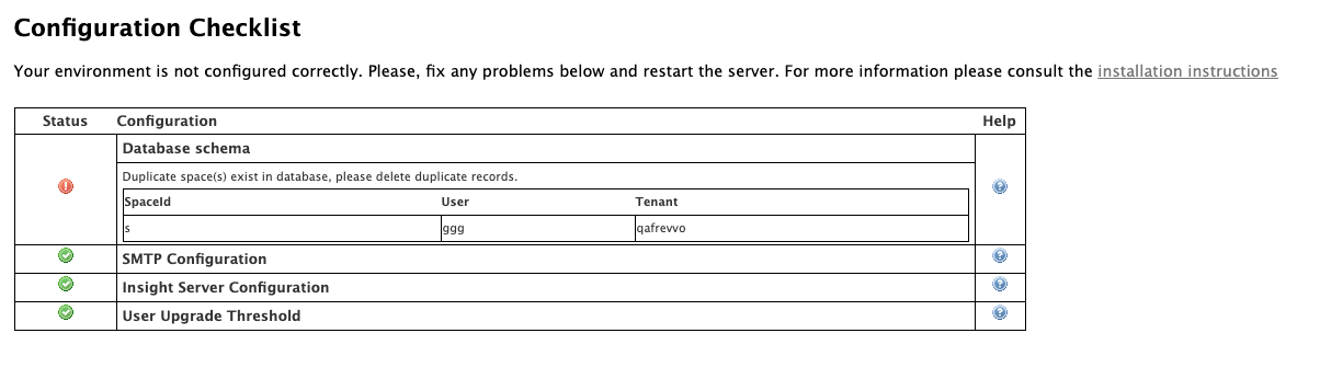
Duplicate Spaces
Duplicate space ids are no longer allowed in v10.0.x. On Premise customers upgrading to v10.0.x may see the error "Duplicate space(s) exist in the database, please delete duplicate records." in the Configuration Checklist if a user has more than one space with same space id. To resolve this error, delete the duplicate space and restart.
Embedded Forms/Workflows
Security enhancements in v10.0.0 now require embedded forms and workflows to be used in https-supported sites. Cloud customers with forms/workflows embedded in http-only supported sites will see a blank page or an error message when attempting to access the resource. To resolve this, use an https-supported outer site to embed the form/workflow. Please note that this may also require a browser or OS upgrade; for example, iOS 13/macOS 10.15 are the minimum iOS/macOS versions that supports the frevvo Cloud sameSiteCookies=none attribute.
Some browsers, such as Safari, also have security enhancements that will prevent embedded content from a third party site from loading. Please see this documentation describing how Safari users can load embedded frevvo forms.
Data API
An http change request (post/put/delete) will soon require a token. This includes operations such as login and upload users by CSV performed through the API. Customers using the frevvo Data API should update their API calls to provide tokens and/or use the new API. Please see additional details including updated example cURL commands here. Current tokenless methods will remain supported for a limited time.
Embedded Forms & Safari Browser
Recent Safari updates have enhanced security features that prevent embedded content third party sites from loading inside another domain. These features help prevent sites from monitoring user's browsing activity, but they also impact frevvo forms embedded on your website when accessed via Safari browsers (and any other browser with similar security features.) Please see this documentation for details.
External URLs
The frevvo.forms.server.external.url property has been deprecated and is no longer supported. If this property was configured in your previous version, you must remove it when upgrading to v10+. Instead, configure a Tomcat proxy in the HTTP connector (port 8082) of the <frevvo-home>\tomcat\conf\server.xml file. See the External URLs Documentation for instructions.
You must remove the frevvo.forms.server.external.url property when upgrading to v10.0+. Failing to remove this property can cause unexpected behavior.
The frevvo.internal.baseurl property no longer exists in v10+. Any setting in frevvo.internal.baseurl will be ignored by frevvo.
The connector with port 8081 was newly added to server.xml in v10+. Please ensure this port is available for frevvo to use. As indicated in the server.xml, changing the frevvo internal connector 8081 settings in the server.xml file can cause unexpected changes, and is not advised.
<!-- A "Connector" used for internal frevvo calls: DO NOT MODIFY IT! -->
    <Connector address="127.0.0.1" port="8081" protocol="org.apache.coyote.http11.Http11NioProtocol"
               connectionTimeout="40000"
               maxHttpHeaderSize="32768"
               useBodyEncodingForURI="true" /> <!-- makes sure that uri parameter are decoded as utf-8 -->
If you need to change the internal port, please see this Default Internal Port documentation.
Documentation Update
The frevvo v10.0 Documentation has been reorganized to better reflect the Guided Designers, make content easier to find, and support both new and experienced users. Some page names have changed, and some content has been moved to different pages. If you have bookmarked frevvo documentation pages, you may need to update your links. Please use the page tree on the left to locate your favorite content.
Planning Your On Premise Upgrade
The initial release of frevvo version 10.0 was deployed to the frevvo Cloud in October 2020. Version 10.0 was released for On Premise customers on January 18, 2021. On Premise customers should review the topics below, the instructions in the Upgrade Guide and Supported Platforms before migrating. It is recommended that you perform a full installation of frevvo v10.0 when upgrading.
v10.0 License
v10 License Key Required
A v10 license key is required for this version of frevvo if you are upgrading from a prior version. Request a v10 license by completing this form before you begin the upgrade.
Before you begin the migration process:
- Please check the Supported Platforms to confirm the latest requirements. Note that v10.0.x is certified on OpenJDK (11.0.6).
- Please read and understand the Planning for v10.0 which may require your action before you begin your upgrade.
- Please read and understand Features Introduced in Prior Releases, which also may require your action before you begin your upgrade.