Each control setting property is explained below. Keep in mind that all controls do not have the same setting properties.
On this page:
Label
A control’s label is displayed on your form beside or above the control. When you first drag in a control it is assigned an arbitrary and unique label—checkbox 43 for example. Obviously for your users’ sake you will want more meaningful labels. Change a control’s label either on the form itself (by clicking the control and selecting the label) or by overlaying the arbitrary name in the Properties Label field. Message controls are the only controls without labels—they are used for static text so you don’t need a label, too.
You can no longer use arbitrary XHTML for styling labels. Due to the incorporation of a new whitlelist approach to filter out XSS attacks, there are restrictions on what you can do in the label markup.
The whitelist allows a full range of text and structural body HTML: a, b, blockquote, br, caption, cite, code, col, colgroup, dd, dl, dt, em, h1, h2, h3, h4, h5, h6, i, img, li, ol, p, pre, q, small, strike, strong, sub, sup, table, tbody, td, tfoot, th, thead, tr, u, ul. This means that you can only use these tags in a label's markup. You can find information about XHTML tags at this w3schools.com website.
These restrictions also apply to help, hint, label, validation message, rule name and description. Let's say you want to underline (6 characters) in the label of a password field.
In the Label field, type this XHTML: Password: <u> > 6 characters <u>.
When typing labels you are free to use any special characters with the exception of the less-than sign (<). If you need a less-than sign in your label, substitute the characters & l t ; (with no spaces between) for the less-than symbol.
Labels can also contain templates that will be replaced by values entered into your form as the form is used. See Templatized Strings for details.
Note that a control's name defaults to its label minus any spaces and special characters. Spaces and special characters are removed in order to make the name valid for use in rules and, for XML users, valid as a xsd schema element name. If the name begins with a numeral (for example,123Name), prepends an underscore to the it (for example, _123Name) to make it a valid XSD element name. Control names will be truncated to 32 characters for all the controls except triggers and panels.
Also note that if you have two controls with the same label, the control's name will automatically be made unique. If you try to edit the name such that it would no longer be unique will prevent the edit.
The < sign is not allowed in a label for Input controls. Searchable Fields with values that contain the < sign will not display completely in the Submissions Table.
Control Type
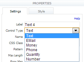
This applies to selection controls (dropdowns, radios and checkboxes) and most input controls (text, text area, email, phone, quantity, number, table, and repeat) and is populated automatically when you first drag in a control. You can change this property if you want to switch a control in your form to a different type of control. This saves you from having to remove the original control and drag in a new one. The Control Type property is also used to change a date control to a time or date/time control. See Date, Time, Date/Time for more information.
There are some limitations: you cannot change a selection control to an input control or vice versa. This means you easily can switch a checkbox to a dropdown list, but you cannot use this property to change a checkbox to a text control.
This property is also useful for verifying what kind of controls are in your form. Since you assign new labels to your controls after you drag them in, you occasionally might forget whether you are looking at a text control or phone control, for example. This property lets you know what kind of controls are in your form no matter what the labels say.
If your control was generated from a schema element, it will have a Display As property instead of a Control Type property.
Convert Repeat to Table or Table to Repeat
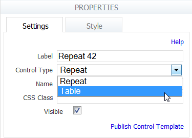
A repeat control can be changed to a table control and vice versa by selecting the appropriate option in the Control Type dropdown. These controls can be changed whether you drag and drop the table or repeat from the palette or populate the form with these controls from schema.
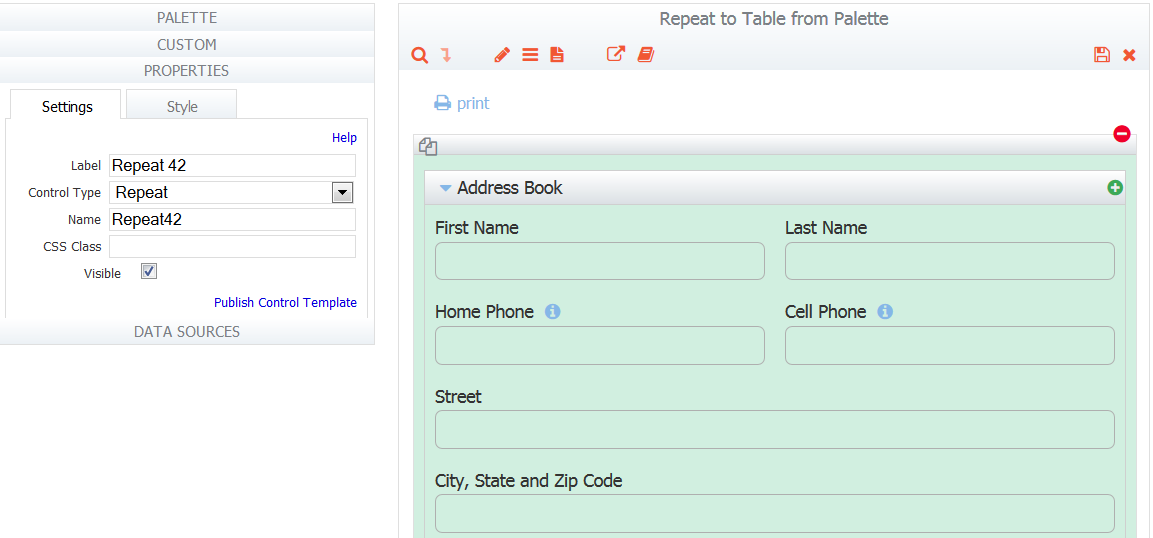
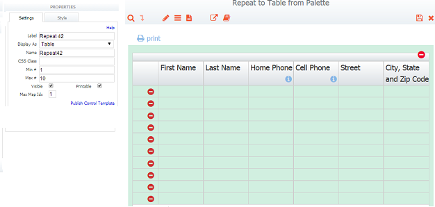
For Example: An Address Book form that contains a section with controls for First and Last Name, Home and Cell Phones, Street, City, State and Zip code is dropped into a repeat control by the forms designer. The min and max values for the repeat are set to 1 and 10 respectively.The designer then decides to change the Control Type of the Repeat Control to a Table by selecting this option from the dropdown.
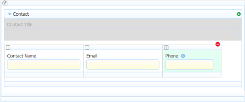
Address Book Controls in a Section in a Repeat in the Forms Designer
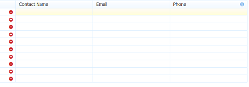
Address Book Repeat Changed to Table in the Forms Designer
Notice each control in the Repeating section becomes a column in the table. The min/max values for the table are the same as the repeating section.
A from-schema repeat that does not contain a section cannot be converted to a table. Schemas with a sectionless repeat with just a single control cannot be converted to a table. You will see the message "Cannot change type on a sectionless, from-schema Repeat." if you attempt the conversion in either of these situations.
Attempting to convert an empty repeat or a repeat that contains an empty section to a table, will display the error "Cannot change type on an empty Repeat".
Repeats with nested panels and sections can be converted to a table. The input controls inside the panels and sections are added to the table as columns. Here is an example of a repeat control with a section with panels that contain Contact Name, Email and Phone input controls.
Here is what the Repeat control looks like in Use mode after it has been converted to a table in the designer. Notice the three input controls become columns in the table.
The Printable, Hide Label and Background Color properties transfer according to the statements below when converting a table to a repeat and vice versa:
- When converting a table to a repeat, the table's printable property is transferred to each section in the new repeat. When converting a repeat to table, the table will always be non-printable. The designer have to set it.
- When converting a table to a repeat, the column's hide label property is transferred to the corresponding control. When converting a repeat to a table, the control's hide label property is not transferred to the column.
- When converting a table to a repeat, you can set the background color on both the column and individual cells. Only the background color on the cells is transferred to the corresponding repeat control. When converting a table to a repeat to a table, the control background color is transferred to the table cell background color.
When you change a table to a repeat or vice versa and there are referencing rules, it is recommended that you verify that your rules still work. See Rules Examples for more information.
Name
Every control has a name. The name is automatically generated and defaults to the control's label minus any spaces and special characters. Spaces and special characters are removed in order to make the name valid for use in rules and, for XML users, this makes the name valid as a xsd schema element name. Control names will be truncated to 32 characters for all the controls except triggers and panels.
Do not name your controls action or method. These are reserved names. If you use these names your form will not properly submit or cancel and may cause a http 404 error when the users try to submit or cancel. Also, avoid using JavaScript Reserved Keywords as control identifier names as these words have a special function in the JavaScript language. Click here for a partial list.
If you have two controls with the same label and at the same level, the control's name will automatically be made unique. If you try to edit the name such that it would no longer be unique, will prevent the edit. In order to use a control in a rule the name must be unique in your form. When a control is dropped inside a section control, it is at a different nesting level then a control dropped outside a section. Also two controls, one inside a section called Car and another in a section called Boat are also at different nesting levels. In both cases the form designer will allow you to name the controls the same. For example both Car and Boat can contain a control named VIN.
Use English alphabet characters only when naming controls. For example, controls named with ó as in Póliza may cause issues when the control is used in a business rule and with submission data.
The Name property is instrumental in several usages within :
- Name is how you refer to your control in Rules.
- Name is also used when initializing form fields via the
_data URL parameter for controls added from the palette.
Note: For controls added from XSD schema, you must use the underlying element name to initialize the control via _data. - Name is how you refer to form fields from Document URIs.
- Name is used in Form Action Display Message and Go to URL Templates.
- Name is used in Doc Action Email Address Templates.
- This is the name given to the XML element corresponding to the control you drag into your form from the palette.
You can change the Name of controls from schema, although schema controls maintain their underlying XSD element name. For example, suppose you are using controls from two schemas in a form and both contain a control named ''FName''. You could change the name of one of these controls to ''FirstName'' to make them unique within the form. This is helpful if you're adding rules to the form, or if you want to use the form as a template.
Except for _data, controls from XSD use the same rules (as above) as controls from palette.
HRef
This property applies only to the Link control. Enter the URL that you want to add to your form. Checking the New Window checkbox will open the URL in a new browser window. The use of Templates is supported in this property.
Pattern
Most controls automatically ensure that users provide the correct data type, but patterns give you the flexibility to impose additional restrictions on what users enter in a particular control.
In the Pattern field in the Properties area, type your pattern using XML schema regular expressions. Check this site for more information. A simple example is a pattern that restricts a text control to only allow strings formatted as a US zip code: \d{5}|\d{5}-\d{4}. If you type this expression in the Patterns property, your form will permit values entered into this field only if they are five digits or five digits followed by the '-' character, followed by 4 digits.
When you define patterns you don’t have to restrict what the control handles automatically. It is not necessary to enter a pattern [a-z] for a Number control, since users can’t type letters in a number field anyway. Since essentially you would be attempting to expand the allowed data types in the control, would ignore this pattern if you entered it.
You have to first save the form before the pattern takes effect. Thus patterns cannot be tested in the form designer, only in use mode.
See Patterns and Validation for more information and useful patterns.
Hint
This property lets you create a tooltip that will display in your form when the user mouses over the control. Simply type the text for your tooltip in the Hint field.
Help
This property lets you provide for your users more detailed help about a specific control. If you enter text here, a icon will appear next to the control on your form. When the user clicks , the help text you supplied in the Help property will be displayed in a floating box.
Decorator
The designer can provide helpful hints for users using the Decorator property. This is a great way to visually enhance the look and feel of your forms/flows.
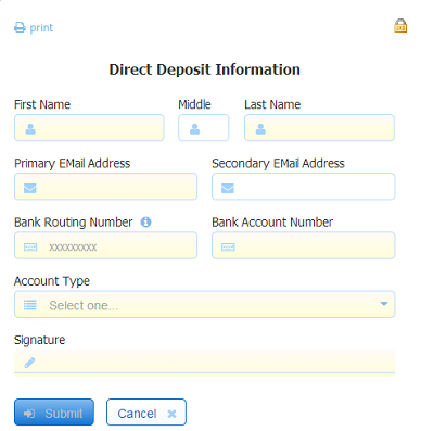
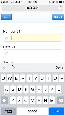
Decorators are on by default. You can control this via a decorator checkbox on the Form Setting Properties. If decorators are turned on, when you drag an input control from the palette, it shows a default decorator. The default depends on the type of control being dragged in. You can change the decorator for individual controls by selecting one from the dropdown list. An icon appears on the left side of input controls.
Decorators do not work in IE8 and they do not appear in snapshots (PDFs). Decorators will disappear when a decorated control is dropped into a table.
Date, Time & Date/Time controls have a decorator checkbox instead of a dropdown.
Placeholder
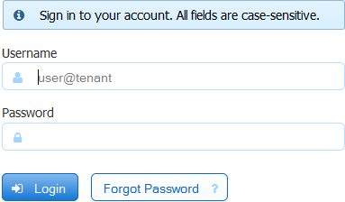
Enter text in this field and it will appear in your input control until the user enters some data. When data is entered, the placeholder disappears. If data is removed, it reappears. This feature does not work in IE8 or IE9. Placeholders do not appear in snapshots (PDFs). You may have noticed the placeholder in the usename field on the login screen.
Placeholders for Date and Time controls are not supported in iOS.
Error Message
This lets you display a specific error message if the user does not supply a valid value in the control. If you leave this property blank users will get generic feedback (an “invalid value” message, for example) if they supply a bad value—but if you use this property, you can make the error message more helpful.
For example, if you are using a pattern that requires the user to enter an area code of 203 in a phone control, you can use the Error Message property to let users know this explicitly if they try to enter a different area code.
Refer to the Table control for information on error messages and columns in a table.
Display As
This property applies only to controls generated from XSD schema elements. (If the control was dragged in from the palette, it has a Control Type property).
Use the Display As property to change the way your control looks on your form (for example, To change a text control to a dropdown, select dropdown from the list of allowable controls). This will change the control's appearance but will not affect how the control validates data. If you need to modify the control's validation behavior, you must update the schema. See Data Sources for further information. The Display As property is not available for the following schema controls: Message, Date, Time, Date/Time and T/F. Repeat controls can only be changed to tables and vice versa.
When you change a table to a repeat or vice versa and there are referencing rules, it is recommended that you it is recommended that you verify that your rules still work. See Rules Examples for more information.
Frevvo Type
This property applies only to controls generated from XSD schema elements that contain <frevvo:displaytype> information.
Refer to the Data Sources topic for information about XSD annotations.
Date, Time, Date/Time Formats
Designers can select formats for Date, Time and Date/Time controls from a variety of options, including formats that include three letter month names. These are discussed below:
Date Format
This property applies only to Date controls and the Date portion of the Date/Time control. Select the Date control type to display only the date input field with a calendar icon. Clicking the calendar to choose the date or hand-typing it, will display the date in the format selected. Form designers can elect to not show the date picker by unchecking the Date Picker checkbox on the Style tab.
The default format is a new option labelled "Automatic" .Designers are encouraged to leave this as the default. When "Automatic" is selected, both entry and display formatting of dates will be locale specific. The designer still has the option to force a particular date format upon the users that is independent of the locale by using the format field, but this is not recommended. Read this documentation for more information.
Date formatting choices previously selected by the designer will be preserved when upgrading existing forms and flows to a new version of . New forms and newly added date controls will default to "Automatic".
European date formatting is supported. Allowable Date Formats consist of three different separators (.- or / or .) and four date display formats (DD/MM/YYYY, MM/DD/YYYY, YYYY/MM/DD and 3 letter month/DD/YYYY).
On a mobile device, the date picker is typically used to provide a date so mobile versions do not support many date formats. If you have a date field with a default date in your form it must be formatted as YYYY-MM-dd in order for it to display correctly on mobile devices.
By using this property, dates entered into the form get translated according to the chosen format and will be reformatted to match the selected format.
- A date typed into a form field will be reformatted to match the selected Date Format
- A date entered into a form field will be translated according to the selected format. For example,if you choose a European format of DD-MM-YYYY and enter 10-05-2009 the date value will be translated as May 10, 2009. If you choose a US format of MM-DD-YYY the date value will be translated as October 5, 2009.
- If you choose any of MM-DD-YYYY using either - or / or . as the separator, all will be valid for that format but will be translated to the selected separator
- Users can still enter dates like Feb 3, 2001. It will be translated into the specified format
adjusts the date to be within 80 years before or 20 years after if the date is expressed with a two digit year. For example, using a pattern of "MM/dd/yy" and the current date/time of Jan 1, 1997, the string "01/11/12" would be interpreted as Jan 11, 2012 while the string "05/04/64" would be interpreted as May 4, 1964. During parsing, only year strings consisting of exactly two digits, will be parsed into the default century. Any other numeric string, such as a one digit string, a three or more digit string, or a two digit string that isn't all digits, is interpreted literally. So "01/02/3" or "01/02/003" are parsed, using the same pattern, as Jan 2, 3 AD. Likewise, "01/02/-3" is parsed as Jan 2, 4 BC. Live forms will always format as 4 digit years.
The date will be converted to the standard xsd:date format of yyyy-mm-dd in the submissions XML document. Here is an example: <Order Date>2012-03-06</Order Date>. Refer to Viewing XML Documents for more details.
Rules can be applied to the Date control in all variations.
Time Format
The Time control denotes "time of day". Time data is not affected by the timezone or Daylight Savings Time adjustments. The time you set in a time control stays the same if later viewed from a different time zone.
This property applies only to the Time control which is created by selecting the Time option from the Date control type dropdown. Select the Time control type to display only a time input field on your form. Changing the control type to Time will not display the date picker.
The default format is a new option labelled "Automatic". Designers are encouraged to leave this as the default. When "Automatic" is selected, both entry and display formatting of times will be locale specific. The designer still has the option to force a particular time format upon the users that is independent of the locale by using the format field, but this is not recommended. Read this documentation for more information about time controls and internationalization.
If you keep the default format of Automatic, you can enter data into a Time control using any of the ways shown in the table. The Time control will accept and display the values as shown:
Time formatting choices previously selected by the designer will be preserved when converting existing forms and flows to a new version of . New forms and newly added time controls will default to "Automatic".
Select one of four variations of military and standard convention time choices from the Time Format dropdown. The default time format is hh:mm using military time. (EX: 18:30). The allowable Time Format choices use military and standard time and two separators, the dot and the colon. Examples are shown below:
By using this property, time entries entered into the form are reformatted to match the selected format. For example, if you choose a military time format of hh:mm:ss and enter 2:00 PM the time value will display in the form as 14:00:00. It will be saved in the submissions XML document as <Order Time>14:00:00</Order Time>. Refer to Viewing XML Documents for more details.
If you choose a format other than automatic, parses and formats the time and dateTime control values with a locale specific date formatter. Read this documentation for more information about date/time controls and internationalization.
Rules can be applied to the Time control in all variations.
Date/Time Format
Select the Date/Time control type, to display two input fields: one for date entry and one for time entry. Dropdown menus, as described above, provide the selection of the 19 allowable date formats for the date portion of the control and 9 choices in military and standard time for the time portion. When you select Date/Time as the control type, the properties panel will display dropdowns to format the date and time. Refer to Date Format and Time Format for details. Rules can be applied to the Date control in all variations.
New forms and newly added date controls will default to "Automatic". Designers are encouraged to leave this as the default. When "Automatic" is selected, both entry and display formatting of dates and times will be locale specific. The designer still has the option to force a particular date/ time format upon the users that is independent of the locale by using the format field, but this is not recommended. Read this documentation for more information about date/time controls and internationalization.
Date/Time formatting choices previously selected by the designer in existing forms/flows will be preserved when upgrading to a new version of . When you select Date/Time as the control type, the properties panel will display dropdowns to format the date and time. Refer to Date Format and Time Format for details.
Some considerations for the Date/Time control:
- When you enter a date in the date portion of the date/time control (or select the date with the picker), it will automatically fill the time portion of the control with a value for 12:00 AM. The value displayed depends on the time format selected: For Example:.
- The date picker is included in the date portion of the date/time control but you can deselect it by unchecking the Date Picker checkbox on the Style tab.
- You cannot enter a time value without a date value.
- The time input field cannot be labeled. It is recommended that the label for the date portion be descriptive enough to include the time portion. If date and time labels over the appropriate input fields are required, two separate controls can be used or the label for the date portion can be extended over the time input field, as shown in the image below:
The local time will be converted to and saved in UTC format and the date will be converted to the standard xsd:date format of yyyy-mm-dd in the submission XML document. Here is an example: <OrderDate>2013-08-12T19:13:00Z</OrderDate>. Refer to Viewing XML Documents for more details.
Max Length
This property is available for text controls and other input controls and limits how many characters users can supply in the control. Simply type a number (positive integer) in the Max Length field. Text area controls do not support this property due to an HTML limitation. However it is very easy to add this functionality to the text area control using a business rule.
# of Rows
This property applies only to text area controls and selection controls using the Comment Property. This property lets you define the initial size of the text area. Scroll bars will appear automatically when the user reaches the # of rows you specify. The default value is 3 for the textarea controls and 1 for selection controls.
Required
Make a control required when you want to force users to enter a valid value in the control before they submit your form. To do this, check the Required checkbox in the Properties area. If the data is optional, leave the checkbox unchecked.
As soon as you mark a control required, the empty control displays a yellowish background gradient. Until users populate all required controls with valid data, they will not be able to submit the form.
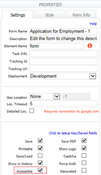
You can change the color displayed by Required fields by modifying a Style and then applying it to your form/flow. If you prefer an asterisk to designate required fields, enable the Accessibility feature by checking the Accessible property on the form/flow Properties pane. This feature was built to allow visually impaired users to access forms. Enabling this property adds an asterisk (*) for all required fields. If users move ahead from that field without filling it, they will see the error, "You can't leave this empty <control name>".
If you click on the Submit button in a form that contains invalid data or required fields that are empty, invalid controls will be highlighted with an orange border. The designer can use a message control to notify the user that fields need to be filled or data needs to be corrected before the form can be submitted. This can be very helpful to users when trying to determine why a form does not submit. Refer to this Valid Forms topic for the details.
You cannot mark grouping controls (tabs, panels and repeats) required. A section is one grouping control that does have a Required Property. If a Section has the required property checked, required controls within it show a yellow background in design and Use mode. If the Section has required unchecked, required controls within it DO NOT show the yellow background color in design and Use mode. The yellow background color appears only when one of the required controls in the section is filled making it mandatory to fill other required controls within the section.
Input controls that are direct children (directly inside) of repeat controls also cannot be marked required, nor do they need to be, since the min# and max# properties take care of this already. You may, however, make controls required when they are inside sections, tabs and panels.
You cannot edit the required property for controls that have been generated from an uploaded schema, since the schema already specifies this via the minOccurs attribute. If a control from schema appears as required and you don't want it to be required, edit the XSD and set minOccurs=0. Re-upload the XSD. Then the control will no longer appear required.
This property is very useful when using rules to hide/show sections depending on something else in the form. If you hide the section you may have to set the required property to false . See these examples.
Options
Options for the Dropdown, Radio and Checkbox controls can be populated using 2 methods:
- Method 1 - Set Up Static Options for Dropdown, Radio or Checkbox controls in the form/flow designers - Designers enter the options at design time by typing them in the Options property for the chosen selection control. Options entered in this way are static - they will not change at runtime.
- Method 2 - Set Up Dynamic Options for Dropdown, Radio or Checkbox controls with Control Properties - Dynamically populate options at runtime from an external RESTful web service source. The
Dynamic Options feature uses Control properties to retrieve data from a web service and populate the selection control options. No coding is needed as required when using a business rule.
Setting Up Static Options
This property appears for dropdown, radio and checkbox controls and is how you populate the choices the user sees in these controls. Make sure the Options Src property is set to the default value - Design Time.
You may have option labels different from option values. The syntax for the options is <value>=<label>. The <label> is what will be displayed on your form and the <value> is what is saved as the selected value when the user submits the form.
When you first drag one of these controls into your form they have generic values: Option 1, Option 2 and Option 3. This matches the generic text you see in the Properties area. To supply your own values, simply overlay the values in the Options property with the values you want and add more (or delete) as necessary.
If you do not enter both <value> and <label> using the <value>=<label> syntax, then the value will default to the label. As soon as you tab off the options property, options without values will automatically be converted to the syntax.
Here the options are entered without values. In this case will default the value to the label.
As soon as you tab out of the Options property the options will be automatically converted to the <value>=<label> syntax.
If you would like the submitted values to differ from the visible label then edit the options as follows. In this case the values are A, B, C, while the visible labels remain morning, afternoon, evening.
The order of choices in your control will match the order in the Properties area. If you have choices that need a logical order (you’d want a dropdown of US states to be sorted alphabetically, presumably), make sure the order is correct in the Properties area. (You can’t sort the text you enter in the Options property field but you can cut and paste.)
In addition to the generic Option 1, 2 and 3 choices, a dropdown control also includes a blank option that by default will appear first in the list. This blank option will appear no matter what text you supply in the Options property. You cannot remove the blank option but you can make one of the other options the default. See Setting Defaults.
What if you want a '=' character to appear in your options? Since the 1st equal sign is the delimiter between the value and the label, you can put an equal in the label as follows. For example, suppose you want your label to be "good = gold." If you enter this as the option, what you'll see in your dropdown is the label "gold." To solve this, use this options string: "a=good = gold". Now the label will be as you wish. Currently, if there is an equal sign in the label, it is not possible to also have an equal in the value. This will be supported in a future release.
The choices cannot be changed if they have been generated from an uploaded schema, since the schema specifies the choices. On controls generated from schema, you won’t see the Options property in the Properties area. However, you can change the option labels. See Labels.
Checkbox option values cannot contain spaces. For example if you set your checkbox option to "Black Cat=Black Cat", it will automatically be converted to "Black_Cat=Black Cat" as soon as you tab out of the options property. This is because checkboxes are multi-select. When the form is submitted, space is used as the separator character for the checkbox control's value. Thus a space character cannot be in the value itself as it would be interpreted as a separator.
The < sign is not allowed in an option label for Selection controls. Searchable Fields with values that contain the < sign will not display completely in the Submissions Table.
Design mode allows options with same value and different label. If you set the options of a Selection control as shown below then click the save and test icon, you will only be able to select one option of the Selection Control in Test mode.
a=b
a=c
This can be a issue when working with dynamic selection controls. Designers must be careful that the web services they are using do not return data with duplicates values.
Comment Property
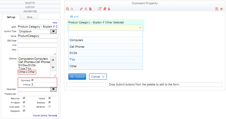
The Comment property is the easiest way to to provide a text box for the user to type in based on the selection of the last option in your selection control. Check the comment property and specify the number of text lines in the # Rows field. For example, a Product Category dropdown control has choices for Computers, Cell Phones, DVDs, TVs and Other. If Other is selected, you can collect additional information by displaying a comment box. To accomplish this, the designer would list Other as the 5th option, check the comment box and specify the # of rows if more than the default value of 1 is required.
When Other is selected in Use mode for the Product category dropdown shown above, a 3 line text box displays where comments can be entered. If the Required property is checked for the dropdown control, then the comment box that opens on selecting the last option is also required.
The Comment property does not apply to the T/F control even though it is included in the selection control group. You can retrieve or set the value in the Comment property with a business rule. If you want to templatize the Comment property, use the special syntax discussed in the Template Syntax for the Comment Field of Selection Controls topic.
Setting Up Dynamic Options - No Coding Needed
Checkbox, Dropdown and Radio controls support the ability to dynamically retrieve options at runtime from a RESTful web service. The Dynamic Options feature will NOT work with SOAP web services. Using this feature with the ComboBox control is described below.
supports data returned from RESTful web services formatted in either XML or JSON. The frevvo Database Connector is an example of a RESTful web service.
The Dynamic Options feature requires:
- The URL to the web service - include parameters and mappings that the service requires in the URL
- Value and Label binding properties - Path(s) to retrieve the option data from the web service results data. Designers determine the values for these properties by examining the results returned by the web service in the Debug Console. This method is described below and in the Dynamic Options Example.
Follow these steps:
- Click on the selection control (Checkbox, Dropdown, Radio)
- Select Web Service from the Option Src dropdown
- Enter the URL of the RESTful web service that you are going to to retrieve the option data from. Data is retrieved using HTTP GET. The URL can contain templates and the options will be automatically updated whenever the value changes of any control referenced by a template in the URL.
Ex: /http(s)://10.0.0.27/:8081/database/BIRT/allCustomers?_mediaType=json - This URL returns a list of all customers from a database The _mediaType parameter specifies that JSON results are returned. In this example, the Database Connector integrates with the database to execute the query. The Database Connector is a Restful service that returns results in XML or JSON.
- After entering the Options URL for your web service, click the save and test icon. Examine the results in the debug console to determine the Value and Label Bindings.
- The syntax for selection control options is <value>=<label>. The <label> is what will be displayed on your form/flow and the <value> is what is saved as the selected value when the user submits the form or completes the workflow.
Enter the Value Binding - this is bind path of the option VALUES within the XML or JSON returned by the RESTful web service. Binding paths are specified with the '/' character used as a delimiter i.e. /resultsSet/CountryID. The path locates the values to be extracted and set into the selection control options. If the data pointed to by the path is repeating, then the data extracted will be a collection of items. This is the value that will be stored in the XML submissions document when the form/flow is submitted/completed.
The Value Binding can be determined by examining the resultSet in the frevvo debug console.Enter the Label Binding - this is the bind path of the option display LABELS within the XML or JSON returned by the RESTful web service. This label is displayed in the selection control options in Use mode. The Label Binding can be determined from the debug console by examining the resultSet in the debug console.
Type the URL to your WebService in the Options Source property then click the save and test icon. Examine the resultSet in the debug console to determine the Value binding.
Example 1: Results returned in JSON formatIf this is the JSON Data returned: "totalResultsAvailable":2, "resultSet":[{"CountryName":"Argentina","CountryID":"1"},{"CountryName":"Aruba","CountryID":"12"},{"CountryName":"Bahamas","CountryID":"13"}]} If the Value Binding property is set to /resultSet/CountryID - the country id of the selected country will be stored in the Live Forms submission If the Label Binding is set to /resultSet/CountryName - the country names are what the user sees as the selection control options - Argentina, Aruba, BahamasExample 2: Results returned in XML formatIf the results are returned in XML: Notice that the XML uses namespaces and that they must be part of the bind path. <?xml version="1.0" encoding="UTF-8"?> <p0:allCountries xmlns:p0="http://www.frevvo.com/database/allCountries"> <row> <CountryID>1</CountryID> <CountryName>Argentina</CountryName> </row> <row> <CountryID>12</CountryID> <CountryName>Aruba</CountryName> </row> <row> <CountryID>13</CountryID> <CountryName>Bahamas</CountryName> </row> </p0:allCountries If the Value Binding and Label Binding properties are be set to the same path: /p0:allCountries/row/CountryName - the Country Name will be included in the submission and Users will see the Country Names as the options of the selection control: Argentina, Aruba, Bahamas
- Click the save and test icon to test your form/flow.
- The Example below uses the Database Connector to retrieve a Customer List from a database. It also shows to construct the Value and Label Bindings from the XML results returned in the Debug Console.
Dynamic Options Example
Let's say you have a form/flow with a Dropdown control named Customer. You want to populate the options of this control with a list of Customers Names. You also would like to store the Customer Number associated with the Selected customer in the form/flow submission. We will use the Database Connector as our Web Service. For this example, the Database Connector is configured in Standalone mode to work with a MySQL database named classicmodels.
The Customer dropdown options can be populated with a business rule but you can also use the Dynamic Options feature. The frevvo Database Connector executes a query against a database named classicmodels that will return a list of Customers in JSON format. We will determine the Value and Label bindings by examining the results returned in the debug console.
Follow these steps:
- Click on the Customer control.
- Select Web Service from the Option Src dropdown
- The Options URL is: http://localhost:8081/database/BIRT/allCustomers?_mediaType=json This URL points to an instance of the Database Connector running on the save server/port as
. The results of this query will show the Customer Number and Customer Name for each customer in the Customers database table in JSON format.
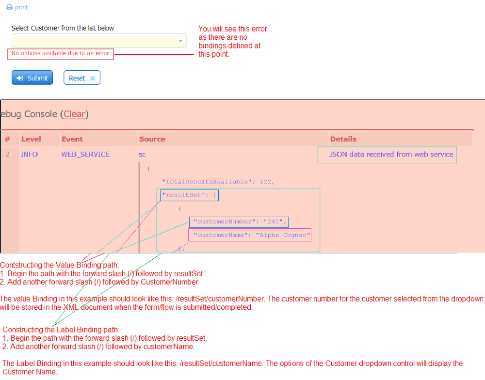
- After entering the Options URL ,click the save and test icon. Ignore the "No options available due to an error" message that displays. This message will disappear once you have configured the Value and Label BIndings.
- To determine the Value Binding, examine the resultSet in the frevvo debug console.
- Begin the path with the forward slash - / followed by resultSet.
- Add another forward slash - / followed by the value from the results that you want to be stored in the submission XML - in this case - customerNumber
- The Value BInding should be set to: /resultSet/customerNumber
- To determine the Label Binding, examine the resultSet in the frevvo debug console.
- Begin the path with the forward slash - / followed by resultSet.
- Add another forward slash - / followed by value from the results that you want to see as the option labels - in this case - customerName
- The Label BInding should be set to: /resultSet/customerName
- Click the save and test icon to test the form. Note the options display the Customer Name.
- Click Submit.
- Navigate to the Forms Home Page and click the Submissions icon. Open the submissions and view the Document tab. Note the Customer Number is the value stored there.
The images show the same form with a Radio/Checkbox control replacing the Customer dropdown.
Radio Control
Checkbox Control
Dynamic Option Runtime Support in the Debug Console
When developing a form/flow with selection controls with dynamic options, the designer needs to see returned results from an entry point in order to determine bind paths, troubleshoot end point urls, etc. Logging available in the "Debug Console" in test mode includes Web Service events such as:
- The web service call being made with fully the resolved end point URL shown (Options URL)
- The web service data retrieved (JSON/XML)
- Any errors received upon calling the web service.
If there is a runtime problem invoking a configured web service entry point, will log a warning statement with a reason to the <frevvo-home>\tomcat\logs\frevvo_YYYY-MM-DD logfile. For example:
08:03:55.177 |-WARN [http-nio-8080-exec-3] [amicPropertyHolderAdapter] - Error calling web service end point: https://api.edmunds.com/api/vehicle/v2/?state=new&year=2017&view=basic&fmt=json&api_key=p9v6s4uv6998k464u33m8jx3 Error: Service call failed with code: 404 (Not Found)
Timeouts for Non-responsive Web Services
A non-responsive web service call for dynamic options can hold-up a form/flow indefinitely. Two timeouts have been added to for socket read timeout and connection timeout. Both timeouts default to 30 seconds.
They can be overridden by adding these parameters to the URL: http.connection.timeout and http.socket.timeout. Both are specified in milliseconds. These timeouts apply to web service calls from rules as well as doc actions, etc.
Secure Web Services
supports Secure Web Service entry points that use HTTP basic authentication. The authentication credentials are entered in the HTTP Authorization Credentials section of the Edit Tenant screen by the tenant administrator. These HTTP credentials are used by the web service integration. Other authentication schemes in use by 3rd-party services are not supported.
Dynamic Options for the ComboBox Control
The ComboBox control supports three types of data retrieval: frevvoUsers, frevvoRoles and Web Service. The source for the options is selected from the Options Src property. Selecting Web Service makes it possible to use the Combobox to retrieve values from a database and enable a list of possible partial matches.
The Dynamic Options feature using the ComboBox will NOT work with SOAP web services.
You cannot test the ComboBox Options in the form/flow designers. Click the save and test icon for the quickest way to verify that the ComboBox is working as expected.
There is also a blank option. Pick this one if you are going to populate your ComboBox options using a business rule.
Here's how it works:
Use the ComboBox to return a list of users/roles in the tenant where your form/flow is located (current tenant). You cannot pull users/roles from a tenant other than the current one due to security restrictions.
- Drag the ComboBox control into your form/flow
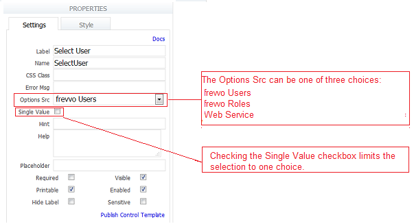
- Set the Options Src to one of two choices: frevvo Users or frevvo Roles.
- Selecting frevvo Users - returns a list of ALL users in the current tenant.
constructs a URL:/frevvo/web/tn/{form.tenant.id}/users?match= then replaces the form.tenant.id template with the name of the current tenant.
- Selecting frevvo Roles returns the list of ALL roles in the current tenant.
constructs a URL:/frevvo/web/tn/{form.tenant.id}/roles?match= then replaces the form.tenant.id template with the name of the current tenant.
- Selecting frevvo Users - returns a list of ALL users in the current tenant.
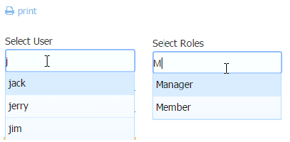
Users can typeahead to narrow the choices based on the letters entered. User ids and roles are case sensitive so remember to use the correct case when typing.
The combobox supports the ability to specify single or multiple values. Simply check the single value checkbox if you want to limit the choice to one value.
When selecting frevvo Users and frevvo Roles as the Option Src, your form or flow MUST be set to Public In Tenant. They do not work with Public forms as these option src choices require security / authentication.
Populate Dynamic Pick Lists from a Database with the ComboBox
The ComboBox control can be used to retrieve values from a web service and enable a list of possible partial matches. This is helpful when you have database queries that return a large number of options. You can filter the number of options returned from a query based on the text typed into the ComboBox. Users typeahead and are only presented with the matching options as choices.
- Your web service must be able to filter results and accept parameters that drive filtering
- A dynamic Options URL that contains the {<combobox control name>.matchText} parameter. As the user types text into the CombBox, the text will be substituted into the URL. The web service returns only the options matching the typed in text as choices.
- The ComboBox control shows up to 100 matching options. If the web service finds more that 100 possible matching options, only the first 100 are to be shown. Informing users that there are additional matches that are not shown is not supported.
Set the Options Source property of the ComboBox to Web Service then provide the Options URL and Bind Path properties:
- Options URL - The URL of the RESTful web service that will retrieve matching options. Be sure that the URL contains the {<combobox control name>.matchText} template parameter.
- Bind Path - The bind path of the matching options within the XML or JSON returned by the RESTful web service. The Bind Path property determines the selected value that is included in the submission and what the user sees.
Example
It is very common to pull options for a typeahead control such as the ComboBox from a database. If you are using the frevvo Database Connector to integrate with your SQL database you already have a Restful service that returns data as resultSets.
Let's say you have a classicmodels MySQL database with a Products table that contains 121 records. You have a form with a ComboBox control named NameofProduct and you want to populate the options from the query results. However, you do not expect your users to scroll through 121 choices until they find the one that they are looking for. Ideally, you would like to filter the results coming back from the query based on the characters inserted into ComboBox. Users can then typeahead and select a value from the filtered choices.
For this example, the frevvo Database Connector is installed on the same machine as and configured in Standalone mode running on port 8081.
You will need a query to run against the database. This query, which is included in the BIRT queryset in the configuration.xml file, uses the MySQL Like and % wild cards, to return all the products that match the value in the template (pname}.
<query name="productsByName"> <retrieve> <!--maps to HTTP GET --> <statement> SELECT * FROM Products where productName LIKE '%{pName}%' order by productName </statement> </retrieve> </query>- Click on the ComboBox control to display the Properties panel. Select Web Service as the Options Src.
Provide the URL to the datasource - in this case the URL to the database query in the BIRT queryset- productsByName. Add the {<combobox control name>.matchText} parameter to specify the value of the variable - pname - in the query as the matching text typed into the Name of Product control.
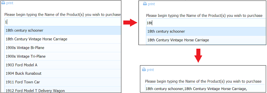
http://<server>:<port>/database/BIRT/productsByName?pName={NameofProduct.matchText}- Click the save and test icon. Enter a value into the ComboBox. Determine the Binding Path from the resultSet. In the image, the number 1 was entered into the ComboBox.
- The ComboBox Properties panel should look like this. If you want to limit the user selection to one value, check the SIngle Value checkbox.
- Users will see all the returned options that match the number 1 when it is entered in the ComboBox. Adding 8t into the ComboBox will further filter the options and display the choices that match 18t . Each time a character is entered it is added to the URL and the Web Service is invoked. Only the matching results is displayed to the user.
ComboBox Control Properties for Business Rules
The following ComboBox properties can be used in rules.
| Property | Purpose |
|---|---|
| optionsUrl | Allow designers to specify more complex dynamically determined end point urls that cannot be built using control templates within the URL. |
| matchText | Read-only. As the user types in the combobox, any rule referencing the matchText property will fire and determine/set options that match. |
| matchingOptions | Write-only. Array of strings. The rule can set the options that match and should be presented to the user as choices. Typically used in conjunction with matchText. |
Labels
This property applies only to controls generated from schema elements. (If you drag a control in from the palette, it has a Options property; if the control was generated from a schema element, it has a Labels property instead.)
You can change the controls labels, although the XSD values for the control in the the schema do not change. In other words, you can change what a user sees in the form, but not the underlying values (i.e., you cannot use the [value=label] syntax you use for palette controls to change the element values).
For example, the schema below specifies choices for an event registration as: ''A'', ''B'', ''C''. However, the form would be easier to understand if the labels for A, B and C were ''morning'', ''afternoon'', and ''evening''. You can edit the labels, and the form will show morning, afternoon and evening. However, when this form is submitted, the submission will still correctly contain the required values A, B or C. If you want to change these values, you must edit and re-upload the schema.
<xsd:element minOccurs="0" name="Registration">
     <xsd:simpleType>
        <xsd:restriction base="xsd:string">
          <xsd:enumeration value="A"/>
          <xsd:enumeration value="B"/>
          <xsd:enumeration value="C"/>
        </xsd:restriction>
     </xsd:simpleType>
</xsd:element>
Note also that you cannot add more labels to the control than the number of XSD values defined for the control in the schema. Using the example above, you cannot add a fourth label to the control because the schema specifies only three possible values (A, B, C) for the control.
The Labels property is also very useful when used in conjunction with the Display As property. For example, imagine your XSD schema contains an element named "product" which is of the type xsd:string. But you know for a fact that there are a limited set of product types that are allowed by the back-end system (a database, for example). An xsd:string element will create a text control on your form by default. But you can easily change the form to restrict the types by using the Display As property to change the control from text to dropdown. Then use the labels property to enter the list of product choices. The submission values will now be restricted to that set of options rather then any text string.
Though you can still edit the underlying schema to add an enumeration or set the options in a business rule, using the labels property makes this common task easier.
Enabled
This property determines whether the control is enabled or disabled when users first access your form. If unchecked, users may not enter a value in the control effectively making the control readonly. Data cannot be entered until the control is enabled. (You can enable the control using a Rule.)
For example, say you are creating a wedding invitation form and want to know if the people completing your form are bringing a guest. Your form might include a text control for the guest’s name that becomes enabled only after users indicate (in another control) that they are in fact coming to the wedding.
You are not permitted to disable grouping controls such as panels or repeats. However, there is an Enabled property for Sections, each of the columns in a Table and each tab in a Tab control. If "enabled" is set on Tab or Section, controls inside of these group controls would be enabled. Conversely, if the property is unchecked, controls inside of a section or tab would be disabled. This property will make it easier to write Business Rules.
You can enable/disable the selection controls via rules thereby enabling/disabling all the selection control options. It is not possible to enable/disable individual options.
Disabled tabs are still selectable and disabled sections can still be expanded and collapsed. This is as designed. If you are trying to show/hide the contents of a tab/section, use the Visible property.
Visible
This property determines whether the control is visible or hidden when users first access your form. It is almost identical in concept to the Enabled property, but instead of disabling the control you hide it and write a Rule that makes it visible based on what users enter in another control.
Hide Label
This property determines whether the control’s label will be displayed on your form. Check the checkbox to hide the label on your form; leave it unchecked to show the control’s label.
Message
This property applies only to message controls and is where you enter the static text that will appear on your form. In addition to regular text, you may include in this property field arbitrary XHTML markup that will be formatted and displayed by the browser.
Message Type
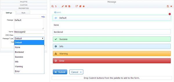
This property only applies to the message control. You can choose a message type to display your control with different background colors, decorators or a border.
Select a type from the Message Type dropdown.
Available message types are
- Default - The background color for Default depends on the color scheme and is currently a grayish gradient in all color schemes. This is the message type for new controls
- None - has no border, decorator or color. Controls in migrated forms will have this type post migration
- Bordered - a border but no decorator or color.
- Info - default decorator and blue background color.
- Success - default decorator and green background color.
- Warning - default decorator and yellow background color
- Error - default decorator and a red background color.
You can center the message text by selecting the center property on the Style tab. Click here for the details.
Min# and Max#
These properties appear as part of a Table Control, when your form has an input control inside a repeat control or an Upload control. Simply type a number (positive integer) into each property field. If you specify a min # of 1 and max # of 10, users must enter values in at least one input control or they will be unable to submit the form, but they may enter as many as 10. See Repeat Controls for more details.
If you set the min# to 0, users initially will see one email control but won’t be required to supply an Email address to submit the form.
MIn/Max properties for the Table Control allow the user to add/delete table rows in a form as needed. See Tables for more details. You can specify the min/max number of attachments that can be uploaded to an Upload control. Business Rules can be used to adjust the min/max properties during runtime. For example, if you have a section with an upload control where the min# and max# are set to 1 in the designer. The user must upload at least one attachment to be able to submit the form. It is possible to set set minOccurs down to 0 even if the design time setting > 0, but not greater than max# , therefore making the field not required using a business rule. The max# can exceed the design time setting as well, but not go below min# value. This is only applicable to controls that are dropped into your form from the palette.
Min/Max properties are not editable for controls generated from an uploaded schema, since the schema already specifies this via the minOccurs and maxOccurs attributes.
Password
This property applies only to text controls and other input controls. If you check the Password checkbox, the text the user enters will appear on the form as asterisks (it will be submitted as normal text, however).
Entering data into Numeric Controls (Number , Phone , Quantity , Email, Money) that have the Password property checked, brings up the text keyboard when the form is running on a mobile device. Users will have to select the numeric keyboard button from the alpha keyboard when entering data.
Save Value
The Save Value property applies to Message, Link, Image and Form Viewer controls. This property controls whether the control's value appears in the form/flow submission document . The property will be unchecked (default) for new Message, Link, Image or Form Viewer controls added to your form/flow. An example of the Properties pane for the Message control is shown in the image.
The Save Value property will be checked for Message, Link, Image and Form Viewer controls upgraded from a previous release. Re-instantiating a submission that has a Message, Link, Image or Form Viewer control will restore the value/text of the control only if Save Value' was checked for it and it was in the submission doc.
- The Message and Link controls still support the "value" property. Existing rules will work unchanged. The Save Value must be checked for there to be a value that is accessible in a business rule.
- Check the Save Value property if you are using the Image control in a template i.e.Print Headers/Footers in the form/flow PDF.
- Include Message Controls in Optional Sections but make sure the Save Value property is unchecked.
- When mapping Message controls with templates to the SharePoint Connector, the Save Value property should be checked.
Sensitive
This property determines whether the value saved in the submissions repository is hidden when viewed in the web submissions UI. Check the checkbox if the data users will enter into this field contains sensitive data that should not be visible when viewed in the web UI. Sensitive field values will be encrypted in the submissions database using an SHA algorithm. The control must be designated as a Saved Field in the form. This property does not enable hashing of the value stored in the XML document.
CSS Class
This is the control’s class name that changes the look of HTML output in your form/flow when added to the CSS Class property of a conttrol. The CSS classes that are available in are listed in the table.
| CSS Class Name | Description |
|---|---|
| f-page-break | Adds a page break to the forms pdf |
| showhelp | Enables Help icon at the top of each column when using the Tight layout |
| f-font css classes | Sets the font size for Message and Table controls |
| f-submit-error | Used to display a message to the user if the form is invalid when they click submit |
(workflows) | Used to display a message to the user if an Activity Document Action in a workflow fails |
CSS Class to Add a Page Break
One built-in css class name is 'f-page-break'. If you want to add a page break to the printed view of the form's pdf, tiff, add f-page-break to the control that you want to start at the top of a new page. See Printing Forms for the details.
CSS Class to Reduce White Space
Another is the showhelp css class that is built into the Tight layout. For example, you can reduce white space even further with the Tight layout so that you have virtually no space between controls by selecting the hide label property on each control. This can be a way to implement a grid type layout as shown in this sample form below.
When controls are this tight together there is no room to display the help icon for controls with help text. Notice that the first row of controls does displays the help icon. This is done by putting the string showhelp into the css class property for each control in the first row. This is a useful way to have help at the top of each column.
CSS Class to Set Font Size for the Table and Message Controls
There are seven CSS classes that set font size that can be used with a Message or Table controls. Add these into the css class property for these controls only. Other use cases are not supported.
Here is the list:
- f-font-xx-small
- f-font-x-small
- f-font-small
- f-font-medium
- f-font-large
- f-font-x-large
- f-font-xx-large
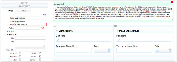
Display and submission pdf results are shown in the image:
Let's say you want the user to read an agreement section and then check a box on the form if they agree. You can put the Agreement text inside a Message Control. Since there is a large amount of text in the Agreement, you may want to make the font smaller so that it does not appear overwhelming. Simply add the desired css class to the Message Control CSS property.
Selecting a choice from the Label Size dropdown on the Style tab of some controls, such as the Message control, will override the css class.
CSS Class to Display Invalid Form Message on Submit
This CSS class is only available in v6.1.4. You can use the CSS class f-submit-error to display a message control that notifies the users that the form cannot be submitted because there are required controls that are empty or controls that contain invalid data. Refer to this topic for the details.
CSS Class to Display a Message if an Activity Document Action post returns a 422 status
The f-action- error css class displays text defined in a Message control if an Activity Document Action post returns an HTTP 422 status for a workflow step. Refer to Activity Document Action Behavior for Failed Post for the details.
If you are using Live Forms in-house, Cascading Style Sheet code that was used in themes applied to forms/flows in previous Live Forms releases, can be added to a newly created style.css file in the frevvo.war file . The context parameter, frevvo.css.url, in the web.xml file must be changed to point to it.
Button Color
You can change the color of the trigger button by selecting a choice from the Button Color dropdown.
Available button colors are:
- Default - The background color for Default depends on the Style applied to your form.
- None - has no border, decorator or color
- Green - default decorator and green background color
- Blue - default decorator and blue background color
- Yellow - default decorator and yellow background color
- Red - default decorator and red background color
- Light Blue - default decorator and light blue background color
Printable
This property determines whether or not this form field will appear in the in the PDF document view of the form. If unchecked, the field will not appear in either view.
You can set the property on a section control and it will automatically apply to all controls inside the section control. This is often used in business rules. See Show/Hide/Print.
Enable if Valid
This property applies only to Submit controls. By default disables the form's submit button until all required fields are filled and contain valid data. See Valid Forms for details of this feature. However, sometimes you may wish to override
' default behavior and allow the user to submit a form even if it is invalid. To do this, uncheck this property.
When "Enable if Valid" is checked and you click on the Submit button in a form that contains invalid data or required fields that are empty, the form will not submit and the invalid fields will be highlighted with an orange background color. The designer can also display a message instructing the user what to do.
This approach is very helpful to users when trying to determine why a form does not submit. Refer to this Invalid Form Notification for the details.
If "Enable if Valid" property is unchecked, you can control the Submit button behavior in a business rule using the Submit.enabled = [true,false] property.
Prefix Property
Custom groups with rules included when dropped back onto the same or another form, will contain a special "Prefix" property. The property will automatically be given a unique value if you drop the group onto the same form 2 or more times. This ensures that the group controls have unique element name. You can view the impact the prefix has on the element names by viewing the form's schema or the control's property panel. Using the prefix property, you can write a separate rule to manipulate the 2nd or greater instance of the custom control. Refer to this documentation for the details.
Max Size
The Max Size property is used to set the upper limit for each attachment uploaded using the Upload Control in your forms/flow. It is set to 10Mb in the cloud. In-house customers should refer to the Max Size property for information about configuring this property for an in-house installation.
File Name
The File Name property is used to rename attachments uploaded to via the Upload Control. Refer to the Changing the filename of an uploaded attachment in the form/flow submission topic for the details.
The bind path of the option display LABELS within the XML or JSON returned by the RESTful web service.

