Layouts and Styles
- Megan Ellis
frevvo makes it easy to select layouts and styling for your projects, portals and forms/workflows. The designer can pick from four different layouts and four global styles where you can specify colors, font name, and other properties. You cannot customize layouts but you can CreatingStyles.
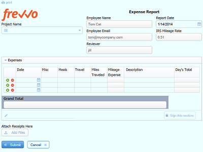
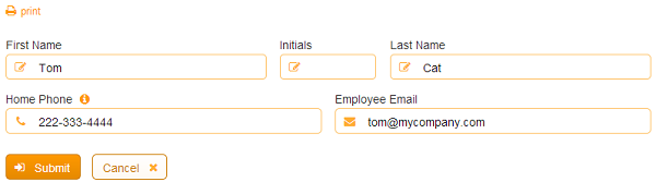
This Expense Report uses the Compact Layout and Aqua Style.
See the CSS Class property for more form/workflow styling options.
On This Page:
Let's say you want to change the background color of your forms/workflows so they will blend in nicely with your existing website. You can choose one of the provided global styles or create a new custom style. Once you create a custom style you can use it in as many forms/workflows as you like. AddingCustomFontstoLiveForms can also be added to frevvo.
Layouts
frevvo provides four layouts that can be applied to forms/workflows. New projects default to Nouveau and forms/workflows created in a project will inherit the Nouveau layout. New layouts can only be added by frevvo. The Layout dropdown on the Form Properties Style tab displays the choices:
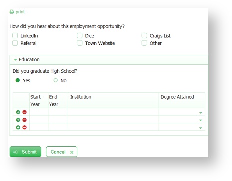
- Nouveau - takes advantage of newer browsers supporting modern CSS and is extremely well-suited to forms/workflows running on mobile devices.
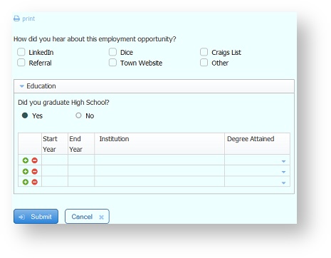
- Compact - This is very similar to the Nouveau layout except for the reduction of vertical space between controls.
- Tight - Vertical and horizontal space is dramatically reduced - - controls will be positioned up against each other.
- Nouveau Square - this layout is the Nouveau layout with square corners for controls.
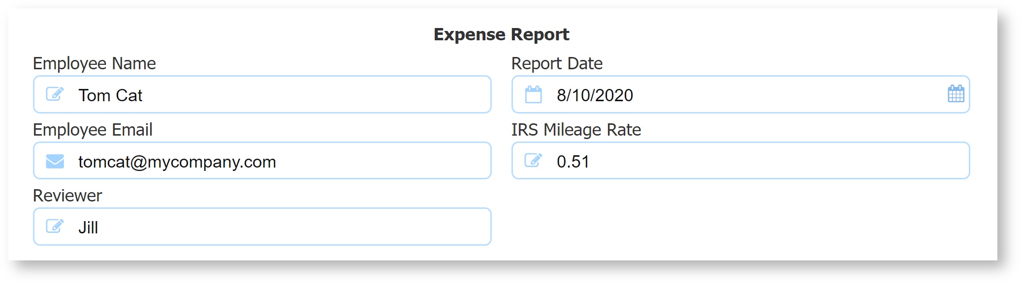
This image shows a panel in an Expense Report form that has the Nouveau layout selected. Notice the vertical and horizontal spacing between the controls:

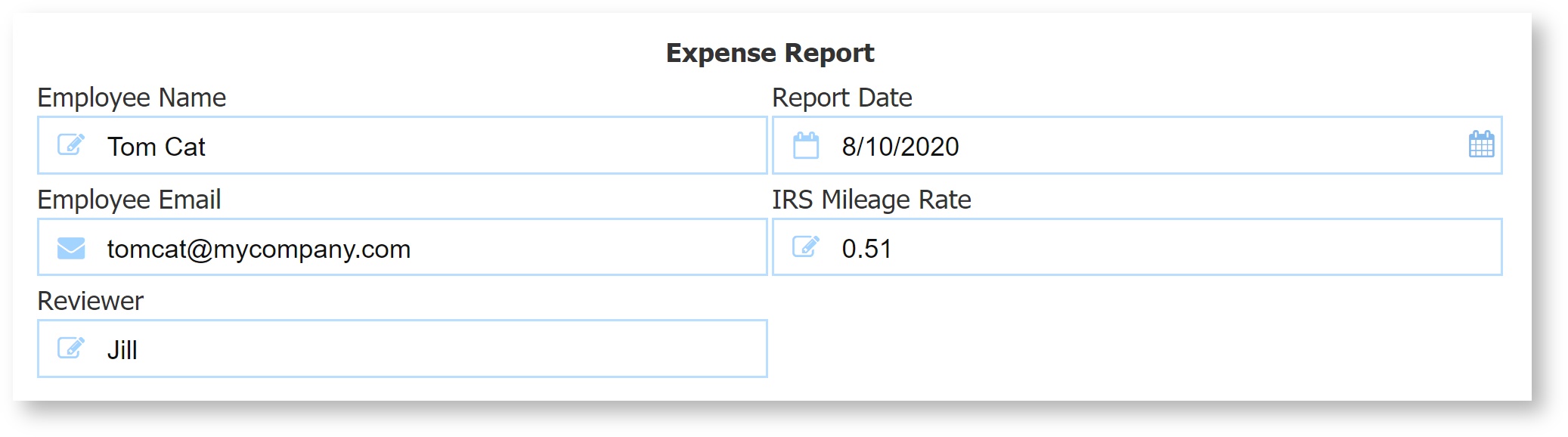
Here is the same panel when the Compact layout is selected for the form. The vertical spacing between the controls has been removed.
This image shows the same panel when the Tight layout is selected for the form. Notice the changes in the vertical and horizontal spacing and the rounded input control corners are replaced by square corners.
This image shows the same panel when the Nouveau Square layout is selected for the form. The Nouveau Square layout has the vertical and horizontal spacing of the Nouveau layout with square corners for input controls.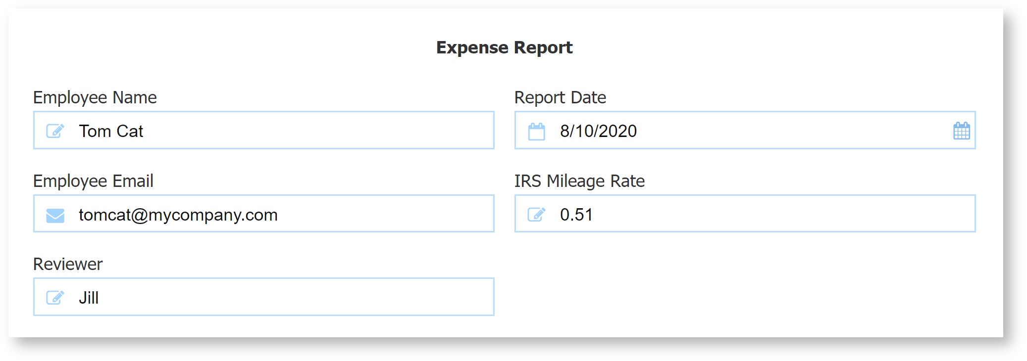
Styles
Styles are used to select a particular look & feel for your project, forms or workflows. The Style feature is primarily concerned with colors (background and font colors) but there is also the opportunity to specify other properties such as the font name, etc.
There are three levels of Styles in frevvo: GlobalStyles, tenant and user.
- Global Styles - can only be created by frevvo. They cannot be removed/edited by anyone including the frevvo superuser. Global Styles are available to all tenants and users. You will not see the global styles on the Styles tab but they will show in the Style dropdown as choices.
- Tenant Styles - created/modified/uploaded by the initial tenant admin ONLY. This is the admin user that was created when the tenant was created. Tenant-level styles are available to all users in the tenant.
- User Styles - created/modified/uploaded by the designer user. They are only available to that user.
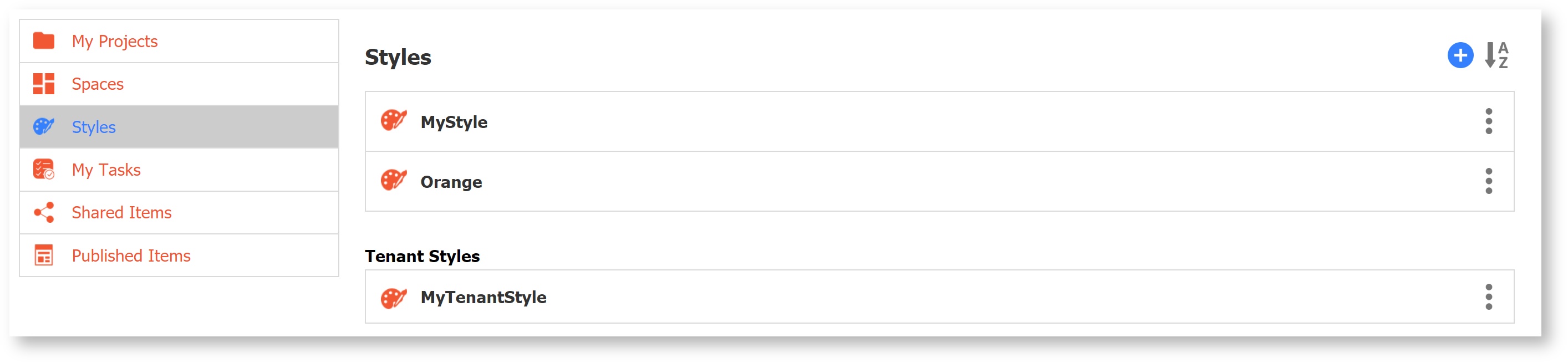
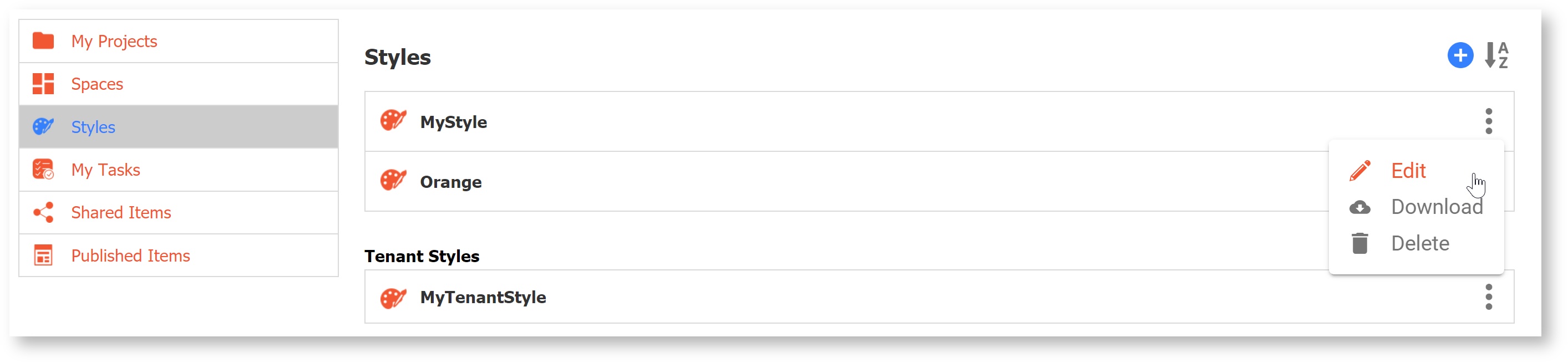
The Styles tab is divided into two sections: My Styles and Tenant Styles. GlobalStyles are not listed here. Styles created/modified/uploaded by the designer user will be listed in the My Styles section. Styles created/modified/uploaded by the initial tenant admin will show in the Tenant Styles section. Styles created/uploaded by additional admins in a tenant will not display here.
Styles are not included in the zipfile when you download a form, workflow or project. Styles must be manually moved from your test/development server to your production environment. You do this by selecting Download from the menu for each style you want to move from your test/development server and then selecting Upload from the  Add menu in the styles tab on your production server. Remember to upload the style at the same level on your production server as you had on your test/development server. You can also
  sort Styles alphabetically (A-Z or Z-A).
Global Styles
frevvo provides four styles that can be chosen from the Style dropdown choices on the Style tab of the Form Properties panel. You will not see Global Styles on the frevvo Style tab. Only styles created by designers and the initial tenant admin will display there.
The four Global Styles are: Blue, Neutral, Green, Aqua. You can use them for your forms, workflows and portals but you cannot download or modify them in any way.
Blue Style
Neutral Style
Green Style
Aqua Style
Creating Styles
The Styles page is divided into 2 sections:
- The top section of the page provides a field for the Style name, a description and the default colors (hex values) for controls explained in the table below.
- The bottom section of the page provides the ability to set colors for specific control types. The overrides in this section are helpful if you want your frevvo projects/forms/workflows to match a Style Guide used by your company.
The frevvo tenant admin or any designer user can create a new Style.
Follow these steps:
If you are logged in as a tenant admin you must first click the Home link in order to see the Styles Tab.
- Click on the Styles Tab.
- Click the Add icon and select New Style. The Update Styles screen will display. Notice that most of the fields have
 Help icons. Click these to get more information about the color property. Also, notice the background of each property field displays the assigned value:
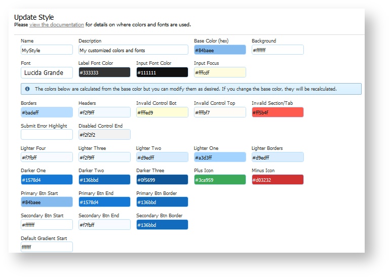
- Enter a name and description in the appropriate fields (limit of 255 characters.)
- The base color defaults to #84baee - the hex value for the color blue. You can replace this value but it MUST be with a hex color value. If you do not supply the #,
will add it for you. Lighter/darker colors are calculated from this color. If you change the base color, they will automatically be recalculated when you tab out of the field or when you click the Recalculate from base button. This color is used for anything that's clickable in your form e.g. print, help, date picker, uploads, workflow navigation icons, button gradients etc.
- The colors for most of the categories are generated from the base color. Some colors have defaults instead. You can change any color you want provided you supply the hex color value. Here is a list of the properties, the default colors, and where in your form the assigned color will display:
| Style Property | Default Value | Description |
|---|---|---|
| Style Name | MyStyle | Name of your Style |
| Description | My customized colors and fonts | Description of your Style |
| Base Color | #84baee | Lighter/darker colors are calculated from this color. If you change the base color, they will automatically be recalculated when you tab out of the field. This color is used for anything that's clickable in your form e.g. print, help, date picker, uploads, workflow navigation icons, audit trail icon, button gradients etc. |
| Background | #ffffff | Form Background Color. Background color of a portal. |
| Font | Lucida Grande | Change the form/workflow font. Be aware that changing the default font can have side effects like disturbing precise control alignment. Please check your forms/workflows carefully if you change the font. Leave blank to use the default font. When you click on the field, you will see a dropdown which will display a list of the default fonts: Arial, Geneva, Helvetica, Lucida Grande, Monaco, sans-serif, Tahoma, Times, Verdana |
| Label Font Color | #333333 | Color of Control Labels. If you specify a different font color on a particular control in your form, it will override the Style setting, used when no task in present in Task List on devices, form/workflow name,user's First /Last name,audit trail header,messages on the Task List. |
| Input Font Color | #111111 | Color of text entered in input, text area and other controls. Also, used as the font color dropdown options. |
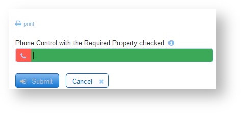
| Input Focus | #fffcdf | Color displayed when the field has the input focus. It is the highlighting color when an input field is selected. |
| Borders | #badeff | Color of most borders. Some controls like Tables use a slightly lighter border. See Lighter Borders below. |
| Headers | #f2f9ff | Section header, Table header, Dropdown gradient, top bar in Mobile renderings. |
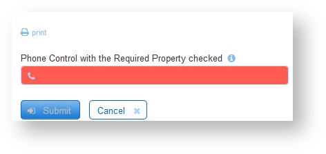
| Invalid Control Bot | #fffed9 | If the control contains invalid data, the bottom half of the Invalid control displays with this color. Use this color value in conjunction with the Invalid Control top to change the color for Required fields in your form. See the Example-ChangingthebackgroundcolorforRequiredFields below. |
| Invalid Control Top | #fffbf7 | If the control contains invalid data, the top half of the Invalid control displays with this color. Use this color value in conjunction with the Invalid Control bot to change the color for Required fields in your form. See the Example-ChangingthebackgroundcolorforRequiredFields below. |
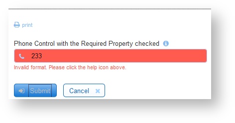
| Invalid Section/Tab | #ff5b4f | Color of collapsed section that is invalid (label/icon), Tab that is not selected containing invalid controls, Must Sign button, Error icon, Error msg. |
| Submit Error Highlight | blank | Use this to specify the background color for invalid controls in a form. Invalid controls will be highlighted with this color when the Submit button is clicked. If you leave this blank, invalid controls will be highlighted with the default color (orange). The color will disappear when data is entered or corrected in the field and it becomes valid. If the form is valid, it can be submitted. Refer to this topic for more information about this feature. See the Example-ChangingtheColorforInvalidFields below for instructions to change the color. |
| Disabled Control End | #f2f2f2 | This is the background gradient end color for disabled controls.. |
| Lighter Four | #f7fbff | Text and tic for the Done button in the Signature Lightbox, text and tic for the Done button of the Upload control Lightbox. Label and decorator for continue / submit / done (signature) / upload (upload control). Much lighter version of the base color. |
| Lighter Three | #f2f9ff | Color of watermark used in portals. Also used for the dropdown hover when selecting forms/workflows/Task List from a the main menu of a portal. Lighter version of the base color. |
| Lighter Two | #d9edff | Color of selected dropdown option, task in task list, disabled icons in task list. Lighter version of the base color. |
| Lighter One | #a3d3ff | Color of all decorators, signature icon, workflow step that is not ready, a selected task in the task list. |
| Lighter Borders | #d9edff | Used as the border for the Table control, icons and tasklist in a mobile portal . |
| Darker One | #1578d4 | Top color of button gradient, Percent/Step navigation for workflows, Mobile navigation control text |
| Darker Two | #136bbd | Running/Runnable steps for workflows, portal menu links on desktop. |
| Darker Three | #0f5699 | Help display background color, selected radio/checkbox, task descriptions. |
| Plus icon | #3ca959 | Plus icon for adding repeat items. |
| Minus Icon | #d03232 | Minus icon for removing repeat items. |
| Primary Btn Start | #84baee | Primary Action Button Gradient Start Color. The Primary Action Button is the Submit button on a form and the Continue/Submit button on a workflow. Default value is the same as the base color. |
| Primary Btn End | #1578d4 | Primary Action Button Gradient End Color. The Primary Action Button is the Submit button on a form and the Continue/Submit button on a workflow. Default value is the same as darker one. |
| Primary Btn Border | #136bbd | Primary Action Button Border Color. The Primary Action Button is the Submit button on a form and the Continue/Submit button on a workflow. Default value is the same as darker two. |
| #ffffff | Secondary Action Button Gradient Start Color. The Secondary Action Button is the Cancel button on a form. Default value is white. | |
| #f7fbff | Background Color for the Cancel,Save,Print,Clear buttons. Secondary Action Button Gradient End Color. The Secondary Action Button is the Cancel button on a form. Default value is the same as lighter four. | |
| #136bbd | Secondary Action Button Border Color. The Secondary Action Button is the Cancel button on a form. Default value is the same as darker two. | |
| Default Gradient Start | This is the background gradient start color for all controls including disabled controls. |
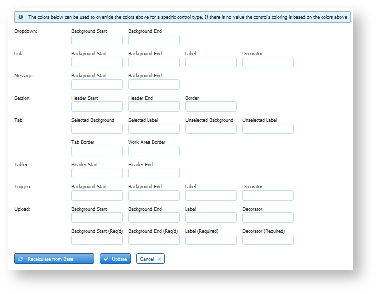
The next section shows the overrides that can be used to set the colors for a specific control type. Hover over the override color fields in this section for helpful hints for each field.
- If a control override color field is empty, the control will use the color specified in the top section.
- If a control override color is provided, the control will use the override color instead of the color specified in the top section.
You can override the background gradient start and end colors for the dropdown, link, message, section, table header, trigger, and required or optional upload controls.
Decorator colors for the link, trigger, and upload controls can be overridden. Tab control background and border colors can also be changed.
There are three buttons at the bottom of the page:
- Recalculate from base - Click this to manually recalculate the colors in your style. You may want to do this if you have modified the calculated colors and decide to revert back to the initial frevvo calculated colors.
- Update - Click this to save modifications made to a new or existing Style.
- Cancel - Click this to return to the Style tab
The default font size for forms/workflows is 14. This cannot be changed.
Example - Control Overrides
Applying the Style below to a form displays the control colors as shown.
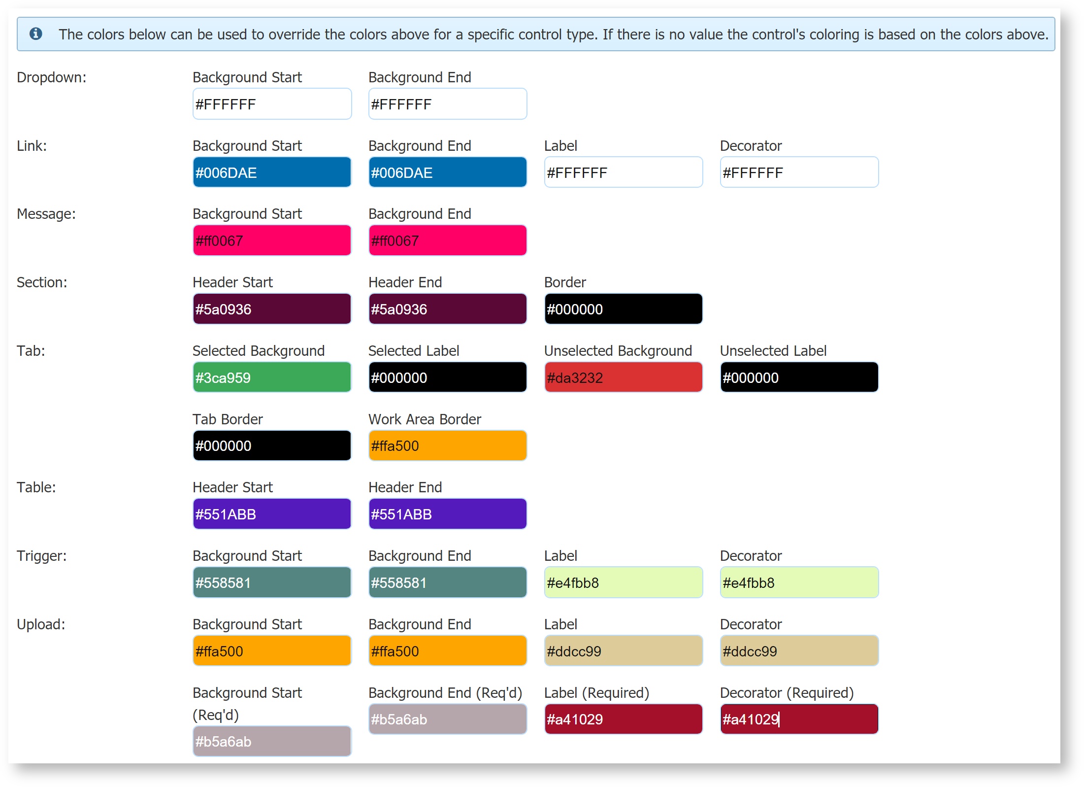
Control Override Section of a Style
Form with the Style containing the Control Override Colors shown applied to it
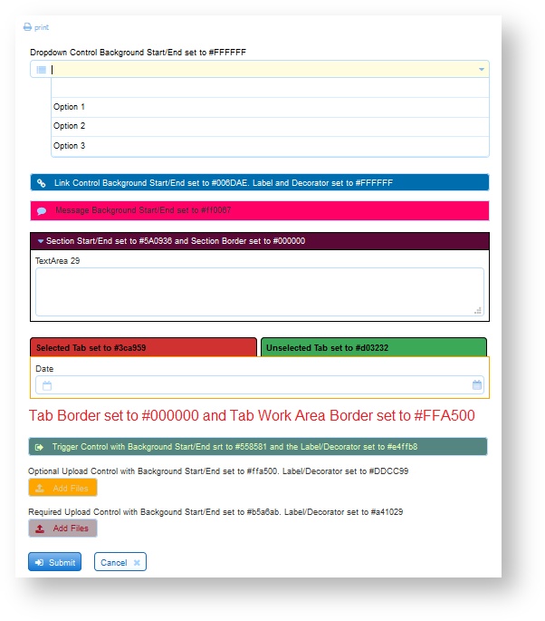
Example - Changing the background color for Required Fields
Let's say you set the Input Focus control color to green and the Invalid Control Top and Invalid Control Bot colors to red in your style.
Asterisks and Required Fields
Example: - Changing the Color for Invalid Fields
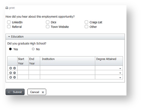
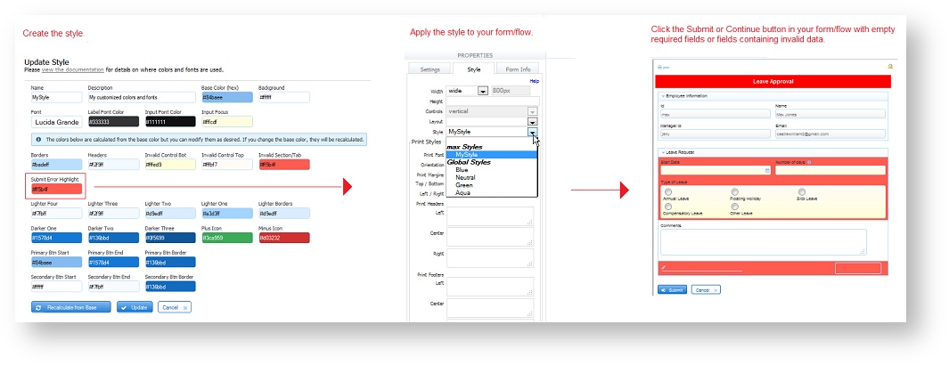
If you click on the Submit button in a form that contains invalid data or required fields that are empty, the invalid fields will be highlighted with an orange background color. You can change the background color by changing the value of the Submit Error Highlight property in the style then applying the modified style to your form/workflow. Follow these steps:
- CreatingStyles
- Specify the hex value for the color that you want in the Submit Error Highlight field. Save the modified Style.
- Edit your form/workflow. Click on the toolbar then the Style tab in the form/workflow property panel on the left. Apply the Style to your form/workflow by selecting it from the Style dropdown.
- Save your form/workflow.
The image shows a style specifying a red color (#ff5b4f) for invalid fields and the result when the Submit button is clicked.
The designer can also display a message instructing the user what to do. This approach is very helpful to users when trying to determine why a form does not submit. Refer to this topic for the details.
Modifying a Style
All the custom styles you created in your designer user account will be listed under the My Styles section of the Styles tab. You can edit, DownloadingStyles or delete your custom styles.
To edit a style,
- Click the style name in the list, or click the
 Action Menu and select
  Edit.
Edit. - Make your changes. Remember, if you change the base color, the dependent colors will automatically recalculate when you exit the field.
- Click the
 button to save your changes.
Use caution when modifying Style colors since they take effect in many places. For example, some of the Style properties affect the frevvo Task List.
Downloading Styles
When moving frevvo from your test/development server to your production environment, all Styles in your tenant must be manually downloaded from your test/development server and uploaded to your production server.
To download a style, click on the Menu and select  Download. A Name.style file will be downloaded. It is a properties file that can be edited using any text editor.
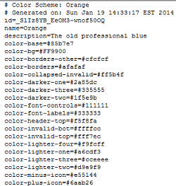
A designer user can download their own styles and styles added by the tenant admin for transfer. Global Styles cannot be downloaded or modified by anyone including the frevvo superuser.
Uploading Styles
A tenant admin or a designer user can upload Styles to frevvo. Styles uploaded by a designer user are listed in the My Styles section of the Styles tab and are only available to that user. Styles uploaded by the initial tenant admin are available to all tenant designer users. Global Styles can only be added by frevvo.
To upload a Style when logged in as a designer user, follow these steps:
If you are logged in as a tenant admin you must first click the Home link in order to see the Styles Tab.
- Click on the Styles Tab
- Click the Add icon and select
 Upload Style.
 - Click on
 button then navigate to the location of the style file on your disk
 - Check Replace if you want to replace an existing file with an updated version
- Click the button.
Using Styles and Layouts
Styles can be selected at the project, form, workflow, and portal levels. If no style is selected, the default global style Blue is used. If no style is set for a form/workflow, it will inherit the style selected for the project. If a form/workflow is embedded in a portal, the portal style will take over even for forms/workflows where you selected a specific style. A style applied to a workflow will be inherited by all the forms contained within it.
Layouts can be selected for projects, forms, and workflows but not portals. If no layout is selected, the default layout, Nouveau, is used.
To select a style and layout for a project, follow the steps below:
- Click the Action Menu for a project on the Projects home page. Select
 Properties.
 - Click the Choose Layout input. The available global layouts will display. Nouveau is the default. Select the layout you want.
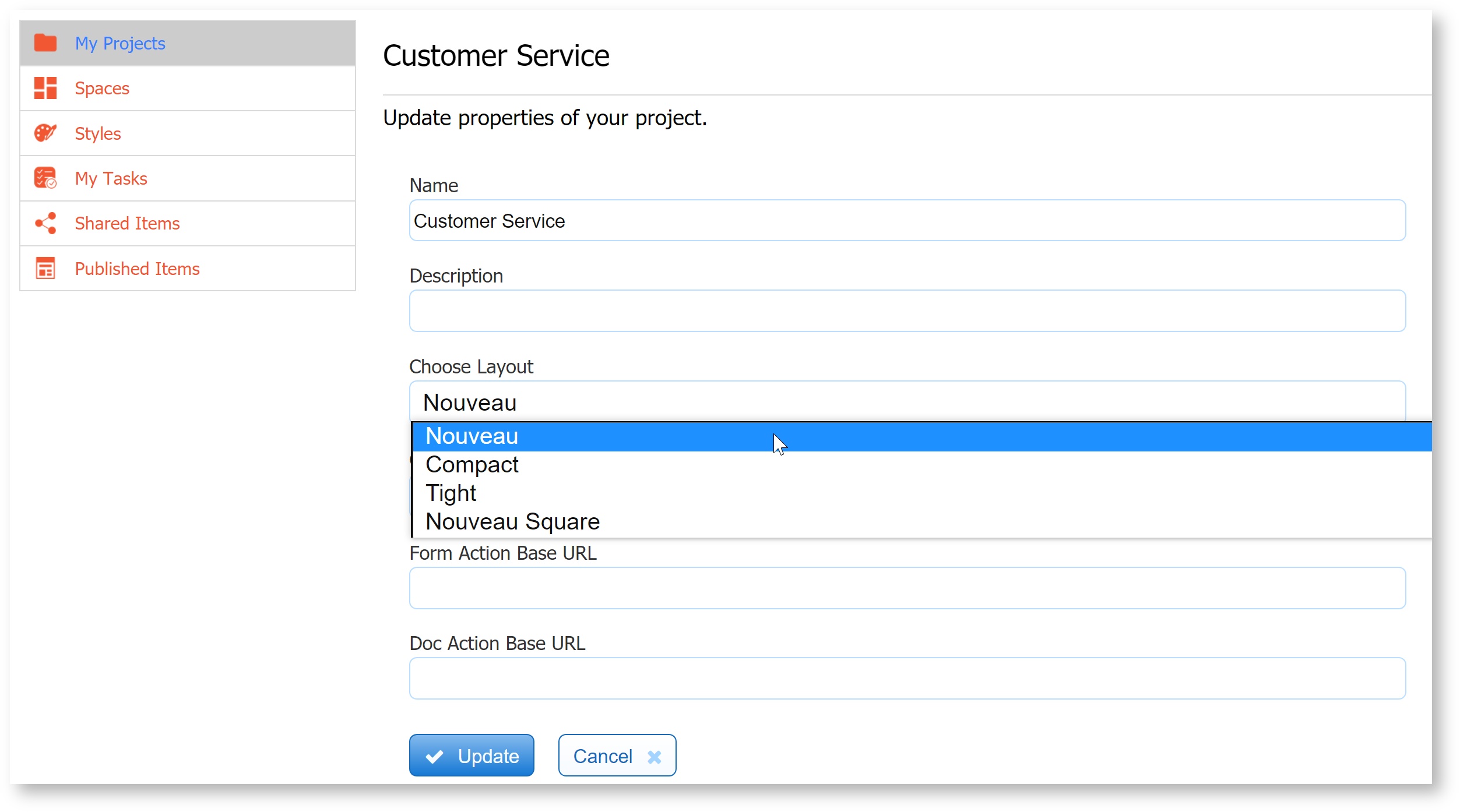
- Click the Choose Style input. All global, tenant, and styles designed by you will be displayed. If you leave the Choose Style field blank, you will get the default style Blue. Select another style to change from the default Blue. If you only see global styles here it means that no custom styles were created by either the tenant admin or by you.
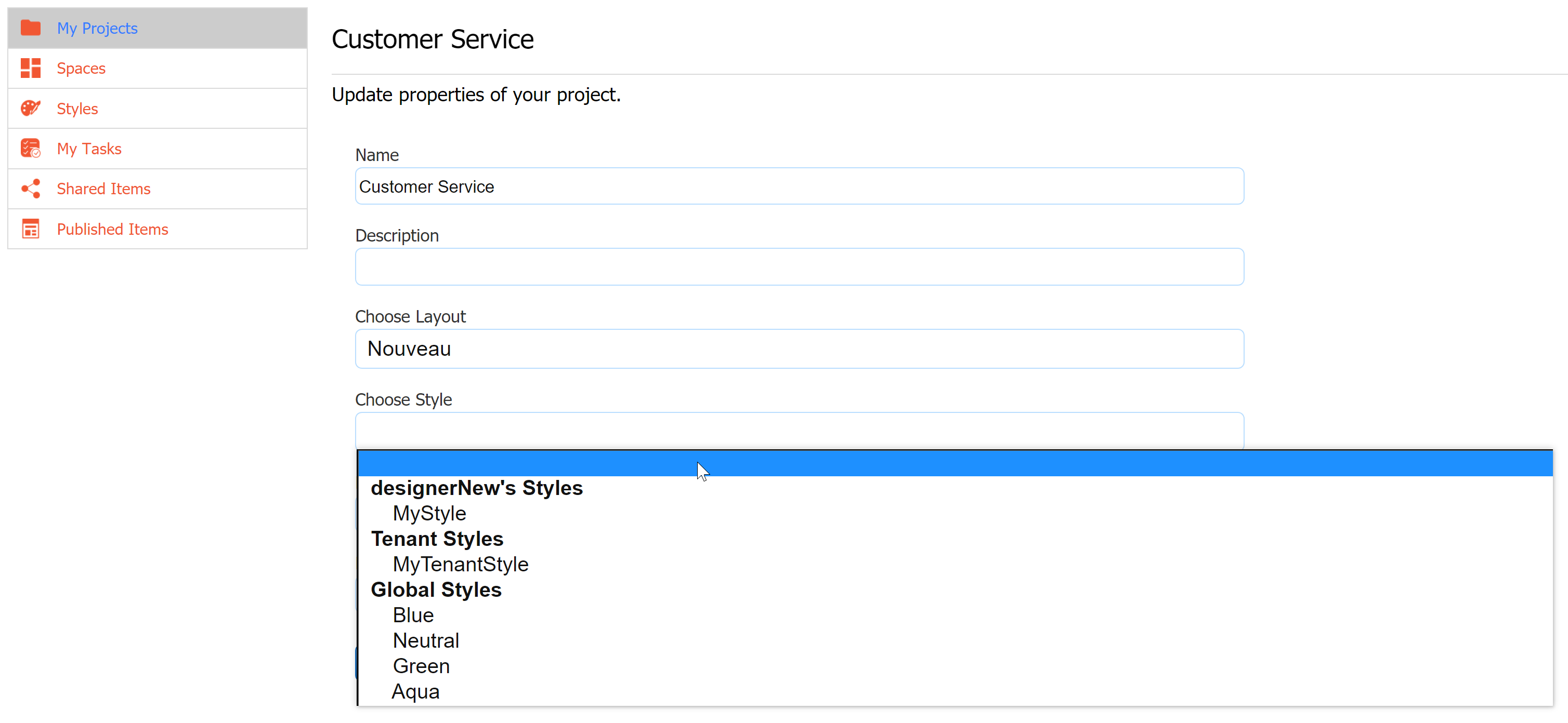
- Click
 .
.
This will apply the selected layout and style to all forms and workflows in that project where the designer has left the FormStyleProperties-Layout unselected. If the designer selected a specific layout and style for any given form or workflow, that selection will take precedence over the project's selection.
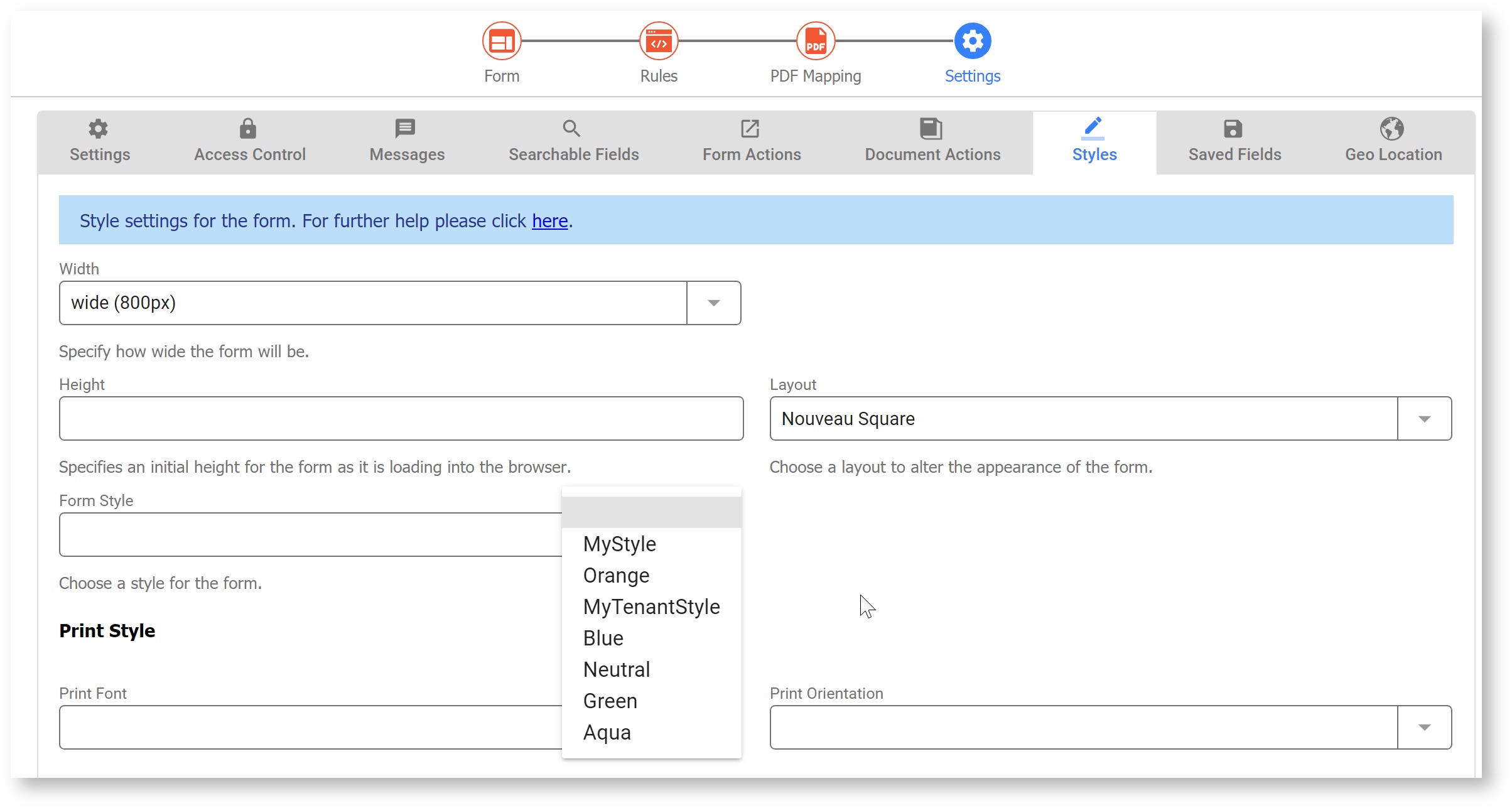
To select a specific layout or style for any given form or workflow, edit the form or workflow, then select the Settings editing mode. Click the Style tab, and pick your layout and style from the respective dropdown lists. These form/workflow designer style properties will override your selected style's properties. For example, if your style sets labels to blue you can override this for a particular control to yellow using the LabelColorandLabelSize.
_styleId URL Parameter
Styles can be selected dynamically via the form or portal using the URL parameter _styleId. This parameter takes precedence over a style selected at the project or form level. Append _styleId=<style name> to the share link of your form/workflow or portal. The share URL shown appends the _styleId parameter equal to a style named Orange that was created by the designer.
http://<your server>:<your port>/frevvo/web/tn/doctenant/user/designer/app/_KOSm0eEAEeOF6Nc8pkcCvQ/formtype/_LMyVkO0YEeOyf-kI5QXetA/popupform?_styleId=Orange
Adding Custom Fonts to frevvo
If your organization requires custom fonts for styling text in Message Controls, you can write custom JavaScript to make them available to frevvo. Once the fonts are loaded, designers can access the fonts via HTML markup. Alternatively, you can add them to the Fonts dropdown in the Rich Text Editor of the Message Control. Click the links for the details.