Dashboards
- Megan Ellis
Dashboards is an add-on feature. We encourage all customers to get to know this exciting new feature.
- Read on! This documentation covers Dashboards in detail.
- View the Dashboards Webinar (1 hour)
- Check out the introductory Dashboards Video (5 min) Coming soon!
Contact us at sales@frevvo.com if you are interested in adding this feature to your account.
Overview
frevvo Dashboards is a reporting feature that allows you to collate, visualize and share metrics and operational insights from your forms and workflows. Use Dashboards to create beautiful, functional reports that give your stakeholders at-a-glance insight into your business and help you monitor the efficiency of your workflow processes. Designers will appreciate the familiar user interface, the broad selection of chart types, filtering and customization options, and the ability to deploy dashboards anywhere, just like a form or workflow.
This Dashboards documentation assumes a general knowledge of frevvo design features for forms and workflows, including controls, business rules and settings. Designers building dashboards likely already have forms and workflows in production with submissions. If you are new to frevvo, we recommend starting with the Quick Start Video Guide or the Workflow Tutorial.
Form and Workflow Design for Dashboards
While this documentation is heavily focused on the technical side of creating and customizing dashboards, form/workflow design plays an important role in optimizing this feature.
View this blog article for additional information and examples of optimal form/workflow design for dashboards.
Designing forms and workflows with dashboards in mind will ensure your process is complete, efficient, productive, and manageable. Form/Workflow design should take into account the key stakeholders in the process and the reporting, monitoring, analysis, and strategic needs of the stakeholders and participants. The designer must quantify and specify those insights in terms of measurements, key performance indicators (KPIs), analytics, and data that is to be derived. This information can be roughly categorized into:
- Strategic data used to measure the process against set goals
- Analytical information that is more tactical and discovery in nature
- Operational and real-time process information
For example, a strategic goal in a Procure-to-Pay process might be on-time procurement. The designer would want to ensure the workflow captures data that can measure this, such as a deadline date and a calculation to determine if the procurement is early, on time, or late.
An example of a tactical insight in the same Procure-to-Pay process is discovering volume buying and discount opportunities. The form/workflow should capture relevant information on the product/service, including category, vendor, rate, and discount information (if any) that allows a stakeholder to assess this metric.
Operational statistics help determine efficiency and look for improvements by examining both data and metadata; for example, in the same Procure-to-Pay process it might be helpful to know which department the current workload is coming from, if the productivity is in line with given resources, and if there are inefficiencies that can be visualized and corrected. Much of this type of information is available in frevvo dashboards by default, including submitter information, process duration, relevant process date/times (start, completion, etc.), and error information.
Create a Dashboard
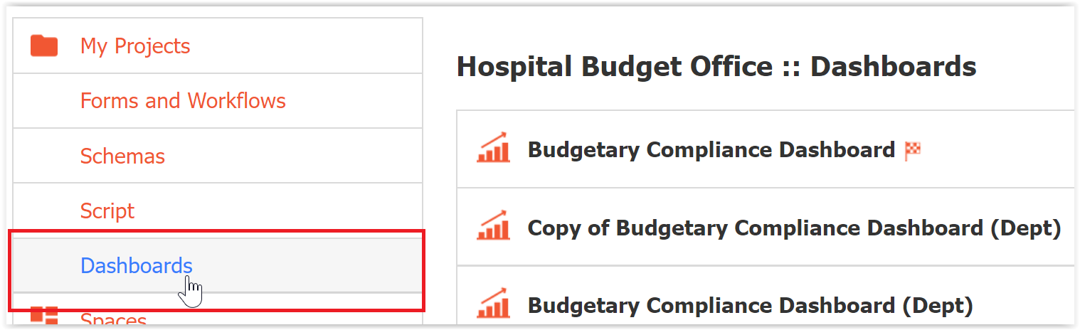
Dashboards are created as part of a project. When you open a Project, you will see a Dashboards tab on the left side menu.
Click the Add icon to create a new dashboard, upload a dashboard, or install a pre-built dashboard template.
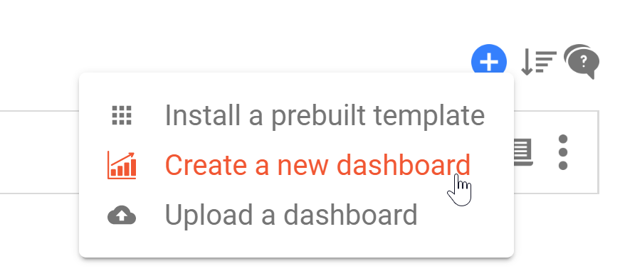
- Install a prebuilt template allows you to create a dashboard from a template that has been published in your tenant. See the templates documentation for more details.
- Create a new dashboard generates a blank dashboard. You will customize each aspect of it, including adding charts and connecting a data source.
- Upload a dashboard installs a frevvo dashboard from a previously downloaded _dashboard.zip file. You might use this when moving a dashboard from a development project to a production project. If you attempt to upload a _form.zip or _workflow.zip from this page, it will upload successfully and will redirect you to the Forms and Workflows homepage. The reverse is also true; upload a _dashboard.zip in the "Upload a form/workflow" dialogue, and you will be redirected to the Dashboards home page.
Once you click an option, you will be taken to the Dashboard Designer.
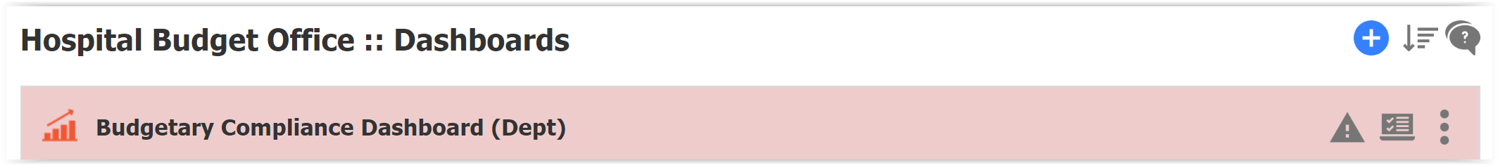
Your dashboards will appear in the list, which can be sorted by Update Date or Name.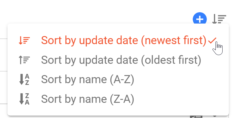
Similar to the Forms and Workflows home page, dashboards with any error will display with a salmon background. See Data Set Validation for more details.
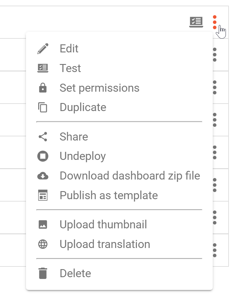
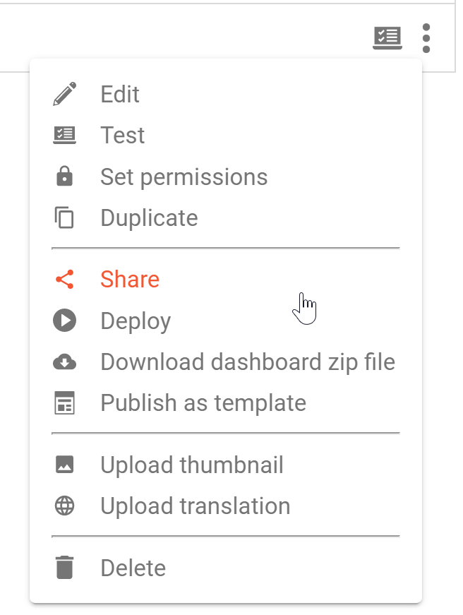
Each Dashboard in the list has a Test icon, which opens the dashboard in test mode, and 3-dot Action menu with the following options:
- Edit opens the Dashboard Designer. You can also open the designer by clicking the dashboard name in the list.
- Test opens the dashboard in test mode.
- Set Permissions opens the Access Control wizard.
- Duplicate creates a copy of the dashboard in the same project. You will immediately see the copied dashboard in the list.
- Share opens the share dialog that provides links for sharing a link or embedding your dashboards for end-users.
- Deploy/Undeploy changes the form from development to production or vice versa.
- Download dashboard zip file downloads a zipped file of the dashboard which can be uploaded into another frevvo project.
- Publish as template makes the dashboard available as a template - the tenant admin must publish the template in order for other designers to use it. See the templates documentation for more details.
- Upload thumbnail allows you to upload an icon that will appear when the dashboard list is viewed in frevvo Space on a mobile device.
- Upload translation allows you to provide a translation file to internationalize the dashboard.
- Delete removes the dashboard. This is permanent and cannot be reversed.
Dashboard Designer
The Dashboard Designer is laid out similarly to the form and workflow designers.
Across the top, you will see:
- Dashboard Name, editable by hovering over it and then clicking the pencil icon.
- Guided Designer Navigation Bar allows you to switch between Dashboard, Rule and Settings editing modes.
- Action Menu with options to Save, Save and Test, Cancel and Close, Preview a read-only view, or show/hide mobile page breaks.
On the left side, you will see two palettes:
- Filter Palette provides controls that you can add to allow the end-user to filter the dashboard at run time.
- Dashboard Palette provides various chart types that you can add to your dashboard canvas.
The Properties panel will display chart properties when a chart is selected and control properties when a control is selected. This is where you will add data sources and customize your chart. See Chart Properties.
Dashboard Canvas
The center of the screen contains the dashboard canvas, which consists of three sections.
Dashboard Header
Every dashboard automatically includes a dashboard header. It is automatically added as the first control at the top when the dashboard is created. It cannot be moved or deleted. Other controls must be added below it. The dashboard header can optionally be hidden. Select the header to show its properties in the Properties panel.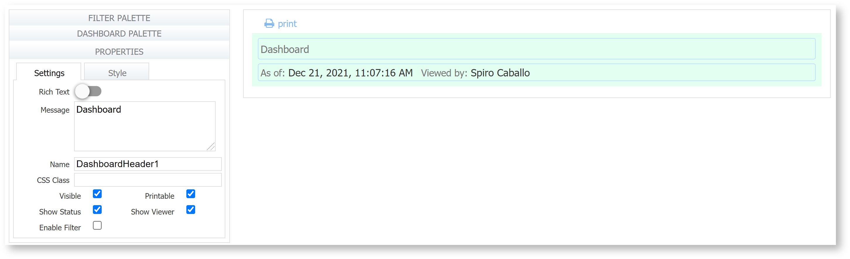
The dashboard header consists of up to three distinct areas on the canvas. Two of these areas are shown in the image above.
Title
The top area is the Dashboard Title and is very similar to a message control. The Message property accepts HTML markup and displays it as the title, or toggle the Rich Text property to use the Rich Text Editor instead. The title may also contain templatized strings.
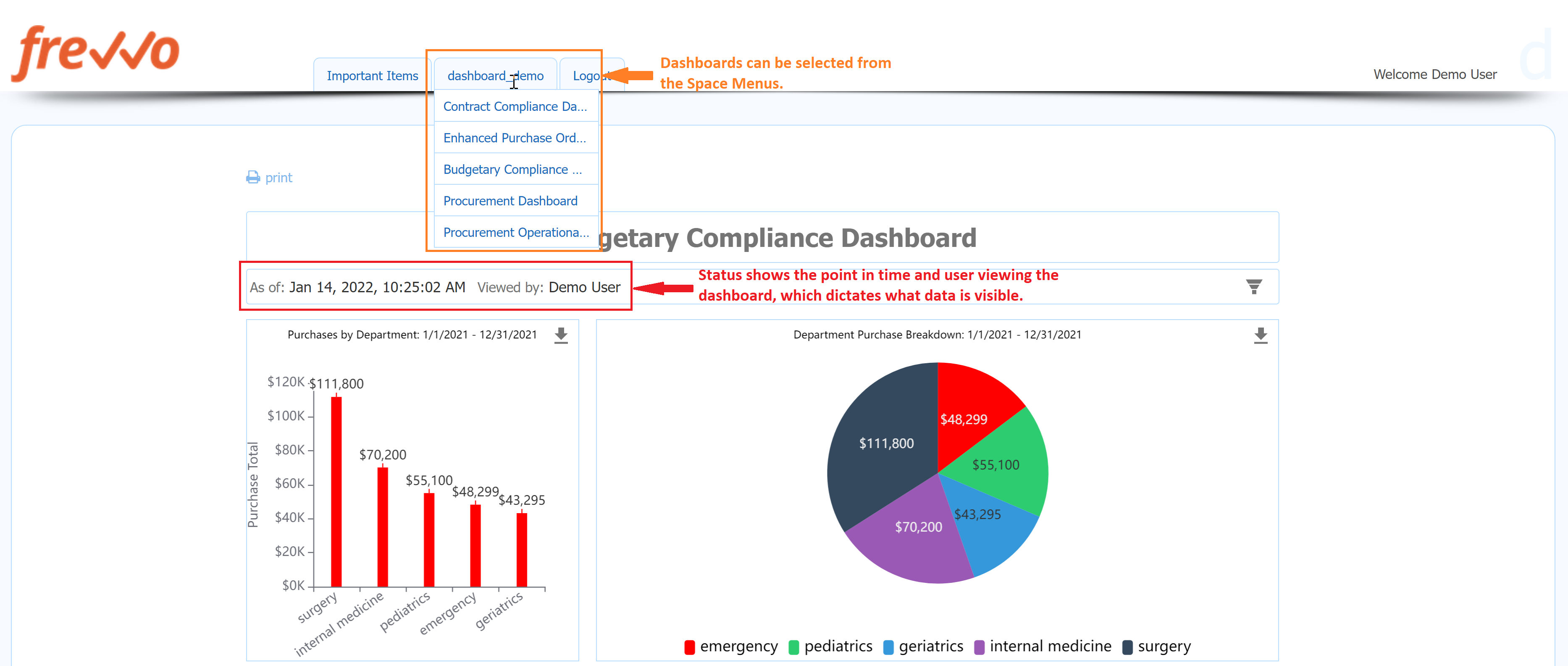
Status
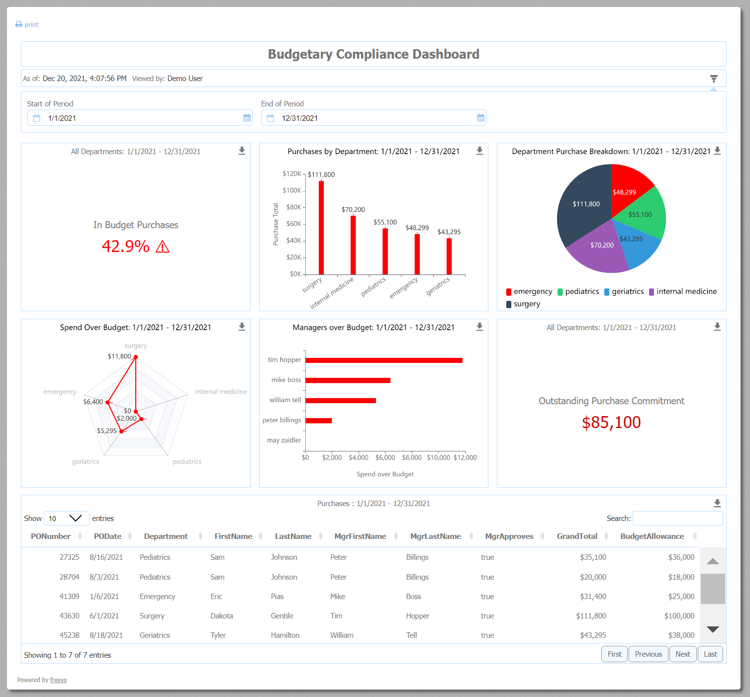
The area below the Dashboard Title is the status area. It optionally shows the “as of” status and the “viewed by” status. The data shown on a dashboard is relative to a point in time and relative to the user that ran the dashboard. The status information is shown to give the user context; at a different time or for a different user, the data shown could be different. However, the designer could choose to not show either or both of these status fields by unchecking the “Show Status” and “Show Viewer” checkboxes in the Properties panel. They are both checked by default.
The status area is only visible if at least one of three properties is checked: Show Status, Show Viewer and/or Enable Filter.
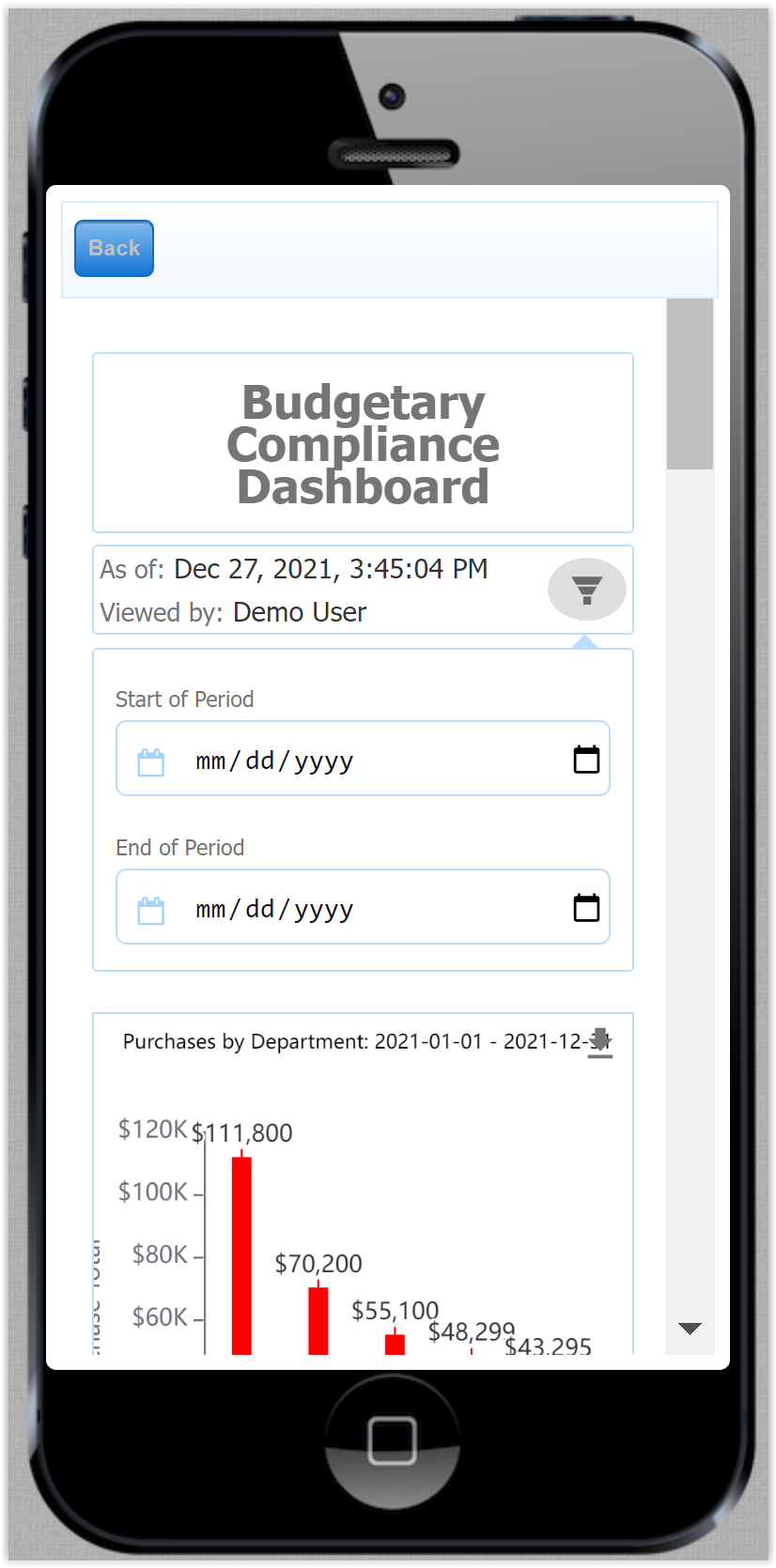
Filter Parameters
The dashboard header also supports an optional filter parameter area. The filter parameter area allows the end-user to customize the runtime dashboard by making selections that will alter the data shown on the dashboard. The filter parameter area includes a filter icon  that allows the designer or end-user to collapse or expand the filters. Set the filter to expanded in the designer to show it expanded by default in use mode or vice versa.
Select “Enable Filter” in the dashboard header Properties panel to display and edit the filter parameter area. This will display the filter icon button in the status area of the dashboard header. 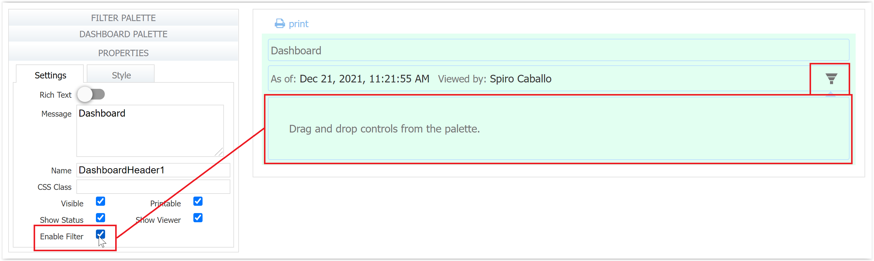
The ability for the end-user to save filter parameter selections is not supported at this time.
Most Filter Palette controls can be dropped inside the filter parameter area (but not outside of it). The only exception is that page break controls may only be dropped on the canvas outside of the filter parameter area. Charts and data tables may not be dropped inside the filter parameter “dropdown” area. Note that the signature, form viewer, and submit controls are not present on the Filter Palette in the dashboard designer.
The controls inside the filter parameter area can be used to filter the dashboard, altering the data that is displayed. To do this, the designer will use these controls as templatized strings in the data configurator wizard, but most importantly in the advanced data filter screen, for the various charts and data tables on the dashboard. As the end-user makes parameter changes, each chart and data table’s data filters are altered. This triggers the data to be retrieved again and the dashboard view to automatically refresh. Rules are available in dashboards and have full access to the controls inside the filter parameter area. The designer can also set default values in the filter controls.
Header Properties
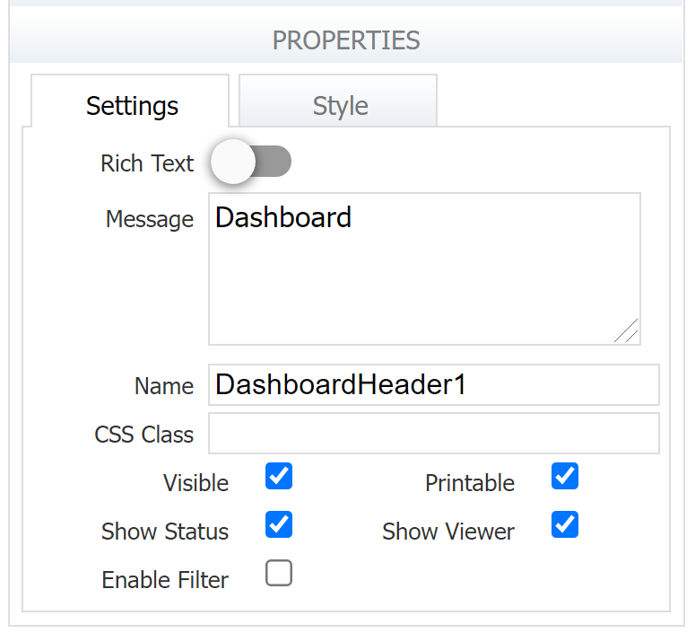
The Dashboard Header properties panel has a Settings tab and a Style tab.
Settings
Similar to message controls, there is a Message property that accepts HTML markup and a Rich Text toggle that makes the Rich Text Editor available. You can also give the header a name and CSS Class if desired. The Visible and Printable properties work as they do in other controls. You will also see three header-specific properties:
- Show Status displays "As of <current date/time>".
- Show Viewer displays "Viewed by <current user>"
- Enable Filter enables the filter parameters area
If any of these three properties are checked, the status area is displayed.
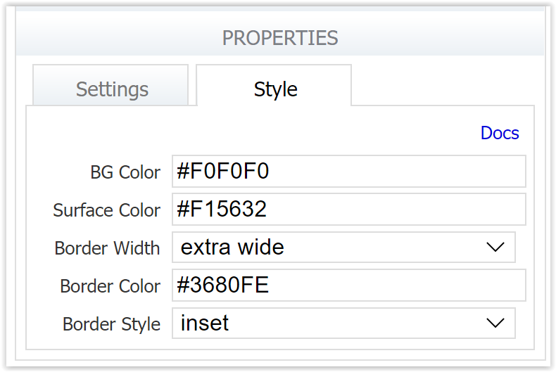
Styles
The styles tab for the dashboard header has been enhanced with new style properties to allow the designer a wide latitude in customizing the markup area of the header.
- BG Color sets the background color of the control.
The following 4 properties apply only to the Title area. - Surface Color is used to set the background color inside the Title area (as opposed to the background color of the area outside the box).
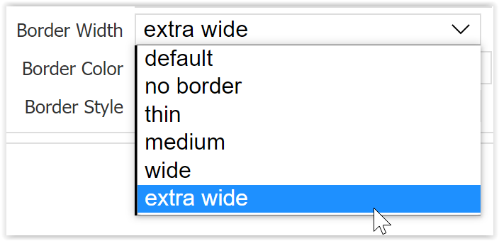
- Border Width property defaults to the width set by frevvo for all control borders and has options for no border as well as overrides of thin, medium, wide, and extra-wide.
- Border Color defaults to the color inherited from the color scheme/style for borders and can be overridden with any valid CSS color name or its hexadecimal RGB equivalent.
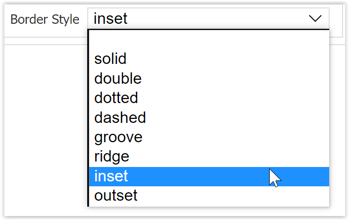
- Border Style defaults to solid unless overridden with one of the CSS border style settings in the dropdown.
All color properties accept any valid CSS color name or its hexadecimal RGB equivalent.
Dashboard Palette
The Dashboard Palette contains all of the chart controls you can use in your dashboard. See the Chart Types page for a detailed description of each type and when you might use it.
- Pie and Donut
- Bar
- Column
- Area
- Line
- Scatter and Scatter Line
- Radar
- Data Table
- Radial Gauge
- KPI
Click any control and drag it to the canvas to add it to your dashboard. Just like when you add controls to a form canvas, you can change the width, and drag and drop additional controls to the right, left, above, or below any existing charts. Green arrows will appear to show you where you can drop the chart control.
When you drop a chart control onto the canvas, it will display some sample data so that you can get an idea of what it will look like with your real data. You must configure the chart in order to show real data.
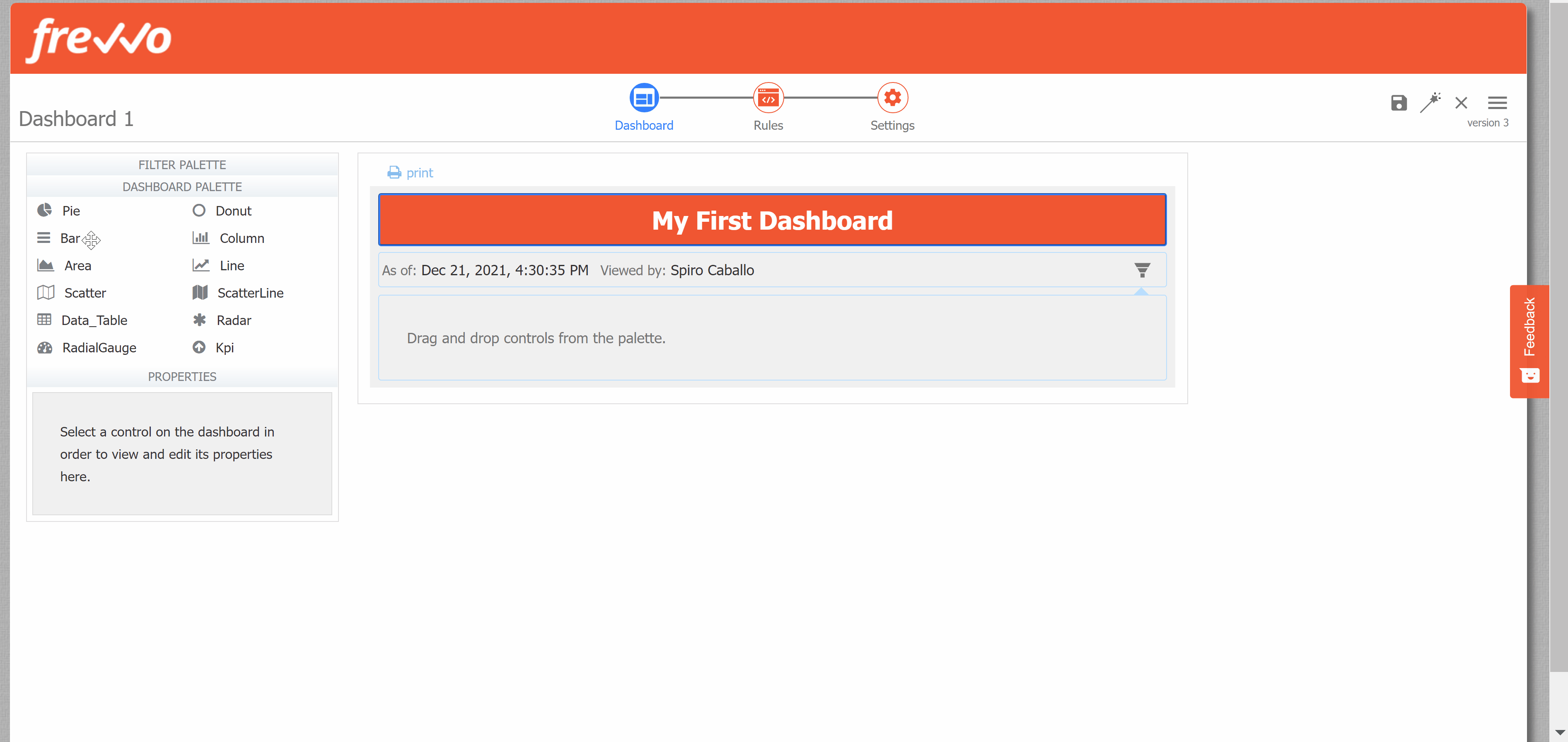
Chart and Data Table Settings
Chart and data table settings and style tab(s) will display in the Properties Panel when they are selected. Several settings are familiar from Palette Control Settings. Click the links on the following property names to learn more: Label, Name, CSS Class, Visible, Printable, Hide Label. The Label on a chart will display at the top of the chart.
The remainder of this section discusses chart settings specific to Dashboard Palette controls.
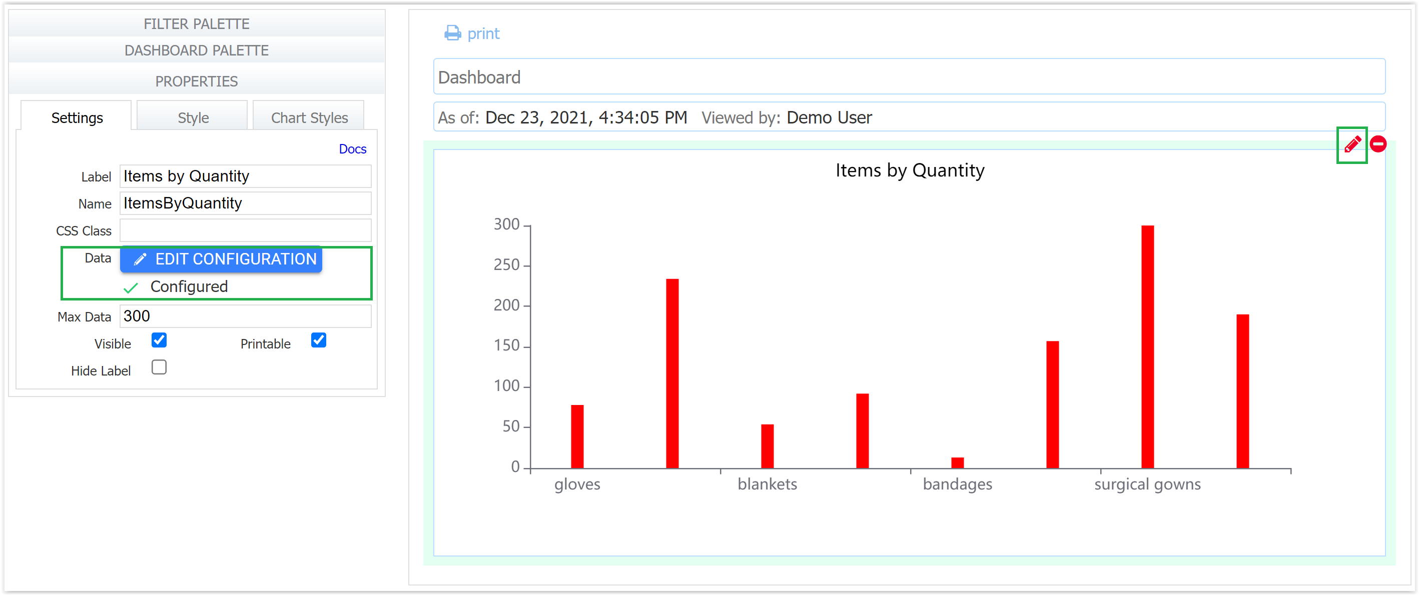
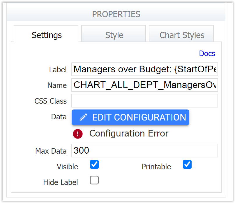
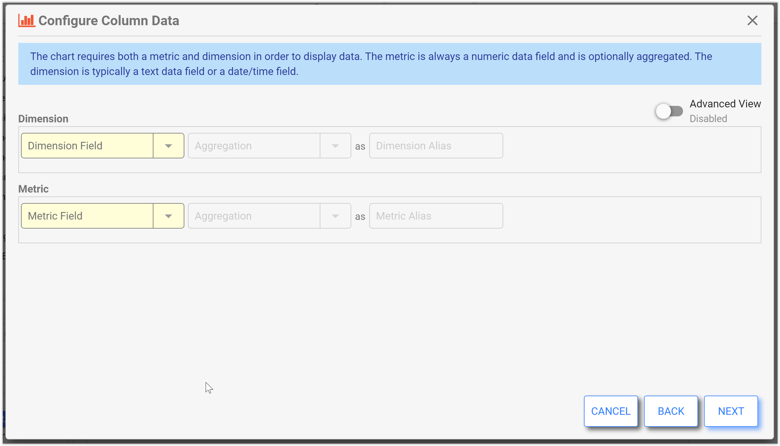
Data
Use the Data property to configure the data that will display in the chart. When you first drag and drop a chart to the canvas, you will see a warning "NOT Configured!" under the Edit Configuration button. If there is a data configuration error, you will see a "Configuration Error" warning here (see Data Set Validation for more info on resolving errors).
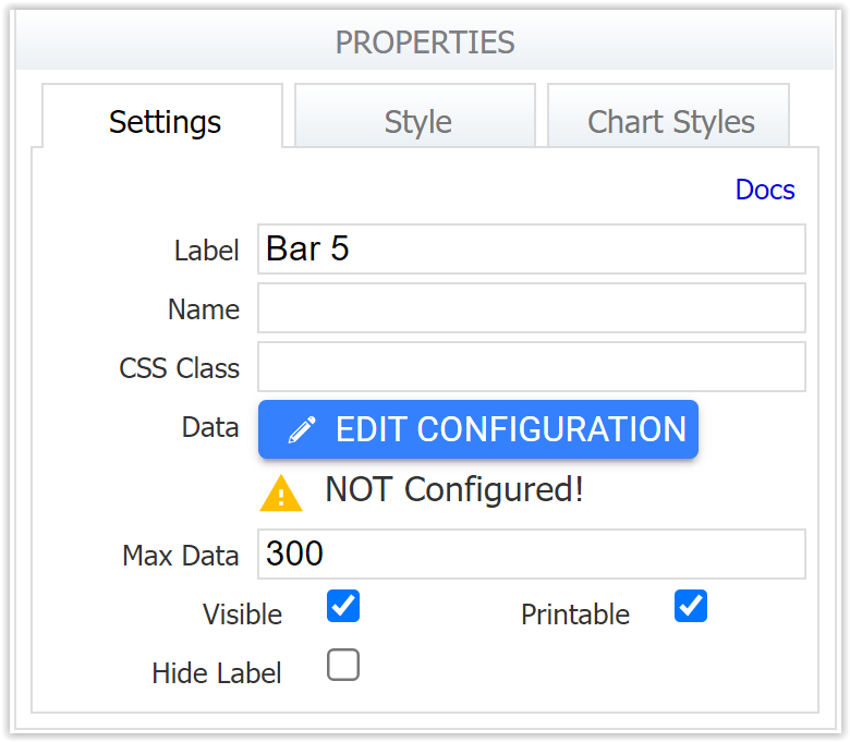
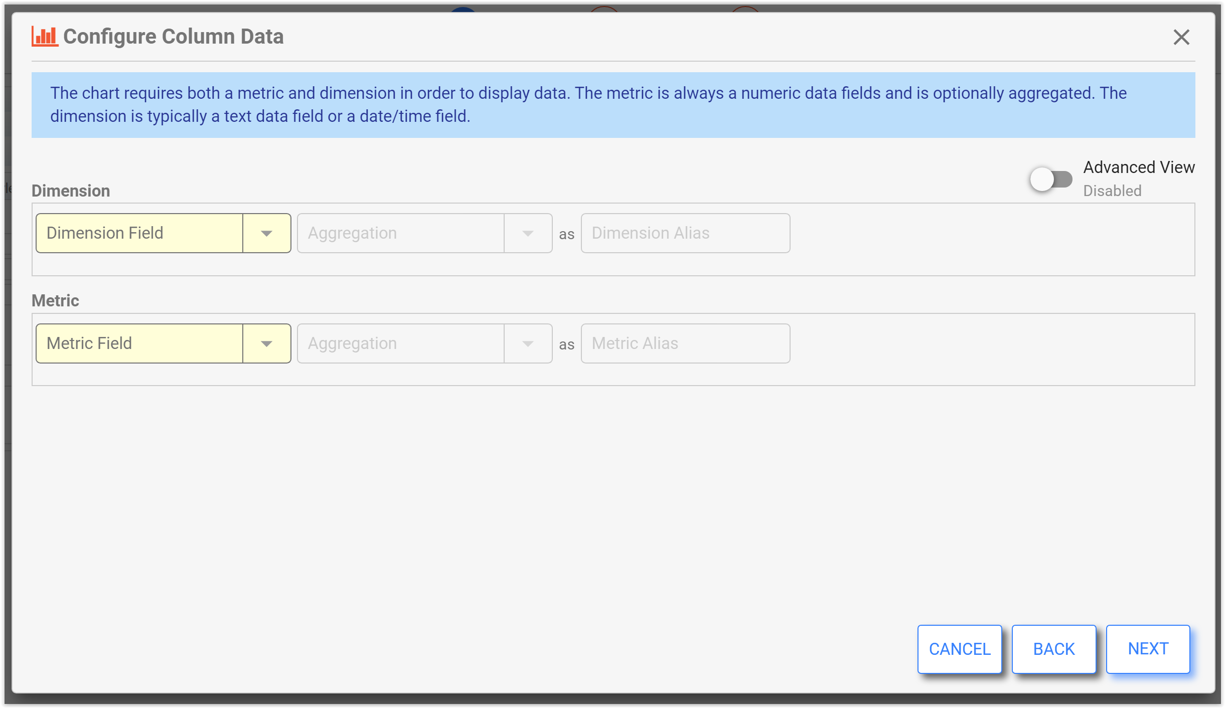
Click Edit Configuration to begin. This will display a "Configure <Chart Type> Data" wizard. The icon and title indicates the chart type you are working on.
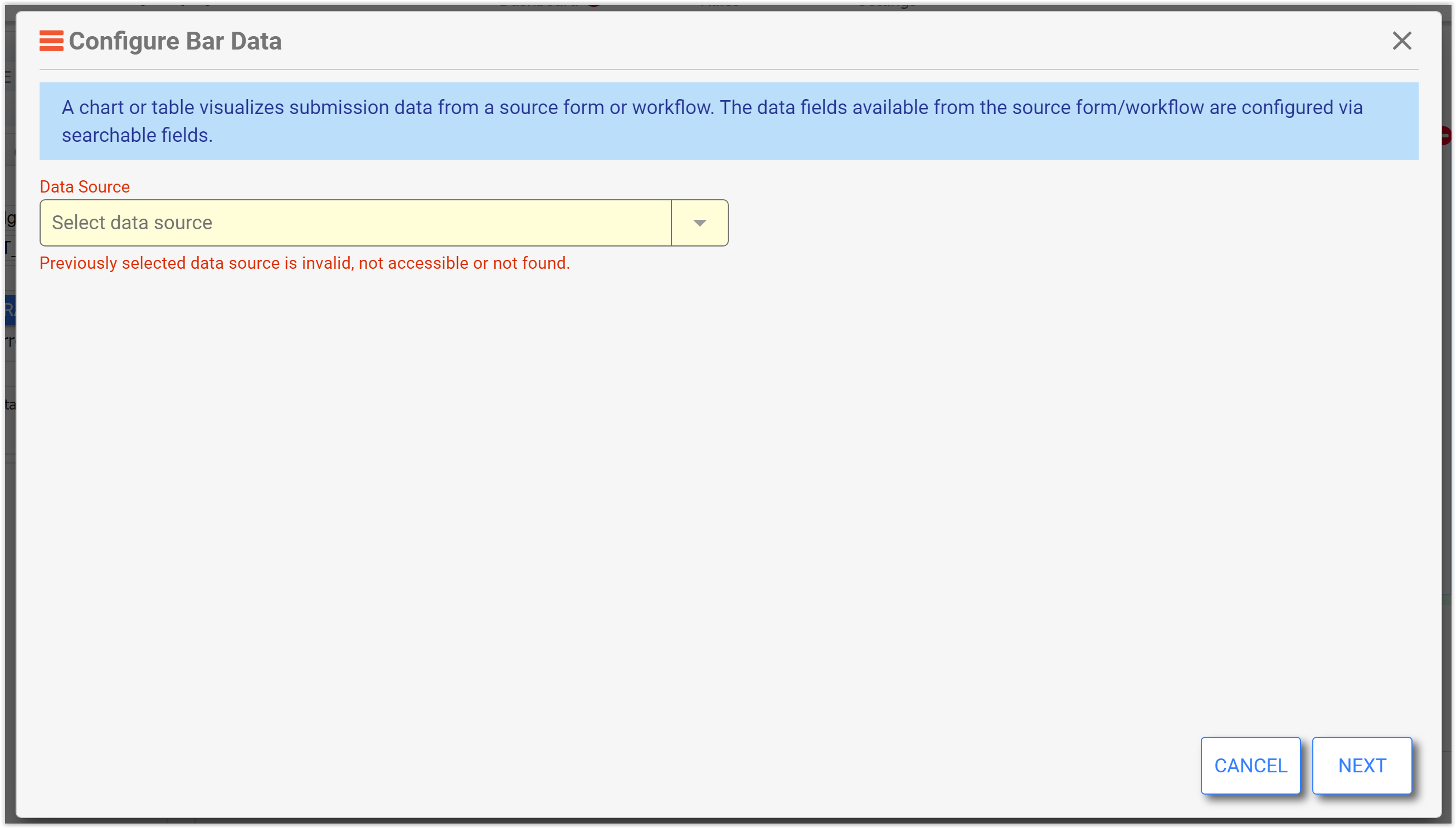
Data Source
The first screen displays a required Data Source dropdown. Select a form/workflow as the data source for this chart/table. The selectable forms/workflows are those that the designer owns, those that have been shared for View/Edit Submissions, and those that have been shared for Editing by another designer in the tenant. See the Access Control and Shared Items page for details about these permissions.
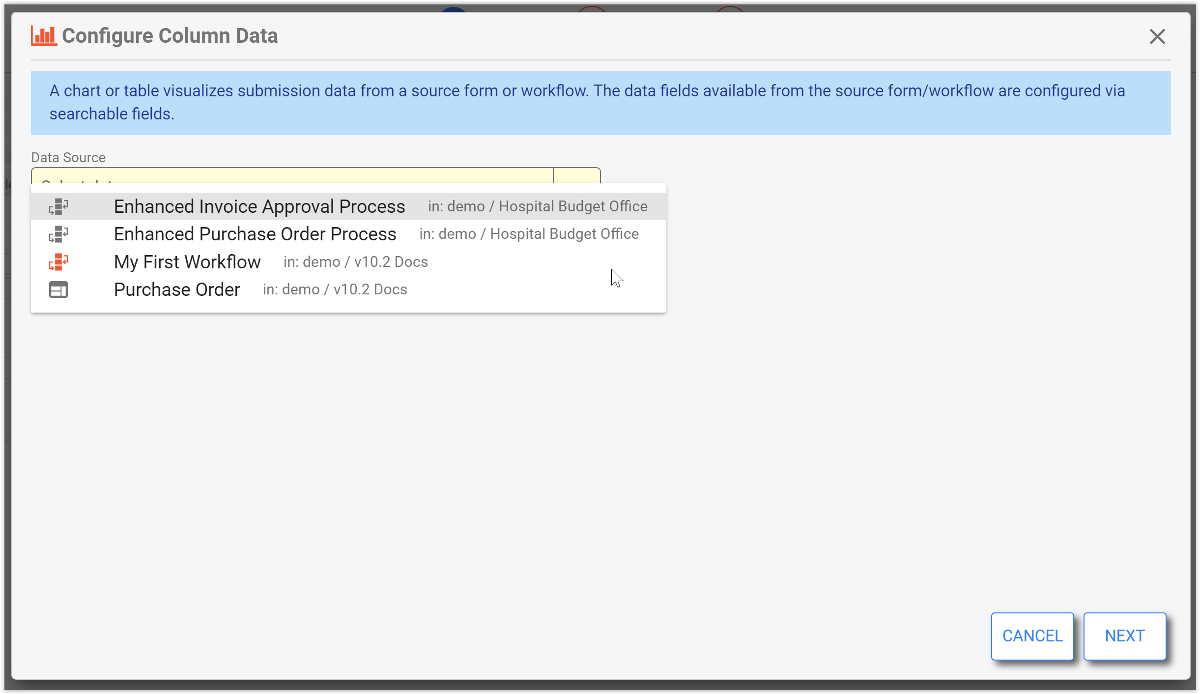
Once you configure a Dashboard, certain changes made to the form/workflow used as the Data Source can cause the dashboard to "break". You will see validation errors in design mode and the Dashboard will not display data at run time. Some changes can prevent a dashboard from displaying any past submission data. Please see Form and Workflow Changes for examples of changes that cause this error state.
Click NEXT to continue configuring the chart.
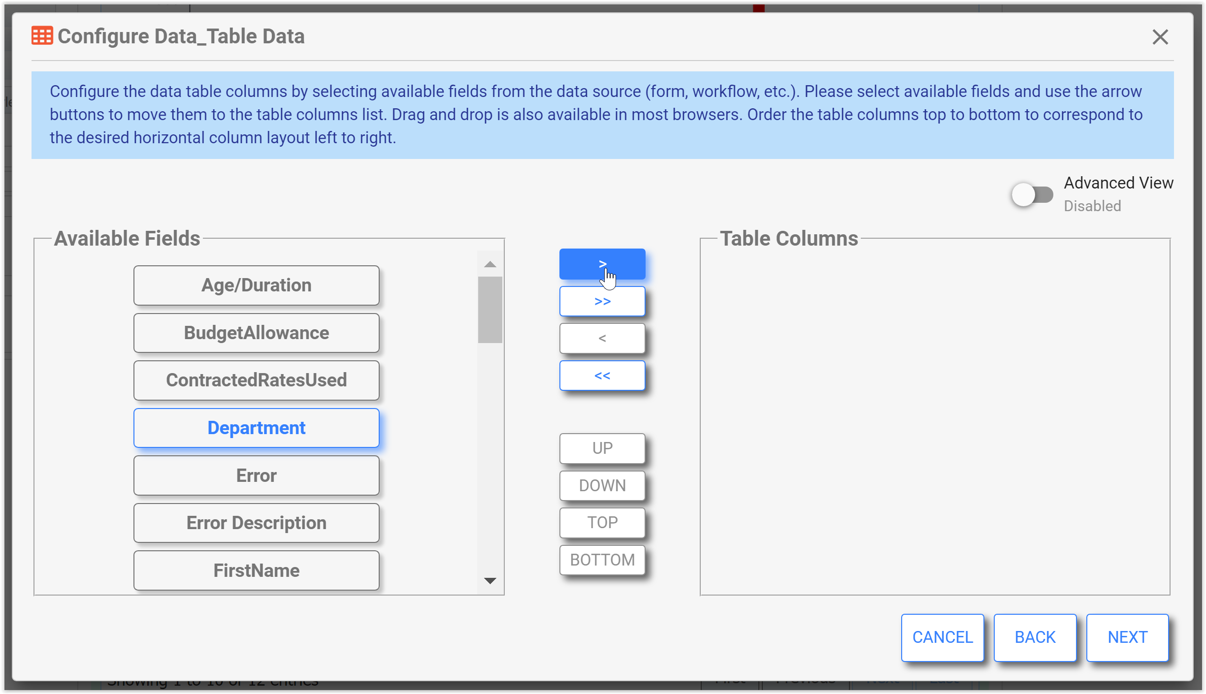
Field Selection
The next screen in the wizard is the field selection screen. This screen will vary in behavior depending on the chart type or data table being configured. The fields available are those you have set up as Searchable Fields in the form/workflow settings, and metadata fields (Age/Duration, Error, Error Description, Lock Date, Lock User ID, Lock User Name, Started Date, State, Submitted Date, Submitter ID, Submitter Name).
The screen below is the field selection screen for a column or bar chart. To use a column/bar chart the user selects a searchable field from the source form/workflow as the dimension. The dimension represents the category used for each column/bar. The value of the metric field chosen will determine the height/length of the column/bar (also known as the 'measure').
Dimension and Metric
Typically, the dimension is a text field or a date/time field that is aggregated or not, but there is no restriction on type for most chart types. The exception to this is for scatter and scatter line charts which require the dimension to be date/time or numeric. If the dimension is a Date, DateTime, or Time field, the dimension will be treated as a “time” axis. This applies to bar, column, line, area, scatter and scatter line charts. A “time” axis can be thought of as a timeline and metric items are plotted/positioned based on the relative time/date. Any other type of dimension is treated as a “category” axis where metric items are plotted/positioned evenly along the axis (not applicable to scatter/scatter line). Radar charts are conceptually the same except that everything is plotted radially.
The metric must always be a numeric “value” and this includes the special “age” metadata field. Therefore it must be either a number, quantity, or money field, or any field type with a count/count distinct aggregation. The dropdowns for dimensions and metrics are not restricted by type and will show all Searchable Fields, so the designer must choose fields that meet these criteria.
Null or Missing Fields
If a field used in your dimension or metric has the potential to be null or missing in some submissions (e.g. if it is not required and may be left blank, might be nulled by a business rule, or was added after the form already had submissions), this may cause irregularities in your chart. It can appear that data is missing, especially when rolling up/aggregating by a field with some null values. Generally, it is advisable to ensure controls used as Dimensions and Metrics have some value; however, this is not a hard-and-fast rule.
Aggregation
Any selected dimension aggregation provides a sub-range to apply any selected metric aggregation over. Dimension and metric aggregation can be applied independently. The aggregations available are dependent upon the field type selected. For example, Day, Week, Month, Year and Quarter are only available on Date and DateTime fields. The optional alias is used in column headings (data table), axis labels, tool tips and data labels.
The following additional validations are done on this screen:
- If any fields are from a repeat, then only one repeating item's fields can be included. You cannot mix repeating fields from more than one repeat/table in a single query.
- If aggregating (including dimension), then all metrics must be aggregated.
- If there is more than one metric, then metrics must be either all aggregated or all not aggregated.
- All aggregated non-date/time fields must at the same level/parentage. If one is from the main form/workflow they all must be or if one is from a repeat/table, they all must be.
- The special calculated "age/duration" field cannot be part of a functional expression.
- If aggregating any field, then the special calculated "age/duration" field cannot be part of the data set.
- In advanced mode, every dimension and metric field expression must have at least one data field in it - literal only expressions are not allowed.
The “age/duration” field is a special calculated field and cannot be part of an aggregated query, nor part of a filter, nor be a sorted field.
The field select screen for other chart types will vary as follows:
Chart Type | Description |
|---|---|
Pie, Donut | Same as Bar/Column except only supports a single metric. |
Area, Line | Same as Bar/Column. |
Scatter, Scatter Line | Same as Bar/Column. |
Radial Gauge, KPI | Same as Bar/Column except only supports a single metric. Also, the dimension is optional, but if supplied is used to add a range (or category) to the metric. Typically, the dimension will be an aggregate data/time. If there is no dimension, then the metric is over all submissions fitting the filter criteria. For KPI, if there is no dimension then no trend information will be shown. |
Radar | Same as Bar/Column. |
The following additional validations are done on this screen and are relevant to advanced view and expressions:
- If aggregating (including dimension), then no dimension may contain an aggregated sub-expression. This means that any aggregation function must be at the first level.
- Aggregation functions may not be nested within another aggregation function.
- If any metric contains an aggregation nested in another non-aggregation function(s), the containing function(s) must not reference any fields as parameters. Doing so would alter the grouping in a way the user would not intend, so it is not supported.
Field Selection for Data Table
The field select screen shown when configuring data for a data table is shown below.
The following validations are done on this screen:
- When configuring a table with a non-date/time aggregated field, there must either be at least one other field that is not aggregated or there must be an aggregated date/time field. This is because non-date/time aggregations require some range to aggregate over for a valid query.
- If any fields are from a repeat, then only one repeating item's fields can be included. You cannot mix repeating fields from more than one repeat/table in a single query.
- If aggregating, then there must be at least one non-date/time field aggregation.
- All aggregated non-date/time fields must at the same level/parentage. If one is from the main form/flow they all must be or if one is from a repeat/table, they all must be.
- If aggregating any field, then the special calculated "age/duration" field cannot be part of the data set.
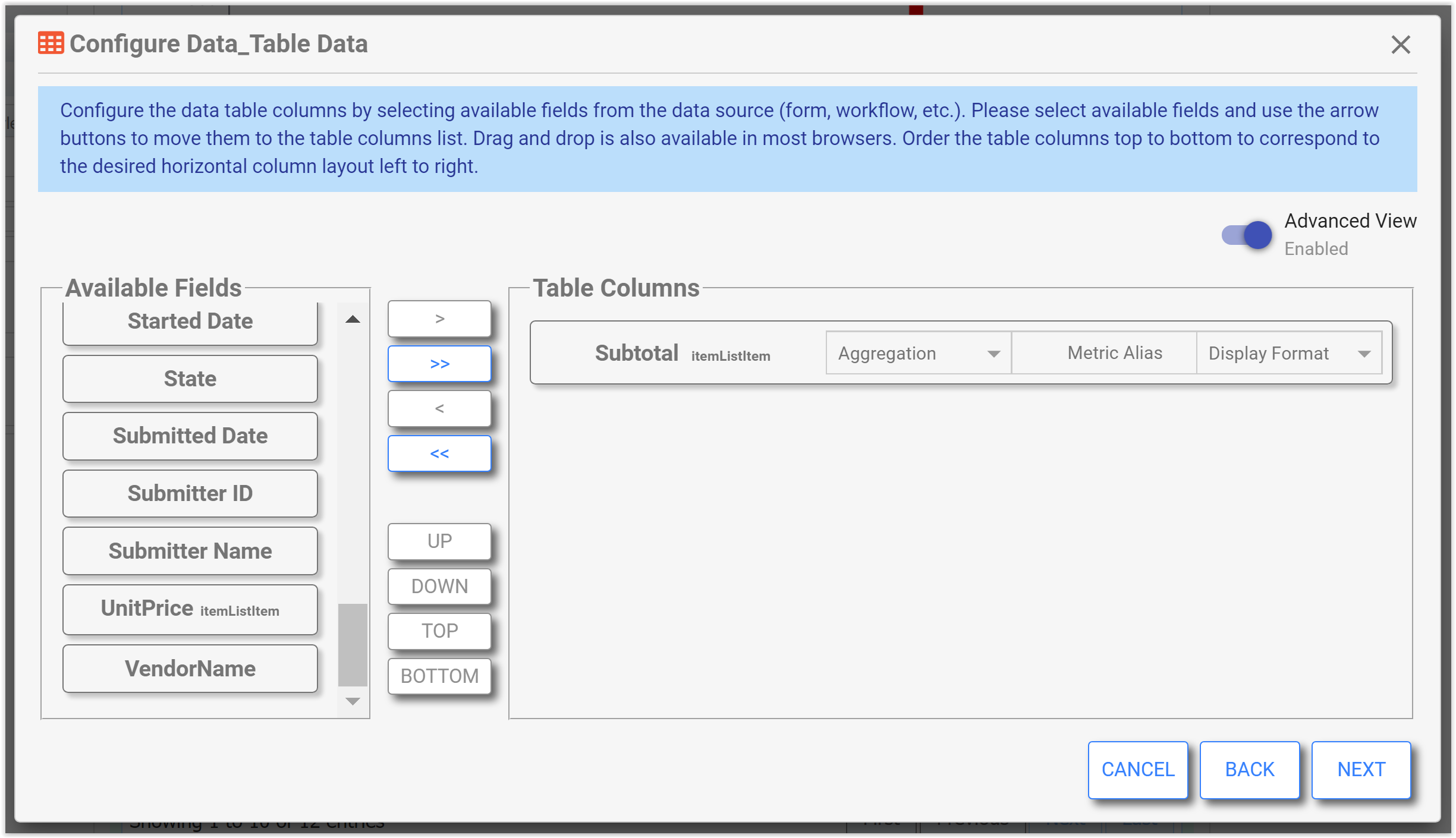
Field Selection Advanced View
In advanced mode, the designer is allowed to enter functional expressions involving one or more fields and can select a display format.
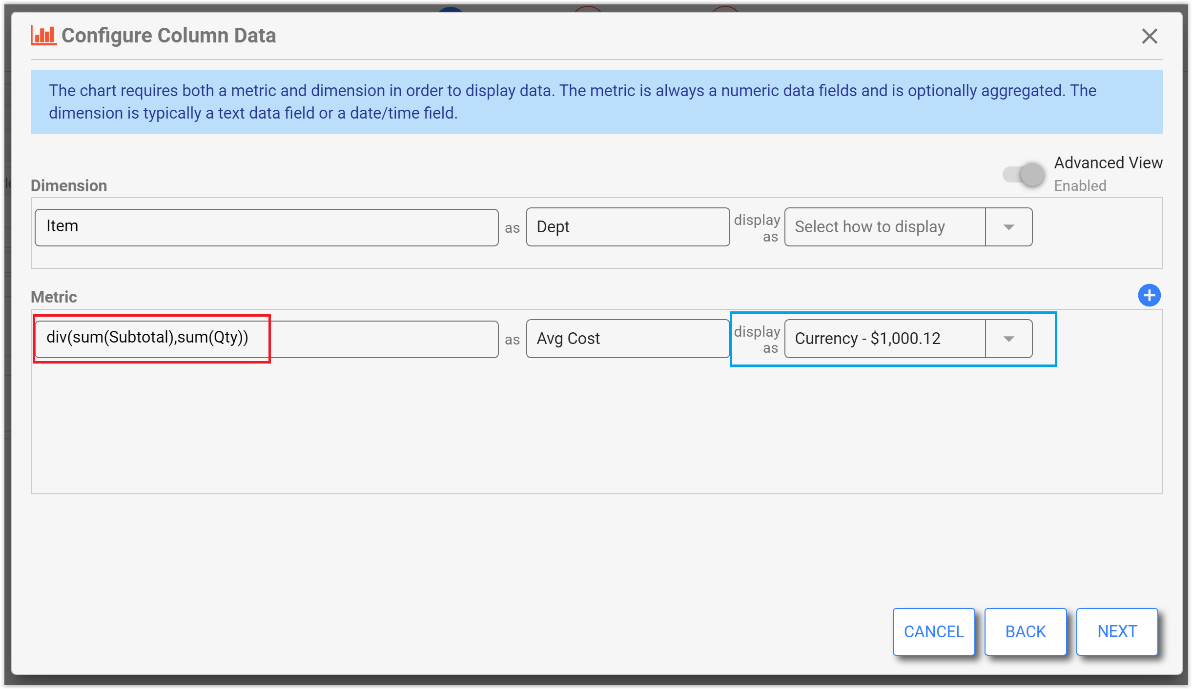
The field and aggregation dropdowns on the non-advanced version of the screen are replaced by an expression input control (similar to the Visual Rule Builder). The designer may enter functional expressions involving multiple fields and nested functions. The expression input offers similar completion prompts, help, and validations as those seen in the Visual Rule Builder expression input. The field and aggregation selects found on the non-advanced version of the screen provide a simple and limited ability to build an aggregating expression and anything entered there is carried over to the advanced version of the screen when changing modes.
The advanced version of the screen additionally allows the selection of a display format for the selected dimension and the metrics. Any chosen display format is used in data labeling and tooltips on the chart. In a data table, the formatting is applied in the table. Also, multiple metrics are supported by the bar/column chart, so advanced mode makes that possible with the appearance of the blue plus icon. At least one metric is required.
Configuring fields for a Data Table in advanced view allows the designer to specify the following on the selected table columns:
- Aggregation function
- An alias
- A display format.
Please refer to the validations described above, which also apply to advanced view.
Click NEXT to continue configuring the chart.
Data Filter
The next screen allows the designer to filter the data. In the non-advanced view the user may only filter by submitted date using the simplified selections in the dropdown. For example, the filter below is for data with a submitted date within the last 6 months from now. All date/time filtering is done relative to the user/browser time zone.
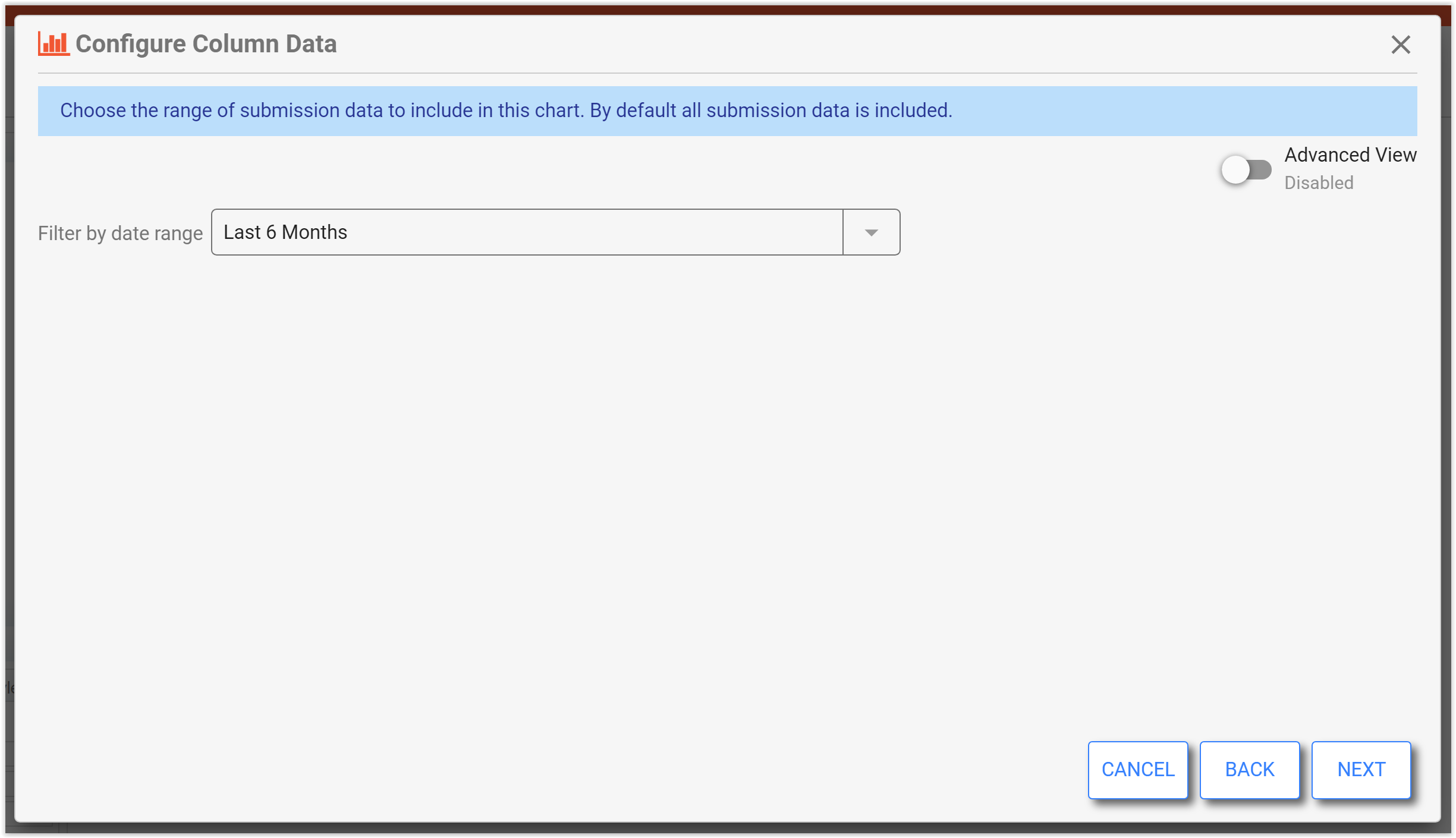
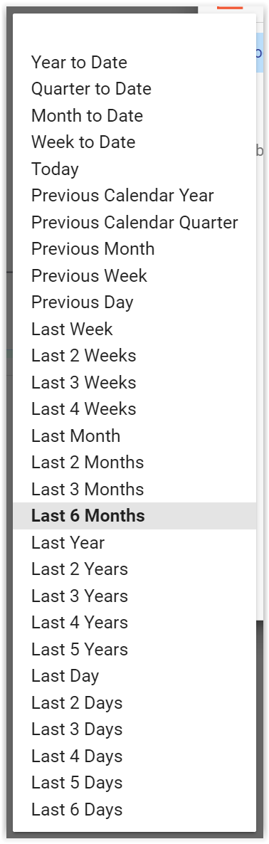
The filter by date range drop down has the following options:
Filter options | Description | Specifics |
|---|---|---|
Year to Date, Quarter to Date, Month to Date, Week to Date, Today | These are all including data with a submission date between the start of the current chosen period and right now. This is specific to the client timezone. | Quarter is calendar quarter (ex: 1/1 - 3/31 is Q1, etc.) Week is defined as Sunday to Saturday. |
Previous Calendar Year, Previous Calendar Quarter, Previous Month, Previous Week, Previous Day | These are all including data with a submission date between the start of the previous chosen period and end of the previous chosen period. The previous period does not include the present date/time which is in the current period. This is specific to the client timezone. | Ex: If Previous Month chosen and today is November 1, then the filter is for October 1 - October 31. |
Last “X” Time | These are all including data with a submission date between the point in time that is “X” time ago and right now. |
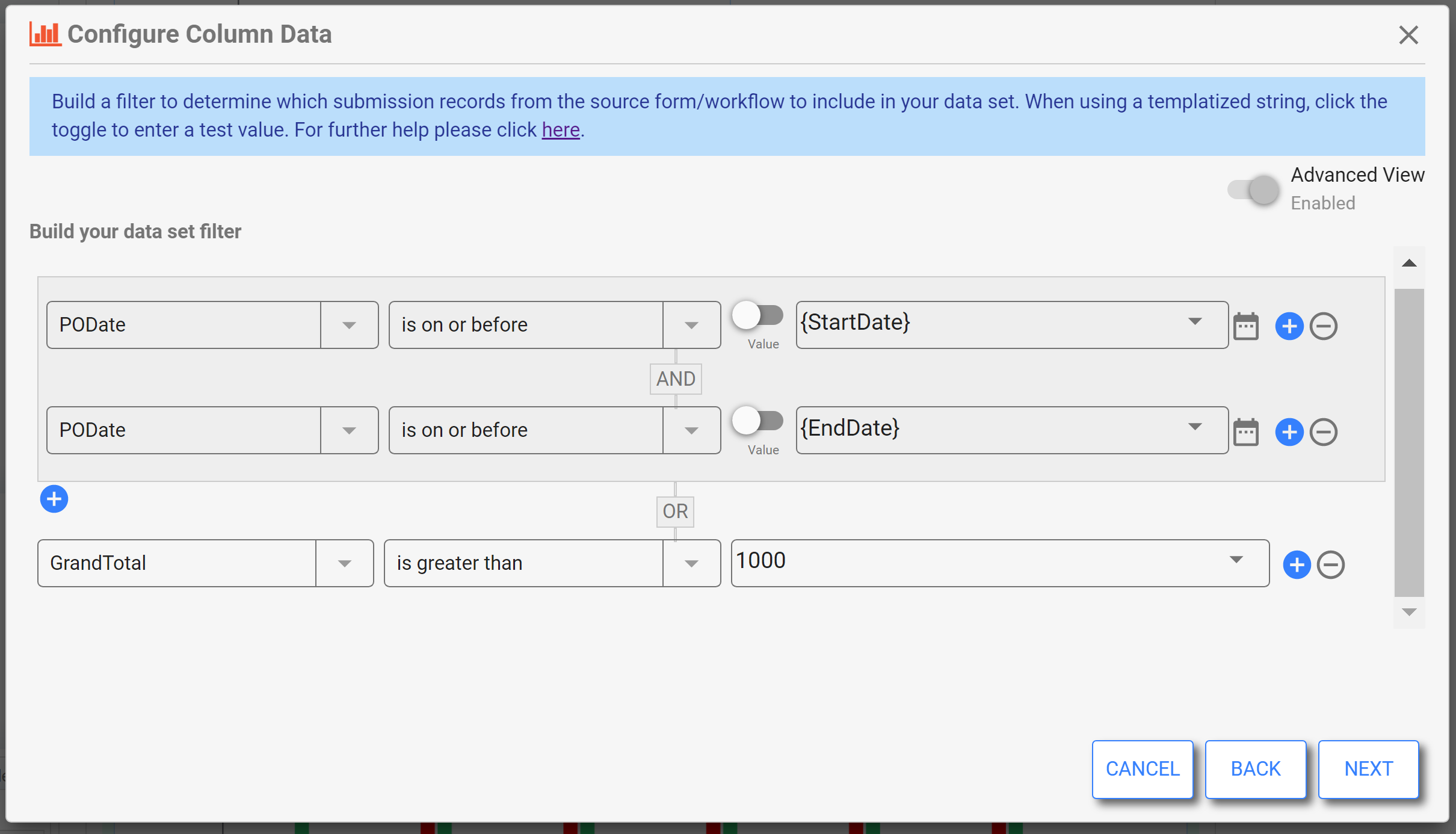
Data Filter Advanced View
The advanced filter screen is used to construct a Boolean expression of filter clauses. Each clause is composed of a left side field from the data source, a match condition in the middle and a right value for the match condition. Note that a few condition types do not require a right side match value. The available match conditions for each field type always include a condition and its opposite (negated) condition. This fact along with the ability to combine clauses using AND and OR Boolean operators enable the designer to build any logical filter expression.
- Any choice made on the non-advanced screen is carried over to the advanced screen.
- As soon as additional filter clauses are added making the filter non-displayable on the non-advanced screen, the advanced view toggle switch is disabled and locked on the advanced setting.
Designers can build a logic expression consisting of AND and OR clauses as well as group sub-expressions. The choice of Boolean operator is made at the time the new clause is added as well as the choice of whether to explicitly “group” the newly added clause with the clause above it. The add menu illustrated below shows the AND/OR items as well as the grouping version of each.
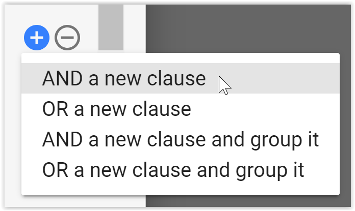
As logic sub-expression groups are added, they are shown in a box to indicate the grouping. Since these can be nested, the nested boxes alternate with and without shading. A max nesting of 4 (explicit) levels is supported. Note that the system will implicitly group sub-expressions as necessary to accurately indicate the order of evaluation. For example, if starting with A AND B and you add an OR of C, the result will be (A AND B ) OR C. Nested grouping is illustrated below.
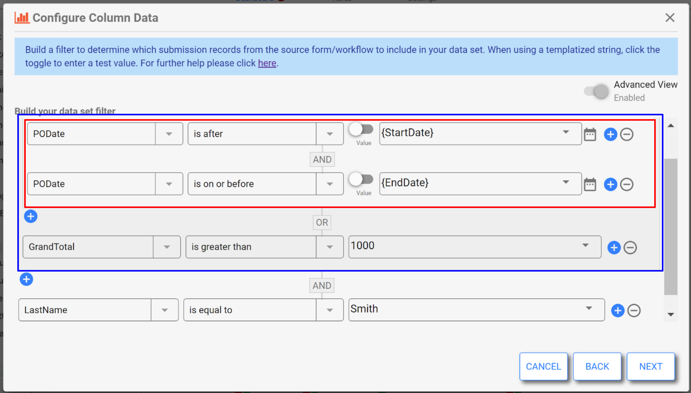
Much like the submission view filter, the conditions vary based on the type of the chosen field and are the same with only minor wording changes from what are used in the submissions filter. The right side value input area is rich in functionality and includes the following:
- A templatized string is allowed. Controls from the dashboard filter parameter area may be chosen as templates, and will be resolved as the value of that field at runtime. The right side field has a dropdown used for the selection of a control template. The user may also type “{“ followed by match text and the system will bring up a list of potential matching control templates.
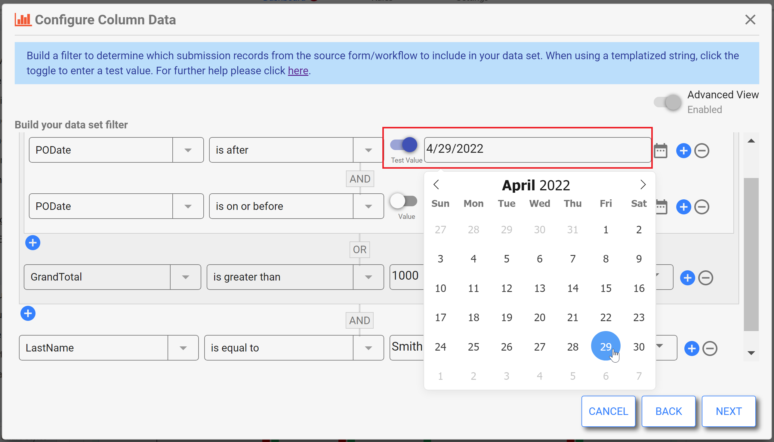
- When the right side value is a template, a toggle appears that allows the display of a required test value field. The toggle will cycle between the value and the test value field. The designer must enter a value that will be used for the filter clause when in design mode. This is necessary because templates are not resolved at design time, but we still want to see data in the chart/table at design time. Templates are not allowed in the test value field.
- When the selected left side field is a Date, Time or DateTime, the right side field will also include a picker icon that brings up the appropriate picker overlay (calendar or time).
When the selected left side field is a DateTime and the selected condition is “is within last”, then the right side value must be a time duration and the user is prompted: “Enter as: PnYnMnDTnHnMnS”.
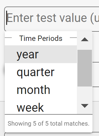
- When the selected left side field is a DateTime and the selected condition is “is within the current” or “is within the previous”, the right side value must be one of the standard time periods (year, quarter, month, week or day). The drop down includes these options. See the non-advanced filter options discussion above for more on this.
- When the selected left side field is a Date, Time or DateTime, the right side field will also include a picker icon that brings up the appropriate picker overlay (calendar or time).
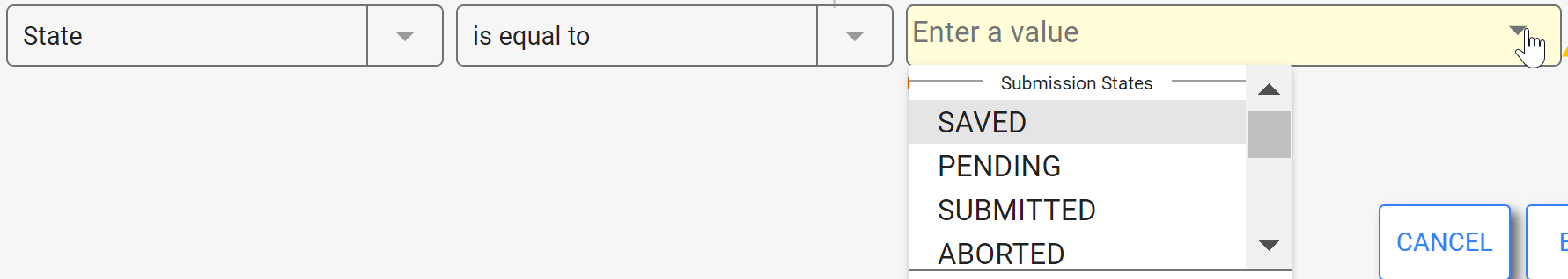
- When the selected left side field is the metadata field ‘state’, then the only operators available are equals and not equals. The right side dropdown contains selectable options for the 5 submission states: PENDING, SUBMITTED, SAVED, ABORTED, WAITING.
The following validations are done on the filter screen:
- If any filter fields are from a repeat, then only one repeating item's fields can be included in the filter. You cannot mix repeating fields from more than one repeat/table in a single filter.
- An aggregated query may not contain a filter with OR clauses that reference fields from the form/workflow itself and a child repeat or table. This is a limitation of querying against SOLR.
The control type on the left and right sides of the expression must be compatible, and the filter expression must resolve to a valid value at run time. Please see Filter Errors for details.
Click NEXT to continue configuring the chart.
Sort Order
Next, the wizard shows the sorting screen. Simply order columns to sort by with the first being primary, etc. Each can be ordered ascending or descending.
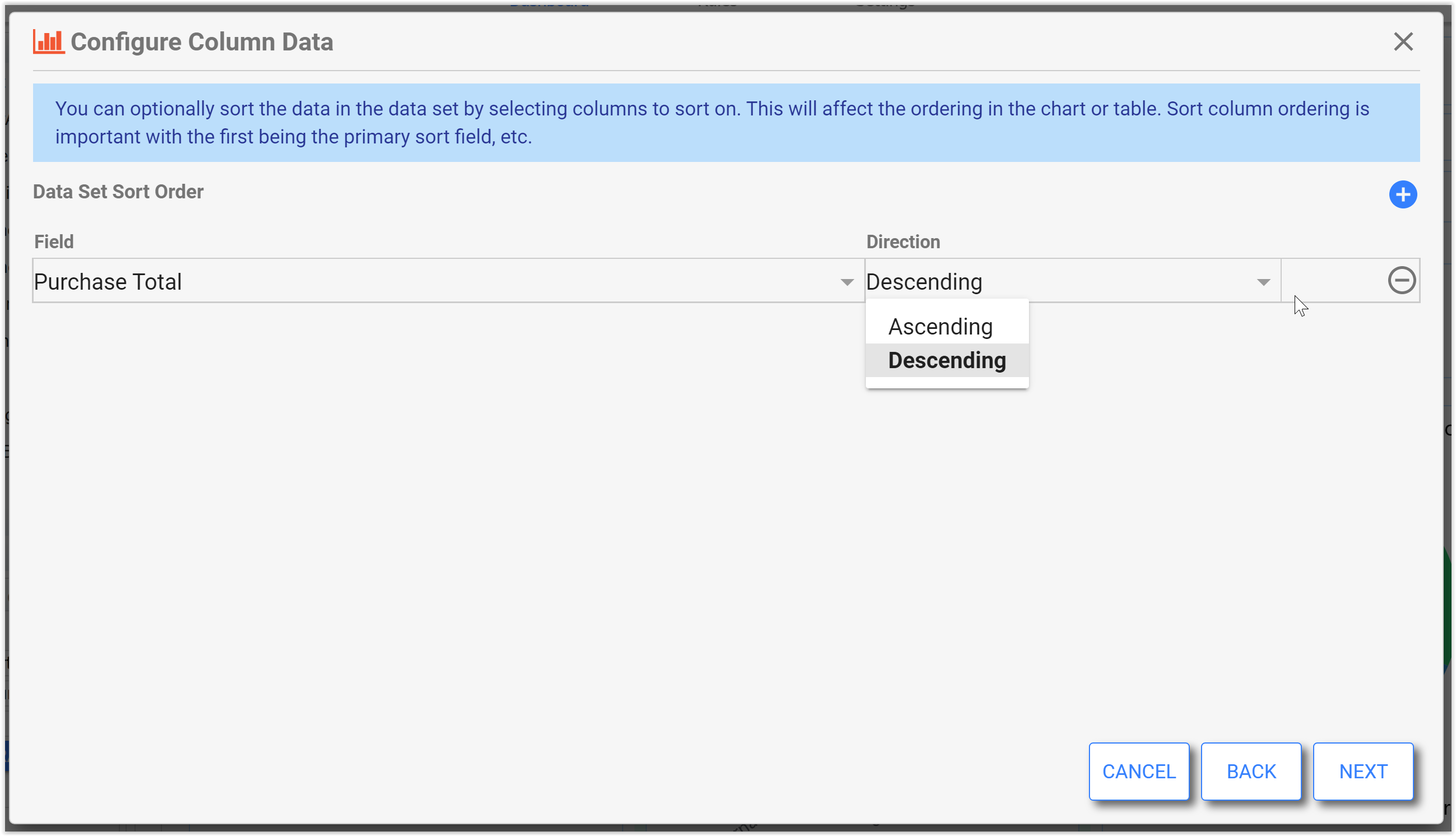
The fields available for sorting depends on the chart type and the dimension type chosen, as shown in this table.
Chart Type / Condition | Pie/Donut | Bar/column | Line/Area | Scatter/Line | Radar | KPI / Gauge |
|---|---|---|---|---|---|---|
Has date/time dimension | Sort by metric or dimension | Sort by dimension ONLY | Sort by dimension ONLY | Sort by dimension ONLY | Sort by metric or dimension | Sort by dimension ONLY |
Text dimension | Sort by metric or dimension | Sort by metric or dimension | Sort by metric or dimension | N/A | Sort by metric or dimension | Sort by dimension ONLY |
Numeric dimension | Sort by metric or dimension | Sort by metric or dimension | Sort by metric or dimension | Sort by dimension ONLY | Sort by metric or dimension | Sort by dimension ONLY |
Multiple metrics with a DATE/TIME dimension | N/A | Sort by dimension ONLY | Sort by dimension ONLY | Sort by dimension ONLY | Sort by metric or dimension | N/A |
Multiple metrics with TEXT dimension | N/A | Sort by metric or dimension | Sort by metric or dimension | N/A | Sort by metric or dimension | N/A |
Multiple metrics with NUMERIC dimension | N/A | Sort by metric or dimension | Sort by metric or dimension | Sort by dimension ONLY | Sort by metric or dimension | N/A |
- KPI/RadialGauge: If there is no dimension, then sorting is not necessary nor allowed.
- Data Table Sorting: Sort fields are constrained to what is in the table columns only.
Sample Data
The last screen of the wizard is the sample data/test screen. It displays a sample of your submission data matching the configuration, filter, etc. There must be real matching submission data for the data source in order to see data here. If you do not see what you expect for your chart, use the BACK button to edit your field selection and filters.
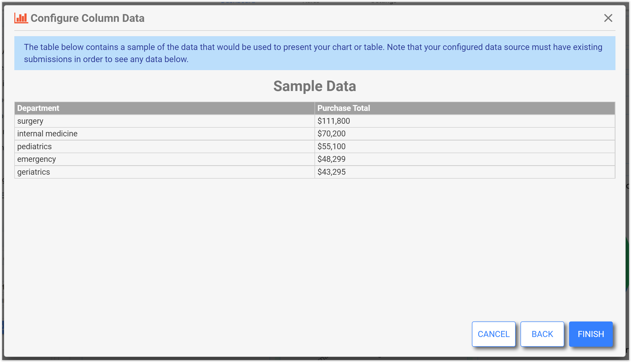
Click FINISH to complete your chart configuration.
The dashboard is automatically refreshed in edit mode, but this time shows real data that matches the configuration. The Settings tab will now display a green check and "Configured" under the Edit Configuration button. You can re-edit the configuration by clicking this button, or by clicking the pencil icon on the chart.
Data Table in Design Mode
The Data Table “Show entries” dropdown and Search field are not active in design mode. Also, the data shown in the data table control in edit mode may only be a subset of the total data in the data set. The data is always complete in use mode.
Max Data
The max data property defaults to different values depending on the chart type. This setting controls the maximum number of data points/rows to show in the chart/table. This prevents having too many data points on a chart which can be hard to decipher or may impact performance. The max for all chart types is 10,000 and leaving this property blank is equivalent to the max (10,000). For a data table, if the number of records matching the query exceeds this max data setting, then the data table will show a yellow warning triangle to alert the user to that fact. This does not apply to charts.
Style Properties
The Style tab contains many familiar settings (e.g. width, BG Color, Label Color, Label Size, Bold, Italic, New Line). There is also a Height property available for charts and data tables. The height property allows the designer to choose the standard height (default), 2x, 3x, or 4x the standard height. The settings are designed so that charts and tables always line up nicely.
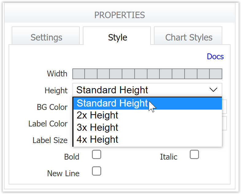
Chart Styles
The chart styles tab in the left-side properties panel allows customization of the chart control's look and layout. The available properties vary by chart type. This image shows the Chart Styles panel for a Column chart.
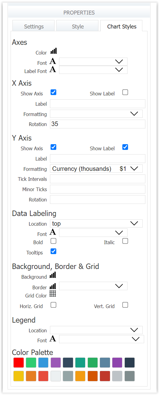
Chart and Table Style properties give the designer an abundance of customization options. However, not all combinations of settings will render optimally, e.g. chart elements may interfere, overlap, etc. frevvo recommends thoroughly testing your style customizations to ensure they render as expected.
Axes
This property group is applicable to bar, column, area, line, scatter, scatter line, radar, range bar, column bar, heat map, and radial gauge chart types.
The Axes group properties control general styling applied to both the X and Y axes. Here the designer can set the axes line color, axes ticks font color and size, and axes labels font color and size. Click the chart or text (A) icon to change the axes/font color using the enhanced color picker. Use the dropdowns to select font size.
X Axis and Y Axis
These property groups are applicable to bar, column, area, line, scatter, scatter line, range bar, column bar, and heat map chart types.
The X Axis and Y Axis property groups allow the designer to customize the look and behavior of the X (horizontal) axis and Y (vertical) axis independently.
- Show Axis shows/hides the axis.
- Show Label shows/hides the axis label
- Label allows the designer to customize the label text. If not set, the label will be taken from the bound data column label.
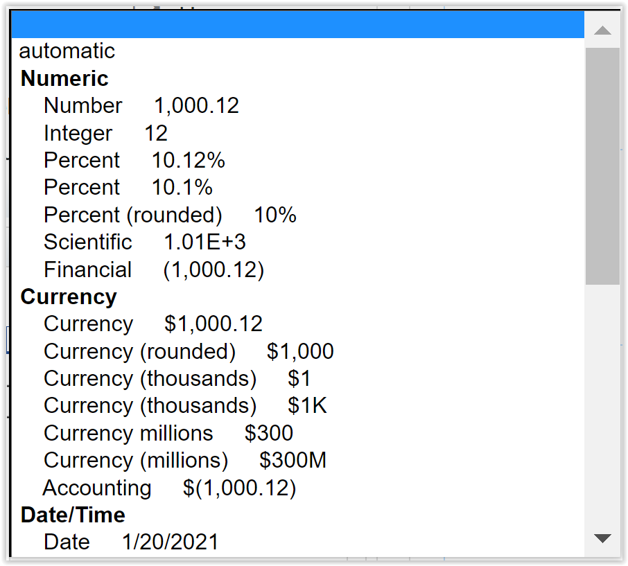
- Formatting customizes the axis ticks display format. Choose from a variety of common numeric, currency, and date/time formats according to the data type you displaying.
- Tick Intervals selects the number of major ticks. Type an integer or use the arrows to increase or decrease the number.
- Minor Ticks selects the number of minor ticks in each major tick interval. Type an integer or use the arrows to increase or decrease the number.
- Rotation defines the angle of the axis tick labels, which can improve the fit and display.
When an axis is a category type, e.g. the X axis on a bar chart, a heat map or a radar chart, properties such as ticks do not apply and are not shown.
Data Labeling
This property group applies to pie, donut, bar, bar, column, area, line, scatter, scatter line, range bar, column bar, heat map, and radar chart types. Location, font color/size, bold, italic, and tooltips properties apply to radial gauge as well.
These properties customize the display of data values in the chart.
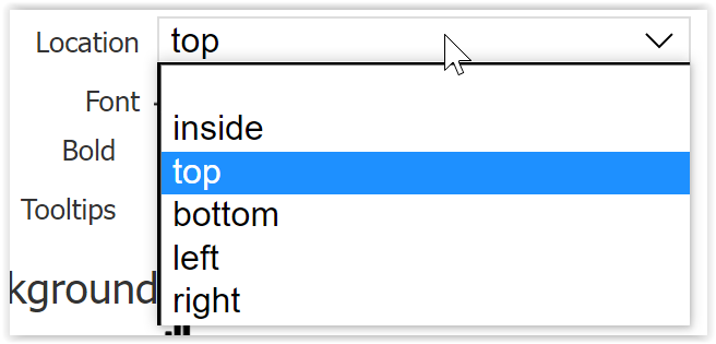
- Location sets the position of the data value relative to the chart element representing it, i.e. inside, top, bottom, left, or right.
- Set Font color by clicking the A icon and using the enhanced color picker, and set font size using the dropdown. The Bold and Italic checkboxes allow further font customization.
- Check Tooltips to display the data values when hovering the mouse over the chart element, e.g a bar or pie piece.
Background, Border and Grid
This property group applies to bar, column, area, line, scatter, scatter line, range bar, column bar, and heat map chart types.
These properties ally to the inner chart area (the area within the axes.)
- Click the chart or grid icons to select a Background, Border, and Grid color from the enhanced color picker.
- Use the Border dropdown to set the border width.
- Check/uncheck Horiz. grid and Vert. grid properties to show/hide grid lines on your chart.
Legend
This property group applies to pie, donut, bar, bar, column, area, line, scatter, scatter line, range bar, column bar, heat map, and radar chart types.
Turn on the legend by giving it a Location. The location options consist of various position and alignment combinations. Clear the location to remove the legend.
Set the Font color by clicking the A icon and using the enhanced color picker, and set font size using the dropdown.
Color Palette
This property applies to pie, donut, bar, column, area, line, scatter, scatter line, range bar, column bar, radar, and heat map chart types. The colors selected will display in the order set. Click any color to change it using the enhanced color picker. For example, here is a pie chart - notice that the pie pieces correspond to the colors in the Color Palette settings.
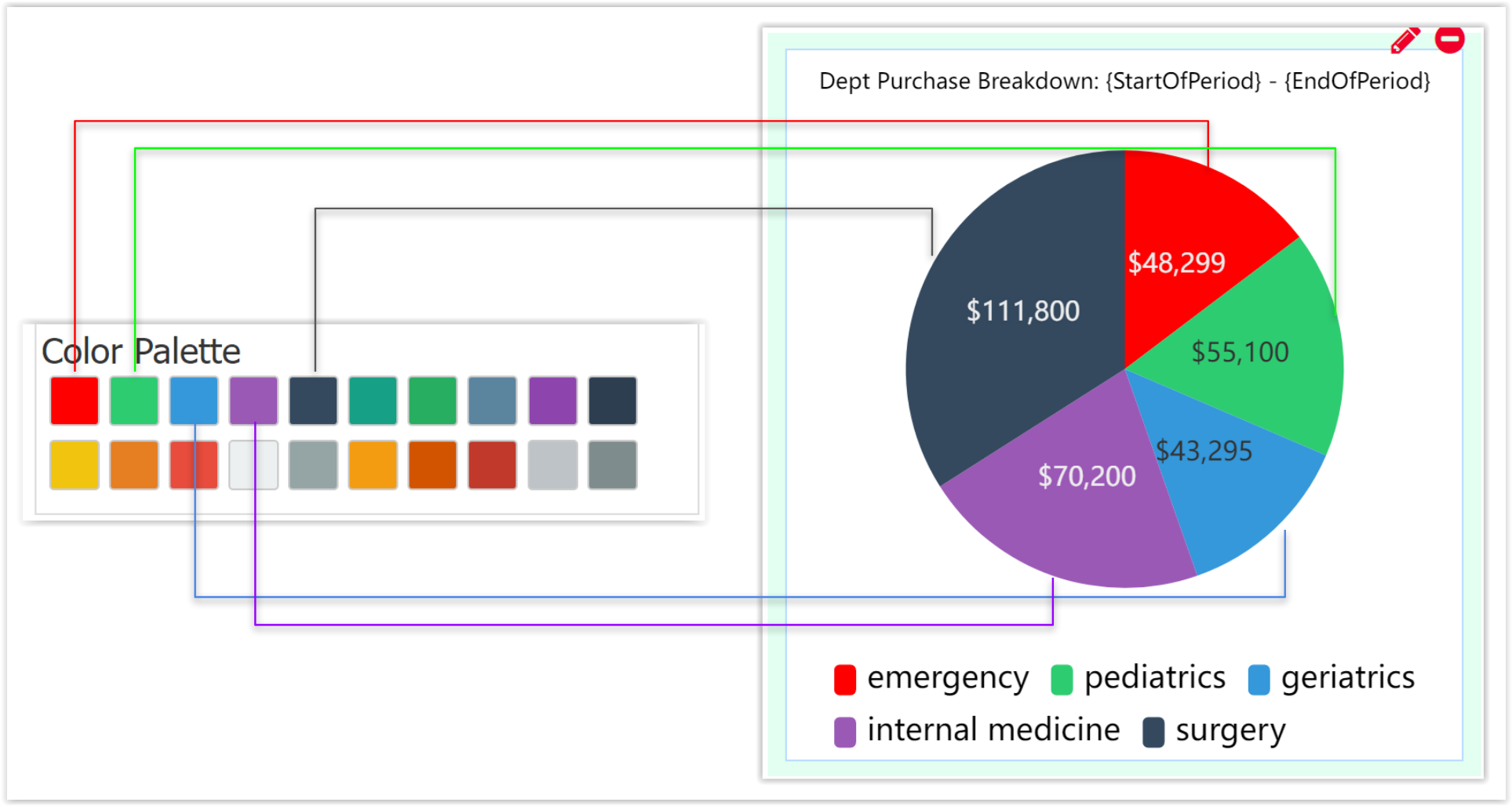
For some chart types (e.g. bar, column) the colors will correspond to the metrics chosen in your data configuration. The first metric will display in the first color, the second metric will display in the second color, and so on.
Radial Axis
This property group applies only to the Radial Gauge chart type.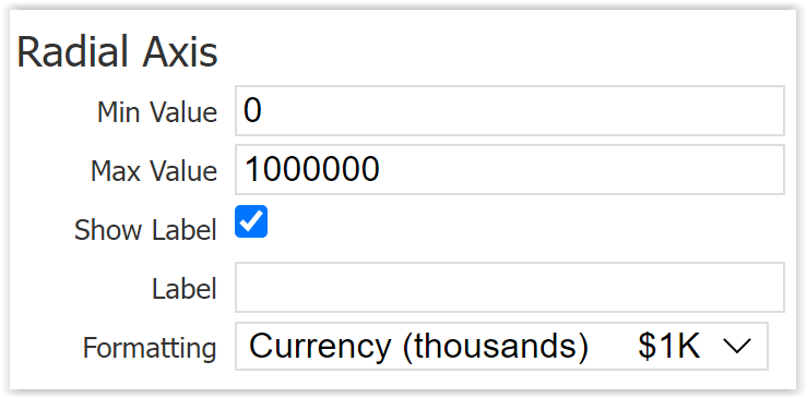
- Set the Min Value and Max Value to display on the gauge.
- Show Label shows/hides the axis label
- Label allows the designer to customize the label text. If not set, the label will be taken from the bound data column label.
- Formatting customizes the axis ticks display format. Choose from a variety of common numeric, currency, and date/time formats according to the data type you displaying.
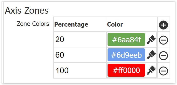
Axis Zones
This property group applies only to the Radial Gauge chart type. The designer can set zones for the radial dial, specified by an ending percent. For example, entering "20" in the first row indicates a zone of 0-20%, and entering "60" in the second row indicates a zone of 21-60%. Click the paintbrush to edit the zone color using the enhanced color picker. The plus and minus icons allow you to add and subtract zones. The last zone should always end at 100%
Radar Axis
This property group applies only to the Radar chart type.
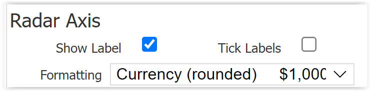
- Show Label shows/hides the axis label
- Tick Labels shows/hides the tick labels
- Formatting customizes the axis ticks display format. Choose from a variety of common numeric, currency, and date/time formats according to the data type you displaying.
KPI
This property group applies only to the KPI (Key Performance Indicator) chart type.
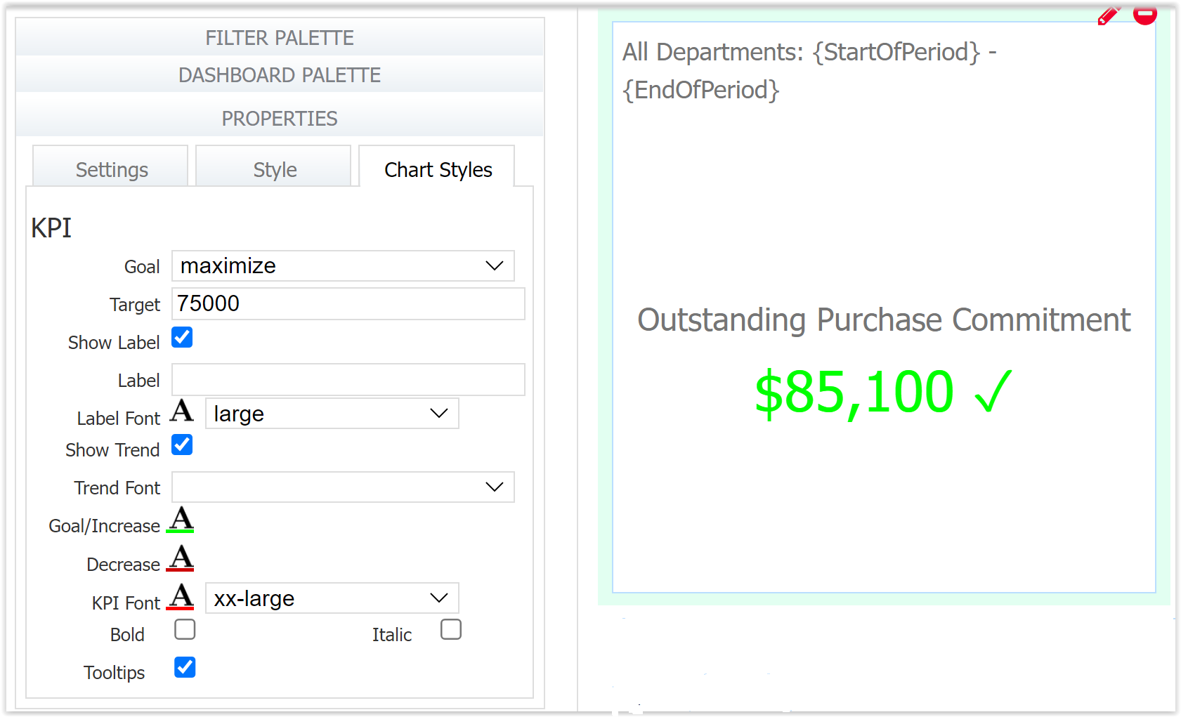
- The Goal dropdown allows the designer to minimize or maximize the KPI/metric. Maximize means that the target is the minimum requirement - the KPI chart will display a green check if the value displayed is greater than the target, and a red warning if the value is less than the target. Minimize is the opposite; the target you set is the ceiling, so a display value less than the target displays a green check, and greater than displays a red warning. Leave this blank to not show any icon at all.
- Target value is the value you will measure this metric by. Leaving this blank with the Goal set to Maximize, the metric will always show a green check. Leaving this blank with the goal set to minimize will always show a red warning.
- Show Label shows/hides the axis label
- Label allows the designer to customize the label text. If not set, the label will be taken from the bound data column label.
- Set Label Font color by clicking the A icon and using the enhanced color picker, and set font size using the dropdown.
- Show Trend will display an up or down arrow based on how the metric has changed over time.
- Set the Trend font size using the dropdown.
- Set the Goal/Increase and Decrease font colors by clicking the A icon and using the enhanced color picker, and set font size using the dropdown.
- Set KPI font color by clicking the A icon, and size using the dropdown. This is the default color when Maximize/Minimize is not used.
- The Bold and Italic checkboxes allow further font customization.
- Check Tooltips to display the data values when hovering the mouse over the chart element, in this case the displayed metric.
Color Picker
Many of the color properties in Chart and Table styles make use of an enhanced color picker. Choose from a selection of predefined colors, or click the pencil icon to create a custom color. In the Custom Color dialogue, you can choose a color using the selector, the eyedropper or by typing in a hexadecimal code, RBG values or HSL values. Click away from the color picker to save your selection and close it.
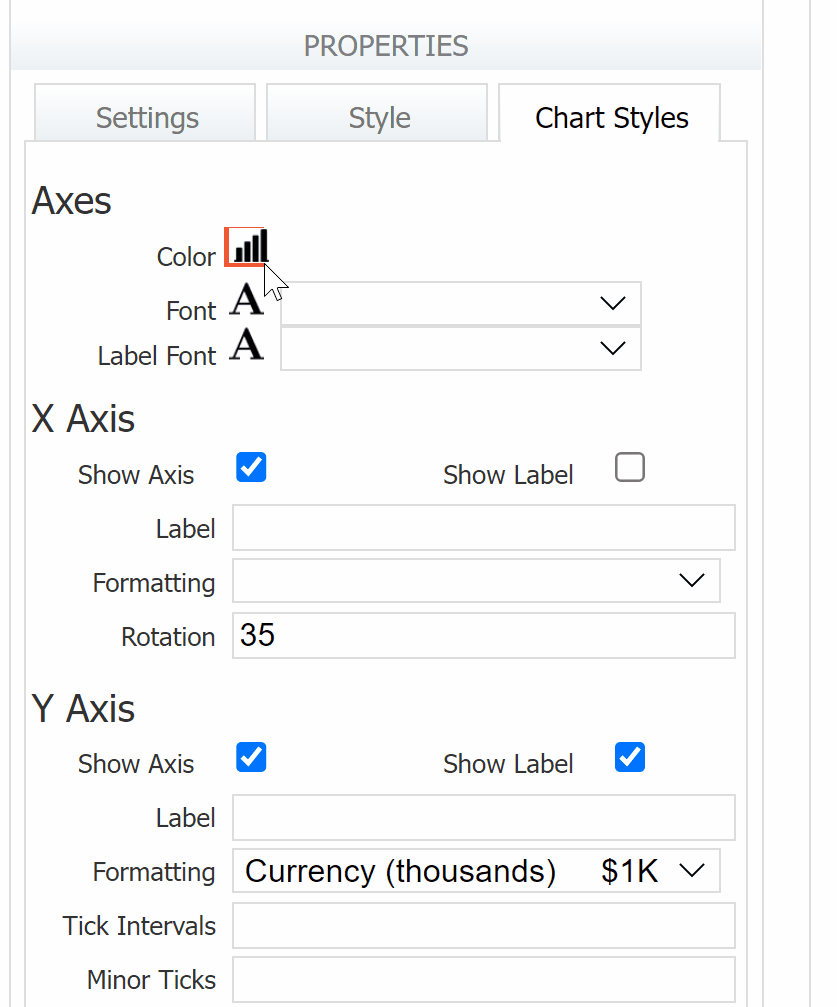
Table Styles
The Table Styles tab in the left-side properties panel allows customization of the table control's look and layout.
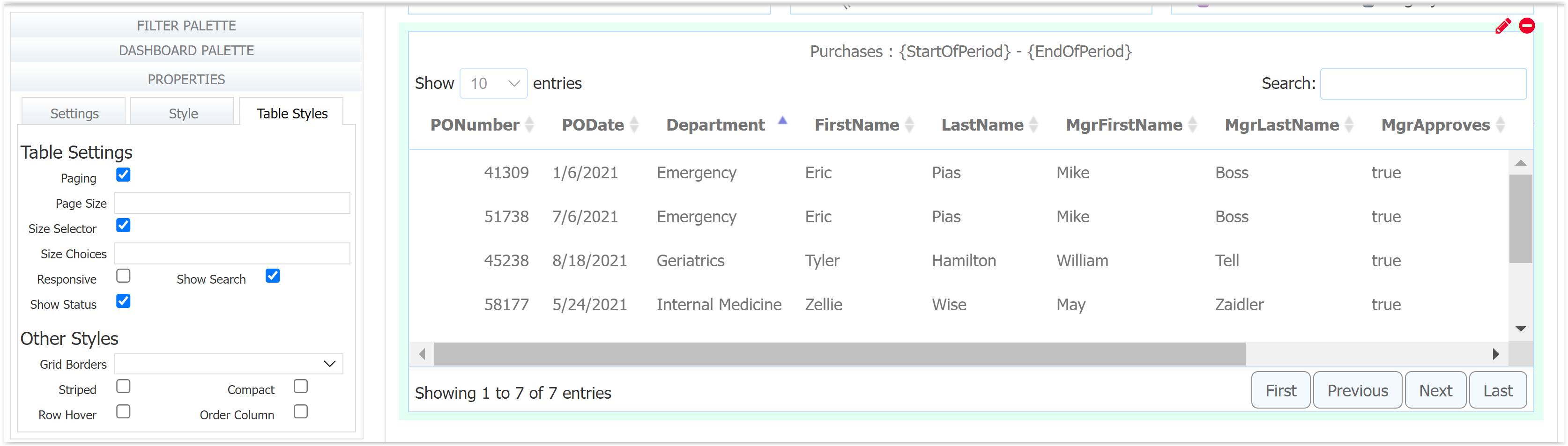
Table Settings
- Paging turns on/off paging. When paging is on, the First, Previous, Next, and Last buttons are displayed and functional.
- Page Size takes an integer and is the default page size.
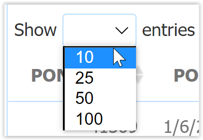
- Size Selector turns on/off the "Show <#> entries" selector, which allows the user to display a different page size than the default. The selector is only visible if Paging is also checked.
- Size Choices dictates the size options shown in the Size Selector, if it is enabled. This property accepts a space delimited list of integers, e.g. "5 10 15 20". If left blank, the size choices default to 10 25 50 100.
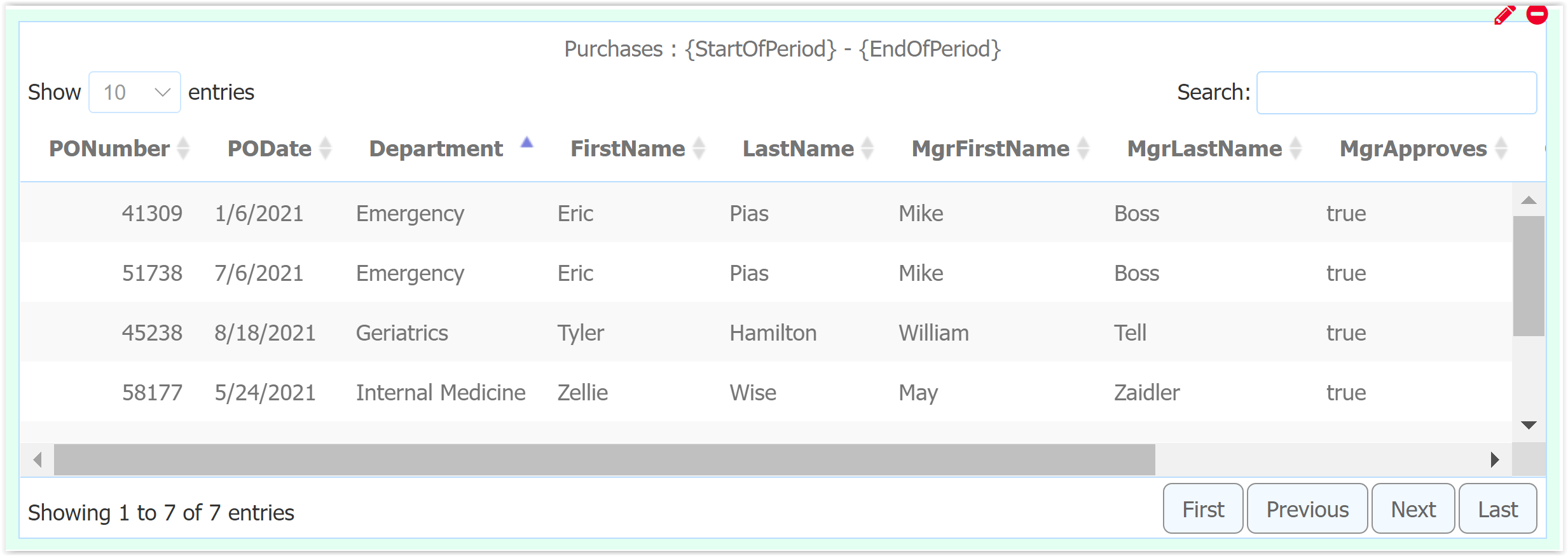
- Responsive turns on/off responsive behavior for the table, which controls the table behavior when the columns cannot fit horizontally. If responsive is checked then the table will show a green plus icon to the left and overflow columns will be shown in a detail area below the row, as shown in the image below. The plus icon toggles the detail area’s visibility. If not responsive, the table scrolls horizontally.
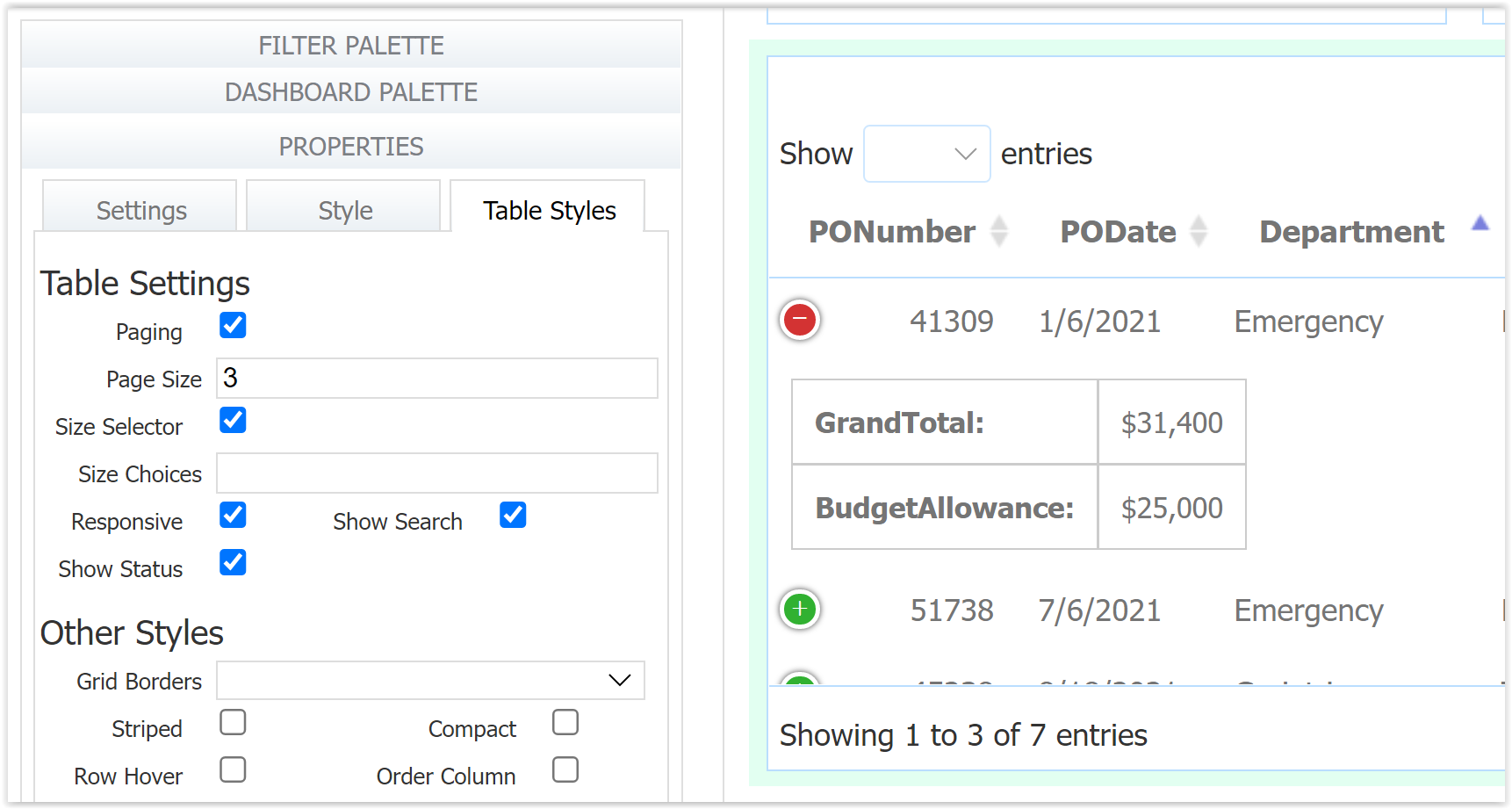
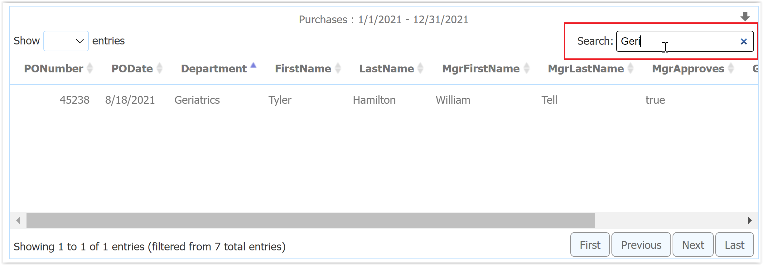
- Show Search turns on/off the table text search featured. If checked, the Search box is displayed on the upper right. Search supports typeahead and immediately limits the results in the table to the search term. Search works over all table data, not just the visible page.
- Show Status turns on/off the status message. When checked, Showing <#> to <#> of <#> entries" is displayed on the lower left.
Other Styles
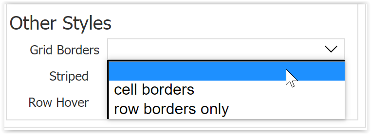
- Select a Grid Borders option from the dropdown. The options are blank (no cell/grid borders), row borders only, and cell borders (all four sides with borders).
- Striped shows alternate rows as shaded and not shaded.
- Compact displays the table more compactly so that more rows fit.
- Row Hover highlights the row currently hovered over in a slightly darker shade.
- Order Columns shows the column that is used to sort the table in a slightly darker shade.
Dashboards at Runtime
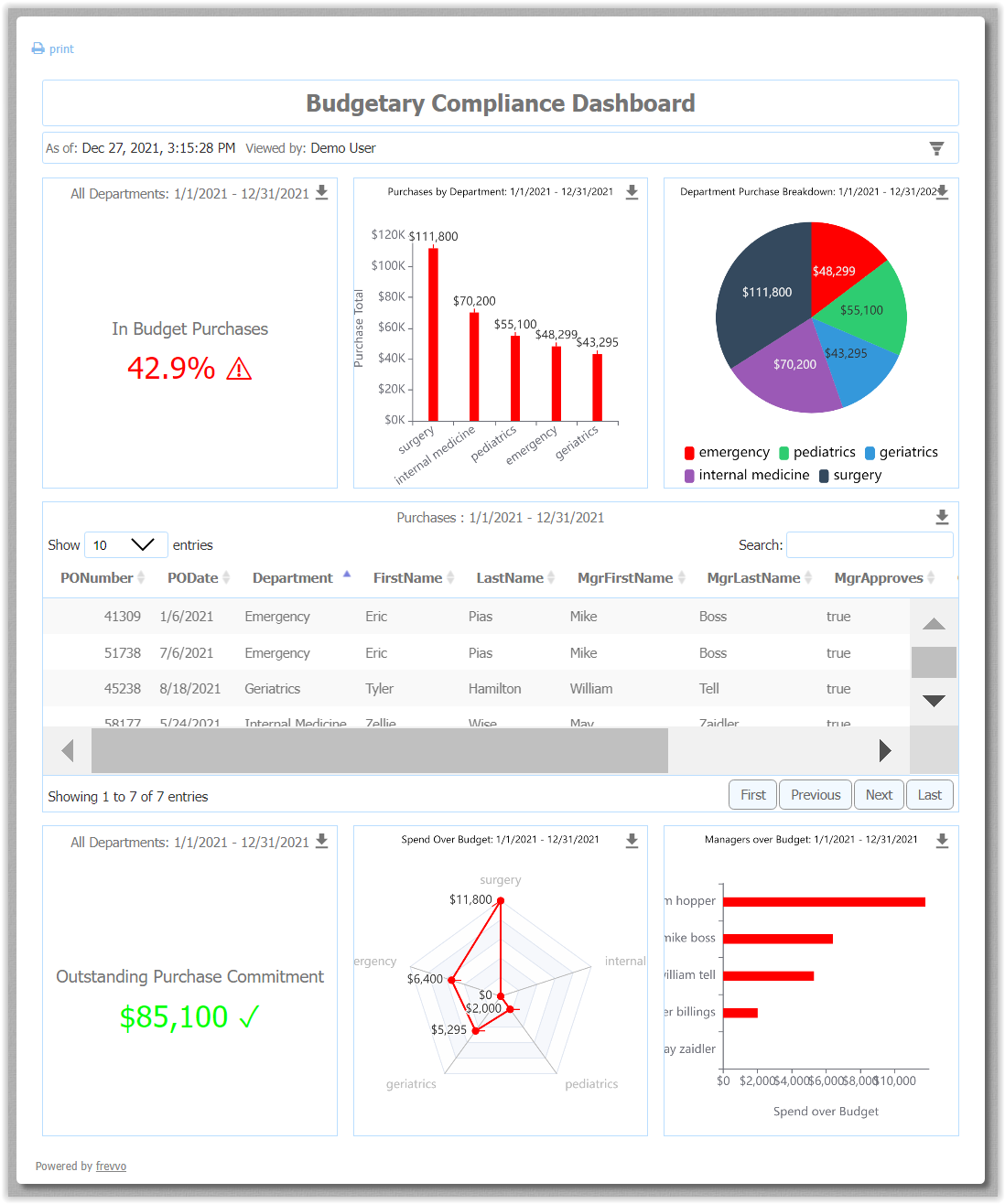
Dashboards display data on all charts and tables immediately.
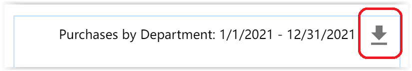
Download to CSV
If the chart/table has been configured for data (not the default data), the data used to build the chart is available for download to a csv. In this situation, a small download icon will appear in the upper right corner of each chart/table and clicking it will result iun a CSV download. In all cases, this download icon is only available at runtime (not in the designer).
Certain expressions are not supported in export. However, any fields and sub-expressions that make up the non-supported expression will appear in the CSV. This should make it possible to re-calculate the original non-supported expression in a spreadsheet, etc. The non-supported expressions (in CSV) are:
- Expressions that contain aggregation functions in sub-expressions.
- When aggregating, any dimension expression that is a non-aggregation functional expression.
In general, the exported CSV data is not guaranteed to be sorted according to any specified sorting fields. For example, if one of the non-supported expressions (above) is specified as a sort by field, then the CSV data will not be sorted.
Mobile View
There are some differences to note in mobile in the phone layout. The dialog header is present on each mobile “page”. Mobile pages may be designed into a dashboard using the page break control. Each control on the parameter area of the dialog header is full width on mobile view regardless of its designed width.
Filter Errors
The filter parameter must resolve to some value in order for the dashboard to return data. Consider using default data or a business rule to ensure there is always some data in the filter parameter at run time.
Additionally, the control types on the left and right sides of the filter expression must be of a compatible control type. For example, if you set the left side control to "Submitted Date", which is a DateTime type, and the right side to a template for a Date control in your filter parameter area; the DateTime and Date controls are incompatible. Keep in mind, DateTime represents a point in time, while Date and Time do not - see Working with Dates and Times for more information on these control types.
When you run the Dashboard in test mode with one of these filter error states, you will see a message in the debug console "Data retrieval from data source aborted, invalid filter", plus a message that explains the specific error.
- An empty Filter Parameter displays the message "Empty control template in data filter for field: <filter field>. Any templatized control in the filter clause must have a value to be valid."
- An incompatible control type will display the message "Invalid control template in data filter for field: <filter field>. You must ensure the type of the field and the templatized control in the filter clause match."

Data Set Validation
The configuration of dashboard controls to data sources via data sets is quite complex with numerous opportunities for breakage. This is especially true in various deployment scenarios such as moving a form/workflow and its accompanying dashboard(s) to a production server and/or tenant. frevvo will detect this breakage and let the designer know as well make it easy to recover.
- Dashboards and their configured data sets/data sources will be validated at startup and when saved and marked in an error state when a problem is detected. On the UI, this will cause dashboards to be displayed in the “salmon” color to indicate a problem.
- In the Dashboard Designer, the charts and tables with problems will be indicated with a message (in yellow) below the relevant controls.
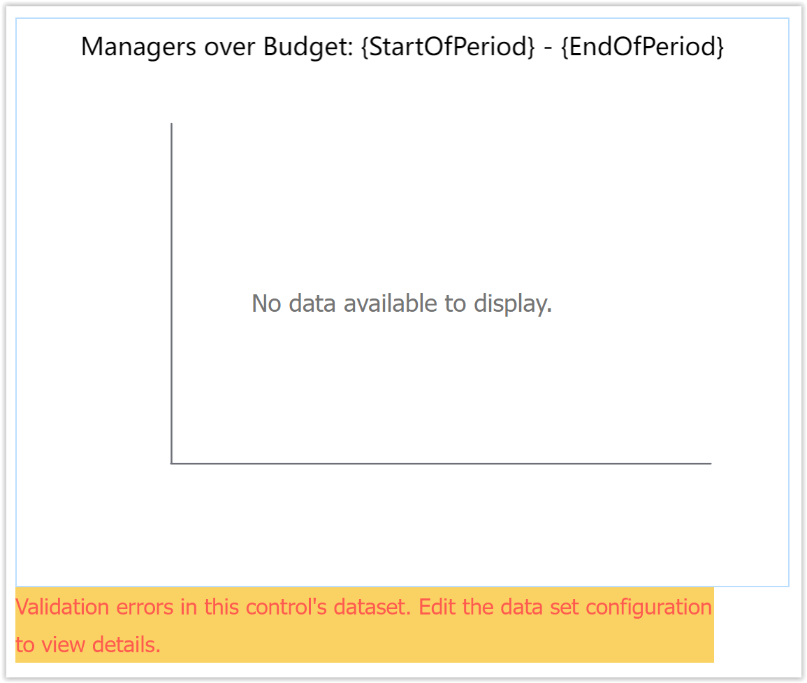
- Charts with a configuration error will indicate an error state in red in the Data property (left-side properties panel) when selected.
- Running the configuration wizard will indicate the problems with validation errors, missing fields in yellow, etc. on the various screens. This guides the designer to the errors and allows for easy correction.
- One common error is a missing data source form/workflow. This may happen in the “deploy to production tenant/server” scenario, and there is no way to avoid it. The designer can simply correct the data source to the same form/workflow in the new location, and the wizard will preserve all other settings and choices. Complete the wizard by clicking next all the way through and saving the dashboard.
- It is possible for a configured data source form/flow to be valid and present in the dashboard designer’s tenant but that the designer does not have access to the data source’s submissions. This can happen when copying a dashboard from one designer account to another in the same tenant. In this case, no error is displayed until the designer runs the data configuration wizard. The selected data source is not displayed and a warning is displayed because the designer does not have access. This is not necessarily a runtime condition because the runtime user may have access to the underlying data source’s submissions. Typically, it is expected that any designer account that a dashboard is deployed to would have the appropriate access.
Form and Workflow Changes
Once you create a dashboard, changes to the form/workflow used as the data source can "break" that dashboard, causing validation errors on the affected Dashboard controls. Here we list some examples of form/workflow changes that may cause Dashboard errors, but this list is not exhaustive. Always use caution when making changes to a form/workflow that has existing submissions, especially if it is used as a Dashboard's data source.
You may be able to correct such errors by following the dashboard's validation messages and correcting your Data Configuration; however, this will only fix the Dashboard for future submissions. Past submissions will not be reflected on the updated dashboard.
One recommendation to help prevent such changes is to add a hidden message control to such forms/workflows, visible only in design mode, that warns the designer that this resource is used by a Dashboard.
Changes that Cause Dashboard Errors
Any change that alters the form/workflow's underlying schema has the potential to "break" the dashboard. The term "break" means to cause a validation error, and to likely not display correct/complete data in the chart. The actual behavior of any given change may vary as there are many combinations of form and dashboard configuration.
Move a control into or out of a Section control
Delete a control
Rename a control
Delete the source form/workflow
Remove a control from Searchable Fields
Change control type:
Text
Email
Money
Phone
Quantity
Number
Text
N/A
Works
Breaks
Works
Breaks
Breaks
Email
Works
N/A
Breaks
Works
Breaks
Breaks
Money
Breaks
Breaks
N/A
Breaks
Breaks
Works
Phone
Works
Works
Breaks
N/A
Breaks
Breaks
Quantity
Breaks
Breaks
Breaks
Breaks
N/A
Breaks
Number
Breaks
Breaks
Works
Breaks
Breaks
N/A
Checkbox
Dropdown
Radio
Checkbox
N/A
Works
Works
Dropdown
Works
N/A
Works
Radio
Works
Works
N/A
Date
Time
Date/Time
Date
N/A
Works
Works
Time
Works
N/A
Works
Date/Time
Works
Works
N/A
Here's an example of a Column chart that was originally designed to display the average Number and Price (metrics) by widget type (dimension). If the Price control is changed from a Money control to a Text control, I see the chart displayed with a validation error in design mode. The Dashboard runs in test and use mode, but the Price calculation does not include submissions since this change. This means your Dashboard users may not know right away there is a problem, but they may see incorrect data.
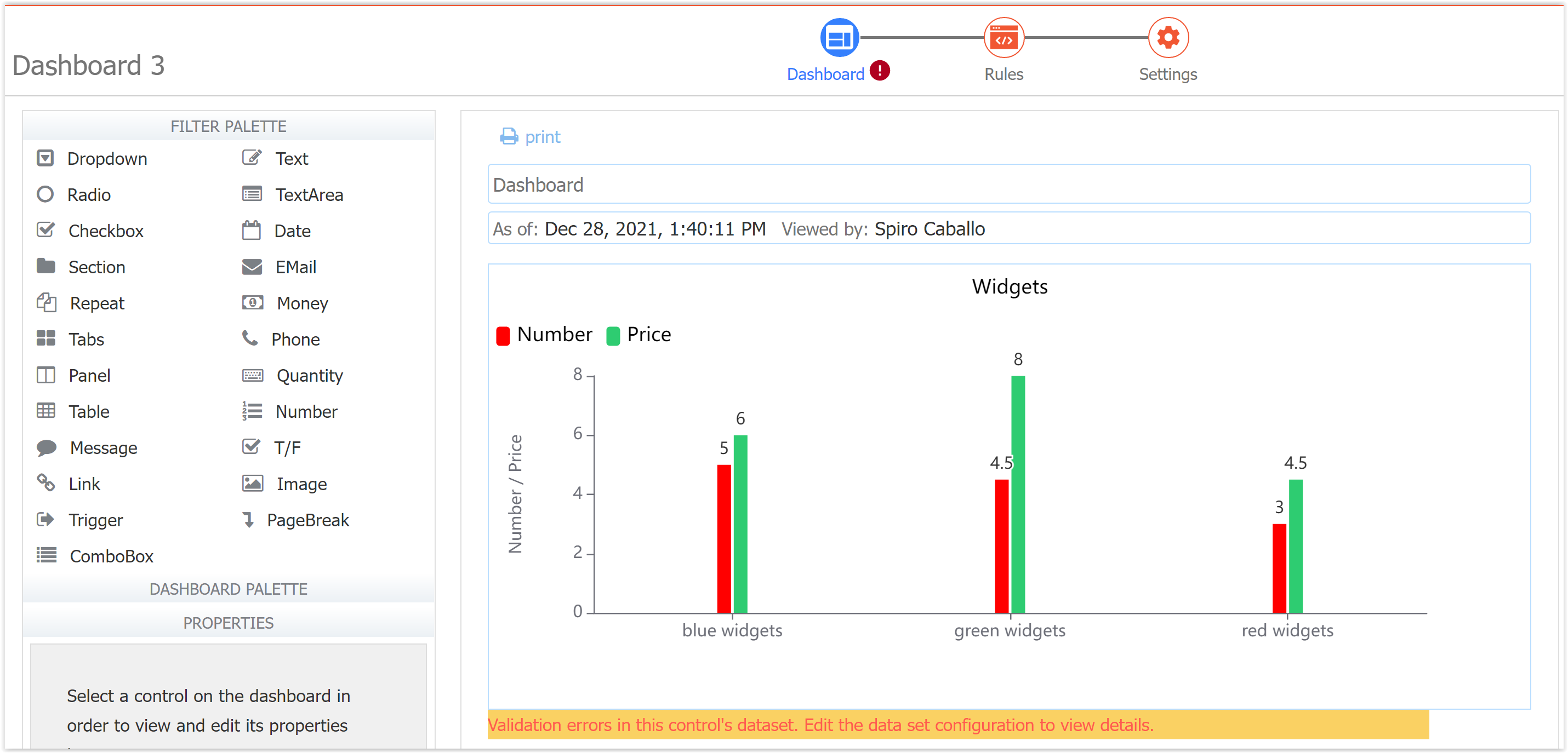
Editing the configuration reveals that both the Dimension and Metric fields are displaying as empty/invalid.
An attempt to use the Price control (which has been changed from Money type to Phone type), displays the error "Must be a numeric value."
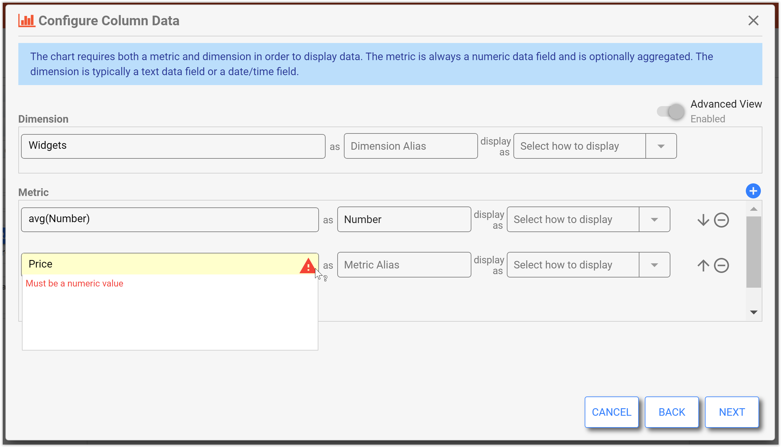
View the Submissions for this form, and you would also notice that the Price column in the Submissions table for all old submissions is blank, even if it had a value before.
You can either revert the control type change on the form, or remove this field from the data configuration. If you leave the control type change, you will not be able to display historical price data from before the control type was changed.
This list is not exhaustive. Always use caution when making changes to a form/workflow that has existing submissions, especially if it is used as a Dashboard's data source.
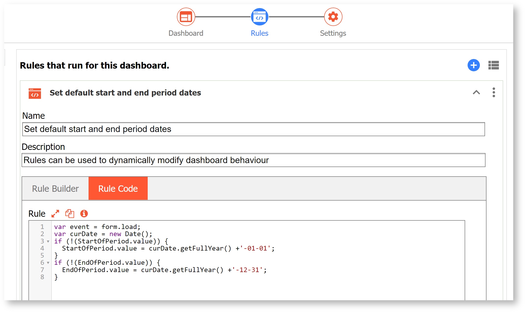
Dashboard Rules
The Rules editing mode allows you to dynamically set properties for filter and chart controls. In this example, the filter start period and end period are dynamically set to the current calendar year based on the date the dashboard is viewed.
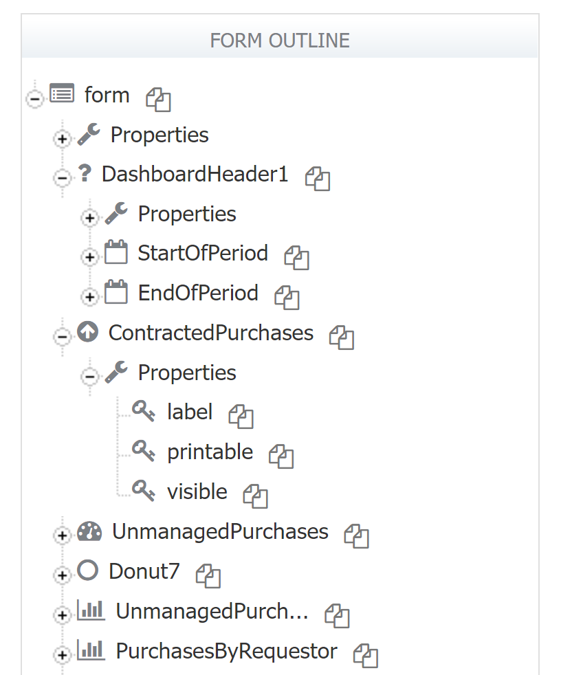
Filter controls have all the same properties that their corresponding form controls have, so you can set their value, status, etc. using rules. Chart controls only have three properties available in Rules - label, printable, and visible. You can see all of the available controls and their properties in the Form Outline.
You can use the Visual Rule Builder or JavaScript to create business rules. See Working with Rules and the Visual Rule Builder documentation for more details.
Dashboard Settings
Settings editing mode allows you to set Dashboard-level properties, access control, and styles.
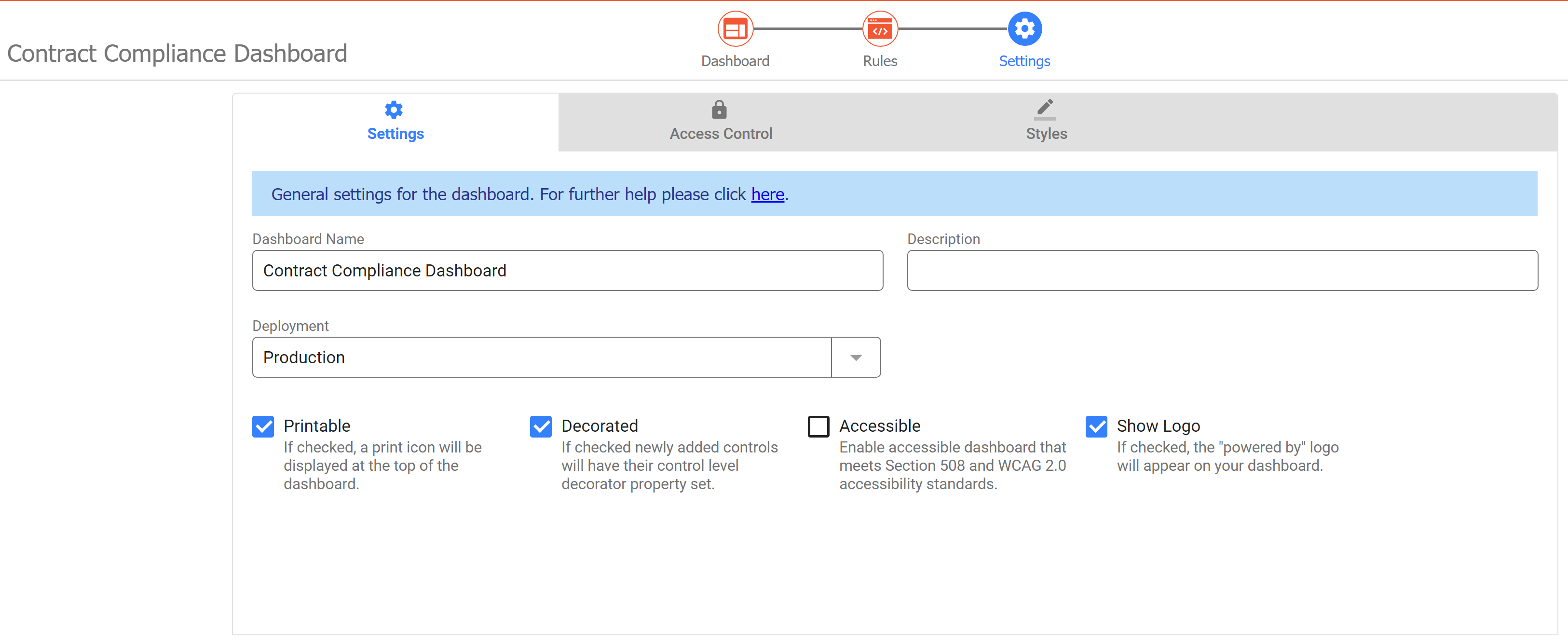
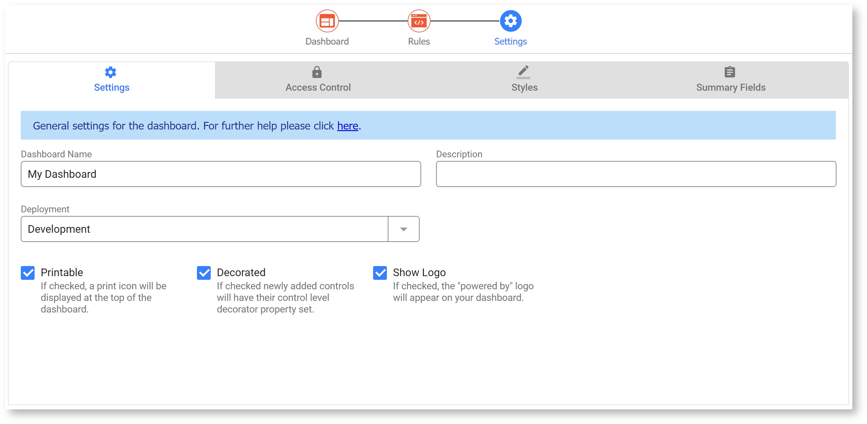
Settings Tab
The Settings tab allows the designer to configure dashboard level properties. These properties work just as they do in Forms and Workflows. Follow the links below to learn more about each specific property.
Access Control Tab
Access Control determines who can view and edit the dashboard. There are only two available Access Control properties. These settings work the same as the corresponding ones for Forms and Workflows.
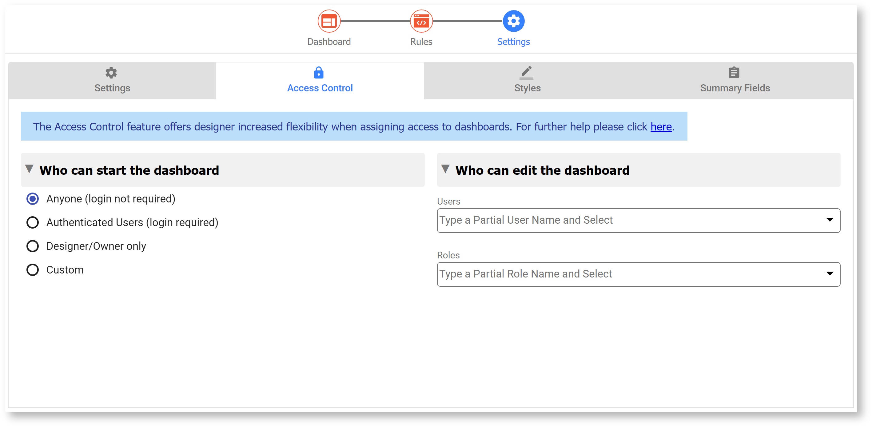
The Dashboard itself will be visible to users/roles set in the Dashboard Access Control "Who can start the dashboard" Settings. However, the data shown in a Dashboard is dependent on the user's permission to view submissions for the Data Source(s) configured in the Dashboard's chart controls. The Dashboard Status will display the name of the user currently viewing it; if the data appears incomplete, check this user's access control on the forms/workflows used as Data Sources.
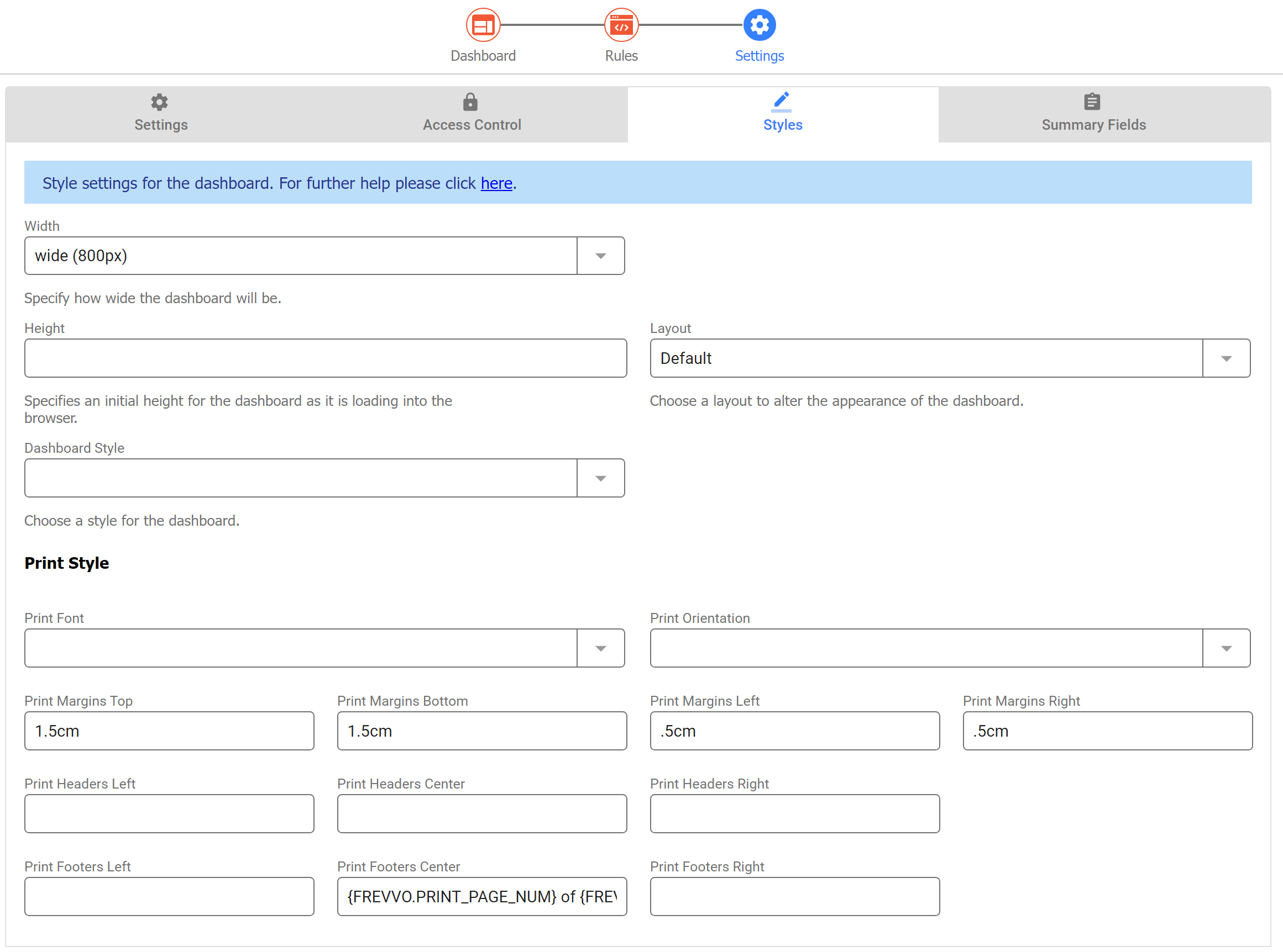
Style Tab
Style properties allow the designer to customize the look and feel of the runtime dashboard and the PDF Snapshot. See the Style Settings documentation for additional details on each of the available properties.
Sharing Dashboards
Just like forms and workflows, Dashboards can be shared via a link, used in a frevvo Space, or embedded in your own website. To share a Dashboard, click its 3-dot action menu and select Share.
This displays a Share dialogue similar to Forms and Workflows with several options available.
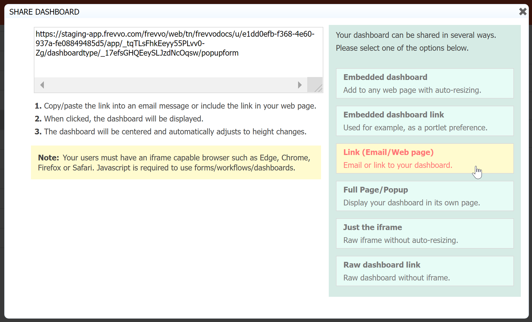
Please visit the Share Forms and Workflows documentation for a detailed explanation of each option.
The Dashboard itself will be visible to users/roles set in the Dashboard Access Control "Who can start the dashboard" Settings. However, the data shown in a Dashboard is dependent on the user's permission to view submissions for the Data Source(s) configured in the Dashboard's chart controls. The Dashboard Status will display the name of the user currently viewing it; if the data appears incomplete, check this user's access control on the forms/workflows used as Data Sources.
Here is an example of a Dashboard embedded in a frevvo Space.