Forms Designer
- Megan Ellis
The Forms Designer has several components. Hover your mouse over the Table of Contents icon  on the right to explore this page.
Check out this 6-minute video for a tour of the Forms Guided Designer!
Guided Designer Navigation
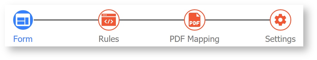
The Guided Designer navigation bar steps you through editing your Form, adding Rules for custom logic, creating custom PDF Mapping, and modifying your form Settings. A blue icon represents your current location in the Guided Designer. You may click between any icons in any order, and changes you have made will be temporarily saved in memory as you move between them. Remember to click Save, Save and Test, or Save and Close before closing your browser window or otherwise exiting the Guided Designer.
|
|
|
|
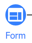
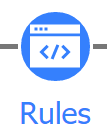
| Form mode allows you to add controls to your form canvas and edit their properties via the left-side Properties panel. | Rules mode is where you will add and edit business rules to customize form behavior. | PDF Mapping allows you to view, add and edit custom PDFs you are generating for this form. | Settings displays the Form Properties Wizard where you can customize your form settings and document actions. |
Action Menu
The action menu in the top right provides several options to save, close and preview your form. Use this chart to understand each action.
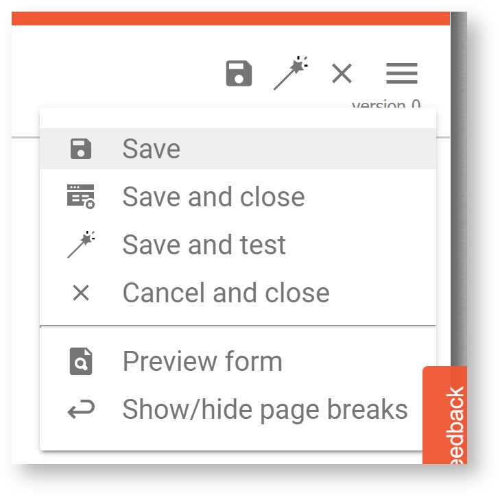
| Icon | Action | Description |
|---|---|---|
| Save without closing | Permanently save your changes and stay on the current page. |
| Save and test | Permanently save your changes, stay on the current page, and open a popup test window. |
| Save and close | Permanently save your changes and return to the Forms & Workflows list. |
| Cancel and close | Cancel your changes and return to the Forms & Workflows list. |
| Preview form | Preview a read-only version of your form in a pop-up window. |
| Show/hide page breaks | Show or Hide mobile and tablet view page breaks while in edit mode (does not impact use mode.) |
| Version number | Current version; Version increases each time you Save, Save and Test, or Save and Close. |
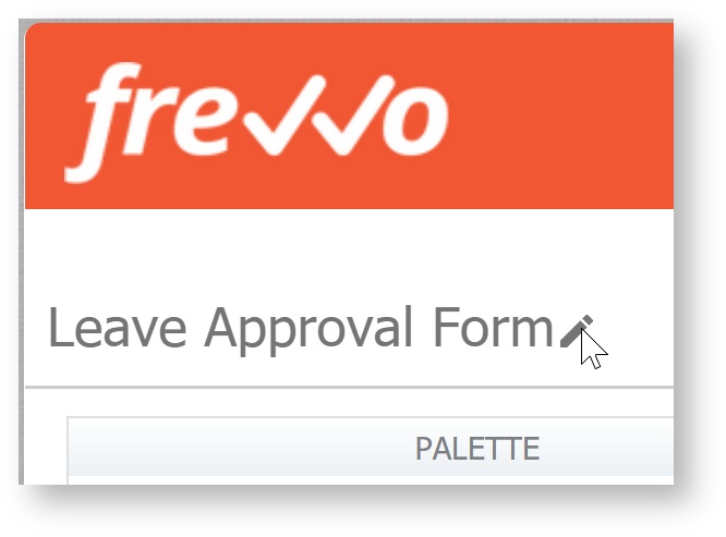
Form Name
Your form name will always appear in the top left corner, and you can change it anytime. Hover your mouse over the Form Name, then click the pencil icon that appears. After changing the name, click the checkmark to save it. You can also edit the Form Name and Description in Settings.
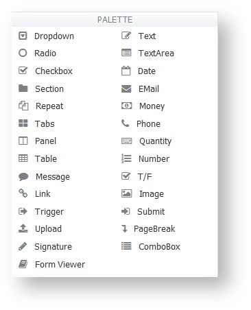
Palette
The palette contains the controls you can use in your forms. Click on the control you want and drag it into your form. See Adding Controls - Drag and Drop for more information.
Custom
This area stores controls you’ve already created and customized so you can re-use them. For example, you might create a dropdown list with your ten branch offices that will be used in several different forms. Instead of creating it from scratch each time, drag it from the form you’re working on and drop it over the shaded area that says “Custom” or click the publish link in the control's properties. Now open or create another form, and you can drag and drop the published control template from the Custom tab to another form.
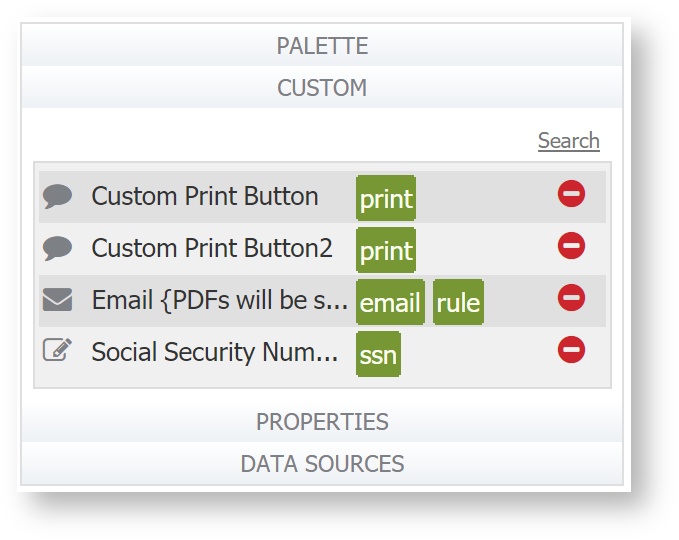
Once the control is in your form, you can modify any of its properties or simply leave it as it was. Any modifications you make apply only to the form you’re working on and will not affect the version of the control that's inside the Custom tab or other forms where you also used this custom control. To delete any control from the Custom tab, simply click the  icon.
icon.
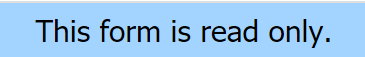
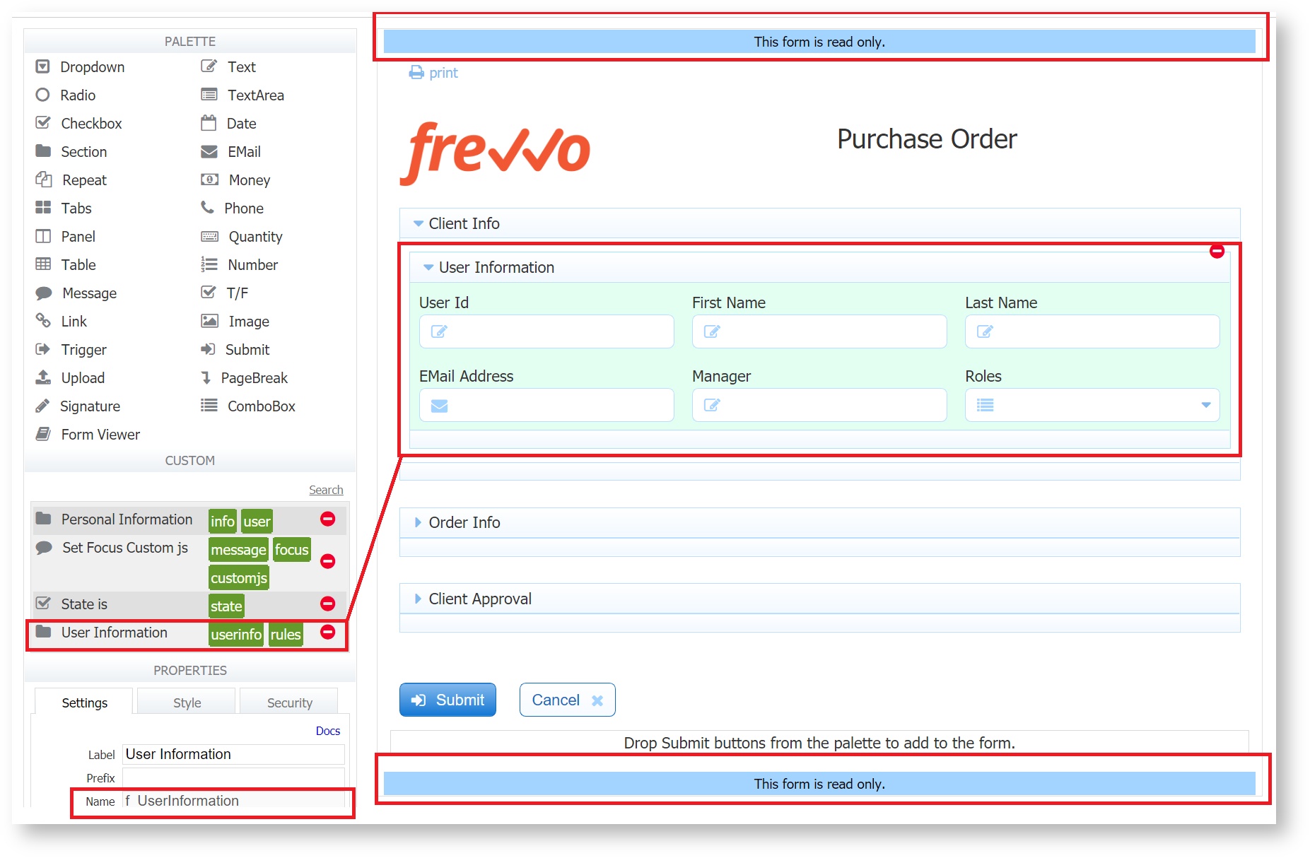
If the control was published as "Read Only", which is often the case with controls published with associated business rules, you will not be able to edit certain properties, such as the control name and control type. Whenever that control is selected for editing, you will also see a blue banner, "This form is read only.", at the top and bottom of your form.
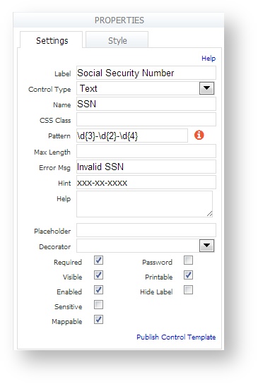
Properties
This is where you define values in a dropdown box, set the max length for an input field, create tooltips, and additional control customization. When you click on a control in your form, the Properties area displays the control’s properties so you can view and edit them.
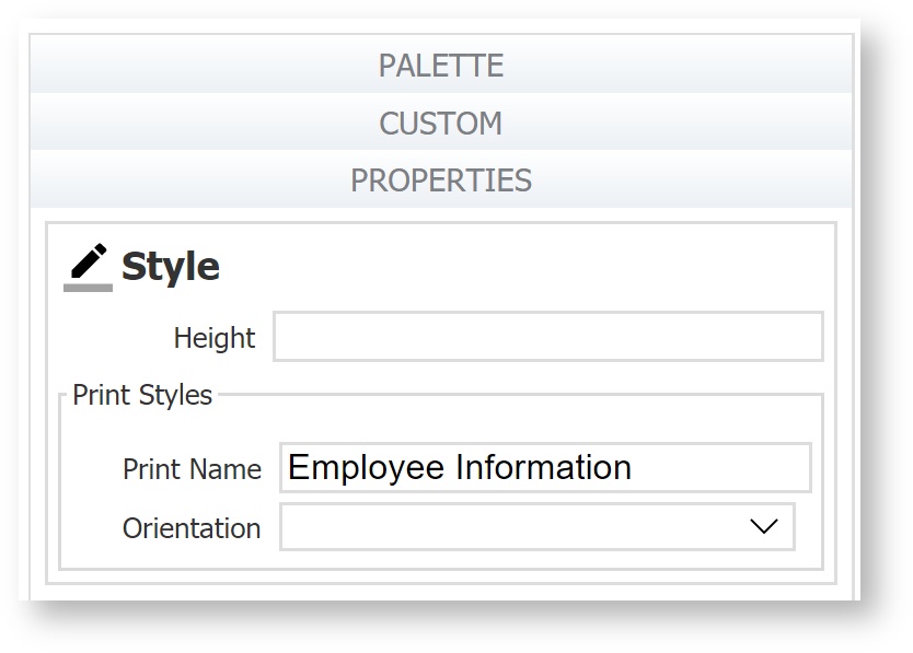
Properties for Form Steps in a Workflow
The Forms editing mode in a Workflow displays a Form Styles panel in the Properties pane, which allows the designer to configure specific print properties for workflow steps using that form (including parent and linked steps.) The Print Name property is the default PDF name used when printing workflow steps.
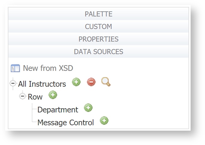
Data Sources
This area displays the list of XML schemas added to the current project. You may add to your form one or more elements from any schema listed here by clicking Add from Schema, but you first must upload the schema into your project from the Schemas tab. Please see Data Sources.
If you do not see the Data Sources tab it may be hidden via the form server's configuration. See Installation Task Show/Hide Data Sources.
Form Canvas
The right side of the Form Designer is the work area where you'll drag and drop controls from the palette to design your form. At the top of this area is the toolbar. Initially the canvas is empty except for a submit and cancel button and possibly a save icon.
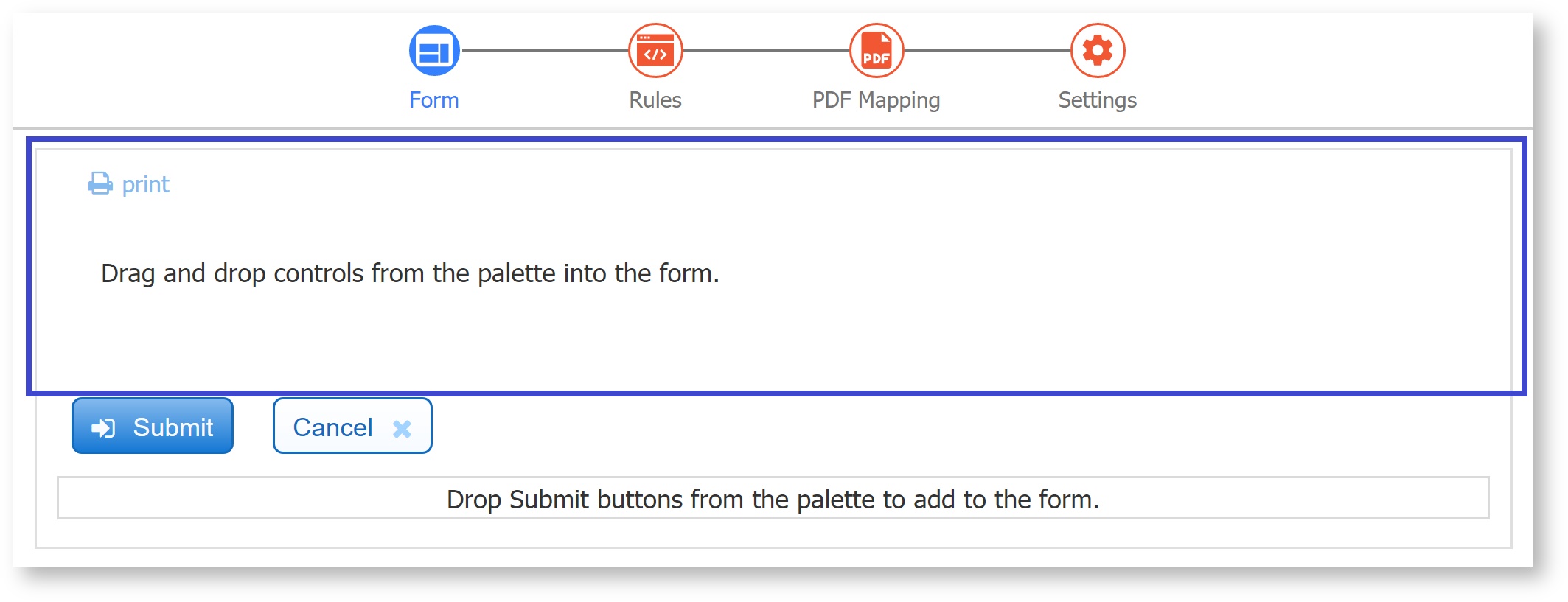
Submit and Cancel Buttons
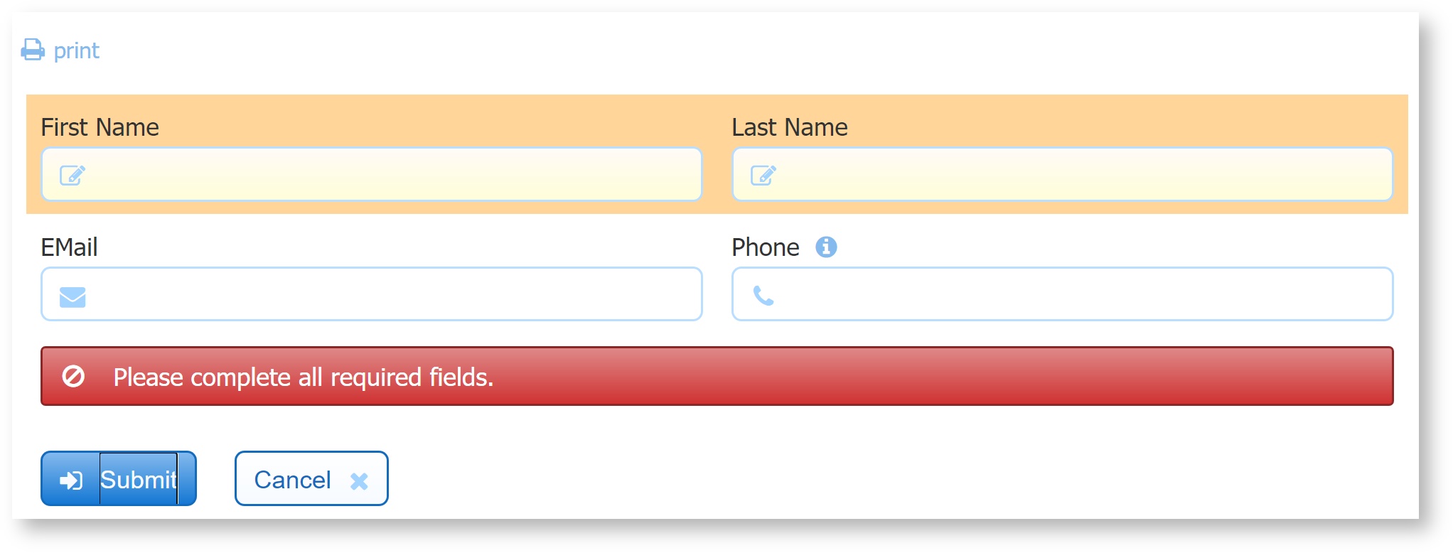
At the bottom of the forms work area are a Submit button and a Cancel button. They are part of every form you create and are both disabled while you are designing your form. When you test your form or users access it, the form can only be submitted after valid data has been supplied in all required controls. To turn off this feature uncheck the Enable if Valid property.
If you click on the Submit button in a form that contains invalid data or required fields that are empty, the invalid fields will be highlighted with an orange background color. The designer can also display a message instructing the user what to do. This method is very helpful to users when trying to determine why a form does not submit. Refer to this topic for the details.
Both buttons have properties that you can customize, so you are free to change the names of these buttons by editing their labels. Additional Submit Controls can be added to the form by dragging/dropping the submit control from the palette. The validation behavior described above applies to added Submit controls as long as the Enable if Valid property is checked.
There is a special template Uri variable named {_frevvo_submit_name}. This template gets converted to the name of the submit button the user clicked when they submitted the form. This feature makes it possible to pass to the back-end system which submit button was clicked (if the form contains multiple submit buttons), so the back end can switch the functionality based on which button the user chose.
An example use of this feature is to have one submit button labeled "Submit," and drop another onto the form and label it "Save". For the Save button, uncheck Enable if Valid. The back end system can then control a save/load feature.
It is also possible to hide one or both of these buttons by unchecking the visible property. It is common to hide the Cancel button and less common to hide the Submit. You might hide the Submit button if an outer application, a JSP for example, takes over the function of handling a submit and then programmatically submits the form.
When you click the Cancel button, a confirmation message displays. You can internationalize this message - it will be part of the form/workflow strings even though there is no Cancel button for workflows.

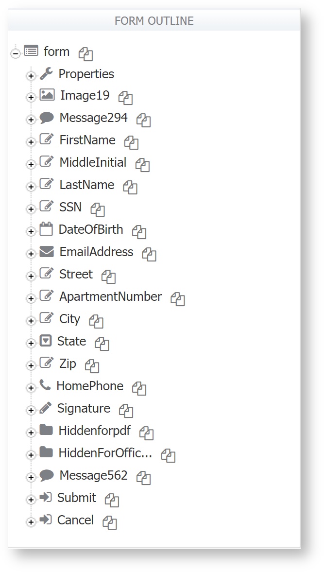
Form Outline
This area is only visible when you are in the Rules and PDF Mapping modes. The form outline list all of the controls in this form and all of the properties applicable to particular controls. The form outline is very helpful when writing business rules. You can copy/paste control names from the form outline to your rule to avoid typos and case issues.