Chart Types
- Megan Ellis
The choice of data visualizations involves many factors and choosing the correct one for the data, audience, and target analysis is of utmost importance to a successful dashboard design. This documentation will discuss the various Chart types available in the Dashboard Palette, with examples and recommendations for when to use them.
Pie
Also known as a Circle chart, the Pie chart is used to illustrate relative proportions and percentages of a whole data set. Pie charts best illustrate information at a point in time, and they are not useful for visualizing trends or changes over time.
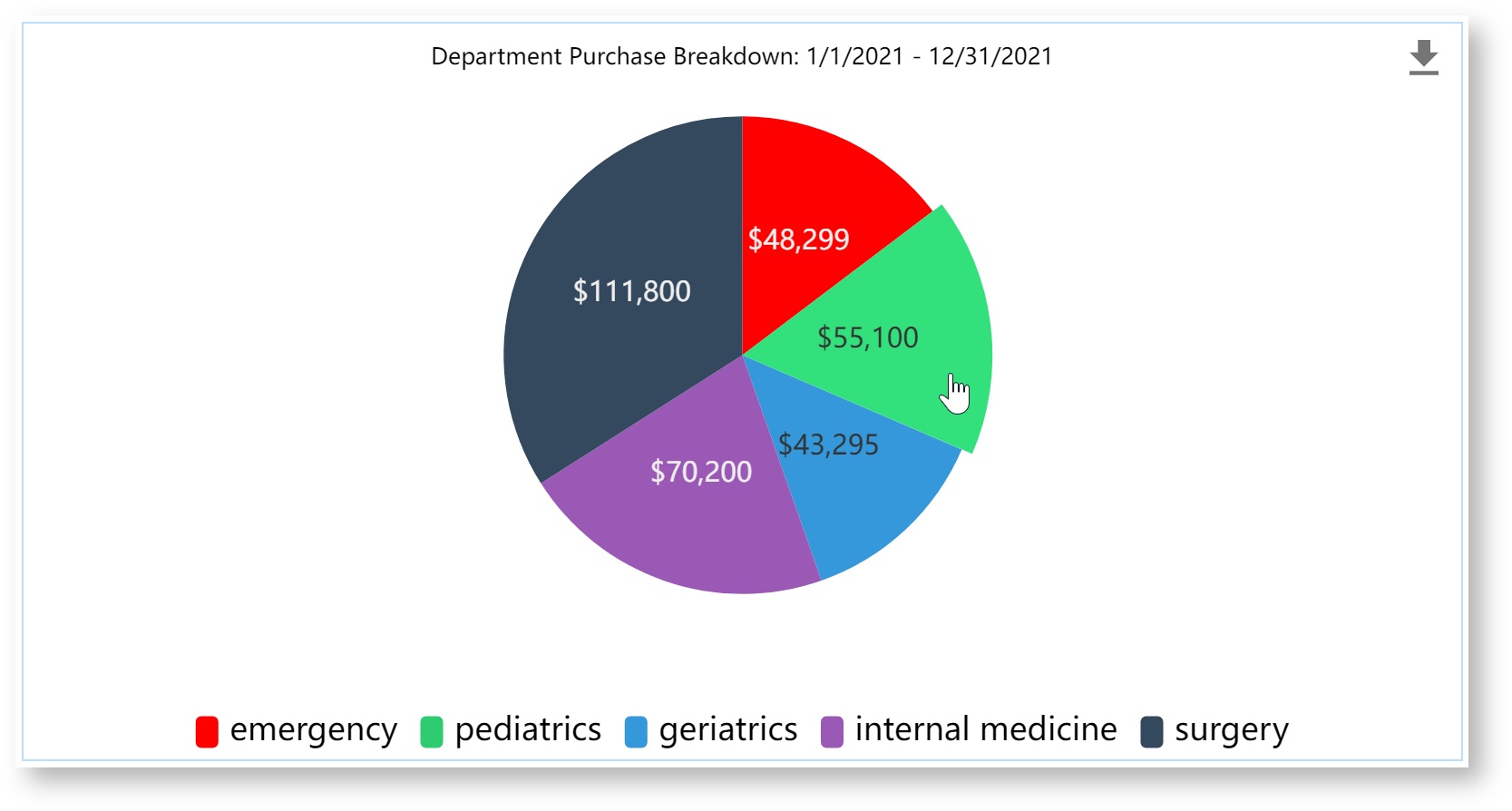
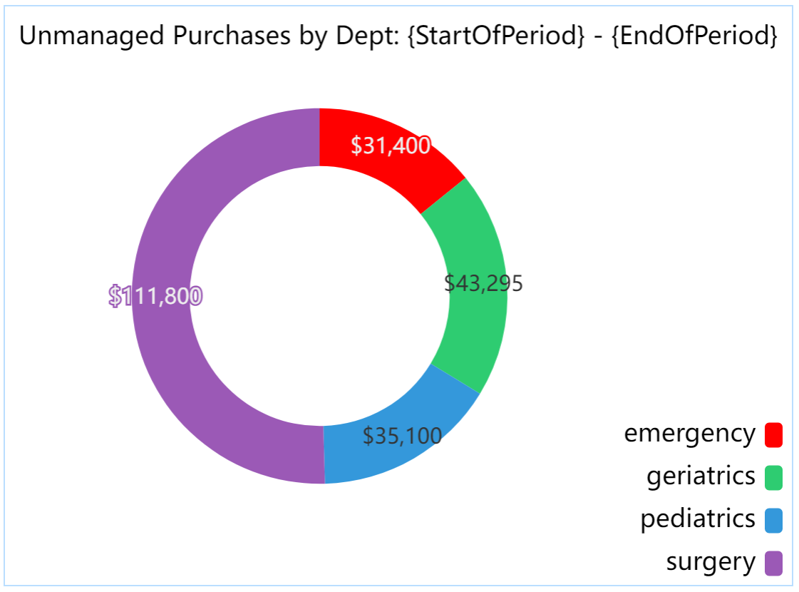
The pie chart should give you a visually clear answer to your compositional questions; for example, the chart in this example clearly tells us how spending is spread across departments. Avoid using too many pie slices that can be hard to decipher. Consider providing value labels on the chart for precision.
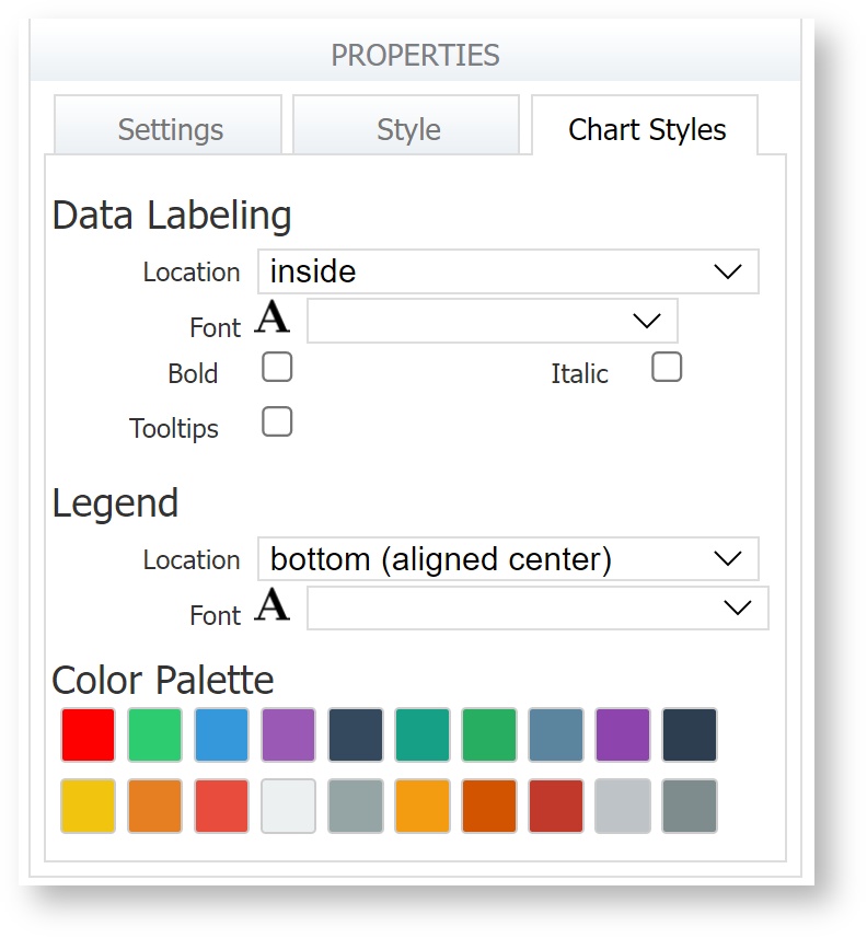
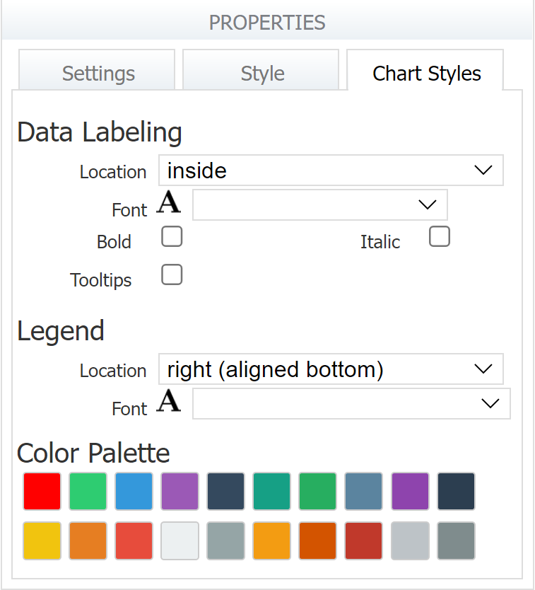
The Pie Chart Styles tab allows the designer to customize data labels, the legend, and the pie piece colors.
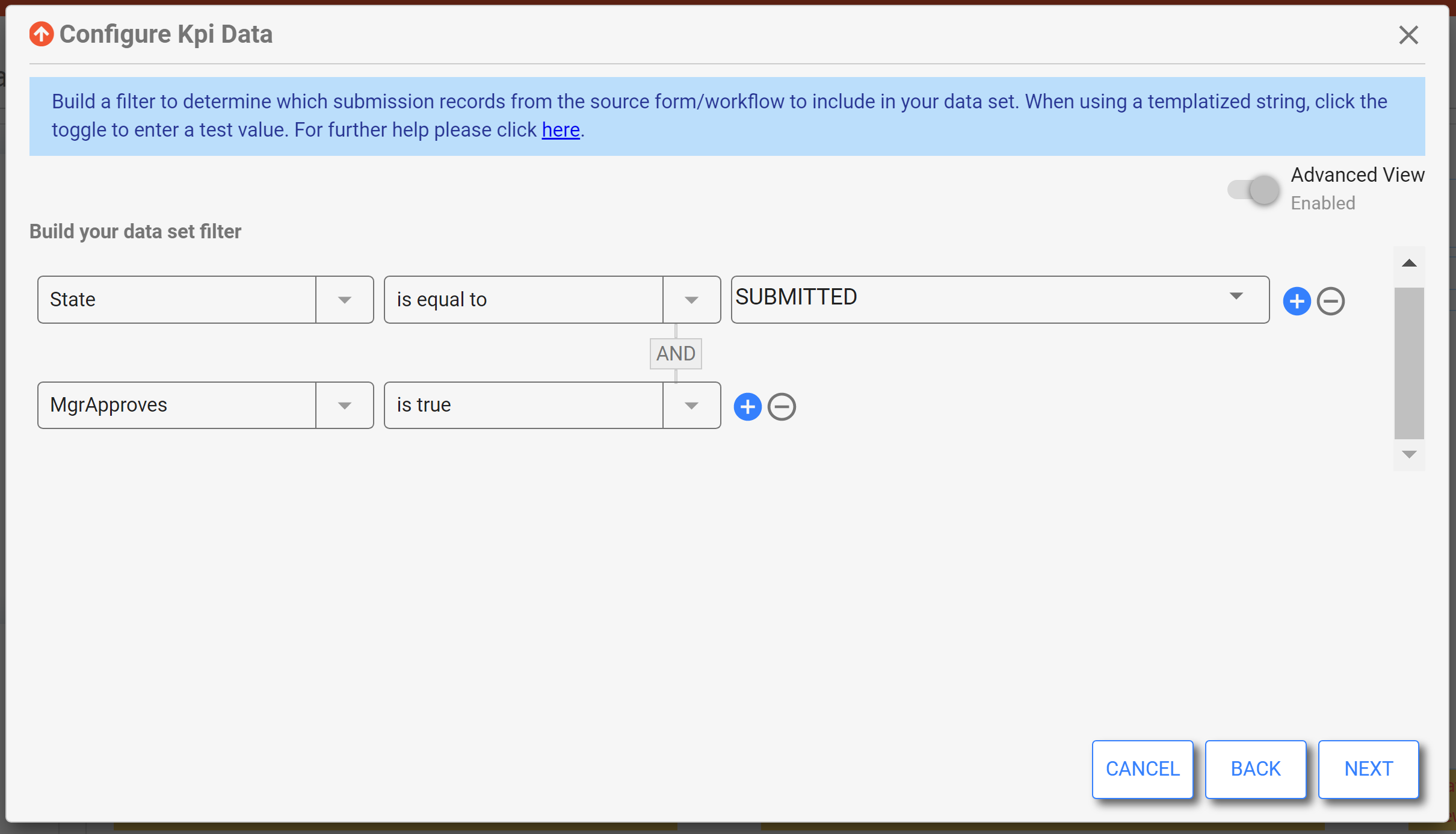
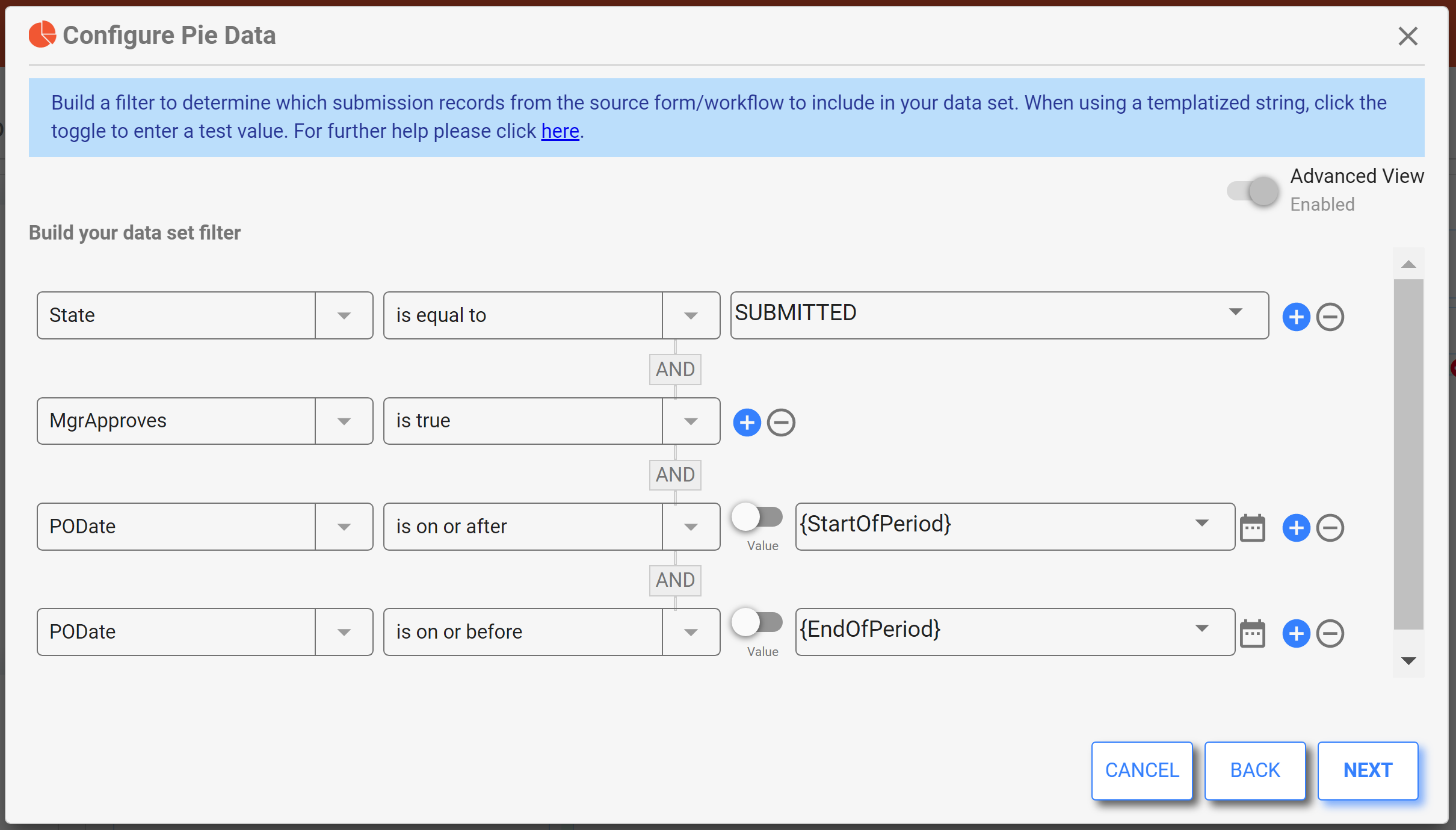
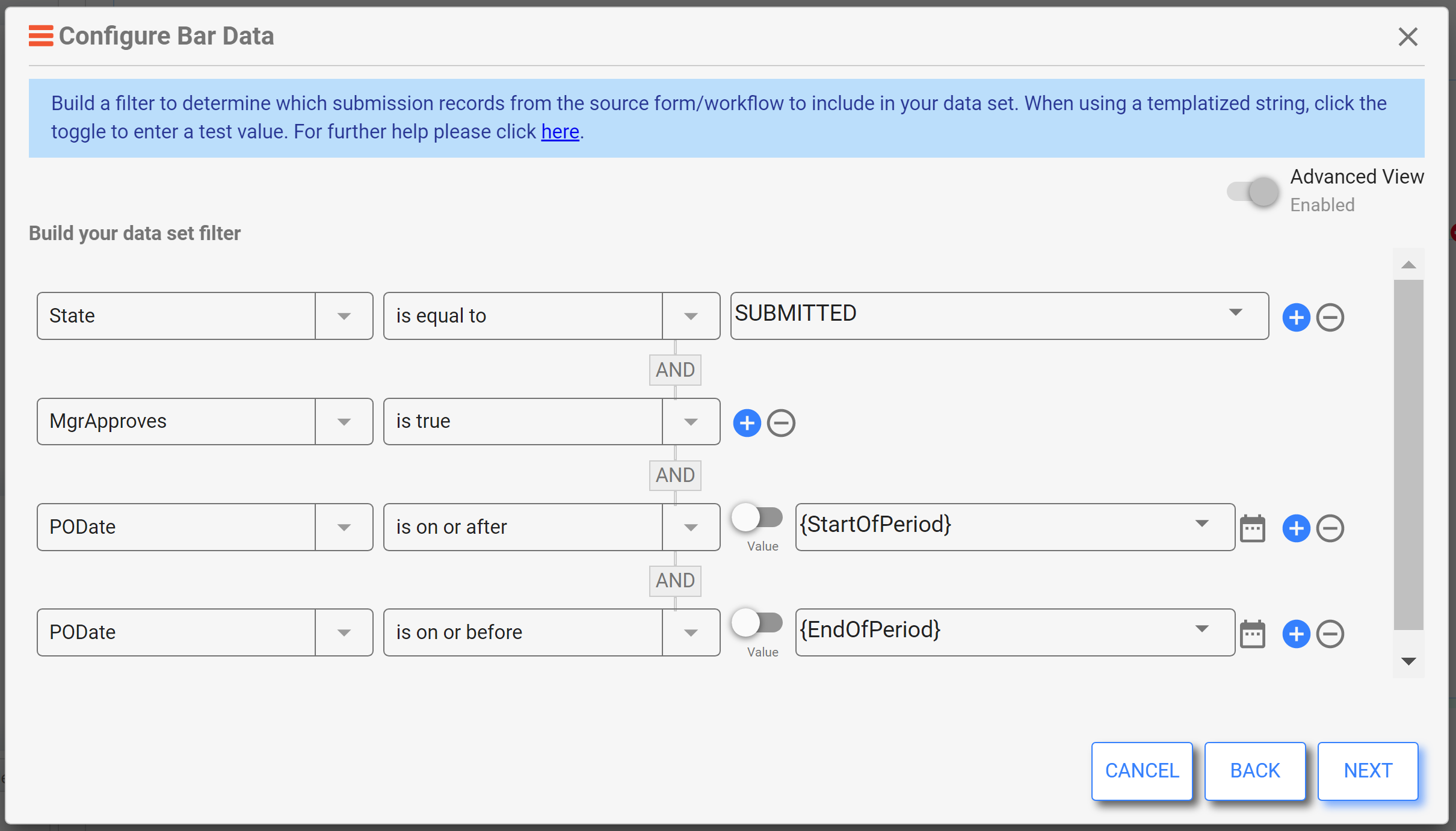
In the Data Configuration wizard, we can see that the dimension (represented by pie pieces) is "Department", while the metric, or size of those pie pieces, is summing the "GrandTotal" field from all Submissions, and displaying the value rounded to the nearest dollar.
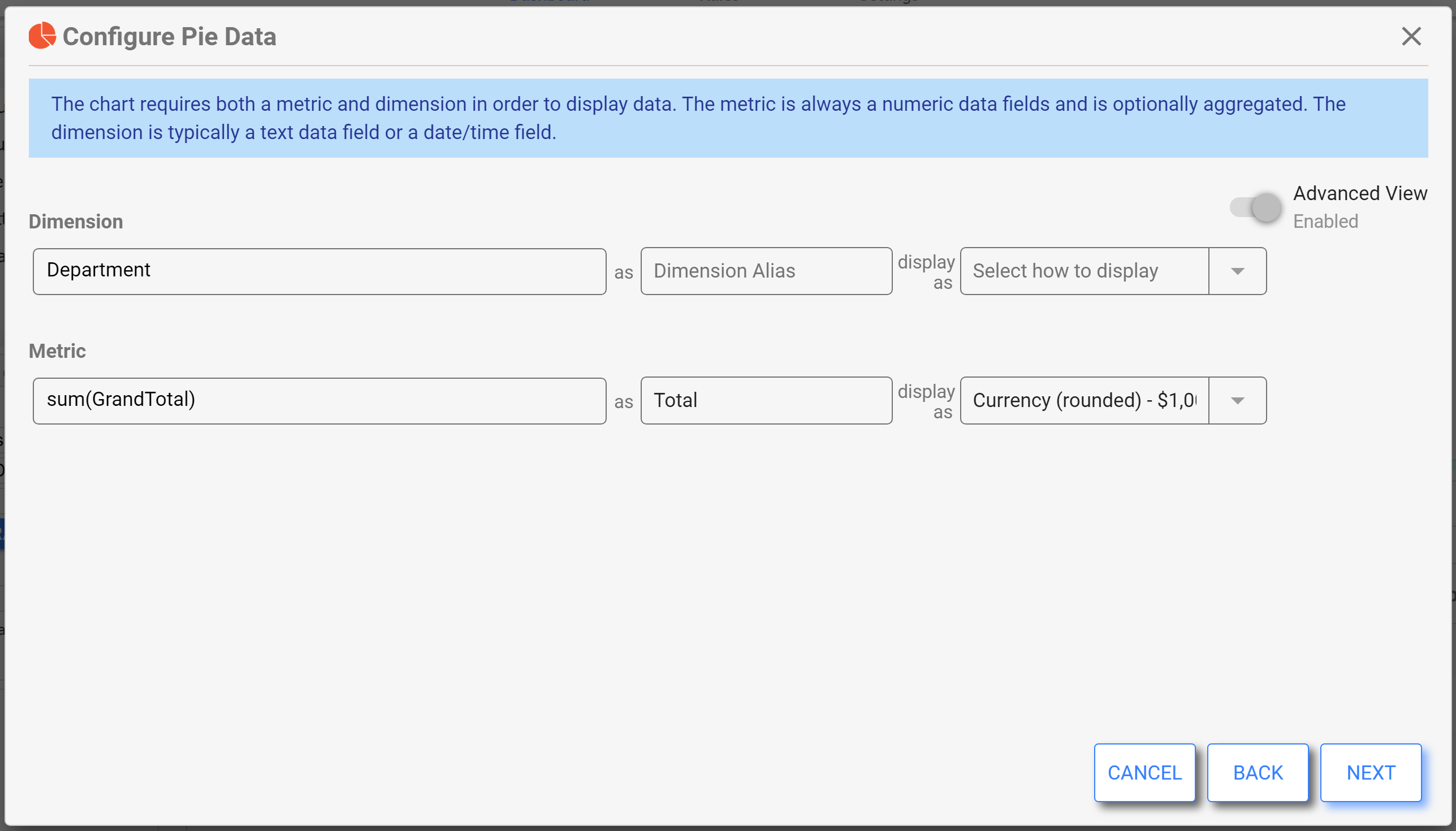
The filter ensures only Submitted and approved orders are included in the data set. It also works with the "StartOfPeriod" and "EndOfPeriod" filter controls on the dashboard, which allows the user to alter the data set at run time.
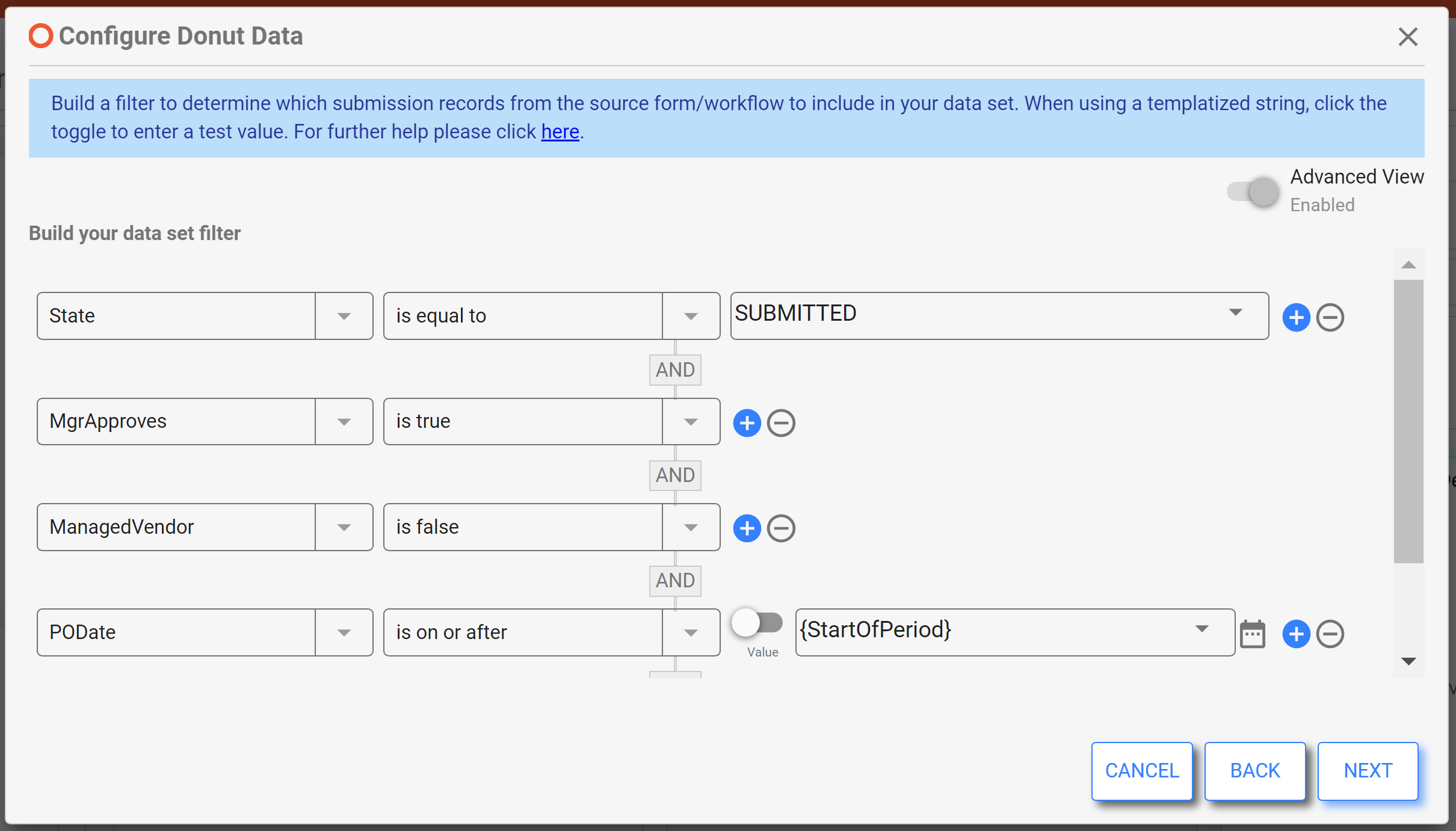
Donut
A Donut chart is very similar to a Pie Chart, except the center is cut out. The Donut chart is used to illustrate relative proportions and percentages of a whole data set. However, generally, donut charts work better with fewer categories than pie charts. This will allow the viewer to easily differentiate between the arc lengths to see the relationship between the categories and to the whole.
Donut Chart Styles and Data Configuration are similar to Pie charts.
The Dimension is the category represented by the different arc colors on the donut, while the Metric determines the size/length of those arcs.
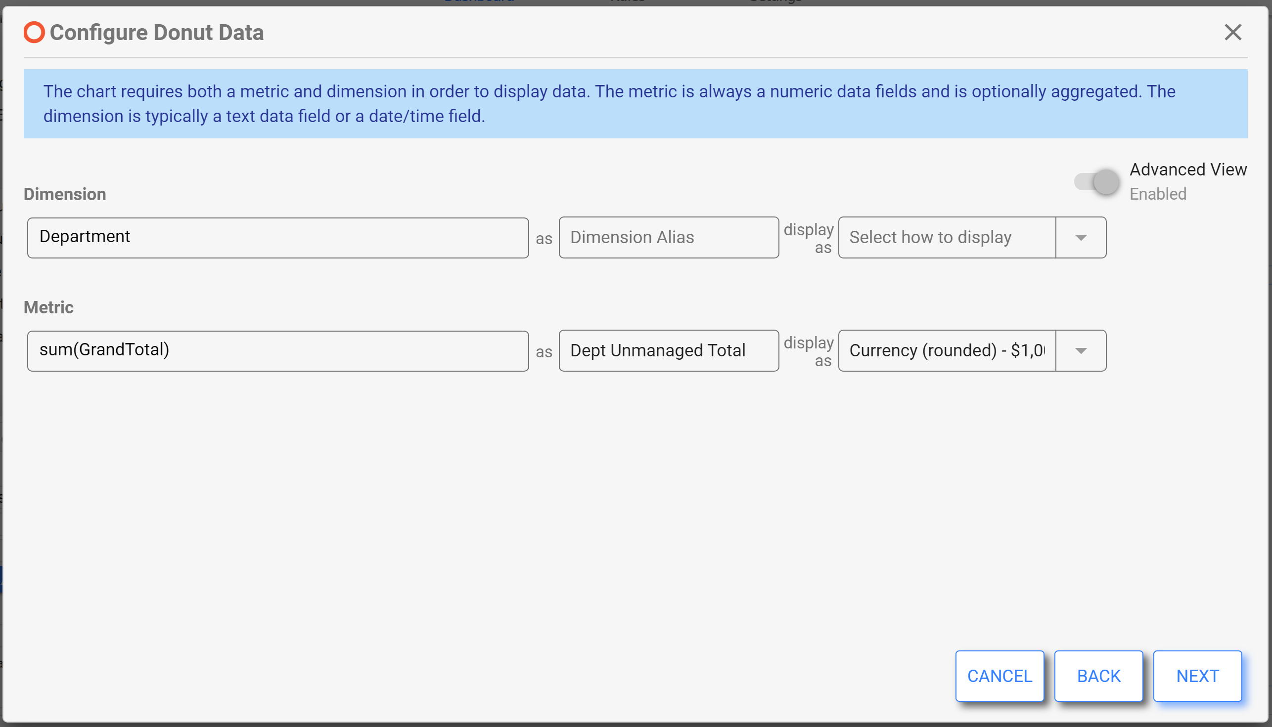
In this example, we have filters to narrow the data set to just those where the "ManagedVendor" T/F control is unchecked, or "is false."
 \
\
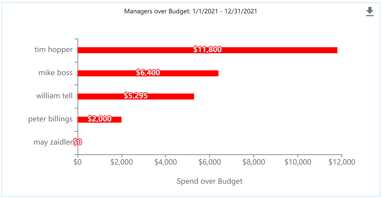
Bar
Bar and Column charts are used to plot categorized data values and are well suited for plotting multiple related data values per category side-by-side. It is best to limit the number of categories and to keep categories clearly spaced on the chart. Bar charts are a good choice when you have long data labels, as they provide space for each bar to be labeled. Avoid time period categorization with horizontal bar charts (time is best plotted on the X-axis).
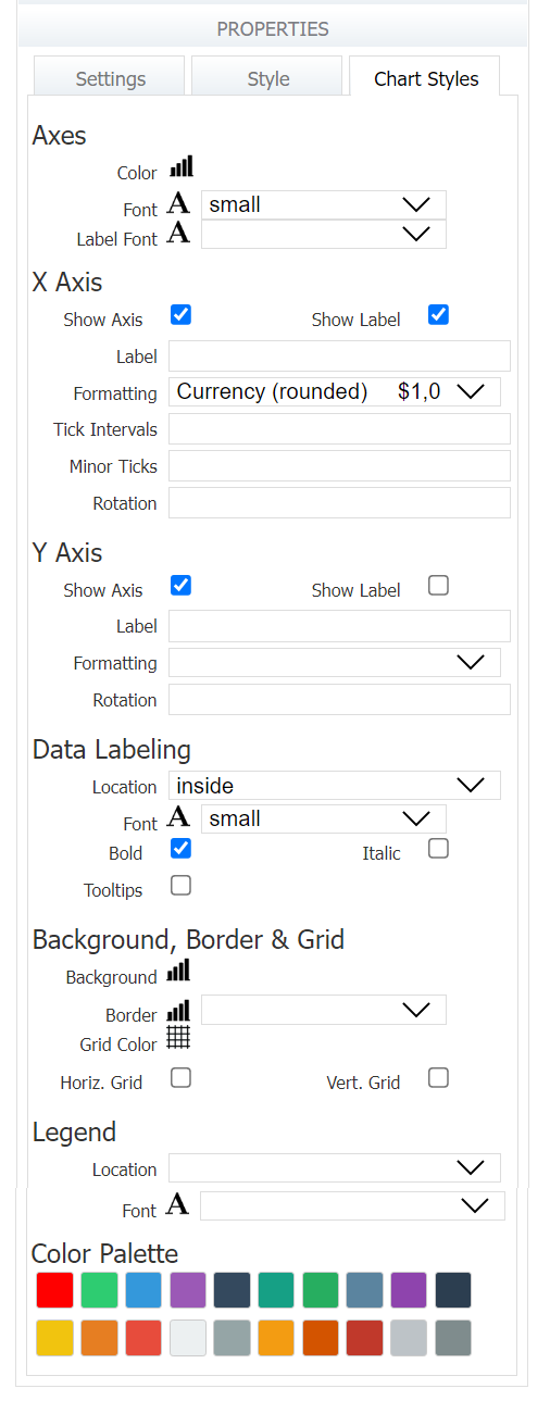
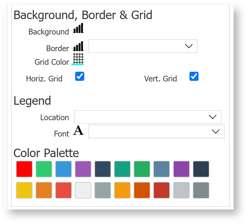
The Bar Chart Styles tab allows you to customize the axis labels and styles, the background, border and grid colors, and the color palette for the bars.
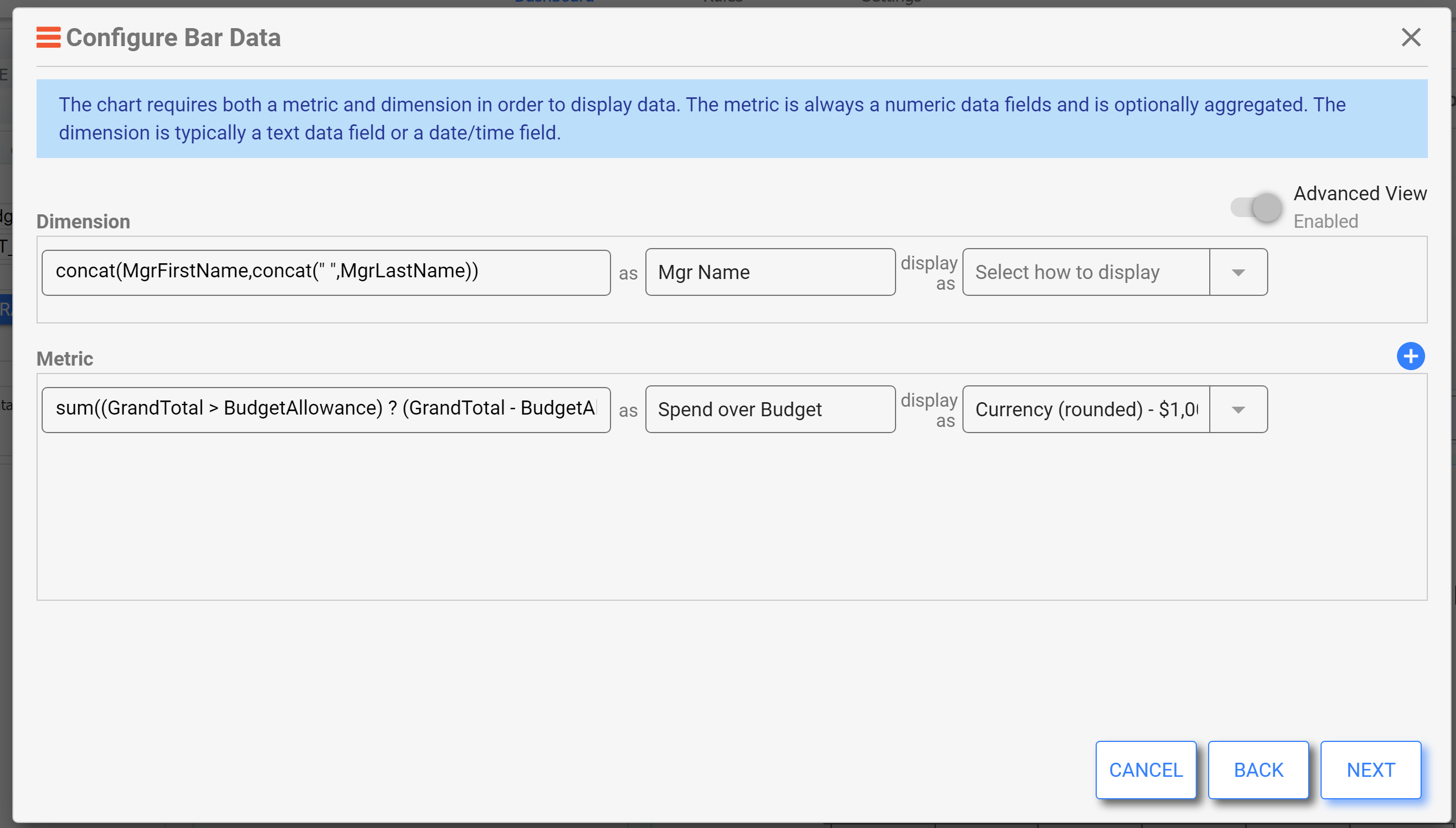
In this example, we've used expressions to create the values shown in the X and Y axes. For the Dimension, the expression concatenates the manager's first and last name. This creates the categories in which to display the metric, which is set to the following expression to calculate the amount the total is over the budget allowance.
sum((GrandTotal > BudgetAllowance) ? (GrandTotal - BudgetAllowance) : 0)
The filter ensures only Submitted and approved orders are included in the data set. It also works with the "StartOfPeriod" and "EndOfPeriod" filter controls on the dashboard, which allows the user to alter the data set at run time.
Column
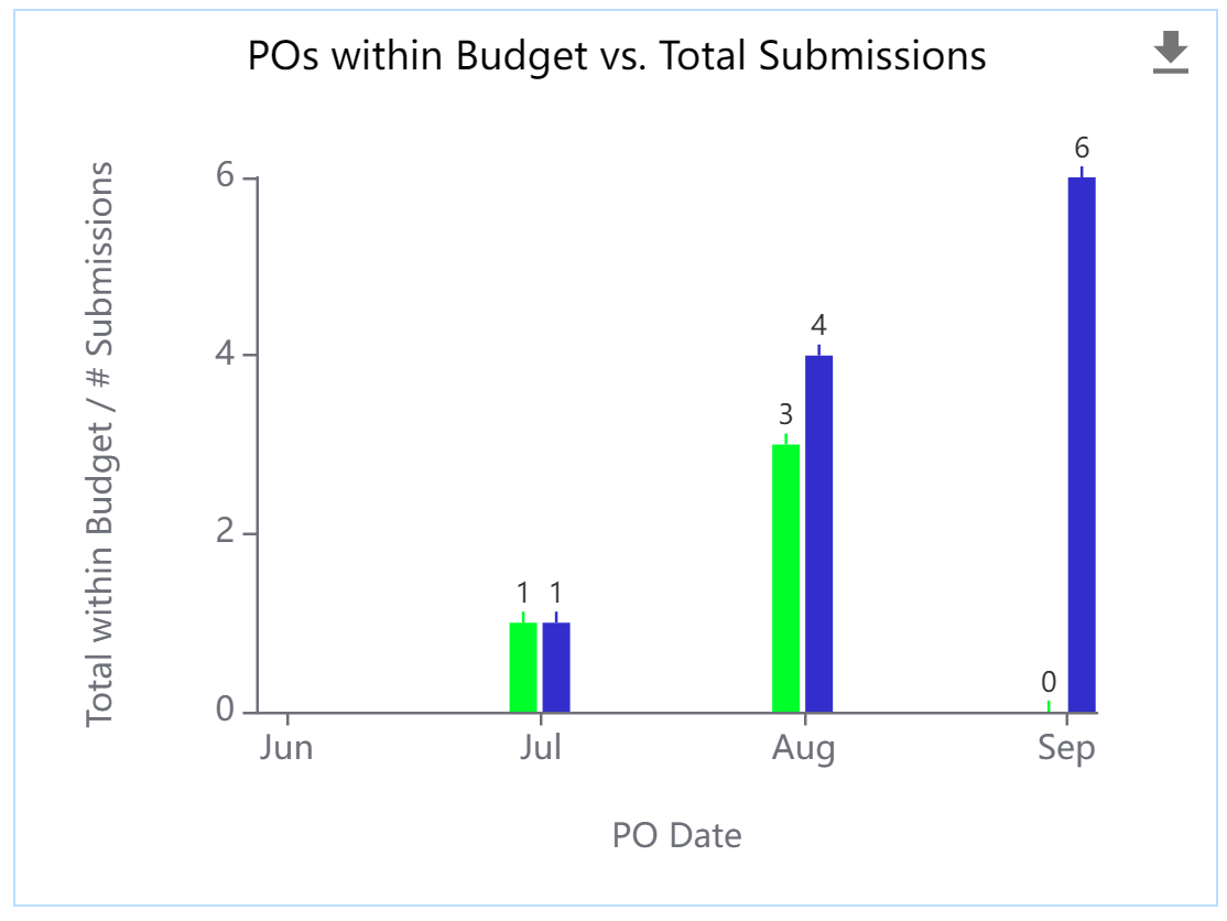
Bar and Column charts are used to plot categorized data values and are well suited for plotting multiple related data values per category side-by-side. Column charts are especially well-suited for plotting chronological data for analyzing trends. You might also choose a column chart if you plan to represent negative values, which will be shown in an easy-to-interpret downward direction. It is best to limit the number of categories and to keep categories clearly spaced on the chart. Here is an example of a chart designed to show both POs within budget and total PO Submissions by month. It's clear to see that while total submissions are increasing, orders within budget are going down in relation to the total orders.
Column Chart Styles and Data Configuration is otherwise identical to Bar charts.
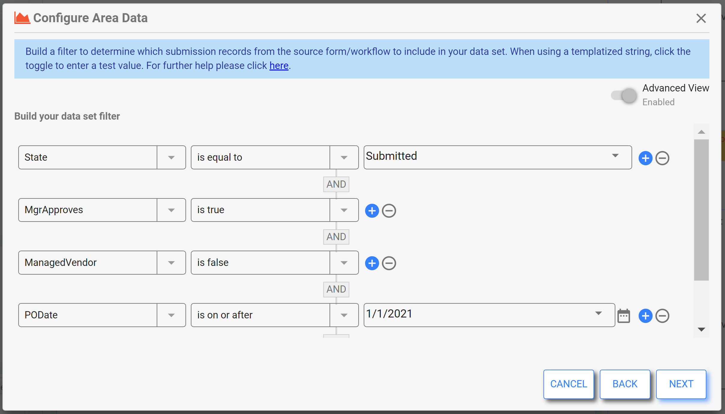
Area
Area and Line charts are very similar, with the Area chart showing the space under the line filled in for a different visual effect. Both Area and Line charts are similar to Column charts in that they can be used to illustrate categorical and time-series data. An area chart with multiple metrics can be good for illustrating part-to-whole relationships. Keep in mind that chronological data is best blotted on the X-Axis.
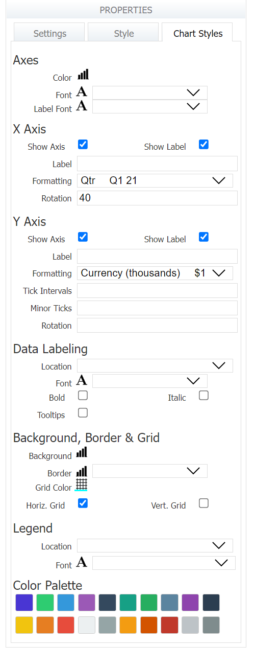
The Area Chart Styles tab is just like Bar/Column Chart Styles. Here you'll notice we've formatted the X and Y axis for improved readability, and added some horizontal grids.
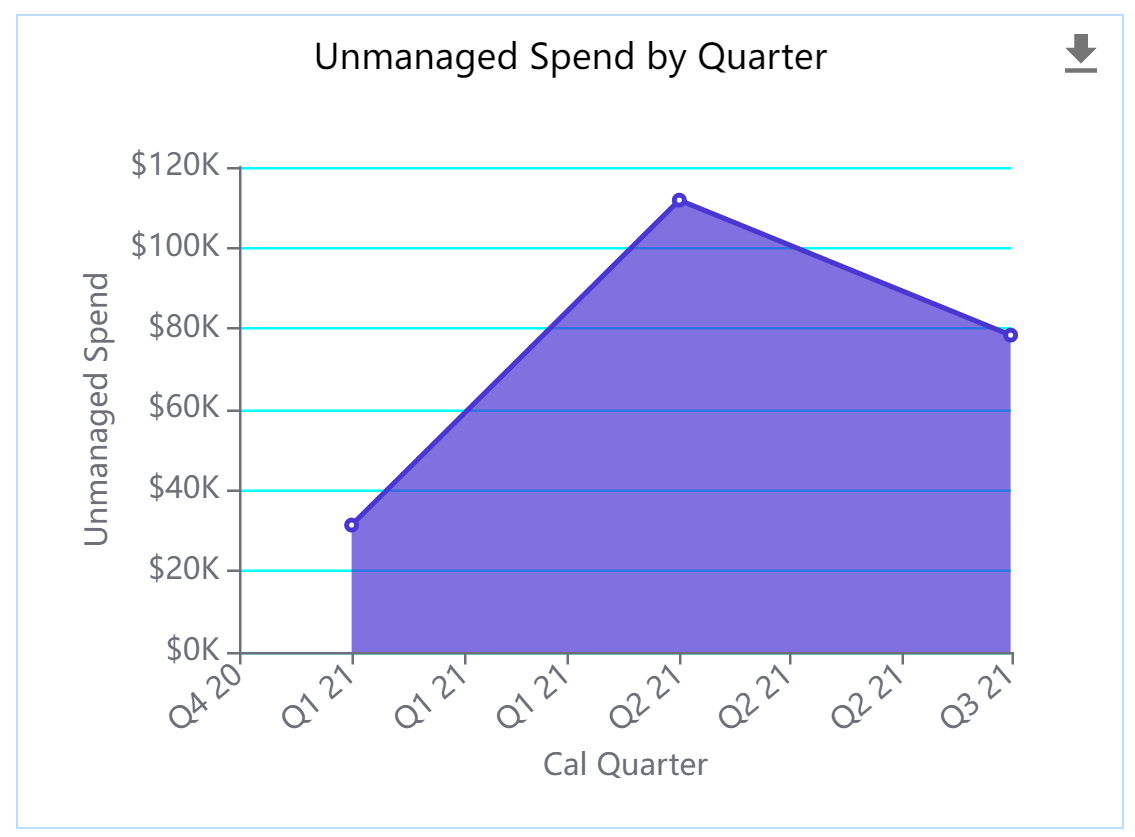
The configuration is also very similar to Column charts. Here we have set the Dimension, or X-Axis to display the PO Dates by quarter. The metric is the grand total for each quarter.
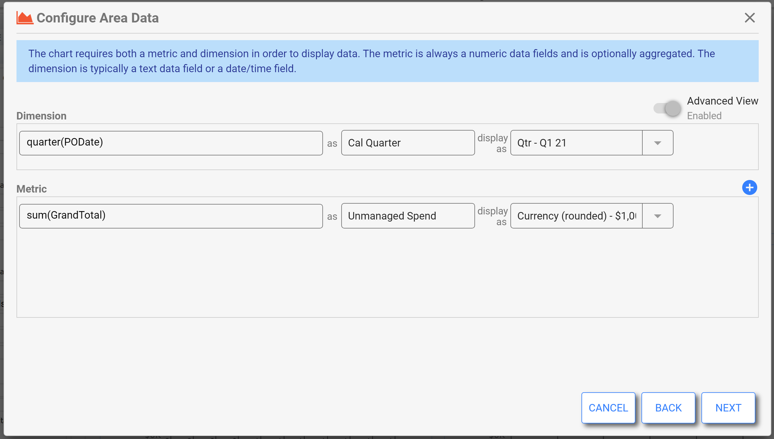
This chart is filtered to show only submitted, approved workflows where the Managed Vendor T/F field is "False" (unchecked). We've also set a date filter in this case.
Line
Area and Line charts are very similar, with the Area chart showing the space under the line filled in for a different visual effect. A line chart connects discrete but continuous data points by using straight line segments. Line charts are particularly effective for trend analysis, such as visualizing expenditure over time or other factors. You might choose a line chart over an area chart if you need to plot multiple data sets, as it will be easier to distinguish each data set's trend. Keep in mind that chronological data is best plotted on the X-Axis.
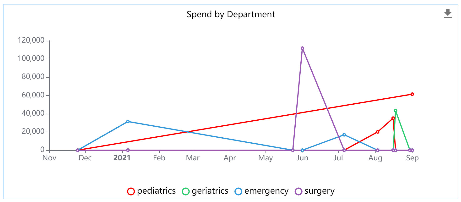
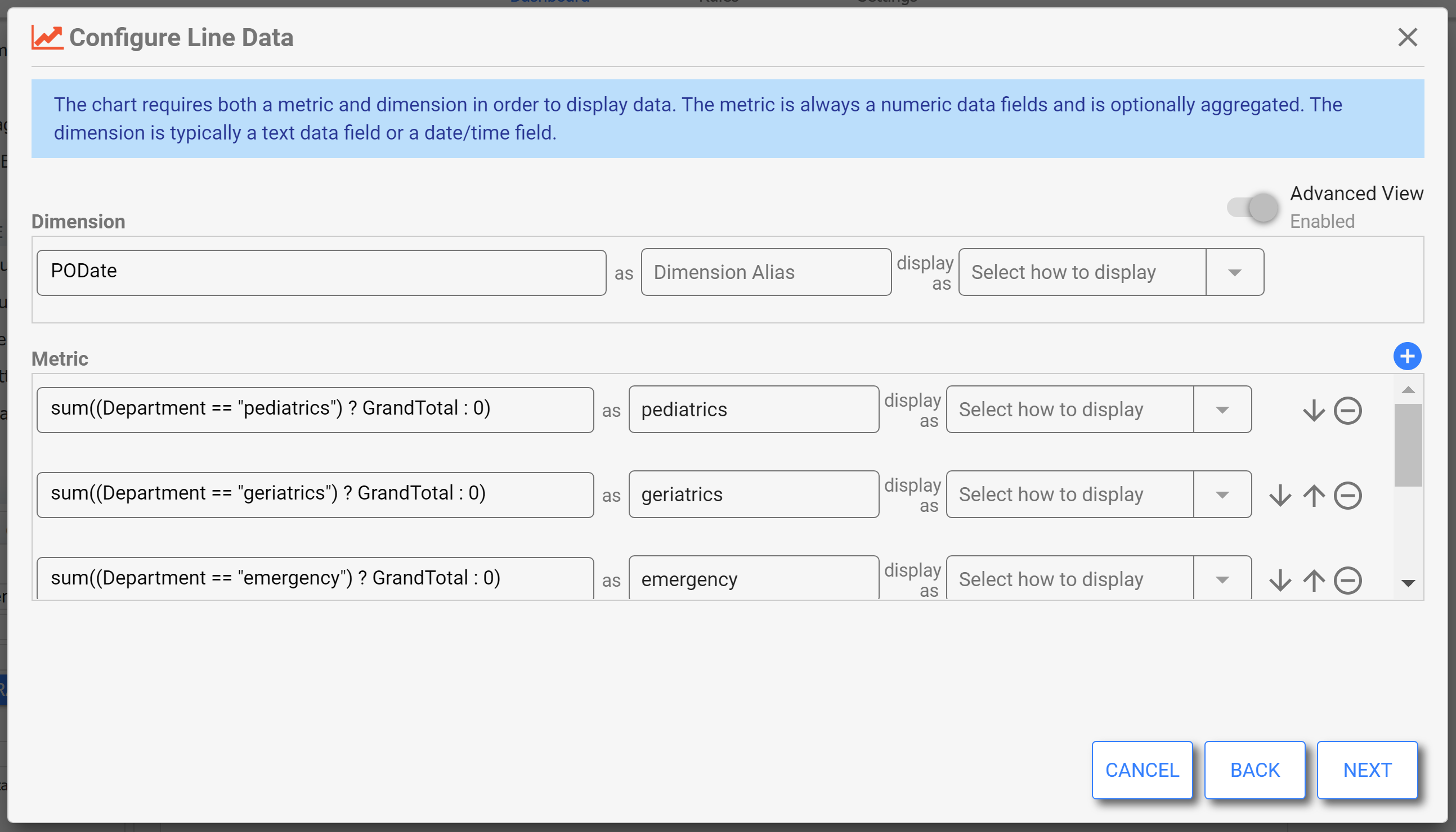
Similar to other charts, the Chart Styles tab allows the designer to configure how the axes, labels, and legend should display. The configuration for this example shows the dimension of PODate and multiple metrics which calculate the total for each department.
Scatter
Also known as a scattergram or scatter plot, this chart is used to analyze a set of data in order to look for a correlation between a set of variables. Typically, the correlation is dependent, meaning one variable is dependent on the other. Correlation can be positive (increase together), negative (one increases while the other decreases), or no correlation at all. The variable you deem as independent should be plotted on the X-axis. In frevvo, the Scatter chart does not show a trend line. Use a Scatter Line to more easily see a correlation with a trend line.
For example, perhaps you want to know if there is a correlation between the amount of a Purchase Order and the length of time it takes to process. This chart shows a positive correlation, meaning that as the Grand Total of the PO increases, so does the number of days it takes to process.
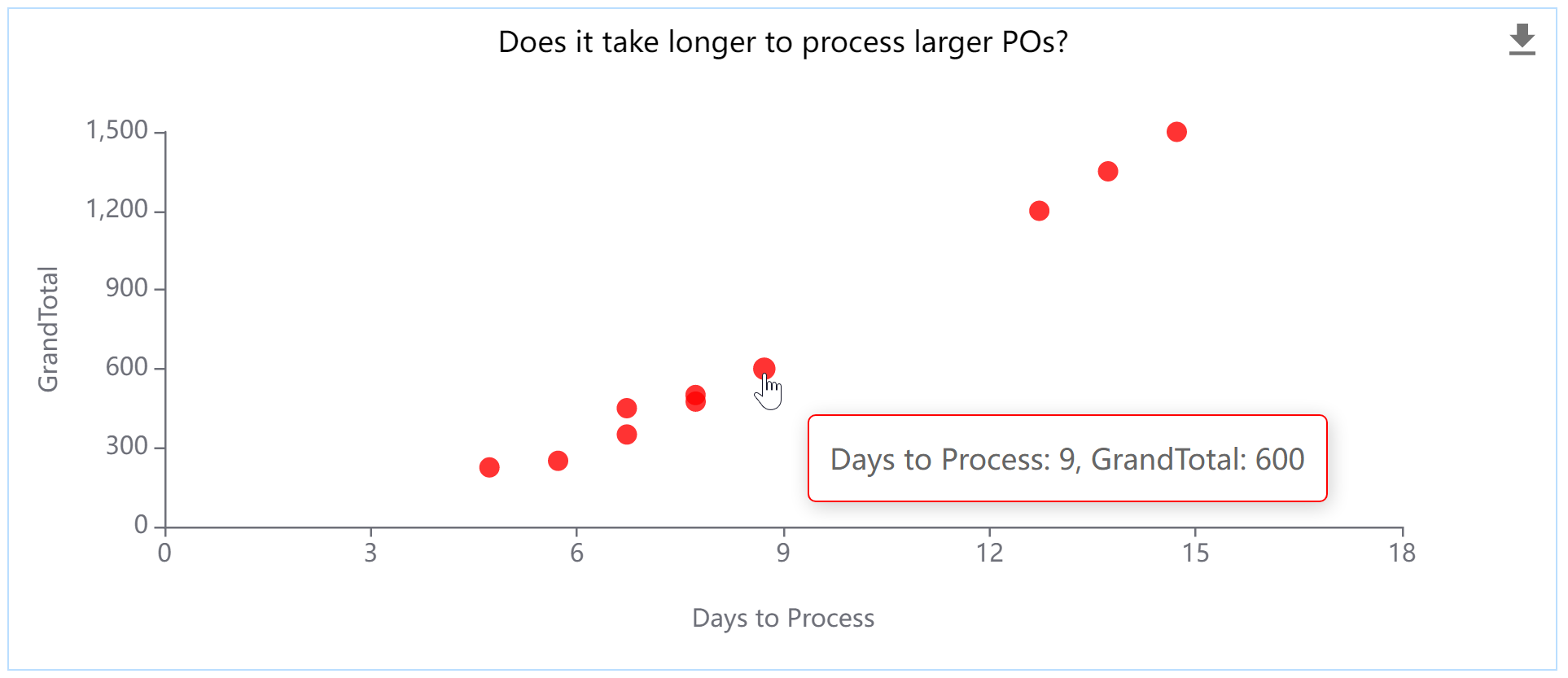
In the Chart Styles tab, this chart is configured to show the data label as a tooltip, which avoids cluttering the picture with data but still allows the user to see details on demand.
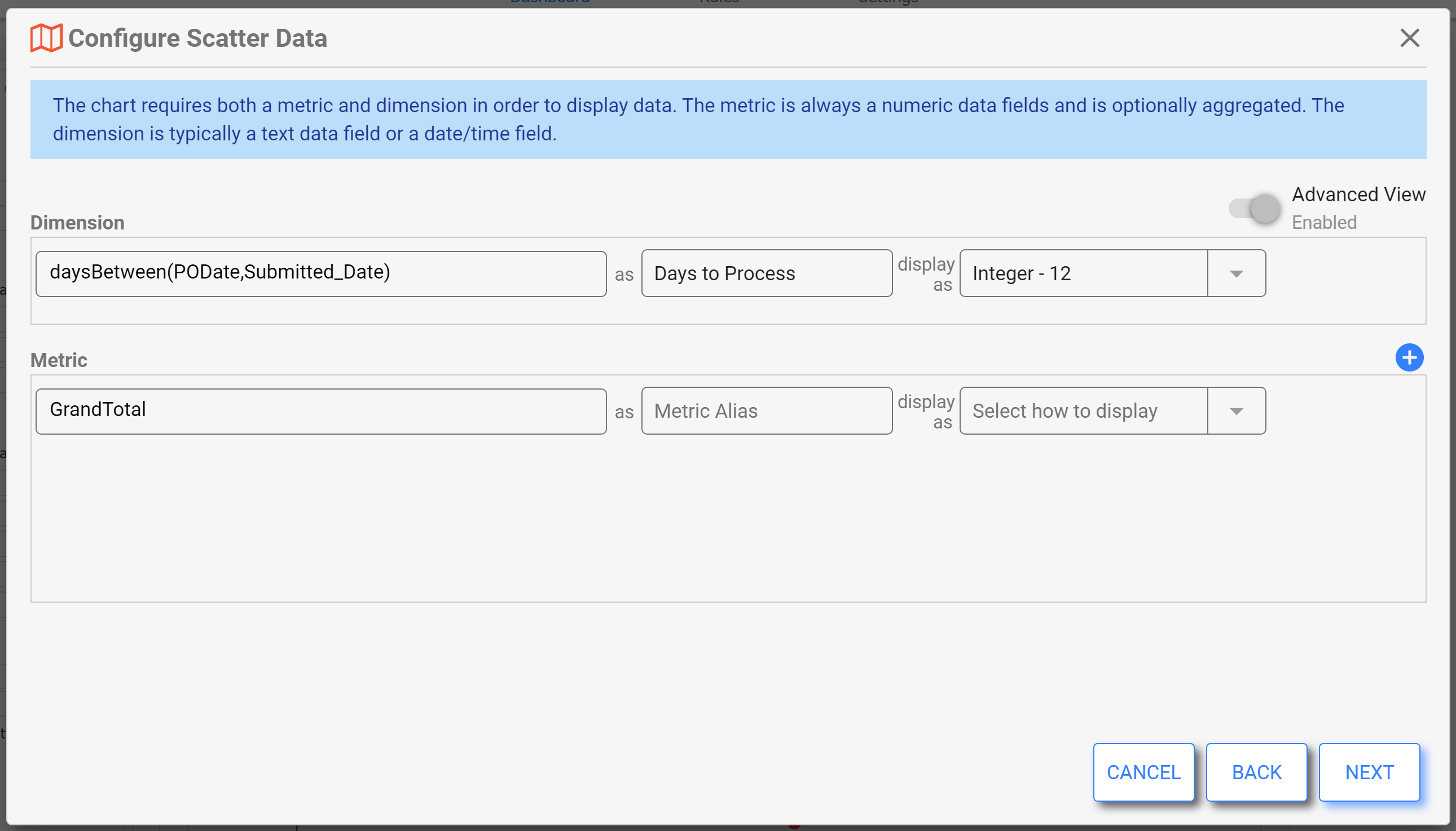
In this configuration, the independent variable (dimension) is set to calculate the days between the PO date and the submitted date. You might also use the "Age/Duration" metadata here. The metric is simply set to the Grand Total so that there is a plot point for each submission.
Scatter Line
Also known as a scattergram or scatter plot, this chart is used to analyze a set of data in order to look for a correlation between a set of variables. Typically, the correlations are dependent, meaning one variable is dependent on the other. Correlation can be positive (increase together), negative (one increases while the other decreases), or no correlation at all. The variable you deem as independent should be plotted on the X-axis. Use a Scatter Line to more easily see the correlation.
This example uses the same data shown in the Scatter chart example to determine if there is a correlation between the amount of a Purchase Order and the length of time it takes to process. The line on this chart illustrates the positive correlation, meaning that as the Grand Total of the PO increases, so does the number of days it takes to process.
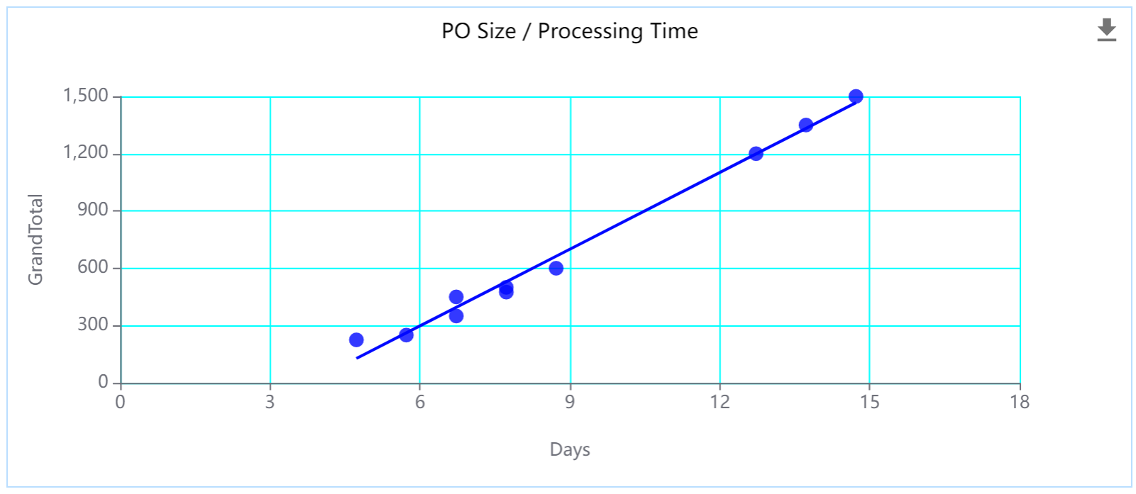
It also employs Chart Styles to display the color of choice on the data and gridlines.
Data Table
Tables are used in situations where details are needed and a chart just can’t provide it. Since they can contain different types of related data, data tables are often useful when different users are likely to be looking at different parts of the data. You can also pair a table with a summary level chart in order to provide supporting details. Avoid overwhelming your dashboard and users with too many tables. Tables are not recommended for illustrating relationships, trends, or patterns; use charts for those tasks.
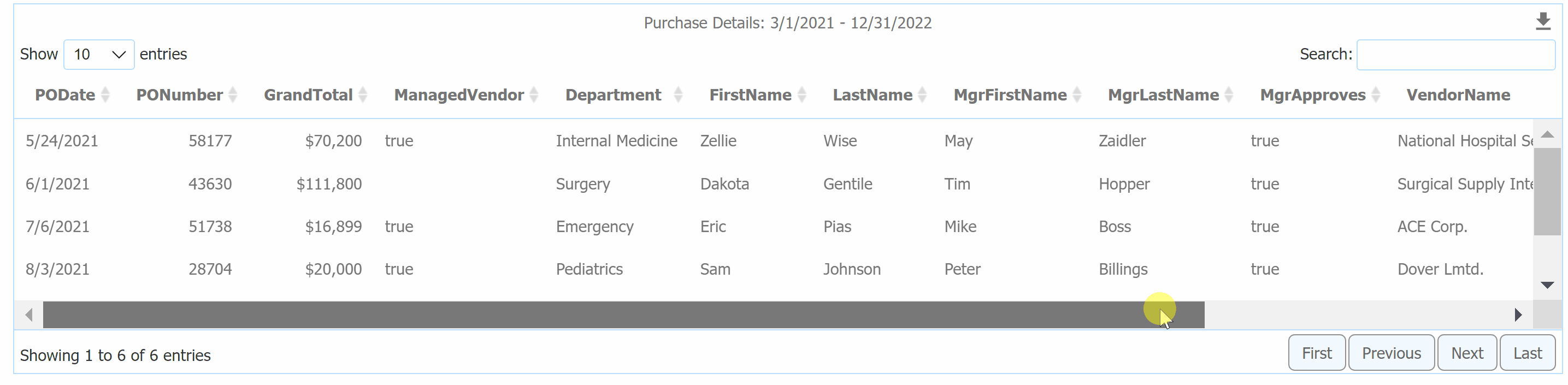
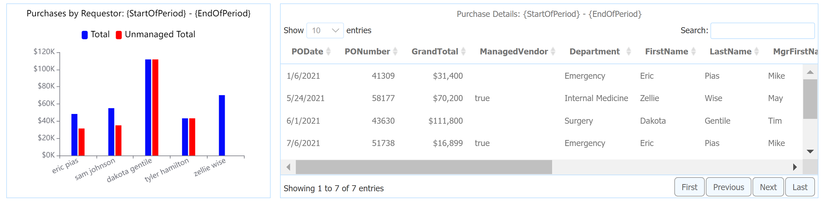
In this example, the Purchase Details table is intended to provide additional data to support the visual charts.
The Data Configuration wizard allows you to specify the fields to use as Table Columns, as well as set aggregation and display for each.
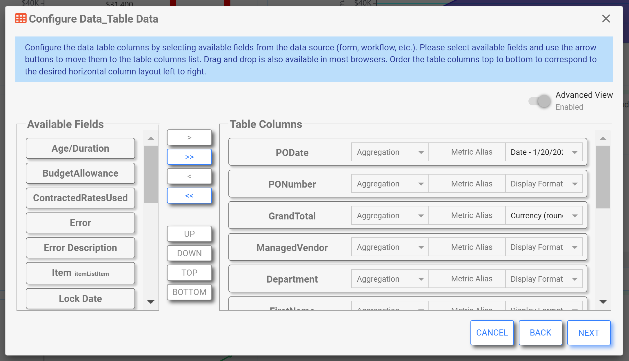
Table Styles are a bit different than Chart Styles. Here we have paging turned on to help the user navigate a larger data set, and we also have the Style Selector available so the user can choose how many records to show in the table at one time.
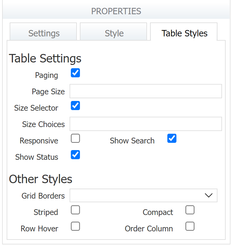
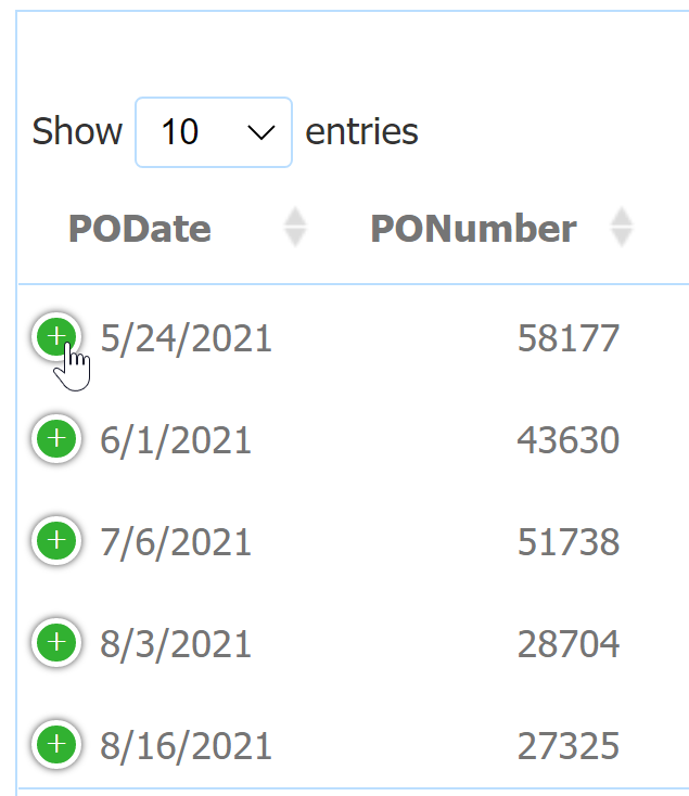
If you don't want the user to have to scroll horizontally, check the Responsive property. This will display a green plus icon to expand an individual row to see additional columns.
Radar
A Radar chart may also be known as a Spider Chart, Web Chart, Polar Chart, or Star Chart. Use this chart to visually compare the quantity of (multiple) variables over three or more dimensions, categories, etc. The variable value scale should be similar across all dimensions for a useful plot (or at least made proportional). This chart is useful where visual disparities (or similarities) in the plot can yield important data insights. The chart is not useful for illustrating trends. The plot is really only useful for a limited number of dimensions and variables to avoid having the useful information obscured by “noise”.
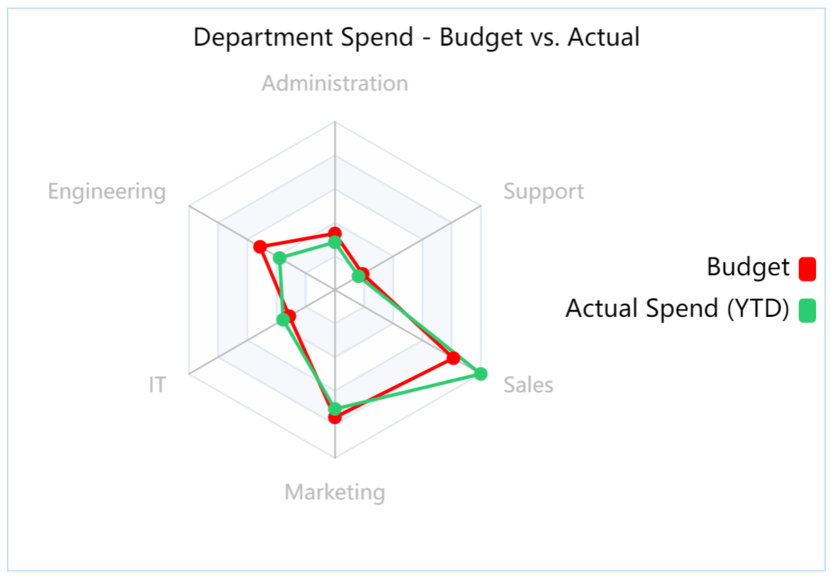
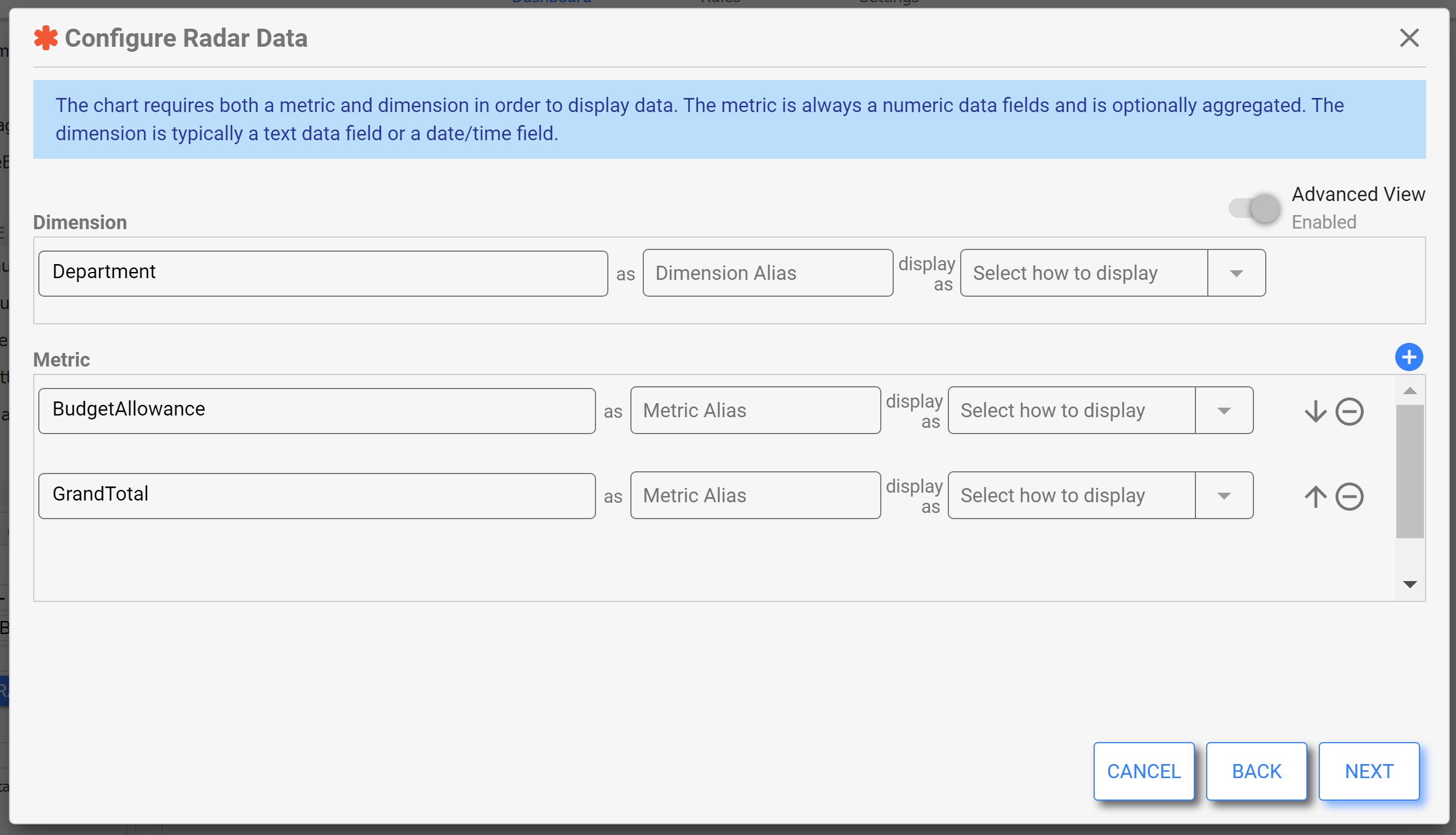
This is a chart type in which you will often want to have multiple metrics in the Data Configuration Wizard.
Radial Gauge
A Radial Gauge chart may also be known as a Gauge, Dial, or Speedometer chart. This chart helps the user visualize Key Performance Indicators or metrics with context about how good (or bad) the current metric value is against a given range of target values.
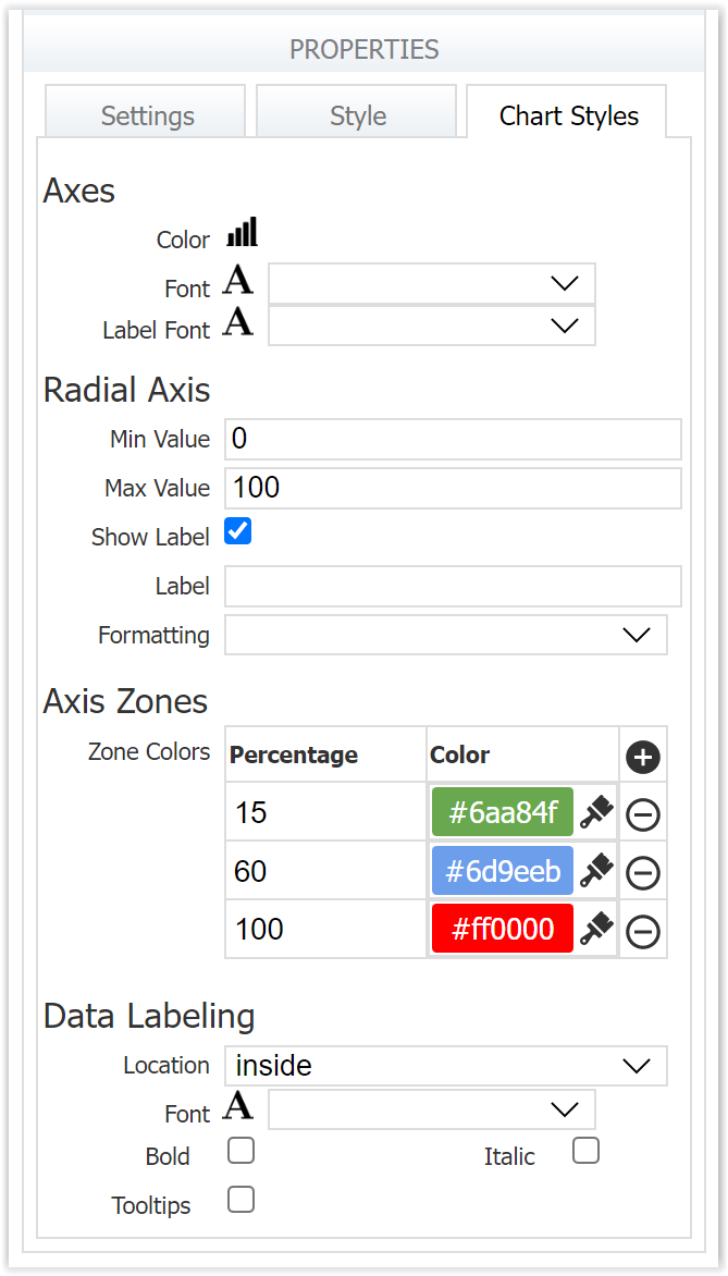
Use colors to indicate in-range, out-of-range and intermediate zones (e.g. near goal) for visualization of where the metric value falls in relation to the goal.
Here is an example of a Radial Gauge used to display the average procurement cycle time, which can be a handy operational insight into process efficiency.
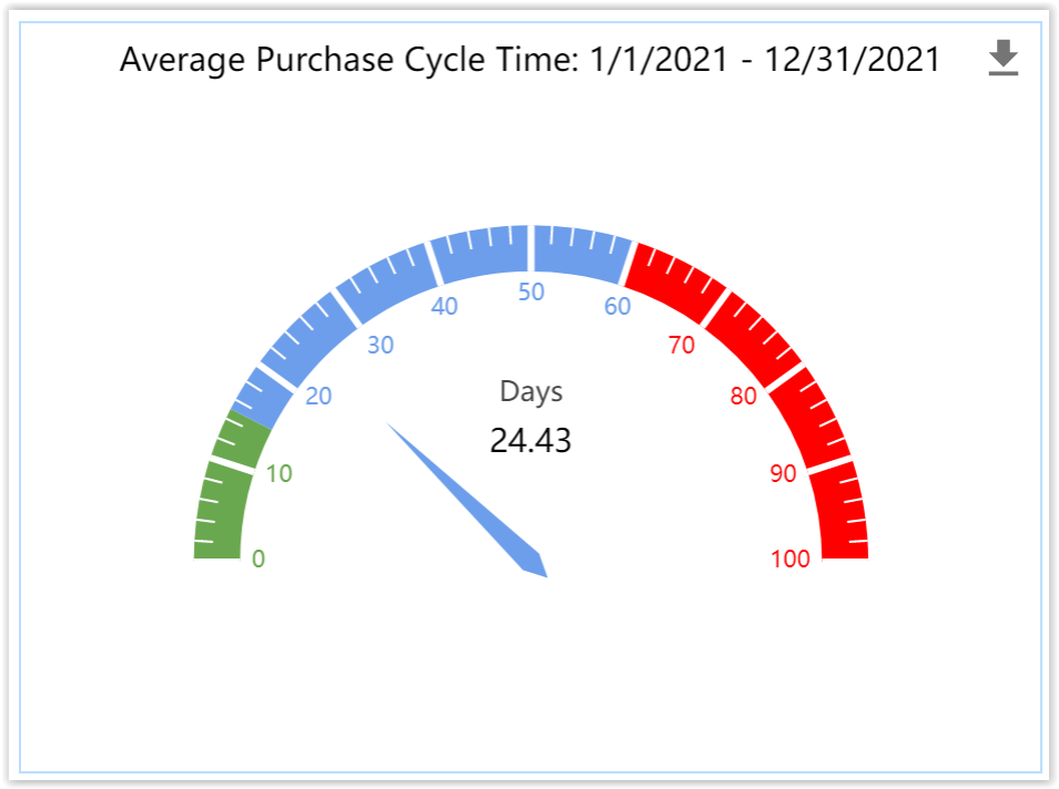
The Chart Styles tab shows how the Axis Zones have been set with colors to indicate within range, intermediate, and out of range. The average cycle time shown (24.43 days) is a bit above the ideal range.
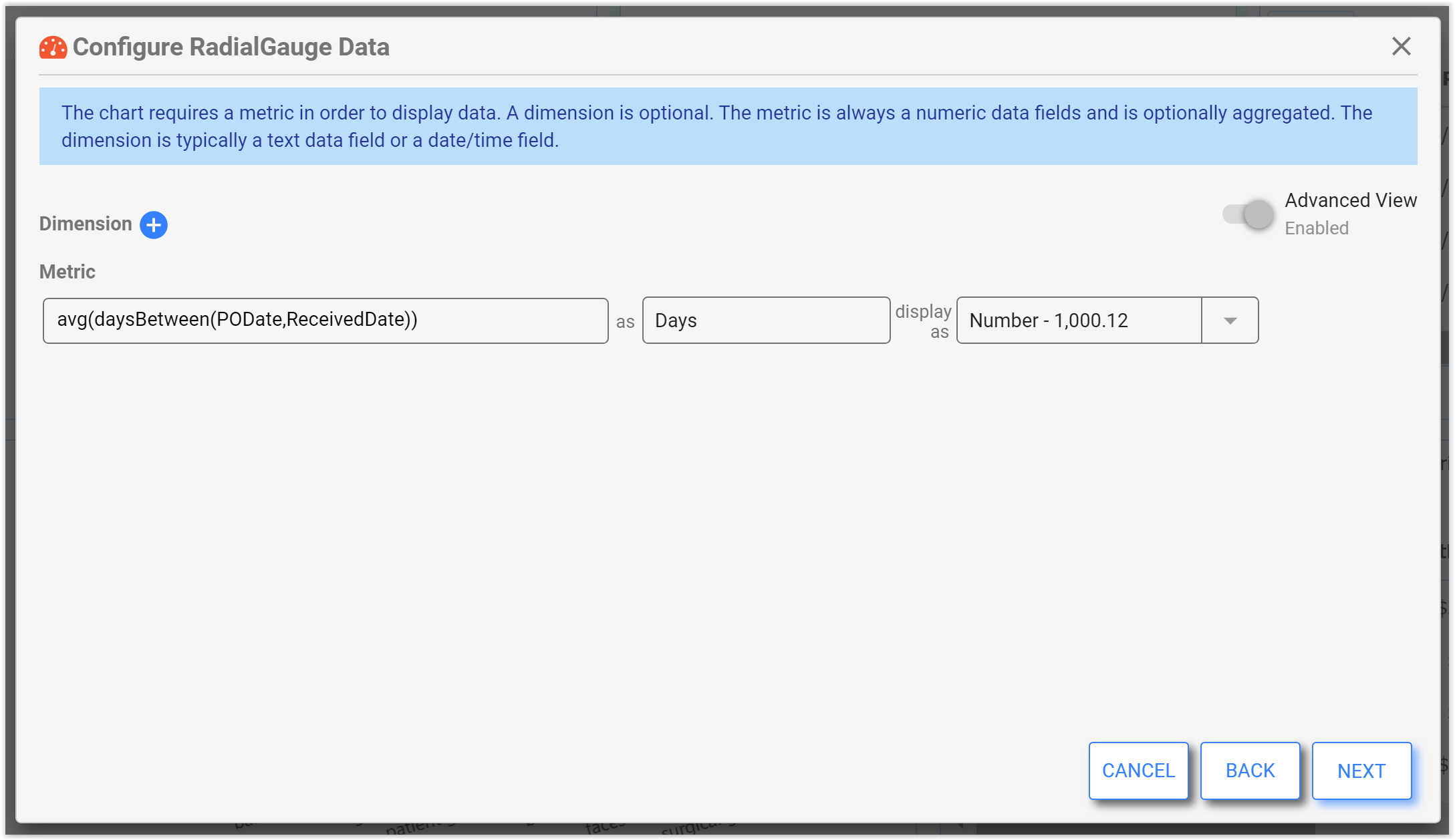
Let's take a look at the Data Configuration for this chart. The Dimension is set to an expression that averages the days between the PO Date and Received Date in the workflow, and displays the result as a number with two decimal points.
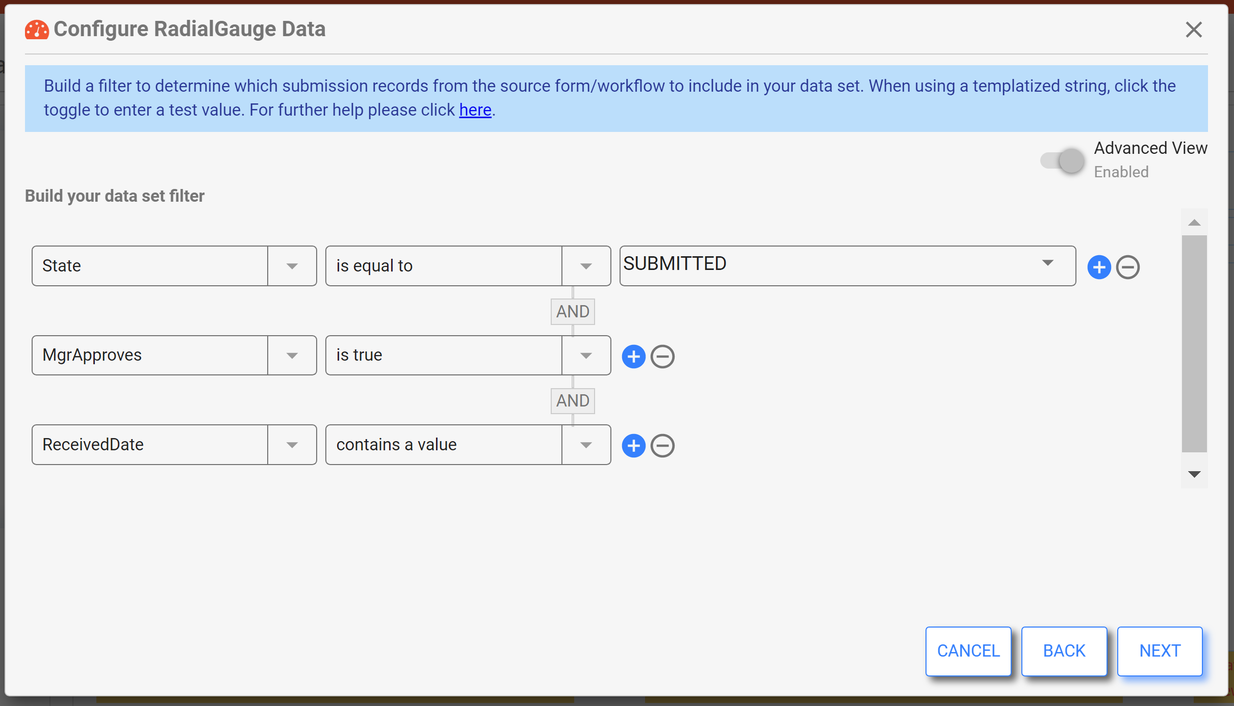
The filter ensures that only purchase orders that are submitted, approved, have a Received Date, and fall within the Start of Period and End of Period filter controls are included. Note the importance of filtering by "Received Date contains a value" - the Received Date is optional in this workflow, and including submissions where this value is null could skew the data. See the note on Null or Missing Fields for more information.
KPI
A KPI, or Key Performance Indicator chart may also be known as a Number chart or a Metric chart. Use a KPI chart for real-time metrics and strategic KPIs, when a single numeric value is all that is needed to convey critical information. It can be used for an all-time roll-up number or for the latest period roll-up.
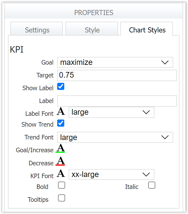
Use this chart to show a metric against a goal value with an in-range/out-of-range indication via a color and indicator symbol. Consider also showing a trend indicator that indicates the percent up or down since the last period. You can also customize the trend color for greater visualization.
Here is an example of a KPI chart that shows the percentage of purchases deemed "in time" where the Received Date is less than or equal to the Need By Date.
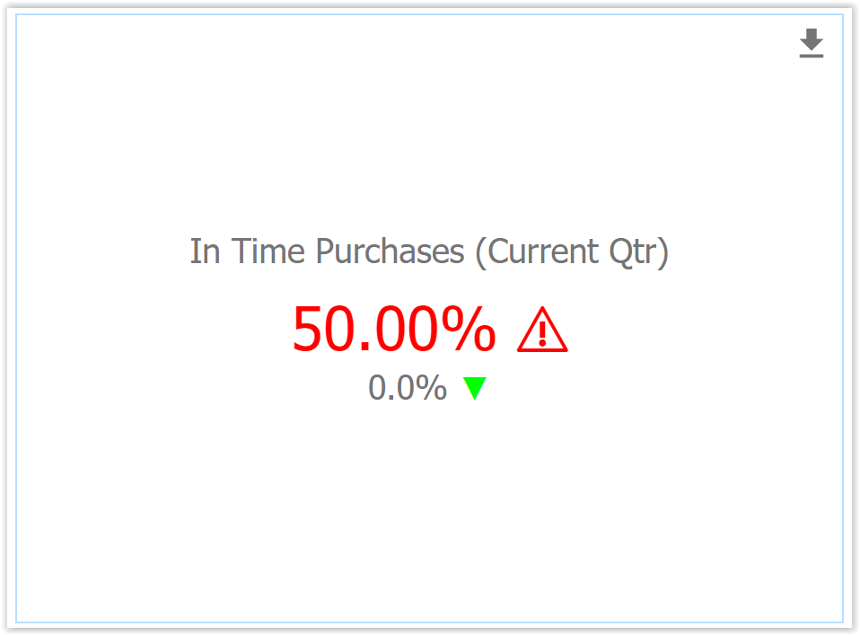
The Chart Styles tab shows the Goal is set to "maximize" and the Target to 0.75. The result, 50% (or .50), is under that goal, resulting in a red warning symbol. Notice that "Show Trend" is also enabled, which displays the change from the previous quarter, in this case, 0% or no change. This gives the user an at-a-glance visualization of progress towards the goal, and what might need attention.
Here's a look at the Data Configuration for this chart. The Dimension is set to the function "quarter()" which aggregates a date or dateTime field/expression to the calendar quarter start date. The Metric is set to calculate the percentage of Purchase Orders where the Received Date is less than or equal to the Need By Date, and display it as a percentage.
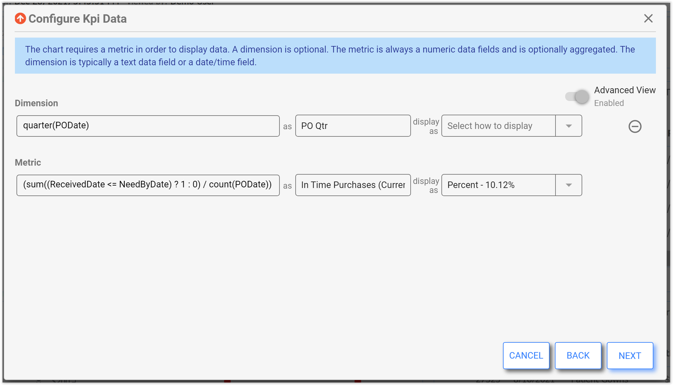
Additionally, the filter ensures that only submitted and approved Purchase Orders are shown in the chart.