Live Forms v8.0 is no longer supported. Please visit Live Forms Latest for our current Cloud Release. Earlier documentation is available too.
Adding Controls - Drag and Drop
- Former user (Deleted)
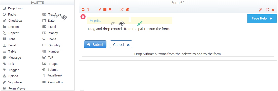
Initially, a form is created with no controls except for a Submit and Cancel button. You must add controls to the form in order to make it useful. Controls can be dropped from the palette or generated from a schema.
On this page:
From the Palette
When you create a new form from scratch, it has no controls other than the Submit and Cancel button. To make your form useful you must start by dragging in controls from the Palette and dropping them in your form.
As you begin to drag a control from the Palette, you’ll see this  icon, which means the control is not yet over a droppable area. When you reach an area on the canvas where dropping a control is allowed, the will change to this
  icon. You must drop controls into the body of the form; you can’t drop them into the toolbar nor can they be dropped below the Submit and Cancel buttons.
You can drag/drop above, below, to the left and right of most controls. As you bring the control over the body of your form, the icon will change to one of the icons below:
 - This means your control will be placed above the control over which you are hovering. You’ll see this icon when you drag the control over the top half of a droppable area.
  - This means your control will be placed below the control over which you are hovering. You’ll see this icon when you drag the control over the bottom half of a droppable area.
 - This means your control will be placed to the right of the control over which you are hovering. You’ll see this icon when you drag the control over the right half of another control.
 - This means your control will be placed to the left of the control over which you are hovering. You’ll see this icon when you drag the control over the left half of another control.
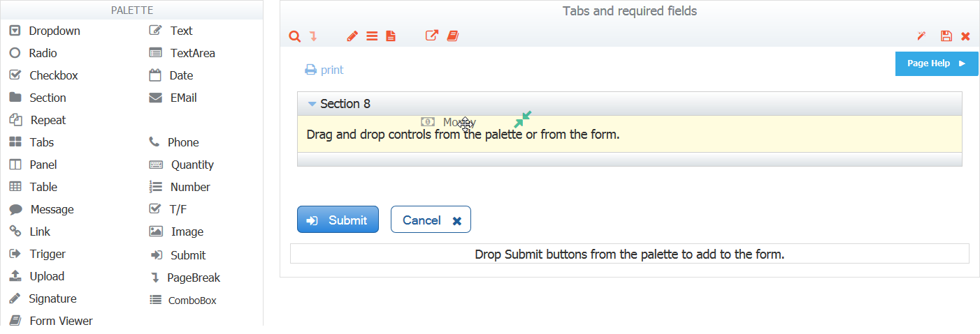
- - If you are hovering over a group control--tab, panel, table, section or repeat--this means your control will be placed inside the group control if there are no other controls inside of it. (If other controls already are inside your group control, you’ll see the , , and icons as you hover over any controls inside your group control so you can govern exactly where inside the group control your new control will go.)
If you are not dragging your control over a group control, this means your control will be placed at the top of your form. Anywhere to the right of the print  icon is a droppable area.
-
 - Click these directional arrows to move your table column to the left or right of the table column on which it is being dropped. The icon only applies to table controls.
Other important drag-and-drop rules:
- If you let go of a control while the
 icon is showing, your control will go back to where it was—either back to the Palette or where it was in your form before you tried to move it.
 - You can drag/drop above, below, to the left and right of most controls.
- You can drop controls above and below the Section, Tab, Table, Repeat and Panel.group controls.
- Panels can be dropped to the left or right of other panels, however, you cannot drop other controls in a similar manner to the left/right of panels.
- You can never drop two different controls into a repeat control—for example, you cannot drag in a quantity control if your repeat control already contains an email control. If you need multiple controls inside a repeat control, first drag the controls into a section, then drop the section into the repeat. Once the section is inside your repeat you may not add anything else to the section, so build the section first in this case. You also may never drop a panel, tab or another repeat control inside a repeat control, nor may you drag in trigger, video, image or link controls. See Repeats for more details.
Note that repeat items automatically generated from a schema may not be dragged outside the repeat control since this would violate the constraints imposed by the schema.
See Multi-Column Form Layout below for information about designing forms with a multi-column layout.
From Schema
You can generate controls automatically from schema elements, but you must first upload your schema into your application. Once you've uploaded the schema and added schema elements to your form's Data Sources area, you can generate controls from these elements automatically. See Generating Controls from Schema Elements.
Multi-Column Form Layout
Multi-column forms are quite common and very easy to create. Here is how it works:
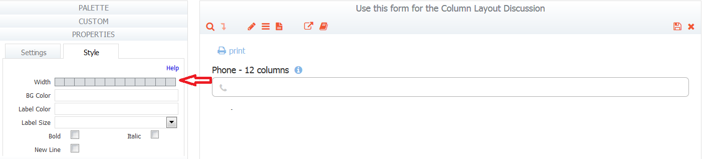
All control widths are specified in columns. The width is selected by clicking on a grid in the style tab. See this documentation for the details.
When dropping controls from the palette on an empty canvas or above or below an existing control, the newly dropped control is 12 columns wide. The trigger control is an exception.
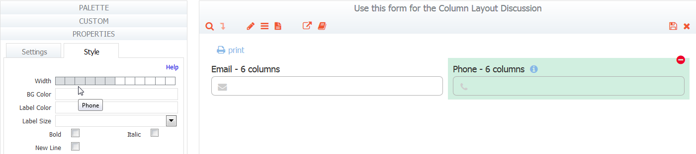
- If you drag a control from the palette and drop it to the left or right of a control, the newly dropped control will take the width of the control you dropped on. The width of a control that is already in your form must be adjusted manually by the designer if the position of the control is changed.
This approach makes It very easy to create a form with a muti-column layout. There are two ways to accomplish this:
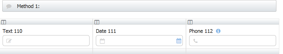
Method 1: You can drag and drop panels from the palette and then drop additional controls inside of the panels. Panels can be dropped to the left or right of other panels. A newly dropped panel dropped to the left/right of another panel will take the width of the panel it was dropped on.
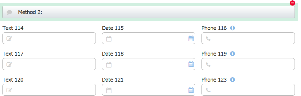
Method 2: Simply drag and drop the first control onto the canvas, modify the width to your specification and then drag and drop additional controls to the right of the previously dropped one. The controls will "wrap around" and line up in columns.
Watch this video for a demonstration.
Page Break controls have special rules for drag/drop. Click here for more information.