This documentation is for frevvo v10.0. Not for you? Earlier documentation is available too.
Accessibility and frevvo
- Former user (Deleted)
- Megan Ellis
Accessible forms/workflows can assist users with visual and motor impairments. frevvo can be used to build accessible forms/workflows that meet Section 508 and WCAG 2.0 accessibility standards. Note that of course, you can also build forms/workflows that do not take advantage of frevvo accessibility features. For Example, form controls that are missing informative labels and help, hint text will not pass accessibility certification.
Form designers are responsible for testing their own forms/workflows to verify that they pass their own certification process.
- frevvo supports accessibility for use mode forms/workflows only
- Accessibility will not be supported in this release for mobile devices, Task List and Spaces
For users requiring assistive technology, frevvo supports the following screen readers:
- Mac OSX Voice Over on Safari only
- JAWS for Windows on IE (10/11)
When using JAWS, the latest version of IE (ie11 presently) is recommended for optimal results.
Assistive technology communicates the labels of form controls, the current value of the control, help text, and any hint text.
Using forms/workflows
Form users must understand the following information in order to interact with accessible forms/workflows.
Keyboard Functions:
The following keyboard combinations are used when a user is not using a screen reader. If you are using a screen reader please read the documentation specific to your screen reader and see the topic Using Assistive Technology below.
| Key Combination | Function |
|---|---|
tab/shift tab |
Note: If a section is expanded, tabbing will take you directly into the section's controls. Tabbing puts the focus on each tab of a tab control. If a tab is selected, it becomes the active tab, and its contents will be in the natural tab order. |
| Enter key or the space bar |
|
| Space bar only |
|
| Enter only |
|
| Escape |
|
| up,down,right,left arrows |
Note: The right/left arrow keys can also be used to cycle/select the options of a radio control. |
| Alt + up/down arrows on a windows keyboard or option + up/down arrows for the Mac |
|
Additional Details
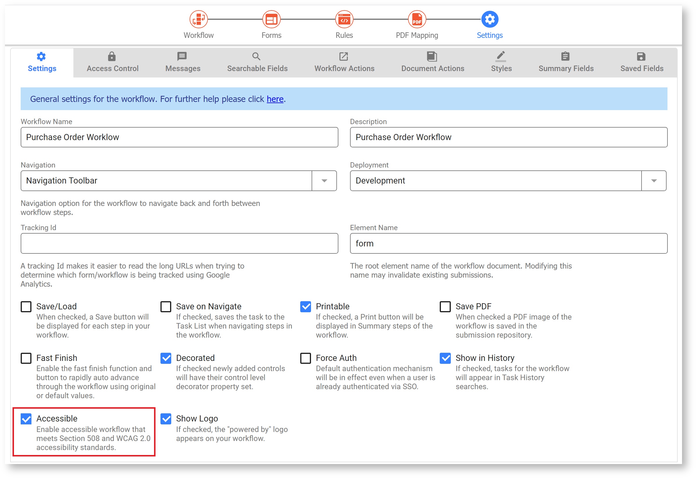
The behaviors described below require the designer to enable the form/workflow Accessible property. See Designing Accessibility forms/workflows.
Required Controls
The designer can optionally enable the Accessibility property on the form/workflow. When enabled, required fields display a asterisk. If users move ahead from a required field without filling it, the error, "You can't leave this empty <control name>" displays. The translatable string, You\ can't\ leave\ this\ empty: is included in the downloaded locale file for form/workflow internationalization. Designer can translate this string to the preferred language as part of the form/workflow internalization process.
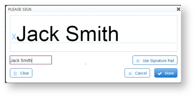
Wet Signature controls
You will notice a Text box on the wet signature lightbox. Type your name, using the keyboard. Typed text will be entered into the signature area. Signature controls on mobile devices will not have the text entry field.
Using Assistive Technology
If you are using a screen reader please read the documentation specific to your screen reader. The only interaction that is specific to frevvo is that you press the F2 key to display or hear field help text. The help text will disappear from the screen when the user advances to the next control.
If you use a navigation shortcut key such as the 'F' key to move through the cells in a table, when using JAWS, the fields are announced with the row number and column. If you use the down arrow key (or up arrow to reverse) to navigate, JAWS does not announce row & column. This is a function of the JAWS reader and cannot be changed by frevvo.
Enabling full keyboard navigation on the Mac
If you are using the Safari and/or Firefox browsers on a Mac, there are two preferences that you must enable to allow full keyboard only navigation via the tab key. Setting these options makes it possible for the user to tab to any control types, which are normally prevented by default.
The first setting is a system preference so it will affect most browsers you use on the Mac.
- Go to System Preferences and select the Keyboard option (it may be “Keyboard & Mouse” depending on your version of OS X).
- From within the Keyboard preferences, select the Shortcuts tab.
- Locate the Full keyboard access: In windows and dialogs, press Tab to move the keyboard focus between option, and select "All Controls”.
The second setting is in the Safari browser:
- Go to Safari -> Preferences
- Under the Advanced tab, select the Press Tab to highlight each item on a webpage check box.
Designing Accessibility forms/workflows
To make a form/workflow accessible in the designers, check the Accessibility property on the form/workflow properties panel. This property is by default unchecked and when checked enables specific advanced accessibility behavior. For Example, Required controls will include an asterisk in the label.
Hint and Help Properties
frevvo designers are encouraged to use the Hint and Help as much as possible. Assistive technology communicates the label of the control, the current value of the control and any hint text. Help is accessed by pressing the F2 key.
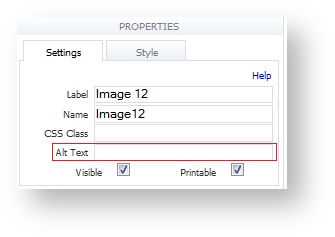
Provide relevant alternative text for for image controls. Alternative text can be localized by the designer when internationalizing the form (or workflow). Assistive Technology will communicate the value of the Alternative Text. This field is intentionally left blank in the designer so it will not be overlooked.
Signatures
When using signatures we recommend using Signed Sections with Text/Signatures Images as these are the easiest for people to use. If you choose to use a Wet Signature control, an additional Text field displays.
The Text field provides a text entry area where you can type your name using the keyboard. Typed text will be entered into the signature area.
Signature controls on mobile devices will not have the text entry field.
The Topaz Electronic signature pad, if properly configured, works well with Wet Signature controls in forms/workflows designed for accessibility. Refer to this topic for the configuration information.
Placeholders
Using placeholders in accessible forms is not recommended as they may be read by assistive technology as "empty line".
Summary Property for Tables
Use the summary property of the table control to specify extra help text that will be announced by AT tools.