Style Properties
- Megan Ellis
To access a control’s style properties, click on the control in your form, then click the Style tab in the Forms Designer’s Property area.
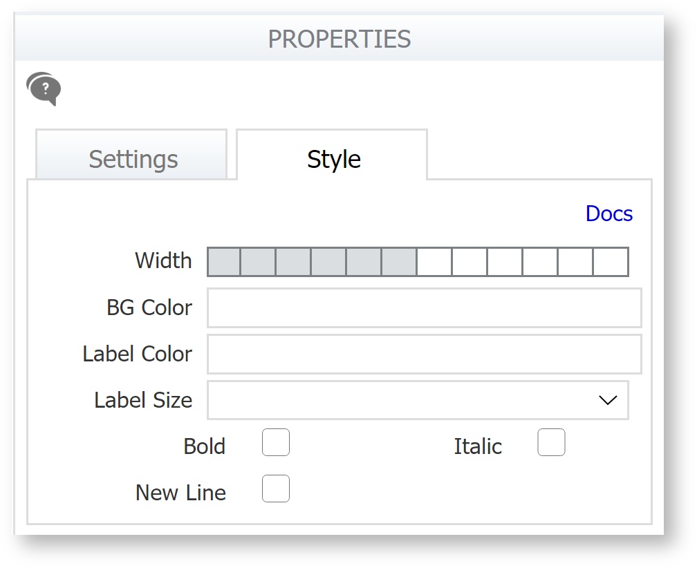
Some controls have more style properties than others, so the specific style properties you see depend on which control you click in your form. As you define style properties for individual controls, remember that these will override any form-level properties you have defined. Each control style property is described below.
On this page:
Width
Most controls have a width property. For input controls, the property specifies the width of the area in which users enter data; for example, you might narrow a control used for entering zip codes or widen a control for a full first, middle, and last name.
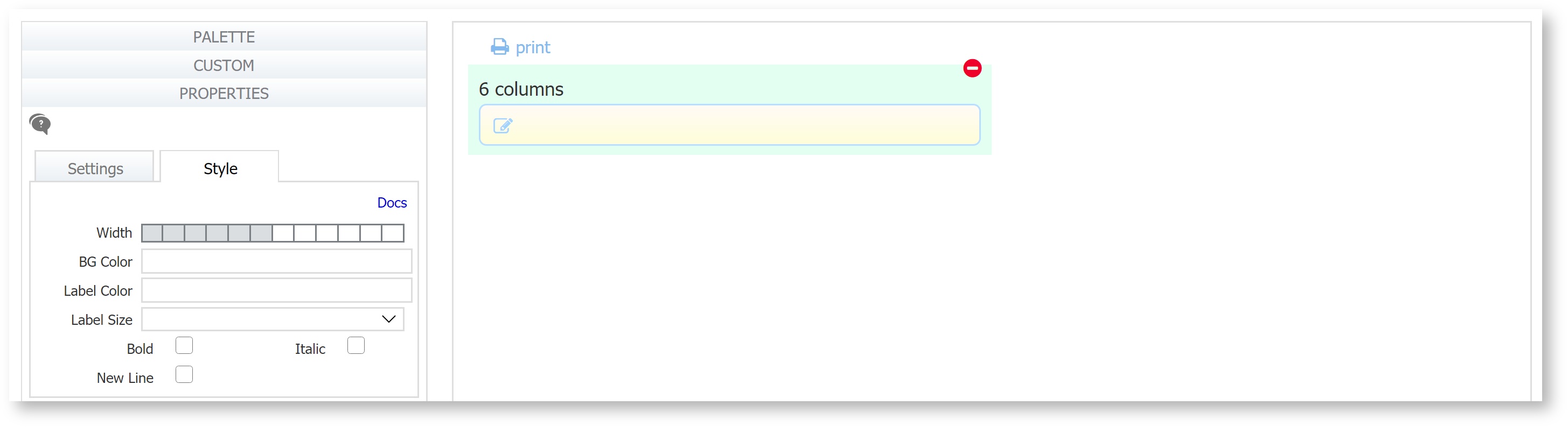
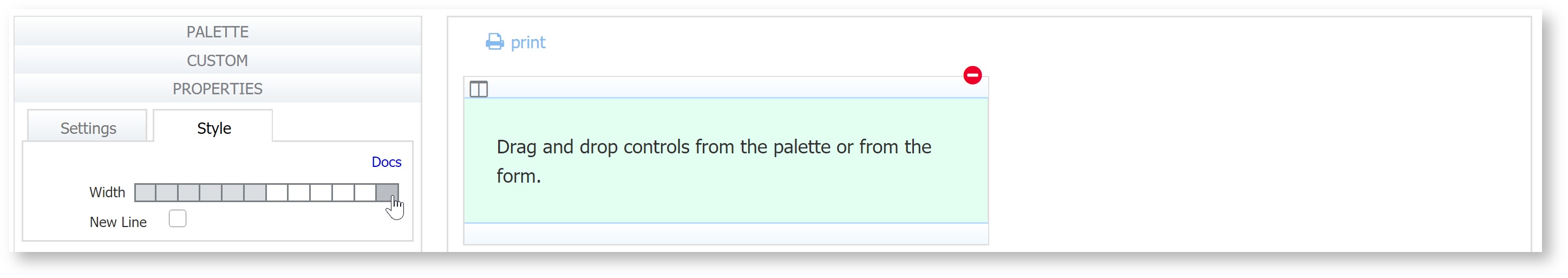
All control widths are specified in columns in a 12-column grid. The width is selected by clicking on a grid in the style tab. When you drag and drop most controls from the palette on to the canvas, the control will be 12 columns wide. The trigger, link and panel controls are the exception - the default widths of the trigger and link controls is 3 columns while the panel is 6. To change the width, simply click the number of divisions on the grid to specify how wide you want the control to be. For example, a text control dropped on the canvas from the palette has a width of 12 columns.
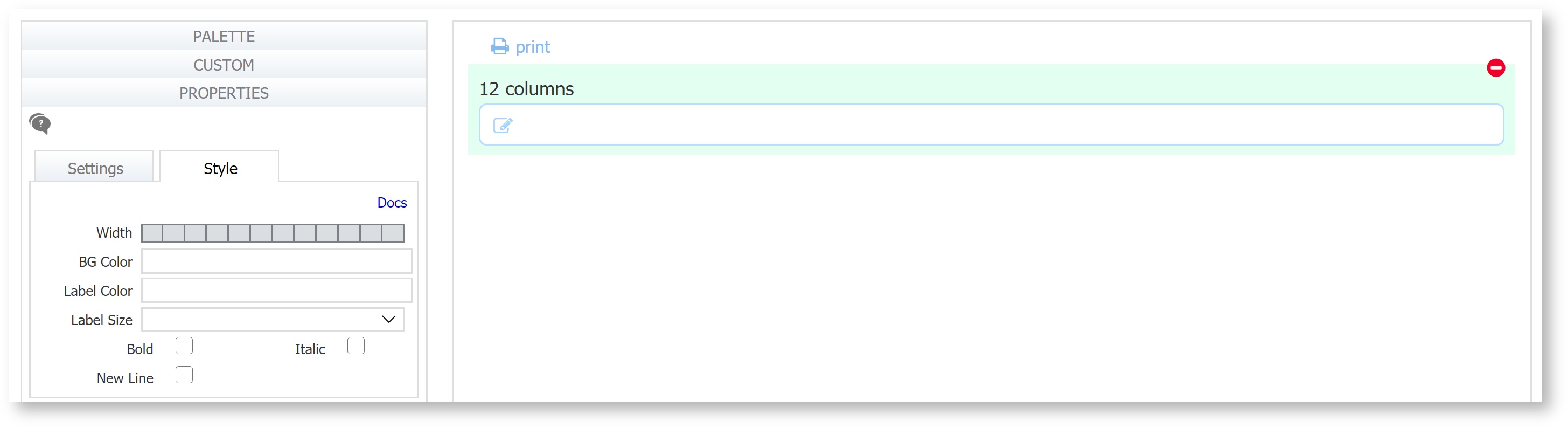
To make this control 6 columns wide, click on the 6th division of the grid.
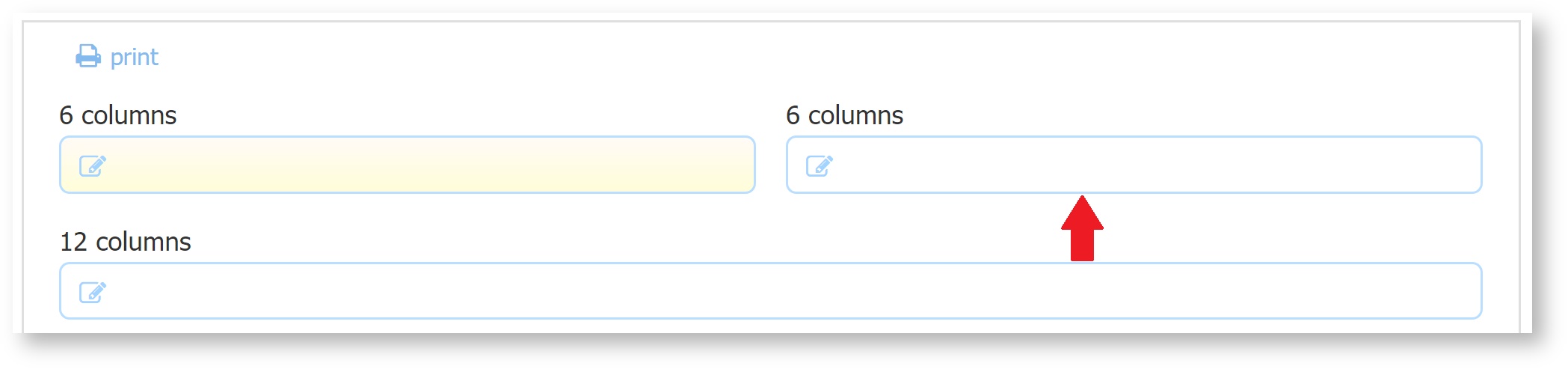
When you make a control N columns wide (e.g. 6), the entire control takes up 6 columns. As a result, if there is space, controls will float up next to other controls. You can prevent this using the New Line property.
Here are some important facts to know when working with control widths:
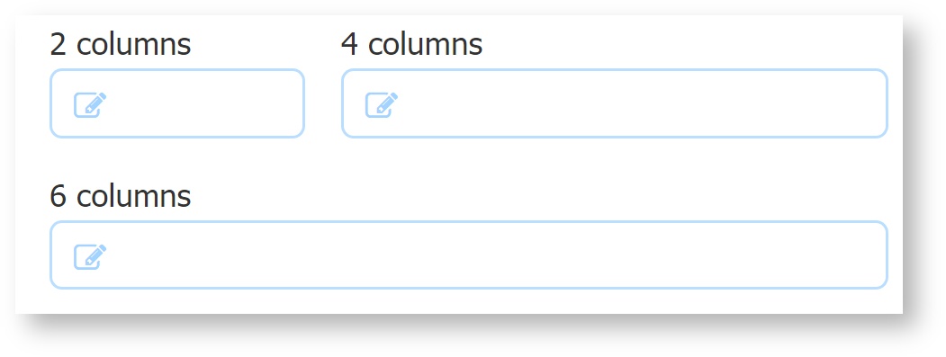
- The total width that fits into a single row is 12 columns - You can have any combination of controls widths on one line - (e.g. Three controls: 3, 4 and 5 grid columns wide respectively or four controls 2,2,4,and 4 grid columns wide.).
- The decorator does not affect the visible control width: a 6 column control is the same width (decorated or not).
- The visible width of controls which add up to the same width of another control is exactly the same. For example, a control that is 2 grid columns wide + a control that is 4 grid columns wide is the same width as a control that is 6 columns wide.
- When you drag a panel from the palette and drop it on the canvas, the default width is 6 grid columns. Panels can be made as wide as 12 columns. Each panel is itself divided into 12 columns irrespective of its width.
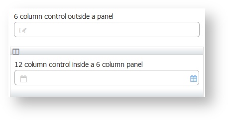
- Panels do not take up visible use mode space i.e. a 6 column control outside a panel and a 12-column control inside a 6-column panel take up exactly the same width. You can edit the Width property of controls you drag inside these controls.
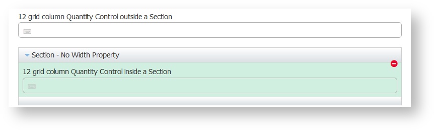
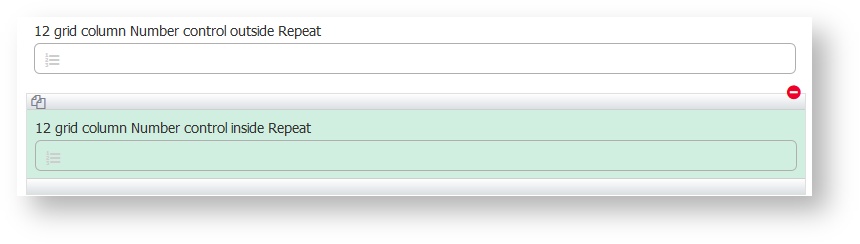
- There is no Width property for sections or tables controls - they are always 12 columns wide. Each is itself divided into 12 columns. They are all exactly as wide as a regular 12 column control. An N-column control that is inside one of these will appear narrower than the corresponding N-column control outside.
- Repeats are also always 12 columns wide and each repeat is itself divided into 12 columns. Like panels, they take up no visible use mode space: a 12-column control outside a repeat and a 12-column control inside a repeat are exactly the same width.
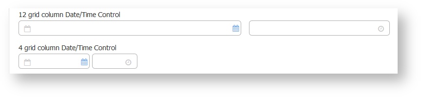
- The total visible width of a date/time control with N columns is the same as the total visible width of any other control with N columns. The relative widths are constant so the space between the two reduces as the total number of columns reduces.
- For tab controls, you access the width property by clicking the unlabeled area to the right of the last tab in your tab group; the width you specify will be applied uniformly to each tab in the group. (See Panels and Tabs for more details.) When setting a control’s width property you may use standard CSS-relative values; for example, 5%, 5em, 5ex or 5px.
Width is a crucial property when designing multi-column forms. frevvo makes this very easy to do. Refer to this documentation for some tips about the drag and drop feature when designing multi-column forms.
Control widths are ignored on the iPhone and the iPad even if the designer has explicitly specified them.
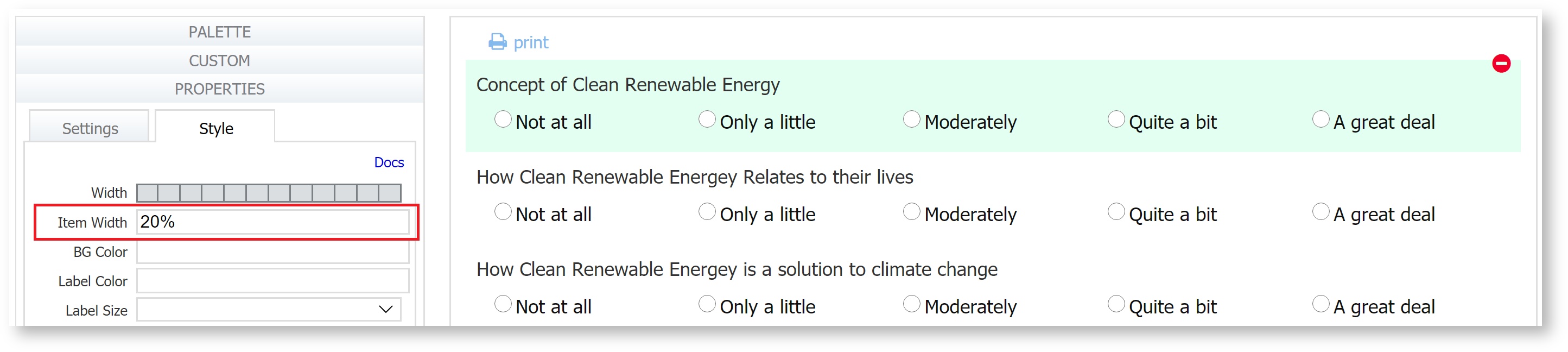
Item Width
Radio and Checkbox controls have an extra property called Item Width. You can use this property to change the layout of the options from vertical (one radio/checkbox button below the next) to horizontal. This is useful to save vertical space on long forms and to improve ease of use for forms with questions that each have the same set of options.
See this image as an example. The Item Width can be entered in % or px values.
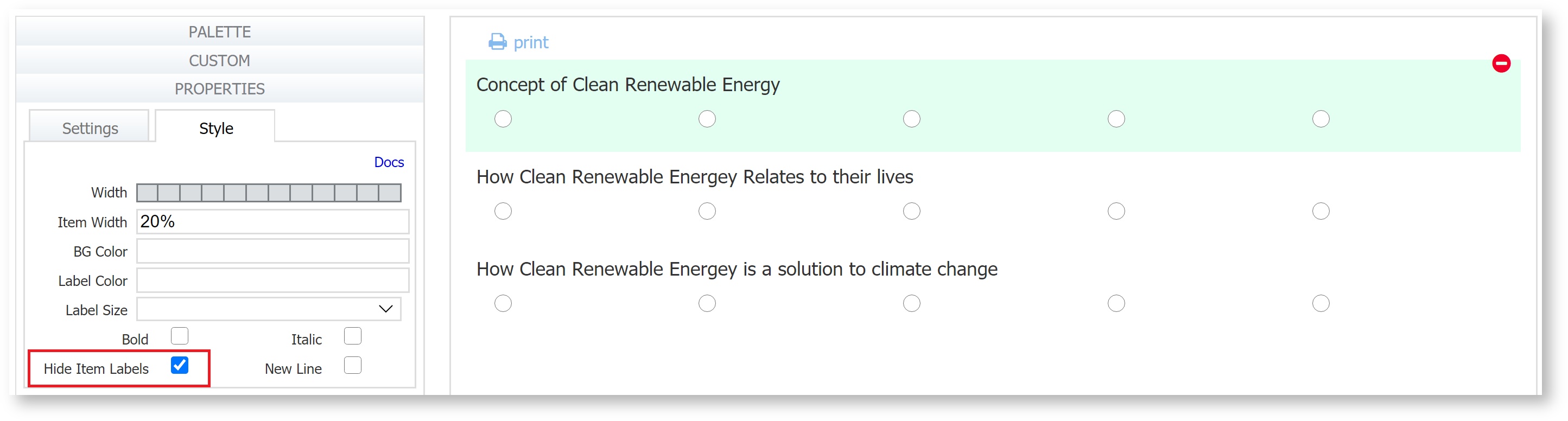
Show/Hide Item Labels
Check this property to show/hide the Item labels for Radio and Checkbox controls. If checked, the item labels are not visible but they still take up space on the screen. Item Labels in a table do not take up screen space.
Background Color
This lets you specify the color that will appear behind the control. Type any valid CSS color name or its hexadecimal RGB equivalent. For example, if you want a red background, you can type the word RED or #aa2211.
Label Color and Label Size
These properties are controlled by the Styles that you apply to your form. However, you can change the font size and color for any specific control on the form. Specify the color by typing any valid CSS color name or its hexadecimal equivalent in the Label Color field.
These properties work well when you want your entire label to have the same size and color, but for more sophisticated labels you can type XHTML in the control’s label property field. For instance, use XHTML if you want to apply two different font colors inside the same label. Typing XHTML also gives you more font precision, since the label size property lets you pick generic font sizes only--small, medium, and so on. There may be controls for which you want a font size somewhere between the small and medium options in the dropdown.
Changing the label color does not affect the decorator. It is always the same color as defined by the style.
Bold
Check this checkbox to make the control's label bold.
Italic
Check this checkbox to italicize the control’s label.
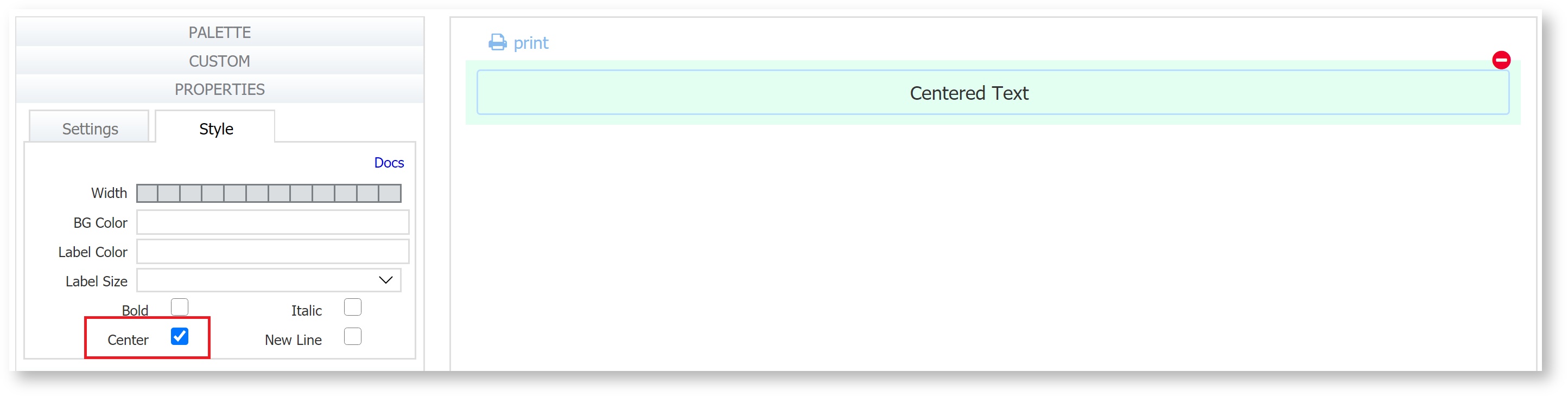
Center
The center property only applies to the Message control. Checking this will center the message text. It works best with None and Bordered message types.
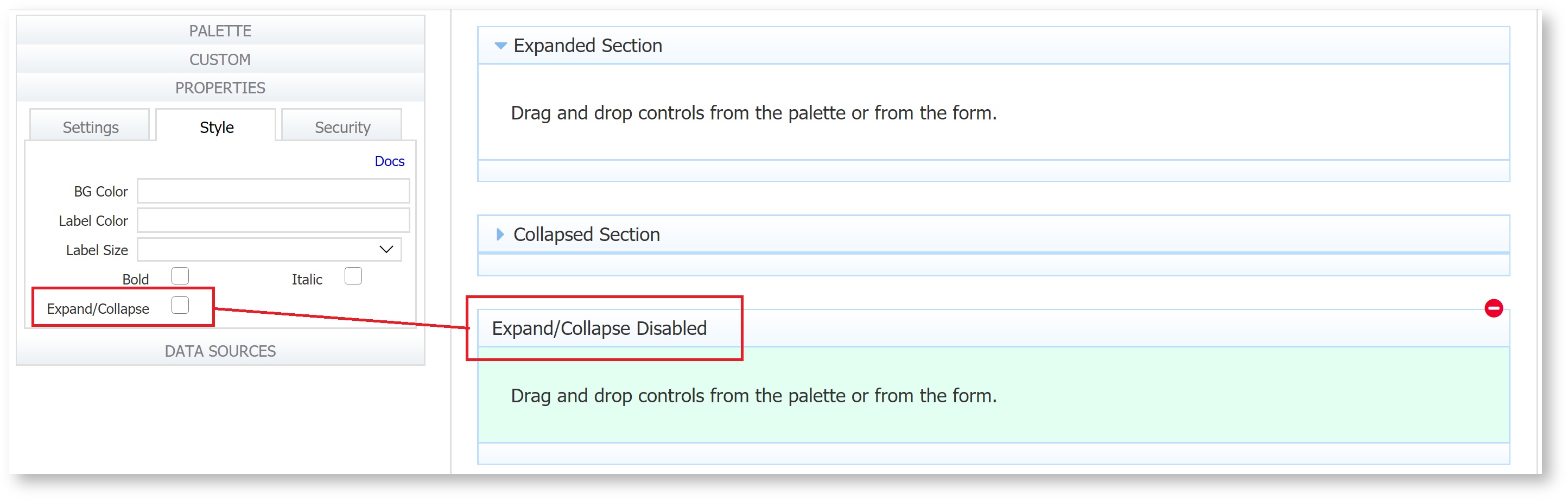
Expand/Collapse
This property applies only to the Section control. When you drag a section control from the palette and drop it onto the designer canvas, the expand/collapse icon will be visible and the Expand/Collapse checkbox will be checked. Uncheck this to hide the icon.
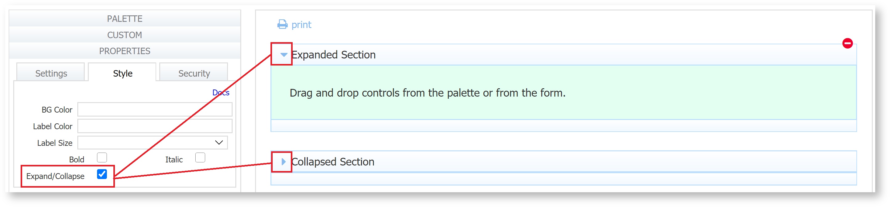
Click the  arrow to expand or collapse a section in design mode. When users access your form the section can be expanded or collapsed—it’s up to you. If you want the section collapsed initially, make sure it is collapsed when you save (finish) your form. Click anywhere in the Section header to expand/collapse the section in Use mode.
Date Picker
To display the date picker, check the checkbox on the Style Property panel. If checked, you will see the date picker inside the date control and the date portion of the date/time input control. The Date Picker's large font makes it easy to see.
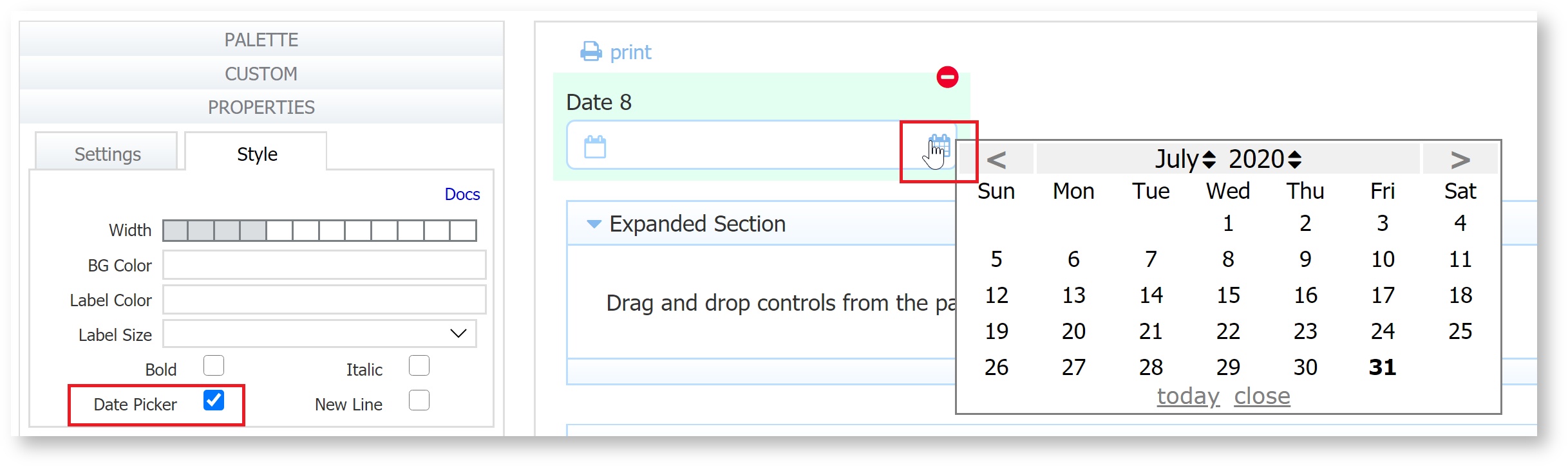
Clicking on the today link in the date picker brings you to the current date. If you are looking at another month and you click on the today link, the date picker will automatically bring you to the current month with today’s date highlighted(bold). Select the date to populate the field in your form/workflow. To close the Date Picker, click the close link.
Month and year menus facilitate quick navigation to earlier/later dates. For example, selecting a past date when entering a Date of Birth is much easier when utilizing the dropdown menus. When selecting a date in the past, select the year first.
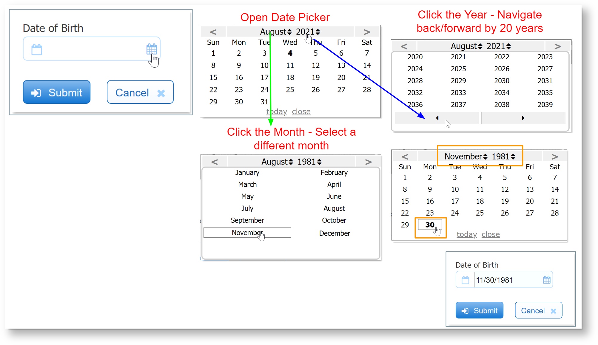
The Date Picker described above only applies to the desktop view. Date and Date-Time controls on mobile devices display device specific date pickers.
New Line
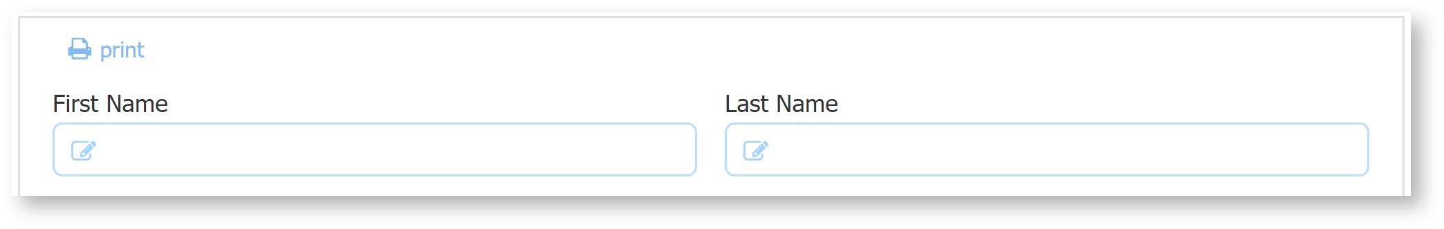
The New Line Property will be present for all controls that have the 12 column width selector. Check New Line and the control always appears on a new line. For example: Let's say you have First Name and Last Name controls side by side in your form.
If you want the Last Name control to be positioned under the First Name, check the New Line property.
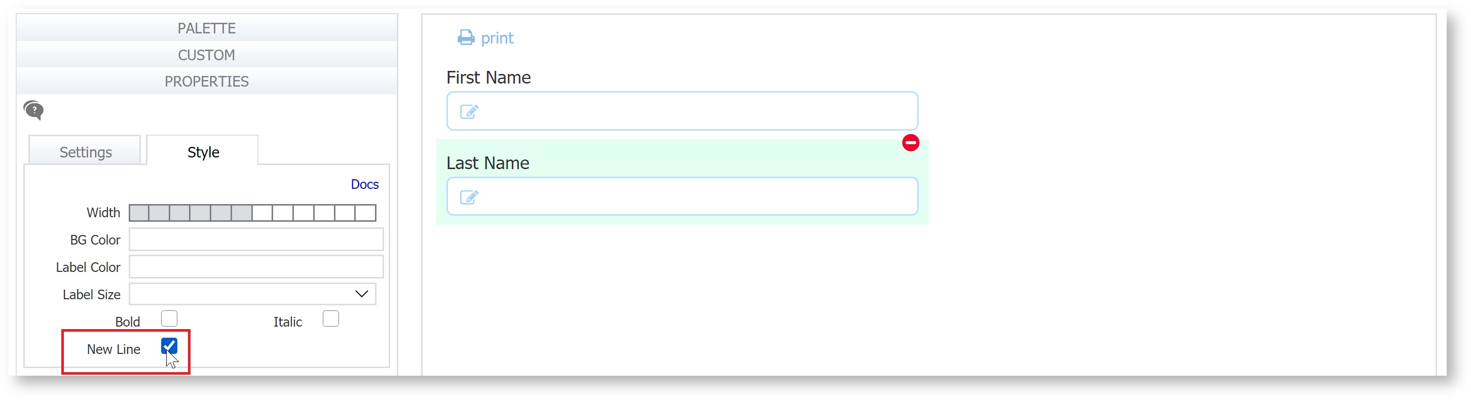
Trigger and Link controls have this property checked by default.