Client Information Form
- Megan Ellis
Previous Section | Next Section
Example - Client Information
Let's begin by creating a simple form that the customer will use to first fill out some basic information. We'll assume that you've uploaded the starter Forms Tutorial project above.
Create the Client Information Form
- Click the name of the Forms Tutorial project (or click the
 Action Menu and select
  Open). You'll be on the Forms and Workflows home page.
 - Click
 Add and select
 Create a New Form. The Form Designer launches.
 - Notice the form name in the top left corner. Click the pencil icon to change the form name to Client Info.
- Add a Section:
- Drag a Section control from the Palette and drop it into the canvas on the right. Notice as you drag, an icon at the top right will indicate where the item will drop.
- The Section will have a default label e.g. Section 1. Click the label; it becomes editable. Change it to Client Information.
- Add Controls to the Section
- Drag a Text control from the palette and drop it inside the Section.
- Click the label and change it to First Name.
- Notice that the Properties panel at the left now shows the properties of this control. Check the Required property at the bottom. See that the control background changes color to indicate that it is required.
- In the Properties panel, click on the Style Tab and set the width to 6 grid columns using the selector at the top.
- Drag another Text control from the palette and drop it to the right of First Name. Make sure the icon indicator at the top-right shows a right arrow before you drop.
- See that the control drops to the right and is automatically 6 grid columns wide so it fits to the right of First Name.
- Change the label to Last Name (you can click on the label or change it in the Properties panel).
- Check the Required property once again.
- Similarly, drag and drop an Email and Phone Control to the right. Experiment with drag/drop. You can drop to the right, left, above, or below most controls.
- Change their labels to Email Address and Phone Number respectively.
- Drag a Text control from the palette and drop it inside the Section.
- Add a Date: Now, drag and drop a Date control above the Section (the icon while dragging should show an upward pointing arrow).
- Change the label to Today's Date.
- Notice that you can change the Control Type to Date, Time, or Date/Time for different functionality. A variety of Date Formats are available but we suggest leaving this setting at Automatic.
- Click the Style Tab in the Properties panel and change the width to 3 grid columns.
- Now, select the Email Address control.
- In the Properties panel, customize the Error Msg property by typing in "You must enter a valid email address."
- Set the Hint to "Enter a valid email address."
- Set the Help property to "Email address <u>must be</u> entered in a valid format."
- See that the Hint message shows up on hover and the Help content causes a help icon to appear. Clicking the icon displays your help text. This text can contain any valid, well-formatted HTML.
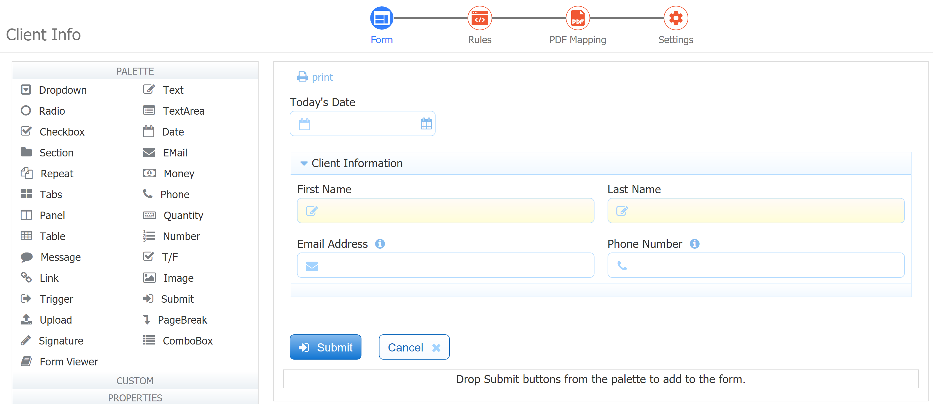
- At this point, your form should look like this:
Next, customize the message displayed when the form is completed.
Click Settings in the Guided Designer Navigation bar at the top of the form. The Form Properties Wizard displays.
Select the Form Actions tab.
The Action: Display Message when user submits form is pre-selected - keep that selection.
Copy the message below into the Message box then click Finish. {FirstName} and {LastName} are examples of templates. Templates are specified by surrounding the name of a control in your form with curly braces. frevvo will use the values entered into the First Name and Last Name fields at runtime.
Thank you {FirstName} {LastName} for your submission.
Click
 Save at the top right corner of your screen to save and continue working, or
  Save and Close to exit the designer and return to the Forms and Workflows Homepage.
Test this Example:
- Click the
 Test icon for your form.
 - You can fill out the date using the date picker or type it in using a variety of formats e.g. Feb 12 2020 or 02-12-2020 etc.
- Fill in First and Last Names. Empty controls displaying a yellow background are required. Required controls must contain valid data in order to submit a form. When you click the Submit button, any invalid fields will be highlighted with an orange background color. You must enter or correct the data in these fields in order for the form to be submitted.
- For Email Address, if you make a mistake (e.g. type in "test") and you will see that frevvo immediately tells you that there is an error. The error message we configured earlier is displayed. The Hint is visible on hover and clicking the Help icon shows the help we configured.
- Similarly, the Phone Number must follow one of the patterns allowed for it or an error will be displayed.
- When all fields are valid, click the Submit button to submit the form. The display message we configured will be displayed.
- If you want to see how the form will look on an iPad or an iPhone, close the window, click the Test icon again then click the Tablet or Smartphone buttons at the top of the test screen.