Layouts - 12 column grid
Previous Section | Next Section
frevvo forms use a 12 column grid for laying out controls that makes it very easy to create responsive layouts that adjust to the device. Let's try it out:
2-column layout
Drag and drop a Text control from the palette into the form. You can name it whatever you want but set the width to 6 columns. See that it takes up half the space in the form. Now, drag and drop another control to the right of this Text control. See that it also takes up 6 columns automatically. Of course, you can adjust this but frevvo is guessing that you're trying to create a 2-column layout. In this manner, drop several controls to the right and see that you can create a 2-column layout.
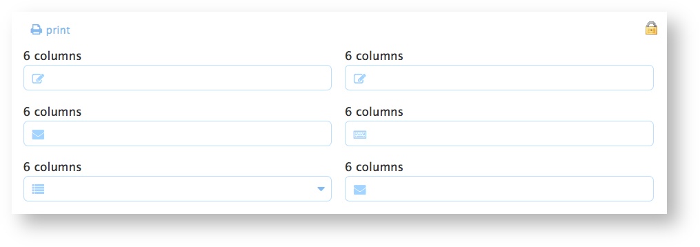
Now drag and drop controls from the palette into the form to try and create the layout shown below:
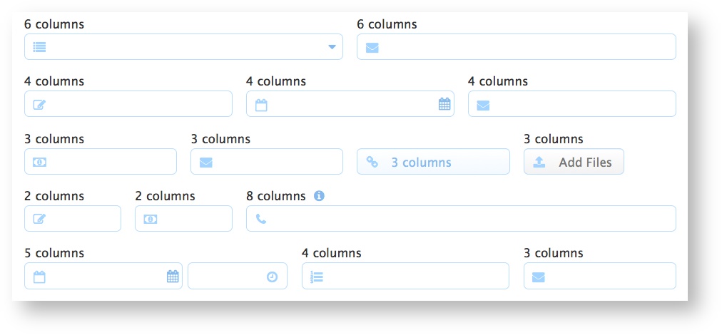
After a bit of experimentation, it should be easy to figure out how the grid works. Any number of controls up to a total width of 12 columns will fit next to each other in the form. You can have any combination as shown above (6+6, 4+4+4, 3+3+3+3, 2+2+8, 5+4+3, etc.). frevvo will lay them out automatically and make sure they align nicely etc.
Newline property
If you want to ensure that a particular control always starts on a new line, click the Style Tab and check the New Line property. That's it.
Panels
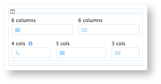
A Panel is a grouping control that can contain other nested controls but is not visible to the end-user on the form. Drag and drop a Panel onto the form. See that it defaults to 6 columns in width. You can set the width to whatever you want and panels follow the same rules above. You can fit panels that add up to a total width of 12 columns next to each other. Within the panel, the interior area again has 12 columns and you can fit controls into a panel using the same rules above irrespective of the width of the panel. Try it. Drag and drop controls into the Panel you just dropped on the form and try to recreate the layout below:
Once again, it should be intuitive and obvious after a bit of experimentation.
Mobile Devices
frevvo will automatically alter the layout for mobile devices. Tablets have enough screen real estate that the form layout is essentially unchanged. The controls may appear different so as to look natural on the tablet but the 12-column grid layout is preserved.
Smartphones have far less real estate and frevvo will layout your controls as if the smartphone screen only has 4 columns. So, a total of 4 columns of width will fit on a phone (irrespective of portrait or landscape mode). If a control is wider than 4 columns, it will shrink to 4 columns. If you have a 6+6 layout, the two controls will shrink to 4 columns (i.e. take up the entire width of the screen on the phone) and be laid out one below the other. Again, the best approach to learning this is to simply try it. Click the Test button for your form after saving it. In the Test popup there are icons representing Tablet and Smart Phone. Click on them and frevvo will display an approximation of how the form will look on that device. Of course, to get an accurate representation, you should test on the actual device.
More information on layouts and other Style properties is in the Style Properties chapter of the documentation.