This documentation is for Live Forms 9.1. v9.1 is a Cloud Only release. Not for you? Earlier documentation is available too.
COVID-19 Response Info: At frevvo, our top priorities have always been employees and customers. We have taken several steps to promote the well-being of our people, to minimize services disruptions, and to help where we can. Visit our website for updates.
Form Setting Properties
- Former user (Deleted)
- Megan Ellis
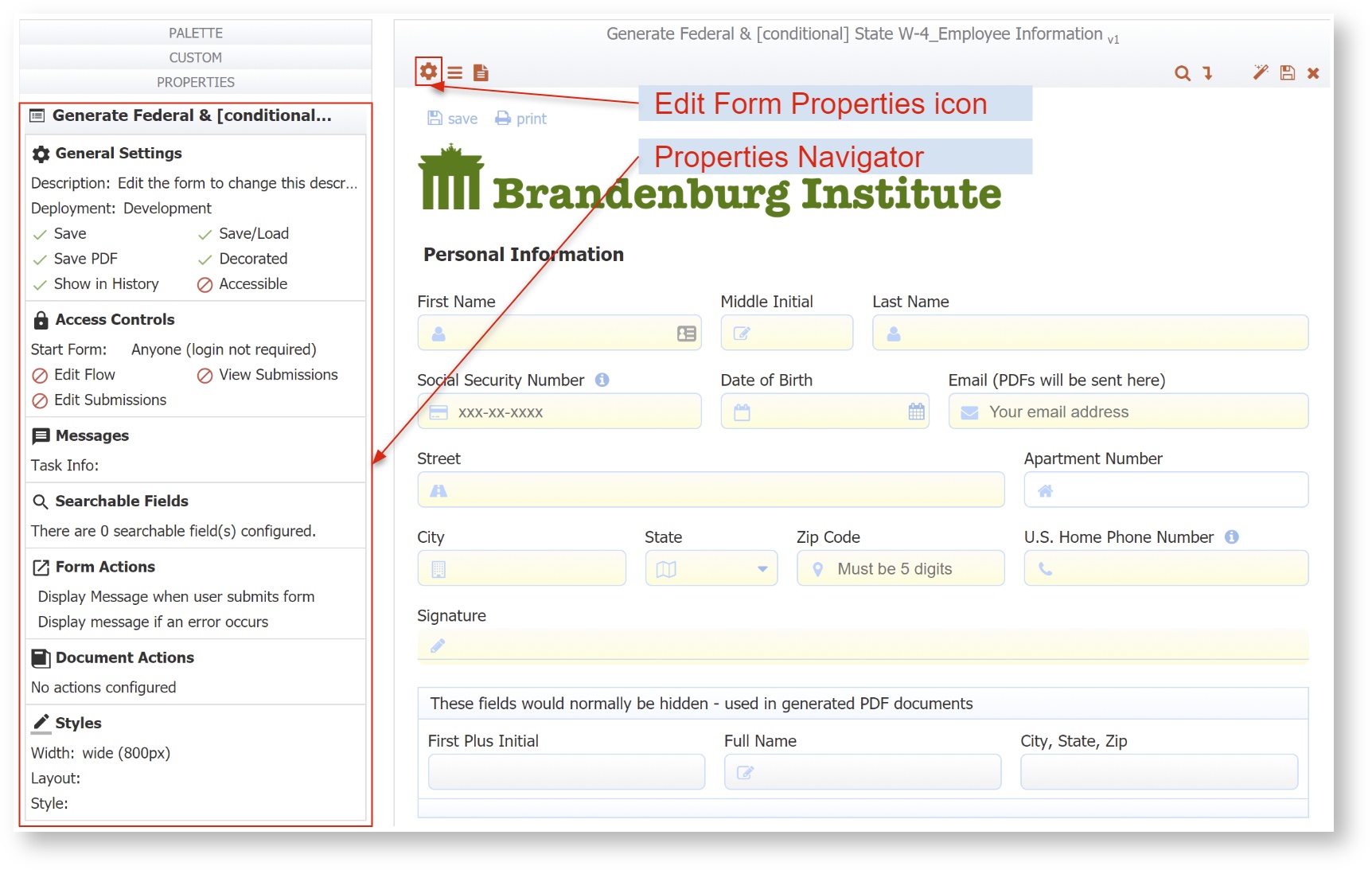
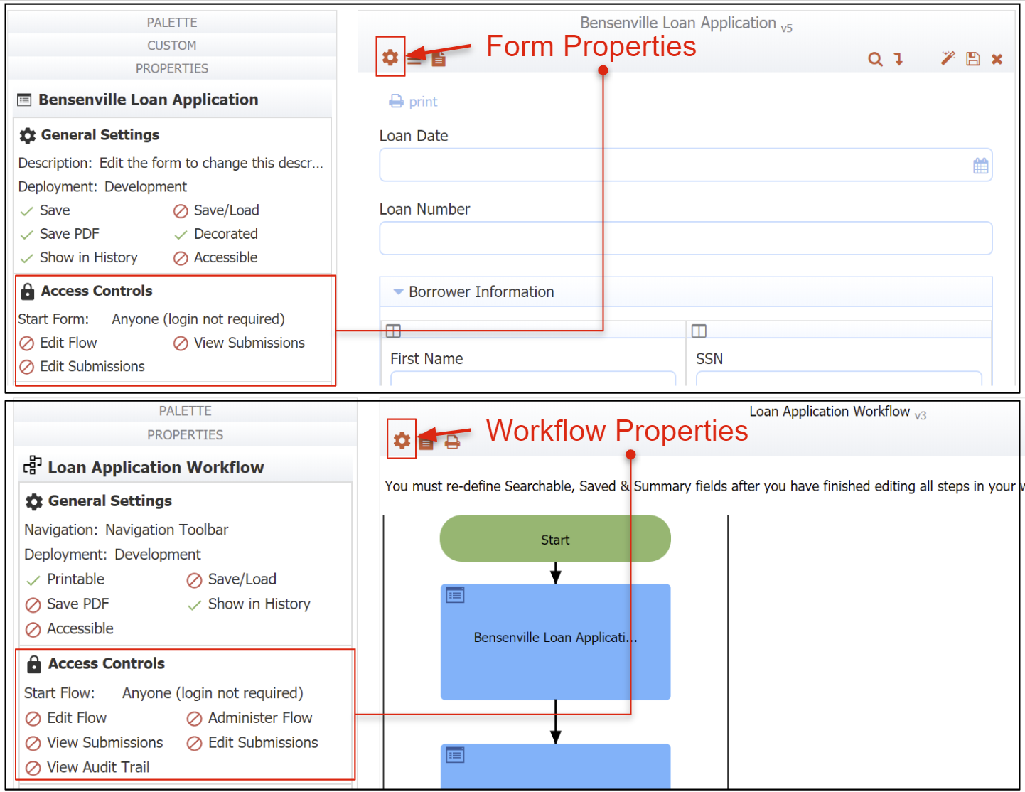
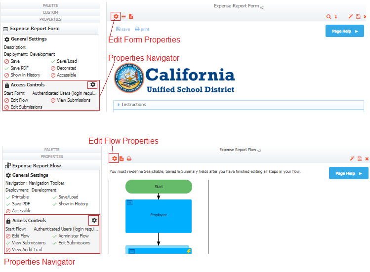
Properties Navigator
Clicking the form name or selecting  Edit icon from the
  Action Menu on the Forms and Workflows Home page opens the form in the
 Forms Designer. The Properties Navigator panel displays in the lower-left portion of the Form Designer. This panel shows information about important properties setup for the form. Not all of the configured properties are shown in this view.
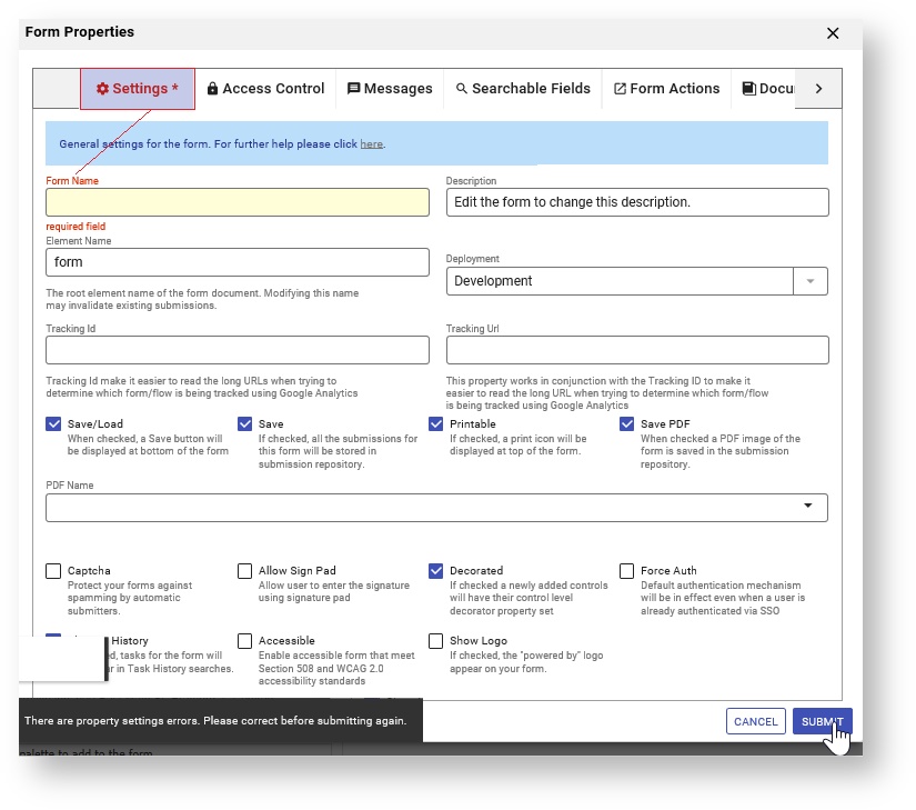
Open the Form Properties wizard by:
- Clicking inside a section or clicking on the
 Edit Form Properties icon in a section of the Properties Navigator. This immediately displays the property tab for editing.
 - Clicking the
 Edit Form Properties icon in the Forms Designer toolbar
The Properties Tabs work the same way whether you open them from the Navigator or from the Forms Designer toolbar. Here is what you need to know:
- If you are working on several tabs at one time, you can navigate to other tabs and make changes there. Use the left and right arrows at the top of the screen to display additional tabs. You must click the Submit button when you are finished configuring Step Properties to save your changes. Remember to save the workflow.
will validate the Property Settings when you click Submit. If a property value is invalid, the tab(s) will not close and a message will display telling the designer that there are corrections to be made before saving. The screen will stay on the current tab if there is a validation error. Otherwise, another invalid tab will be auto selected (starting from left to right) if another tab needs attention. Tab labels with invalid entries display in red.
- Clicking on the Cancel button closes the tab(s). You will be asked to confirm if any changes were made.
- Hover over any field on the Properties tabs to see a helpful hint providing information about the property. Some fields contain instructions to guide you.
- Clicking on the
 down arrow for a property shows an unfiltered list of choices applicable to that property. For some properties, you may see templatized controls from your workflow and workflow/special templates provided in
 - In some cases, you can type ahead to narrow down the list. Use the up/down arrows, the Enter key or click an option with your mouse to select an option. Use the Backspace, Delete or click the x on a selected property to delete it.
- Typing a opening curly brace into some fields, followed by the name of a control, show a list of the fields in your workflow that match the entered text and will be added to the field as a control template.
- On some tabs, you may have to slide the
 toggle to the right to turn on a feature.
Each form setting property is described below.
On this page:
Form Name
This is the name you see on the Forms home page where your forms are listed. We recommend changing the name to make it more meaningful than the arbitrary name assigned when you create it, but keep in mind it is a working name only, so users will not see it. Form names longer than 60 characters will be truncated. It is recommended that you name your form/workflows using characters that are suitable for filenames. Following the POSIX filename standard (A–Z a–z 0–9 . _ - ) will ensure it works. Click the pencil icon above the Properties Navigator to edit the name then click the
  checkmark to save or the
  cancel icon to discard your changes. You can also change the name on the Settings tab.
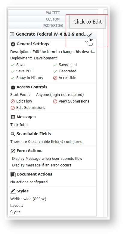
If the Form Name is changed after the form has been deployed and has submissions, the original form name will still appear on the Task List and Recent Submissions tabs on the user dashboard.
Settings
Specify General Settings for your form on the Settings tab
You can access the Settings tab in three ways:
- Click the Edit Form Properties icon on the Forms Designer toolbar. This will launch the Forms Properties wizard. It will default to the Settings tab.
- Click anywhere in the General Settings section in the Properties Navigator. This takes you directly to the Settings tab.
- Click the inside the General Settings section in the Properties Navigator. This takes you directly to the Settings tab.
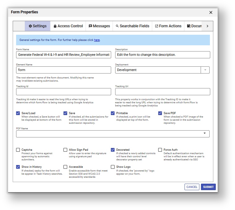
Description
By default all form descriptions say, “Edit the form to change this description,” but you can change this if you wish. You also see this description when you view individual submission documents.
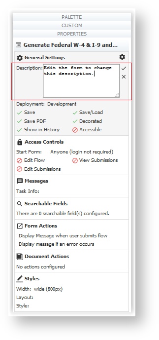
Click the pencil icon next to the Description field in the Properties Navigator to edit the Description without invoking the Form Properties Wizard.
Element Name
The default value for the Element Name property is form. The root element name in the submission xml of a form created from the designer palette is determined by the value in this field. It needs to be a valid XML element name. The designer can now change the name of the form without impacting the element name. Form schema and the generated xml file show the element name. When the form name is updated, and 'Element Name' is kept the same, previous submissions can be initialized successfully. When 'Element Name' is updated, previous submissions cannot be initialized.
If you change the element name, all existing submissions will become invalid and you will see the error message. "Submission is not valid. An incompatible change was made to the form/workflow."
Deployment
This field lets you toggle a form between two states: PRODUCTION and DEVELOPMENT. When a form is in the development state it contains a watermark. Deploying the form into the production state removes the watermark.

You can change the state of your form from the deployment dropdown or you can click on the deployed/undeployed button on the forms home page.
See the deployment state topic in the Administrator's Guide.
Tracking Id
When your form loads it will send a page view event to your Google Analytics account if you enter your Google account tracking ID into this form property. Please refer to Google's documentation for information about finding your Google Analytics tracking ID.
Tracking Url
This property works in conjunction with the Tracking ID and was intended to make it easier to read the long URL's when trying to determine which form/workflow is being tracked using Gloogle Analytics. Full functionality will be available in a future release. Please contact Customer Support for the latest information on this feature. Tracking Url is not available for workflows at this time.
Save/Load
If you check this checkbox, a Save button will be displayed at the bottom of your form.
This feature is useful for lengthy forms where your users may not have all the information required to complete the form in a single session. By clicking on the Save button a copy of the form with all the current values is saved on the
form server. Later the user can re-open the form from their task list; see Perform a task for more information. The form will populate the fields with the saved values.
You can save your partially filled in forms as many times as you want.
Currently the Save button label for forms cannot be customized like it can for workflows. The ability to change this may be available in a future release.
Refer to the Save and Load feature for full details.
Save
This property is checked by default. When check all submissions for this form will be stored in ' submission repository. If you uncheck the checkbox, the form submission will still be logged in the submission repository and you will be able to view the metadata about the submission (time/date submitted, success/failure conditions, etc...) but NO form field data is saved.
The submissions repository can store your form data in three ways -- as data values; as an xml document; and as a pdf form image. By default for efficiency, data is only stored as xml. If you plan to export your form data to an Excel spreadsheet or plan to view your form data in the submission repository detail view, you must configure your form to save the data field values. See the documentation for setting up Searchable Fields. Also see the documentation for viewing your data in submission repository.
Printable
If you check a form's printable checkbox a print  icon will be displayed at the top of your form. If you don’t want users to print your form, uncheck the checkbox so users will not see the print icon. You can control which form fields are visible in the pdf print view via the printable property on each field in your form. Refer to Printing Forms for more information about Print View/submission pdfs, including how to support international characters.
Save PDF
This property can only be checked if you have the save property checked. When checked a PDF image of the file is also saved in Live Forms' submission repository or to Google drive. See the documentation for the submissions repository for details on viewing the PDFs saved there. Notice all controls, including those disabled or in a signed section, are no longer grayed out in the pdf.
PDF Name
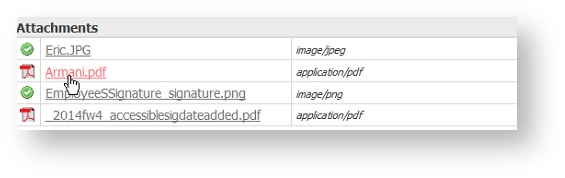
When you check Save PDF on the form Property panel, an optional PDF name field displays. It is only visible when the "Save PDF" property is checked and is disabled when the "Save" property is unchecked. If this new property is set, then it is used to name the generated PDF. You can use templates to name the pdfs .For example, let's say you have an Employee Onboarding form for new hires and you wanted the pdf in the submissions to be named using their last name. Simply add the name of the control in your form that collects the last name as a template ex:{LastName} in the PDF Name property. The pdf for each Employee Onboarding submission will then be named {LastName}.pdf.
If the PDF Name property is empty, then the form name is used as the pdf name. It is recommended that PDF Names use characters that are suitable for filenames. Following the POSIX filename standard (A–Z a–z 0–9 . _ - ) will ensure it works.
PDF names can contain special characters with the exception of curly braces {}.
In the submissions, the pdf for the Onboarding of new hire Eric Armani is named as shown.
The designer can specify the content of the headers, footers and the size of margins for the pdf for a form/workflow on the Styles tab. Refer to this documentation for the details.
Captcha
This feature helps to protect your forms against spamming by automatic submitters. It is only supported for Forms. Check the Captcha checkbox to select it.
uses Google provided Invisible reCAPTCHA. When using and submitting a form configured with Captcha, the reCAPTCHA logo is displayed in the lower right corner. In most cases, no further action is required by the user
Some less trusted users may see one or more challenge screens when attempting to submit a reCAPTCHA protected form. The challenge screens are grids of images and users are asked to choose the images matching a certain criteria. These are standard reCAPTCHA challenge screens and frevvo has no control over what is presented and when.
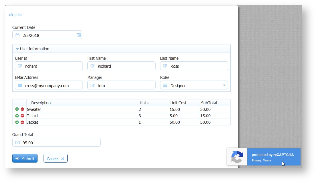
- In some share link embedding scenarios, the logo may not show even though reCAPTCHA is active.
The frevvo Cloud uses a custom reCAPTCHA key that is configured for Domain Name Validation providing maximum security. To implement the maximum possible protection from form spamming in your in-house environment, follow the steps listed in Administration of reCAPTCHA Keys.
Allow Sign Pad
Check this checkbox if the step in a workflow will be using an external signature pad. Leave the property unchecked (default) on the steps that will not be using a signature pad. See Topaz Electronic Signature Pads topic for the models supported and configuration information.
Decorated
Decorated is checked by default when you create a new form. If you uncheck Decorated at the form level, newly added controls will have their control level decorator property unset -- meaning no decorator. It will NOT remove the decorator from all controls already in the form.
Force Auth
If this is checked and the tenant supports SSO (single sign on) such as the LDAP Security Manager enabled tenants, then the
authentication mechanism will be in effect even when a user is already authenticated via SSO.
For example, if you leave force auth unchecked and your form is public in tenant, and you are already authenticated via SSO you will not have to login directly to to use the form. If instead you check force auth
will force you to login directly even though you are already authenticated via SSO.
See /wiki/spaces/frevvo91/pages/901492728 for more details.
This property is currently ineffective for tenants with the default delegating security manager. However the delegating security manager may support SSO in the future.
Show in History
If this checkbox is unchecked, tasks for the form will not appear in Tasks history searches. If you want them to appear, make sure this box is checked. Checking or Un-checking it affects all tasks including ones that were created prior to the action.
Accessible
Live Forms can be used to build accessible forms/workflows that meet Section 508 and WCAG 2.0 accessibility standards. Check the Accessible property to turn on this feature. Refer to this documentation for the details.
Show Logo
This property is checked by default and causes the “powered by ” logo to appear on your form. Uncheck the checkbox to remove the logo from your form.
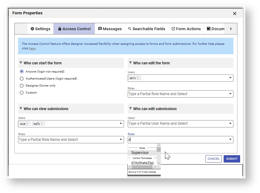
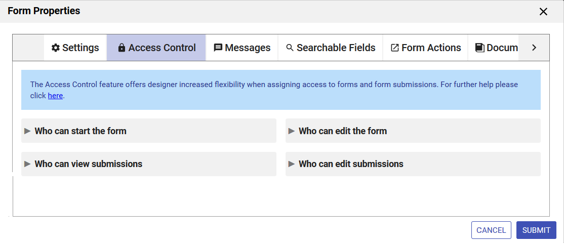
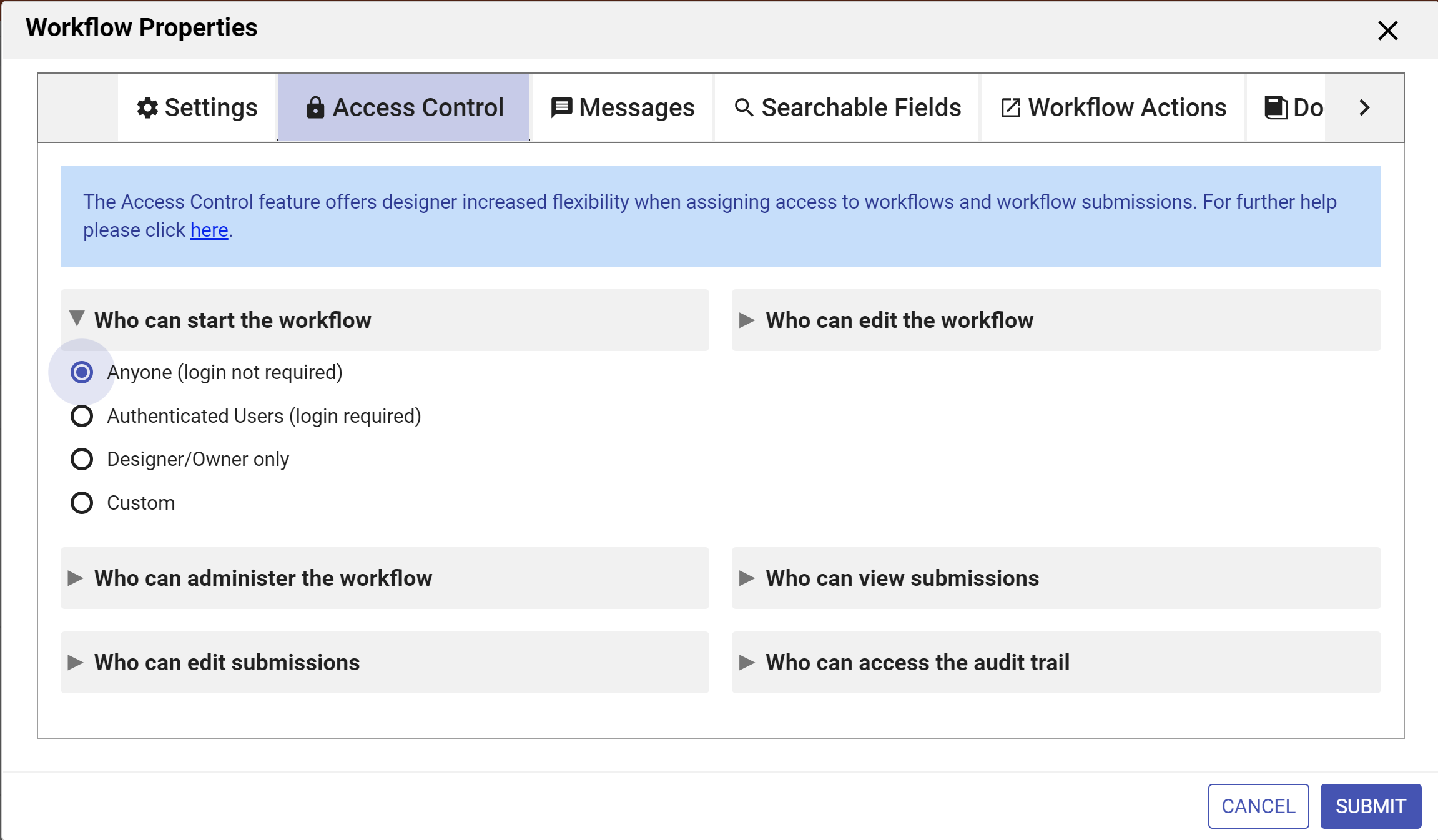
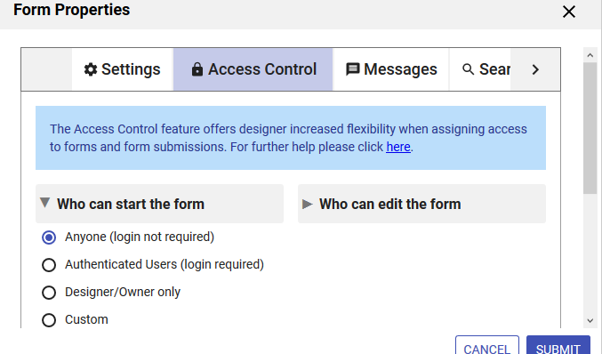
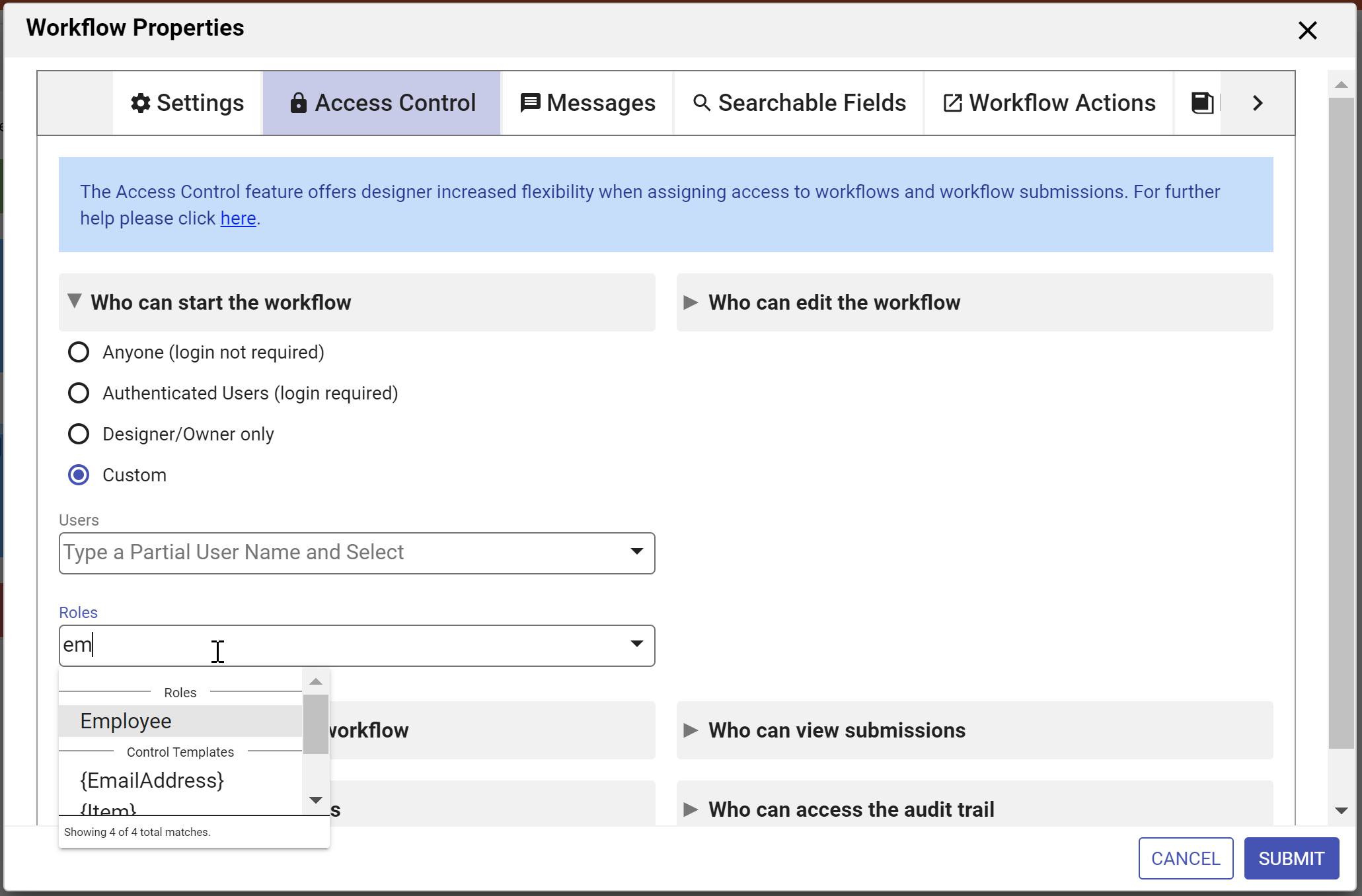
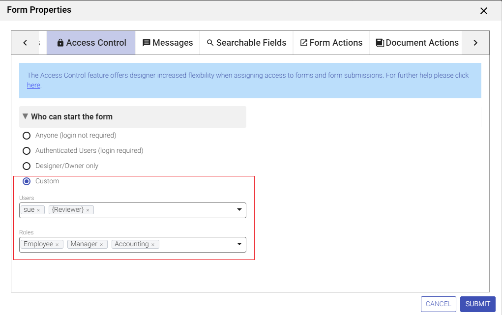
Access Control
Use the Access Control tab to assign form permissions to users/roles in your tenant.
You can access the Access Control tab in three ways:
- Click the Edit Form Properties icon on the Forms Designer toolbar. This will launch the Forms Properties wizard. Click the Access Control tab.
- Click anywhere in the Access Control section in the Properties Navigator. This takes you directly to the Access Control tab.
- Click the inside the Messages section in the Properties Navigator. This takes you directly to the Access Control tab.
- Enter the users and roles for the permissions provided.
- Clicking on the down arrow(s) show a list of users, roles and templatized fields from your form. Select the users/roles from the dropdown
- Type the opening curly brace - {- followed by the control name to enter a field from your form as a template. Selecting an option enters the control name into the field with the closing curly brace.
- Click the Submit button to save the changes or navigate to another tab.
Remember, if you navigate to another tab without clicking the Submit button, changes will NOT be saved.
The Access Control feature offers the designer increased flexibility when assigning access to forms/workflows and form/workflow submissions. Runtime access can be assigned to specific users/roles as long as they exist in your tenant. Also, the Access Control feature enables the designer to use templates to define user and role lists to dynamically control access.
Designer users can give permission to edit forms/workflows and monitor submissions to other user(s) by adding them to the Who can edit the form/workflow dropdown. Users with this permission have the ability to run the Refresh Searchable Fields process for the forms/workflows they are editing. This process updates existing submissions if changes are made to Searchable Fields .
Tenant admins will continue to have full access to all capabilities and will not be subject to Access Control List (ACL) checks.
Access Control List User Interface
- Although designer users can click the
 Security icon from the Action Menu on the Forms and Workflows Home page, we encourage you to use the Form/Workflow Properties wizards explained below to assign permissions.
Open the Access Control wizard by
- Editing the form/workflow.
- Clicking the Access Controls section or the
cog icon on the Form/Workflow designer Properties Navigator when editing a form/workflow.
- Click the Access Control tab.
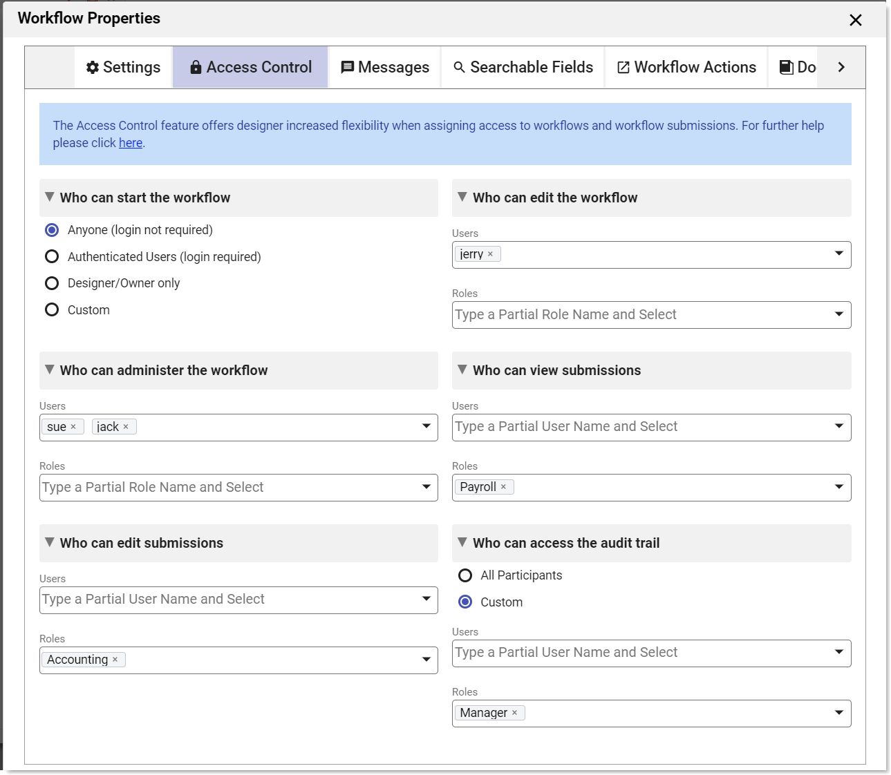
Form designers as well as users with the publisher role are authorized to configure access control. The Access Control wizard makes the following permissions available for forms/workflows:
- Who can use the form/workflow?
- Who can edit the form/workflow?
- Who can view form/workflow submissions?
- Who can edit form/workflow submissions?
- Who can access the audit trail - available only for workflows
- Who can administer the workflow - available only for workflows
ACL Permissions for Forms
ACL Permissions for Workflows
ACL settings,set by the designer, are retained when you download/upload a form/workflow/project to another designer user in the same or different tenant and when you copy a form/workflow.
Dynamic ACLs
Templates provide the ability to dynamically determine and restrict access to submissions/ task audit trails when assigning Access Control permissions. Templates are like variables in your form that can be filled in by the user, populated by a business rule or from a back end system. Any item on the Access Control screens contained in curly braces is a form template and will be replaced with the value of the associated control. For example, the list below contains a fixed role (reviewer) and one dynamic template based role - {AcctMgrRole} :
In the example discussed below, templates are used to navigate the workflow to the correct employee in the Accounting department and to define user lists to dynamically control access.
Who can start the form/workflow
Setting this permission determines who is allowed to create form/workflow submissions. The choices for Form/Workflow visibility are:
- Anyone(login not required) - anyone can use it even if they are not logged in. This is the default setting for Forms and Workflows.
- Authenticated Users(login required) - the form is usable to anyone who has an account (username/password) and is logged in to your tenant.
- Designers/Owner Only - the designer user who created the form/workflow (owner) can edit, test or use the form. They must be logged into
- Custom - The owning designer always has access to the form/workflow. Additionally, the designer may configure selected users and/or roles (i.e. users with these roles) to have runtime access to the form/workflow.
The designer can specify the visibility of a form/workflow from either the Forms and Workflows Homepage or the Form/Workflow Properties wizard.
- On the Forms and Workflows Home Page: Click the Action Menu on a form/workflow and select Set Permissions.
- In the Form/Workflow Properties wizard:
- Click anywhere in the
 Access Control section of the Properties Navigator (quick-view) or
 - Use the
 cog icon to open the Form/Workflow Properties Wizard and select the Access Control tab.
- Click anywhere in the
Clicking on the icons or in the Access Control section of the Properties Navigator display the same wizard which can be used to set the Visibility of your form/workflow.

When Who can start the form or Who can start the workflow is displayed in the Permission field, the designer can select one of the dropdown choices to specify form/workflow visibility. The default value for forms is Anyone (login not required) while workflows default to Authenticated Users (login required). The choices for form/workflow visibility are:
- Anyone (login not required) - anyone can use it even if they are not logged in.
- Authenticated Users (login required) - the form is usable to anyone who has an account (username/password) and is logged in to your tenant.
- Designers/Owner Only - the designer user who created the form/workflow (owner) can edit, test or use the form. They must be logged into
- Custom - The owning designer always has access to the form/workflow. Additionally, the designer may configure selected users and/or roles (i.e. users with these roles) to have runtime access to the form. Use this option to auto-start workflows programmatically.
When is embedded in another product such as Atlassian's Confluence wiki, you do not have access to the icons described above.
The designer can grant form/workflow access to explicit users/roles by selecting the Custom option. Roles and users can be selected via an editable combo-box control. As the user types, will try to find any roles and users in the tenant that contain the typed string. Up to 5 matches are displayed below the combo box. Selecting a role/user from the dropdown inserts the selection into the list.
Click Submit or continue with the next option in the Access Control wizard.
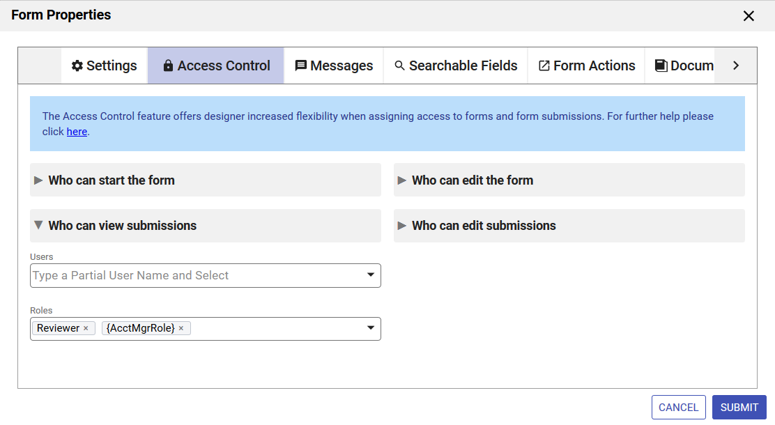
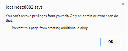
The Expense Report in the above images can be used by anyone in the tenant with the role of Employee, Manager or Accounting, the user id of the Reviewer and the user Sue. Notice the Reviewer role is encased between curly braces. This is an example of a control template. Templates are like variables in your form that will be evaluated at runtime and replaced with the actual values entered. For templates to work, there must be a control in your form with the name given inside the curly braces.
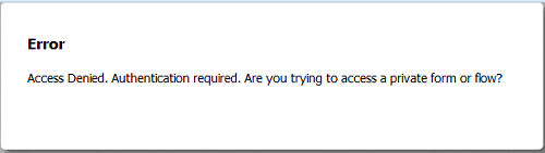
The user, Jack, who has the role of frevvo.Publisher, is not a Reviewer for anyone in the company and of course, is not Sue, will be denied access to the form. He will see this error:
You can publish any form/workflow regardless of whether it can be started by Anyone (No login required) or just the Designer/Owner. If Designer/Owner Only is selected, the person who created it or any user given the Who can edit the form/workflow permission can edit it or test it. It is possible for more than one designer to collaborate on forms/workflows in development if the form/workflow owner (the designer that created the form/workflow) gives this permission to other designers. However, if one designer is working on the form, other designers will be denied access. Form/workflow owners can also designate the Who can view submissions or Who can edit submissions permissions to other users so two or more people may view/edit submissions at the same time.
Similarly, if a form visibility is set to Authenticated Users(login required), only users with accounts in the tenant will be able to access the form.
If you set the form/workflow visibility to Anyone (login not required) and users have begun submitting it, you'll need to use caution when modifying your form. If users access it while you are editing it, they will see error messages indicating that the page is being refreshed or that the form is invalid. A form/workflow made public this way is accessible to anyone with the form/workflow's URL. There are other methods of sharing forms that have increasingly higher levels of security. See form security for details.
You can mark your form/workflow Designers/Owner Only until you are done developing it, which will prevent new users from accessing the form, but if users happen to be completing the form when you switch it from Anyone (login not required) to Designers/Owner Only, they will see error messages. A better approach if feasible is to edit the form in a copy of your project running on a staging server. You can then replace the current form with the new form by removing the original project/form/workflow from the staging server and uploading the new project/form/workflow.
ACL settings set by the designer are retained when you download/upload a form/workflow/project to another designer user in the same or different tenant and when you copy a form/workflow.
The designer can set other permissions, such as who can view/edit submissions for forms and workflows via the Access Control wizard. Roles and users that can view the audit trail or be designated as workflow administrators are specified through the same wizard.
Public forms that include the save/load feature or digital signatures will prompt the user with the login screen when they click to save or sign. These features require a login.
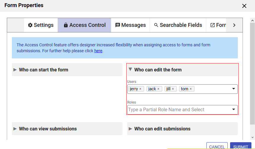
Who can edit the form/workflow
- Edit permissions should not be given to forms or workflows currently in production use. Please see the Admin Best Practices Guide
- Users with this permission have the ability to run the Refresh Searchable Fields process for the forms/workflows they are editing. This process updates existing submissions if changes are made to Searchable Fields.
Form and workflow owners (designer users that created the form/workflow) can give other users (designers/non-designers) the capability to edit form/workflows. This is particularly helpful if a designer user takes a leave of absence or leaves the company. The "backup designer" has the ability to make changes to the form/workflow without having to download the form/workflow(s) from the owner's account to the backup designer's account. The "backup designer" also can view related submissions by clicking on the Submission or Legacy Submission icons. The ability to edit submissions is granted by a different permission.
Users with or without the role of frevvo.Designer can be assigned the permission to edit forms/workflows.
Users given this permission access the shared form/workflow from the Shared Items tab even if they have the frevvo.designer role assigned to them. They can only edit the form/workflow that was shared with them. They will not have the ability to create new forms/workflows from the Shared Items tab. The ability to make changes to a form/workflow is not available from Shared Items on the Important Items menu in a space.
To assign users the ability to edit forms/workflows, follow these steps:
- Open the Access Control wizard.
- Click the
 right arrow to expand the Who can edit the form/workflow section.
 - Enter the roles that you want to grant editing capability to in the Roles section. Begin typing the role name then select the role from the dropdown.
- Enter the users that you want to grant editing capability to in the Users section. Begin typing the user id then select the user from the dropdown.
It is not good practice to use Templates for this permission and is not recommended.
- Click Submit or go to the next permission section in the Access Control List.
Users that have been granted the editing permission, access forms and workflows that have been shared with them via the Shared Items tab on their Home Page. It will not work from the Shared Items selection in a Space or any other embedded scenario.
The Who can edit the form/workflow permission does not apply if you are running with Confluence. Confluence users share form/workflow editing by specifying the Forms Editor group on the /wiki/spaces/frevvo91/pages/901493435 screen. Users who will be sharing the editing function must be assigned to the specified group.
A browser notification message displays if the user who has been granted permission to edit forms/workflows tries to modify their own ACL. will not allow the "backup designer" to remove themselves from the ACL list.
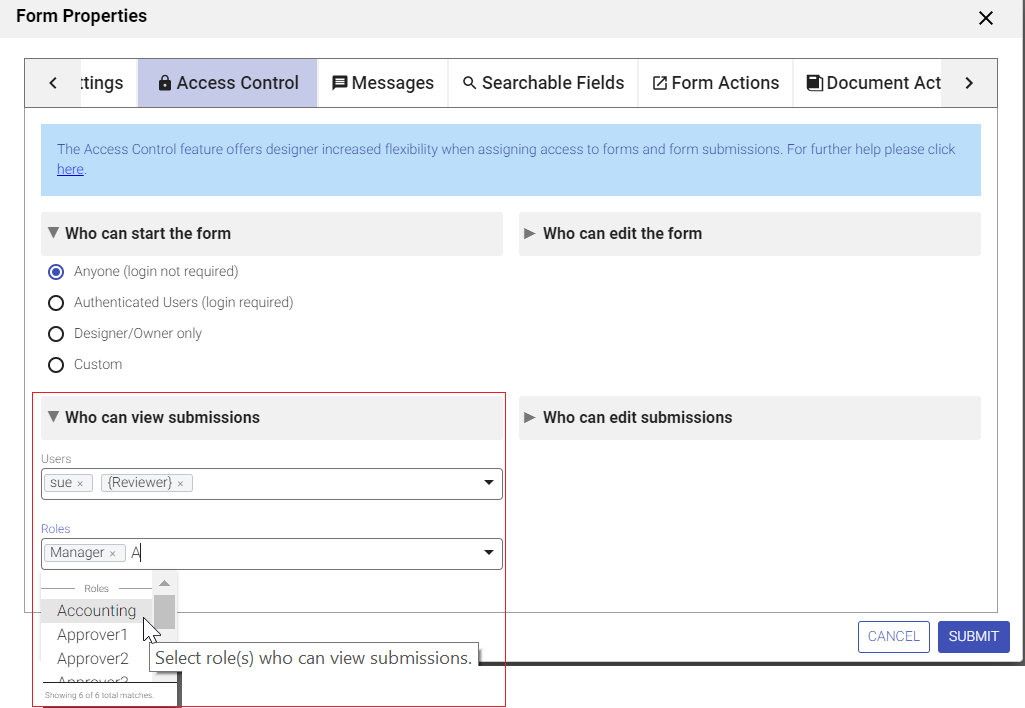
Who can view submissions
The designer can assign permission to view form/workflow submissions to specific roles/users. Any user with view access can view submissions in read-only mode. Submission deletion is not allowed. Templates can be used to dynamically determine at runtime which users and roles are allowed to view submissions.
To assign permission to view submissions, follow these steps:
- Open the Access Control wizard.
- Click the right arrow to expand the Who can view submissions section.
- Enter the roles you want to grant view access to in the Roles section. Begin typing the role name then select the role from the dropdown. You can enter control names from your form/workflow encased in curly braces to act as templates for dynamic access.
- Enter the users you want to grant view access to in the Users section. Begin typing the user id then select the user id role from the dropdown. You can enter control names from your form/workflow encased in curly braces to act as templates for dynamic access.
- Click Submit or go to the next permission section in the Access Control List.
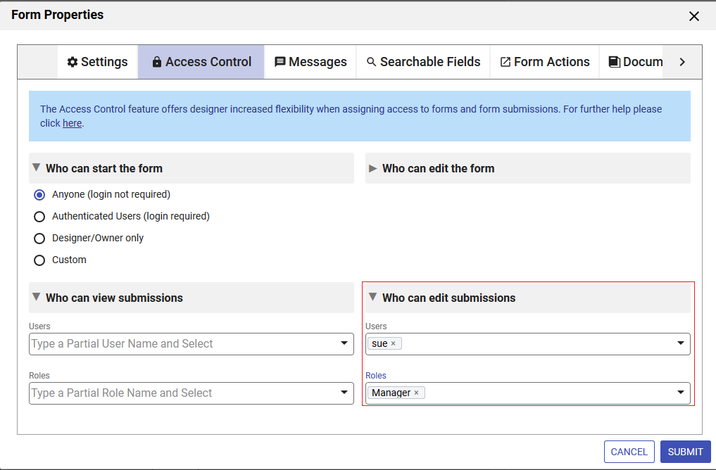
Who can edit submissions
The designer can assign permission to edit form/workflow submissions to specific roles/users. Any user with edit access can view, edit and delete submissions in the SUBMITTED, ABORTED or ERROR states. Submissions in the PENDING, SAVED or WAITING states can only be deleted by the tenant admin, workflow admin or designer user that created the workflow. Refer to the Deleting Submissions for more information.
Templates can be used to dynamically determine at runtime which users and roles are allowed to edit submissions.
To assign permission to edit submissions, follow these steps:
- Open the Access Control wizard.
- Click the right arrow to expand the Who can edit submissions section.
- Enter the roles you want to grant edit access to in the Roles section. Begin typing the role name then select the role from the dropdown. You can enter control names from your form/workflow encased in curly braces to act as templates for dynamic access.
- Enter the users you want to grant edit access to in the Users section. Begin typing the user id then select the user id role from the dropdown. You can enter control names from your form/workflow encased in curly braces to act as templates for dynamic access.
- Click Submit or go to the next permission section in the Access Control List.
Who can access the audit trail - Workflows Only
The audit trail is accessed on a user's Task List by clicking the
 View Task History icon. Roles/Users granted this permission will see theView Task History icon on tasks in their task list.
To assign permission to view the audit trail, follow these steps:
- Open the Access Control wizard.
- Click the right arrow to expand the Who can access the audit trail section.
- Enter the roles you want to grant edit access to in the Roles section. Begin typing the role name then select the role from the dropdown. You can enter control names from your form/workflow encased in curly braces to act as templates for dynamic access.
- Enter the users you want to grant edit access to in the Users section. Begin typing the user id then select the user id role from the dropdown. You can enter control names from your form/workflow encased in curly braces to act as templates for dynamic access.
- Click Submit or go to the next permission section in the Access Control List.
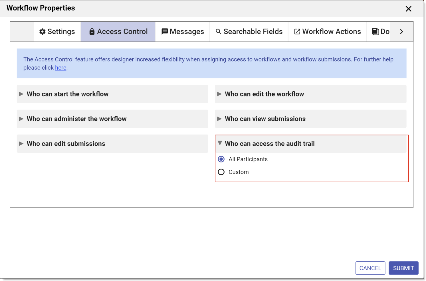
- Custom indicates that only users granted explicit access or with one of the specified roles can view the audit trail for the task (provided they have access to the task). Roles and users can be selected via an editable combo-box control.
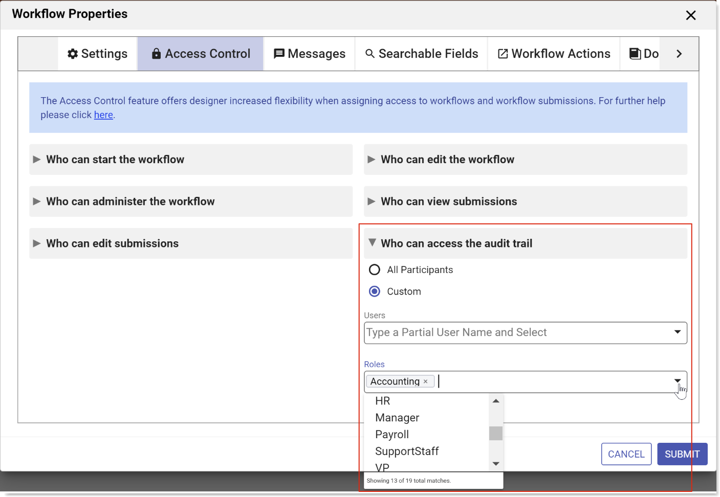
- Enter the roles you want to grant audit trail access to in the Roles section. Begin typing the role name then select the role from the dropdown. You can enter control names from your workflow encased in curly braces to act as templates for dynamic access.
- Enter the users you want to grant audit trail access to in the Users section. Begin typing the user id then select the user id from the dropdown. You can enter control names from your workflow encased in curly braces to act as templates for dynamic access.
- Click Submit or select the next option in the Access Control List.
Who can administer the workflow - Workflows Only
This permission lets a user abort, reassign and reset tasks that are not assigned to them. These administrative tasks are no longer restricted to tenant admins.
The designer can delegate these tasks to additional users/roles by assigning them in the Who can administer the workflow section of the Access Control dropdown. Any user/roles listed here will be considered a Workflow Administrator. As such, the Modify Task icon on a task in the task list will be displayed. Tenant admins and designer users get the Modify Task icon by default.
To assign user/roles as Workflow Administrators, follow these steps:
- Open the Access Control wizard.
- Click the right arrow to expand the Who can administer the workflow section.
- Enter the roles you want to grant workflow admin access to in the Roles section. Begin typing the role name then select the role from the dropdown. You can enter control names from your form/workflow encased in curly braces to act as templates for dynamic access.
- Enter the users you want to grant workflow admin access in the Users section. Begin typing the user id then select the user id role from the dropdown. You can enter control names from your form/workflow encased in curly braces to act as templates for dynamic access.
- Click Submit to complete the ACL setup.
- Be sure to save the workflow if you were accessing the ACL from inside the Workflow Designer.
User jerry has been designated as a workflow administrator for the Expense Report but not for the Time Sheet workflow. When Jerry logs into , his task list will appear as shown:
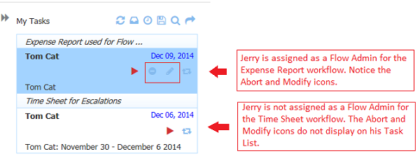
The Modify Task dialog allows a 'workflow admin' to execute any one of abort/reassign/reset functions.
When searching for tasks, if a workflow is chosen, and the user is a workflow admin for it, then all tasks for that workflow display. If no workflow is selected, then all tasks, even those that the workflow admin has not participated in, plus tasks for which the user is a workflow admin will display.
Messages
You can access the Messages tab in three ways:
- Click the Edit Form Properties icon on the Forms Designer toolbar. This will launch the Forms Properties wizard. Click the Messages tab.
- Click anywhere in the Messages section in the Properties Navigator. This takes you directly to the Messages tab.
- Click the inside the Messages section in the Properties Navigator. This takes you directly to the Messages tab.
Enter your customized text for each message in the appropriate field.
- Clicking on the down arrow shows a list of templatized fields from your form that you can use in the Task Information message.
- Type the opening curly brace - {- followed by the control name to enter a field from your workflow as a template. Selecting an option enters the control name into the field with the closing curly brace
- Click the Submit button to save the changes or navigate to another tab.
Remember, if you navigate to another tab without clicking the Submit button, changes will NOT be saved.
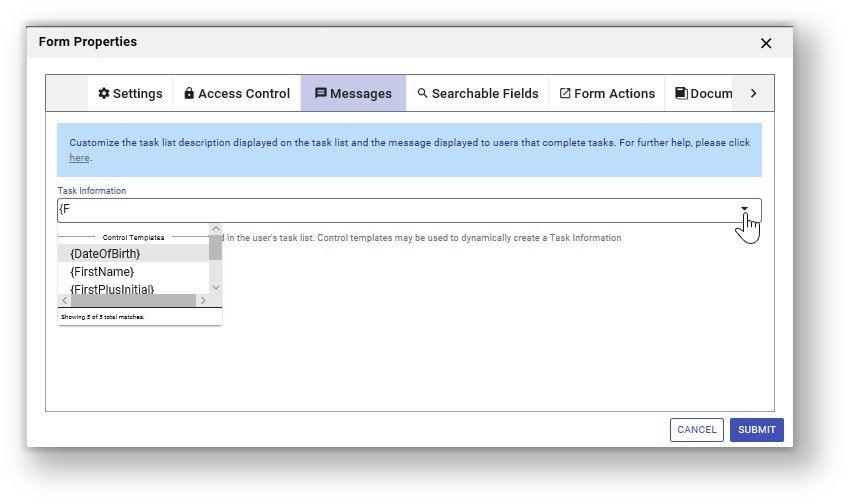
Task Information
When you save a partially filled form to continue it later, the saved form is accessed via your task list. This field controls the name that gets displayed in the task list. For more details, see the Tasks documentation. This field can use templatized strings for dynamic content, e.g. the Task Info can contain "Vacation Request for {FirstName} {LastName}" where FirstName and LastName are the names of fields in a form. Before putting the task on your task list, will resolve the Task Info string using the actual values of the FirstName and LastName fields e.g. "Vacation Request for Tom Smith".
You access your Task list from your projects home page. You use the Task list to perform tasks, complete a saved form or work workflow, to view a task's history, or search for tasks you've participated in — a tenant admin can also search for other users' tasks.
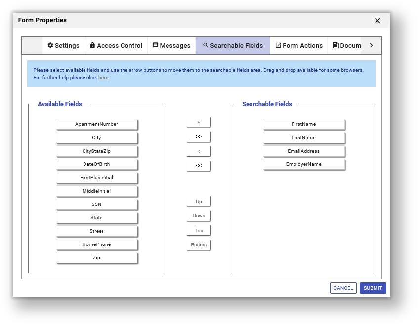
Searchable Fields
Use the Searchable Fields tab to set up fields from your form to use as task and submission search criteria.
You can access the Searchable Fields tab in three ways:
- Click the Edit Form Properties icon on the Forms Designer toolbar. This will launch the Forms Properties wizard. Click the Searchable Fields tab.
- Click anywhere in the Searchable Fields section in the Properties Navigator. This takes you directly to the Searchable Fields tab.
- Click the inside the Messages section in the Properties Navigator. This takes you directly to the Searchable Fields tab.
- Follow the instructions below to setup the Searchable Fields for your form.
- Click the Submit button to save the changes or navigate to another tab.
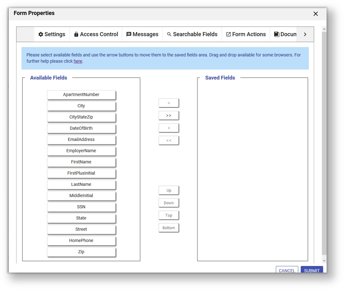
Setup Searchable Fields
Searchable fields configured for a form or workflow are the fields that may be used to filter submissions in the submissions view. By default, all your data is saved as an XML document. This is the most efficient way to store/access your data both in terms of speed as well as storage. However, if you prefer to view your data via the submissions user interface, you can choose which fields are available to the user as search criteria in addition to the XML data.
Considerations when deciding which types of fields to configure are listed below.
Searchable fields are indexed for easy search of form/workflow Submissions. They can also be used when searching Tasks on a user's Task List. You will see columns for the controls in your form/workflow designated as Searchable fields in the Submissions table. This is helpful when trying to locate a particular submission from a long list. Searchable Fields are downloaded into the Submissions Download to a CSV file along with the submission default columns.
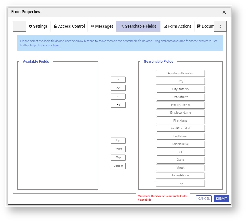
Cloud customers can configure up to 20 Searchable Fields.
In-house customers can change change the default value by adding the frevvo.max.searchable.fields configuration parameter to the <frevvo-home>\tomcat\conf\Catalina\localhost\frevvo.xml file.
Saved fields do affect performance as they are independently stored in addition to XML data. This can significantly reduce performance, especially for large forms and require additional storage in the repository. Saved fields are not rendered in the submission table and cannot be used as search criteria for submissions. The only reason to configure Saved fields is if you want to use the Export to Excel feature which is available on the Legacy Submissions view
The Export of submissions to Excel feature has been replaced by the Download to CSV. If you have not used the Export to Excel feature in the past, we recommend that you become familiar with the Download to CSV .You can still use the Export to Excel feature by accessing it from the Submissions Legacy view. However, the Legacy Submissions view and the Export to Excel may be removed in a future release.
Designers should carefully consider which fields to designate as Searchable fields. The selection of the correct fields as search criteria can be very helpful with submission and Task List searches.
The wizard displays the fields from your form/workflow. Only controls that are considered form data will be listed. For Example, the link, signature, image, upload, trigger, section, PageBreak, Message, Form Viewer and video controls will not show up in the Searchable field lists as there is no value to save or query against. Also, group controls (tabs, panels, repeats) will not show up on the list of Available Fields.
We do not recommend using columns from Tables or Repeats as Searchable fields. The data will be hard to interpret since there can be multiple data values for the same field.
- Do not select a Textarea field as a Searchable Field if the amount of text stored in the field is greater than 32k.
Searching submissions using a Repeat control from schema is not supported.
- If the value of a field contains the < sign, the data in the Submissions Table will be incomplete. For example, if the value = a<b only the "a" will show in the Submission Table.
Move the the fields listed in the Available Fields tab that you want to use as search criteria to the Searchable Fields tab. You can change the order of the fields when you move them into the Searchable Fields area. The order of the form fields will be reflected in the Submission Table and the export to a csv file once existing submissions are resubmitted or a new submission is created.
There are two ways to select/unselect or reorder Searchable fields :
Drag and Drop - You can drag the fields from the Available Fields list and drop them into the Searchable Fields list if you re using Firefox, Chrome or Safari browsers. Items may be dragged between lists and within the Searchable Fields list. Items may be dropped between existing items and before the top-most item and below the bottom item. Only a single item may be dragged. Currently, the drag and drop function will not work in the Internet Explorer browsers. This issue will be addressed in a future release.
Center arrow buttons
- The > right arrow moves the selected field from the Available Fields list to the bottom of the Searchable Fields list.
- The < left arrow moves the selected field from the Searchable Fields list to the bottom of the Available Fields list.
- The >> double right arrows move all the form fields in the Available Fields list to the Searchable Fields list.
- The << double left arrow moves all the form fields in the Searchable Fields list to the Available Fields list.
Click Finish to save. Selecting the X in the upper right corner cancels any changes. Remember to save your changes when you exit out of the designer.
Controls are listed in the Available and Searchable Lists using control names. If the name changes, it will unset the Searchable field. The newly renamed control will now show on the Available list and the designer must move it to the Searchable List again. Hover the cursor over any control name for a tooltip showing the section where it is located, which is helpful if multiple controls have the same name.
Maximum Number of Searchable Fields
Cloud customers can configure up to 20 Searchable fields. In-house customers can change the maximum number of Searchable Fields with a configuration parameter.
When an attempt is made to add more than the maximum configured number of Searchable fields, an error message ("Maximum Number of Searchable Fields Exceeded!"). displays on the lower right of the screen and will disappear after a short time. Any fields in excess of the maximum configured number will not be allowed.
Adding/Removing Searchable Fields
If you make changes to Searchable Fields in a form or workflow, the changes will take affect for new submissions. If you want to update existing submissions to reflect your changes, run the Refresh Searchable Fields process.
Searchable fields can be refreshed for:
All forms/workflows in all tenants (in-house) or a specific tenant (Cloud or in-house) - must be initiated by the frevvo Cloud or customer in-house superuser administrator. Cloud customers must contact frevvo to request a refresh of Searchable fields for your entire tenant.
frevvo will run the Refresh process during a time when your users are NOT using
In-house superuser administrators should refer to the Refresh Searchable Fields topic for the instructions.
- An individual form/workflow - can be initiated by Designers (owners), Tenant Admins or any designer user given permission to edit forms/workflows for a
If refreshing production forms or workflows, run the job during a time period when the forms or workflows are not being used.
Form Actions
The Form Action wizards help set up what the user sees when the form is submitted.
You can access the Form Action tab in three ways:
- Click the Edit Form Properties icon on the Forms Designer toolbar. This will launch the Forms Properties wizard. Click the Form Actions tab.
- Click anywhere in the Form Actions section in the Properties Navigator. This takes you directly to the Form Actions tab.
- Click the inside the Form Actions section in the Properties Navigator. This takes you directly to the Form Actions tab.
Success
The Form Actions available on the Success tab are:
Display Message when User Submits Form
Forward Users to a web page of your choice
Post Data and forward users to your web page
Forward to Paypal to complete payment
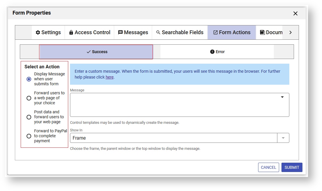
Refer to Form and Doc Action Wizards for the details.
Error
The Form Action Wizards available to handle errors are:
- Display Message if an error occurs
- Forward users to an error page of your choice
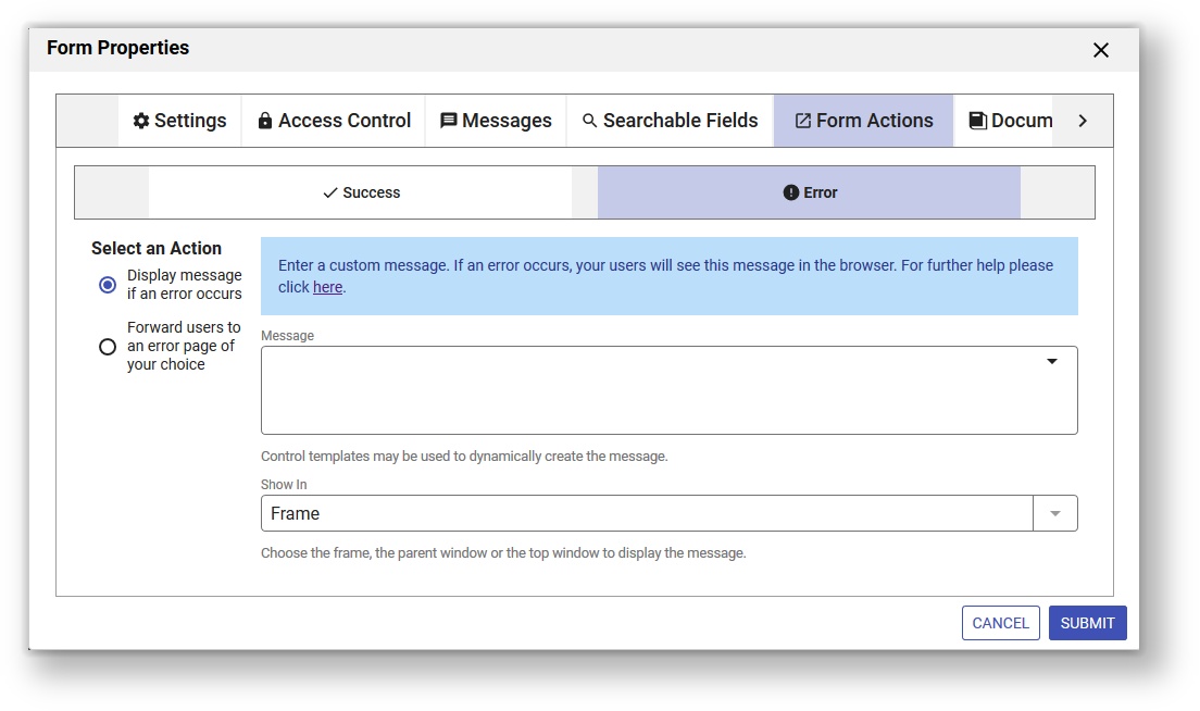
Refer to Form and Doc Action Wizards for the details.
Document Actions
The Document Action wizards help set up what happens to the data when the form is submitted.
You can access the Document Action tab in three ways:
- Click the Edit Form Properties icon on the Forms Designer toolbar. This will launch the Forms Properties wizard. Click the Document Actions tab.
- Click anywhere in the Document Actions section in the Properties Navigator. This takes you directly to the Document Actions tab.
- Click the inside the Document Actions section in the Properties Navigator. This takes you directly to the Document Actions tab.
The designer can choose to:
- Send Documents
- Send Data
- Send an Additional Email
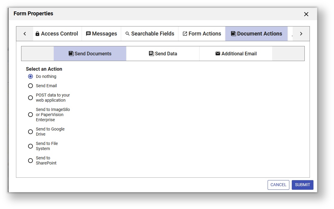
Send Documents
The Document Action wizards available on the Send Documents tab are:
- Do Nothing
- Send Email
- POST data to your web application
- Send to ImageSilo or PaperVision Enterprise
- Send to Google Drive
- Send to File System
- Send to SharePoint
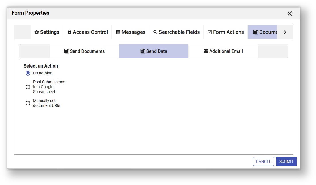
Send Data
The Document Action wizards available on the Send Data tab are:
- Do nothing
- Post Submissions to a Google Sheet
- Manually set document URIs
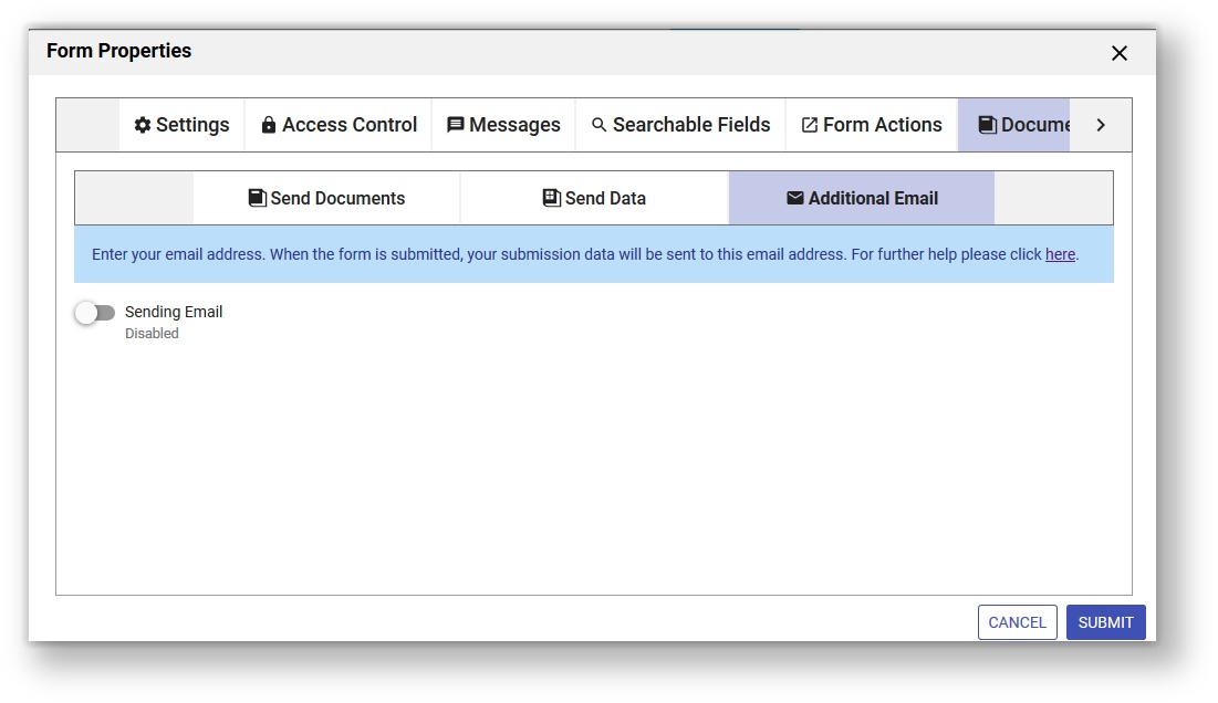
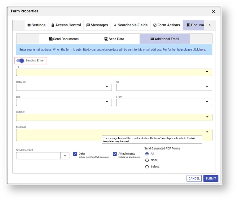
Additional Email
This wizard allows you to send a second email when the form is submitted.
Refer to Form and Doc Action Wizards for the details.
Styles
Set up style settings for your form on the Styles tab.
You can access the Styles tab in three ways:
- Click the Edit Form Properties icon on the Forms Designer toolbar. This will launch the Forms Properties wizard. Click the Syles tab.
- Click anywhere in the Access Control section in the Properties Navigator. This takes you directly to the Document Action tab.
- Click the inside the Messages section in the Properties Navigator. This takes you directly to the Form Action tab.
Width
This specifies how wide your form will be. The default “wide" is 800px, but the dropdown also includes thin (450px) and regular (600px). You also may pick the custom option; this will enable the box to the right of the Width dropdown and let you specify your own width.
Height
This property specifies an initial height for your form as it is loading into the browser. It does not dictate the actual height. You typically do not have to edit your form’s height property since the form can resize dynamically. However if your form is very small it can improve the appearance as your form loads if you set height to the actual height of your form.
See Embedding and Using Forms for details on configuring the actual form height.
Controls
This property applies whether the options you define for checkbox and radio controls will be displayed vertically or horizontally. In the current version the property is always to set to vertical and cannot be changed.
Layout
You can choose one of the layouts provided by from the Layout dropdown to alter the appearance of your form. The choices are Nouveau, Compact and Tight. Nouveau gives your form a clear (white) background and a submit and cancel button with rounded corners. New forms are created with the Nouveau layout. The Compact and Tight layouts are similar to Nouveau with adjustments made to the horizontal and vertical spacing between the controls. Refer to Layouts and Styles for the details.
Form Style
You can apply a style to your form by selecting a choice from the Style dropdown. Styles are mainly concerned with colors but you can specify other properties such as font name, size and color as well. gives you four choices: Blue, Neutral, Green or Aqua. The designer/admin can create styles or modify existing ones. See Layouts and Styles for the details.
Print Styles
designers can specify the content of headers and footers for the PDF that is generated when the Save PDF property is checked for a form/workflow. When this property is checked, a PDF is created when you submit a form/workflow, when a user clicks on the print link in use/test-mode or the print icon in a edit-mode workflow. Print margins: Top, Bottom, Left and Right can also be specified.
Headers and footers can contain:
- Templates
- page number
- total page count
- content from any control that can normally be used in a template
- images - either external to the form/workflow or from a contained images control via a template
- Plain text
- HTML markup.
Follow these steps to select print fonts and orientation and setup headers, footers and margins for the pdf:
- Logon to
- Open the form/workflow designer.
- Create/edit your form/workflow.
- Click the Edit Form Properties icon in the toolbar to display the form/workflow Properties panel.
- Click the Styles tab.
- Don't forget to save your changes.
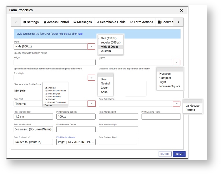
Print Font
Use this property to optionally select the font will use when rendering PDFs generated as part of a submission, Print View or from an acroform as part of a form/workflow submission. In-house customers must purchase and install font families for the fonts to show in the dropdown. Refer to this documentation for the details.
Contact customer support for help with this feature if you are a Live Forms Online customer.
Print Orientation
The designer can choose print orientation when rendering PDFs generated if the Save PDF property is checked or when you click on the  Print icon. Dropdown choices are blank, Portrait or Landscape. When no value is selected, it defaults to Portrait.
Information about inserting page breaks into your form can be found here.
Print Margins
Set the print margins for the pdf by entering values in the Top, Bottom, Left and Right property fields.
| Property Name | Purpose | Notes | Default |
|---|---|---|---|
| Print Margins (Top/Bottom/Left/Right) | Used to configure the width/height of the page margins appearing in the print PDF view. | Specifies a margin in px, pt, cm, etc. To specify a margin in inches, use the abbreviation "in" without the quotes. For example, for a 1 inch margin on the top/bottom of the pdf, enter 1in in the Top/Bottom property fields. | 0. |
If top/bottom margins are not set and a header or footer is specified, then the appropriate margin will be defaulted to 50px.
Print Headers/Footers
Specify the header/footer content using the Print Headers and Print Footer properties at the form or workflow level. These properties do not appear on the form designer when inside a workflow.
| Property Name | Purpose | Notes | Default |
|---|---|---|---|
| Print Headers | |||
| Left | Used to specify a print header appearing to the left. | Header will appear left justified. Accepts templates for control values. | Empty |
| Center | Used to specify a print header appearing in the center. | Header will appear centered. Accepts templates for control values. | Empty |
| Right | Used to specify a print header appearing to the right. | Header will appear right justified. Accepts templates for control values. | Empty |
| Print Footers | |||
| Left | Used to specify a print footer appearing to the left. | Footer will appear left justified. Accepts templates for control values. | Empty |
| Center | Used to specify a print footer appearing in the center. | Footer will appear centered. Accepts templates for control values. | Empty |
| Right | Used to specify a print footer appearing to the right. | Footer will appear right justified. Accepts templates for control values. | Empty |
Specialized templates values that are supported in headers and footers are detailed in the following table:
| Template | Purpose |
|---|---|
| FREVVO.PRINT_PAGE_NUM | This will be replaced by the current page number in the PDF print output. The template name must be enclosed in curly braces when specified in the header/footer fields - {FREVVO.PRINT_PAGE_NUM} |
| FREVVO.PRINT_PAGE_COUNT | This will be replaced by the total number of pages in the PDF print output. The template name must be enclosed in curly braces when specified in the header/footer fields - {FREVVO.PRINT_PAGE_COUNT} |
| <image_control_name>.img | This will be replaced with an image tag sourced to the internal url of the image for an image control appearing somewhere in the form/workflow. This can be used to place an image into the header/footer that is contained in the form/workflow (no external dependency). Replace <image_control_name> with the name of the image control.and enclose the template in curly braces - {<image_control_name>.img}. Note that the image will be displayed in its true size. |
| <image_control_name>.url | This will be replaced with the internal url of the image for an image control appearing somewhere in the form/workflow. This can be used to place an image into the header/footer using your own markup that is contained in the form/workflow (no external dependency). Replace <image_control_name> with the name of the image control and enclose the template in curly braces - {<image_control_name>.url}. Also, this can be used to force the image to a certain size (using width/height attributes). |
FREVVO.PRINT_PAGE_COUNT Template in Headers/Footers
The template works best with workflows designed using Linked Activities. These types of workflows result in a single linked printable form. It will not work as reliably in a workflow design that uses multiple forms.
Images in Headers/Footers
When you use the {image_control_name.img}, outputs <img src="the image's url"/>. This will output the image in its normal size. In this case, that is 174x170 pixels for the color grid. You can instead use something like: <img src="{<image_control_name>.url}" width="50" height="50"/> to size the image smaller to fit. If you want the image to be its true size and not be cut off, then you need to set your margin top and bottom accordingly.
If you don't set a margin size for either top or bottom and you also set either a header or footer, then the system picks an arbitrary margin height of 50px, for the header/footer that has the selected value. It is up to the designer to adjust the top or bottom margins to display the image as required.
HTML in Headers/Footers
Invalid markup in a print header/footer field will result in it being rejected and cleared off of the field in the form/workflow designers. If there was a previous value in the field it will display. Correct your HTML to continue.
Avoid special characters in the Print Headers/Footers. For example, using an &, <, > or any other special characters in the print header/footer can prevent your form/workflow from generating the PDF and submitting successfully.
Saved Fields
Set up Saved Fields for your form on the Saved Fields tab. Be sure to read the information below first.
You can access the Saved Fields tab by clicking the Edit Form Properties icon on the Forms Designer toolbar. This will launch the Forms Properties wizard. Click the Saved Fields tab. This tab does not appear in the Properties Navigator.
Select the Available Fields and use the arrow buttons to move them to the Saved Fields list. Drag and drop is available for some browsers.
Saved Fields tab
This Saved Fields tab displays only when the Legacy Submissions view is configured as it is in the cloud. The only reason to configure Saved Fields for a form/workflow is if you want to use the Export to Excel which is only available in the Legacy Submissions view. Remember, Saved Fields are stored in the database when the form/workflow is completed. This can significantly reduce performance, especially for large forms and require additional storage in the repository.
In-house customers can choose to hide the Legacy Submissions view with a configuration parameter. If the Legacy submission view is not visible, the Saved Fields tab is not displayed in the Form/Workflow Designers and the Export to Excel feature is not available.
Refer to Submissions Stored Inside of Live Forms - Legacy View for the details about the Legacy Submission view and the Export to Excel feature.Geo Location
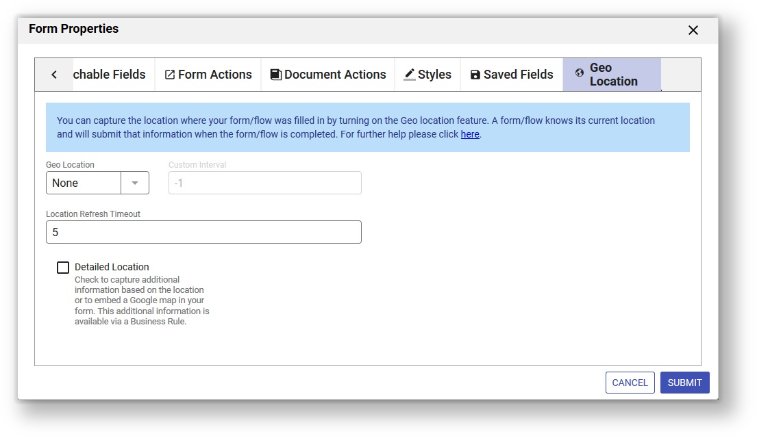
Use the Geo Location tab to set up your form to pull in a Google map and/or collect location information.
You can access the Geo Location tab by clicking the Edit Form Properties icon on the Forms Designer toolbar. This will launch the Forms Properties wizard. Click the Geo Location tab. This tab does not appear in the Properties Navigator.
New in-house installations must obtain an API key in order to use this feature. Follow the steps listed here to obtain the key.
You can capture the location where your form was filled in by turning on ' Geo location feature. A forms knows it's current location and will submit that information when the form is completed.
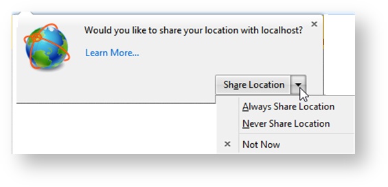
uses the HTML5 GeoLocation api. The geo api is well supported on tablet, phone and recent laptop/desktop browser versions. This feature works on a desktop or any GPS capable mobile device.
When the form loads in the browser, it will ask for the location. All browsers will show a pop up asking the user's permission to use their location, unless permission was Always granted or refused in a previous session. The user must give permission for Geo location to proceed. Here is an example of the request in the Firefox browser:
The Geo Location feature works in conjunction with rules that use the form.positionUpdated identifier. You can set up the rule to execute every time the position is updated. See Business Rules for examples of rules that will do this. Also see Rules Position Data for the complete list of available build-in data.
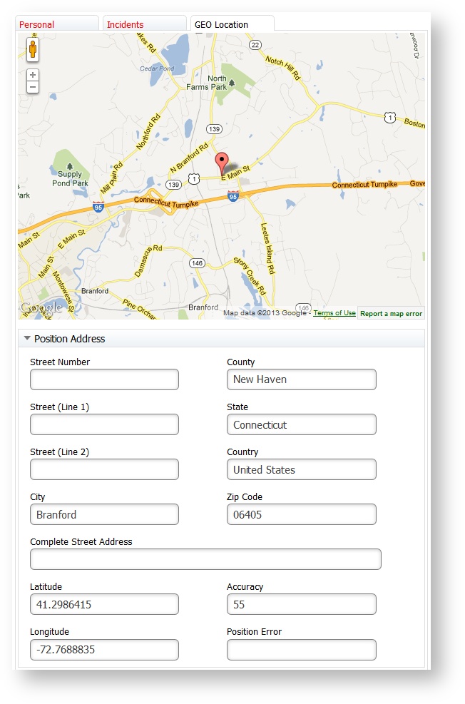
You can also collect additional information associated with your location. For example, a section of a Police Incident Report, shown in the image, captures the location where the form was filled in plus the address information associated with it. The last position update will be in the submission metadata of your form or workflow but it is NOT automatically added to the XML document . You must create controls (perhaps hidden) and rules to add the location information to the form XML document. The Position Address section of the Police Incident Report has controls and rules to show longitude, latitude, accuracy and/or errors plus the address information.
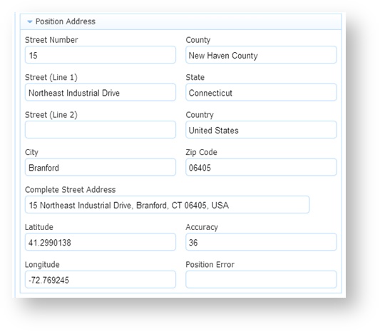
Latitude and Longitude display the coordinates of the user location. The accuracy of the location in meters is represented by the value in the Accuracy field - a low Accuracy value means the position is more precise. You can display a position error code and the text description of error message in your form if desired. Error message codes can be 1, 2 or 3:
1 - Permission Denied - You will get this error code if the user says no to the access question.
2 - Position Unavailable - This error code means the device running the browser cannot get the GPS satellite signal (tunnel, underground).
3 - Timeout - The device running the browser times out trying to get the location information.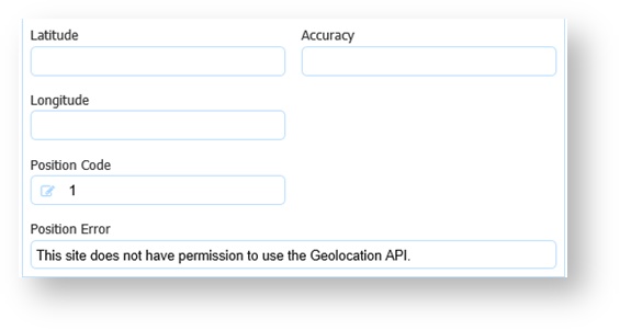
You will never see coordinates and error codes in the same form. You get one or the other.
The options for the Geo Location field are:
- None - (no location) - this is the default
- On Load - at start time
- Custom - allows the designer to specify a periodic refresh. The default value is 30 seconds. Choosing this method will fire a rule in the specified time. For example, if the field to the right of the Geo Location Dropdown was set to 10, the rule would fire every 10 seconds. See below for more details.
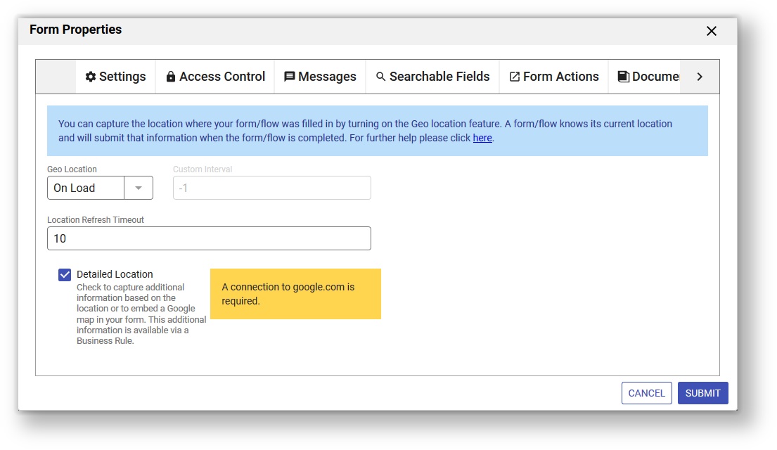
The Loc Timeout is the amount of time in seconds the location finder in the browser will search to find the location before it times out. The default value is 5 seconds. To capture additional information based on the location via a Business Rule or to embed a Google map in your form. you need a connection to google.com and you must check the Detailed Loc. checkbox on the Properties panel. You will need to put a message control in your form where you want the map to display. Type f-map-div in the css class field on the message control Properties panel. This is a built in java script to display the map that cannot be edited.
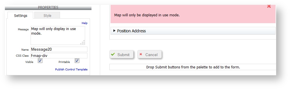
The map will only display in use mode.